Categories
Uncategorized

Learning about DAX Function Categories in Power BI: A Comprehensive Guide

Data Analysis Expressions (DAX) offer a powerful way to build complex formulas in Power BI, transforming data into actionable insights. By utilizing DAX, users can perform tasks ranging from simple calculations to complex data modeling.

Understanding DAX functions is crucial for anyone looking to enhance their data analysis capabilities in Power BI.

A computer screen displays a Power BI interface with DAX function categories. Charts and graphs are visible in the background

The versatility of DAX lies in its various function categories, which include logical, mathematical, and text functions, among others. Each category provides unique tools that can be combined to meet specific analytical needs.

Exploring these categories helps users make the most of Power BI’s data modeling strengths.

Aggregation Functions

Aggregation functions in Power BI’s DAX language are essential tools for summarizing data. They allow users to perform calculations on a group of values, like finding a sum or average, making it easier to analyze large datasets.

One key function is SUM, which adds up all the values in a column. This helps in quickly knowing total sales or expenses.

The AVERAGE function calculates the mean of the values within a column, providing insights into typical values or trends.

Another important function is COUNT. This function counts the number of non-blank values in a column. It’s useful for understanding the scale or volume of data entries.

For more complex scenarios, DISTINCTCOUNT comes in handy as it counts unique entries, offering insights into the variety within a dataset.

For a more nuanced approach, SUMX and AVERAGEX are used. These functions work by applying a calculation to each row first and then aggregating. This is useful for weighted averages or when conditions apply to single data points before they are aggregated.

Advanced users may find APPROXIMATECOUNTDISTINCT helpful, a function that estimates unique values for large datasets, saving processing time.

2) Count Filters

Count filters in Power BI are essential for managing and analyzing data accurately. They help users focus on specific information by narrowing down data to meet certain criteria.

In Power BI, functions like COUNTX and CountRows are widely used. These functions allow users to count items within a set of data, considering multiple conditions or categories.

Using COUNTX, users can count items with multiple filters applied. This is useful for scenarios requiring various conditions to be considered.

For example, understanding different resource counts across categories is made easier by using COUNTX with more than one filter.

On the other hand, CountRows is beneficial when the total number of rows matching certain conditions is needed. It provides a clearer picture of how many data entries meet specified criteria.

Understanding how to use these functions effectively ensures better data analysis and more precise results.

3) Logical Operators

Logical operators in DAX are essential for creating effective calculations in Power BI. They help determine outcomes based on conditions.

By using logical operators, users can make their data model more dynamic and responsive.

One common operator is the AND function, which checks if all conditions in a given expression are true. If all parts of the expression evaluate to true, the AND function returns true.

This is useful when multiple criteria need to be met before an expression is considered valid.

Another important operator is the OR function, which evaluates if at least one condition is true. Unlike the AND function, only one part of the expression needs to be true for the OR function to return true.

This is handy when at least one of many conditions should trigger an action.

The IF function is also widely used for logical evaluations. It checks a condition and returns different outputs based on the result.

Users can specify what to do when a condition is true and what to do when it is false. The IF function is versatile, allowing nested conditions to handle more complex scenarios.

4) Text Manipulation

DAX text functions are essential for handling text data in Power BI. They provide the ability to format and analyze strings within tables and columns. These functions are similar to Excel’s text functions but are optimized for tabular models.

One of the primary uses of DAX text functions is to concatenate string values. This is useful when combining different pieces of information into a single text string for reports. Users can join text from multiple columns or add custom text easily.

Another key feature of DAX text functions is the ability to extract parts of a string. This can be done using functions that return specific segments based on position or delimiter, enabling precise control over string data manipulation.

Adjusting formats for dates, times, and numerals is another capability of DAX text functions. This allows users to present data in a more readable or region-specific format.

For example, changing date formats to match local preferences can improve report clarity.

Functions like SEARCH and FIND in DAX are valuable for locating specific text within a string. They help identify data patterns or the presence of keywords, which is crucial for detailed analyses.

Text manipulation in DAX also includes functions for replacing or substituting text within strings. This helps in cleaning data, such as correcting errors or updating values to reflect changes in naming conventions.

5) Date and Time Functions

Date and time functions in DAX are essential for handling data related to time periods. These functions allow users to perform calculations based on specific dates and times.

Functions like TODAY return the current date. When dealing with time, the TIME function can be used to create a time value from hours, minutes, and seconds.

This is useful when analyzing data over specific times during the day.

Other useful functions include WEEKDAY, which identifies the day of the week for any date, and WEEKNUM, which gives the week number for a specific date. These can help in grouping data by weeks or filtering data by days of the week.

For those needing to work with UTC dates, functions like UTCNOW and UTCTODAY return the current universal time date and time. They ensure consistency when working with international datasets.

In addition, the DAX Guide for Date and Time provides a comprehensive list of functions, like EDATE and EOMONTH, to manipulate dates for a given number of months before or after a starting date. These functions help in forecasting and time-based analysis.

6) Parent-Child Functions

Parent-child functions in DAX are important for managing hierarchical data. These functions help deal with data structures where each row is linked to a parent row. This setup is common in organizational charts or file directories.

A key function in this category is PATH. It creates a text path showing the parent-child relationships for a specific row. Users can see the full hierarchy from any given point. This is useful for understanding the structure of complex data.

Another important function is PATHITEM. This function extracts specific levels of the hierarchy. For example, retrieving the immediate parent or a specific ancestor. It helps navigate the hierarchy efficiently.

Functions such as PATHLENGTH and PATHCONTAINS provide added functionality. PATHLENGTH determines how deep the hierarchy goes from a starting point. PATHCONTAINS checks if a particular item exists within a path.

Using these functions, users can manage hierarchical data more effectively in Power BI.

7) Information Functions

Information functions in DAX serve to extract and provide details about data in Power BI. These functions are highly valuable for analysts who need to understand specific characteristics of their data.

One key function is the ISBLANK, which identifies if a cell is empty. This helps in preventing errors in calculations and analyses by identifying gaps in data.

The ISERROR function checks whether an expression results in an error. This is useful when trying to handle or troubleshoot complex calculations, ensuring that errors are addressed promptly.

Another useful function is ISEVEN, which determines if a given number is even. Similarly, ISODD checks if a number is odd. These functions can help categorize or filter data based on numeric attributes.

A particularly important function is ISNUMBER, which determines if a value is a numeric type. This function is helpful when converting text to numbers or when validating data types in datasets.

The ISLOGICAL function identifies if a value is a boolean, which can be useful in logical operations or conditions, ensuring the right value types are used for calculations.

Finally, ISTEXT checks if a given input is text. This helps in differentiating text from numbers, allowing users to apply appropriate formatting or calculations. It is especially handy when dealing with mixed data types in a column.

8) Statistical Functions

Statistical functions in DAX are essential for data analysis in Power BI. They allow users to perform calculations related to statistical distributions, probability, and data variability.

DAX provides functions like AVERAGE, COUNT, and STDEV.P that help analyze datasets efficiently.

For example, AVERAGE calculates the mean of a set of numbers, while STDEV.P measures data dispersion by calculating population standard deviation.

Using these functions, users can derive insights from data patterns and trends. This makes it easier to understand underlying distributions and variations in datasets.

By leveraging statistical functions, Power BI users can transform raw data into valuable information for decision-making processes.

DAX also offers functions like VAR.P for population variance and MEDIAN, which helps in finding the middle value in a dataset. These tools are crucial for analyzing and interpreting statistical information in business scenarios.

Having a strong grasp of statistical functions can enhance data modeling in Power BI. It allows for more precise and informed analyses, leading to better business outcomes. Knowing how to utilize these functions effectively is key to mastering Power BI’s analytical capabilities.

9) Math and Trigonometry Functions

Math and Trigonometry functions in DAX are essential for performing calculations on data. They are used in Power BI for tasks like calculating the square root, finding absolute values, and more.

The POWER function helps in raising numbers to a specific power. This is useful for exponential growth calculations.

The QUOTIENT function returns only the integer portion of a division. This can be handy for dividing items into whole units without fractions.

RADIANS is another important function. It converts degrees into radians, which is particularly useful in trigonometric calculations where angles in radians are required.

Functions like RAND and RANDBETWEEN generate random numbers. RAND returns a number between 0 and 1, while RANDBETWEEN provides a random number within a specified range.

The ABS function is also significant. It returns the absolute value of a number, and it’s used when the direction of a number (positive or negative) doesn’t matter.

Calculating angles is easy with ACOS. It returns the arccosine of a number, which is useful in various mathematical and scientific calculations.

These functions are similar to those in Excel, but DAX has its own specifics, especially concerning data types. This makes understanding their application in Power BI crucial.

These math and trigonometry functions enable users to perform complex calculations and analyses in Power BI, making data insights more comprehensive and actionable.

10) Time Intelligence Functions

Time Intelligence functions in DAX are crucial for analyzing data across different time periods. These functions help in calculating metrics like year-to-date, quarter-to-date, and month-to-date. They allow users to compare past performance with the present, making it easier to identify trends and patterns.

Users need to ensure that there is a Date Table marked in their data model before using these functions. This table should contain a column with continuous dates covering the entire time frame of the dataset.

For more information, visit Time intelligence functions at Microsoft Learn.

Some commonly used time intelligence DAX functions include TOTALYTD, TOTALQTD, and TOTALMTD. These functions are designed to compute cumulative totals over specific periods, such as a year, quarter, or month.

Understanding these can significantly enhance data analysis capabilities in Power BI. Learn more at DAX: Mastering Time Intelligence Functions for Data Analysis.

While using these functions, it’s important to take note of deprecated features. Some functions might be volatile or not recommended for use, as mentioned in DAX Guide.

Having a good grasp of the alternatives is beneficial for efficient data analysis.

These tools are essential for anyone looking to effectively utilize Power BI for time-based data assessments. Leveraging these functions allows for a more dynamic and insightful approach to business intelligence.

Understanding DAX Function Categories

DAX functions in Power BI are essential tools for creating complex calculations. They allow users to manage data models efficiently. Understanding the different categories can help you build more powerful data analyses and visualizations.

Basic Concepts of DAX Functions

Data Analysis Expressions, or DAX, includes a broad set of functions used to create custom calculations in Power BI. These functions are similar to those in Excel but have more advanced capabilities.

The core idea is to work with relational data by managing data tables, filtering data, and performing calculations based on conditions.

Categories include mathematical functions, like SUM and AVERAGE, which perform basic calculations, and time intelligence functions, such as DATESYTD, which handle complex date ranges. Understanding these basics is crucial for anyone using DAX in Power BI.

Importance of DAX in Power BI

DAX is crucial for enhancing the functionality of models in Power BI. It enables the creation of calculated columns, measures, and tables based on specific data requirements.

This capability makes data analysis more dynamic and interactive, allowing users to gain deeper insights.

Incorporating DAX functions allows users to create powerful formulas, enhancing the semantic models. It maximizes the potential of Power BI by supporting advanced analytics, making it a valuable tool for business intelligence professionals looking to elevate their reports and dashboards.

Exploring Different DAX Function Categories

DAX functions in Power BI encompass various categories that enable users to perform comprehensive data analysis. Key categories include functions for aggregation, time intelligence, and logic. Each offers unique capabilities, empowering analysts to derive meaningful insights from their data.

Aggregate Functions

Aggregate functions in DAX allow users to perform calculations across a set of values. These functions are vital for summarizing data.

Common examples include SUM, AVERAGE, MIN, and MAX. They help in computing totals, averages, minimums, and maximums, respectively.

In Power BI, these functions are often used in reports and dashboards to display essential metrics.

For instance, the SUM function can total sales figures for a fiscal quarter. This category of functions ensures that data-driven insights are accurate and comprehensive.

Time Intelligence Functions

Time intelligence functions in DAX are used to perform dynamic calculations on dates. They are crucial for analyzing data over time periods like months, quarters, and years.

Functions like DATEADD, DATESYTD, and PARALLELPERIOD help in calculating values over specific time intervals.

These functions provide the ability to compare performance over different periods or track trends.

For example, the DATESYTD function calculates the year-to-date total of sales. Time intelligence functions are essential tools for any Power BI user working with trend analysis and forecasting.

Logical Functions

Logical functions in DAX are designed to make decisions based on conditions. They include functions like IF, AND, OR, and SWITCH. These functions evaluate expressions and determine the output based on logical conditions.

For example, the IF function checks whether a condition is met and returns a value based on the result.

Such functions are especially useful in scenarios where outcomes depend on specific criteria. Logical functions provide flexibility in defining complex decision-making rules within data models.

By understanding these categories, users can enhance their data analysis capability, transforming raw data into insightful information and aiding in strategic decision-making using Power BI’s powerful DAX functions.

Frequently Asked Questions

A laptop screen displaying a Power BI interface with various DAX function categories and a person studying them

Here are some common questions that many people have when learning about DAX functions in Power BI. This section covers important basics for beginners, useful categories, and resources for improving DAX skills.

What are the fundamental DAX functions to start with for beginners in Power BI?

Beginners in Power BI should start with basic functions like SUM for aggregation, COUNT for counting values, and IF for logical tests. These essential functions form the foundation for constructing more advanced formulas.

Can you list the categories of DAX functions used in Power BI?

DAX functions are organized into several categories. Some key ones include aggregation functions, logical operators, text manipulation, and date and time functions. Each category helps solve different types of data analysis problems.

What are some examples of commonly used DAX functions in Power BI reports?

Commonly used DAX functions in Power BI reports include SUM, AVERAGE, and COUNTROWS for data aggregation. DATEADD and RELATED are often used for date and relationship handling. These functions allow users to perform complex data transformations.

How can I improve my skills in writing DAX expressions for Power BI?

Improving skills in writing DAX expressions involves practice and learning from examples. It helps to experiment with different functions, work on real datasets, and refer to online tutorials or courses that specialize in DAX.

Which DAX functions are essential for performing advanced data analysis in Power BI?

Advanced data analysis in Power BI often requires functions like CALCULATE for modifying filter contexts, EARLIER for row-based calculations, and ALL for removing filters. Mastering these can greatly enhance analytical capabilities.

What resources are available for learning DAX functions in Power BI comprehensively?

Several resources are available for comprehensive learning. For example, the DAX function reference on Microsoft Learn is a great starting point. Additionally, platforms like Analytics Vidhya offer articles and tutorials for in-depth understanding.

Categories
Uncategorized

Learning Seaborn Coding: Master Data Visualization Effortlessly

Getting Started with Seaborn

Seaborn is a popular Python library for data visualization. It offers an intuitive interface and is built on top of Matplotlib, making it easier to create informative and attractive statistical graphics.

Seaborn Overview

Seaborn enhances Python’s data visualization capabilities and simplifies the creation of complex graphs.

It works efficiently with pandas data structures, making it ideal for handling data frames directly. This library is particularly useful for visualising statistical relationships, data distributions, and categorical data.

Seaborn addresses some limitations of Matplotlib by providing default styles and themes that make plots visually appealing.

Users can easily customize styles to match their needs, improving the readability and presentation of their data visualizations.

Built-in functions simplify drawing common charts like bar plots, heatmaps, and violin plots.

Installation and Setup

To begin using Seaborn, it needs to be installed on your system.

This can be done using a command line by typing pip install seaborn. If you are working in an Anaconda environment, using conda install seaborn is recommended.

Post-installation, import Seaborn in your Python scripts with import seaborn as sns. It’s also important to import Matplotlib to control various plot aspects like titles and axes labels.

For executing code, tools like Jupyter Notebook provide an interactive platform, enabling real-time visualizations and adjustments.

Ensure Python and pip are updated to avoid compatibility issues during installation.

Understanding the Dataset-Oriented API

Seaborn’s design efficiently handles data-focused tasks using a dataset-oriented API.

This approach allows users to input datasets directly and specify variables for plots, streamlining the visualization process. Functions like lineplot(), scatterplot(), and barplot() interpret input data frames, determining the best way to display them.

This API design eliminates the need for manually preparing data, offering automatic aggregation and transformation for summarization and visualization purposes.

This functionality is particularly beneficial for statistical analysis and exploration, making Seaborn a powerful tool for data scientists and analysts working with complex datasets.

Fundamentals of Data Visualization

A laptop displaying a code editor with a script for Seaborn data visualization. A notebook, pen, and coffee cup are nearby

Seaborn simplifies the process of creating stunning data visualizations by offering tools to work with Python’s pandas and numpy libraries.

Key aspects include using powerful plotting functions, handling dataframes efficiently, and following a structured workflow for data analysis.

Exploring Basic Plotting Functions

Seaborn offers a wide range of plotting functions that make it easy to create compelling visuals.

Users can craft line plots, scatter plots, and bar plots with simple syntax. For example, a scatter plot can be made using the scatterplot() function.

Seaborn also allows for customization, such as changing color palettes or adding legends and titles.

One crucial benefit is the option to create statistical graphics that reveal insights clearly. Functions like pairplot() help visualize relationships within multidimensional data. These plots help researchers and data analysts communicate complex patterns with clarity.

Diving into Pandas Dataframes

Seaborn integrates seamlessly with the pandas dataframe structure.

This integration allows users to manipulate and visualize large datasets with ease. Pandas dataframes hold structured data in tabular form, making them ideal for analysis and plotting in Seaborn.

Using dataframes, users can filter and sort data, or perform operations like grouping or aggregation. Seaborn relies on dataframes to access data efficiently, providing convenience through its data-handling capabilities.

This integration empowers users to conduct thorough data analysis while leveraging Seaborn’s visualization power.

Visualization Workflow

Following a structured visualization workflow is crucial in data analysis.

This begins with data preparation, where pandas and numpy play critical roles in cleaning and organizing the data. Once ready, selecting the right Seaborn plotting functions is key to highlighting data insights.

The workflow includes choosing the right plots to communicate the message effectively. Users must then customize the visuals to ensure clarity, adapting elements like axis labels and plot size.

Throughout this process, Seaborn’s documentation and community support provide valuable resources, guiding users to optimize their data visualization efforts.

Understanding Seaborn’s Plotting Syntax

Seaborn is a powerful tool for data visualization in Python, built on top of Matplotlib. It offers a simple interface for creating complex graphics with minimal coding.

Key elements include how data is handled and how semantic mappings are used to convey additional information visually.

The Role of Data in Seaborn

In Seaborn, data is typically managed using dataframes. This format makes it easy to specify data directly in the plots.

Users need to focus on selecting the appropriate columns and determine how they should map to the axes.

For example, when plotting, the data parameter takes a dataframe, while x and y parameters specify the respective columns.

Additionally, Seaborn automatically handles missing data, which simplifies processing and visualization. It integrates well with tools like Pandas, making the transition from data processing to visualization seamless.

Using dataframes, it becomes straightforward to perform exploratory data analysis and generate plots without extensive coding. This role of data handling in Seaborn aims to reduce the complexity of data selection and comparison.

Semantic Mapping Concepts

Semantic mapping is key to creating meaningful plots with Seaborn. This involves using visual elements to represent dimensions of the data, such as size, color, or style.

Seaborn allows users to add semantic mappings that enhance plot interpretation. For instance, data can be mapped to different hue, size, or style aesthetics.

This lets users differentiate data categories and better understand relationships within the data. For example, in a scatter plot, points could vary by color to represent different categories.

By using these semantic elements, users can enrich their visualizations, making them more informative and aesthetically appealing. These tools help highlight patterns or differences within the data that might not be visible otherwise.

Styling and Themes in Seaborn

Seaborn makes it easy to enhance data visualization with various styling options and themes. Users can adjust aesthetic parameters, explore customizable color palettes, and apply built-in themes for better presentation.

Setting the Aesthetic Parameters

Seaborn offers simple ways to improve the appearance of plots. Users can set the aesthetic parameters using the sns.set_style() function.

Five styles are available: darkgrid, whitegrid, dark, white, and ticks. These styles make it easier to tailor the look of plots to suit different needs.

Additionally, the sns.despine() function can remove the top and right spines from plots, giving them a cleaner appearance.

Adjusting the aesthetic settings helps in creating visuals that are both clear and attractive.

Customizing with Color Palettes

Color palettes in Seaborn enable precise control over plot colors. Users can select from built-in palettes or create custom ones using sns.color_palette().

Palettes are important for distinguishing between data groups or highlighting specific data points.

Visual clarity is improved with contrasting colors, and sns.palplot() can be used to display a palette for preview.

Using these tools, users can ensure their data visualizations are visually appealing and informative.

Applying Default Themes

Seaborn has five default themes that cater to different presentation needs: darkgrid, whitegrid, dark, white, and ticks.

The default is usually darkgrid, but users can switch to another theme with sns.set_theme() by passing a theme’s name.

For example, using a white background with white is ideal for publishing, while dark is suited for presentations.

These themes help users quickly adjust plot appearances to match their intended output, ensuring a professional and polished look.

Statistical Data Exploration

A computer screen displaying a colorful statistical data visualization created using Seaborn coding

Statistical data exploration in Seaborn involves examining individual variables and their relationships. It uses various plots to reveal patterns, trends, and connections within datasets. Through univariate and bivariate analysis, users can gain insights into distributions and interactions.

Univariate and Bivariate Analysis

Univariate analysis focuses on a single variable, analyzing its distribution and central tendencies like the mean.

Seaborn offers several plots for univariate analysis, such as histograms and box plots. Histograms display frequency distributions, allowing users to see how data is spread. Box plots show the quartiles and any potential outliers, helping to identify the spread and symmetry of the data.

Bivariate analysis examines relationships between two variables. Scatter plots and heatmaps are common choices for this type of analysis.

Scatter plots, often used in regression analysis, depict correlations and relationships, providing a visual representation of statistical relationships. Heatmaps visualize data matrices, showing variations and concentrations through color grading.

Understanding Statistical Plots

Statistical plots are essential in exploratory data analysis. They offer visual representations of data that make it easier to notice patterns and outliers.

Seaborn enhances these plots with features like color palettes and themes, increasing readability and visual appeal.

Seaborn’s ability to combine multiple plots helps to illustrate complex relationships in data. For example, regression analysis can be visualized with scatter plots and regression lines, showing trends and predicting new data points.

The combination of these plots aids in making more informed decisions in data exploration and analysis.

Distributions and Relationships

When exploring data with Seaborn, it’s essential to understand how distributions and relationships are visualized. These concepts help in revealing patterns, making it easier to interpret statistical relationships between variables.

Creating Histograms and Kernel Density Plots

Histograms are valuable tools in data visualization, offering a simple way to display the distribution of a dataset.

Seaborn provides several functions to create histograms, such as histplot(), which helps in dividing the data into discrete bins. This makes it easy to see how data points are spread out across different ranges.

Kernel Density Plots (KDE plots) add a smooth, continuous curve to represent data distribution. Seaborn’s kdeplot() function facilitates this, providing an easy way to signal the data’s underlying pattern.

Unlike histograms, which show data in blocks, KDE plots offer a more elegant, fluid visualization. This smoothness helps in understanding the data’s peak areas and overall distribution shape.

Seaborn also integrates functions like distplot() (deprecated), which combined histograms with KDE plots, offering a comprehensive view of the data distribution.

Understanding these tools can significantly enhance one’s ability to analyze and visualize statistical data effectively.

Visualizing Pairwise Data Relations

When examining how different variables relate to each other, Seaborn’s scatter plots and pairwise plots are indispensable.

Scatter plots, using functions like relplot(), graphically display data points on two axes, making trends and outliers evident.

Pair plots, created using the pairplot() function, offer a more detailed view by plotting multiple pairwise relationships across an entire dataset.

This approach is beneficial for exploring relationships and spotting correlations between variables. Additionally, pair plots often include histograms or KDE diagonal plots to show univariate distributions.

Joint plots, through jointplot(), combine scatter plots with additional univariate plots like histograms near the axes, offering insights into how two datasets interact.

These plots are helpful to explore potential causal relationships or identify patterns. By using these tools, users can gain a comprehensive view of relational data dynamics.

Categorical Data Visualization

Categorical data visualization is crucial for identifying patterns and insights in datasets where variables are divided into discrete groups. Tools like box plots, violin plots, count plots, and bar plots play a major role in illustrating differences and distributions.

Comparing Box and Violin Plots

Box plots and violin plots are great for visualizing distributions in categorical data.

The box plot provides a summary of data using a box to show the interquartile range and whiskers to indicate variability outside the upper and lower quartiles. This plot is helpful in comparing the spread and any outliers across different categories.

In contrast, violin plots include not just the summary statistics but also the kernel density estimation. This gives a deeper understanding of the data distribution across range categories.

Violin plots are especially useful when the data has multiple peaks or is asymmetrical. Comparing these plots helps users decide which details they need to focus on based on their data characteristics.

Understanding Count and Bar Plots

Count plots and bar plots are essential for visualizing categorical data by displaying frequencies of data points.

A count plot is straightforward; it shows the count of observations in each category, often using bars. This is ideal for understanding the distribution and frequencies at a glance.

The bar plot (or barplot() in Seaborn) is more flexible. It represents data with bars where the length of each bar corresponds to a numerical value, suitable for comparing different categorical groups using additional variables like hue.

For categorical data analysis, these plots provide clear insights by representing quantities and comparisons effectively.

Advanced Plotting with Seaborn

Advanced plotting with Seaborn involves techniques that allow for creating complex visualizations.

Techniques like faceting with FacetGrid and multi-plot grids enable users to visualize data in different dimensions, enhancing the depth of analysis and presentation.

Faceting with FacetGrid

FacetGrid is a powerful tool in Seaborn for creating multiple plots side by side, helping to reveal patterns across subsets of data.

By using FacetGrid, one can map different variables to rows and columns, showcasing how data changes across dimensions.

For instance, when using FacetGrid, a user can specify a variable to facet along rows or columns. This results in a grid of plots, each representing a subset of the data. This method is particularly useful when comparing distributions or trends across different categories.

When combined with functions like relplot, catplot, or lmplot, FacetGrid becomes even more versatile.

Users can choose the type of plot to display in each facet, using options such as scatter plots, line plots, or bar plots. This flexibility allows for creating detailed and informative multi-plot visualizations.

Multi-Plot Grids and Customizations

Multi-plot grids in Seaborn, such as those created with pairplot and jointplot, are designed to provide a comprehensive view of data relationships.

These grids can display different visualizations in a single figure, each showing unique aspects of the dataset.

With pairplot, users can visualize pairwise relationships in a dataset across multiple dimensions. It showcases scatter plots for each pair of variables and histograms along the diagonal. This approach helps in understanding correlations and distributions effectively.

On the other hand, jointplot combines scatter plots with marginal histograms or density plots, offering insights into both joint and individual distributions.

Customizing these plots can further enhance their impact. Users may adjust aesthetics, add annotations, or refine layouts to create clear and compelling visual stories.

Regression and Estimation Techniques

In this section, the focus is on using Seaborn for creating regression plots and employing estimation techniques to analyze data. Understanding linear relationships and the role of confidence intervals in assessing these models is crucial.

Creating Regression Plots

Regression plots are key tools in understanding relationships between variables.

In Seaborn, two main functions used for this purpose are lmplot and regplot.

regplot is known for its simplicity and is great for adding a regression line to scatter plots. It offers quick insights into data trends.

On the other hand, lmplot provides more flexibility and can handle additional features like faceting, which is helpful for examining complex datasets.

Users can visualize how a dependent variable changes in response to an independent variable.

Customization options include altering line aesthetics and color, allowing for clear visual communication. Utilizing these functions effectively helps illustrate relationships and uncover patterns in data.

Applying Estimators for Mean and Confidence Intervals

Estimators are used to summarize data by calculating means and confidence intervals, helping users make informed judgments about datasets.

Regression analysis in Seaborn allows for the display of confidence intervals alongside regression lines, providing a visual indicator of model reliability.

The confidence interval typically appears as shaded regions around the regression line. This shading indicates the range within which the true regression line is expected to lie with a certain level of confidence, often 95%. This can be adjusted to suit different statistical needs.

Understanding these intervals helps in assessing the precision of predictions and the likelihood of these predictions being representative of true outcomes.

Utilizing Multi-Dimensional Data

Seaborn is a powerful Python data visualization library that can help users make sense of complex, multi-dimensional data. By using tools like joint and pair plots and examining heatmaps and cluster maps, users can uncover hidden patterns and relationships in their datasets.

Building Joint and Pair Plots

Joint and pair plots are essential for visualizing relationships between variables. A jointplot combines a scatterplot and marginal histograms, providing a simple way to observe correlations and distributions.

Users can enhance these plots with regression lines using Seaborn’s high-level interface.

Pair plots extend this concept, enabling the comparison of multiple variable pairs within a dataset. This multi-dimensional approach helps illustrate relationships, detect outliers, and identify trends.

When dealing with large datasets, the integration with pandas dataframes is beneficial, as it allows for seamless data manipulation and plotting. Utilizing these tools is crucial for efficient exploratory data analysis.

Exploring Heatmaps and Cluster Maps

Heatmaps and cluster maps are vital for assessing data through color-coded matrices.

A heatmap visualizes the magnitude of values, making it easier to spot significant variations in data. Seaborn excels at creating detailed heatmaps, which are ideal for analyzing correlations between variables.

Cluster maps expand on heatmaps by incorporating clustering algorithms. They group similar rows and columns together, revealing structures or patterns that might not be immediately evident.

This tool is particularly useful for data with multiple plots, enabling axes-level plotting for more granular insights. By leveraging numpy for numerical operations, users can handle large volumes of multi-dimensional data with ease.

Seaborn in Practice

Seaborn is a powerful tool for data visualization in Python. By using built-in example datasets, it simplifies plotting and presentation.

Working with Example Datasets

Seaborn comes with several built-in datasets like the iris and tips datasets. These datasets allow users to practice and understand different plotting techniques without needing to find external data.

The iris dataset includes measurements of iris flowers, useful for classification plots. For instance, users can create scatter plots to explore relationships between features.

The tips dataset, on the other hand, is great for learning about statistical plots. It shows daily tipping habits, allowing users to create bar plots or box plots to summarize the data.

To visualize these datasets, users can load them with functions like sns.load_dataset("iris"). Once data is loaded, various graphs can be created using functions such as sns.scatterplot() and sns.boxplot(). Users should remember to use plt.show() to display plots effectively in their scripts or notebooks.

Tips and Tricks for Effective Data Visualization

Utilizing Themes and Contexts: Seaborn offers customization options with themes and contexts. For example, sns.set_context() adjusts the plot elements’ sizes, which helps in creating visuals for different environments such as presentations or reports. Users can switch between contexts like [‘notebook’, ‘talk’, ‘poster’] depending on their needs.

Enhancing Aesthetics: Users can customize plots by modifying parameters. For example, changing color palettes, adjusting aspect ratios, or incorporating facet grids to show multiple plots in one figure. Experimenting with these settings can help highlight key data insights.

User Guide: Seaborn’s user guide contains valuable information for mastering these features and improving data visualization skills.

Fine-Tuning Seaborn Plots

A person working at a computer, surrounded by code and data visualizations, with a focus on a Seaborn plot being fine-tuned

Fine-tuning Seaborn plots involves adjusting their aesthetics and structure using tools like axes-level functions and applying context settings. These adjustments help create more polished and informative visualizations.

Enhancing Plots with Axes-Level Functions

In Seaborn, axes-level functions provide direct ways to modify individual plots. These functions plot data onto a single matplotlib.pyplot.Axes object, offering precise control over each aspect of the plot.

Functions such as sns.lineplot and sns.scatterplot are common tools used for relational plots. These allow users to customize their plot’s appearance by changing the color, size, and style of plot elements.

Modifying these attributes involves parameters like hue, size, and style, which distinguish different data variables by color, size, or line style.

Users can adjust these settings to emphasize key data points and relationships, making the plots more visually appealing and easier to interpret. This customization enhances the chart’s overall readability and impact.

Final Touches: Despine and Context Settings

Seaborn also provides the ability to adjust the plot’s style and context, which further refines its appearance.

The function sns.despine helps remove unwanted chart spines, providing a cleaner look. This is particularly useful for plots that need minimal distractions from data.

Context settings, managed with sns.set_context, allow scaling of plot elements like labels and lines for different viewing situations, such as presentations or reports.

By using context settings, users can adapt their plots for their specific audience. These final touches turn basic visualizations into more effective and attractive graphical representations, ensuring the plot communicates its message clearly and effectively.

Frequently Asked Questions

A computer screen displaying a webpage with a title "Frequently Asked Questions Learning Seaborn Coding", surrounded by coding books and a cup of coffee

This section addresses common inquiries regarding getting started with Seaborn for data visualization, how it differs from Matplotlib, and resources for learning. It also covers popular visualizations available in Seaborn and how to integrate it into coding projects.

How do I start learning Seaborn for data visualization?

Begin with a strong foundation in Python, as Seaborn is built on it. Familiarity with data structures like lists and dictionaries will help.

Installing Seaborn is a key first step, followed by exploring basic plots and experimenting with different styles.

What are the differences between Seaborn and Matplotlib?

Seaborn builds on Matplotlib, offering more visually appealing themes and easier creation of complex plots. While Matplotlib is great for basic plotting, Seaborn automates many visualizations, making it powerful for statistical graphics.

More information can be found in this discussion of Matplotlib and Seaborn.

Can you recommend any reliable tutorials for Seaborn beginners?

For beginners, Coursera offers courses that walk through the fundamentals of Seaborn alongside Python essentials. These courses can provide structured learning and practical projects to build skills effectively.

What are common data visualizations that Seaborn is particularly good for?

Seaborn excels in creating statistical plots like pair plots, heatmaps, and distribution plots. It makes it easy to detect patterns and trends in data, which is essential for analysis.

For a detailed understanding, you can check this introduction to Seaborn.

How do I import Seaborn and integrate it with my coding projects?

To use Seaborn, it must be installed using pip. Once installed, import it into your Python projects with import seaborn as sns.

This allows access to Seaborn’s powerful visualization functions and integration with Matplotlib for advanced customizations.

What are some resources to find comprehensive Seaborn learning material?

The official Seaborn documentation is a great resource, providing detailed examples and explanations.

Online courses, like those on Coursera, also provide structured learning paths.

Blogs and tutorials are plentiful and can offer step-by-step guides tailored to different skill levels.

Categories
Uncategorized

Learning How To Write Efficient, Optimized SQL: Boost Database Performance

Understanding SQL and Its Applications

SQL, or Structured Query Language, is essential for managing and interacting with relational databases. It allows users to create, read, update, and delete data efficiently.

This section addresses the core aspects of SQL and how databases play a critical role in query execution.

Fundamentals of Structured Query Language

Structured Query Language is a standardized language used to manage relational databases. It includes commands like SELECT, INSERT, UPDATE, and DELETE, enabling users to perform various operations on data.

SQL syntax is crucial for defining relationships between tables and retrieving specific data based on conditions.

The language employs commands to sort, filter, and join data from multiple tables, making it versatile for various applications. Understanding the basic commands and structure is vital for anyone looking to work with SQL effectively.

The Role of Databases in SQL Querying

Databases store and manage data efficiently, forming the backbone of SQL operations. In a relational database, data is organized in tables, which can be linked through keys.

This structure allows SQL queries to connect and retrieve information seamlessly across different tables.

SQL database systems include popular platforms like MySQL, PostgreSQL, and SQL Server. Each platform supports SQL standards with unique extensions, providing robust solutions for data management.

Effective use of SQL relies on understanding how these databases organize and process data, ensuring efficient query performance and results.

Efficiency in SQL Query Writing

When learning to write SQL queries, efficiency is key to improving performance. By focusing on concise query writing and avoiding common pitfalls, an engineer can enhance their SQL skills significantly.

Writing Concise SQL Queries

Crafting concise queries is essential for boosting efficiency. Using specific columns in SELECT statements instead of * can reduce data processing time.

This practice helps in retrieving only the necessary information, thereby saving system resources.

Joining tables effectively is also important for concise query writing. Using INNER JOINs when possible and avoiding unnecessary LEFT or RIGHT joins streamlines data retrieval.

Filtering data early in the query process with WHERE clauses can further enhance performance by reducing the amount of data handled by the database.

Additionally, indexing is a powerful technique. By creating indexes on columns that are frequently searched, query performance is improved. However, it is crucial to consider the balance between read and write operations when implementing indexes.

For more tips on SQL query performance, refer to Mastering SQL Query Performance.

Avoiding Common Inefficiencies

Avoiding inefficiencies involves recognizing and rectifying typical mistakes in SQL query writing.

One common pitfall is using subqueries that could be replaced with joins. Joins are usually more efficient and easier for the database to process.

Another inefficiency arises when queries are executed without consideration of indexing. Not using indexes on search columns can lead to slower query execution times.

Instead, incorporate indexing strategies that prioritize frequently searched columns to reduce response time.

Overusing complex functions and calculations in SELECT statements can also slow down a query. Simplifying these expressions or using them sparingly boosts query speed.

Properly managing transaction scopes and minimizing their duration can also prevent unnecessary locking and improve overall performance.

For more insights, explore Best Practices For SQL Query Optimizations.

SQL Optimization Techniques

Optimizing SQL queries is crucial for ensuring databases run efficiently and handle large datasets smoothly. This involves both recognizing the importance of optimization and employing advanced methods to enhance query performance.

The Importance of Query Optimization

Efficient SQL query optimization is critical because databases often manage large volumes of data. By optimizing queries, databases can process data faster, reducing response times and improving performance.

This not only saves resources but also enhances user experience.

Key techniques include selecting only necessary columns in a query to avoid unnecessary data processing, which is highlighted in 12 Tips for Optimizing SQL Queries for Faster Performance.

Indexing is vital for speeding up data retrieval. Properly created indexes can significantly reduce the amount of data the database engine must examine.

Additionally, rewriting complex queries into simpler parts can increase execution efficiency.

Advanced Optimization Methods

Advanced methods include using execution plans to understand and improve query performance. These plans detail how a SQL query is executed by the database and help identify bottlenecks.

Understanding join strategies is another critical component. Choosing the right join type and sequence can drastically enhance query speed.

Sub-query optimization, by converting sub-queries into joins, also helps in reducing execution time.

Further, as mentioned in SQL Query Optimization, monitoring and adjusting I/O operations and ensuring minimal data movement between disk and memory are important.

Techniques like caching and partitioning can be applied to manage data access patterns effectively.

Index Utilization in SQL

Indexes significantly enhance the performance of SQL queries by reducing the amount of data the database searches through. They play a critical role in speeding up data retrieval, contributing to more efficient querying processes.

Understanding Indexes

Indexes in SQL function much like an index at the back of a book. They allow the database to find records more quickly. By creating an index, a data structure is formed, pointing to the stored data’s actual location.

Whenever a query runs, the SQL engine checks if an index can expedite the process.

Using indexes is essential for improving query performance. For example, when executing SELECT queries with WHERE clauses, indexes can minimize the rows that need examining. This results in faster query responses and reduced load on the server.

Indexing Strategies for Query Improvement

Effective use of indexes involves choosing the right type and column to index.

Clustered indexes organize rows in the table based on the index key and are ideal for columns frequently searched. Non-clustered indexes create a separate entry of data pointers and are better for columns used in JOIN operations or filtering data.

Maintaining indexes requires regularly updating them as data changes.

Strategies include analyzing query patterns and adjusting indexes accordingly. For instance, index maintenance might involve dropping unused indexes to improve update performance, resulting in optimized data retrieval and execution.

To learn more about creating indexes, refer to how to use indexing for SQL query optimization.

SQL Execution Plans Analysis

An SQL execution plan is a blueprint created by the database to execute a query. It shows the steps the system will take to retrieve data. This plan helps identify areas to enhance query performance.

Components of Execution Plans:

  • Operators: Actions like scans, seeks, joins.
  • Cost: Measures like I/O and CPU usage.
  • Output: Rows returned at each step.

Execution plans can be visualized through tools like SQL Server Management Studio. Using the “Display Estimated Execution Plan” helps foresee execution challenges. It also estimates execution time for each step.

There are two main types of execution plans:

  1. Estimated Execution Plan: Predicts the actions before query execution.
  2. Actual Execution Plan: Shows the real steps taken after running the query.

Execution plans help pinpoint slow parts of a query. Highlighting the most expensive operations can guide performance tuning. For instance, SQL Server uses the Query Optimizer to determine efficient data access paths.

To improve query performance, one can examine the execution plan to identify inefficient operations. Adjusting indexes or rewriting parts of the query can reduce execution time, resulting in better performance.

Join Operations in SQL

A computer screen with SQL code, a book on SQL optimization, and a notebook with handwritten notes

Join operations are crucial in SQL, allowing for the combination of data from multiple tables. Understanding the types of joins and techniques for optimizing their performance can greatly enhance the efficiency of SQL queries.

Types of Joins and Their Impact

SQL offers several types of joins, each serving different purposes and impacting performance differently. Inner joins are the most common, returning rows when there is a match in both tables. This type is efficient but requires careful indexing to maintain speed with large datasets.

Left joins return all rows from the left table and matched rows from the right, filling with NULL where no match is found. Right joins work similarly, but for the right table. Full outer joins combine both, including non-matching data from both sides.

Choosing the right join type is essential. For example, when prioritizing data completeness over speed, outer joins might be appropriate, though they can slow down queries. Understanding how each join affects query results helps in making informed decisions based on the database needs.

Optimizing Join Performance

Optimizing SQL join performance involves various strategies.

Begin by applying early filtering with a WHERE clause to reduce the data size before entering join operations. This method minimizes unnecessary data processing.

The order in which tables are joined also affects performance. Typically, starting with the smallest datasets can reduce the number of computations required.

Consider using indexes strategically on columns involved in joins to quickly locate rows.

Another approach is reviewing query plans generated by the SQL server. These plans reveal the sequence of operations and can guide adjustments for improved efficiency.

Techniques like partitioning tables or rewriting queries to simplify complex joins might also enhance performance.

Utilizing Subqueries and Common Table Expressions

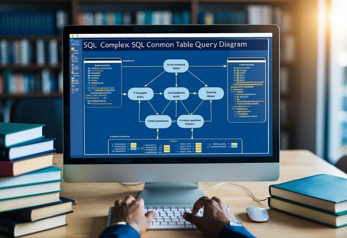
A person studying a complex SQL query diagram with subqueries and common table expressions, surrounded by reference books and a computer

In SQL, subqueries and Common Table Expressions (CTEs) are essential tools for writing efficient and optimized queries. They both help in breaking down complex queries into manageable parts, enhancing readability and maintainability.

Integrating Subqueries in Queries

Subqueries are powerful tools in SQL that allow one query to be nested inside another. They can be used in SELECT, INSERT, UPDATE, or DELETE statements.

One primary advantage of subqueries is their ability to filter data by providing a conditional logic within the main query. This nested structure aids in complex comparisons and calculations.

For example, subqueries can return single values, multiple rows, or entire tables. In some cases, instead of directly filtering data in the main query, a subquery pre-filters the dataset, making the main query more streamlined.

By isolating portions of the query in subqueries, a user can focus on improving performance and response times, crucial for databases with large datasets.

To further understand how subqueries differ from CTEs, explore this resource.

Best Practices for Using Common Table Expressions

Common Table Expressions (CTEs) provide a readable way to manage complex queries by naming temporary result sets. CTEs can be useful when the same query part repeats multiple times within a query.

They are defined using the WITH clause in SQL. CTEs improve query organization and are easier to debug than sprawling nested subqueries.

Key best practices when using CTEs include clear naming conventions and keeping CTEs concise. Limiting their scope to necessary calculations or temporary results avoids clutter in the query.

Understanding the benefits of recursion, specifically available in CTEs, can also optimize queries by simplifying hierarchical data operations.

To learn more about CTEs and optimization strategies, check out this resource.

Managing Query Results

A computer screen displaying a well-organized table of query results, with various SQL commands and code snippets scattered around

When working with SQL queries, efficient management of query results is crucial. It involves using the right techniques to retrieve necessary data without overloading the system.

This section will explore comprehensive strategies to enhance database performance.

Effective Use of the SELECT Statement

Using the SELECT statement efficiently is key to managing query results. Instead of using SELECT *, specify only the columns you need. This practice reduces the amount of data processed and returned, leading to faster queries and less resource usage.

For large datasets, consider filtering results with conditions in the WHERE clause. Apply functions like SUM() or AVG() where possible to aggregate data efficiently.

Organizing the select statement can streamline performance and make the results easier to analyze. This approach not only ensures relevant data retrieval but also optimizes database performance.

Selecting Distinct Data and Limiting Results

Retrieving unique data is often necessary. The SELECT DISTINCT statement helps in fetching unique records by removing duplicates from the result set. It’s particularly useful in datasets where redundancy occurs, minimizing confusion and maintaining data integrity.

Limiting the number of rows in a result set is another technique to manage database load. Using the LIMIT clause allows a defined number of results to be returned.

This is useful in applications where displaying or processing a huge dataset is impractical.

Applying these practices can significantly enhance the efficiency and speed of SQL queries, leading to better resource optimization and user experience.

Database Operations and Performance

A person typing SQL queries on a computer, with multiple tabs open for researching database optimization techniques

Efficient database operations are crucial for improving query performance. This involves optimizing both data retrieval and write operations to ensure faster and more reliable database interactions.

Improving Data Retrieval

Retrieving data from databases efficiently is vital for maintaining quick query performance. One effective strategy is using indexing. Proper indexes help the database quickly locate and retrieve data without scanning entire tables. This reduces response times and resource usage.

Using the EXISTS operator instead of IN can also enhance performance. The EXISTS operator avoids full table scans by checking for the existence of a required condition. This is efficient for subqueries and can speed up the data retrieval process significantly.

These approaches focus on minimizing the load and enhancing the overall speed of operations.

Database Write Operations

Write performance can impact the overall efficiency of a database. Minimizing large write operations is essential as they can cause databases to slow down. When writing or updating large volumes of data, it is important to manage transaction logs and tempdb efficiently to prevent excessive growth and resource drain.

Batching writes is another technique that can improve performance. By grouping multiple write operations into a single transaction, the database can reduce overhead and lock contention.

Ensuring data integrity while optimizing write speeds requires a balanced approach, focusing on effective transaction handling and system monitoring to quickly address potential bottlenecks.

SQL Query Optimizers

A group of SQL query optimizers studying and writing efficient, optimized SQL code

SQL query optimizers play a crucial role in database management. They decide the most efficient way to execute a query by evaluating different possibilities. Understanding how to interpret and influence this optimization process can enhance database performance significantly.

Role of the Query Optimizer

The SQL query optimizer is vital for database efficiency. It determines the best execution plan for SQL queries, aiming to minimize resource use and execution time. This process involves analyzing columns, indexes, and joins to choose the fastest approach.

Query optimizers can be syntax-based or statistics-based. Syntax-based optimizers use the query structure to choose a plan, while statistics-based optimizers analyze database statistics and data distribution to decide on the best execution method.

Understanding the role of the optimizer helps developers write queries that perform efficiently, minimizing server load. This knowledge is particularly useful as databases grow, ensuring that systems scale effectively.

Interpreting and Influencing Optimization

Developers can influence query optimization by using specific techniques such as query hints. Query hints are commands embedded in SQL statements that suggest optimizers take a certain course of action. This might involve choosing a particular index or execution path, allowing developers to tailor performance according to specific needs.

Interpreting the output from optimizers is key. Tools like execution plans display how a SQL query will be executed, including how data will be accessed and manipulated.

By analyzing these execution plans, developers can identify performance bottlenecks and adjust queries for better efficiency.

By learning to interpret these plans and use hints effectively, developers can directly impact the performance of their SQL queries, ensuring that databases operate smoothly and efficiently. This understanding is an essential part of advanced SQL skills.

Resource Management in Query Processing

A computer screen displaying a complex SQL query with multiple tables and joins, alongside a stack of books on database management and optimization

Effective resource management in query processing is crucial for achieving efficient and optimized SQL performance. Key strategies focus on minimizing resource consumption and optimizing the buffer cache to reduce latency and enhance processing speed.

Minimizing Resource Consumption

Minimizing resource consumption involves several techniques that aim to reduce the load on database servers. One important method is to optimize SQL queries by avoiding unnecessary columns and rows in SELECT statements.

Using joins efficiently can also help, as poorly structured joins can consume more resources.

Indexes are another useful tool, accelerating data retrieval and reducing CPU and memory usage. Properly indexed tables allow queries to locate data quickly without scanning entire tables.

Users should also ensure that maintenance tasks, such as updating statistics and regularly checking query plans, are done to keep performance smooth.

Choosing efficient data types for columns can make a difference too. Smaller data types generally use less memory and improve processing times.

By carefully considering these aspects, users can effectively minimize resource consumption during query processing.

Buffer Cache Optimization

The buffer cache plays a vital role in query processing by storing frequently accessed data in memory, reducing the need to read from disk and thus lowering latency. To optimize the buffer cache, administrators should ensure the cache is appropriately sized for the workload. A well-sized buffer cache leads to fewer data page swaps and faster query responses.

Setting up a cache prioritization strategy is also beneficial. This involves identifying and prioritizing frequently accessed tables or indexes to remain in the cache longer.

Techniques like partitioning help by organizing data into manageable sections that the cache can efficiently handle.

Monitoring cache hit ratios offers insights into how well the cache performs. High hit ratios indicate effective caching strategies, which contribute to faster query execution.

By understanding and leveraging these factors, users can improve SQL performance through effective buffer cache optimization.

Advanced SQL Features for Optimization

A computer screen displaying complex SQL code with optimized features and efficient writing techniques

Advanced SQL features can greatly enhance the efficiency of database management and data retrieval. By leveraging techniques like stored procedures and trigger-based optimization, users can achieve more streamlined and effective query performance.

Using Stored Procedures

Stored procedures are precompiled SQL code blocks that simplify repetitive tasks. They allow users to encapsulate complex operations, making them easier to manage and reuse.

One advantage is that they reduce network traffic because only the procedure call returns over the network instead of the entire query. This leads to faster execution.

Stored procedures can handle various operations such as complex calculations or batch processing. They support different data types and conditional logic with constructs like the WHERE clause.

Using parameters, these procedures adapt to different inputs, enhancing their flexibility for different scenarios.

Such features make stored procedures a valuable tool for SQL optimization, providing both speed and convenience in managing and executing queries.

Trigger-Based Optimization

Triggers are specialized database objects that automatically execute predefined actions in response to specific events. They can efficiently enforce data integrity rules by checking conditions before data modifications occur, such as updates or deletions. This automated approach ensures the database remains consistent and valid without manual interventions.

Another utility of triggers is in auditing changes. By recording modifications in separate logs, they facilitate monitoring data.

This feature optimizes resource use by performing actions automatically and without external requests.

Integrating triggers with conditions like the WHERE clause enables precise control over when and why these events are fired.

Triggers can thus contribute significantly to database optimization strategies by ensuring that tasks are executed consistently and correctly without manual oversight.

Frequently Asked Questions

A stack of books labeled "SQL Optimization" with a computer and open browser showing SQL tutorials

This section covers various aspects of SQL query optimization, including techniques for improving performance, best practices for Oracle databases, and methods for handling specific SQL operations like ‘LIKE’ queries.

What techniques can improve SQL query performance on large datasets?

When working with large datasets, using indexing is crucial. Indexes help in quickly locating data without scanning every row.

Additionally, it is recommended to avoid complex joins and unnecessary subqueries, which can slow down performance. Utilizing batch processing rather than processing row-by-row can also enhance efficiency.

Can you provide examples of SQL query optimization for better efficiency?

Optimizing SQL queries often involves selecting only the necessary columns instead of using ‘*’. This reduces the amount of data processed.

It is also effective to rewrite queries to eliminate redundant calculations and use joins efficiently to reduce execution time.

See more on SQL query optimization examples at this guide.

What are the best practices for writing efficient SQL queries for Oracle databases?

In Oracle databases, using bind variables can significantly improve query performance by reducing parsing overhead.

Analyzing execution plans to understand how queries are executed helps in making necessary adjustments. Additionally, prioritizing the order of joins can lead to faster results and better resource management.

How does one optimize a SQL Server query to ensure maximum performance?

Optimizing SQL Server queries involves checking for missing indexes and avoiding functions in WHERE clauses, which can prevent the use of indexes. Partitioning large tables helps manage and query large volumes of data more efficiently.

Learn more about SQL Server optimization techniques at this resource.

What resources are available for learning advanced SQL optimization techniques?

Various online platforms and books provide advanced SQL optimization techniques. Platforms like SQLPad offer in-depth guides on query performance.

Engaging with community forums and SQL workshops can also help expand knowledge in this area.

What methods can be used to optimize ‘LIKE’ queries in SQL?

To optimize ‘LIKE’ queries, it’s effective to use full-text indexing if available. Placing wildcards at the end of the pattern rather than the beginning allows the use of indexes.

Also, using specific patterns rather than broad ‘%pattern%’ could lead to performance gains.

Categories
Uncategorized

Learning about Seaborn for Data Visualizations: A Comprehensive Guide

Understanding Seaborn and Its Position in the Python Ecosystem

Seaborn, a Python library, simplifies statistical data visualization by offering an intuitive interface.

It enhances the capabilities of Matplotlib and works seamlessly with Pandas, making it a preferred tool for data scientists and analysts.

Overview of Seaborn as a Python Library

Seaborn is a powerful tool in the Python ecosystem for creating informative data visualizations. Unlike other libraries, Seaborn provides a high-level interface that simplifies the process of crafting complex statistical plots.

This library is built on top of Matplotlib and specifically designed to handle statistical plots with minimal coding effort.

One key feature is Seaborn’s ability to create visually appealing graphics with just a few lines of code.

It offers various plotting functions that are particularly useful for statistical data visualization, such as bar plots, scatter plots, and heatmaps. These features make it an essential tool for data analysis, allowing users to focus on interpreting results rather than coding details.

Comparison with Matplotlib and Integration with Pandas

While built on Matplotlib, Seaborn differentiates itself with a higher-level interface, streamlining the process of creating complex visualizations.

Matplotlib serves as a more general-purpose plotting library, offering extensive customization options. Seaborn, however, abstracts many of these details, making plotting simpler and more accessible.

Seaborn seamlessly integrates with Pandas, enabling it to handle data frames and apply data-centric operations efficiently. This integration allows users to plot data directly from Pandas data structures, enhancing workflow efficiency and reducing the need for data manipulation outside the libraries.

The combination of Seaborn, Matplotlib, and Pandas makes Python a versatile environment for comprehensive data analysis and visualization.

Getting Started with Seaborn

Seaborn is a popular Python library for data visualization. Before you can utilize its powerful tools, you need to install it properly and understand the software it relies on.

These steps are essential for using Seaborn effectively.

Installation and Setup

To start using Seaborn, you need to install it. You can install Seaborn using pip by running the command pip install seaborn in your terminal.

This method works well for most users with Python already installed. If you use Anaconda, Seaborn can be added using conda install seaborn. This can be a convenient choice since Anaconda manages dependencies automatically.

Once installed, you should verify the installation by importing Seaborn in a Python script with import seaborn as sns. Any errors during this step usually indicate issues with the installation that may need troubleshooting.

Understanding Seaborn Dependencies

Seaborn relies on several key libraries to function. It is built on top of Matplotlib, which handles the lower-level details of plotting.

This means that a working Matplotlib installation is necessary. Additionally, NumPy and SciPy are important for numerical operations. These libraries handle various mathematical functions and algorithms that Seaborn uses to create plots.

When installing Seaborn, pip and conda generally handle these dependencies for you. Still, ensuring they are up to date is crucial for avoiding compatibility issues.

Keeping these libraries updated ensures smoother operation of Seaborn.

Working with Data in Seaborn

Seaborn is a powerful tool for data visualization in Python, designed to work seamlessly with pandas dataframes. Understanding how to load and handle datasets is key to unlocking its potential.

The following subsections will provide insight into using Seaborn effectively with these data structures to create meaningful visualizations.

Introduction to Dataframes in Seaborn

Pandas dataframes are integral to working with Seaborn because they organize data in a tabular format that’s easy to manipulate and analyze. Each column in a dataframe can be viewed as a separate dataset, making it simple to plot variables and explore relationships.

Seaborn refers to these dataframes as inputs for its plotting functions. Whether the data involves numeric or categorical variables, the capability to directly utilize pandas dataframes allows for smooth integration. This direct use helps in creating detailed visualizations without extensive data manipulation beforehand, streamlining the entire process of data analysis.

Loading and Handling Datasets

When working with Seaborn, datasets can be loaded using typical Python file handling methods or directly from built-in functionalities. This versatile approach enables users to load various data types, such as CSV files or databases.

Once loaded, these datasets can be easily handled using pandas dataframe methods. Functions like .head() or .info() provide quick insights.

For instance, if one were working on the popular tips dataset or the pokemon dataset, such methods allow a user to understand the structure and content of the dataset quickly.

Handling datasets with these tools helps streamline the path to effective data analysis.

Utilizing the ‘load_dataset’ Function

Seaborn’s load_dataset function is a convenient feature for accessing ready-to-use datasets. This function downloads datasets from online repositories, making it easy to experiment with pandas dataframes without needing external files.

For instance, calling sns.load_dataset("tips") imports the tips dataset directly into a pandas dataframe format.

This function simplifies the process, especially for beginners exploring data visualization concepts. It also facilitates learning on pre-processed datasets, allowing users to focus more on visualization techniques rather than data preparation.

These tailored datasets, like those for learning purposes, greatly support users in honing their skills with Seaborn.

Exploring Basic Plot Types and Customizations

Seaborn offers a variety of plot types that help visualize data effectively. Users can create informative and visually appealing plots, like histograms and scatter plots. Customizations allow for adjusting colors and styles to better communicate insights.

Single Variable Plots

Seaborn excels in creating plots for single variables, often known as univariate plots. Histograms are widely used to display the distribution of a variable’s values. For example, they show how frequently each value appears in a dataset.

Histograms can be augmented with density plots, which provide a smoothed version of the data distribution.

Another effective plot type is the box plot, which summarizes a variable’s distribution. It highlights the median, quartiles, and potential outliers.

Violin plots extend the box plot by adding density information, making them useful for understanding the distribution and frequency of data.

Seaborn’s built-in themes ensure these plots are easy to customize and read.

Bivariate Plots

To explore relationships between two variables, Seaborn offers various bivariate plots. The scatter plot is essential for visualizing potential correlations, showing how changes in one variable might affect another.

By using Seaborn’s scatterplot function, users can easily illustrate these relationships.

For comparing distributions, the bar plot can represent categorical data against numerical values. Bivariate plots like line plots are also useful for tracking changes over time, making them ideal for time series data.

Each plot type can be styled using Seaborn’s themes, ensuring clarity and engagement with the data.

Customizing Plots with Seaborn Aesthetics

Seaborn’s flexibility shines in its customization capabilities. Users can modify plot aesthetics through colors and styles, helping to convey data stories effectively.

Seaborn provides several built-in themes like darkgrid or whitegrid, which adjust the plot’s background to match the desired mood or presentation style.

With Seaborn, users can also customize plot elements, such as fonts, sizes, and colors. This customization helps make plots more readable or highlight specific data points.

Adjusting the size of the plot elements ensures that visual elements do not overshadow data.

Using these Seaborn features, users can create plots that not only inform but also captivate the audience.

Statistical Plots for In-Depth Data Analysis

Seaborn provides a variety of tools for creating statistical plots that help with exploring data patterns, understanding relationships, and analyzing trends. These plots assist users in making data-driven decisions and uncovering valuable insights. Below are detailed descriptions of key types of statistical plots available in Seaborn.

Distribution and Relationship Plots

Visualizing data distributions is critical to spotting patterns and outliers. Distplot, also known as distribution plot, combines a histogram and a kernel density estimate (KDE) curve, providing a smooth representation of data distribution.

The KDE plot itself can be used independently to focus on data smoothness and continuity.

When analyzing relationships, the jointplot is ideal for displaying bivariate distributions with scatter plots and KDE alongside histograms on the axes. For broader relationship exploration, the pairplot offers a grid of plots for each variable pair in a dataset, facilitating quick insights into potential correlations.

Categorical Data Visualization

When dealing with categorical data, Seaborn offers versatile plotting options. The point plot is perfect for representing the relationship between categorical variables and a response variable, showing mean values and confidence intervals.

Another useful tool is the heatmap, which displays data in a matrix form with colors indicating different value ranges. This can help in identifying trends in large datasets.

For visualizing categorical data distributions across different categories, box plots and violin plots are commonly used, each providing a view of central tendency and variability within data categories.

Advanced Multi-Plot Grids

Advanced users might dive into complex datasets using multi-plot grids. Seaborn’s FacetGrid allows users to map plots across multiple facets or subplots in a single frame, making it easy to visualize data across subsets systematically.

This technique can be applied to create complex visual comparisons within data. For example, one can map a joint plot across several categories to explore how distributions and relationships vary between groups.

PairGrid takes this a step further by plotting multiple pair plots, enabling a comprehensive view and multi-variable analysis simultaneously.

These statistical tools in Seaborn support deeper data understanding and efficient visualization, facilitating more informed analyses.

Diving Into Advanced Plotting Techniques

Seaborn offers a variety of advanced plotting techniques that elevate the quality of data visualizations. These methods include combining multiple plots for comparative analysis, utilizing sophisticated plot types, and adjusting plot aesthetics through contexts and styles.

Mastering Multiple Plots on a Single Figure

Creating multiple plots on a single figure allows for direct comparisons and comprehensive analysis. This approach is particularly useful in exploring relationships between multiple variables.

Seaborn’s pairplot and facetgrid are powerful tools for such tasks. A pairplot can show pairwise relationships across an entire dataset, using different plot types like scatter or histogram.

The FacetGrid allows for even higher customization by mapping row and column subplots. This creates a grid of plots to visualize how relationships change across different categories or variables.

For example, using a grid to plot multiple violin plots side by side can easily reveal patterns in distinct groups. This method leverages the power of multi-plot visualizations to uncover hidden insights.

Exploring Seaborn’s Advanced Plots

Seaborn includes advanced plots that offer deeper insights into data. A violin plot is excellent for visualizing the distribution and probability densities of the data. It combines a box plot with a kernel density plot, showing not just medians but the full distribution.

Joint plots can handle two-dimensional data, displaying a regression line with scatter, among other combinations. These plots are useful for examining joint distributions and dependencies.

regplot is another advanced tool for regression analysis, ideal for visualizing linear relationships. It helps in understanding trends and patterns by fitting and visualizing linear models onto your data.

Leveraging Plotting Contexts and Styles

Seaborn offers flexible styling through contexts and styles, enhancing both aesthetics and clarity.

Contexts like “paper,” “notebook,” and “poster” adjust the scale of plot elements to suit different presentation settings. This is crucial for maintaining readability in various formats.

Theming allows for the application of custom matplotlib styles. This includes adjusting colors, lines, and even font sizes, making plots more visually appealing and consistent.

Semantic mapping techniques further enhance interpretability by using colors or markers to represent additional variables.

For instance, different hues can distinguish groups within a line plot, making multi-layered data easier to interpret at a glance.

Customizing Visual Representations for Clarity and Precision

Fine-tuning data visuals is essential for enhancing both understanding and interpretation.

Seaborn offers a variety of tools to adjust visual elements for precision and clarity, including error bars, confidence intervals, and customizable color palettes.

Using Error Bars and Confidence Intervals

In Seaborn, error bars and confidence intervals are used to depict variability and reliability in data.

When using a line plot, they help indicate the uncertainty of each point on the line.

Error bars illustrate the range around a data point or mean, showing the potential error margin. On the other hand, confidence intervals offer a range where the mean is likely to appear, providing an estimate of the data’s precision. Both are crucial for making informed inferences about the dataset.

Seaborn offers built-in support for adding these elements to your plots easily.

Adjusting parameters such as width or alpha level allows users to fine-tune the appearance of these indicators, providing a clear view of data trends and significance.

Adjusting Color Palettes and Themes

Another feature of Seaborn is its ability to customize color palettes and themes, enhancing the visual appeal and readability of data.

Color choices can significantly impact how data is understood, emphasizing specific details or trends.

Seaborn provides default themes and color palettes, which can be adjusted using various parameters.

For example, the sns.set_palette() function allows selection from pre-configured palettes or the creation of custom ones. Color palettes can highlight different data groups, making comparisons straightforward.

Moreover, integrating themes from Matplotlib ensures consistency across multiple graphics, enhancing the coherence of visual presentations.

By refining visual elements, Seaborn empowers users to craft precise and clear data visualizations.

Practical Tips for Effective Data Visualization

Creating effective data visualizations involves selecting appropriate plots and ensuring visual appeal while maintaining clarity. These two aspects can greatly enhance the interpretability and usefulness of the visual data representations.

Choosing the Right Plot for Your Data

Choosing the right plot begins with understanding your data type and the message you wish to convey.

Histograms are useful for displaying the distribution of numerical data, allowing viewers to see the frequency of data intervals.

Scatter plots are ideal for showing relationships between two continuous variables, making trends or correlations more apparent.

When summary statistics such as medians or quartiles are needed, a boxplot provides a clear snapshot of data spreads and outliers.

For more complex analyses, consider combining multiple types of plots. This involves using exploratory data analysis to gain insights.

Each plot type highlights different aspects of data, so the choice should align with the data’s story. More on plot selection can be found in the guide on data visualization with Seaborn.

Balancing Aesthetics and Functionality

Balancing aesthetics with functionality ensures that data insights are easily interpreted without distraction.

This involves using pleasing color schemes and well-organized layouts.

Seaborn, a visualization library, integrates with Matplotlib to offer statistical graphics that are both informative and attractive. Color palettes in Seaborn enhance the visual appeal without compromising readability.

Clutter-free design highlights key points effectively. Essential elements like labels and legends should be clear but not overwhelming.

Interactive elements can engage users more deeply with the visual content, aiding their statistical analysis processes.

For an elegant approach to visualization, explore the Practical Guide to Data Visualization with Seaborn for insights on combining aesthetics with functionality.

Seaborn for Exploratory Data Analysis

Seaborn is a powerful library for data visualization in Python, particularly useful for exploratory data analysis. It simplifies the process of discovering patterns and relationships in datasets through various types of plots. This section explores how Seaborn helps in understanding distributions, identifying trends, and comparing data subsets.

Understanding Distribution with Seaborn Plots

Seaborn provides a variety of plots to analyze data distributions effectively.

The histogram and boxplot are popular choices for visualizing univariate data.

A histogram helps in understanding the frequency of data points within certain ranges. It provides a visual representation of how values are distributed across intervals.

Meanwhile, a boxplot offers insights into the data’s quartiles and potential outliers, showing the spread and symmetry of the dataset.

For example, the distplot is used for creating histograms and includes a kernel density estimation by default, giving a smooth curve over the data.

Users can adjust the bandwidth according to their analysis needs, providing control over the plot’s appearance.

Identifying Relationships and Trends

To explore relationships between variables, Seaborn’s pairplot and jointplot are very useful. These plots make it easier to identify trends and correlations.

A pairplot creates scatter plots between every pair of variables in a dataset, allowing for quick identification of relationships. It also includes histograms along the diagonal for univariate analysis.

A jointplot focuses on the relationship between two variables by displaying their joint distribution. It combines elements like scatter plots and kernel density estimation, providing a more comprehensive overview.

By adding regression lines, it’s possible to explore potential linear relationships.

Comparing Subsets of Data

Seaborn allows users to compare different data subsets effortlessly through faceted plots.

Faceting creates multiple plots on a grid, which can be used to compare distributions or relationships across categories.

For instance, the FacetGrid function can be utilized to plot multiple subsets of the data, making comparisons across categories simple.

By organizing the plots in a grid format, patterns and anomalies become more apparent.

This feature is beneficial for breaking down complex datasets into smaller, digestible parts, enhancing insights into the variable interactions within subsets.

Refining Data Visualization with Seaborn’s Statistical Tools

A computer screen displaying a colorful and intricate data visualization created using Seaborn's statistical tools

Seaborn offers an array of tools for enhancing data visualizations. Its capabilities make it easy to perform regression and kernel density estimation, and integrate statistical analysis tools like matplotlib to create insightful and visually appealing graphs.

Performing Regression and Kernel Density Estimation

Seaborn simplifies creating regression plots with functions like regplot. These plots allow users to add a regression line to their scatter plots, making it easier to observe trends or relationships in data. It helps in visualizing how one variable affects another, an essential part of regression analysis.

Kernel Density Estimation (KDE) plots are another powerful feature in Seaborn.

A kde plot is used to visualize the distribution of data over a continuous interval. KDE plots are useful for understanding the distribution shape and the varying density of data points, which can be crucial for data exploration.

They serve as a smoothed version of a histogram, providing more refined insights.

Integrating Statistical Analysis Tools

Seaborn integrates smoothly with matplotlib, enhancing its functionality for creating statistical plots.

The library offers a high-level interface, making statistical visualizations attractive and easy to produce. Through functions like barplot(), Seaborn displays categorical data concisely, enabling quick comparisons.

Statistical plots in Seaborn can highlight patterns and offer deep insights when combined with its analysis tools.

These tools allow users to incorporate statistical context into their visualizations, such as confidence intervals and error bars, enhancing the interpretability of graphs.

Seaborn’s blend of visualization and statistical tools equips users to create informative graphs, enhancing their ability to communicate data insights effectively.

Interactive and Dynamic Data Visualizations with Seaborn

Seaborn, a Python library, is versatile for creating interactive visualizations. While primarily known for static graphics, its features can integrate with tools like Jupyter Notebooks to enhance interactivity. This helps in exploring data more dynamically.

Incorporating Interaction in Seaborn Plots

Seaborn provides groundwork for visualization by building on Matplotlib. While Seaborn itself focuses on static plots, interactivity can be added using additional libraries like Plotly.

For example, using Seaborn’s relplot or pairplot, users can visualize relationships and modify them for interactive use.

To enhance interactions, exporting plots to Plotly format is effective. The code:

import plotly.tools as tls
plotly_fig = tls.mpl_to_plotly(seaborn_plot.fig)
plotly_fig.show()

uses Matplotlib’s rendering system to allow interactive features like zooming and hovering.

Leveraging Seaborn with Jupyter Notebooks

Jupyter Notebooks are excellent platforms for interactive work with Seaborn. Within this environment, Kernels provide the computational power to execute Python code.

This allows for using interactive widgets alongside Seaborn plots. For example, integrating FacetGrid with interactive sliders helps dynamically filter data.

Using plt.show() in a Jupyter Notebook can render the visualizations created with Seaborn for immediate feedback.

Combining the interactivity of Jupyter’s interface with Seaborn’s FacetGrid, users can create powerful exploratory data analysis tools that are both informative and engaging. The notebooks also support embedding Plotly plots, enabling further interaction directly within cells.

Expanding Seaborn’s Capabilities for Machine Learning and Data Science

A laptop displaying a complex seaborn data visualization, surrounded by scattered papers and a notebook filled with machine learning algorithms

Seaborn is a powerful tool for data visualization, offering diverse styles and plots useful for machine learning and data science. It easily integrates with libraries like Pandas and SciPy, enhancing the analysis and visualization of complex datasets.

Visualizing Machine Learning Datasets

Seaborn excels at visualizing data commonly used in machine learning. It supports categorical plots, which help in displaying the distribution of data across different categories.

For example, box plots allow comparison of variables by showing quartiles and outliers, providing insight into the data’s spread.

Pair plots are another feature, useful for exploring relationships between multiple variables simultaneously. They create a matrix of scatter plots that help identify trends and patterns across data variables. This visualization aids in observing potential correlations essential in feature analysis.

Heatmaps, supported by Seaborn, are effective for visualizing matrix-like data structures. They are useful in identifying clusters and patterns within a dataset.

These tools allow data scientists to prepare data better, making processes in machine learning smoother and more informed.

Integrating with SciPy for Advanced Statistical Analysis

Seaborn’s ability to integrate with SciPy allows for advanced statistical data analysis. This integration enables users to apply statistical functions directly to data visualizations.

For instance, users can add regression lines to scatter plots, which are calculated using SciPy’s robust statistical functions.

Seaborn supports plotting confidence intervals, enhancing interpretation by providing a visual measure of uncertainty.

This is achieved by leveraging SciPy’s statistical capabilities to calculate these intervals. This functionality is crucial for interpreting models and assessing predictions made by machine learning algorithms.

Working with Pandas and NumPy, Seaborn simplifies data manipulation and provides a seamless workflow for setting up and modifying data visualizations.

This collaboration empowers data scientists to perform complex statistical analysis while leveraging the advanced plotting capabilities of Seaborn.

Frequently Asked Questions

A person browsing a book or website with charts and graphs, surrounded by notebooks and pens

Seaborn is a powerful tool for creating data visualizations in Python. It offers various features and works well with both long-form and wide-form data.

Understanding its integration with other libraries and exploring practical examples can enhance the learning experience.

How do I get started with Seaborn for data visualizations?

To begin using Seaborn, it’s essential to have a basic idea of Python and some familiarity with data structures like dataframes.

Installing Seaborn via pip and reviewing its documentation will help users start creating plots quickly.

Can you explain the main differences between Seaborn and Matplotlib?

Seaborn and Matplotlib are both popular for data visualization. While Matplotlib is used for basic charting, Seaborn offers more customized themes and statistical plots.

Seaborn automates some plotting tasks, making it simpler for some types of visualizations. More detailed comparisons can be found on resources discussing their use cases.

What resources are available for learning Seaborn effectively?

Several online platforms provide tutorials and guides for Seaborn. Websites like GeeksforGeeks are helpful for learning basic to advanced features.

These resources often include code examples and explanations to enhance understanding.

How can I import Seaborn and set it up for creating visualizations in Python?

Seaborn can be imported through Python using the import seaborn as sns command. It relies on libraries like Matplotlib and pandas, so having them installed can be beneficial.

The Seaborn FAQ provides insights into setting up and troubleshooting common issues.

Are there any comprehensive guides or PDFs for advanced data visualization with Seaborn?

Online platforms like DataScientest and published ebooks can be useful.

These resources often contain in-depth discussions and examples that cater to advanced users looking for higher-level visualization techniques.

Where can I find practical examples of data visualizations using Seaborn?

Practical examples are available on many tutorials and educational platforms.

Websites such as Seaborn documentation often provide code snippets and visual examples to illustrate different types of plots. These can be great for applying knowledge and seeing Seaborn in action.

Categories
Uncategorized

Learn About Database Design: Essential Concepts and Best Practices

Understanding Database Design

Database design is crucial in developing systems that efficiently store, organize, and retrieve data. It involves both technical and logical skills to ensure data integrity and accessibility.

Fundamentals of Database Systems

A well-structured database system serves as the backbone of any information technology project. It consists of several key components like tables, rows, and columns, which together form a framework for storing and accessing data efficiently.

Normalization is a critical process in database design. It reduces data redundancy and enhances data integrity by organizing tables and their relationships appropriately.

Furthermore, the database design lifecycle includes phases such as requirement analysis, conceptual design, and logical modeling. These stages ensure that all data requirements are met and that the final database model aligns with the intended use of the application, improving both the performance and reliability of the system.

Role of Data Management in IT

Data management plays a vital role in information technology by ensuring that data is processed and stored accurately and securely. Database management systems (DBMS) are software tools that facilitate these processes, making them more efficient through features like access control and backup management.

A well-managed database provides the foundation for efficient data analysis and decision-making processes.

In IT, data management involves data modeling and maintenance. These processes help establish how data elements relate to each other and how they should be stored. Effective management leads to cost savings in storage and significant improvements in data consistency and usability, ultimately supporting strategic goals and operational needs in an organization.

Database Modeling and Design

Database modeling and design is a crucial process in structured data management. It involves creating a blueprint for how data will be stored, organized, and accessed within a database system.

Conceptual Design Overview

Conceptual design focuses on creating a high-level model of the data requirements. This phase involves identifying the major entities and their relationships. It typically uses Entity-Relationship (ER) diagrams to visually capture these components.

ER diagrams consist of entities, attributes, and relationships. Entities represent objects or concepts, attributes describe properties of entities, and relationships define how entities interact. This model helps to ensure a clear structure that aligns with user needs. It also provides a foundation for more detailed logical design, bridging the gap between user requirements and system specifications.

Logical Design Principles

Logical design translates the conceptual model into a logical schema, focusing on data structure and organization. It involves defining tables, keys, and data models, ensuring that the relationships captured in the ER diagrams are accurately represented.

A critical aspect of logical design is normalization, which organizes data to minimize redundancy and dependency. This process involves dividing large tables into smaller, related tables and defining relationships between them.

By achieving normalization, databases become more efficient and easier to manage. Logical design lays the groundwork for physical implementation, ensuring that the data structure supports all necessary operations.

Physical Design Considerations

Physical design involves the actual implementation of the database on a specific platform, considering aspects such as performance, storage, and retrieval efficiency. This stage addresses how data will be stored in database files, including indexing and partitioning strategies.

Decisions during physical design can significantly impact database performance. Indexing improves retrieval times, while partitioning optimizes storage for large volumes of data.

Additionally, physical design must account for hardware constraints and the anticipated volume of data. By tailoring the database to its environment, this stage ensures that it meets organizational needs for efficiency and scalability.

Database Schema and Structures

A database schema outlines how data is organized and the relationships between tables, keys, and attributes. Proper schema design ensures efficient data storage and retrieval and includes components like primary and foreign keys that define relationships.

Defining Tables and Relationships

In a database, tables serve as the primary structure for organizing data. Each table contains rows and columns where rows represent records, and columns represent different attributes or fields. Defining tables involves specifying the data type of each attribute and deciding how tables relate to each other.

Keys play a critical role in defining relationships between tables. A primary key is a unique identifier for each record in a table. It ensures that no two rows can have the same identifier value.

Relationships between tables are often established using foreign keys. A foreign key is an attribute in one table that links to the primary key of another table, creating a connection and enabling data to be cross-referenced.

These key components help in creating a logical framework for the database schema, which is essential for database efficiency and integrity. This structured approach allows for easy data retrieval and updates while preventing redundancy.

Ensuring Data Integrity

Maintaining data integrity is crucial in database design. It involves using constraints and indexing to keep data accurate and dependable. Applying normalization techniques like Third Normal Form (3NF) also helps prevent data anomalies and inefficiencies.

Applying Constraints and Indexing

Constraints are rules applied to database tables to ensure data accuracy and reliability. Common types include primary key constraints that uniquely identify each record, and foreign key constraints that maintain relationships between tables. These rules prevent duplicate or invalid data entries, ensuring consistency.

Indexing enhances data retrieval speed. It creates a data structure that improves search efficiency, allowing quick data access without scanning entire tables.

Selecting the right columns to index is essential as over-indexing can slow data updates.

Testing is essential after applying constraints and indexing. It verifies that data integrity rules are working correctly and data operations are efficient. Testing ensures constraints prevent invalid data and indexing boosts query performance without unnecessary overhead.

Normalization Techniques

Normalization organizes data to reduce redundancy and improve integrity. A widely used method is achieving Third Normal Form (3NF). In 3NF, each column must be dependent only on the primary key, eliminating transitive dependencies.

Steps to normalization include:

  • Removing duplicate data from tables.
  • Ensuring each table has a primary key.
  • Breaking larger tables into smaller, related tables.

Normalization minimizes data anomalies during insertions, deletions, and updates. Proper normalization also simplifies data maintenance, making future changes easier to manage. Through these methods, databases maintain structured and accurate data, essential for reliable performance.

SQL and Data Manipulation

SQL is essential for modifying and interacting with databases. Key tasks include writing queries to retrieve data and using functions and stored procedures for complex operations. These tools empower users to manage and manipulate data efficiently, making them crucial for any database-driven environment.

Writing SQL Queries

Writing SQL queries involves using commands like SELECT, INSERT, UPDATE, and DELETE to interact with data. The SELECT statement retrieves data based on specified conditions, while INSERT adds new records. The UPDATE statement is used to modify existing records, and DELETE removes records from a table.

Efficient querying requires a good grasp of filtering with WHERE clauses, sorting with ORDER BY, and grouping using GROUP BY. Joins are also vital, allowing for data retrieval from multiple tables. Mastery of these elements ensures robust data handling and supports effective database management.

Functions and Stored Procedures

Functions and stored procedures allow for more complex data manipulation within a database. Functions can perform calculations, format strings, or return table results. They help streamline repetitive tasks and improve query performance.

Stored procedures are precompiled SQL code sequences that perform operations such as data validation or batch processing. They provide a way to package logic that can be executed with a single call, reducing redundancy and enhancing security. Understanding when and how to use these tools is essential for optimizing database workflows and maintaining data integrity.

Database Management Skills

Effective database management involves ensuring the system runs smoothly and securely. Key elements include maintaining data consistency and implementing robust security measures. Understanding these components helps in managing databases efficiently.

Maintenance and Data Consistency

Proper maintenance of a database ensures it remains functional and reliable. This includes regular updates and backups to prevent data loss.

Database administrators perform routine checks to verify data consistency, ensuring that records are accurate and up to date.

Data consistency is crucial for reliable information retrieval. It involves using techniques like normalization to reduce redundancy and maintain integrity. Regular audits help in identifying discrepancies and aligning data with the expected format, boosting overall system performance.

Security Measures and User Roles

Database security is vital to protect sensitive information. Implementing access controls restricts user permissions, ensuring only authorized personnel can view or modify data. Encryption further safeguards data, making it unreadable to unauthorized users.

User roles help define what different users can access. By assigning specific roles, administrators can control access levels, minimizing security risks. Regularly updating passwords and monitoring access logs also prevent unauthorized data breaches, keeping the database secure.

Learning and Certification Paths

A person studying a diagram of a database schema with interconnected tables and entities

For those looking to advance their skills in database design, several options are available. Students can choose from various online courses and specialized programs and earn professional certificates or degrees to boost their career prospects. These pathways provide flexibility, practical knowledge, and recognitions that are beneficial for both beginners and seasoned professionals.

Online Courses and Specializations

Online platforms like Coursera offer a wide array of database design courses. These courses cover essential topics like relational databases and data modeling. For hands-on learning, they often feature real-world projects.

After completing these courses, learners may receive a shareable certificate to showcase on their LinkedIn profile. Coursera Plus provides access to multiple courses for a flat fee, making learning cost-effective. Some programs also offer financial aid, ensuring accessibility to a broad audience.

Degrees and Professional Certificates

Students can obtain an online degree or a career certificate for more comprehensive learning. These programs delve deeper into advanced concepts and often include job-ready certificate programs.

They typically blend lectures with hands-on projects, essential for gaining job-relevant skills. Organizations like FreeCodeCamp offer an open source curriculum that provides in-depth training for free, making education more accessible. Completing such programs can significantly enhance a candidate’s credentials in the job market.

Data Structure Considerations

A network of interconnected nodes with various data types flowing between them

Selecting the appropriate data structures is crucial in database design. It impacts how effectively data is stored and accessed. Some important considerations involve choosing the most suitable data structures and understanding their practical applications.

Choosing the Right Data Structures

Picking the right data structure affects database efficiency. Each structure offers unique benefits based on requirements.

For example, if data needs to be highly normalized, options like the snowflake schema are beneficial. This schema helps reduce redundancy by organizing data into different tables.

Ease of access and update speed are other factors to consider. Relational databases rely on tables as primary structures, while NoSQL databases might use key-value pairs or document-based structures. Each has strengths for different tasks. Understanding these strengths enables better database performance and optimization.

Examples of Data Structures in Use

Tables serve as foundational data structures in relational databases. They store data in rows and columns, making query execution efficient.

A snowflake schema is an example where tables are organized to support complex queries without data duplication by using connections between tables.

In contrast, NoSQL databases often use flexible structures like documents and graphs. These are suitable for unstructured data and enable quick scalability.

For instance, a graph database might store interconnected data efficiently, allowing rapid access to related information.

Using the right structures, like those in a snowflake schema, ensures that databases are both flexible and robust, adapting to diverse data scenarios.

Real-World Database Applications

Databases play an essential role in driving various aspects of modern society. They support vital functions such as business intelligence, which helps companies make informed decisions, and provide robust solutions for global companies operating in the digital economy.

Business Intelligence and Analysis

Business intelligence involves using databases to collect, store, and analyze data. This process turns raw information into meaningful insights.

Companies use these insights for strategic planning, improving processes, and gaining a competitive edge.

A business can leverage data to understand customer behavior, sales trends, and market opportunities.

Tools like data warehousing are often used to manage large volumes of data efficiently. This enables businesses to generate reports and visualizations that aid decision-making and identify patterns.

Effective databases ensure data integrity and accessibility. They allow businesses to act swiftly and adapt to changes in the market environment.

This is critical for sustaining growth and success in today’s fast-paced digital economy.

Database Solutions for Global Companies

Global companies rely on databases for managing vast amounts of information across different regions. These databases facilitate communication, streamline operations, and support various functions such as customer relationship management (CRM) and supply chain logistics.

For instance, e-commerce giants use advanced databases to handle transactions and manage inventory, ensuring products are available where needed.

Systems like ERP (Enterprise Resource Planning) integrate various business functions into a unified dataset.

Databases must be scalable and secure. They are designed to handle multitudes of requests and protect sensitive information from cyber threats.

Effective database solutions empower global companies to maintain efficiency and provide consistent services worldwide. This infrastructure supports their strategy to compete in the interconnected digital economy.

Open Source Tools and Resources

Exploring open source tools for database design can provide a wide array of learning opportunities. These resources help users grasp complex concepts, share knowledge, and improve their skills through practice.

Utilizing FreeCodeCamp and Similar Platforms

FreeCodeCamp offers a robust open source curriculum that includes lessons on database design and management. Learners benefit from structured courses paired with practical projects that reinforce theoretical understanding.

In addition to FreeCodeCamp, there are other platforms that specialize in coding. Many offer interactive exercises and community support, aiding those who aim to learn to code efficiently.

These platforms provide users with hands-on practice, essential for mastering database concepts and effectively designing schemas.

These resources are suitable for users at different experience levels, providing step-by-step instructions and valuable insights into real-world applications.

Finding Resources in Coding Communities

Coding communities, such as GitHub and open forums, are valuable for finding database design resources. On platforms like GitHub, users can access repositories dedicated to database tools, tutorials, and community projects.

Engaging with these communities enables learners to ask questions, share experiences, and collaborate on open source projects.

These interactions can greatly enhance one’s understanding and application of database principles.

Members often share curated lists and tools, facilitating quick access to a variety of learning resources and fostering an environment of continuous knowledge exchange.

This collaborative approach helps troubleshoot challenges and expand one’s capabilities in database design.

Database Performance and Optimization

A sleek, modern computer server room with rows of flashing lights and cables, showcasing efficient database performance and optimization

Optimizing database performance is crucial to maintaining efficient and responsive systems. Key strategies include using effective indexing and refining query execution to reduce load times and increase efficiency.

Indexing Strategies

Indexes are vital for speeding up data retrieval in databases. They act like a roadmap, guiding queries to the information they need without scanning every row.

With proper use, indexes reduce query times significantly and enhance system performance.

Different types of indexes serve various purposes. B-Tree indexes are commonly used in MySQL and support fast retrieval of sorted data.

Hash indexes are efficient for unique value searches but might not help with range queries. The challenge lies in balancing the number of indexes, as too many can slow down write operations and require more maintenance.

Regularly analyzing and updating the logical model of the database helps in deciding which indexes are beneficial.

In summary, effective indexing is an ongoing task that involves careful planning and periodic assessment.

Query Optimization Techniques

Optimizing queries is essential for reducing execution time and enhancing system performance. This involves analyzing and rewriting queries to make them more efficient.

Basic methods include selecting only necessary columns, avoiding wildcard characters, and using joins instead of subqueries when possible.

It’s also important to use performance optimization tools that analyze query execution plans. These tools can pinpoint bottlenecks and suggest improvements.

Another key strategy is designing a optimal schema design to align with query requirements, reducing redundant data processing.

Regular query performance reviews and leveraging maintenance tools keep databases running smoothly.

By focusing on these techniques, database operations remain fast and efficient.

Frequently Asked Questions

A person browsing a computer screen with various tabs open, researching and learning about database design

Effective database design involves understanding core principles, following structured steps, and using the right tools. Beginners can start with foundational knowledge and gradually build their skills to become proficient database designers.

What are the key principles of effective database design?

Effective database design involves organizing data to ensure efficiency, reduce redundancy, and maintain data integrity. Normalization is a crucial process to achieve these goals.

Designing with scalability and flexibility in mind is also important to accommodate growth and changes over time.

What steps are involved in the database design process?

The database design process typically includes requirements gathering, conceptual design, logical design, and physical design. Each step involves specific activities like defining entities, relationships, and constraints, as well as creating models and diagrams to visualize the database structure.

What are some best practices for designing a database?

Best practices include normalizing tables to reduce data duplication, choosing appropriate data types, and indexing columns to improve query performance.

It’s also essential to plan for security and backup strategies to protect data and ensure its availability.

Which tools are most useful for database design?

Popular tools for database design include MySQL Workbench, Microsoft Visio, and ER/Studio. These tools provide features for creating entity-relationship diagrams, visualizing database structures, and managing design changes effectively.

How can beginners get started with learning database design?

Beginners can start by learning the basics of SQL and database management systems. Online courses and tutorials, such as those offered on platforms like Coursera, can be excellent starting points for gaining foundational skills.

What foundational knowledge is required to become a proficient database designer?

A good understanding of data modeling, SQL, and basic programming concepts is essential.

Knowledge of database management systems and experience with tools like ERD software will also help in building a strong foundation for becoming an effective database designer.

Categories
Uncategorized

Learning T-SQL – Understanding Normalization: A Practical Guide

Understanding the Basics of Normalization

Normalization is a fundamental concept in database management. It helps organize data efficiently, reducing redundancy and ensuring data integrity.

This section explores the basics of normalization, focusing on what it is, why data integrity matters, and the roles of primary and candidate keys.

What Is Normalization?

Normalization is a process used in database design to organize data into tables. It involves dividing larger tables into smaller, linked tables to minimize data redundancy. This process helps eliminate repeated information by ensuring that each piece of data is stored only once.

To achieve this, normalization often follows several normal forms, each with its own rules. For example, the First Normal Form (1NF) requires that tables have unique data. Each subsequent form builds upon the previous ones, refining the organization further.

By adhering to these principles, databases become more efficient and easier to maintain, making data manipulation and retrieval more straightforward.

Importance of Data Integrity

Data integrity is vital to maintaining accurate and reliable information within a database. It ensures data is correct, consistent, and accessible. Without it, a database runs the risk of becoming unreliable and full of errors.

Normalization contributes to data integrity by ensuring data is logically stored, reducing duplication, and preventing anomalies. This logical arrangement helps when updating, deleting, or inserting data, preventing inconsistencies.

Importantly, data integrity also safeguards against unauthorized access and unintended changes. This security measure is crucial for maintaining trust in the data’s accuracy, especially in environments where data is shared or accessed frequently by many users.

Roles of Primary and Candidate Keys

Keys play a crucial role in the organization of a database. A primary key is a unique identifier for a record within a database table. It ensures that each entry is distinct, which is essential for maintaining order and retrieving specific data.

Candidate keys are keys that could serve as a primary key because they uniquely identify records. Having multiple candidate keys allows flexibility, ensuring at least one option for a primary key choice.

Choosing the right keys is vital for efficiency. Primary and candidate keys provide a way to access the necessary data quickly and accurately, supporting the structure defined by normalization. This organization is central to the optimal functioning of database systems.

Exploring First Normal Form (1NF)

First Normal Form (1NF) is a foundational aspect of database normalization. It focuses on ensuring that database tables are organized more efficiently by eliminating duplicated data and ensuring that each piece of information is stored only once. This results in databases that are easier to manage and less prone to errors.

Defining 1NF

First Normal Form requires that each table column holds atomic values, meaning each column should contain indivisible values. Tables in 1NF do not have multi-valued attributes, and each row must have unique combinations of data. Columns should represent a single kind of data, such as a list of names or dates.

For example, a table of employee information should not have a column with multiple phone numbers. Instead, there must be separate columns for each phone number type or rows dedicated to each number.

Eliminating Duplicates

One key part of achieving 1NF is eliminating duplicates and data redundancy. Duplicate entries in a table can cause inconsistencies during data retrieval and manipulation. By ensuring each piece of data is stored only once, 1NF helps reduce errors.

This involves using primary keys to uniquely identify each record and reorganizing data into separate tables if needed. For example, instead of listing all an employee’s projects in one field, they can be stored in another table linked by a key.

Ensuring Atomic Values

Atomic values mean that table columns should not contain sets or collections of data within a single column. Each field in a database table must carry only one value, which ensures that data manipulation and queries remain consistent and straightforward.

For instance, a table with a column for “addresses” should contain one address per row rather than storing multiple addresses for a person in one row. This makes it easier to process and analyze the data within the database’s structure.

Helping maintain atomic values is crucial for the overall integrity and performance of the database, ensuring quick and reliable access to information.

Delving into Second Normal Form (2NF)

Second Normal Form (2NF) focuses on making sure that all table data is related to the entire primary key, which helps prevent redundancy. Understanding 2NF and handling partial dependencies are crucial for effective database normalization.

Understanding 2NF

Second Normal Form is an important step in database normalization. It builds upon the First Normal Form by eliminating partial dependencies on a composite key. A table satisfies 2NF if it is already in First Normal Form and each non-key attribute is fully functionally dependent on the entire primary key.

To put a table into 2NF, one must identify composite keys and ensure all attributes rely on the whole key, not just part of it. If any non-key attribute depends only on part of a composite key, it indicates a partial dependency that needs resolving. Addressing 2NF increases data integrity and reduces data anomalies within a database.
Handling Partial Dependencies

Partial dependencies occur when a non-key attribute depends on part of a composite primary key rather than the whole. In a table not complying with 2NF, data redundancy and update anomalies may arise due to these dependencies. To handle partial dependencies, it’s necessary to divide the table.

Consider a table with a composite key, like CourseID and StudentID. If CourseName relies only on CourseID, a partial dependency exists. Splitting the table into two separate tables can resolve this: one for course details and another for student enrollments. This separation ensures each attribute fully depends on its respective primary key, aligning with 2NF principles.

Advancing to Third Normal Form (3NF)

Achieving Third Normal Form (3NF) in a database is key for reducing redundancy and ensuring data integrity. This process involves addressing transitive dependencies and ensuring non-primary key columns depend only on the primary key.

Characterizing 3NF

Third Normal Form builds upon the Second Normal Form by eliminating transitive dependencies. In 3NF, every non-primary key column must rely solely on the primary key.

To better understand 3NF, consider a table where a column depends on another column that isn’t the primary key. This setup creates a dependency chain, leading to redundancy and anomalies. By moving related columns into separate tables, the database becomes more efficient and easier to maintain.

3NF ensures each piece of data is stored in only one place. This reduces errors and inconsistencies in database updates.

Resolving Transitive Dependencies

Transitive dependencies occur when a non-key column depends on another non-key column, which then depends on the primary key. To resolve this, the database must be restructured. This may involve creating new tables to separate linked data.

For example, consider a table with StudentID, StudentName, and AdvisorName. If AdvisorName only depends on StudentID indirectly through StudentName, a new table associating StudentName with AdvisorName can break this dependency.

By addressing these dependencies, 3NF supports a clean and concise database structure. This simplification improves data accuracy and simplifies maintenance, ensuring that the database remains consistent as it grows and evolves.

Beyond 3NF: Boyce-Codd Normal Form (BCNF)

Boyce-Codd Normal Form (BCNF) is a higher level of database normalization that addresses issues not fully solved by the third normal form (3NF). Achieving BCNF helps eliminate certain types of anomalies and reduces data redundancy, improving database consistency and integrity.

Defining BCNF

BCNF is a stricter version of the third normal form. A table is in BCNF if it is already in 3NF and every determinant is a candidate key. A determinant is an attribute or set of attributes on which some other attribute is fully functionally dependent.

If any determinant sets are such that they are not keys, the table does not meet BCNF requirements. In practical terms, BCNF ensures that the structure of a table allows all data dependencies to relate only to candidate keys.

Addressing Anomalies and Redundancies

By achieving BCNF, a database can resolve update anomalies that occur when data modifications like insertions, deletions, or updates create inconsistencies. These anomalies often arise because non-key attributes can determine other non-key attributes.

One example of an anomaly is if editing information requires changing multiple rows in a table. BCNF helps prevent these by ensuring non-key dependencies are removed. This also reduces data redundancy, as it minimizes repeated data, leading to more efficient data storage and maintenance.

Addressing these issues with BCNF leads to a more robust database design, ensuring that data changes do not introduce inconsistencies or redundancies.

Higher Normal Forms: 4NF and 5NF

Understanding advanced database normalization requires a focus on unique dependencies. Fourth normal form (4NF) addresses multi-valued dependencies, while fifth normal form (5NF) aims at resolving join dependencies. Both are critical to enhancing database efficiency and reducing redundancy.

Understanding 4NF: Multi-Valued Dependencies

Fourth normal form (4NF) is concerned with eliminating multi-valued dependencies, which occur when one attribute in a table uniquely identifies another attribute, leading to redundancy. To achieve 4NF, a table must be in Boyce-Codd normal form (BCNF) and should not have any non-trivial multi-valued dependencies. This involves breaking down tables into smaller ones where each table represents a distinct relationship without redundancies.

For example, consider a table where a single professor teaches multiple courses and advises multiple student groups. To eliminate the multi-valued dependencies, it is split into two tables: one for professor-course relationships and another for professor-student group advisory. This separation ensures data duplication is minimized, and updates become more straightforward.

Mastering 5NF: Join Dependencies

Fifth normal form (5NF) focuses on join dependencies to ensure that data is split in such a way that it can be reconstructed without any loss. A table reaches 5NF when it is in 4NF and cannot be further decomposed without losing the ability to join back correctly using natural joins. This form is necessary when data stems from complex relationships between multiple entities.

For illustration, if a project involves multiple teams and equipment, one table might hold information about projects, teams, and equipment usage. Achieving 5NF would mean separating this into multiple tables: projects-teams, projects-equipment, and teams-equipment. Ensuring only essential joins maintain integrity prevents unnecessary data repetition and maintains consistency.

Structuring Database Tables Efficiently

Efficient table structuring involves key design principles that help in managing data effectively. It also includes strategic use of composite keys to maintain data integrity and optimize performance.

Table Design Principles

Proper table structure is crucial for optimal database design. It involves defining clear and concise data types for each column. Consistency in naming conventions enhances readability and maintainability.

Normalization is a technique often used to eliminate redundancy. By organizing data into smaller, related tables, databases can avoid duplication and improve integrity. Using foreign keys to link these tables is vital for maintaining relationships.

Indexes should be carefully planned. They speed up data retrieval but can slow down updates. Balancing these factors is essential for efficient structure.

Composite Keys in Database Design

A composite key involves using two or more columns together as a primary key. This is useful when a single column is not unique enough to identify each record. Composite keys enforce uniqueness across the combined columns, ensuring data integrity.

In scenarios where multiple attributes define an entity, composite primary keys are implemented. They help in uniquely identifying records while maintaining a logical relationship among data attributes.

It is essential to choose columns for composite keys that are stable and unlikely to change. This helps in maintaining the integrity of the database and prevents unnecessary updates. Proper use of composite keys results in a well-structured database system.

T-SQL and Normalization

Normalization is a key concept in structuring databases efficiently. It involves organizing data to reduce redundancy and improve query performance. In T-SQL, mastering normalization helps in writing efficient queries in SQL Server.

Normalization Techniques in SQL Server

Normalization in SQL Server follows a series of formal rules. These rules are called normal forms.

The process begins with the First Normal Form (1NF), where tables must contain unique rows and each cell holds a single value. Then, moving to the Second Normal Form (2NF), all non-key attributes must depend entirely on the primary key.

Next, the Third Normal Form (3NF) ensures no transitive dependencies exist. In addition to these forms, advanced techniques like Boyce-Codd Normal Form (BCNF) handle more complex dependencies.

Applying these techniques reduces data anomalies and maintains data integrity. Understanding these forms allows you to create databases that are easier to manage and scale.

Writing Queries for Normalized Data

Writing T-SQL queries for normalized databases involves using JOIN operations. These operations are necessary because data spread across multiple tables due to normalization requires combining related data for retrieval.

Efficient use of indexes is crucial to enhance query performance. Understanding how to construct SELECT statements with INNER JOIN, LEFT JOIN, and RIGHT JOIN is important.

These commands help in merging data from normalized tables efficiently. For example, joining a customer table with an orders table involves linking them through a common key, such as CustomerID.

Practice with normalized databases improves query design and results in faster, more efficient data retrieval.

Organizing Data in Relational Databases

In relational databases, organizing data efficiently is fundamental. The use of normal forms in data organization helps minimize redundancy while ensuring data integrity. Database management techniques enhance scalability and performance.

Role of Normal Forms in Data Organization

Normal forms are essential in organizing data within a relational database. They ensure that data is structured without redundancy. The first normal form (1NF) requires that data in a table is stored in rows and columns with unique entries.

Subsequent normal forms, like the second (2NF) and third (3NF), focus on removing data anomalies and dependencies.

By adhering to these forms, a database becomes easier to manage and less prone to errors during updates or deletions. This process ensures that each piece of data is stored in only one place, increasing data integrity and consistency.

Database Management and Scalability

Effective database management is crucial for ensuring scalability. As businesses grow, their databases must handle more transactions and larger data volumes.

Strategies like indexing, partitioning, and sharding can improve database performance.

Indexing speeds up data retrieval, while partitioning divides a database into smaller, manageable parts. Sharding distributes data across multiple servers, which enhances scalability by reducing the load on a single database server.

These techniques enable the database to expand and accommodate growth without a drop in performance. Implementing such strategies ensures that relational databases remain efficient and responsive even as they scale.

Addressing Database Design Challenges

Proper database design ensures efficient data management and effective use of resources. It involves preventing data redundancy and update anomalies, while balancing normalization with performance considerations.

Preventing Data Redundancy and Anomalies

Data redundancy occurs when the same data is stored in multiple places within a database. This redundancy can cause update anomalies, where changes in one location do not automatically update duplicated data elsewhere.

By implementing database normalization techniques, designers divide large tables into smaller, related tables.

Normalization minimizes redundancy and ensures data integrity, so the data is accurate and reliable. It also helps prevent insertion, deletion, and update anomalies by organizing data within separate entities that maintain consistency over time.

This structured approach is crucial for applications that require high reliability and consistency.

Balancing Normalization with Performance

While normalization helps manage redundancy, it can sometimes lead to complex queries that affect database performance.

To address this, designers may use a strategy known as denormalization, where some redundancy is intentionally preserved to optimize read performance.

Understanding the trade-off between normalization and performance is vital. Queries that involve multiple, joined tables can slow down performance, especially in high-traffic applications.

By selectively denormalizing, such as merging related tables, designers can achieve faster query responses. This balance ensures efficient execution of operations like searching and reporting, which are critical in database-driven applications.

Frequently Asked Questions

Normalization in databases involves organizing data to reduce redundancy and improve integrity. This section explores common questions about its purpose, benefits, and process.

What is the purpose of normalization in a database?

Normalization aims to organize data efficiently. It minimizes redundancy and ensures data integrity. By structuring the database, normalization helps maintain accurate and consistent data.

How can normalization improve database design and performance?

Normalization enhances database design by creating a clear structure. This organization reduces data duplication, which speeds up query response times. It also simplifies updates and maintenance tasks, resulting in better performance.

Can you provide an example of the normalization process?

Consider a customer database. Initially, customer details and orders might be in one table. Through normalization, details and orders are split into separate tables. This separation eliminates duplicate data entries, creating a cleaner structure.

What are the different normal forms in normalization?

Normalization involves various stages known as normal forms. The first normal form eliminates repeating groups. The second removes partial dependencies. The third normal form addresses transitive dependencies, and higher forms solve more complex relationships.

How does denormalization differ from normalization?

Denormalization is the opposite of normalization. It involves merging data back into fewer tables to streamline access and improve performance. While this can speed up retrievals, it may also lead to data redundancy and inconsistency.

What challenges might one encounter when normalizing an existing database?

Normalization of existing databases can be complex. It may require restructuring. This can lead to data migration and compatibility issues. A primary challenge is ensuring that the database retains functionality while gaining efficiency.

Categories
Uncategorized

Learning MatPlotLib for Data Science – Histograms: A Step-by-Step Guide

Understanding Histograms in Data Science

Histograms are a key tool in data visualization. They provide a graphical representation of the distribution of a dataset.

By showing how often data points occur within certain ranges, histograms help reveal the frequency distribution of a continuous variable.

Creating a histogram involves dividing data into bins, or intervals. The x-axis represents these bins, while the y-axis shows the frequency of data points in each bin.

This setup makes it easy to identify central tendencies, such as the mode, as well as the spread of the data.

Histograms are often used to assess whether data follows a normal distribution. A normal distribution will appear bell-shaped, with the highest bar in the center. Recognizing this pattern can aid in understanding how data behaves.

The shape of a histogram provides insights into data characteristics. For example, skewed histograms show asymmetry, indicating that data may have outliers or a bias.

Understanding these patterns is crucial for analyzing data distribution and making informed decisions.

To effectively use histograms, data scientists must choose appropriate bin widths. Too few bins can oversimplify the data, while too many can make patterns hard to discern.

Balancing these elements ensures an accurate and meaningful representation.

Getting Started with Matplotlib

To begin using Matplotlib, you need to install it and understand the basics of plotting. This includes setting up your environment and creating simple graphs using Python.

Installation and Setup

To install Matplotlib, you can use Python’s package manager, pip. Open your command line and type:

pip install matplotlib

This installs the library and its dependencies on your computer. If you use Anaconda, you can install it through the Anaconda Navigator or with:

conda install matplotlib

Once installed, you need to import it in your Python environment. Use the following line at the top of your script:

import matplotlib.pyplot as plt

This line imports the “pyplot” module from Matplotlib, which is commonly used for creating plots.

Having everything ready and set up correctly is crucial for smooth workflow and productivity.

Basic Plotting with Matplotlib

Creating a basic plot with Matplotlib is straightforward. Start by generating data. For example, create a list of values:

x = [1, 2, 3, 4]
y = [10, 11, 12, 13]

Use the plot function to display these values:

plt.plot(x, y)
plt.xlabel('X-axis Label')
plt.ylabel('Y-axis Label')
plt.title('Simple Line Plot')
plt.show()

In this example, plot creates a line graph with x and y lists as the data points. You can add labels and titles for clarity.

To display the plot, call plt.show().

This basic introduction to plotting with Matplotlib highlights its ease of use for visualizing data.

Working with Datasets in Python

When working with datasets in Python, it’s essential to use tools that make data management and analysis straightforward. Two key aspects of this process involve importing data efficiently and exploring well-known datasets like the Iris dataset.

Importing Data using Pandas

Pandas is a powerful library for data manipulation and analysis in Python. It offers extensive functions for importing and processing data.

The most common way to import data is through CSV files using the read_csv function. This function reads the CSV file into a DataFrame, which is the primary data structure in Pandas.

DataFrames provide an intuitive way to handle data. They allow users to easily select rows and columns, perform calculations, and clean data.

For tasks requiring numerical computations, Pandas integrates well with NumPy, which can enhance performance and provide additional mathematical functions.

Additionally, Pandas supports importing data from Excel, SQL databases, and JSON files, making it versatile for various data sources.

Exploring the Iris Dataset

The Iris dataset is a staple in data science, used for demonstrating machine learning algorithms. It includes 150 records of iris flowers, detailing four features: sepal length, sepal width, petal length, and petal width. Each record also includes the species type.

This dataset helps beginners understand data analysis and machine learning basics.

Once loaded into a DataFrame, the Iris dataset allows users to perform exploratory data analysis. This includes computing statistics for each feature and creating visualizations.

Histograms are particularly useful here, as they show the distribution of numerical data and help identify any patterns or anomalies among the features.

Working with the Iris dataset provides fundamental insights into data handling, making it a valuable tool for anyone learning data science.

Creating Histograms with Matplotlib

Creating histograms with Matplotlib allows users to visualize data distribution effectively. It provides control over the number of bins, range, and other features to shape the histogram according to the dataset and analysis needs.

The hist() Function

The hist() function in Matplotlib is essential for creating histograms. It is part of the pyplot module, often used with the alias plt.hist(). This function takes in data and automatically calculates the distribution and frequency of data points.

A simple example:

import matplotlib.pyplot as plt

data = [1, 2, 2, 3, 3, 3, 4, 4, 4, 4]
plt.hist(data)
plt.show()

This snippet displays a histogram based on the data list. The hist() function offers additional parameters that allow customization, such as bins, range, and density, which control the elements that define the histogram’s appearance.

Adjusting Histogram Bins and Range

Adjusting bins and range is crucial for analyzing specific data patterns.

The bins parameter determines the number of intervals. Changing this can highlight different aspects of data distribution. A larger bin number provides more detail, while fewer bins can simplify the view.

Example of adjusting bins:

plt.hist(data, bins=5)

The range parameter sets the boundary of data included in the histogram. This parameter is useful when focusing on a particular section of the dataset.

Specifying range restricts the displayed data, which can help when only certain parts of the data are relevant.

Combining both parameters enhances control over the plotting, ensuring that the histogram fits the data analysis needs effectively.

Chart Customizations for Better Insights

Customizing charts can transform raw data into meaningful insights. Making small adjustments in Matplotlib, such as adding labels or utilizing styles, can greatly enhance a histogram’s readability and informational value. These customizations are crucial for data scientists to communicate findings effectively.

Labels and Titles

Labels and titles play a critical role in data visualization. They provide context and help the audience understand the histogram at a glance.

Users can set titles for their charts using plt.title(), and add axis labels by employing plt.xlabel() and plt.ylabel().

Incorporating descriptive labels ensures that anyone can interpret the data correctly without further explanation.

Using Matplotlib’s features, titles and labels can be formatted with distinct fonts and colors. This is beneficial when aiming to highlight specific parts of the data.

Effective labels and titles not only make the data more accessible but also emphasize the key points that need attention.

Colormap and Styles

Colormaps and styles can dramatically affect how data is perceived.

By using different colormaps, like viridis or plasma, users can highlight density variations within a histogram.

Colormaps are applied through the cmap parameter in plt.hist(), making certain elements more prominent visually.

Styles can also be customized in Matplotlib, allowing users to adjust elements like line styles and colors.

Employing the plt.style.use() function gives users access to predefined style sheets such as seaborn, which enhance visual appeal and make comparisons easier.

By incorporating styles and colormaps, a histogram not only becomes visually appealing but also provides greater clarity and insight into the data.

Understanding Histogram Parameters

A computer screen displaying a histogram with labeled axes and a color-coded data distribution

Understanding the parameters of a histogram is crucial in data visualization. The arrangement of bins, the number of bins, and the range significantly affect how data patterns are revealed. Here, key parameters such as bin count and histogram range will be explored.

Number of Bins and Calculation

The number of bins in a histogram influences its appearance and the amount of detail shown. More bins can reveal intricate data patterns, while fewer bins may result in oversimplification.

A common method to calculate the number of bins is the square root choice, where the number of bins equals the square root of the data points. This provides a balance between detail and clarity.

Other methods include the Sturges’ formula and Freedman-Diaconis rule, which consider data distribution and spread.

Choosing an appropriate number of bins is crucial for accurate data representation and allows for better insights into distribution characteristics.

Histogram Range and Intervals

The range of a histogram determines the boundaries of data measurement. It includes the minimum and maximum values.

Setting an appropriate range ensures all data points are represented without excluding outliers.

Non-overlapping intervals within the range are essential for clarity. Each interval, or bin, should be uniform to prevent misleading visual interpretations.

For example, when plotting monthly temperatures, intervals of five degrees might display variations more clearly than broader ranges.

An effective range and well-defined intervals help in depicting the true nature of the data set, ensuring that conclusions drawn from histograms are based on accurate visualizations.

Visualizing Multiple Distributions

Visualizing multiple distributions is essential in data science for comparing data sets. Individual histograms or subplots can be used to show differences in distribution patterns, allowing for a detailed examination of variations between data sets.

Overlaying Multiple Histograms

Overlaying multiple histograms is a method that allows data analysts to compare different data sets in a single plot. This technique involves plotting two or more histograms on the same axes.

By using the alpha parameter in Matplotlib, one can adjust transparency to make overlapping areas visible. A low alpha value ensures that each distribution remains visible, even when overlapped.

Seaborn offers a similar approach with its kdeplot() function, providing a kernel density estimate. It effectively smooths the distributions, which can help in visual comparisons.

When overlaying histograms, choosing a consistent bin size is essential for accurate comparison and interpretation.

This method is particularly useful for identifying patterns or changes in distributions where direct side-by-side comparisons may not be practical.

Utilizing Subplots for Comparison

Subplots can be an effective way to visually compare several distributions at once. By creating a grid of smaller plots within a single figure, each subplot represents a different data set.

This setup facilitates easy side-by-side comparisons without the clutter of overlapping information.

Matplotlib’s subplot() function allows for flexible layout arrangements. One can customize each subplot with different colors or line styles to enhance clarity.

Subplots can be especially useful when working with a large number of distributions, as they allow the viewer to maintain focus on individual details.

For a more sophisticated visual representation, Seaborn’s FacetGrid offers additional functionality, enabling dynamic changes and well-organized multiple plots without manual adjustments for each subplot.

Statistical Concepts behind Histograms

Understanding histograms in data science involves grasping how data is distributed. Key concepts such as central tendency and spread are crucial for interpreting these visual representations.

Measures of Central Tendency

Central tendency involves understanding the center of a data set, which is essential for interpreting histograms.

The mean and median are two primary measures.

The mean, often called the average, is the sum of all data points divided by the number of points. It provides a general idea of the data’s center.

In histograms, data points cluster around the mean when the distribution is normal.

The median, on the other hand, is the middle value once the data is ordered. In a normally distributed set, the mean and median are usually close. This helps in evaluating a histogram’s skewness.

Measures of Spread

The spread of data gives insight into how dispersed the data points are around central values. One key measure of spread is the standard deviation.

Standard deviation calculates the average distance between each data point and the mean.

In a histogram, a smaller standard deviation indicates data points are close to the mean, while a larger one shows they are more spread out.

Another aspect is the probability distribution of data. This includes understanding how frequently values occur, further helping analysts assess variability within a data set.

By examining the spread, one can better understand the dataset’s variability and dispersion, which are visually represented in histograms.

Plotting Histograms with Pandas

Pandas is a popular library for data handling in Python. It is widely used for data analysis and manipulation. One of its features is the ability to create various types of plots directly from data stored in a DataFrame.

To create a histogram with Pandas, the plot.hist() function can be applied to a DataFrame column. This function automatically bins the data into intervals and displays the frequency of each range.

Here’s a simple walkthrough on how to plot a histogram in Python using Pandas:

  1. Import Libraries:

    import pandas as pd
    import matplotlib.pyplot as plt
    
  2. Load Data into a DataFrame:

    data = {'Scores': [89, 72, 94, 69, 78, 95, 88, 91, 73, 85]}
    df = pd.DataFrame(data)
    
  3. Plot the Histogram:

    df['Scores'].plot.hist(bins=5, alpha=0.7, color='blue')
    plt.xlabel('Scores')
    plt.ylabel('Frequency')
    plt.title('Scores Distribution')
    plt.show()
    

Adjusting the bins parameter changes the number of bins. The alpha parameter controls the transparency of the bars.

In data science, using Pandas to plot histograms is efficient for initial data exploration. It provides immediate insight into the distribution of numerical data.

For more advanced plotting techniques, combining Pandas with Matplotlib can produce detailed and customized plots, as discussed in articles like those found on IEEE Xplore.

Density and Probability Distributions

Understanding density and probability distributions is integral to data science. Density plots and histograms are tools used to visualize data distributions effectively. This section will cover how to plot density plots and the differences between histograms and density plots.

Plotting Density Plots

Density plots are vital for visualizing the distribution of data over a continuous interval. Unlike histograms, which use bars, density plots display a smooth curve that indicates where values are concentrated over the interval.

To create a density plot, Matplotlib in conjunction with Seaborn is often used. The kernel density estimation (KDE) method is a popular choice, which calculates the probability density function of the data. This method helps in identifying the underlying distribution pattern.

Using Python, a simple line of code with libraries like Matplotlib or Seaborn can generate a density plot. This visual tool is essential for comparing multiple data sets or assessing the shape of a single data set’s distribution.

The simplicity of creating these plots makes them a preferred choice for many data scientists.

Histograms vs. Density Plots

While both histograms and density plots depict data distribution, they do so differently. A histogram uses bars to represent frequencies of data within specified ranges, providing a clear picture of data distribution over discrete bins.

Density plots, on the other hand, use a smooth line to show a continuous distribution, estimating the probability density function of the dataset. This makes density plots more suitable for identifying the distribution’s shape without being restricted to pre-defined bins.

Choosing between histograms and density plots depends on the data’s nature and the specific analytic needs. Histograms are ideal for showing the count of data points in bins, while density plots provide a continuous probability distribution view.

Both tools are important in understanding and analyzing probability distributions.

Advanced Histogram Techniques

Learning how to use advanced techniques in Matplotlib for creating histograms can greatly enhance data visualization. Key areas include setting custom bin sizes and edges, as well as applying transformations and scaling to reveal hidden patterns.

Custom Bin Sizes and Edges

Choosing the right bin size and edges is crucial for an accurate representation of data. In Matplotlib, users can define custom bin sizes using the bins parameter, impacting the level of detail presented.

For data following a normal distribution, using custom bin sizes allows for a more precise match to the data’s underlying structure.

Manipulating bin edges involves specifying boundaries for each bin, which can highlight certain data segments. For example, unequal bin sizes help emphasize specific ranges within the data.

Users can define bin edges by providing an array of edge values, offering full control over histogram design. This flexibility assists in tailoring the visualization to suit particular data analysis needs.

Transformations and Scaling

Applying transformations and scaling can enhance data insights by adjusting how data values are interpreted within a histogram.

One method involves using a log scale to manage wide-ranging data values. This is especially useful when some values are much larger or smaller than others, allowing the histogram to represent data more evenly.

Transformations can also be applied to raw data before plotting. For instance, square root or power transformations help in normalizing data that do not initially fit a normal distribution.

By transforming the data, users can create histograms that reveal patterns not visible with linear scaling, improving the overall analysis clarity.

Case Study: Analyzing Flower Attributes

A colorful histogram depicting flower attributes with labeled axes and a title

In this case study, the focus shifts to using histograms to understand the attributes of flowers. Specifically, the analysis examines sepal length and petal length from the iris dataset, a fundamental dataset in data science.

Histogram for Sepal Length

The sepal length of Iris flowers varies across different species. Using a histogram, one can visualize the distribution of sepal lengths in the dataset. This visualization helps in identifying patterns or trends in the sepal length across various flower species.

The matplotlib library provides tools to create these histograms efficiently, enabling users to adjust bin sizes and customize labels.

By analyzing the histogram, users can quickly see which sepal lengths are most common among the Iris species, providing insights into their growth patterns.

In practice, the histogram displays various peaks, which can indicate the presence of different flower species, each with unique sepal length characteristics. This analysis can be valuable for identifying specific trends or anomalies within the dataset.

Histogram for Petal Length

The petal length attribute is another critical aspect in understanding the differences between Iris species. When plotted, the histogram for petal length reveals how petal sizes vary.

This data visualization can highlight whether certain lengths are more prevalent in specific species. Differences in petal length can also suggest evolutionary adaptations.

To generate this histogram, the matplotlib library is again a useful tool.

By carefully analyzing the histogram, users can detect variations in petal lengths, which might correlate with the flower’s environment or other biological factors. This analysis is crucial for researchers studying plant biology and ecology, as it offers a straightforward way to assess biological diversity within the dataset.

Frequently Asked Questions

Matplotlib is a popular library for creating visualizations in Python, including histograms. Understanding how to utilize its features can greatly enhance data analysis and presentation.

How do you create a histogram using Matplotlib in Python?

To create a histogram, use the plt.hist() function from the Matplotlib library. This function helps you to visualize the distribution of data points across specified ranges. It’s a fundamental tool for exploring data patterns and variability.

What parameters are available to adjust histogram bins in Matplotlib?

In Matplotlib, the bins parameter in the plt.hist() function sets the number of bins or the bin edges. You can specify an integer for equal-width bins or a sequence for custom bin edges, providing flexibility in how data is grouped and displayed.

How can you control the bar width of a histogram in Matplotlib using ‘rwidth’?

The rwidth parameter in plt.hist() adjusts the relative width of the bars. By setting rwidth, users can make the bars narrower or wider, affecting the visual spacing between bars, which can help improve readability and visual appeal of the histogram.

Can you demonstrate an example of a Matplotlib histogram with data from a CSV file?

Yes, first import the data using libraries like Pandas. For example, use pd.read_csv() to read the file, then plot the relevant column using plt.hist(). This approach is efficient for analyzing numerical data stored in CSV format.

In what scenarios is Matplotlib particularly useful in data science?

Matplotlib is especially useful for data visualization tasks like plotting histograms, bar charts, and scatter plots. It’s valuable when exploring datasets to identify trends, patterns, and outliers, aiding in making informed decisions based on visual observations.

What does the ‘%hist’ command do in the context of Python data analysis?

The %hist command in IPython or Jupyter Notebook displays the history of input commands. It’s useful for reviewing previous operations during a session.

This allows data analysts to track their process. They can also repeat or modify commands for further analysis.

Categories
Uncategorized

Learning About Linear Regression and How to Implement in Python: A Comprehensive Guide

Understanding Linear Regression

Linear regression is a foundational statistical method used to explore the relationship between variables. It is a widely used technique in data science for predictive analysis, modeling, and understanding data patterns.

Defining Linear Regression

Linear regression is a method used to examine the linear relationship between dependent and independent variables. It involves fitting a straight line, often called a regression line, through the data points in a scatter plot.

The goal is to determine how changes in one or more predictors can affect the response variable. This technique predicts outcomes by minimizing the differences between observed and predicted values.

In mathematical terms, the relationship is expressed as:

[ y = mx + c ]

where y is the dependent variable, x is the independent variable, m is the slope of the line, and c is the intercept.

Simple vs Multiple Linear Regression

Simple linear regression focuses on analyzing the relationship between two variables: one independent and one dependent. The goal is to find the straight line that best fits the data, allowing one to predict future values of the dependent variable based on the independent variable.

Multiple linear regression extends this concept by involving two or more independent variables in the analysis. This allows for a more comprehensive model that can account for various factors influencing the dependent variable.

It uses a linear equation like:

[ y = b_0 + b_1x_1 + b_2x_2 + … + b_nx_n ]

Here, (y) is the dependent variable, (x_1, x_2,…,x_n) are independent variables, and (b_0, b_1, b_2,…,b_n) are the coefficients.

Applications of Linear Regression in Data Science

Linear regression is crucial in data science for tasks such as trend analysis, risk management, and forecasting. It is often used in economic modeling to predict trends based on past data.

Businesses apply it to estimate sales or budget forecasting and evaluate the impact of marketing strategies.

In healthcare, linear regression can analyze the effect of different treatments by assessing patient outcomes over time.

Additionally, it helps scientists understand relationships within datasets, making it an essential tool for both simple predictions and complex data analysis involving multiple variables. The ability to interpret and communicate these relationships effectively is a significant asset in various fields.

Fundamentals of Machine Learning

Machine learning involves teaching computers to learn from data and make predictions or decisions. It includes various methods, such as supervised learning and regression analysis, which are essential concepts for understanding how machines can process and analyze data effectively.

Supervised Learning Overview

Supervised learning is a core technique in machine learning where the model learns to map inputs to outputs based on example input-output pairs.

It involves training a model on a labeled dataset, which means each input comes with a known output. The goal is to enable the model to predict outcomes for new, unseen data accurately.

There are two main types of problems in supervised learning: classification and regression.

Classification tasks involve predicting a discrete label, like spam or not spam in an email. In contrast, regression tasks focus on predicting continuous values, such as house prices.

Supervised learning uses algorithms like linear regression, decision trees, and support vector machines to construct models.

Introduction to Regression Analysis

Regression analysis is a critical aspect of supervised learning, focusing on estimating the relationships between variables. This analysis helps in predicting continuous outcomes by learning the connection between dependent and independent variables.

Linear regression, the simplest form, assumes a linear relationship between variables, allowing for easy interpretation and implementation.

In linear regression, the model attempts to fit a line that best represents the data trend. This method is widely used in forecasting and determining the strength of predictors. It is crucial in scenarios where understanding the impact of one variable over another is necessary.

Multiple linear regression involves more than one predictor, providing a more complex analysis for diverse sets of data. For detailed guidance on aspects like model formulas, refer to resources on multiple linear regression.

Preparing Data for Regression

Proper preparation of data is crucial for creating an effective linear regression model in Python. This involves sourcing the right dataset, selecting features and targets, and dealing with missing data and outliers.

Dataset Sourcing and Structure

It’s important to use a well-structured dataset for linear regression. The dataset should include both independent variables and dependent variables.

It is often stored in formats like CSV, Excel, or SQL databases.

The dataset should have a clear structure, with columns representing different features and the target variable. Sources like DataCamp’s tutorial can provide guidance on where to find quality datasets. Always verify the credibility and relevance of your data source to the problem at hand.

Features and Target Selection

Selecting the right features and target is key in linear regression. Features are the predictors or independent variables, while the target is the outcome or dependent variable.

Choosing relevant features is essential. Irrelevant features can lead to overfitting or inaccurate models.

Tools like correlation matrices can help identify which features have the most impact on the target variable. Understanding these relationships aids in selecting the most appropriate predictors.

Handling Missing Data and Outliers

Missing data and outliers can skew the results of a regression analysis.

Effective strategies for addressing these issues include:

  • Imputation: Filling in missing data using methods like mean, median, or mode.
  • Removing Outliers: Identifying and excluding data points that fall outside the normal range. Techniques include Z-scores and the IQR method.

Regular checks should be done to ensure data integrity before proceeding with any regression analysis. Handling these issues carefully enhances the model’s reliability and accuracy.

Working with Python for Linear Regression

Implementing linear regression in Python involves using several key libraries that streamline data manipulation and visualization tasks. These tools make it easier to prepare data, visualize patterns, and apply linear regression models effectively.

Important Python Libraries

Python has various libraries that support linear regression. Scikit-learn is a popular choice due to its efficient and straightforward API for implementing machine learning models, including linear regression.

NumPy and SciPy are essential for numerical computations and scientific computing tasks. They provide foundational support for data handling and array manipulation.

Libraries like pandas assist in data manipulation, while Matplotlib helps in creating visualizations that clarify data relationships.

These tools enable smooth data processing and analysis.

Loading and Manipulating Data with Pandas

Pandas is a vital library for data analysis in Python. It allows easy loading and manipulation of data, which is crucial when preparing data for linear regression.

With pandas, data can be read from various sources like CSVs or databases and then cleaned and transformed efficiently. Users can filter, sort, and aggregate data to prepare it for regression analysis.

DataFrames, a primary data structure in pandas, offer robust capabilities for handling spreadsheets or tabular data. This enhances the analytical capabilities of pandas, making data preparation a more simplified process.

Visualizing Data with Matplotlib

Matplotlib is a powerful library for data visualization in Python. It enables users to create diverse plots and graphs, which help in understanding data features before applying linear regression models.

Through plots like scatter plots or line graphs, users can visualize potential relationships between variables, aiding in model selection.

The interactive capabilities of Matplotlib allow for detailed exploration of data, enhancing insights into trends and outliers. Users can customize these plots for better illustration of their data’s behavior.

Thus, Matplotlib is integral for creating visuals that support data interpretation and model assessment.

Constructing a Regression Model

Constructing a regression model involves selecting variables, determining coefficients, and plotting the regression line. The process often utilizes the method of ordinary least squares to find the most suitable line that fits the data. Understanding these concepts is essential to accurately modeling data relationships.

Determining Variables and Coefficients

In a regression model, selecting variables is crucial. The dependent variable is what the model predicts, while independent variables are used for prediction.

For example, in predicting house prices, the price is the dependent variable, and features like size or location are independent variables.

Coefficients in the linear equation represent the relationship between the variables. They show how much the dependent variable is expected to increase or decrease with a change in an independent variable.

Calculating these coefficients accurately is essential for the model’s reliability.

Plotting the Regression Line

Plotting the regression line helps visualize the relationship between the dependent and independent variables. The best-fit line is drawn through the data points, showing the general trend.

To plot the regression line, it’s helpful to use tools like matplotlib in Python, which can easily display graphs.

The closer the data points are to the line, the more accurate the model is. This visual representation helps in assessing the model’s effectiveness and in identifying any potential outliers or anomalies in the data.

Understanding Ordinary Least Squares

The ordinary least squares (OLS) method is commonly used to ensure the best possible fit for the regression line.

OLS minimizes the sum of the squared differences between the observed values and the values predicted by the linear equation. This method provides the most accurate coefficients.

By reducing prediction errors, OLS helps in achieving a balance between the model’s simplicity and accuracy. It’s a fundamental approach that underpins many linear regression models.

Detailed information on how to implement OLS in Python can be found in resources like Scikit-learn’s linear models.

Diving into Linear Algebra Concepts

Linear algebra plays a crucial role in understanding linear regression. It helps explain how data points relate through mathematical concepts like slope and intercept, and how variance and mean influence these relationships.

Slope and Intercept in Linear Equation

The slope and intercept are key components of a linear equation, usually written as (y = mx + b). Here, (m) represents the slope, and (b) is the y-intercept.

The slope indicates the steepness of a line and shows how much (y) changes for each unit increase in (x). A positive slope means the line rises, while a negative slope means it falls. Learning to calculate the slope is essential for predicting outcomes based on trends.

The intercept is the point where the line crosses the y-axis. It represents the value of (y) when (x) is zero. Knowing the intercept helps to understand the starting point of a data trend or the influence of variables not included in the model. Both slope and intercept are fundamental in building accurate predictive models.

Calculating Variance and Mean

Variance measures the spread of data points from the mean, reflecting how much variability exists. It’s calculated by averaging the squared differences from the mean. A high variance indicates that data points are spread out over a wide range of values.

The mean is the average value of a data set and provides a central point around which data points are dispersed.

Understanding mean and variance is pivotal in assessing data consistency and variability.

Together, they form the basis for more complex concepts in statistics and linear regression, allowing analysts to evaluate data distribution and reliability effectively. Variance and mean are essential for developing and refining statistical models, making them indispensable in data analysis.

Model Training and Evaluation

To effectively develop a predictive model, it is crucial to split data appropriately and evaluate the model’s performance accurately. Ensuring that a model is neither too complex nor too simple helps improve its generalizability and accuracy.

Splitting Data into Training and Test Sets

Data splitting is a fundamental step in machine learning. To create reliable models, the dataset is divided into a training dataset and a test set.

This can be done using the train_test_split function in Python’s Scikit-learn library. Typically, the training set comprises 70-80% of the data.

The training dataset teaches the model, while the test set evaluates its prediction capability. Properly splitting the data helps achieve an unbiased measurement of model performance.

It ensures that the model learns the underlying patterns rather than memorizing the dataset.

Assessing Model Performance

Assessing how well a model performs involves using metrics like R-squared, Mean Absolute Error (MAE), and Root Mean Square Error (RMSE).

These metrics quantify the differences between predicted and actual values. Each metric offers insight into model accuracy and error rates.

Cross-validation is another vital technique. It involves splitting the data into multiple parts and training on each subset, providing a more generalized view of the model’s performance.

This approach helps prevent the model from being overly tailored to specific data splits, thus offering a clearer picture of its predictive power.

Preventing Overfitting and Underfitting

Balancing complexity is key to avoiding overfitting and underfitting. Overfitting occurs when a model is too complex, capturing noise rather than the actual pattern. This results in high accuracy on training data but poorly generalizes to new data.

Techniques like regularization and pruning can help address this.

Underfitting, in contrast, happens when a model is too simple, failing to capture essential data patterns. Increasing model complexity or adding more features can address this.

Cross-validation is also an effective tool for identifying and mitigating overfitting and underfitting, ensuring the model maintains its predictive accuracy across different datasets.

Optimization and Computational Efficiency

A computer screen displaying code for linear regression in Python, with mathematical equations and data visualization

In linear regression, improving the performance of models is crucial. This is often achieved by optimizing parameters and ensuring computational efficiency.

Methods like gradient descent and handling statistical issues such as multicollinearity and homoscedasticity are key.

Gradient Descent Explained

Gradient descent is a popular method for optimizing the parameters of a linear regression model. It involves iterating over data to minimize the cost function, often denoted as J(θ).

The algorithm updates the parameters by moving in the direction of the steepest descent. This is calculated by taking the gradient of the cost function.

The learning rate, an important hyperparameter, determines the step size in each iteration.

A small learning rate can result in slow convergence, while a large one might overshoot the minimum. It’s essential to choose an appropriate learning rate to ensure efficient computation and avoid oscillations.

Implementations in Python often use libraries such as scikit-learn, offering easy integration for gradient descent algorithms.

Dealing with Multicollinearity and Homoscedasticity

Multicollinearity occurs when two or more predictors in a model are correlated, making it difficult to isolate the impact of each variable.

This can be addressed by removing highly correlated predictors or using techniques like principal component analysis (PCA) to reduce dimensionality.

Homoscedasticity refers to the consistency of variance in the error terms of a regression model. When this is not met, the reliability of the inference in regression is compromised.

Detecting violations of homoscedasticity can be done using visual methods like residual plots.

Solutions for dealing with heteroscedasticity include transforming variables or using robust standard errors.

Both multicollinearity and homoscedasticity issues need careful handling to ensure accurate model predictions.

Advanced Regression Techniques

Advanced regression techniques enhance predictive accuracy and address issues like overfitting in linear models. Key approaches include polynomial regression and regularization methods, which help understand complex patterns and improve model reliability.

Exploring Polynomial Regression

Polynomial regression is an extension of linear regression used to model data with a non-linear relationship. Unlike simple linear models, polynomial regression can capture curvatures in data by including polynomial terms such as squares or cubes of the predictors.

This approach still uses the method of least squares to minimize errors but allows for a more flexible fit to complex datasets.

For example, a quadratic model (including squared terms) can curve a line to better match the data points. This technique is particularly useful when linear relationships are insufficient.

Care must be taken to select the correct degree of the polynomial, as a higher degree can lead to overfitting, making the model less generalizable.

Leveraging Regularization Methods

Regularization methods can reduce overfitting by adding penalties to the regression model’s complexity.

Common techniques include Lasso and Ridge regression, which modify the cost function used in least squares to balance the model fit and its complexity.

Lasso (L1 regularization) tends to produce sparse models by shrinking some coefficients to zero, effectively selecting relevant features.

Ridge (L2 regularization) shrinks coefficients but retains all features, which can stabilize the solution for datasets with multicollinearity.

Both approaches help in creating models that generalize better to unseen data by preventing overly complex models that fit the noise in the training set.

Using these methods ensures that the model retains necessary features while avoiding the pitfalls of overfitting, making it robust and reliable for predictions.

Measuring Regression Accuracy

A computer screen displaying a python code editor with a linear regression algorithm and a scatter plot of data points

Understanding how well a regression model makes predictions is crucial. This involves analyzing the model’s residuals and error metrics like MAE, MSE, and R-Squared.

Fine-tuning the model ensures more accurate predictions.

Residuals and The Importance of Fit

Residuals are the differences between actual and predicted values. They indicate how well the regression line fits the data.

A good fit implies that residuals are randomly distributed around zero. When residuals show a pattern, it suggests the model could be improved.

Plotting residuals helps identify any patterns. Consistent patterns in residuals often indicate that the model is missing key relationships.

Thus, analyzing residuals is essential to determine if adjustments are needed to improve the model’s accuracy.

Error Metrics: MAE, MSE, and R-Squared

Mean Absolute Error (MAE) measures the average magnitude of errors in predictions, ignoring their direction. It’s calculated as the average of the absolute differences between predicted and actual values.

Mean Squared Error (MSE) considers both variance and bias, making it useful for sensitive datasets. It squares each error, so larger errors have more impact.

R-Squared, or the coefficient of determination, indicates how well data points fit a model. It’s a measure of explained variance, and its value ranges from 0 to 1. An R-Squared close to 1 means predictions are more accurate.

These metrics are key to evaluating model performance and guiding improvements.

Fine-Tuning Predictions

Improving predictions often involves tweaking model parameters. Techniques like cross-validation and grid search can help refine models.

Cross-validation involves dividing the dataset and testing the model on different subsets, ensuring robustness. This process helps identify the best fitting parameters.

Another approach is to adjust model complexity. This involves finding a balance between underfitting and overfitting.

Adding relevant features, transforming variables, or using regularization methods can enhance predictions.

Fine-tuning maximizes accuracy by finding the most effective model configuration.

Frequently Asked Questions

Linear regression is a crucial topic for those interested in data analysis and machine learning. Understanding how to implement it in Python can help analyze relationships between variables effectively. Here are some frequently asked questions to guide new learners.

How do you perform linear regression analysis using a specific dataset in Python?

To perform linear regression on a dataset, one first needs to explore the data using libraries like pandas for data manipulation. Then, tools such as scikit-learn or statsmodels can be applied to fit a linear model.

These libraries offer functions that simplify fitting and evaluating regression models.

What are the necessary steps to implement linear regression from scratch in Python?

Implementing linear regression from scratch involves several steps. First, clean and prepare the data. Then, calculate the line of best fit that minimizes error by using the least squares method.

Once the model is defined, predictions can be made. Resources like Analytics Vidhya offer detailed guides on this process.

Which Python libraries are considered best for conducting linear regression analysis?

Python offers several robust libraries for linear regression. Common options include scikit-learn for its ease of use and efficiency, and statsmodels for detailed statistical insights.

NumPy and pandas are also helpful for data manipulation and preparation.

Can you provide an example of how to build and interpret a multiple linear regression model in Python?

To build a multiple linear regression model, scikit-learn can be used. Begin by importing the necessary libraries and dataset. Then, separate the dependent and independent variables.

Use the model’s coefficients to interpret the relationship between variables. GeeksforGeeks provides practical examples.

How is the pandas library utilized for linear regression tasks in Python?

Pandas is instrumental in preparing and cleaning data for linear regression. It allows users to handle missing values, normalize data, and create data frames needed for regression models.

The library is often used alongside others like scikit-learn to manage data pre-processing efficiently.

What are the core concepts one must understand when learning about linear regression in the context of machine learning?

Key concepts in linear regression include understanding the relationship between dependent and independent variables. Also, the significance of the slope and intercept, and how these elements influence predictions.

Learners should also grasp how to evaluate a model’s accuracy through metrics like R-squared. These foundational ideas are essential for effective model interpretation.

Categories
Uncategorized

Learning about Linear Regression – Simple Linear Regression Explained Clearly

Fundamentals of Linear Regression

Linear regression is a basic yet powerful statistical method. It is used to model the relationship between two or more variables. This technique helps in predicting the output variable based on the input variables.

It’s a key concept in both statistics and machine learning.

Dependent Variable: This is what you aim to predict. Also known as the output variable, its value changes in response to changes in the independent variables.

Independent Variable: These are the input variables used to predict the dependent variable. Changes in these variables are assumed to influence the dependent variable.

In simple linear regression, there is one input and one output variable. The goal is to find the best-fitting line that represents the relationship between them. This line is often determined using the ordinary least squares method.

The formula for a simple linear regression model is:

[ Y = a + bX ]

  • (Y) is the predicted output.
  • (a) is the intercept.
  • (b) is the slope of the line.
  • (X) is the independent variable.

For multiple regression, more than one independent variable is used. This adds complexity but also improves prediction accuracy by considering multiple factors.

Understanding how variables are connected to each other is vital. With this knowledge, linear regression can be applied to diverse fields such as economics, finance, and social sciences. It helps to make data-driven decisions based on the observed relationships.

Understanding Simple Linear Regression

Simple linear regression is a method used to predict the relationship between two variables: one independent and one dependent. Key components like the regression line, slope, and intercept play a crucial role. It’s important to understand the assumptions such as linearity and normality that back this model.

Definition and Concepts

Simple linear regression models the relationship between two variables by fitting a straight line, known as the regression line, through data points. This line represents the best estimate of the dependent variable based on the independent variable.

Key components include the slope and the intercept. The slope indicates how much the dependent variable changes with a one-unit change in the independent variable. The intercept is the expected value of the dependent variable when the independent variable is zero.

In practice, simple linear regression helps in understanding how variables like income might impact another factor, such as spending habits. It provides a visual way to see correlation between the variables, showing whether changes in one variable are likely to affect the other.

Assumptions and Conditions

Simple linear regression relies on specific assumptions to be valid. One major assumption is linearity, which means the relationship between variables should be a straight line. The model also assumes homoscedasticity, meaning the variance of errors is consistent across all levels of the independent variable.

Another key assumption is normality of the residuals, where the differences between observed and predicted values should follow a normal distribution. These conditions help ensure the accuracy and reliability of predictions made by the regression model.

Understanding these assumptions is vital for interpreting results correctly. Violating these assumptions can lead to misleading conclusions, reducing the model’s effectiveness in predicting future outcomes.

The Mathematics Behind Regression

Understanding the mathematics of linear regression involves key concepts like the regression equation, calculating coefficients, and analyzing the mean and variance within the data. These elements work together to create a model that identifies relationships and patterns.

The Regression Equation

The regression equation is fundamental in predicting the relationship between variables. It is written as:

[ y = beta_0 + beta_1x + epsilon ]

Here, ( y ) is the dependent variable, ( x ) is the independent variable, ( beta_0 ) is the y-intercept, ( beta_1 ) is the slope, and ( epsilon ) is the error term. The slope indicates how much ( y ) changes for a one-unit change in ( x ). This equation helps to identify the best fit line that minimizes error, offering insights into the relationship between predictor and response variables.

Calculating Coefficients

Coefficients in the regression equation are calculated using methods like least squares. This technique minimizes the sum of the squared differences between observed and predicted values. The calculations involve solving:

[ beta_1 = frac{sum{(x_i – bar{x})(y_i – bar{y})}}{sum{(x_i – bar{x})^2}} ]

[ beta_0 = bar{y} – beta_1bar{x} ]

Where ( bar{x} ) and ( bar{y} ) are the means of the independent and dependent variables, respectively. Calculated coefficients provide direction and steepness of the line, which are essential for accurate machine learning algorithms.

Mean and Variance

Mean and variance are critical for evaluating the data’s distribution and spread. The mean describes the central tendency of the data, while variance measures its dispersion:

  • Mean: ( bar{x} = frac{sum{x}}{n} )

  • Variance: ( text{Var}(x) = frac{sum{(x_i – bar{x})^2}}{n} )

These metrics help in assessing the reliability and performance of the regression model. A large variance indicates more spread in the data, which might influence the line of best fit. Understanding these elements helps in creating more precise predictions.

Data Preparation for Regression Analysis

Preparing data for regression analysis involves crucial steps to ensure the accuracy and reliability of results. This process includes selecting an appropriate dataset and addressing any data quality issues that might impact the analysis.

Selecting a Dataset

Choosing the right dataset is essential for simple linear regression. The dataset should include a continuous dependent variable and an independent variable. Ideally, the data should be split into training and test datasets. This split enables a model to be trained on one portion and tested on another to evaluate performance.

A well-chosen dataset ensures the complexity of the model is appropriate for the problem. Before selection, one should outline the specific research question or hypothesis. Understanding the nature of the data will help in selecting a dataset that fits the requirements of the analysis.

Handling Data Quality Issues

Addressing data quality issues is key to robust regression analysis. The first step involves checking for missing values. Missing data can skew results, so options include removing rows with missing values or using imputation methods to fill gaps.

Outliers are another concern. They can disproportionately affect the slope of the regression line, thus careful scrutiny for them is vital. Conducting a preliminary analysis, such as calculating the mean and standard deviation, helps identify outliers.

Proper handling of these issues ensures the training data and test dataset yield reliable outcomes.

Visualizing Data to Recognize Patterns

Understanding how data points interact can reveal insights about patterns and trends. Visualizing data, especially with scatter plots and regression lines, helps in identifying the potential relationships and discrepancies.

Scatter Plots and Linearity

Scatter plots are a valuable tool for visualizing relationships between two variables. By plotting data points on a graph, one can easily see if there is a trend or pattern. Scatter plots are especially useful in identifying linearity, where points create a pattern that resembles a straight line.

To recognize this linearity, examining the distribution and spread of data points is important. If the points cluster tightly around a line, a linear relationship is likely present. This visual representation helps in assessing whether applying a simple linear regression model would be appropriate.

Best Fit Line and Residual Analysis

The line of best fit, or regression line, is drawn through data points to represent the relationship between variables. It minimizes the distance between itself and all points, indicating the trend. This line makes predictions more accurate and is central to understanding data patterns.

Residuals, the difference between observed values and predicted values by the line, help evaluate the line’s accuracy. Analyzing residuals through graphs shows if the model fits well or if there are patterns indicating issues. Lesser residuals typically suggest a better model fit, enhancing understanding of the model’s effectiveness.

Executing a Simple Linear Regression in Python

Simple linear regression helps find the relationship between two variables. By using Python, this method becomes efficient and easy to apply, especially with libraries that simplify the process. Below are ways to execute this algorithm using Python, including a demonstration.

Using Libraries and Frameworks

Python offers several libraries to implement simple linear regression efficiently. The most common library for this task is scikit-learn, which provides tools for building and training machine learning algorithms. Other libraries like NumPy and Pandas are crucial for data manipulation and preparation.

NumPy helps with numerical calculations, while Pandas handles data structures, making it easier to manage the training dataset.

To start, install the necessary libraries by running:

pip install numpy pandas scikit-learn

Matplotlib is useful for visualizing the results, helping to understand the linear relationship between variables. This library allows you to plot the regression line and identify how well it fits your data.

Code Example for Implementation

To execute a simple linear regression model in Python, first import the necessary packages:

import numpy as np
import pandas as pd
from sklearn.linear_model import LinearRegression
import matplotlib.pyplot as plt

Load your dataset, ensuring it is clean and ready for analysis. The training dataset should include the dependent and independent variables needed for the regression.

Create a LinearRegression object and fit it to your data, specifying the variables. This models the linear relationship:

model = LinearRegression()
model.fit(X_train, y_train)

Once the model is trained, make predictions:

predictions = model.predict(X_test)

Finally, use Matplotlib to visualize the results:

plt.scatter(X_test, y_test, color='blue')
plt.plot(X_test, predictions, color='red')
plt.show()

This example demonstrates how to implement the regression model, analyze results, and draw the regression line using Python and its libraries.

Simple Linear Regression in R

Simple linear regression is a statistical method used to model the relationship between two variables. It captures how a single dependent variable (response) changes as the independent variable (predictor) changes.

In R, this process is straightforward and can be done using the lm() function.

To perform simple linear regression in R, data should be prepared first. This includes ensuring the data meets key assumptions like linearity, independence, and homoscedasticity.

Visual tools like scatterplots can help check these assumptions.

The lm() function is used to create the regression model. The basic syntax is lm(y ~ x, data=mydata), where y is the dependent variable, x is the independent variable, and mydata is the dataset.

This function returns an object that contains the estimated coefficients, residuals, and other diagnostic information.

# Example in R
model <- lm(y ~ x, data=mydata)
summary(model)

The summary() function can be used to review the regression model. This includes the coefficients, R-squared value, and p-values, which help determine the strength and significance of the relationship.

Interpreting the output involves looking at the coefficients: the intercept (b0) and the slope (b1). The intercept indicates the expected value of y when x is zero, while the slope shows how much y changes for each unit increase in x.

Additional diagnostic plots and statistics can be evaluated using functions like plot() on the model object. These help check the fit and identify possible outliers or anomalies in the data. Such tools are crucial for refining and validating the model in real-world applications.

Algorithm Understanding for Optimization

A person studying a linear regression algorithm, surrounded by graphs, equations, and data points

Understanding key concepts like gradient descent, learning rate, and bias is crucial for optimizing linear regression algorithms. The following subtopics explain these concepts and how they impact optimization.

Exploring Gradient Descent

Gradient descent is an iterative optimization algorithm used to minimize a function by adjusting parameters. It calculates the gradient of the cost function, guiding the adjustments needed to find the optimal solution.

By moving in the direction of the steepest descent, the algorithm seeks to locate the function’s minimum. This process involves updating the coefficients of the model iteratively, reducing the difference between predicted and actual values.

For linear regression, this technique helps improve model accuracy by fine-tuning the line to best fit the data points.

Tuning the Learning Rate

The learning rate is a hyperparameter that determines the size of each step taken during gradient descent. A well-chosen learning rate enables efficient convergence to the minimum cost.

If the rate is too high, the algorithm might overshoot the minimum, leading to divergence.

Conversely, a learning rate that’s too low can result in a slow convergence process, requiring many iterations to reach an optimal solution.

Adjusting the learning rate is a sensitive task, as finding a balance helps achieve faster and more reliable optimization during model training.

Bias and Variance Trade-off

The bias and variance trade-off is a critical aspect of model building. Bias refers to errors introduced by simplifying the algorithm, which might cause underfitting when the model is too basic. In contrast, variance reflects the model’s sensitivity to small fluctuations in the training data, leading to overfitting.

Striking a balance between bias and variance ensures the model generalizes well to new data. Too much bias can result in poor predictions, while high variance can make a model overly complex, failing on unseen data.

Understanding and adjusting these factors can significantly improve the efficiency of the optimization process.

Evaluating Regression Model Performance

Model evaluation in regression focuses on analyzing residuals and various error metrics to assess how well the model predicts unseen data. This involves understanding both the leftover errors from predictions and metrics that quantify prediction quality.

Residual Analysis

Residual analysis is crucial for diagnosing a regression model’s performance. Residuals are the differences between observed and predicted values. Examining these helps identify patterns that the model might be missing.

Ideally, residuals should be randomly scattered around zero, indicating a good fit.

Plotting residuals can reveal non-linearity or heteroscedasticity. A histogram of residuals shows if errors are normally distributed. If residuals display a pattern, like funneling or a curve, it may suggest model improvements are needed, such as adding interaction terms or transforming variables to achieve linearity.

Error Metrics and Their Interpretations

Error metrics provide quantitative measures for evaluating a regression model.

Mean Squared Error (MSE) calculates the average of squared errors, emphasizing larger errors more than smaller ones.

Calculating the square root of MSE gives the Root Mean Squared Error (RMSE), which is easier to interpret because it’s in the same units as the response variable.

Standard Error quantifies the accuracy of predictions by measuring the average distance that the observed values fall from the regression line.

Lower values of RMSE and standard error indicate better predictive performance. These metrics help understand the model’s predictive power and guide model refinement to minimize errors.

Prediction and Forecasting with Regression

Prediction in linear regression involves using a model to estimate unknown values from known data. Simple linear regression uses a straight line to predict the dependent variable based on the independent variable. This approach is central to many fields, helping researchers and professionals make forecasts and informed decisions based on historical trends.

For many applications, forecasting can take different forms. For example, predicting future sales in a business relies on analyzing past sales data. Meanwhile, weather forecasting might predict temperature and rainfall based on various meteorological variables.

In finance, regression is often used to predict stock prices. Analysts create models based on past stock performance and external economic factors to make these predictions. This practice helps investors make strategic choices based on expected future returns.

Key components for accurate predictions include:

  • Model Accuracy: Ensuring the model fits historical data well.
  • Data Quality: Using reliable and relevant data.
  • Variable Selection: Choosing the right independent variables.

Simple linear regression can extend to multiple linear regression, which uses more than one predictor. This provides a more detailed analysis and can improve prediction accuracy by considering multiple factors.

Making predictions in regression is about understanding relationships between variables and using that insight creatively to anticipate future outcomes. By combining statistical models with domain knowledge, this process helps in planning and decision-making across various industries.

Statistical Methods in Regression

Statistical methods play a critical role in regression analysis, helping to determine relationships and influences between variables. They include techniques such as hypothesis testing, which assesses the significance of regression results, and understanding correlation, which distinguishes between relationships.

Hypothesis Testing in Regression

Hypothesis testing is a statistical method used to verify if the relationship observed in regression analysis is statistically significant. It involves formulating a null hypothesis, which states there is no relationship between the independent and dependent variables, and an alternative hypothesis, suggesting a relationship exists.

In the context of simple linear regression, the t-test is often used to evaluate the significance of the regression coefficient. This test determines whether changes in the independent variable actively impact the dependent variable. A p-value is calculated to decide if the results can reject the null hypothesis with confidence.

Importantly, a low p-value (typically < 0.05) indicates strong evidence against the null hypothesis, suggesting the relationship is significant.

Another element in regression analysis is the y-intercept, which is tested to determine if the regression line passes through the origin or not, affecting the interpretation of data science results.

Understanding Correlation and Causation

Correlation and causation often confuse learners in regression analysis. Correlation measures how variables move together, meaning if one changes, the other tends to change too. The regression coefficient indicates the strength and direction of this correlation.

Yet, correlation does not imply causation. Just because two variables are correlated does not mean one causes the other to change. For instance, ice cream sales might correlate with temperature increases, but buying ice cream doesn’t increase temperatures.

Understanding this distinction is crucial in data science, where drawing incorrect conclusions about causation based on correlation can lead to misleading interpretations. Statistical methods help clarify these complex relationships, ensuring more accurate insights are gleaned from the data collected.

Advanced Topics in Linear Regression

A graph with a scatter plot of data points and a line of best fit representing simple linear regression

When exploring advanced topics in linear regression, one key concept is multiple linear regression. This method extends simple linear regression by using two or more independent variables to predict a dependent variable. It helps in modeling more complex relationships in data sets, allowing a more comprehensive analysis.

Centering and scaling variables are crucial strategies in multiple linear regression. This involves adjusting predictor variables to have a mean of zero, which can improve the stability of the model, especially when interacting terms are present.

Interaction terms are used when the effect of one independent variable depends on the level of another variable. By including these terms, models can capture more complex relationships, reflecting real-world interactions between factors.

Another advanced aspect is polynomial regression. This is useful when the relationship between the variables is non-linear. By adding polynomial terms to the model, it can better fit non-linear data patterns.

Regularization techniques, such as Lasso and Ridge regression, help address issues of overfitting, particularly in models with many predictors. They work by adding penalties to the model, reducing the magnitude of coefficients, and improving the model’s predictive performance.

Handling multicollinearity is also significant in advanced linear regression. When independent variables are highly correlated, it can make estimates unreliable. Techniques like Variance Inflation Factor (VIF) can be used to detect and address these issues.

Model diagnostics are essential for ensuring the adequacy of a linear regression model. Techniques such as residual plots and goodness-of-fit measures help assess how well the model performs and identify potential areas of improvement.

Frequently Asked Questions

A person pointing to a graph with a line showing a linear regression model, while others look on with interest

Simple Linear Regression is a fundamental statistical tool used to understand and predict relationships between two variables. It involves concepts like slope and intercept, making it valuable in research and practical applications.

What are the basic concepts and assumptions of Simple Linear Regression?

Simple Linear Regression involves modeling the relationship between an independent variable and a dependent variable. Key assumptions include a linear relationship, homoscedasticity, normal distribution of errors, and independence of observations.

How do you interpret the slope and intercept in a Simple Linear Regression model?

The slope indicates the change in the dependent variable for each unit change in the independent variable. The intercept represents the expected value of the dependent variable when the independent variable is zero.

What are the steps involved in performing a Simple Linear Regression analysis?

To perform Simple Linear Regression, start by plotting the data to check linearity, then estimate the coefficients using methods like ordinary least squares. Next, evaluate the model’s fit and validate assumptions through diagnostic checks.

How can Simple Linear Regression be applied in real-world research?

This model is widely used in fields such as finance and economics. It helps analyze the impact of variables like income or price on outcomes like sales or satisfaction, providing valuable insights for decision-making.

What are the common issues one can encounter with Simple Linear Regression, and how can they be addressed?

Common issues include non-linearity, heteroscedasticity, and autocorrelation. These can be addressed using transformations, weighted least squares, or adding relevant variables to the model.

How does Simple Linear Regression differ from multiple linear regression?

Simple Linear Regression uses one independent variable, while multiple linear regression involves two or more independent variables.

This allows for modeling more complex relationships, taking into account multiple factors affecting the dependent variable.

Categories
Uncategorized

Learning About the Overlap in Skills for Data Analysis, Data Engineering and Data Science: A Seamless Integration

Demystifying the Data Trinity: Analysis, Engineering, and Science

The fields of data analysis, data engineering, and data science share several skills and responsibilities that often overlap. Understanding these can help in choosing the right career path or improving collaboration between roles.

Core Competencies in Data Professions

Data Analysts focus on cleaning and interpreting data to identify trends. They often use tools like SQL, Excel, and various data visualization software.

Their goal is to present insights clearly to help businesses make informed decisions.

Data Engineers design systems to manage, store, and retrieve data efficiently. They require knowledge of database architecture and programming.

Skills in data warehousing and ETL (Extract, Transform, Load) pipelines are critical for handling large datasets.

Data Scientists work on creating predictive models using algorithms and statistical techniques. They often utilize machine learning to uncover deeper insights from data.

Proficiency in languages like Python and R is essential to manipulate data and build models.

Convergence of Roles and Responsibilities

While each role has distinct functions, there are key areas where these professions intersect. Communication is crucial, as results from data analysis need to be shared with engineers to improve data systems.

The findings by data analysts can also inform the creation of models by data scientists.

In some teams, data scientists might perform data-cleaning tasks typical of a data analyst. Similarly, data engineers might develop algorithms that aid data scientists.

In many organizations, collaboration is encouraged to ensure all roles contribute to the data lifecycle effectively.

Understanding these shared and unique responsibilities helps strengthen the overall data strategy within a company. By recognizing these overlaps, professionals in these fields can work more effectively and support each other’s roles.

Fundamentals of Data Manipulation and Management

A computer screen displaying interconnected nodes representing data analysis, data engineering, and data science skills

Data manipulation and management involve transforming raw data into a format that is easy to analyze. This process includes collecting, cleaning, and processing data using tools like Python and SQL to ensure high data quality.

Data Collection and Cleaning

Data collection is the initial step, crucial for any analysis. It involves gathering data from various sources such as databases, web scraping, or surveys.

Ensuring high data quality is essential at this stage.

Data cleaning comes next and involves identifying and correcting errors. This process addresses missing values, duplicates, and inconsistencies.

Tools like Python and R are often used, with libraries such as Pandas offering functions to handle these tasks efficiently.

Organizing data in a structured format helps streamline further analysis. Eliminating errors at this stage boosts the reliability of subsequent data processing and analysis.

Data Processing Techniques

Data processing involves transforming collected data into a usable format. It requires specific techniques to manipulate large datasets efficiently.

SQL and NoSQL databases are popular choices for managing structured and unstructured data, respectively.

Python is favored for its versatility, with libraries like Pandas facilitating advanced data processing tasks.

These tasks include filtering, sorting, and aggregating data, which help in revealing meaningful patterns and insights.

Data processing ensures that data is in a suitable state for modeling and analysis, making it a critical step for any data-driven project. Proper techniques ensure that the data remains accurate, complete, and organized.

Programming Languages and Tools of the Trade

Data professionals use a variety of programming languages and tools to handle data analysis, engineering, and science tasks. Python and R are the go-to languages for many, coupled with SQL and NoSQL for data management. Essential tools like Jupyter Notebooks and Tableau streamline complex workflows.

The Predominance of Python and R

Python and R are popular in data science for their versatility and ease of use. Python is widely used due to its readable syntax and robust libraries, such as NumPy and Pandas for data manipulation, and libraries like TensorFlow for machine learning.

R, on the other hand, excels in statistical analysis and offers powerful packages like ggplot2 for data visualization.

Both languages support extensive community resources that enhance problem-solving and development.

Leveraging SQL and NoSQL Platforms

SQL is the backbone of managing and extracting data from relational databases. It enables complex queries and efficient data manipulation, essential for structured datasets.

Commands like SELECT and JOIN are fundamental in retrieving meaningful insights from datasets.

NoSQL platforms, such as MongoDB, offer flexibility in managing unstructured data with schema-less models. They are useful for real-time data applications and can handle large volumes of distributed data, making them critical for certain data workflows.

Essential Tools for Data Workflows

Various tools facilitate data workflows and improve productivity. Jupyter Notebooks provide an interactive environment for writing code and visualizing results, making them popular among data scientists for exploratory data analysis.

Visualization tools such as Tableau and Power BI allow users to create interactive and shareable dashboards, which are invaluable in communicating data-driven insights.

Software like Excel remains a staple for handling smaller data tasks and quick calculations due to its accessibility and simplicity.

Using these tools, data professionals can seamlessly blend technical procedures with visual storytelling, leading to more informed decision-making. Together, these languages and tools form the foundation of effective data strategies across industries.

Statistical and Mathematical Foundations

A Venn diagram with three overlapping circles representing data analysis, data engineering, and data science skills

Statistics and mathematics play a crucial role in data analysis and data science. From building predictive models to conducting statistical analysis, these disciplines provide the tools needed to transform raw data into meaningful insights.

Importance of Statistics in Data Analysis

Statistics is pivotal for analyzing and understanding data. It allows analysts to summarize large datasets, identify trends, and make informed decisions.

Statistical analysis involves techniques like descriptive statistics, which describe basic features of data, and inferential statistics, which help in making predictions.

By leveraging statistics, data professionals can create predictive models that forecast future trends based on current data.

These models use probability theory to estimate the likelihood of various outcomes. Understanding statistical modeling enables analysts to identify relationships and trends, which is critical in fields like finance, healthcare, and technology.

Mathematical Concepts Underpinning Data Work

Mathematics provides a foundation for many data-related processes. Concepts such as linear algebra, calculus, and probability are essential in data science.

Linear algebra is used for working with data structures like matrices, which help in organizing and manipulating datasets efficiently. Calculus aids in optimizing algorithms and understanding changes in variables.

Incorporating mathematical concepts enhances the ability to build complex models and perform detailed data analysis.

For example, probabilistic methods help in dealing with uncertainty and variability in data. By grasping these mathematical foundations, professionals can develop robust models and perform sophisticated analyses, which are essential for extracting actionable insights from data.

Creating and Maintaining Robust Data Infrastructures

A network of interconnected gears, wires, and circuit boards representing the intersection of data analysis, data engineering, and data science

Building strong data infrastructures is key for supporting data-driven decision-making. It involves designing systems that can scale and efficiently handle data. Managing data pipelines and warehousing ensures data moves reliably across platforms.

Designing Scalable Data Architecture

Designing scalable data architecture is crucial for handling large volumes of information. It often includes technologies like Hadoop and Spark, which can process big data efficiently.

These systems are designed to grow with demand, ensuring that as more data flows in, the architecture can handle it seamlessly.

Cloud platforms such as AWS, Azure, and GCP provide on-demand resources that are both flexible and cost-effective.

Using data lakes and smaller distributed systems can further improve scalability by organizing data without the limitations of traditional data warehouses. Implementing Apache Spark for distributed data processing ensures quick analysis and insights.

Managing Data Pipelines and Warehousing

Data pipelines are automated processes that move data from one system to another while performing transformations. Tools like Apache Airflow are popular for orchestrating complex workflows.

These pipelines need to be reliable to ensure that data arrives correctly formatted at its destination.

ETL (Extract, Transform, Load) processes are vital for data warehousing, as they prepare data for analysis. Data warehousing systems store and manage large datasets, providing a central location for analysis.

Technologies such as AWS Redshift or Google BigQuery enable quick querying of stored data. Maintaining a robust pipeline architecture helps companies keep data consistent and accessible for real-time analytics.

Advanced Analytical Techniques and Algorithms

A web of interconnected gears, circuit boards, and data visualizations overlapping and merging together

Advanced analytical techniques integrate predictive modeling and machine learning to enhance data analysis. These approaches leverage tools like scikit-learn and TensorFlow for developing robust models and algorithms. Utilizing these methods empowers professionals to manage big data and implement effective data mining strategies.

Developing Predictive Models and Algorithms

Predictive modeling involves creating a mathematical framework that forecasts outcomes using existing data. It requires the selection of appropriate algorithms, which can range from simple linear regression to complex neural networks.

These models analyze historical data to predict future events, aiding decision-makers in strategic planning.

Tools like scikit-learn simplify the process by providing a library of algorithms suitable for various data structures. Data scientists often select models based on factors like accuracy, speed, and scalability.

Big data processing helps improve model accuracy by providing a wider range of information. An effective approach combines model training with real-world testing, ensuring reliability and practicality.

Machine Learning and Its Applications

Machine learning (ML) utilizes algorithms to enable systems to learn and improve from experience. Its primary focus is to develop self-learning models that enhance decision-making without explicit programming.

Artificial intelligence drives innovation in machine learning by simulating human-like learning processes.

Applications of ML include classification, clustering, and regression tasks in areas like finance, healthcare, and marketing.

Technologies like TensorFlow facilitate the creation of complex neural networks, enabling high-level computations and simulations. Data engineers harness ML to automate data processing, improving efficiency in handling vast datasets.

Proper algorithm selection is key, with specialists often tailoring algorithms to suit specific requirements or constraints.

Insightful Data Visualization and Reporting

A Venn diagram with three overlapping circles representing data analysis, data engineering, and data science skills

Data visualization is essential for turning raw data into meaningful insights. Effective reporting can shape business decisions, creating a clear narrative from complex data sets. With the right tools and techniques, anyone can develop a strong understanding of data trends and patterns.

Crafting Data Stories with Visuals

Visual storytelling in data isn’t just about making charts; it’s about framing data in a way that appeals to the audience’s logic and emotions. By using elements like color, scale, and patterns, visuals can highlight trends and outliers.

Tools like Tableau and Power BI allow users to create interactive dashboards that present data narratives effectively. This approach helps the audience quickly grasp insights without slogging through spreadsheets and numbers.

Incorporating visuals into reports enhances comprehension and retention. Presenting data through graphs, heat maps, or infographics can simplify complex datasets.

These visuals guide the reader to understand the story the data is telling, whether it’s tracking sales growth or understanding user engagement patterns. A well-crafted visual can transform dry statistics into a compelling narrative that drives business strategy.

Tools for Communicating Data Insights

Choosing the right tool for data visualization is crucial. Popular options include Tableau, which offers robust features for creating interactive dashboards, and Power BI, known for its compatibility with Microsoft products.

Both allow users to turn data into dynamic stories. They support a range of data sources, making them versatile options for diverse business intelligence needs.

For those familiar with coding, Jupyter Notebook is an excellent choice. It integrates data analysis, visualization, and documentation in one place. The flexibility in such tools allows users to compile and present data insights in a cohesive manner.

Selecting the most fitting tool depends on the specific needs, complexity of data, and the user’s expertise in handling these platforms.

Data Quality and Governance for Informed Decisions

A bustling office with three interconnected circles representing data analysis, data engineering, and data science. A prominent sign reads "Data Quality and Governance for Informed Decisions."

Data quality and governance are essential for organizations aiming to make accurate data-driven decisions. High-quality data and effective governance practices ensure that business decisions are backed by reliable and actionable insights.

Ensuring High-Quality Data Output

High-quality data is accurate, complete, and reliable. These characteristics are vital in making data-driven decisions.

Poor data quality can lead to incorrect or incomplete insights, which negatively impacts business strategies.

Organizations must focus on maintaining data quality to ensure that the insights derived from it are trustworthy. This involves regular checks and validation processes.

Using advanced tools and methodologies, like data cleaning and transformation, organizations can improve data quality. This enhances their ability to extract actionable insights from datasets.

Accurate data collection, entry, and storage practices are equally important.

Data Governance and Ethical Considerations

Data governance is a framework that ensures data is used appropriately and ethically. It involves setting policies and practices that guide the responsible use of data.

Effective governance establishes clear roles and responsibilities for data management.

Organizations must focus on data security, privacy, and compliance with laws to maintain trust with stakeholders. Ethical considerations in data usage also include ensuring transparency and fairness in data handling.

Implementing a robust data governance strategy supports informed business decisions and strengthens data-driven processes. Moreover, maintaining high data governance standards helps organizations avoid legal and ethical pitfalls.

To learn more about how data governance can improve data quality, visit the Data Governance Improves Data Quality page.

Building and Leading Effective Data Teams

A group of people with diverse backgrounds collaborate around a table, exchanging ideas and working together on data-related projects

Establishing effective data teams requires a balance of technical skills and collaboration.

Focus on encouraging domain expertise and clear communication among various roles to ensure successful teamwork.

Cultivating Domain Expertise Among Teams

Domain expertise is essential in data teams, as it deepens the team’s ability to interpret data insights accurately. Team members must develop an understanding of industry-specific concepts and challenges.

This knowledge allows data scientists and analysts to tailor their approaches to solve real-world problems better.

Training programs and workshops can be beneficial in fostering domain-specific skills. Encouraging team members to engage with industry publications and attend relevant conferences further enhances their knowledge.

These activities should be complemented by mentoring sessions, where experienced team members share insights with newer ones, fostering a culture of continuous learning and expertise growth.

Roles and Collaboration within Data Organizations

A successful data organization is one where roles are clearly defined but flexible enough to promote collaboration.

Key roles include data engineers, who manage data infrastructure, and data analysts, who interpret data using visualization tools. Data scientists often focus on creating predictive models.

Effective collaboration is fostered by encouraging open communication and regular cross-functional meetings. Tools like collaborative platforms and dashboards help keep workflow and progress transparent, allowing team members to identify and address potential issues.

Emphasizing teamwork over individual effort and recognizing collaborative achievements can significantly enhance the team’s cohesion and productivity.

Navigating Career Paths in Data Professions

A person analyzing data, building systems, and conducting experiments

Entering the realm of data professions requires a clear understanding of the right educational background and a keen insight into market trends. These insights help shape successful careers in data-related fields, from data analysis to data science.

Evaluating Data-Related Educational Backgrounds

Choosing the correct educational path is crucial for anyone aspiring to enter data professions. A bachelor’s degree in fields such as computer science, statistics, or mathematics can provide a strong foundation.

However, degrees aren’t the only path. Bootcamps and short courses offer focused training in practical skills relevant to data roles.

For those focusing on data analysis or engineering, knowledge in programming languages like Python and SQL is invaluable. Meanwhile, data scientists might benefit more from proficiency in machine learning frameworks.

Each career path has specific skills and qualifications, which aspiring professionals must consider to enhance their career opportunities.

Understanding the Market and Salary Trends

The demand for data professionals continues to grow, influencing market trends and salary expectations.

Professionals equipped with the right skills find themselves in a favorable career outlook.

Salaries can vary significantly based on role and experience level. For instance, entry-level data analysts might see different compensation compared to data scientists or engineers.

Reviewing resources like the Data Science Roadmap helps in estimating potential earnings.

Furthermore, regions play a role in salary variations. Typically, urban centers offer higher compensation, reflecting the demand and cost of living in these areas. Understanding these trends assists individuals in making informed career decisions.

Evolution and Future Trends in Data Ecosystems

Data ecosystems are rapidly evolving with advanced technologies and strategies. The focus is shifting towards more integrated and efficient systems that leverage emerging technologies in big data platforms and data-driven AI strategies.

Emerging Technologies in Big Data Platforms

Big data platforms are transforming with new technologies to handle increasingly complex data. Systems like Hadoop and Storm are being updated for better performance.

Advanced analytics tools play a crucial role in extracting valuable insights and enabling more accurate predictive analytics.

This involves processing vast amounts of information efficiently and requires innovative solutions in storage and retrieval.

As part of this evolution, the need for improved software engineering practices is evident. Developers are focusing on real-time data processing, scalability, and flexibility to support diverse applications across industries.

The Move Towards Data-Driven AI Strategies

AI strategies increasingly depend on data ecosystems that can effectively support machine learning models and decision-making processes.

A shift towards data-driven approaches enables organizations to realize more precise predictions and automated solutions.

This trend emphasizes the integration of robust data management practices and innovative big data platforms.

By linking AI with vast datasets, businesses aim to gain a competitive edge through insightful, actionable intelligence.

Investments in AI-driven platforms highlight the importance of scalable data architectures that facilitate continuous learning and adaptation. Companies are enhancing their capabilities to support advanced use cases, focusing on infrastructure that can grow with evolving AI needs.

Frequently Asked Questions

A Venn diagram with three overlapping circles representing data analysis, data engineering, and data science skills

When exploring careers in data-related fields, it is important to understand the distinct roles and required skills. Data analysis, data engineering, and data science each have specific demands and responsibilities. Knowing these differences can guide career choices and skill development.

What distinct technical skill sets are required for a career in data analysis compared to data science?

Data analysts often focus on statistical analysis and data visualization. They need proficiency in tools like Excel and Tableau.

Data scientists, in contrast, typically need a deeper understanding of programming, machine learning, and algorithm development. Python and R are common programming languages for data scientists, as these languages support sophisticated data manipulation and modeling.

How does the role of a data engineer differ from a data analyst in terms of daily responsibilities?

Data engineers design, build, and maintain databases. They ensure that data pipelines are efficient and that data is available for analysis.

Their day-to-day tasks include working with big data tools and programming. Data analysts, on the other hand, spend more time exploring data and identifying patterns to inform business decisions.

What are the fundamental programming languages and tools that both data scientists and data analysts must be proficient in?

Both data scientists and data analysts commonly use programming languages like Python and R. These languages help with data manipulation and analysis.

Tools such as SQL are also essential for handling databases. Familiarity with data visualization tools like Tableau is critical for both roles to present data visually.

Which methodologies in data management are essential for data engineers?

Data engineers must be knowledgeable about data warehousing, ETL (Extract, Transform, Load) processes, and data architecture.

Understanding how to manage and organize data efficiently helps in building robust and scalable data systems. This knowledge ensures that data is clean, reliable, and ready for analysis by other data professionals.