Categories
Uncategorized

Learning Power BI – Data Prep: Mastering Data Extraction and Transformation

Overview of Power BI

Power BI is a powerful tool that supports data analysis and visualization. It allows users to create reports and dashboards, simplifying data interpretation and enabling informed decision-making. The platform includes several core components, with Power BI Desktop being a key area of focus for creating custom visualizations and data models.

Introduction to Power BI Desktop

Power BI Desktop is a robust application that acts as the starting point for building and designing reports. It provides tools for importing data from various sources, including Excel, databases, and online services.

Users can clean and transform the data to fit their needs.

In Power BI Desktop, users have the flexibility to use self-service data prep tools, enabling quick data shaping and modeling. This feature makes it easier to create detailed reports and insightful data analysis.

Drag-and-drop functionality enhances user experience, allowing for intuitive report creation and customization.

Furthermore, Power BI Desktop supports the creation of interactive visualizations. These can be tailored with custom visuals, improving the clarity of reports and dashboards, as explained in Power BI Data Modeling.

Core Components of Power BI Ecosystem

The Power BI ecosystem consists of several interconnected tools and services. These include Power BI Desktop, Power BI Service, and Power BI Mobile apps. Each plays a vital role in data management and collaboration. The Power BI Service is an online platform where users publish and share reports, making collaboration seamless.

Dashboards in the service provide a consolidated view of key metrics and insights. They compile visualizations from multiple reports, enabling easy tracking of important data.

As part of the ecosystem, Power BI also offers options for real-time data streaming, enhancing its capability for time-sensitive data analysis.

Data connectivity is another important aspect, with Power BI connecting to a wide array of sources. This versatility allows users to build comprehensive models and dashboards, supporting diverse business needs. For more details, refer to a comprehensive discussion in Learning Microsoft Power BI.

Sourcing Data

Understanding how to source data effectively is essential for making the most out of Power BI. This section explores various data sources, the impact of connectivity types, and the use of dataflows, as well as the integration of big data and cloud sources.

Identifying Various Data Sources

Data sources are crucial for building insightful Power BI reports. They can range from relational databases like SQL Server and Oracle to NoSQL data stores such as MongoDB. Understanding these sources helps analysts choose the right data for their analysis.

Identifying the characteristics of each data source is vital. Consider aspects like data format, update frequency, and connection requirements.

Knowing these can optimize data preparation and ensure efficient data retrieval in Power BI.

Connectivity Types and Their Impact

Connectivity types can significantly affect data performance and management. There are two main connectivity types in Power BI: import and direct query. Choosing between them depends on the data size and refresh needs.

Import mode allows data to be loaded into Power BI, making it faster for analysis but requiring regular updates.

Direct query, on the other hand, keeps data in the source, allowing for real-time updates but might impact performance.

Selecting the right connectivity type is critical for balancing performance and data freshness.

Utilizing Power BI Dataflows

Power BI dataflows provide a way to process and clean data within Power BI itself. They allow users to create reusable data preparation logic, which saves time and effort.

Dataflows can be linked to various data sources and help in shaping and transforming data using the Power Query editor. This makes it easier to maintain consistent data transformation steps across multiple reports and dashboards.

Dataflows are especially useful when dealing with complex data transformations or when working with multiple data sources consistently.

Incorporating Big Data and Cloud Sources

Big data and cloud sources are increasingly important in the modern data landscape. Integrating these into Power BI requires understanding both the type of cloud service and the data source characteristics.

Services like Azure, AWS, and Google Cloud offer scalable solutions for storing and retrieving large datasets.

Power BI supports connections to these cloud sources, allowing users to harness the power of big data analytics efficiently.

When working with these sources, consider factors such as data privacy, access speed, and cost to make informed decisions.

Data Extraction Techniques

Data extraction is a crucial step in preparing data for analysis in Power BI. Techniques such as loading data from Excel, connecting to databases like SQL Server, and using ETL processes are essential.

Retrieving Data from Microsoft Excel

Excel is a common tool for data storage and manipulation. Retrieving data from Excel into Power BI allows users to leverage familiar data structures.

Users can import entire sheets or specific ranges, making it flexible for both small and large data sets. Formatting and cleaning data before loading can save time.

Techniques like using named ranges and structured tables help in maintaining consistency. Enabling auto-refresh ensures data is up-to-date, reducing manual updates.

Connecting to SQL Server and Other Databases

SQL Server is a powerful database system used widely in businesses. Power BI can easily connect to SQL Server, allowing users to retrieve large volumes of data efficiently.

This connection supports data exploration and transformational capabilities directly. By using SQL queries, users can filter and preprocess data before it arrives in Power BI.

Other databases like MySQL and Oracle can also be connected similarly, providing versatile data access. Ensuring secure and optimized queries is important to prevent performance problems and ensure data integrity.

Implementing ETL Process for Data Preparation

ETL (Extract, Transform, Load) is a core process in data preparation. It involves extracting data from various sources, transforming it into a suitable format, and loading it into Power BI.

Tools like SSIS and Azure Data Factory enhance ETL process efficiency. Transformations include cleaning data, aggregating information, and adjusting formats.

Data integration from multiple sources is also facilitated during transformation, improving analysis quality.

Using Power BI’s Query Editor, users can implement ETL processes for streamlined data handling, ensuring that only quality data is analyzed.

Transforming and Shaping Data

Transforming and shaping data in Power BI involves adjusting raw data to make it more useful for analysis. This process includes using tools like Power Query to make data more reliable and informative by cleaning, pivoting, and renaming elements.

Using Power Query for Data Transformation

Power Query is a powerful tool used for data transformation. It helps users to import data from various sources, such as Excel, databases, and web pages.

Once the data is loaded, Power Query provides options to transform it by removing unnecessary columns, filtering rows, or merging tables. The Advanced Editor allows for more complex transformations through custom M code.

Users can easily rename and pivot data to better suit their needs. Power Query also lets users group data, which can help to summarize and analyze information effectively.

These features enhance the data preparation process, making Power Query an essential tool for any analytical task.

Essentials of Data Cleaning and Profiling

Data cleaning and profiling are crucial for ensuring the quality and reliability of data. Profiling involves checking data quality by identifying issues like duplicates, missing values, or inconsistent data formats. These checks help users assess the accuracy and completeness of data before further analysis.

In Power BI, data cleaning tasks like removing duplicates, correcting errors, and filling in missing values are simplified with Power Query. Profiling tools also allow users to profile columns, which helps in understanding the data distribution and spotting anomalies.

Implementing these cleaning steps ensures that the data conforms to the standards required for accurate business reporting and analysis.

Advanced Data Shaping Techniques

Advanced data shaping techniques involve more complex operations to tailor data for specific needs. Power Query supports these operations with features like transposing tables, creating custom columns, and conditional column generation.

This flexibility allows data to be molded into a format that maximizes its analytical potential.

To further refine data, users can apply rule-based transformations that automatically adjust values based on certain conditions. Another advanced technique is the integration of data from multiple sources, which improves the depth of analysis.

These advanced shaping methods elevate a user’s ability to produce customized data models that are directly aligned with their analytical objectives.

Data Modeling Essentials

Data modeling is crucial for turning raw data into organized, actionable insights in Power BI. It involves understanding how data points connect and optimizing data performance. Attention to relationships and granularity ensures accuracy and efficiency.

Understanding Relationships and Data Granularity

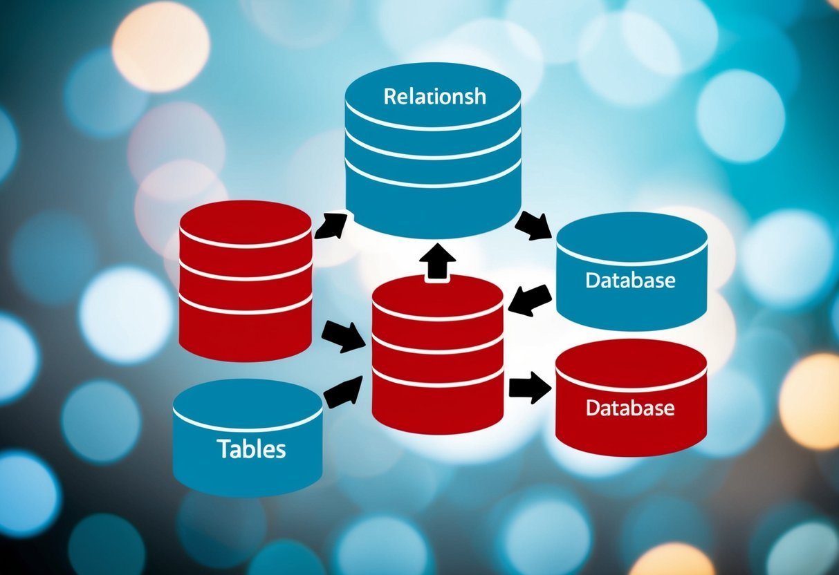
In data modeling, recognizing relationships between different data tables is vital. These relationships define how data connects across sources. Whether in a business intelligence guidebook or practical applications, they are the backbone of an effective data model.

Data granularity refers to the level of detail stored in the model. It affects how detailed the analysis can be. Fine-grained data allows for more detailed insights, while coarse granularity provides broader overviews.

A careful choice of granularity helps data analysts balance storage and performance challenges effectively, ensuring that reports and dashboards meet user needs.

Optimizing Data Models for Performance

Performance in data models significantly impacts the speed and efficiency of Power BI reports. To achieve optimal performance, data analysts often use the right storage mode.

Import mode is suitable for fast queries with medium data volume. Meanwhile, DirectQuery is better for large datasets but may slow down performance.

Data model optimization includes removing unnecessary columns and tables, reducing model size, and ensuring column data types are appropriate. Techniques like aggregations and indexing can further enhance performance.

Properly optimizing data wrangling techniques ensures that the model remains efficient, scalable, and user-friendly.

Loading and Storage Considerations

Loading data efficiently and choosing the right storage options are crucial when working with Power BI. These choices impact performance and data management.

Choosing the Correct Storage Mode

Selecting the right storage mode can greatly affect both performance and flexibility. Power BI offers several storage modes such as Import, DirectQuery, and Dual.

  • Import Mode stores a copy of the data within Power BI, offering excellent performance. It’s suitable for smaller datasets where speed is essential.
  • DirectQuery Mode connects directly to the data source, useful for handling large datasets that change frequently. Though it can slow down report performance, it ensures up-to-date data.
  • Dual Mode allows for hybrid scenarios, where some tables are imported while others use DirectQuery. This mode provides a balance between performance and data freshness.

Deciding on the right mode depends on the dataset size, performance requirements, and data timeliness.

Strategies for Incremental Refresh

Incremental refresh is key to improving the performance of large datasets in Power BI. It enables the update of only new or changed data, not the entire dataset.

  • Establishing a refresh policy is vital. This policy defines parameters such as how often and what data range should be refreshed.
  • Using partitioning helps manage data efficiently. Data is split into partitions, which reduces load times by only refreshing specific parts.

Implementing incremental refresh is beneficial in scenarios where data changes frequently but historical data remains constant. This strategy saves time and reduces load, enhancing overall performance.

Advanced Data Analysis

Advanced data analysis in Power BI leverages complex techniques and custom measures to provide deep insights. With methods like time series analysis, users can forecast trends and enhance predictive modeling. Custom measures expand analytical capabilities by building unique calculations for more detailed datasets.

Time Series Analysis Techniques

Time series analysis is essential for predicting and understanding data trends over time. It involves examining patterns such as seasonality, cycles, and trends.

In Power BI, users can utilize time series analysis to forecast future values using custom visuals and DAX formulas. Techniques like exponential smoothing help in smoothing out noise for clearer trend visualization.

Time series analysis often requires cleaning and preparing data since missing data points can significantly impact results. When using Power BI, connecting to varied data sources ensures comprehensive datasets for more accurate forecasting.

Implementing these techniques can lead to enhanced decision-making and strategy development by identifying patterns and projecting future trends.

Achieving Deeper Analytics with Custom Measures

Custom measures in Power BI allow users to perform calculations that standard aggregations do not cover. By using Data Analysis Expressions (DAX), users can create custom calculations tailored to their unique needs.

This capability is crucial for organizations needing in-depth insights from their data.

Creating custom measures requires understanding both data structures and logic expressions. They can be used to calculate percentages, averages, or any specific metric needed for detailed analysis.

Custom measures enable businesses to interpret their data more effectively, driving informed decisions by transforming raw data into actionable insights.

Users leverage these tools in Power BI to push beyond basic analysis, achieving a deeper understanding of complex data sets and improving analytical outcomes.

Data Quality Assurance

A computer screen displaying various data sources being connected and shaped in Power BI

Ensuring the quality of data is crucial in Power BI data preparation. It involves detecting anomalies and profiling columns to maintain data integrity. Sufficient attention to these aspects enhances the reliability of analysis and insights.

Detecting and Handling Data Anomalies

Data anomalies can lead to incorrect analysis and reporting. Detecting these outliers is crucial to maintain data accuracy.

Various methods like visual inspection, statistical analysis, and automated tools help identify anomalies. Tools can compare expected patterns with actual data, highlighting discrepancies.

Once detected, handling anomalies involves deciding whether to correct, omit, or transform the data.

  • Data correction includes fixing errors in data entry or format.
  • Omission may be necessary when anomalies cannot be clarified or verified.
  • Sometimes, it might be suitable to transform data through processes such as normalization to ensure consistency across datasets.

Profile Columns to Ensure Data Integrity

Profiling columns helps understand data structure and quality. It involves analyzing each column’s statistical properties, such as mean, median, and frequency of values. This insight can reveal inconsistencies or missing values, impacting results.

Column profiling tools can automatically generate summaries, making it easier to spot issues like duplicate entries or unusual value distributions.

They ensure each column aligns with expected data standards, improving overall data integrity.

Profiling helps identify potential data quality issues, allowing data handlers to address them before proceeding to analysis or visualization. Adjusting for these discrepancies upfront can prevent misinterpretations of the data.

Sharing and Collaboration in Power BI

In Power BI, collaborating with team members and sharing insights through reports and dashboards is essential for effective data analysis. This section explores the functionalities of Power BI, including the workspace environment and how to create shareable content efficiently.

Working with Power BI Workspace

The Power BI Workspace acts as a central hub for managing all reports and dashboards. It allows users to collaborate in real-time, making it easier for teams to access and work on shared projects.

Each workspace can host multiple datasets and reports, which helps in organizing content based on specific projects or departments.

Users can set permissions to ensure that only authorized personnel access sensitive information. This is vital for maintaining data security while enabling collaboration.

Teams can have different workspaces tailored to distinct projects, adding flexibility and structure to data management.

Collaboration is enhanced through Power BI’s integration with other tools, such as Microsoft Teams. This allows users to discuss reports and make changes without leaving the workspace. Sharing feedback or suggesting modifications directly within the platform streamlines the collaborative process.

Creating Shareable Reports and Dashboards

Creating shareable reports and dashboards in Power BI is straightforward and enhances the decision-making process across an organization.

Reports are crafted using various visualization tools that help present data in an understandable way. Meanwhile, dashboards provide a snapshot of important metrics, allowing users to monitor performance efficiently.

Once a report or dashboard is ready, it can be easily shared via direct links or through embedding in other applications.

Power BI also supports publishing to the web, making findings accessible to a broader audience if needed.

This feature is beneficial for teams that collaborate with external partners or clients.

Adding a shareable certificate can provide additional validation and security, ensuring the integrity and authenticity of shared data. This enhances trust among users and stakeholders, particularly when dealing with critical business information.

The ability to share and collaborate effectively in Power BI aids in fostering a data-driven culture within organizations.

Leveraging BI Tools for the Digital Economy

In today’s digital economy, business intelligence (BI) tools are crucial for making informed decisions. Microsoft Power BI is an essential tool, combining data from different sources and transforming it into actionable insights.

Data analytics plays a pivotal role in this process. Power BI allows users to clean and visualize data, making it easier to identify trends. This can significantly enhance decision-making and strategic planning for businesses.

To leverage these tools effectively, businesses should focus on integrating their data sources. Power BI supports various data sources like Excel, SQL databases, and cloud services, providing flexibility in data handling.

Benefits of Using Power BI in the Digital Economy:

  • Data Connectivity: Power BI connects to various data sources seamlessly.
  • Interactive Dashboards: Users can create interactive dashboards that update in real-time.
  • User-Friendly Interface: With a focus on simplicity, Power BI is accessible to users with varying expertise.

By using BI tools, companies can adapt quickly to market changes. This is due to the enhanced ability to analyze large datasets. Companies can stay ahead by identifying opportunities and managing risks effectively.

In the rapidly evolving digital landscape, leveraging tools like Power BI empowers organizations to drive growth and maintain a competitive edge.

Professional Development in Power BI

Engaging in professional development for Power BI involves acquiring certifications and practical experience. These elements enhance skills, making individuals more competitive in the field of data analysis.

Earning Career and Shareable Certificates

Career certificates in Power BI can boost job prospects for data analysts. Certificates are available through various platforms, offering structured courses that cover essential skills like data visualization and analysis.

Completing these programs often results in a shareable certificate, which can be displayed on professional networks like LinkedIn. These certificates validate one’s expertise and can differentiate candidates in a crowded job market.

Aside from career advancement, they also ensure professionals stay updated with the latest tools and features in Power BI, contributing to continuous learning and growth.

Engaging in Hands-On Projects and Learning

Hands-on projects are crucial for mastering Power BI. Practical experience allows individuals to apply theoretical knowledge in real-world scenarios.

Engaging in projects that simulate workplace situations helps develop problem-solving skills. These projects might involve importing data from different sources, shaping data, and creating dashboards.

By participating in hands-on learning, professionals gain confidence in using Power BI tools, making them ready for challenges in data analysis roles.

It’s also a way to demonstrate skills during job interviews, as completed projects can be showcased in portfolios. Regular practice through these projects ensures that learning goes beyond just theoretical concepts, embedding practical understanding.

Online Learning Resources

A person at a desk with a computer, accessing various data sources and shaping data in a Power BI learning module

Online learning offers a convenient way to gain skills in Microsoft Power BI. Two important platforms are Coursera and Coursera Plus, providing a range of courses on data analytics and data preparation techniques.

Utilizing Coursera for Power BI Training

Coursera hosts numerous courses focused on Microsoft Power BI, which cater to both beginners and advanced users. These courses often cover essential skills like data loading, transformation, and visualization.

Students can access video lectures, quizzes, and peer-reviewed assignments.

A notable feature is the flexibility offered by Coursera. Learners can study at their own pace, fitting study time around existing commitments. For those seeking broader insights, Coursera also integrates learning paths covering multiple aspects of data analytics.

Exploring Power BI Courses on Coursera Plus

Coursera Plus provides unlimited access to thousands of courses, including those on Power BI. This subscription model is ideal for learners who wish to explore multiple courses without worrying about individual costs.

Subscribers can delve into complex skills like DAX (Data Analysis Expressions) and Power Query. The variety of courses helps cater to different learning styles, ensuring that learners can find resources suited to their preferences and needs.

This platform is beneficial for those who intend to deepen their understanding of data analytics, beyond just the basics of Power BI. More courses on data sciences and related areas are also available to complement their Power BI knowledge.

Frequently Asked Questions

Understanding how to handle data in Power BI is crucial for effective analysis. This guide answers common questions about combining tables, data cleaning, loading, and integrating data from various sources. It also explores tools within Power BI for managing queries.

How can you combine tables with the same columns in Power BI?

In Power BI, users can combine tables by using the “Append Queries” feature. This is useful when all tables have the same structure. After appending, it’s important to check for any duplicate entries or data inconsistencies.

What are the best practices for data cleaning in Power BI?

To clean data efficiently, users should first remove any duplicates and correct errors. Then, they should ensure accurate data types for each column. Utilizing Power Query Editor can streamline this process and help create repeatable cleaning steps.

How do you prepare and load data for analysis in Power BI?

Preparing data in Power BI involves importing it using Power Query Editor. Once the data is shaped as needed, it can be loaded into the model. Just make sure to optimize the model for analysis to improve performance.

What steps are involved in cleaning and transforming data in Power BI?

Data transformation in Power BI starts with removing null values and handling missing data. Users can then reshape the data by pivoting or unpivoting columns. Adding custom columns or calculated fields enhances the dataset.

How can you get and integrate data from various sources into Power BI?

Power BI supports integration from diverse sources like Excel, databases, and web services. Users can connect to these sources directly within Power BI and use Power Query Editor to shape the data for their needs.

What tools are available within Power BI to consolidate and manage queries?

Power BI offers the Power Query Editor for managing queries. This tool allows users to consolidate data from different tables and apply transformations. Users can also use advanced features like M Language to create more complex query operations.

Categories
Uncategorized

Learning about Pandas Input and Output Using HTML Tables: A Comprehensive Guide

Getting Started with Pandas and HTML Tables

Pandas is a powerful Python library used for data manipulation and analysis. HTML tables serve as a popular data source format that can be seamlessly integrated with Pandas to improve data analysis.

Importance of Pandas in Data Analysis

Pandas is a top choice for data analysts due to its versatility and efficiency. It provides data structures like Series and DataFrame that simplify handling large datasets.

The library enhances productivity for tasks like cleaning, transforming, and visualizing data. Its features are especially valuable when dealing with structured data in formats like CSV, Excel, or HTML tables.

By using functions such as read_html(), which requires additional libraries like lxml, professionals can quickly import data from web sources into a Pandas DataFrame, making it ready for analysis.

Overview of HTML Tables as a Data Source

HTML tables are often used to display structured data on web pages. These tables can be a rich source of information for analysts. Using Pandas, they can extract this data easily.

The read_html() function parses multiple tables from a single webpage, returning them as a list of DataFrames. This makes it convenient to interact with various datasets without manual copying.

HTML tables, combined with Pandas, allow seamless integration of web data into analytical workflows, ensuring that analysts can leverage real-time or periodically updated information directly from web sources like statistics or financial data. For more on this approach, visit Statology’s guide on Pandas and HTML tables.

Installation and Setup

A computer screen displaying a Pandas input and output tutorial with HTML tables

To get started with using HTML tables in Pandas, it is important to properly install the necessary packages and set up the Python environment. These steps will ensure a smooth experience as you work with data extraction and manipulation.

Installing Pandas and Dependencies

Pandas is a key library for handling data in Python. It can be installed using pip, the Python package manager. Begin by opening a terminal and using the command:

pip install pandas

In addition to Pandas, other dependencies are needed for reading HTML tables. Such dependencies include lxml, beautifulsoup4, and html5lib.

To install these, run:

pip install lxml beautifulsoup4 html5lib

These libraries enable Pandas to effectively parse and manipulate HTML tables. The lxml parser is commonly recommended for its speed and reliability, while BeautifulSoup provides flexibility for extracting data.

Setting Up the Python Environment

Having a well-configured Python environment is critical for seamless functioning. It’s advisable to create a virtual environment to manage dependencies and avoid conflicts with other projects.

In your terminal, navigate to your project directory and run:

python -m venv env
source env/bin/activate  # On Windows, use `envScriptsactivate`

Once the environment is activated, proceed with installing the packages. This setup ensures that your libraries, like Pandas and matplotlib, remain organized.

Importing relevant libraries in your scripts is straightforward. Begin with:

import pandas as pd
import matplotlib.pyplot as plt

This setup prepares the environment for comprehensive data analysis using Pandas and its accompanying libraries.

Understanding Dataframes in Pandas

Pandas DataFrames are central to handling structured data. They allow users to efficiently manage both small and large datasets with various data types. This section focuses on how DataFrames are structured and different ways to perform data manipulation.

Dataframe Structure and Data Types

A Pandas DataFrame is a two-dimensional table with rows and columns. Each column can hold different data types like integers, floats, and strings. This makes DataFrames versatile for cross-analyzing various datasets.

Using libraries like Pandas, users can create DataFrames from lists, dictionaries, or numpy arrays.

DataFrames have unique labels for both columns and indexes, making data location straightforward. Users can check dataset properties using .info() for data types and .describe() for summary statistics. These features simplify understanding the dataset structure and types.

Each column in a DataFrame can be treated like a Pandas Series, allowing operations on specific segments of data without affecting the entire structure.

Manipulating Dataframes

Manipulation of DataFrames in Pandas is essential for data analysis. Users can filter data, sort values, and apply functions to adjust data as needed.

For instance, the .loc[] and .iloc[] functions help access specific data points or ranges. Reindexing is another tool to change the order or labels of a DataFrame, offering flexibility in data presentation.

Appending and merging DataFrames can be done using .append() and .merge(), useful for combining datasets. This is particularly helpful when data is split across multiple sources. Manipulating DataFrames with pandas is crucial for cleaning and organizing data, preparing it for accurate analysis and visualization.

Reading HTML Tables with Pandas

Pandas offers efficient methods to handle data from various formats, including HTML tables. Through the read_html() function, users can easily import tables from HTML files and refine their data analysis in Python.

Utilizing the read_html Function

The read_html() function in Pandas is designed to extract HTML tables from a given URL or file path. This function returns a list of DataFrames, as an HTML file can contain more than one table.

By default, it searches for and reads all tables, but users can specify which one to import using the match parameter.

Parameters allow customization, such as using parse_dates to automatically convert date columns into datetime objects. This is especially useful when working with time series data.

The function handles data parsing efficiently, simplifying tasks such as converting HTML tables directly into Pandas DataFrames. This makes it convenient for those needing to analyze web-sourced data without diving into web scraping techniques.

Handling Multiple Tables within a Single HTML File

When an HTML file contains multiple tables, the read_html() function can efficiently manage them. By returning a list of DataFrames, each table is stored as a separate DataFrame, allowing for easy access to each.

This approach is beneficial when analyzing data from complex HTML files with several tables.

Users can iterate over the list to process each table individually or select specific ones using indexing. If there’s a need to choose a particular table, the match parameter becomes handy, enabling users to specify keywords that match the desired table’s content.

Such flexibility in handling multiple tables makes the read_html() function a powerful tool when dealing with intricate data sources.

Navigating HTML Table Structures

HTML tables are often used for displaying data on web pages. Understanding how to navigate their structures is critical for extracting meaningful information. Key techniques include managing complex structures, such as those with rowspans and colspans, and effectively extracting data.

Dealing with Rowspans and Colspans

In HTML tables, rowspans and colspans allow cells to span across multiple rows or columns, respectively. This can make the table more functional by merging cells into larger blocks of data.

For instance, a table displaying a schedule might use a rowspan to show activities that last multiple days, or a colspan to merge cells showing an event across several hours.

Navigating tables with these elements requires careful consideration in data extraction. When processing such tables, it is essential to identify how these spans alter the table’s structure.

Tools like BeautifulSoup can be used to parse through these tables, identifying and handling the merged cells accordingly. Pay attention to how merged cells impact data alignment to ensure accurate data retrieval.

Extracting Tabular Data from Web Pages

Extracting tabular data from web pages often involves using libraries like Pandas and BeautifulSoup. The pandas.read_html function, for instance, can simplify data retrieval by automatically detecting HTML tables and converting them into DataFrames.

This method is particularly useful for web pages with multiple tables, as it returns a list of DataFrames, each corresponding to a table.

BeautifulSoup provides more granular control, allowing users to navigate through tags and extract specific pieces of structured data.

By leveraging methods like find_all, users can gather all relevant table elements and extract data into a usable format.

Efficient navigation of HTML table structures ensures accurate and organized data collection from the diverse tabular data presented on web pages.

Advanced Data Extraction Techniques

Advanced data extraction techniques leverage the strengths of libraries like BeautifulSoup and the power of regular expressions. These methods enable precise and efficient data gathering from complex web pages.

Using BeautifulSoup for Fine-Tuned Parsing

BeautifulSoup is a popular tool for parsing HTML and XML documents. It is especially useful for web data extraction when working with HTML tables.

This library allows users to navigate the HTML structure easily, making it simpler to locate and extract specific data elements.

BeautifulSoup is capable of handling messy HTML with its flexible parsing engine. For instance, users can find elements based on tag, class, or id attributes, allowing for highly targeted extraction.

Developers working with pandas and BeautifulSoup can effectively manage large volumes of web data, ensuring data integrity and consistency.

Implementing Regular Expressions in Data Extraction

Regular expressions (regex) are powerful tools used in data extraction for identifying specific patterns within text. They are essential when parsing HTML content that follows non-standard structures or when extracting data from unpredictable locations within HTML documents.

Regex can filter and match complex patterns, making them ideal for extraction tasks that require precision.

For example, if there is a need to extract only certain numbers or text formats within an HTML block, regular expressions can locate and retrieve those elements efficiently.

By integrating regex with tools like pandas.read_html(), users can automate retrieval processes involving intricate data arrangements, ensuring both accuracy and efficiency. This combination allows for streamlined data extraction workflows that accommodate diverse web formats.

Customizing Data Reads

A computer displaying a webpage with an HTML table, surrounded by open books and a notebook with handwritten notes

When using pandas to handle HTML tables, there are several ways to tailor the reading process for specific needs. This involves adjusting the match parameter to refine searches and post-processing HTML data for better results.

Manipulating the match Parameter

The match parameter in the pandas read_html() function allows users to filter tables by specified strings or regular expressions. By using this, one can target tables containing certain keywords, ensuring only relevant data is imported.

For example, if a table contains financial data for multiple companies, the match parameter can narrow down to only those tables including a specific company’s name.

This method is particularly useful on large websites with multiple tables, like Wikipedia, where selecting the right table is crucial. Using regular expressions provides even more control, letting users match patterns rather than exact phrases.

Post Processing with pandas read_html()

After reading a table with pandas.read_html(), some cleaning might be necessary. This function often requires manual adjustments, such as renaming columns that default to NaN.

Aside from renaming, users might need to format data types, remove unwanted columns, or deal with missing values.

This step ensures the DataFrame is ready for analysis and avoids errors in further data processing.

Following a structured process for post-processing ensures data’s integrity and usefulness. Utilizing pandas’ rich set of data manipulation functions can significantly improve the quality and reliability of the final output.

Writing Dataframes to HTML

When working with dataframes in Pandas, converting them to HTML tables allows for easy integration with web applications. This section discusses the tools and methods used to achieve this using Pandas.

Using the to_html() Method

The to_html() method is an essential function in Pandas for converting dataframes into HTML tables. This method provides a straightforward way to export a dataframe’s contents to an HTML format, which can be displayed directly on web pages.

Users can specify an output file path to save the HTML table. If no path is specified, the table will be returned as a string.

Customizing the output is possible. For example, users can select specific columns to include by passing a list to the columns parameter, allowing for tailored data display.

Additionally, Pandas offers options to add styles or CSS classes to the resulting HTML, enhancing the table’s readability and aesthetics. This customization is detailed by guides on how to export a Pandas DataFrame to HTML efficiently.

Integrating with Web Technologies

Integrating Pandas with web technologies involves making data more accessible and interactive. This includes handling HTML files for data visualization and managing HTTP protocols for data transfer and communication.

Handling HTML Files and HTTP Protocols

Working with HTML files allows data to be viewed in web browsers as interactive tables. Using Pandas, data frames can be converted to HTML tables through the to_html() method. This makes it easier to share data online and embed it in websites.

When fetching data from online sources, the read_html() function comes in handy. It reads HTML tables from either files or URLs, offering versatility in data handling.

For accessing web pages, HTTP requests are necessary. These include GET and POST requests, which facilitate data retrieval and submission.

Handling HTTP headers correctly is crucial, as they contain metadata that informs servers how to process requests.

Authentication and Session Management

In web environments, authentication ensures secure data access. When using Pandas to pull data from specific URLs, proper authentication might be needed.

One common method is incorporating API keys or OAuth tokens to verify identity.

Session management is essential for maintaining constant connection with web servers. Cookies play a vital role in this, as they store session information, allowing continuous interaction without repeated logins.

These cookies are sent with HTTP requests to keep track of sessions. This approach is vital for applications where data needs to be periodically updated or refreshed without manual intervention, making integrations smoother and more efficient.

Exporting Data to Other Formats

When working with Pandas, converting data into different file formats is essential. This enables users to share and store data in widely accessible forms. Key formats include CSV, Excel, and JSON, which are supported by Pandas for exporting structured data.

Converting to CSV and Other File Types

Pandas provides a straightforward approach to export a DataFrame to CSV files using the to_csv() function. This is useful for transferring structured data into a format that’s easy to read and used by many applications.

To convert a DataFrame to a CSV file, one needs to specify the file name, such as dataframe.to_csv('filename.csv'). Options like delimiters and including headers can also be customized.

Besides CSV, Pandas can export data to Excel using to_excel(). This function requires specifying the output file name and can include additional features like multiple sheets.

For formats like JSON, the to_json() function is available, allowing data to be saved in a format that’s lightweight and good for APIs.

It’s crucial to know these methods to ensure data compatibility across different systems and platforms.

Visualizing Data with Matplotlib

A computer screen displaying a matplotlib data visualization with pandas input and output using HTML tables

Matplotlib, a library in Python, is a powerful tool for creating a variety of charts and plots. It integrates well with Pandas dataframes, making it easier to visualize complex datasets. Understanding how to leverage these tools is essential for effective data analysis.

Creating Charts from Dataframes

To create charts with Matplotlib using a Pandas dataframe, one starts by importing the necessary libraries.

With Matplotlib, you can generate a wide range of plots, such as line graphs, bar charts, and histograms. For instance, plotting a line graph involves calling the plot() method on a dataframe column.

Each column in the dataframe can easily be visualized through this method.

A basic example involves importing Pandas and Matplotlib. Data is read into a dataframe, and using plt.plot(), a visual representation is created.

Integrating Matplotlib with Pandas allows for customization using various parameters for plot styling. This combination is highly beneficial for anyone working with data in Python as it provides clarity and insight into datasets.

For more advanced visualization, Matplotlib can convert plots into HTML code for embedding on websites. Libraries like mpld3 help transform these visuals for web use.

Creating interactive visualizations enhances user engagement and allows for a better exploration of the data presented.

Python Programming Foundations

Python is a versatile programming language known for its multi-paradigm capabilities, blending different programming styles to suit various tasks. Additionally, the Python Software Foundation plays a crucial role in its continued development and community support.

Python’s Multi-Paradigm Approach

Python stands out due to its support for multiple programming paradigms, including procedural, object-oriented, and functional programming. This flexibility allows developers to choose the best approach for their specific task.

Procedural programming provides a step-by-step approach, useful for simple tasks and scripts.

Object-oriented programming (OOP) is another style Python excels at, with its easy-to-understand syntax and power through classes and objects. OOP helps manage complex systems by organizing code into logical units.

Additionally, Python supports functional programming, allowing developers to solve problems with fewer side effects and more reusable code. This paradigm is exemplified in Python’s support of first-class functions and lambda expressions.

This multi-paradigm nature makes Python ideal for numerous applications, from web development to scientific computing using tools like Jupyter Notebook.

The Python Software Foundation

Founded to promote, protect, and advance Python, the Python Software Foundation (PSF) is instrumental to the language’s growth. It supports Python’s development by funding initiatives, organizing conferences, and managing the development infrastructure.

The PSF also ensures that Python remains open-source, fostering a strong, supportive community. It offers grants and resources to projects that enhance Python’s ecosystem, ensuring the language evolves in a way that’s beneficial to users worldwide.

Led by influential figures like Guido van Rossum, Python’s creator, the Foundation strengthens the language’s presence in both educational and professional settings. The PSF plays a critical role in maintaining Python as a leading programming language for developers around the globe.

Frequently Asked Questions

Pandas offers powerful tools to handle data in HTML tables, allowing extraction and conversion between HTML and DataFrames. Understanding how to troubleshoot common issues and enhance output can improve efficiency.

How can data be extracted from an HTML table into a Pandas DataFrame?

Data can be extracted using the read_html() function, which parses tables and returns a list of DataFrames. This function is convenient for simple HTML files with tabular data.

What is the process for converting a Pandas DataFrame to an HTML table?

Conversion to an HTML table is done using the to_html() method. This method writes the DataFrame to an HTML file by specifying the file path for export, which can be relative or absolute.

Are there any methods to prettify the HTML output of a Pandas DataFrame?

The to_html() function allows optional arguments like border, justify, and classes to style or prettify the output. Additional styling libraries can also be integrated.

What steps should be taken if ‘No tables found’ error occurs when using Pandas to read HTML?

Ensure that lxml is installed as it helps in parsing HTML content. Verify the content and structure of the HTML to confirm tables exist.

Reinstalling lxml with pip install lxml might be necessary if working in Jupyter Notebook.

How to apply custom classes to a DataFrame when converting it to HTML using to_html?

Custom classes can be added by specifying the classes parameter within the to_html() function. This lets users define CSS for styling directly on the HTML table output.

Has the read_html method in Pandas been deprecated, and if so, what are the alternatives?

The read_html() method is still in use and has not been deprecated.

Users can continue leveraging it to extract tables from HTML formats.

Categories
Uncategorized

Learning About Pandas and Pivot Tables: Master Data Analysis Effortlessly

Understanding Dataframes in Pandas

A person studying a computer screen with a dataframe displayed, surrounded by notes and books on data analysis and pivot tables

A DataFrame is a core component of the Pandas library. This data structure is used widely for data manipulation in Python. It organizes data in a table format, similar to a spreadsheet, with labeled rows and columns.

Each column can have a different data type, such as integers, floats, or strings.

Pandas as a Python package simplifies complex data operations. It allows users to handle large datasets efficiently.

DataFrames are particularly useful for performing operations like filtering, sorting, and aggregating data.

DataFrames have several important attributes and methods:

  • .head(): Displays the first few rows of the DataFrame.
  • .info(): Provides a summary, including data types and memory usage.
  • .describe(): Offers statistics like mean and median for numerical columns.

DataFrames can be created from various sources, including lists, dictionaries, and arrays. For example:

import pandas as pd

data = {'Name': ['Alice', 'Bob'], 'Age': [25, 30]}
df = pd.DataFrame(data)

DataFrames support operations like joining, merging, and pivoting. The pivot_table() method reshapes and summarizes data effectively.

Proper understanding of DataFrames enhances data analysis capabilities. Whether analyzing sales data or survey results, the flexibility of Pandas makes it a go-to tool for data scientists and analysts.

Fundamentals of Pivot Tables

Pivot tables are essential for data analysis, allowing users to transform complex datasets into summarized, meaningful insights. This section breaks down the process and components involved in creating these powerful tools within the Pandas library.

Defining Pivot Tables

A pivot table is a tool used in data analysis to summarize large datasets. By condensing data into a more digestible format, pivot tables help identify patterns and trends that might not be visible otherwise.

In the Pandas library, the pivot_table() function enables this transformation. Users can aggregate data in different ways, such as summing or averaging. This versatility makes pivot tables a popular choice for those looking to analyze and interpret summarized data.

Pivot tables offer a customizable approach to data analysis. They can be configured to display data in various ways, depending on the user’s needs. For example, you can adjust which columns serve as row or column labels, which helps in tailoring data views to specific goals.

This adaptability is what makes pivot tables valuable for many data-driven projects.

Pivot Table Components

Key components of pivot tables include index, columns, and values.

The index refers to the column that will serve as the row labels, organizing the data into easily readable sections. The columns field is where users can decide which data will be used as column headers. This choice impacts how data is displayed and analyzed.

The values component is where the actual data points are configured for analysis. Users can specify which fields to use and what kind of calculations to apply, such as sums or averages.

The flexibility of these components allows for a high level of customization in data presentation, making pivot tables a robust tool for data summarization.

Data Analysis with Pivot Tables

Pivot tables are powerful tools in data analysis. They allow users to summarize and explore data by performing calculations like sums, averages, and counts. By using pivot tables, one can easily spot trends and draw meaningful insights from complex data sets.

Performing Aggregate Functions

Pivot tables make it easy to apply aggregate functions to large datasets. Users can calculate sums, counts, and averages for specific data categories.

For example, to find the total sales in a region, a pivot table can sum up all sales entries related to that region. Users can also compute the mean to understand average sales per day, or the count to see how often a product was sold.

Other useful calculations include finding the minimum or maximum value in a dataset. This helps in identifying best and worst performances.

Additionally, it’s possible to calculate the median to get a sense of the central tendency. By using these functions, data analysts can gain quick access to important statistics.

Analyzing Trends and Statistics

Pivot tables help identify trends and patterns over time. By organizing data into categories, users can view changes in variables, such as sales growth or customer preferences.

For instance, pivot tables can illustrate monthly or yearly trends, allowing businesses to adjust their strategies accordingly.

In addition to trends, pivot tables facilitate deeper statistical analysis. Users can calculate the standard deviation to measure data variability, which indicates how spread out the numbers are in a dataset.

By employing these statistical functions, analysts can uncover insights into data, supporting evidence-based decision-making. These features make pivot tables indispensable in the toolkit of anyone analyzing data.

Pivot Table Configuration in Pandas

Pandas offers powerful tools for creating pivot tables, allowing users to efficiently manage and analyze data. Two key aspects include setting indices, columns, and values, along with customizing aggregation functions to summarize the data effectively.

Setting Index, Columns, and Values

In Pandas, creating a pivot table often starts with the pivot_table() function. This function helps in organizing data by defining the index, columns, and values.

The index parameter specifies the rows, while the columns parameter determines the unique values across the top. These two parameters help in structuring the data meaningfully.

The values parameter is crucial as it defines what data will be aggregated. When specified, this parameter tells the pivot table which data to summarize.

Correct configuration of these parameters helps in drawing accurate insights from complex datasets, making the pivot table a versatile tool for data analysis.

Customizing Aggregation Functions

Customization of aggregation functions allows users to tailor how data is summarized. By default, the aggfunc parameter uses the mean, but it can be changed to other functions like sum, count, or even custom functions.

This flexibility enables users to view data summaries that align closely with their specific analytical needs.

Utilizing different aggregation functions provides varied perspectives on the data. For example, using sum can reveal total values, while count shows the number of entries.

This customization capability makes the pivot table an invaluable asset, adapting it for diverse analytical tasks and ensuring the output is both meaningful and relevant.

Advanced Data Aggregation

Advanced data aggregation in Pandas involves using multiple functions and incorporating both margins and subtotals to gain deeper insights from data. These techniques enhance analysis by providing detailed summaries.

Using Multiple Aggregation Functions

When working with large datasets, employing multiple aggregation functions can provide a comprehensive overview. In Pandas, the groupby() method allows for the application of various aggregation functions like sum, mean, or count.

Using agg() is crucial for applying these functions to different columns simultaneously.

For example:

df.groupby('category').agg({'sales': ['sum', 'mean'], 'profit': 'sum'})

This code snippet calculates the sum and mean of sales and the sum of profits for each category.

By using multiple functions, it is possible to extract a wider set of statistics, which are valuable for analysis. This approach highlights trends and anomalies that may otherwise go unnoticed, aiding decision-making processes.

Incorporating Margins and Subtotals

Incorporating margins and subtotals can significantly enhance data presentations.

The pivot_table() function in Pandas includes a parameter, margins=True, which automatically adds totals across rows and columns. These are referred to as “margins”.

Subtotals are critical for understanding cumulative data.

The margins_name parameter customizes the name of these totals. For example:

df.pivot_table(values='sales', index='region', columns='product', aggfunc='sum', margins=True, margins_name='Total')

This output provides a grid summarizing sales, where “Total” columns and rows reveal overall and cumulative totals.

Such details offer a clearer view of data distribution and assist in interpretative analysis, making it easier to identify significant figures directly from the table.

Manipulating Data with Pivot Tables

Using pivot tables in Pandas can enhance the analysis of data by effectively organizing and summarizing it. They offer numerous options to handle missing values and adjust data granularity, which are crucial for accurate data representation.

Handling Missing Data

Pivot tables in Pandas can manage missing data efficiently. When creating a pivot table, users might encounter gaps in their data.

By including the parameter fill_value, users can replace these gaps with a specific value like zero. This helps maintain data continuity and improves interpretability.

Additionally, the option dropna can be used to remove any entries with missing data, which ensures the dataset remains clean.

When dealing with time series data, it’s often useful to set parse_dates to accurately handle date information.

Using this option can assist in preventing errors related to date formatting and missing entries.

Adjusting Data Granularity

Adjusting data granularity is a significant feature of pivot tables. It allows users to summarize data at different levels of detail, providing flexibility for analysis.

By selecting different index options, like specific columns or a list of columns, users can control how detailed or summarized the data should appear in the table.

The ability to aggregate data over time or categories helps in drawing insights more effectively.

Users can, for instance, change data granularity to review monthly or annually summarized data to identify broader trends. This flexibility is essential for tailoring the data presentation to better suit specific analytical needs.

Pandas Pivot Table Examples

Pandas pivot tables are powerful tools used to analyze data across various sectors. These examples highlight how pivot tables can be applied to both sales and sports data to provide meaningful insights through summary statistics and data reorganization.

Case Study: Sales Data Analysis

In a sales data analysis, a pivot table in pandas can help to quickly summarize total sales by different categories like regions or products. Using the .pivot_table() method, one can group data to reveal patterns and trends in sales performance.

For instance, if analyzing sales data for a company, the pivot table can list regions in rows and different products in columns. Using an aggregation function like sum, the table can display total sales for each product in every region.

This allows businesses to see which products perform well in various locations and make informed decisions.

Example Table:

Region Product A Product B
North $10,000 $8,000
South $9,500 $11,000

Such tables not only organize the data but also help in spotting trends or outliers in the sales data.

Scenario: Sports Data Insights

In sports, particularly for analyzing basketball players’ performances, a pandas pivot table can be quite useful. By using player names as the index and statistics like points, rebounds, and assists as columns, one can easily compare player performances.

For example, using the .pivot_table() function, one might set teams as the columns and players as the rows to see aggregated statistics like average points per player.

This kind of analysis helps in understanding which players are contributing most to their team’s success.

Example Table:

Player Team A Team B
Player 1 25 22
Player 2 18 19

The table displays points scored across teams, aiding in deciding strategic moves or player trades.

Time Series Analysis with Pivot Tables

Time series analysis involves examining data points collected or recorded at specific time intervals. One of the powerful tools for performing this analysis in Python is using Pandas pivot tables. These tables help organize and manipulate data efficiently.

To perform time series analysis, data is often grouped by specific units like year, month, or day.

In Pandas, the .dt accessor can extract these time components from datetime objects. With these columns, you can create a pivot table that summarizes data over time.

Example structure for summarizing data could look like:

Month Year Value
January 2022 1500
March 2023 1700

In the table, the values are aggregated using a function like np.sum or np.mean. Pandas’ pivot_table() function can then be used to pivot on these columns.

A typical use case might involve comparing sales figures over multiple years. The pivot table can quickly show trends and patterns which are crucial for making data-informed decisions.

In addition to organizing time-based data, pivot tables can facilitate easy plotting of time series data. Visual representation helps identify seasonal patterns, trends, or outliers.

For practical guidance, check out resources like Pandas documentation or online tutorials, which delve deeper into techniques for managing and visualizing time series data with pivot tables. Tools like these enhance data analysis for better business or research outcomes.

Visualizing Data Through Pivot Tables

Pivot tables in Pandas are a powerful tool for data visualization. They help in transforming and summarizing data, making it easier to generate useful insights. With the ability to reshape data, users can easily prepare it for creating plots.

Types of Plots:

  • Bar Plot: Represents data with rectangular bars. In Pandas, setting kind='bar' can easily generate these plots.
  • Line Plot: Ideal for showing trends over time. Use kind='line' to create these plots in Pandas.

Pandas provides the plot function, which can be integrated with pivot tables. This function enables users to visualize data effectively, by using the index for the x-axis and columns for values. With Pandas DataFrame plotting, complex data sets become more manageable, allowing for clear and concise data representation.

It’s crucial to choose the right kind of plot based on the data. If the data requires aggregation, pivot_table is the go-to method. Otherwise, pivot can suffice if no aggregation is needed.

Visualizations not only make data exploration more engaging but also facilitate better communication of insights. Utilizing the right type of plot makes the information accessible, especially for those less familiar with raw data formats.

Other Pivot-Related Operations in Pandas

Pandas offers powerful tools not just for creating pivot tables but also for reshaping and analyzing data in different ways. These include functions like melt(), crosstab(), and the comparison between pivot() and group by operations.

Reshaping Data with Melt and Crosstab

The melt() function is used to transform or reshape data, making it long-form. It helps in pivoting from a wide format to a long format by un-pivoting columns into rows. This is particularly useful when dealing with complex datasets where columns need to be converted into rows for easier analysis.

Meanwhile, the crosstab() function is similar to a pivot table but is specifically used for cross-tabulation. It summarizes data by showing the frequency distribution between two or more variables. Users often turn to crosstab() when they need to compute a simple count or frequency of variables grouped together. By carefully using both functions, data can be manipulated to suit various analytical needs.

Comparing Pivot and Group By

The pivot() function rearranges data by changing its structure into a new table layout, allowing for data aggregation along specified dimensions. It is particularly useful for data that has categorical data types in the columns, and a desire to display sums or averages along these categories.

The group by operation, on the other hand, is more flexible and can perform calculations over groups defined by the user. It splits the data into subsets, applies a function to each subset, and combines the results. Unlike pivoting, which is more suitable for a fixed table structure, group by is ideal for more complex operations that require custom processing. Understanding when to use each of these operations will enhance the ability to analyze and understand datasets more thoroughly.

Interactive Analysis with Pivot Tables

Pivot tables in Pandas offer a powerful way to summarize and analyze large datasets. They simplify data by organizing it in a meaningful way. Using pivot tables, analysts can calculate sums, averages, or counts of data.

Interactive features enhance the pivot table experience. By enabling filters and selections, users can focus on specific data points. This flexibility allows for more detailed exploration of patterns and trends.

Benefits of Interactive Pivot Tables:

  • Customization: Adapt tables to show only relevant data.
  • Flexibility: Easily switch between different data views.
  • Efficiency: Quickly spot patterns or anomalies.

Tools like QGrid extend Pandas by offering interactive table functionalities. These tools help users navigate large datasets more intuitively, enhancing the data analysis process.

Students and professionals often engage with pivot tables through interactive quizzes. These quizzes provide practical insights into how data behaves and changes with various filters. They also provide a hands-on way to learn about data manipulation.

To get started, people can use resources such as the Real Python’s tutorial on creating pivot tables, which guides users step-by-step in building and customizing tables for better data insights.

Frequently Asked Questions

A person using a laptop to research pandas and pivot tables, with open books and notes scattered around the desk

Pandas is a powerful tool for managing data, and pivot tables are essential for summarizing large datasets. Below are answers to common questions about using pivot tables with Pandas.

How do I create a pivot table in Pandas?

To create a pivot table in Pandas, use the pivot_table() function with required parameters like data, values, and index. The data parameter takes a DataFrame, while values and index specify the columns to aggregate and group by. More details can be found in the Pandas documentation.

What are the differences between the pivot and pivot_table functions in Pandas?

The pivot() function is simple and works well with unique column combinations. On the other hand, pivot_table() is more flexible. It handles duplicates and supports aggregation with functions like mean and sum. For advanced usage, refer to Pandas 2.2.3 documentation.

How can I convert a Pandas pivot table to an Excel file?

To convert a Pandas pivot table to an Excel file, use the to_excel() method. First, create your pivot table, then call pivot_table.to_excel('file_name.xlsx'). This exports the pivot table to an Excel worksheet.

How do you use the count function with a Pandas pivot table?

Use the count function in a Pandas pivot table as an aggregation method. Set aggfunc='count' within pivot_table(). This calculates the number of non-null entries for each group formed by the index columns.

Can you provide an example of a pivot table in Python using Pandas?

Creating a simple pivot table in Pandas might look like this:

import pandas as pd

data = {'Category': ['A', 'A', 'B', 'B'], 'Values': [10, 20, 10, 30]}
df = pd.DataFrame(data)
pivot = df.pivot_table(values='Values', index='Category', aggfunc='sum')
print(pivot)

What are the main benefits of using pivot tables when analyzing data?

Pivot tables simplify data analysis by allowing quick and efficient summarization.

They enable users to aggregate, filter, and organize data dynamically, making it easier to spot trends and patterns without changing the original dataset.

For more depth, check out the guide on GeeksforGeeks.

Categories
Uncategorized

Learning What Data Analysts Do: Exploring Key Responsibilities and Skills

Understanding the Data Analyst Role

A person analyzing data on a computer, surrounded by charts and graphs, with a pen and notebook nearby

A data analyst plays a crucial part in helping organizations make data-driven decisions. By interpreting and analyzing data, they provide insights that guide strategic and operational plans.

This section explores their key responsibilities and how their role compares to a data scientist.

Key Responsibilities of a Data Analyst

A data analyst is responsible for collecting, organizing, and interpreting data.

Data Gathering involves collecting data from various sources, such as databases or external data collection methods. Once collected, data must be cleaned and organized to ensure accuracy.

Data Analysis is where they identify trends and patterns. This often involves using statistical tools and software. Critical thinking is vital here, as analysts must determine the relevance and implications of data findings.

Communication Skills are essential for a data analyst. They must present their findings effectively to non-technical stakeholders. This is often done through data visualizations, making complex data more understandable. Analysts must translate data insights into actionable recommendations, fostering informed decision-making within the organization.

Data Analyst vs. Data Scientist

While both roles involve working with data, there are notable differences.

A data analyst focuses primarily on analyzing existing datasets to extract actionable insights. Their work often revolves around specific questions or problems to improve business decisions.

On the other hand, a data scientist typically works with larger datasets and uses complex algorithms. They often build predictive models using machine learning and require advanced programming skills. Data scientists delve deeper into data exploration and are often more involved in research.

Both positions require strong analytical skills, but data scientists tend to have a broader scope of work. This difference highlights the distinct job outlooks for each role.

Educational Pathways and Skills Development

A data analyst surrounded by computer screens, graphs, and charts, analyzing and interpreting data for educational pathways and skills development

Becoming a data analyst involves obtaining specific educational qualifications and developing key skills. Prospective data analysts can follow various educational pathways, supported by structured programs and self-directed learning resources.

Required Educational Background

Most data analysts hold at least a bachelor’s degree in fields like mathematics, statistics, computer science, or data science. These programs typically cover essential subjects, including statistics and programming languages such as Python and R.

For those already holding a degree in another discipline, pursuing a professional certificate can provide the necessary foundation in data analytics.

Programs like the Google Data Analytics Professional Certificate offer valuable insights into industry-relevant tools and methods. Certification programs can enhance a candidate’s understanding of data analysis processes and improve employability.

Skill Building and Self-Study Options

Beyond formal education, building technical skills is crucial.

Proficiency in statistical analysis, data visualization, and programming can be achieved through self-study and online courses.

Platforms such as Coursera offer comprehensive courses that help individuals refine their abilities in tools like Python and R.

Participating in bootcamps allows aspiring analysts to immerse themselves in practical, hands-on learning experiences.

Engaging in data projects and using resources like GeeksforGeeks’ data analyst roadmap can further round out one’s skill set.

Commitment to continuous learning and skill development is key to success as a data analyst.

Core Technical Competencies in Data Analysis

A person analyzing data using a computer and various tools

Data analysts need a mix of programming skills and tools to analyze and present data effectively. They rely on statistical methods and use various software and programming languages to derive meaningful insights from data sets.

Programming and Statistical Analysis

Data analysts often use programming languages like Python and R to perform data manipulation and statistical analysis.

Python is popular due to its simplicity and wide range of libraries like Pandas and NumPy, which simplify data analysis tasks. Similarly, R is favored for its statistical capabilities and graphical representation abilities.

SQL is essential for querying databases and extracting data for analysis. Understanding SQL helps analysts handle large data sets efficiently without overloading traditional spreadsheet software.

Statistical analysis forms the backbone of data analytics. It enables analysts to identify trends, patterns, and relationships in data.

Tools like SAS and Jupyter Notebooks are also used to perform complex statistical computations and model data.

Data Visualization and Business Intelligence Tools

Visualization is key to transforming data into understandable insights.

Tools like Tableau and Microsoft Power BI are widely used for creating interactive and shareable dashboards. These tools help analysts convey data insights compellingly.

Microsoft Excel and Google Sheets remain powerful tools for data analysis due to their versatility and ease of use. They also offer visualization features that are intuitive for many users.

Business intelligence involves leveraging both data analysis and visualization tools to guide strategic decisions.

Users can create reports and dashboards that help organizations understand their operations better. These tools enhance communication by presenting complex data in clear, visual formats that support informed decision-making.

Key Data Analysis Processes and Techniques

A data analyst sitting at a computer, surrounded by charts and graphs, analyzing data using various techniques and processes

Data analysis involves various critical steps, each essential for obtaining meaningful insights. Collecting and cleaning data are foundational processes, while exploratory and predictive analytics help in understanding and anticipating trends.

Collecting and Cleaning Data

Collecting Data is the first step in any data analysis process. It involves gathering relevant information from different sources like surveys, databases, and online repositories.

Effective data collection requires a clear strategy to ensure the data is accurate and relevant.

Cleaning Data is crucial for guaranteeing accuracy and usability. This step involves removing or correcting errors and inconsistencies. Data cleaning helps in dealing with missing values, duplicate entries, and incorrect formats.

The process often uses tools and software designed to automate these tasks, making them faster and more reliable. It’s important to prioritize data cleaning because poor quality data can lead to inaccurate results.

Key Techniques:

  • Identifying Errors: Locate inaccuracies within the data.
  • Standardizing Data: Ensure consistency across various datasets.
  • Removing Duplicates: Eliminate repeated entries for accuracy.

Exploratory and Predictive Analytics

Exploratory Data Analysis (EDA) is used to uncover patterns and trends in the data. Analysts use techniques like visualization and summary statistics here.

EDA helps in forming hypotheses about the data and identifying variables that might be related.

Predictive Analytics uses historical data to forecast future trends. This process often involves machine learning and data modeling to build effective predictive models.

It aims to predict outcomes based on input data, aiding decision-making.

Key Tools and Methods:

  • Data Visualization: Charts and graphs to visually interpret data.
  • Statistical Analysis: Calculating metrics to understand relationships.
  • Predictive Modeling: Developing models to forecast future scenarios.

Business Acumen and Industry Knowledge

Developing business acumen and industry knowledge is crucial for data analysts. These skills help them align data insights with business goals and contribute significantly to decision-making processes.

Understanding Business Decisions

Data analysts must grasp the significance of informed business decisions. This involves understanding the goals and challenges faced by the company.

Business analysts often collaborate with management to ensure that data-driven decisions increase efficiency and profitability.

By knowing the key performance indicators (KPIs) and industry benchmarks, analysts can recommend strategies that align with organizational goals.

Knowing how data impacts various departments helps in creating solutions that benefit the entire organization.

Insights from analysis can drive policy changes, improve customer satisfaction, and increase revenue. This makes a data analyst indispensable in a business setting.

Comprehending the broader business implications of data analysis ensures that recommendations are practical and achievable.

Market Research and Operations Analysis

Market research is vital for data analysts to understand the competitive landscape. By examining trends and consumer behaviors, analysts help businesses adapt and stay ahead.

Market research analysts focus specifically on collecting and interpreting data about consumer preferences, which can lead to smarter marketing strategies and product offerings.

Operations analysis is another critical aspect, focusing on the efficiency and effectiveness of internal processes.

Operations research analysts use data to optimize resource allocation, streamline workflows, and minimize costs. Their work can lead to improved operational performance.

Industry knowledge is essential here, as it aids in predicting market shifts and preparing the company for future challenges.

By combining market research and operations analysis, data analysts provide valuable insights that enhance overall business performance.

Data Analytics and Its Impact on Business Strategy

A data analyst sitting at a computer, surrounded by charts and graphs, analyzing data to inform business strategy

Data analytics plays a key role in shaping business strategies by converting raw data into insights that drive decisions. This involves processes like descriptive, diagnostic, and prescriptive analytics, which support long-term plans and daily operations.

Turning Data into Actionable Insights

Businesses are inundated with data. The task is to transform this data into insights that can be acted upon.

Descriptive analytics involves summarizing historical data to understand what has happened. For instance, sales trends over different periods can offer a clear picture of past performance.

Diagnostic analytics digs deeper into historical data to uncover the reasons behind certain outcomes. This step is vital for identifying patterns and anomalies that could signal significant shifts in business operations.

Prescriptive analytics goes further by recommending actions. It uses algorithms and models to suggest the best steps to take in specific scenarios.

These insights can lead to better decision-making processes and help in formulating strategies that are aligned with business goals.

Turning data into actionable insights enhances the ability to anticipate and mitigate risks, offering businesses a competitive edge.

Influence on Long-Term Business Strategy

Data analytics profoundly influences long-term business strategies.

By building a robust data strategy that incorporates data governance, companies ensure the reliability and integrity of their data resources. This approach supports sustained growth and adaptability.

Businesses use analytics to refine their strategic directions. Predictive models allow them to forecast future trends and set realistic objectives.

These models, grounded in real data, help businesses stay ahead of market changes and competitor actions.

A comprehensive data analytics strategy also enables continuous learning and adaptation.

By frequently revisiting analytics insights, companies can update their strategies to remain relevant and effective in a dynamic business environment.

Databases and Data Management Systems

Databases and data management systems are crucial for data analysts, as they handle a large volume of structured data. These systems ensure that data is stored, accessed, and maintained effectively.

Using SQL and Database Tools

SQL, or Structured Query Language, is a critical tool for any data analyst. It is the standard language for managing and manipulating databases.

Data analysts use SQL to extract specific information from databases, run queries, and generate reports. This allows them to gather insights and support decision-making processes.

SQL’s simplicity and effectiveness make it an indispensable skill for accessing and updating data.

Beyond SQL, other database tools like Apache Hadoop and KNIME offer additional capabilities.

Hadoop is particularly useful for large-scale data processing, allowing analysts to handle big data with ease. KNIME provides a user-friendly interface for data analytics and visualization, enabling better data exploration.

Mastering these tools helps analysts perform their tasks more efficiently and analyze complex datasets effectively.

Ensuring Data Quality and Governance

Data quality and governance are essential aspects of data management systems.

Analysts must ensure that data is accurate, complete, and consistent to derive meaningful insights. They are responsible for cleansing and organizing data to maintain its integrity.

Implementing data governance policies helps in managing data access, security, and compliance.

Analysts use various techniques to validate data, correct errors, and prevent data duplication. This ensures that the datasets are reliable and the analysis is trustworthy.

Adhering to these practices allows organizations to maintain confidence in their data-driven decisions.

Specialized Application of Data Analysis

Data analysis plays a critical role in various fields, driving decision-making and innovation.

In healthcare, it enhances patient care and operational efficiency. In machine learning, it helps in creating models for better predictions and insights.

Medical and Healthcare Analysis

Healthcare analysts use data analysis to improve patient outcomes and streamline operations. They analyze patient records, treatment plans, and outcomes to find patterns.

Predictive models can forecast disease outbreaks, enabling timely interventions.

Data mining is pivotal in identifying risk factors linked to chronic diseases. By analyzing large datasets, healthcare professionals can create personalized treatment plans.

This approach enhances preventive care and personalizes treatments, improving patient satisfaction. The importance of data analysis in healthcare can’t be overstated, especially with increasing data volumes.

Data analysis also supports cost reduction in medical operations. By analyzing resource use and patient flow, hospitals can optimize staffing and equipment allocation, lowering costs while maintaining care quality.

Machine Learning and Advanced Analytics

Machine learning is a subset of data analysis that focuses on building algorithms to generate insights from data. Data analysts utilize machine learning to create predictive models that can identify trends and predict future outcomes.

Advanced analytics uses statistical techniques to provide insights beyond basic data analysis. It involves exploring unstructured data to uncover relationships and patterns. Machine learning and data analysis techniques are crucial for developing sophisticated applications in sectors like finance and marketing.

Incorporating these techniques improves decision-making and operational processes across industries.

Machine learning, combined with robust analytics, transforms raw data into actionable insights, aiding businesses in strategic planning and performance optimization.

The Role of Collaboration and Communication

A group of data analysts collaborate, sharing ideas and insights while communicating through charts, graphs, and diagrams

Data analysts need strong collaboration and communication skills to effectively work with teams and present their findings. These abilities enhance not only team dynamics but also the impact of data-driven decisions.

Teamwork in Data Analysis

Effective teamwork is essential in data analysis. Analysts often work with cross-functional teams that include IT, marketing, and finance.

Using tools like Slack or Google Docs can simplify communication and ensure everyone is on the same page. Such platforms help maintain transparency and allow team members to bring their diverse expertise to the table, which results in better problem-solving and more robust data interpretations.

Being open to different perspectives while ensuring clarity in sharing insights leads to successful team collaborations.

Data Storytelling and Presentation

Data storytelling is a crucial skill for analysts. It involves turning complex datasets into compelling narratives that are easy for stakeholders to understand.

This often requires creating visual aids, like charts or graphs, to highlight key insights. Analysts must translate complex data into straightforward presentations.

This skill is vital for decision-making processes. It’s important that the presentations are tailored to the audience’s level of understanding, ensuring the key messages are clear and actionable.

This ability can greatly influence how data-driven strategies are received and implemented within an organization. Skills like these are crucial for any analyst aiming to make a significant impact.

Career Advancement and Job Outlook

A data analyst reviewing charts and graphs, surrounded by computer monitors and data visualizations

Data analysts have a promising career path with several opportunities for growth. Understanding how to progress and what the job market offers is crucial for anyone pursuing this field.

Navigating the Data Analyst Career Path

Data analysts often start in entry-level positions but can progress to more advanced roles. At the beginning, they may focus on tasks like collecting and cleaning data.

With experience, they can move up to positions like senior data analyst or data scientist. Skills in tools like SQL, Python, and R become important as they advance.

Some data analysts choose to specialize in areas such as predictive analytics or business intelligence. Specializations can lead to roles in management or strategy, where they use their expertise to lead teams and drive business decisions.

Understanding the Job Market and Salary Expectations

The demand for data analysts continues to grow as companies seek to make data-driven decisions. According to Springboard, jobs in this field are expected to grow steadily.

Salaries for data analysts vary, influenced by factors like location and experience. Typically, entry-level salaries range around $60,000 per year, while experienced professionals can earn over $100,000 annually.

Skills in advanced data techniques can enhance earning potential.

Increases in demand are driven by innovations like augmented analytics, which use AI to improve data processes. This trend ensures that data analysts remain vital in various industries, providing insightful data interpretations to support decision-making.

Continuing Education and Professional Growth

A data analyst surrounded by computer screens, graphs, and charts, analyzing and interpreting data for professional growth and continuing education

Continuing education is vital for data analysts to maintain a competitive edge. Earning certifications and staying updated with new technologies are key strategies for professional growth.

The Value of Certifications and Bootcamps

Certifications like the IBM Data Analyst Professional Certificate provide structured learning and help analysts validate their skills. Such qualifications are recognized by employers, often leading to better job prospects and promotions.

Data analytics bootcamps offer intensive, hands-on training. These programs focus on practical skills, making them ideal for those who prefer learning by doing.

Bootcamps can be completed in a shorter time compared to traditional degrees, enabling quicker entry into the workforce. They are an excellent option for those looking to switch careers or specialize further in the field.

Keeping Up with Emerging Technologies

Data analytics is a fast-evolving field with new tools and techniques emerging regularly. Analysts need to stay updated with innovations, such as advancements in machine learning and AI.

This knowledge enhances their ability to analyze data effectively and offer valuable insights to their organizations.

Continuing education can involve online courses, workshops, and conferences focused on the latest technology trends. These platforms provide analysts with up-to-date information and practical skills.

Staying current not only enhances their capability but also increases their value to employers. By being proactive in their learning, data analysts can adapt quickly to technological changes.

Frequently Asked Questions

Becoming a data analyst involves developing specific skills and gaining relevant qualifications. Understanding the job responsibilities and possible career paths is essential for those interested in this field.

How can someone become a data analyst with no prior experience?

Getting started as a data analyst without experience involves acquiring key skills such as data management, statistical analysis, and proficiency in tools like Excel or SQL.

Online courses, internships, and self-learning can help build these competencies.

What are the essential skills needed to be a successful data analyst?

Essential skills include strong analytical abilities, proficiency in data visualization tools, and knowledge of programming languages like Python or R. Attention to detail and effective communication are also critical for interpreting and presenting data insights.

What are typical job responsibilities for an entry-level data analyst?

Entry-level data analysts typically gather, clean, and organize data. They use various tools to perform preliminary data analysis, create reports, and help their team make data-driven decisions.

They also often assist in developing strategies based on data insights.

How does one pursue a career in data analysis and is it a viable path?

A career in data analysis can be pursued by completing relevant coursework, gaining certifications, and building practical experience through internships.

With the increasing reliance on data-driven decision-making, it’s a viable and growing career path in various industries.

Can a person self-learn the necessary skills to become a data analyst?

Yes, it’s possible to self-learn the necessary skills. Many online resources and platforms offer courses in data analytics, programming, and statistics.

Diligent practice, project work, and collaboration with professionals can accelerate the learning process.

What are the common qualifications and certifications required for a data analyst?

Common qualifications include a degree in fields such as computer science, mathematics, or statistics.

Certifications like Microsoft Certified: Data Analyst Associate or Google Data Analytics Professional Certificate can enhance a candidate’s profile and demonstrate their expertise.

Categories
Uncategorized

Learning and Understanding When to Use What Types of Charts: A Comprehensive Guide

Creating effective visualizations is an important skill in data analysis.

Charts and graphs help communicate complex information clearly and quickly. When used correctly, they enhance storytelling and foster deeper insights.

A person surrounded by various types of charts and graphs, studying and comparing them to understand their purposes and applications

Choosing the right chart type is crucial for effectively displaying data.

Each type functions differently and is suited for specific kinds of data relationships. By understanding the strengths of each chart, one can ensure the message is conveyed accurately and efficiently.

Bar Chart: Effective for Comparing Quantities

Bar charts are a powerful tool for visualizing data, especially when it comes to comparing quantities across different categories.

This style of chart presents data using rectangular bars where the length of each bar is proportional to the value it represents.

These charts can be oriented either vertically or horizontally, depending on the length of the category labels and the type of comparison desired.

In a vertical bar chart, the values are displayed on the y-axis, while a horizontal bar chart displays values along the x-axis. Horizontal bar charts are useful when dealing with long category labels.

Bar charts are particularly effective for categorical data, such as comparing sales figures across different products or departments.

For instance, businesses often use bar charts to show revenue by department, helping to easily identify which areas are performing best.

Different types of bar charts serve unique purposes. Stacked bar charts display multiple variables by stacking bars atop one another, showing parts of a whole. Meanwhile, grouped bar charts allow for the comparison of sub-categories within the main categories.

Using a baseline of zero is essential in bar charts as it accurately represents the data proportions. Any deviation from this can mislead the viewer by exaggerating differences between values. This is a fundamental principle for providing accurate data representation in bar charts.

2) Line Chart: Ideal for Showing Trends Over Time

Line charts are a powerful tool for displaying how data changes over time.

They work by plotting data points connected by straight lines, making trends easy to spot. Time typically runs on the horizontal axis, while the measured data values are on the vertical axis.

This type of chart is especially useful for analyzing patterns. It helps in identifying peaks and troughs in sales figures, temperature changes, or any other variable that fluctuates over periods.

For instance, businesses might use a line chart to observe monthly sales trends, ensuring they can react to shifts in consumer demand effectively.

A line chart also allows for quick comparisons between different data sets.

By plotting multiple lines on the same axes, users can compare different variables, such as sales performance across different regions. This makes it easier to determine which areas need improvement or are performing well.

Using a line chart, when data is consistent over time, helps people understand information at a glance.

For example, temperature readings taken every hour can be effectively visualized on a line chart. The chart makes it clear how temperatures fluctuate throughout the day.

Line charts can be enhanced by shading the area under the line, known as an area chart. This technique provides a visual representation similar to a combination of a line chart and a bar chart, where not only the data points are important but also the volume between them. This is helpful for visualizing cumulative data over time, such as total revenue growth.

3) Pie Chart: Useful for displaying proportions

A pie chart is an effective tool for illustrating parts of a whole. It presents data as a circular graph divided into slices. Each slice represents a category or percentage of the total. This makes it easy to compare proportions and see which category has the most or least.

Pie charts are particularly useful when dealing with a small number of categories. If there are only a few groups to compare, the differences between the sizes of each slice are clear. This helps viewers quickly grasp how each part contributes to the whole.

Using pie charts is ideal for showing simple data, like survey results or budget breakdowns.

For example, a pie chart can display how a family’s monthly expenses are divided among rent, groceries, utilities, and savings. Each slice shows the relative size of each expense, making it easy to see how money is spent.

However, it’s important to avoid using pie charts with too many slices. Having too many categories can make it difficult to understand the data. For those cases, it might be better to use bar charts or other types of graphs.

When designing pie charts, choosing distinct colors for each slice is helpful. This enhances clarity and makes it easier to distinguish between categories. Labels or percentage values can be added for extra detail, further aiding comprehension.

4) Scatter Plot: Best for observing relationships between variables

Scatter plots are valuable tools for visualizing data. Each dot on the plot represents a data point defined by two variables. By positioning the points using horizontal and vertical axes, it becomes easier to see how these variables relate to each other.

These plots are ideal for identifying patterns and trends in data. For example, they can show whether two variables have a positive, negative, or no correlation. The strength and direction of the relationship can often be seen by the way the dots are arranged.

Data outliers, or unusual data points, are also easily spotted in scatter plots. These points lie far from other data points, providing hints about exceptional cases or errors in the data. By examining scatter plots, analysts gain insights into the dataset’s characteristics.

A scatter plot chart uses dots to represent values, making it a clear choice for visualizing variable relationships.

This type of chart is often used to observe how different factors might affect one another.

Determining the nature of relationships, whether they are linear or nonlinear, helps in making predictions based on the data. Based on visual analysis, relationships can be categorized as linear, nonlinear, positive, or negative. This categorization can guide decision-making and further analysis efforts.

Histogram: Great for Illustrating Frequency Distributions

Histograms are an excellent way to display frequency distributions. They are particularly useful for visualizing the spread and shape of data. By arranging data into bins across a numeric range, histograms provide insight into patterns such as skewness or modality. The height of each bar in a histogram represents the frequency of data points in that bin.

Unlike bar charts, histograms are continuous, with bars touching each other to represent data that is continuous, such as intervals or ratios. This setup helps in identifying where most of the data points lie and if there are any outliers. Histograms are commonly used in statistics to determine the distribution of numerical datasets.

Choosing the right bin size is important when creating a histogram. Too many bins may lead to a complicated graph, while too few can oversimplify the data. Analysts often experiment with different bin sizes to effectively show distribution characteristics.

Histograms can reveal different types of distributions, such as normal, skewed, or bimodal. A normal distribution, for instance, appears as a bell-shaped curve, while a skewed distribution has a longer tail on one side. Recognizing these patterns can help in making data-driven decisions or hypotheses.

6) Heat Map: Perfect for Visualizing Data Density or Correlations

Heat maps are a valuable tool for representing data density or correlations between variables. They use a range of colors to show patterns or relationships in data. Each color represents a different value, making it easy to compare various points.

In business, heat maps can display customer interactions on websites. By using a heat map, companies can see which parts of a webpage are attracting the most attention.

For geographical data, heat maps provide visual insights into data intensity over regions. For example, they can show population density or weather patterns using color gradients to highlight data concentration on a map. This makes it easy to spot trends or areas that require attention.

Educational institutions can utilize heat maps to present student performance data. This allows educators to quickly identify trends or areas where students might be struggling, facilitating targeted interventions.

In the field of research, scientists use heat maps to represent complex relationships in a dataset. They can demonstrate how different variables influence each other, which is helpful when analyzing experimental data or biological information.

Heat maps are straightforward yet powerful.

Their visually appealing format helps in presenting complex datasets in an easily interpretable way. Because of this, they are widely used across various sectors including business, geography, and research.

7) Box Plot: Essential for representing data distributions

Box plots are a powerful way to visualize how data is spread out. They give a quick view of the statistics of a dataset, like the median, quartiles, and potential outliers. These plots are useful for showing the central value of data and the way it is spread.

The box in a box plot shows the interquartile range (IQR), which contains the middle 50% of the data. The line inside the box represents the median, indicating the central point of the data. Whiskers extend from the box to show the variability outside the middle 50%.

Box plots are especially useful when comparing multiple data sets. They allow easy comparisons of medians and the spread of each set, making it simple to see which groups have more variability or different central tendencies.

Outliers are often clearly marked by points outside the whiskers. This makes it easy to identify data points that differ significantly from the rest of the dataset.

Even though box plots provide limited details about the data distribution’s shape, they remain valuable for spotting general trends and anomalies.

8) Radar Chart: Suitable for Comparing Multiple Variables

A radar chart is a useful tool for visualizing data when comparing multiple variables at once. This type of chart displays data on axes that radiate from a central point, making it easy to see how various elements relate to each other.

Each axis represents a different variable, and data points are plotted along these axes.

Radar charts are ideal for showing patterns and differences across categories. They can be particularly effective in highlighting strengths and weaknesses among the variables.

Users can quickly compare sets of data, which is beneficial when assessing different options or alternatives.

This chart type is often used in applications such as performance analysis or survey results, where multiple attributes are evaluated together.

The visual appeal and compact structure of radar charts make it convenient to present comprehensive information without overwhelming the viewer.

By organizing data in this way, radar charts allow for easy identification of outliers or unique relationships among variables. The shape of the plotted data can reveal insights that might not be immediately apparent in other chart formats.

When creating a radar chart, it’s important to select variables that have a similar scale. This ensures that comparisons are fair and meaningful.

Users can benefit from the ability to quickly modify and adapt radar charts by focusing on the most relevant aspects of their datasets.

Understanding the best practices for creating these charts helps in maximizing their effectiveness. For example, using radar charts in tools like Microsoft Excel involves selecting the right data and chart subtype, making the process efficient and the results reliable.

9) Gantt Chart: Key for project management and scheduling

Gantt charts are essential tools in project management. They help managers plan, schedule, and track a project’s progress.

In a Gantt chart, tasks appear as horizontal bars along a timeline, making it easy to see when tasks start and end.

Project managers often use Gantt charts to allocate resources efficiently. By seeing all project tasks on one chart, they can ensure that team members are not overburdened and that deadlines are realistic. This helps in keeping projects on track and within budget.

These charts are particularly useful for identifying the critical path of a project. The critical path shows the sequence of crucial tasks that determine the project’s duration. Recognizing this path allows managers to focus on key tasks that could affect the project’s completion date if delayed.

Industries like construction, software development, and event planning frequently use Gantt charts. They provide a clear visual representation of a project plan, which helps in communicating with stakeholders.

Stakeholders can quickly grasp the project’s timeline and progress without getting bogged down in details.

Gantt charts also allow for easy adjustments. If a task is delayed, project managers can update the chart to reflect changes, and adjust subsequent tasks accordingly. This flexibility is crucial in dynamic project environments where unexpected changes may occur.

10) Bubble Chart: Excellent for displaying three dimensions of data

A bubble chart is a unique type of visual that displays three dimensions of data. It extends the basic scatter plot by adding a third variable, represented by the size of each bubble. This makes bubble charts useful in scenarios where comparing relationships between three variables is essential.

In a bubble chart, each bubble represents a single data point. The placement on the x-axis and y-axis shows two dimensions, just like in a scatter plot. The bubble’s size introduces a third variable. This visual cue helps in quickly assessing patterns or trends.

Bubble charts are often employed in fields like business intelligence and scientific research. They can help visualize complex relationships such as economic, social, and scientific data. This makes them a powerful tool for presentations and reports where clarity and impact are needed.

For effective use, it’s crucial to focus on design elements. Proper labeling and readability ensure data is understood at a glance.

It’s important to avoid overlapping bubbles, which can make analysis difficult.

Although they offer the advantage of displaying three dimensions, bubble charts should be used carefully. Too many bubbles or excessive overlap can make the chart confusing rather than helpful. Keeping the data focused and well-organized is key to maximizing their effectiveness.

Understanding Chart Types

Different types of charts serve various purposes, each offering unique insights into data. Bar and column charts are great for comparing quantities. Line charts are perfect for showing trends over time. Pie charts are common but should be used cautiously.

Bar and Column Charts

Bar and column charts are powerful tools for displaying categorical data. They use rectangular bars to represent quantities, making them ideal for comparing data points across categories. Bar charts display data horizontally, while column charts present it vertically. Both are effective in showcasing differences in size or frequency between groups.

These charts work well when exploring data sets with many categories, as they’re easy to understand at a glance.

Bar and column charts are versatile and can be used with different data types, such as numerical or categorical information. By clearly displaying differences between groups, these charts help identify patterns and trends.

Line Charts

Line charts are essential for displaying data trends over time. They use points connected by lines to show changes in data values. This type of chart is ideal for tracking continuous data, such as stock prices or temperature changes. Line charts reveal patterns and fluctuations, making them valuable for monitoring trends.

Because they can represent multiple data series on the same graph, line charts are useful for comparing related data over time. For example, they might show how different stocks perform over several months.

This chart type is widely used in scientific and financial fields, where it is important to track variations over time.

Pie Charts and When to Avoid Them

Pie charts represent data as slices of a circle, with each slice showing the proportion of a category within the whole. They are effective for visualizing simple proportional data. A pie chart helps communicate percentages quickly, making it useful for data sets where whole relationships are critical. However, they can be misleading when comparing many categories or displaying small differences between values.

It is best to avoid pie charts when dealing with complex data sets or when accuracy is important. In such cases, bar charts or line charts offer clearer comparisons.

Pie charts are most effective when showing data with only a few categories, ensuring simplicity and reducing the risk of misinterpretation.

Choosing the Right Chart

Choosing the right chart is essential for effective data representation. This involves understanding the characteristics of your data and matching them with suitable chart types. Specific data like comparisons and trends often require specialized charts to convey the right message.

Data Characteristics and Chart Types

Different types of data require different kinds of charts. Categorical data, like types of fruits, is best shown through bar charts because they can clearly depict differences in quantities. Quantitative data, such as sales figures over time, often fit line charts well because these charts show trends and changes over periods.

Another important aspect is the number of variables. For data with multiple variables, grouped bar charts or scatter plots are effective. Scatter plots, which can show relationships between variables, are ideal for bivariate data.

For simpler comparison within categories, a pie chart can effectively show proportions, though it may not offer the detailed insights provided by other types.

Comparative and Trend Data

When comparing data sets, or showing trends over time, specific charts are more effective. Line charts are ideal for tracking changes and trends across periods, making them perfect for time-related data. They can show patterns and fluctuations, giving a clear view of how things evolve.

For comparing several data sets, stacked bar charts are useful. They allow viewers to see both the total and individual parts clearly. Similarly, bubble charts can provide insights by adding a third dimension to data points through bubble size, making them great for complex comparisons.

Frequently Asked Questions

Choosing the right chart depends on various factors like data types, the relationships you wish to illustrate, and the context of your analysis. Understanding these elements helps in effectively conveying the intended message and makes the data easy to interpret.

What criteria should be used to select the appropriate type of chart for my data?

The choice of a chart depends on the type of data being presented. If the goal is to compare quantities, a bar chart is often suitable. To show trends over time, a line chart is preferred. When illustrating parts of a whole, a pie chart is effective. Selecting the right chart helps ensure clarity and impact.

Can you explain when a line graph is preferable over other types of charts?

Line graphs are ideal for showing changes over time. They are particularly useful when you need to present data points sequentially and want to emphasize the progression, trends, or patterns in the information. This makes line graphs perfect for tracking things like stock prices or weather data over a period.

In what situations is a bar chart more effective in presenting data than a pie chart?

Bar charts are more effective than pie charts when there are multiple categories to compare. They allow for easy comparison of values across categories and can accommodate more data points without becoming cluttered. For example, a bar chart is better for comparing sales revenue of different products.

How does the function of the data dictate the choice of graphs or charts used?

The function of the data determines whether you’re aiming to show distribution, compare values, or illustrate relationships. For frequency distributions, histograms are ideal. If comparing data sets, bar or line charts work well. Understanding the function of your data is crucial in selecting the most effective visualization.

What are the core differences between the main types of charts used in data visualization?

Bar charts, line charts, and pie charts each serve different purposes. Bar charts excel in comparisons, line charts demonstrate trends, and pie charts highlight proportions. Scatter plots display relationships between variables, while histograms are used for frequency distributions. Each type of chart has specific strengths suited to particular data characteristics.

For comparative data, which types of graphs offer the clearest insights?

For comparative data, bar charts and line charts offer clear insights.

Bar charts allow for straightforward comparison of different categories with visual ease.

Line charts, on the other hand, let you compare data trends over time.

These types of graphs present information in a direct and understandable manner.

Categories
Uncategorized

Learning about SQL Subqueries: A Comprehensive Guide

Understanding SQL Subqueries

SQL subqueries, also known as inner or nested queries, are integral to database management. These allow one query to be embedded within another, helping to refine data extraction processes.

This section will detail what subqueries are and explore their various types.

Defining Subqueries

A subquery is a SELECT statement situated inside another SQL query, often referred to as the outer or main query. The primary role of a subquery is to provide a result set that can be used by the outer query.

Subqueries are typically enclosed within parentheses and can be used in SELECT, INSERT, UPDATE, and DELETE statements.

Subqueries can appear in different parts of a SQL query, such as in the WHERE clause, the FROM clause, or the SELECT clause. They offer a way to perform more complex and precise querying.

For instance, a subquery might be used to filter results by returning only those rows that meet specific conditions, based on calculations or criteria within the subquery.

Types of SQL Subqueries

There are several types of SQL subqueries, including scalar subqueries, correlated subqueries, and multi-row subqueries.

A scalar subquery returns a single value and is often used in the SELECT list or WHERE clause.

Correlated subqueries differ as they reference columns from the outer query and are evaluated once per row processed by the outer query.

Multi-row subqueries, on the other hand, can return multiple rows. These are particularly useful in conjunction with keywords like IN, ANY, or ALL when testing multiple values against a list.

Each type of subquery has its distinct use case and benefits when managing databases effectively. Understanding these types ensures one can leverage SQL subqueries to their full potential, processing data efficiently.

Basic Syntax of Subqueries

The basic syntax of SQL subqueries involves using a query within another query. These can be used in various SQL clauses such as SELECT, WHERE, and FROM. Knowing where and how to apply these subqueries is key to unlocking powerful data retrieval capabilities.

Components of a Subquery

A subquery, or inner query, consists of a SELECT statement nested within another SQL statement. It usually returns a single set of results that feeds into the main, or outer, query.

The essential components include the SELECT clause, which specifies the columns, and a table or tables from where the data is pulled.

Subqueries can act as a comparison baseline. They often use SQL operators such as IN or EXISTS to filter data, where the subquery determines the filter criteria. Each subquery must be enclosed in parentheses to be correctly identified by the system.

Placement within SQL Statements

Subqueries can be placed in various parts of an SQL statement.

In the SELECT clause, subqueries can return a computed value or a set of values for comparison.

Within the WHERE clause, they help filter rows based on conditions that depend on the subquery results, providing dynamic filtering.

Subqueries in the FROM clause act like temporary tables allowing complex transformations or aggregations.

This versatility allows for enhanced data operations by fetching relevant subsets of data efficiently. Each placement is useful but requires careful structuring to ensure the query executes correctly and effectively.

Single-Row and Scalar Subqueries

Single-row subqueries and scalar subqueries are useful in SQL for getting specific data. They return distinct results and are essential in filtering and complex calculations.

Using Single-Row Subqueries

Single-row subqueries return one row and one column of data to the main query. They are commonly used with comparison operators like =, <, and >.

These subqueries are often found in a WHERE or HAVING clause, helping to filter results based on a single value.

For example, if you need to find the employee with the highest salary in a department, you would use a single-row subquery to get that specific salary. This makes queries efficient by narrowing down results that match exact criteria, ensuring precise output.

Understanding Scalar Subqueries

Scalar subqueries also return a single value, but they focus more on calculations and derived data.

These subqueries can appear in SELECT statements, allowing for dynamic computation and data transformation.

A scalar subquery is useful in situations where you need a calculated value, such as an average, to appear as a single result in the main query.

For instance, in selecting the average price of products, a scalar subquery performs the calculation without needing multiple rows or columns, simplifying SQL operations.

Such subqueries fit well in relational databases, offering precision in data queries and calculations. They are versatile options for enhancing query performance and clarity.

Multi-Row Subqueries

Multi-row subqueries in SQL return more than one row from the database. They are essential for matching patterns across subsets of data.

Common operators include IN, ANY, and ALL, which evaluate conditions based on multiple results from the subquery.

Applying the In Operator

The IN operator is often used with multi-row subqueries to compare a value against a list of values produced by the subquery.

For example, if querying for employees in particular departments, the subquery could return a list of department IDs. The outer query then selects all employees matching those IDs.

This method is efficient for filtering results based on a specific list. It can be combined with other conditions to fine-tune the results.

Using Any and All Operators

The ANY and ALL operators further enhance the power of multi-row subqueries.

ANY checks if any value in the subquery meets the condition. For instance, find if any employee has a salary higher than specific salaries of other employees, using a subquery to gather those salaries.

The ALL operator, conversely, checks if all returned rows meet a condition.

When used effectively, such as comparing if every product in a category is above a certain price, it helps evaluate broad conditions over a set of data.

Operators like ANY and ALL provide flexibility, letting the user apply wide-ranging evaluations across multiple datasets within SQL.

Correlated Subqueries Explained

Correlated subqueries reference columns from the outer query, creating a dynamic and dependent relationship between them. These subqueries are crucial in complex SQL queries and can impact performance.

Linking the Inner and Outer Query

A correlated subquery is distinct because it depends on the outer query for its values. Unlike independent subqueries, it uses data from the main query to evaluate each row.

For instance, if a subquery checks if an employee’s salary is above the department average, it requires access to department data from the outer SQL query.

This connection ensures each subquery execution is tailored to the specific row being processed, making correlated subqueries essential for row-by-row operations.

The repetition in accessing outer query values makes this type of subquery different but vital for specific tasks.

Performance Considerations

Correlated subqueries can slow down performance due to their row-by-row execution. Each entry in the outer query table triggers a new execution of the subquery, which can lead to significant workload on the database.

This is important when considering alternatives, such as using joins for optimization.

Keeping the impact on performance in mind is key when deciding to use such subqueries.

As noted in Correlated Subquery in SQL, performance drawbacks should be weighed against the subquery’s benefits for complex problems.

For large datasets or high-demand systems, optimizing the SQL structure is crucial. Understanding the trade-off between convenience and performance is necessary for effective database management.

Integrating Subqueries in SQL Clauses

A database diagram with nested queries and SQL code, surrounded by books and computer screens

Subqueries in SQL are versatile tools that enhance query capabilities. They can be integrated into various clauses to efficiently filter, organize, and refine data.

Filtering with the Where Clause

The WHERE clause uses subqueries to hone in on specific data. A subquery can act as a filter by fetching related data.

For example, fetching all customers who made purchases above a certain amount might involve a subquery that retrieves these amounts first.

Subqueries here can return single or multiple results. If it returns multiple rows, operators like IN or EXISTS are often used. When dealing with single results, = is common.

These techniques make SQL queries powerful and adaptable for complex data requirements.

Conditions in Having Clause

The HAVING clause is another area where subqueries excel, especially when combined with aggregate functions. This clause, unlike WHERE, filters data after it’s grouped.

Subqueries in this clause assist by assessing aggregated data only if it meets the requirements set by the subquery.

For instance, finding departments with average sales above a threshold might involve a subquery to calculate these averages first.

Utilizing subqueries in HAVING facilitates precise filtering of groups in SQL.

Data Grouping with Group By Clause

The GROUP BY clause organizes data into unique groups. While subqueries are less direct here, they can influence grouping by determining which records enter the group.

For example, a subquery might identify records meeting specific conditions before they’re grouped.

Though not commonly used as directly as in WHERE or HAVING, subqueries help when needed to influence how data is grouped, enabling more sophisticated queries.

Advanced SQL Query Functions

A computer screen showing a complex SQL query with subqueries and advanced functions

Advanced SQL queries often utilize subqueries in combination with various functions to enhance data manipulation.

Key areas of focus include aggregate functions, which calculate metrics across data groups, and window functions, which perform calculations across a set of table rows related to the current row.

Aggregate Functions and Subqueries

Aggregate functions, like COUNT, SUM, and AVG, are powerful tools in SQL for summarizing data. When used with subqueries, they allow for detailed data analysis.

For instance, to find employees whose salary exceeds the average, a subquery can calculate the average salary. The outer query filters employees based on this calculated average.

These functions enable users to compute metrics such as totals and averages, simplifying complex data sets into manageable insights. Subqueries can operate on both individual and grouped data, enhancing their flexibility for detailed analyses.

Window Functions with Subqueries

Window functions provide another layer of sophistication in SQL. Unlike aggregate functions, they perform calculations across a row set without collapsing it into a single output.

When combined with subqueries, window functions like ROW_NUMBER, RANK, or LEAD allow users to perform complex analyses over data partitions.

By using subqueries with window functions, users can calculate metrics that depend on a row’s position within a data set.

These calculations help in ranking, cumulative totals, and running averages.

For example, window functions can be used to rank employees based on their salary while still retaining all rows in the output. This approach offers detailed insights that are hard to achieve with basic SQL queries.

Writing DML Statements with Subqueries

A computer screen showing SQL code with nested subqueries and DML statements

Using subqueries in DML statements like INSERT, UPDATE, and DELETE can enhance SQL queries by allowing more complex data interactions.

Subqueries within these statements help filter, consolidate, and manipulate data efficiently.

Subqueries in Insert Statements

Inserting data using subqueries can save time and reduce errors. Subqueries in an INSERT statement allow one to pull data from an existing table to insert into another.

This is useful when populating a table with data that is already organized in a specific way.

For example, consider inserting customer data into a sales table. The subquery can select customer IDs from a customers table where purchase details are matched with certain criteria.

The format of such queries would be like:

INSERT INTO sales (customer_id, sale_date) 
SELECT id, current_date 
FROM customers 
WHERE purchase_amount > 100;

Such methods help focus on only the relevant data, making database management more effective.

Subqueries in Update and Delete Statements

Subqueries play a crucial role in updating and deleting specific sets of data. In an UPDATE statement, a subquery can help specify the exact rows that need modification based on dynamic conditions.

For example, updating the price of products based on the latest information from a market trends table can be handled by:

UPDATE products 
SET price = (SELECT new_price 
             FROM market_trends 
             WHERE products.id = market_trends.product_id)
WHERE EXISTS (SELECT 1 
              FROM market_trends 
              WHERE products.id = market_trends.product_id);

In DELETE statements, subqueries ensure only targeted data is removed. For example, removing records of inactive users might look like:

DELETE FROM users 
WHERE id IN (SELECT user_id 
             FROM user_activity 
             WHERE last_login < '2023-01-01');

Subqueries with Common SQL Databases

A computer screen showing a SQL database with subqueries and related learning materials open on a desk with a notebook and pen

Subqueries are a powerful tool in SQL, allowing users to perform complex queries within common databases like MySQL and other relational database systems. By using subqueries, users can enhance the versatility and efficiency of their data analysis.

Subqueries in MySQL

MySQL supports various types of subqueries, such as single-row and multiple-row subqueries. These can be used in several SQL clauses, including SELECT, WHERE, and FROM. MySQL subqueries can return either scalar values or tables.

One common use of subqueries in MySQL is to filter data. For example, to find employees in a department with a specific minimum salary, a subquery can identify which departments meet the criteria, and the main query retrieves the employees.

MySQL also allows correlated subqueries, where the subquery references columns from the outer query. This type of subquery evaluates rows individually rather than in one go. MySQL subqueries can efficiently replace joins in some cases, making them an essential part of a database query toolkit.

Resources like the SQL Subqueries tutorial can provide additional guidance and examples.

Working with Relational Databases

In relational databases, subqueries can handle tasks that involve comparing aggregates or lists of values. For instance, finding records that lack corresponding entries in another table can be managed by a subquery utilizing NOT EXISTS. Relational databases often support both non-correlated and correlated subqueries.

Using subqueries in databases such as PostgreSQL or SQL Server enhances user capabilities by enabling more dynamic data retrieval methods. These databases often leverage subqueries for conditional joins or nested aggregations.

The guide to SQL subquery types offers insights into different subquery use cases across various relational databases. Exploring these options enables precise, targeted data manipulation within large datasets.

Practical Subquery Examples

A database diagram with nested tables and arrows showing relationships

SQL subqueries are powerful tools for making complex data queries clearer and more efficient. They can be used to handle tasks like managing employee data and analyzing customer purchase trends. This section explores specific examples of how subqueries can simplify these tasks.

Employee Management Queries

In employee management, subqueries are often used to compare salaries and identify top earners. For example, a query might determine which employees receive the highest salary compared to a specific employee. This can be done by using a subquery to select the salary of the employee with a given employee_id and then finding others who earn more.

Another use is updating employee records. Subqueries can help in setting conditions, such as finding employees in a certain department who earn above-average pay. To do this, a subquery identifies the average salary within that department, and the main query updates or retrieves employees exceeding that amount.

Customer and Purchase Data Insights

For businesses, understanding customer behavior is crucial. Subqueries assist in analyzing purchase patterns by retrieving customer data like customer_id linked to the highest spending. A subquery might calculate the total spent per customer_id to find the top purchasers.

Subqueries also come in handy when determining price trends, such as identifying products with an average price exceeding a threshold. This involves a subquery averaging prices of a specific product line and the main query flagging products meeting or surpassing that average. By doing this, businesses can gain actionable insights into customer preferences and pricing strategies.

Designing Complex SQL Queries

A series of interconnected databases, each with its own unique structure, flowing into a central hub

Designing complex SQL queries involves the careful combination and optimization of multiple subqueries. By understanding how to efficiently nest and manage SQL code, one can craft flexible SQL statements that deliver precise results.

Combining Multiple Subqueries

Complex queries often need multiple subqueries to efficiently fetch and process data. Subqueries can be used to rank values, filter results, or calculate aggregates. 

Using subqueries strategically allows the main query to remain clear and focused. For example, when retrieving records that meet specific criteria from various tables, the main query becomes more manageable and organized.

SQL provides several useful features like JOINs and UNIONs to connect subqueries. They allow different datasets to be brought together seamlessly.

Resources like PopSQL’s guide on complex SQL queries highlight how skilled use of these techniques can significantly enhance query performance and maintainability.

Optimizing Nested Queries

Optimization is crucial when employing nested queries. Poorly designed queries can lead to slow performance and high resource consumption. Hence, refining SQL code for efficiency is essential.

Using indexes can speed up the retrieval process in complex queries. They help the database quickly locate relevant data.

SQL Shack suggests testing individual components of the query separately to ensure each part functions correctly before combining them.

Another effective strategy is to use SQL views. These virtual tables simplify recurring complex operations by encapsulating SQL code into reusable objects. This makes it easier to manage nested queries and keeps the codebase cleaner and more understandable.

Learning Resources and Further Reading

An open book surrounded by stacks of reference materials on SQL subqueries

Exploring SQL subqueries requires both practical experiences and solid tutorials. Interactive exercises and comprehensive guides can help people become proficient in this aspect of SQL.

Interactive SQL Subqueries Course

For hands-on learning, the SQL Subqueries: Real-World Exercises is highly recommended. This course offers exercises for beginners and advanced users, helping to grasp subqueries through practical applications.

Users can tackle exercises across different datasets, which improves their problem-solving skills and confidence in using subqueries effectively.

Such interactive platforms are beneficial for preparing for exams or interviews. With structured lessons and exercises, learners gain a better grasp of how subqueries operate within different SQL commands, such as SELECT and UPDATE. Engaging directly with examples is an efficient way to strengthen their understanding.

Comprehensive SQL Tutorials

The Mastering Subqueries in SQL: A Comprehensive Guide provides detailed insights for both novices and seasoned professionals. This tutorial digs into how subqueries can be incorporated within various SQL statements, such as SELECT or DELETE.

These guides explain key concepts with clarity and depth, offering code snippets and clear explanations. They are valuable for understanding when and how to apply subqueries in real-world scenarios.

Such resources also break down the complexities of nested queries, making it easier for learners to apply these skills independently in their work.

Frequently Asked Questions

A computer screen displaying a webpage with a FAQ section on SQL subqueries, surrounded by open books and a notebook with handwritten notes

SQL subqueries are essential for extracting specific data and are versatile in their use. They can be optimized for better performance and used in specific scenarios where they offer advantages over JOINs.

What is a subquery in SQL, and how is it used?

A subquery is a query nested within another query. It can be used in various SQL statements like SELECT, INSERT, UPDATE, or DELETE to provide results that meet certain conditions. Subqueries often appear in the WHERE or HAVING clauses.

Can you explain the different types of subqueries in SQL?

SQL subqueries can be categorized as single or multiple row subqueries based on the result set. Additionally, they can be correlated or non-correlated. Correlated subqueries depend on the outer query for values, while non-correlated subqueries run independently.

How can you optimize the performance of SQL subqueries?

Optimizing SQL subqueries involves techniques like indexing columns used in subqueries, rewriting subqueries to JOINs if possible, or limiting the result set using filters. This ensures faster and more efficient query execution.

What are the limitations when using nested subqueries in SQL?

Nested subqueries can become complex and impact performance. Some database systems may limit the level of nesting allowed. Additionally, deeply nested queries can be harder to read and maintain.

How does the execution of correlated subqueries differ from non-correlated subqueries in SQL?

Correlated subqueries execute once for each row processed by the outer query and hence are resource-intensive. Non-correlated subqueries, on the other hand, run a single time and their result is used by the outer query, making them often faster in execution.

In what scenarios should subqueries be used instead of JOINs in SQL?

Subqueries can be more suitable when the logic requires filtering based on aggregated data. They are also useful when a query needs to rely on the result of another query.

In certain cases, subqueries can make complex operations more readable than JOINs.

Categories
Uncategorized

Learning about L1 Regularization – Lasso Regression: A Comprehensive Overview

Understanding L1 Regularization

L1 regularization, also known as Lasso Regression, is a technique used in machine learning to enhance model performance by reducing overfitting.

It involves adding a penalty term to the loss function, encouraging simpler models with fewer coefficients.

In the context of L1 regularization, the penalty term is the sum of the absolute values of the coefficients, multiplied by a parameter, often denoted as λ (lambda).

This can shrink some coefficients to zero, effectively performing feature selection.

The main advantage of L1 regularization is its ability to balance the bias-variance tradeoff. By selecting only the most important features, it helps reduce variance while managing bias in the model.

L1 regularization is commonly applied in high-dimensional datasets where numerous features might lead to overfitting.

By simplifying the model, L1 regularization enhances prediction accuracy and generalization capabilities.

L1 regularization is often compared to L2 regularization, which uses squared coefficients instead of absolute values.

While both methods aim to control model complexity, L1 is particularly effective in scenarios where feature selection is crucial. More information on L1 regularization in deep learning can be found here.

A helpful way to remember L1 regularization is through bold and italic notes. The key is its simplicity and effectiveness in improving models by automatically choosing which features to focus on while ignoring others. This selective approach makes L1 regularization a valuable tool in statistical modeling and machine learning.

Fundamentals of Lasso Regression

Lasso regression, or Least Absolute Shrinkage and Selection Operator, is a powerful tool in machine learning and statistics. It is widely used for feature selection and regularization in linear models. Important differences exist between Lasso and other methods like Ridge Regression.

Core Concepts of Lasso

Lasso focuses on reducing overfitting by adding a penalty to the absolute size of the coefficients in a model. This penalty is known as L1 regularization.

By doing so, Lasso can effectively shrink some coefficients to zero, leading to simpler models with relevant features. This characteristic makes it a valuable tool for feature selection in high-dimensional datasets.

The mathematical formulation of Lasso involves minimizing the sum of squared errors with a constraint on the sum of the absolute values of coefficients.

The balance between fitting the data and keeping coefficients small is controlled by a tuning parameter, often called lambda (λ).

Small values of λ can lead to models resembling ordinary linear regression, while larger values increase the regularization effect.

Differences from Ridge Regression

Although both Lasso and Ridge Regression are forms of regularization, their approaches differ significantly.

Lasso uses L1 regularization, which means it penalizes the coefficients by their absolute values. In contrast, Ridge Regression applies L2 regularization, penalizing the square of the coefficients.

A key difference is that Lasso can set some coefficients exactly to zero. This results in models that are often simpler and easier to interpret. Ridge Regression, on the other hand, tends to keep all features in the model, shrinking them only toward zero. Consequently, Lasso is often chosen for cases where feature selection is crucial.

These distinctions help users choose the right method based on the specific needs of their data analysis tasks. For further reading, consider learning more about Lasso Regression.

Mathematical Formulation of Lasso

Lasso regression is a technique that helps enhance model accuracy and interpretability. It involves L1 regularization, which adds a penalty to the cost function. This penalty term forces some coefficients to be exactly zero, aiding in feature selection.

The cost function for lasso is:

[ J(theta) = text{Loss Function} + lambda sum_{i=1}^{n} |theta_i| ]

  • Loss Function: Often, the loss function is the mean squared error for regression tasks.
  • Regularization term: Here, (lambda) is the regularization parameter that determines the strength of the penalty. Larger (lambda) values increase regularization, which can lead to simpler models.

The purpose of L1 regularization is to minimize the cost function, balancing both model fit (loss function) and complexity (regularization term).

In lasso regression, this can lead to sparse models by shrinking some coefficients to zero, effectively eliminating some features from the model.

This mathematical strategy helps combat overfitting by discouraging overly complex models. By introducing penalties tied to the absolute values of coefficients, lasso ensures models remain both accurate and interpretable.

For more detailed insights, Lasso’s approach to regularization can be seen in Stanford’s exploration of feature selection.

Advantages of Lasso in Feature Selection

Lasso Regression, known for its L1 regularization, is valuable for improving model accuracy by focusing on critical features. It reduces complexity and enhances interpretability, especially when models are dealing with numerous variables.

Promoting Model Sparsity

Lasso Regression promotes sparsity by reducing many feature coefficients to zero. This helps in identifying only the most significant variables and ignoring irrelevant features.

By adding a penalty for large coefficients, it encourages a simpler and more efficient model.

This method is particularly effective in high-dimensional datasets where distinguishing between relevant and irrelevant features is crucial. The sparsity it creates is beneficial for creating models that are not only easier to interpret but also faster in processing.

Handling Multicollinearity

Multicollinearity occurs when independent variables in a dataset are highly correlated, which can complicate model interpretation. Lasso addresses this by selecting one variable from a group of correlated features, essentially reducing unnecessary feature inclusion.

Through this selection process, more stable and unbiased estimators are established. This makes models built with Lasso Regression more reliable in predictions as they manage multicollinearity effectively.

By simplifying the feature set, it helps in enhancing the robustness of statistical models.

Comparing L1 and L2 Regularization

L1 Regularization (Lasso Regression) and L2 Regularization (Ridge Regression) are techniques used in machine learning to prevent overfitting.

L1 regularization adds the “absolute value of magnitude” of coefficients as a penalty term. This tends to make some of the weights exactly zero, leading to sparse models and making it valuable for feature selection. More details can be found in Understanding L1 and L2 Regularization for Deep Learning.

L2 regularization, on the other hand, adds the “squared magnitude” of coefficients as a penalty term. Unlike L1, it does not force coefficients to become zero, but rather shrinks them toward zero evenly.

This method is often more stable for models where feature selection is not important. Further insights are available in Understanding Regularization: L1 vs. L2 Methods Compared.

Key Differences

  • L1 Regularization: Leads to sparse models, useful for feature selection.
  • L2 Regularization: Provides evenly distributed weights, does not reduce coefficients to zero.

Both techniques are widely used in machine learning, each with unique advantages for different types of problems. Combining them can sometimes provide a balanced approach to regularization challenges. For more, visit The Difference Between L1 and L2 Regularization.

Optimizing the Lasso Regression Model

When optimizing a Lasso Regression model, selecting the right hyperparameters and using effective cross-validation techniques are crucial. These steps help balance bias and variance, minimizing the mean squared error.

Tuning Hyperparameters

Tuning hyperparameters is vital for Lasso Regression. The main tuning parameter in Lasso is alpha, which impacts the L1 regularization strength.

A higher alpha penalizes large coefficients more, which can help reduce overfitting by creating a sparser model.

To find the optimal alpha, try different values and evaluate the model’s performance on a validation set. Using a grid search approach is common. It systematically tests a range of alpha values and finds the combination that results in the lowest mean squared error.

This approach helps in understanding how different hyperparameter settings affect model performance.

Cross-Validation Techniques

Cross-validation techniques are essential to assess model performance and improve its reliability.

The most common method is k-fold cross-validation, which involves splitting the data into k subsets. The model is trained on k-1 of these subsets, and validated on the remaining one. This process is repeated k times, with each subset used once as the validation set.

A variation of this is stratified k-fold cross-validation, ensuring each fold is representative of the entire dataset. This is particularly useful when dealing with imbalanced data.

Cross-validation helps in controlling bias and variance and provides a more robust estimate of the model’s mean squared error.

Using these techniques ensures that the model isn’t sensitive to a single data split and performs consistently across various samples.

Impact of Regularization on Overfitting

Regularization is a key technique in machine learning for managing overfitting, which happens when a model learns the training data too well, including noise and random fluctuations.

Overfitting often leads to poor performance on new data because the model doesn’t generalize well. When a model is too complicated, it captures this noise along with the underlying pattern.

Regularization Techniques:

  1. L1 Regularization (Lasso): Adds the absolute value of coefficients as a penalty to the model’s error. This can result in some coefficients becoming zero, effectively reducing the complexity of the model by selecting only significant features. Learn more about L1 regularization’s impact on feature selection and overfitting from DataHeadhunters.

  2. L2 Regularization (Ridge): Adds the squared magnitude of coefficients to the penalty. This shrinks the coefficients towards zero, reducing model complexity without necessarily setting them to zero.

Bias-Variance Tradeoff:

Regularization helps balance the bias-variance tradeoff. Low bias and high variance can indicate overfitting.

By introducing a penalty on the model’s complexity, regularization increases bias slightly but decreases variance, resulting in a more generalized model.

Implementing regularization wisely can prevent overfitting and improve a model’s ability to generalize from training data to new, unseen data. When done correctly, it ensures that a model captures the fundamental patterns without memorizing the noise.

Handling High-Dimensional Data with Lasso

Lasso regression is a powerful tool for managing high-dimensional data. It applies L1 regularization, which adds a penalty equal to the sum of the absolute values of the coefficients.

This method effectively controls model complexity and reduces overfitting.

A key advantage of lasso regression is its ability to perform variable selection. By forcing some coefficients to zero, it automatically eliminates less important features, helping to focus on the most relevant ones.

This makes it particularly useful for creating more interpretable and sparse models.

In the context of high-dimensional data, where there are more features than data points, lasso regression is valuable. It deals with the problem of multicollinearity and helps improve model prediction performance.

It ensures that only a few variables are selected, which simplifies the model and enhances its predictive power.

High-dimensional datasets often contain noise and irrelevant data. Lasso regression minimizes the impact of this noise by focusing on significant variables and reducing the complexity of the data.

A detailed guide on handling high-dimensional data highlights how L1 regularization aids in feature selection. Researchers and data scientists utilize these features for better model accuracy and efficiency.

Lasso Regression and Model Interpretability

Lasso regression enhances interpretability by simplifying regression models. It uses L1 regularization to push the coefficients of less important features to zero.

This results in models that are more sparse and easier to understand.

Increased sparsity means fewer variables are included, making it simple to identify which features are most influential. This is a form of feature selection, as it naturally highlights significant variables in the model.

Feature selection through lasso also aids in reducing overfitting. By only retaining impactful features, the model generalizes better to unseen data.

This makes it a valuable tool for analysts and data scientists.

Comparing lasso with other methods, such as ridge regression, lasso stands out for its ability to zero-out coefficients. While ridge adjusts coefficients’ sizes, it doesn’t eliminate them, making lasso uniquely effective for interpretability.

Applying lasso in both linear and logistic regression contributes to a more straightforward analysis. For people seeking to balance model accuracy and simplicity, lasso regression is a reliable option.

In practice, interpreting model results becomes simpler with fewer coefficients. Because of this, analysts can communicate findings more effectively, supporting decision-making processes. Lasso’s ability to enforce sparsity ensures a clearer picture of the data landscape.

Case Studies of Lasso Regression in Practice

Lasso regression is widely used for model fitting and predictive performance, particularly in cases with high-dimensional data. It improves model accuracy by applying a penalty that forces regression coefficients towards zero. This results in simpler and more interpretable models.

In a medical study, researchers used lasso regression to identify key predictors of disease from a vast set of genetic data. By applying L1 regularization, they were able to enhance the model’s predictive power while reducing the risk of overfitting.

Real estate analysts often employ lasso regression in R to predict housing prices. With numerous variables like square footage, location, and amenities, lasso helps in selecting the most influential features, offering more accurate estimates.

In marketing, businesses utilize lasso regression for customer behavior analysis. By selecting important variables from customer data, companies can tailor their strategies to target specific segments effectively. This ensures more personalized marketing campaigns.

Here is a simple example in R where lasso regression can be implemented to fit a model:

library(glmnet)

# Example data
x <- matrix(rnorm(100*20), 100, 20)
y <- rnorm(100)

# Fit lasso model
model <- glmnet(x, y, alpha = 1)

# View coefficients
coef(model)

These practical applications demonstrate how lasso regression aids in streamlining complex models and enhancing predictive performance across diverse fields.

Assessing Model Performance

A computer screen displaying a graph with a curve being adjusted by a slider, while a notebook with equations and a pen sit nearby

Assessing model performance in Lasso Regression involves evaluating how well the prediction aligns with actual outcomes. Key metrics and the balance between test and training accuracy are critical for a robust analysis.

Evaluation Metrics

One crucial metric for evaluating Lasso Regression is the residual sum of squares (RSS). The RSS measures the sum of squared differences between the observed and predicted outcomes. A lower RSS value indicates better predictive performance of the model.

Another important metric is model accuracy. This tells us how often the model’s predictions are correct. Validation accuracy helps confirm that the model generalizes well to new, unseen data.

These metrics provide a well-rounded view of performance, guiding adjustments to improve the model.

Test vs Training Accuracy

The comparison between test dataset accuracy and training accuracy is crucial in assessing performance.

High training accuracy might indicate that a model is fitting well to the data it was trained on. However, if the test accuracy is low, it suggests overfitting, where the model struggles with new data.

Balancing these accuracies requires adjusting Lasso’s regularization strength to find the optimal setting.

This ensures that the model performs consistently well across different datasets. By monitoring these accuracies, one can refine the model to achieve reliable prediction outcomes.

Regularization Techniques Beyond Lasso

A maze of tangled ropes, with some being pulled taut and others left slack, symbolizing the complexity of L1 regularization in lasso regression

Ridge Regularization: Ridge regularization, also called L2 regularization, is another popular method. It adds a penalty equal to the square of the magnitude of the coefficients.

This helps in stabilizing solutions to problems like ordinary least squares (OLS) by discouraging overly complex models. It often handles multicollinearity and improves model generalization by reducing variance.

Elastic Net: Elastic Net combines the strengths of both Lasso and Ridge regularization. It introduces penalties that include both the absolute value of coefficients (like Lasso) and their squared values (like Ridge).

This makes Elastic Net suitable for scenarios where there are many more predictors than observations or when predictors are highly correlated.

Lists and tables can make complex topics simpler. Here’s a comparison:

Technique Penalty Use Case
Ridge Squared values of coefficients Multicollinearity, general model tuning
Lasso Absolute values of coefficients Feature selection, sparse models
Elastic Net Combination of Ridge and Lasso Handling correlated features, high-dimensional data

Constraints in these techniques guide the model to find the best balance between simplicity and accuracy.

By applying these regularization techniques, models can be tuned to achieve better performance, especially in the presence of large datasets with complex patterns or noise.

Frequently Asked Questions

A chalkboard filled with equations and graphs related to L1 regularization and lasso regression, surrounded by books and research papers on the topic

Lasso regression is a powerful tool in machine learning for tasks like feature selection and dealing with high-dimensional datasets. It introduces the concept of sparsity in model parameters through L1 regularization, setting it apart from other techniques.

How does L1 regularization in Lasso regression affect feature selection?

L1 regularization in Lasso regression applies a penalty to coefficients. This penalty can shrink some coefficients to zero, effectively removing these features from the model.

This feature selection ability helps simplify models and can improve their interpretability.

In what scenarios is Lasso regression preferred over Ridge regression?

Lasso regression is preferred when the goal is to perform automatic feature selection. It is particularly useful when reducing the number of features is important, such as in high-dimensional datasets.

In contrast, Ridge regression is better when dealing with multicollinearity without dropping variables.

Can you explain how L1 regularization can lead to sparsity in model parameters?

L1 regularization penalizes the absolute magnitude of coefficients. This can lead to some coefficients becoming exactly zero, which means those features are not used in the model.

This sparsity helps in creating simpler, more interpretable models, which is particularly beneficial in datasets with a large number of predictors.

How do you choose the regularization strength when applying Lasso regression?

The regularization strength in Lasso regression is crucial and is often selected using cross-validation. This involves testing different values and selecting the one that results in the best model performance.

The right strength balances between bias and variance, leading to an optimal model.

What are the implications of using Lasso regression for variable reduction in high-dimensional datasets?

Using Lasso regression in high-dimensional datasets can significantly reduce the number of features, leading to more manageable and efficient models.

This can improve model interpretability and performance, particularly in cases where many features are irrelevant or redundant.

How does the implementation of Lasso regression in Python differ from conventional linear regression models?

Implementing Lasso regression in Python typically involves using libraries such as scikit-learn. The process is similar to linear regression but includes setting a parameter for the regularization strength.

This allows Python to automatically handle feature selection and regularization, unlike standard linear regression models.

Categories
Uncategorized

Learning Seaborn Matrix Plots: A Guide to Visualizing Data Relationships

Getting Started with Seaborn

Seaborn is a powerful Python library for creating engaging statistical graphics. It is built on top of Matplotlib, offering a more user-friendly interface for creating visually appealing plots.

This guide will outline how to install Seaborn and provide a basic introduction to the library’s features.

Installing Seaborn

To start using Seaborn, it’s important to first ensure that it is properly installed.

Seaborn can be installed in a Python environment using pip, the Python package manager. Run the following command in your terminal or command prompt:

pip install seaborn

If you are using the Anaconda distribution, you can install Seaborn using Conda, which is another package manager. The command for this is:

conda install seaborn

In addition to Seaborn, it’s necessary to have both Python and Matplotlib installed in your environment, as Seaborn relies on these to function.

To verify the installation, try importing Seaborn in a Python script:

import seaborn as sns

A successful import indicates that the installation went smoothly.

Understanding the Seaborn Library

Seaborn is designed to build on top of Matplotlib, simplifying complex visualizations. It is particularly noted for its built-in themes, which give plots a professional appearance with minimal effort.

The library also supports visualization of complex datasets, including heatmaps and pairwise scatter plots. These features are useful for exploring relationships between variables in data.

Seaborn offers specialized plot types like violin and swarm plots, which are not readily available in Matplotlib. Use Seaborn to easily customize these visuals and tailor them to specific needs.

For detailed examples and tutorials, visit resources such as the Python Seaborn Tutorial on GeeksforGeeks or the Seaborn Tutorial on DataCamp.

Essentials of Seaborn Plots

Seaborn plots are valuable tools for creating clear and appealing visualizations in Python. They work especially well with Pandas DataFrames and come with various themes to enhance readability and presentation.

Plotting with Pandas DataFrames

Seaborn integrates seamlessly with Pandas, which makes it ideal for plotting data stored in DataFrames. DataFrames are collections of data organized into labeled columns, making them perfect for handling datasets.

By accepting DataFrames directly, Seaborn allows users to specify which columns contain the data to be plotted, simplifying the plotting process.

This integration provides a straightforward way to visualize relationships between variables. For example, scatter plots, bar plots, and heatmaps can be quickly generated to express patterns or trends within the data.

Using Seaborn with Pandas not only enhances data efficiency but also supports complex visualizations with minimal code.

Seaborn Themes and Aesthetics

Seaborn offers various themes to improve plot aesthetics, providing an appealing look by default.

Users can choose from themes like dark, white, and ticks, among others. These themes adjust the plot’s overall appearance, catering to different presentation needs.

Color palettes further enhance plot clarity by customizing colors. Options like deep, muted, or user-defined palettes enable standout visualizations.

The use of themes and colors is vital during presentations or in a Jupyter Notebook, where a talk style might be appropriate. By setting these aesthetics, Seaborn ensures that data visuals not only convey information accurately but also look professional and polished.

Matrix Plots and Heatmaps

Matrix plots and heatmaps are powerful tools in data visualization, allowing users to display complex data like correlation matrices or pivot tables in an easy-to-read format. These plots use color-coded cells to represent data values, making patterns and relationships easier to spot.

Creating a Simple Heatmap

A simple heatmap can be created using the sns.heatmap function from the Seaborn library. This function requires a 2D dataset, such as a correlation matrix or a pivot table.

The library translates data values into a color gradient specified by the cmap parameter. Popular color maps include 'viridis', 'plasma', and 'coolwarm'.

For clarity, additional parameters can be used to enhance the display. Setting annot=True will add numeric labels to each cell. Adjusting the fmt parameter allows for control over the number formatting of these annotations.

The combination of color and annotations helps users quickly grasp data insights.

For example:

import seaborn as sns
import matplotlib.pyplot as plt

data = [...]  # Your dataset here
sns.heatmap(data, cmap='viridis', annot=True)
plt.show()

This code creates a visual map of the data, where each cell’s color depends on the data’s value, helping viewers visually assess variable relationships.

Advanced Heatmap Customizations

For more complex data visualization needs, advanced customizations are available.

Adjusting the linewidths parameter can create space between the cells for clarity. Adding cbar arguments allows control over the color bar placement and appearance.

Users may customize the axis labels or titles to better explain their dataset.

To make an annotated heatmap more engaging, modifying the cmap for contrasting colors can emphasize variations in data. Another customization involves setting the limits using vmin and vmax, which can help focus on specific data ranges.

These customizations drive home the data’s story, allowing users to highlight key aspects tailored to their audience and specific analytical requirements. Enhanced heatmaps present a polished and insightful view, critical for in-depth data analysis.

Cluster Maps

Cluster maps in Seaborn are powerful tools for visualizing data patterns through hierarchical clustering. They not only rearrange data into a more insightful view but also allow high customization, including color palettes and scaling options.

Understanding Hierarchical Clustering

Hierarchical clustering is a method used to categorize data points into nested clusters.

In Seaborn, the sns.clustermap function provides a visual representation by arranging data into a heatmap accompanied by dendrograms. These tree-like diagrams show how clusters are grouped at various levels.

A key feature is its ability to reorder both rows and columns of the dataset, making patterns more obvious.

Users can access the reordered indices through clustergrid.dendrogram_row.reordered_ind and clustergrid.dendrogram_col.reordered_ind, which can help in further data analysis.

This technique is especially useful for identifying relationships and trends within complex datasets.

Customizing Cluster Maps

Customizing a cluster map is essential for adapting the visualization to specific requirements.

With Seaborn’s clustermap, adjustments can be made to the color palette, which affects how data values are represented visually. Options are available for various palettes like coolwarm or viridis.

Another feature is standard_scale, which standardizes data along rows or columns to make comparisons clearer. Users can set this parameter to 0 for scaling across columns or 1 for rows.

Additionally, options like figsize and col_cluster help tailor the size and clustering of columns, respectively.

Cluster maps are highly customizable, enabling users to create clear and informative visualizations that suit their specific data analysis needs.

Examining Distributions

When examining data distributions in Seaborn, understanding both histograms and KDE plots is crucial. These tools help visualize a dataset’s spread, providing insights into the underlying patterns and density.

Creating Histograms

Histograms are essential for visualizing frequency distributions. They display data by grouping values into bins, allowing readers to understand how data points are spread across different ranges. Each bin is shown as a bar, with the height indicating the number of data points within that range.

Using Seaborn, histograms can be easily created to provide a clear view of data distributions.

For example, a histogram can quickly show if the data is skewed or exhibits bimodality, revealing different peaks. This makes it easier to identify trends and anomalies.

The choice of bin size can significantly impact the histogram’s appearance and interpretation. Too few bins can oversimplify the data, while too many can make the graph cluttered, complicating analysis.

Understanding KDE Plots

KDE (Kernel Density Estimation) plots provide a smooth estimate of the data distribution. Unlike histograms, which use bins, KDE plots use a kernel to estimate the probability density function. This results in a smooth curve that represents data trends.

KDE plots are particularly useful for identifying the underlying structure of data without being affected by bin size. They can reveal multimodal distributions and subtle data patterns that histograms might miss.

In Seaborn, KDE plots can be combined with histograms for a more comprehensive view. This combination allows for a clearer comparison between the observed frequencies in the histogram and the estimated probability density.

This technique offers a deeper insight into the data’s distribution and density, which is essential for detailed analysis.

Comparative Data Analysis

In the field of data visualization, comparing datasets effectively can reveal patterns and insights that are less obvious in raw data. Seaborn offers versatile tools such as bar, box, and violin plots to highlight these differences and trends. These plots help illustrate categorical comparisons and the distribution of data features.

Bar Plots for Categorical Comparison

Bar plots are a staple for visualizing categorical data. They display data using rectangular bars where lengths represent the value of each category, making them ideal for comparing quantities across different groups.

In Seaborn, categorical plots like bar plots are easy to create and customize. Users can change the color maps (cmaps) and order of categories to emphasize specific features of the dataset.

These plots are particularly useful for assessing differences in frequencies or averages across categories. Adding error bars can provide additional context by showing variability within each category. This lets users see not just mean values, but also how much these values can vary.

Seaborn’s ability to layer additional statistical graphics makes bar plots a powerful choice for comparative analysis.

Utilizing Box and Violin Plots

Box plots offer a concise summary of data distributions through their five-number summary: minimum, first quartile, median, third quartile, and maximum. This makes them excellent for highlighting differences in features, particularly when comparing between groups. Box plots can also identify outliers, providing insight into potential anomalies or unusual data points within the dataset.

Violin plots extend box plots by incorporating density information. They add detail about the distribution’s shape and spread by showing the probability density of the data at different values.

This additional layer is beneficial when distinguishing between multiple datasets or comparing variations within the same category. When analyzing the distribution of datasets, the visual depth provided by pair plots can offer meaningful insights.

Multivariate Data Exploration

Multivariate data exploration involves analyzing datasets with multiple variables to uncover meaningful patterns and insights. Effective visualization tools like pair plots and facet grids in Seaborn can significantly enhance the analysis process, helping to make complex data more understandable.

Leveraging Pair Plots

Pair plots are a powerful way to explore relationships between several continuous variables. They create a grid of scatter plots for each pair of variables, which makes it easy to spot trends or correlations.

In Seaborn, the pairplot() function is used to generate these plots, displaying bivariate relationships and offering insights into distributions with histograms along the diagonal.

This function is particularly useful for identifying linear relationships and potential outliers in datasets.

Pair plots also support customization for exploring trivariate interactions by using hue to add a categorical variable, thus adding a third dimension to the analysis.

This visualization method is efficient for initial data exploration, providing a broad view of the data’s structure.

Facet Grids for Subgroup Comparisons

FacetGrids enhance multivariate exploration by allowing subgroup comparisons across categorical variables. This tool excels in visualizing the distribution of data across different levels of a categorical variable, such as gender or region.

In Seaborn, a FacetGrid is used to map a function like a scatter plot onto multiple axes. Each plot represents a different subgroup, making it easier to detect patterns or differences.

This approach is beneficial for datasets with both continuous and categorical variables, leveraging grid layouts to present comparisons clearly.

FacetGrids make large datasets more manageable, ensuring that each subgroup’s data can be individually inspected while maintaining a consistent visual style across multiple plots.

Line Plots and Time Series

Line plots are essential tools in data visualization, showcasing changes over time in a clear, interpretable manner. In time series analysis, they reveal patterns, trends, and cycles, essential for data-driven decision-making.

Time Series Visualization

Time series visualization highlights data over a time continuum, displaying trends and seasonal patterns. A line plot with Seaborn is ideal for this purpose, plotting data points with a connected line that emphasizes changes between them.

By handling datetime data on the x-axis, Seaborn formats the tick marks effectively, enhancing readability.

Such visualization is crucial for identifying recurring patterns and anomalies in datasets like stock prices or weather records, aiding in forecasting and monitoring. Pairing line plots with additional components like highlighting specific events can make the insights even more meaningful.

Line Plot Customizations

Customization in line plots enhances the clarity and impact of the visual representation. Users can modify attributes like line style, color, and marker type to better convey the data’s message.

In Seaborn’s documentation, versatility in customization is highlighted, allowing adjustments to suit various datasets and visualization requirements.

For instance, using different colors or line styles for different data categories can make multivariate data easier to interpret. Incorporating transparency and error bands, as seen in timeseries plot examples, provides a more comprehensive view by indicating variability and uncertainty.

Such customizations leverage the full power of Seaborn’s functionality, creating compelling and informative visualizations.

Advanced Plot Types

Exploring advanced plot types can greatly enhance data visualization capabilities. This section covers the use of joint plots with hexbins and how data reshaping allows for complex visualizations.

Joint Plots and Hexbins

Joint plots are powerful tools in data visualization, combining different plot types to explore relationships between two variables. They often mix scatter plots with histograms or density plots.

A popular enhancement of the scatter plot in these is the hexbin plot, which aggregates data points into hexagonal bins. This is especially useful for large datasets where overplotting might obscure patterns.

Hexbins improve clarity by displaying the density of points, helping identify trends and correlations in matrix data.

Seaborn provides straightforward methods to create these, using joint plot syntax with options to incorporate hexbins. The ability to interpret high-density regions in data sets sets them apart from plain scatter plots.

Reshaping Data for Complex Visualizations

Reshaping data is essential for creating complex visualizations, such as those involving matrix data. In Seaborn, this often requires adjusting data formats to fit specific plot requirements like pivot tables or reorganizing data into long or wide forms.

Matrix plots benefit from data reshaping by allowing the representation of 3D data relationships in 2D formats. Tools in Seaborn, like FacetGrid and PairGrid, make it easier to handle such data modifications.

These tools enable the visualization of multiple variables simultaneously, providing insights into broader data patterns and interactions. With complex visualizations, users can interpret intricate datasets more effectively.

Categorical Data Representation

Categorical data can be visualized effectively using various plot types in Seaborn. Understanding which plot to use depends on the specific details you want to highlight, such as individual data distributions or frequency counts.

Strip and Swarm Plots

Strip plots and swarm plots are valuable for displaying individual data points within categories. These plots can help identify patterns or outliers in a dataset.

The strip plot scatters data points along a single line for each category, which can show the distribution but may overlap, making it hard to read with larger datasets. In contrast, the swarm plot adjusts for overlap by spreading points along the categorical axis, ensuring each point is visible. This approach provides a clear visualization when categories contain many data points.

Using strip or swarm plots is beneficial in data analysis, especially if understanding specific details about the data distribution is crucial. These plots offer insights that are sometimes not visible in aggregated data representations.

Count Plots for Frequency Visualization

Count plots are an effective tool for illustrating the frequency of categories in a dataset. This plot represents the number of occurrences of each category as bars.

By visualizing frequency, one can quickly identify which categories are most or least common.

Count plots help with comparative analysis among categories, allowing easy spotting of trends or imbalances. For example, a count plot can highlight which products are most popular in sales data or survey responses. Using count plots supports data-driven decisions by revealing simple count-based insights that might dictate different analysis strategies or business actions.

Interactive Visualizations

A computer screen displaying a colorful matrix plot with interactive visualizations

Interactive visualizations enhance the user experience by allowing dynamic exploration of data. While Seaborn is primarily a static visualization library, tools and methods can be used to make its plots interactive, especially when combined with other libraries.

Dynamic Plots with Seaborn

Seaborn integrates closely with Matplotlib, which serves as a base for creating dynamic plots. Although Seaborn itself doesn’t offer native interactivity, users can leverage the capabilities of Matplotlib to add interactivity.

This feature allows users to interact with plots through zooming, panning, and more.

To make plots interactive in environments like Jupyter Notebooks, libraries like ipympl can be used.

ipympl provides an interactive Matplotlib backend that makes Seaborn plots interactive within the notebook environment. Installing and enabling ipympl can transform static plots into interactive ones, enhancing the visualization experience significantly.

Integrating with Other Libraries

Beyond Matplotlib, integrating Seaborn with other libraries enhances interactivity.

For instance, using Plotly alongside Seaborn can create dynamic plots that allow hover effects and drill-down capabilities. Plotly is well-known for its ability to handle interactive graphing efficiently.

Another tool to consider is Bokeh, which works well for creating interactive visualizations that can be embedded into web pages.

Bokeh’s server functionality is particularly useful for deploying interactive visualizations at scale.

These integrations enable data analysts and scientists to transform static Seaborn plots into powerful, interactive tools, providing more insightful and engaging data experiences.

Practical Tips and Tricks

A laptop displaying a Seaborn matrix plot tutorial with a notebook, pen, and coffee mug on a desk

This section offers strategic advice on enhancing Seaborn plots’ efficiency and tackling common obstacles. Learn how to handle the tips dataset for better performance and gain insights into practical troubleshooting methods.

Performance Optimization

When working with large datasets like the tips dataset, performance can be enhanced by reducing data size and complexity. Use sampling techniques to work with a smaller subset of data without losing important insights.

Preprocessing data efficiently can also save computation time. When plotting, setting parameters like dpi for increased resolution improves clarity without redrawing large plots repeatedly.

Choosing the right plot type is key. For example, using heatmaps in matrix plots can provide comprehensive data visualization without overloading the system. Ensure to update Seaborn and related libraries to their latest versions for optimized performance.

Troubleshooting Common Issues

Users often encounter issues such as mismatched plot sizes or rendering errors in tutorials. Checking for inconsistencies in datasets, such as the tips dataset, can prevent these errors.

Ensure data types are correctly formatted; for example, converting categorical data into numeric types where necessary.

Sometimes plots appear cluttered. Simplifying data and removing unnecessary dimensions can help. Users might face installation problems; confirming the proper installation of dependencies like Matplotlib and Pandas is essential.

Quick Tip: Use online forums and resources when errors persist. They’re rich in community-driven solutions that pinpoint specific Seaborn issues. For more detailed guidance, see the troubleshooting section in relevant documentation on Seaborn matrix plots.

Frequently Asked Questions

A person browsing a webpage with a list of frequently asked questions about learning Seaborn matrix plots

Seaborn is a powerful tool for creating matrix plots with customizable features. It provides easy ways to manipulate color palettes, manage axis labels, and create specific types of plots like scatterplot matrices and pairplots.

How can you customize the color palette of a heatmap in Seaborn?

To customize the color palette of a heatmap in Seaborn, use the cmap parameter. It allows the selection of color maps such as 'viridis', 'coolwarm', or any other Matplotlib colormap.

Users can also create custom palettes with Seaborn’s color_palette() function, enhancing visual presentations significantly.

What are the steps to create a pairplot in Seaborn?

Creating a pairplot in Seaborn involves using the pairplot() function. Import necessary libraries and data, then call sns.pairplot(data).

This function generates pairwise relationships in a dataset, automatically adjusting labels and legends for convenience. It’s helpful for exploring data distributions and relationships.

How is a matrix plot implemented in Seaborn differently from Matplotlib?

Seaborn builds on Matplotlib’s capabilities by providing more advanced statistical graphics. Seaborn’s matrix plots, like heatmaps or correlation matrices, integrate better with Pandas data structures, offering additional features like easier customization and automatic legend generation, as noted in its documentation.

Can you provide an example of using Seaborn to plot a correlation matrix?

To plot a correlation matrix in Seaborn, first calculate the correlation using df.corr() with a DataFrame df. Then, use sns.heatmap(corr) to visualize the matrix.

Options like annot=True can add value labels to each cell, making the matrix easier to interpret.

What options are available for controlling the axis labels in Seaborn matrix plots?

Controlling axis labels in Seaborn matrix plots involves parameters like xticklabels and yticklabels. Users can specify label rotation or frequency displayed on axes.

Additionally, functions like sns.set() can adjust style and global settings, providing flexibility in label presentation.

In what scenarios is Seaborn’s scatterplot matrix preferred over a simple scatterplot?

A scatterplot matrix is preferred when analyzing relationships between multiple variables simultaneously. It displays all pairwise scatterplots for a dataset rather than focusing on just two variables.

This helps in understanding complex data interactions more thoroughly and efficiently.

Categories
Uncategorized

Learning T-SQL – Create and Modify Constraints: Essential Skills for Database Management

Understanding T-SQL and Constraints

T-SQL, or Transact-SQL, is a powerful extension of SQL used with Microsoft SQL Server. It offers capabilities for managing databases and defining constraints that ensure data integrity.

Overview of T-SQL

T-SQL is the variant of SQL used in Microsoft SQL Server. It includes additional features that make it more powerful for database management. These features enable it to handle complex transactions and functions, making it suitable for enterprise-level applications. T-SQL allows users to retrieve, insert, update, and delete data with commands like SELECT, INSERT, UPDATE, and DELETE.

It also offers enhanced procedural programming features such as loops and conditions that make database operations more flexible. T-SQL can create stored procedures, functions, and triggers to automate repetitive tasks. This programming language is specifically designed to interact seamlessly with SQL Server, optimizing performance and maintenance.

Defining Constraints in SQL Server

Constraints in SQL Server are rules applied to columns in a table to enforce data integrity. They ensure that only valid data is stored in the database. Common types of constraints include PRIMARY KEY, FOREIGN KEY, UNIQUE, CHECK, and DEFAULT constraints.

  • PRIMARY KEY constraints identify each record uniquely within a table.
  • FOREIGN KEY constraints maintain referential integrity by ensuring relationships between tables are valid.
  • UNIQUE constraints prevent duplicate values in specified columns.
  • CHECK constraints enforce logical conditions on column values.
  • DEFAULT constraints set pre-defined values for a column if none is specified during data insertion.

By using these constraints, Transact-SQL helps maintain the data’s accuracy and security within the SQL Server environment. Proper constraint implementation is crucial for efficient database management and integrity.

Creating Tables with Constraints

Creating tables with constraints in SQL Server involves defining rules that data must follow within a table. This ensures data integrity and enforces rules at the database level. Two major steps include using the CREATE TABLE statement and adding constraints during creation.

Using Create Table Statement

The CREATE TABLE statement is the starting point for defining a new table in SQL Server. It allows users to specify the table name and set up each column with a designated data type. For instance, a table named Employees might have columns such as EmployeeID, FirstName, and LastName.

Each column must be given a specific data type like INT for integers or VARCHAR for variable character strings, to define what kind of data it can store.

Important considerations include choosing appropriate data types to optimize storage and performance. Declaring primary data types ensures only correct data can be added.

Using CREATE TABLE, users can also define constraints like primary keys within the table setup to uniquely identify each record, critical for maintaining data integrity and relationships across tables.

Adding Constraints Upon Creation

Adding constraints at the time of table creation helps enforce rules about what data can be inserted into the table. Common constraints include PRIMARY KEY, FOREIGN KEY, UNIQUE, CHECK, and NOT NULL.

For example, a PRIMARY KEY constraint can be added to the EmployeeID to ensure each employee is uniquely identifiable.

These constraints are defined within the CREATE TABLE statement. Including constraints in the initial creation helps prevent invalid data entries from impacting the database’s reliability.

For instance, a NOT NULL constraint might be applied to ensure that key fields such as LastName aren’t left blank, maintaining essential data standards. This proactive approach simplifies future data management and reduces the risk of errors.

Implementing Data Integrity

Implementing data integrity in databases is crucial for maintaining the accuracy and reliability of stored information. Key concepts include constraints and rules that ensure the data remains consistent and accurate over time.

Domain Integrity

Domain integrity involves ensuring that data within a column adheres to specific rules or constraints. These rules limit the type of data that can be stored in a column, ensuring it meets predefined criteria.

For example, a column storing birth dates might specify a date format, ensuring only valid dates are accepted. Constraints like CHECK and DEFAULT are often used. A CHECK constraint allows conditions to be applied to a column, while a DEFAULT constraint supplies a preset value if no value is provided during data entry.

Using these constraints maintains uniformity and correctness of data in the relational database, thus enhancing data integrity.

Referential Integrity

Referential integrity ensures that relationships between tables remain consistent. This is vital in relational databases, where data is often linked by primary and foreign keys.

A primary key uniquely identifies each record in a table, while a foreign key links to a primary key in another table. This connection must be maintained so that foreign keys always refer to existing primary keys.

For instance, if an order table contains a foreign key referencing a customer table, the customer must exist for the order to remain valid.

Enforcing referential integrity prevents orphaned records and maintains logical links across the database. This is crucial for reliable data management and integrity, achieving a level of data accuracy and consistency essential in database systems.

Types of SQL Constraints

SQL constraints are essential in managing database integrity and ensuring data accuracy. They define rules for the allowed values in tables and help maintain the correctness of data. The following subsections provide details on the different types of constraints and their specific roles in a database.

Primary Key Constraint

The primary key constraint uniquely identifies each record in a table. It ensures that no two rows have the same identifier, serving as the main reference point.

Each table can have only one primary key, which may consist of a single column or a combination of multiple columns. The primary key also plays a critical role in establishing relationships between tables by connecting with foreign keys.

Foreign Key Constraint

A foreign key constraint ensures referential integrity between two tables. It links a column, or group of columns, in one table to the primary key of another table.

This constraint prevents actions that would destroy links between tables, like deleting data that other data depends on. It allows databases to maintain consistent and meaningful relationships, enhancing data reliability.

Unique Constraint

The unique constraint guarantees that all values in a column or a set of columns are different from one another. Unlike the primary key, a table can have multiple unique constraints.

This constraint is crucial for fields that require distinct values but are not part of the primary key, such as email addresses or usernames.

Check Constraint

A check constraint verifies that data entered into a column meets specific criteria before being added to the database.

It allows conditions like restricting an age field to values greater than zero. Check constraints are invaluable for enforcing domain integrity, reducing data errors by ensuring values adhere to predefined standards.

Default Constraint

Default constraints assign a predefined value to a column if no value is specified during an insert operation. They streamline data entry by automatically populating fields with standard values, reducing the need for manual input.

This is particularly helpful for fields like status or timestamps, where a default value often applies to most entries.

Not Null Constraint

The not null constraint ensures that a column cannot have a null value, making it mandatory for data entry.

It is crucial for fields that require a value in every row, eliminating the possibility of missing or unknown data. This constraint assures that important information is always captured, maintaining data completeness.

Modifying Constraints with T-SQL

T-SQL offers several ways to change constraints on tables in SQL Server. This involves using specific T-SQL syntax to alter the database structure efficiently and ensure data integrity.

Using Alter Table Statement

The ALTER TABLE statement is essential for modifying existing table constraints. It allows users to change the schema without losing data.

To modify a constraint, the statement often targets specific features like renaming columns or changing data types.

When adjusting a constraint, it is crucial to specify the constraint_name. For example, adjusting a column’s data type may require temporarily dropping and re-adding constraints. Understanding the specifics of these changes ensures that the database maintains consistency and performance.

Adding and Dropping Constraints

Adding or removing constraints often requires precise syntax commands.

Using ALTER TABLE, one can easily add constraints by specifying types like CHECK, UNIQUE, or FOREIGN KEY.

To drop a constraint, the command ALTER TABLE table_name DROP CONSTRAINT constraint_name is used. This action removes restrictions on data entries but must be done carefully to avoid data integrity issues.

When adding a constraint, knowing the impact on existing data is important. The syntax ensures changes are intentional and structured, helping maintain the database’s reliability and consistency.

Ensuring Unique Data Entries

Unique data entries are crucial for maintaining data integrity in a database. By using T-SQL constraints and indexes, one can effectively manage duplicate values and ensure that each piece of data is stored correctly.

Unique Constraints and Indexes

Unique constraints are vital tools in T-SQL to maintain data uniqueness. They ensure that all values in a column are distinct. This is crucial when identifying records with unique identifiers like email addresses or social security numbers.

Applying a unique constraint to a column automatically creates a unique index, which also optimizes query performance.

For tables with multiple columns, composite unique constraints can be used. These guarantee combined uniqueness across two or more fields. When combining columns, each row must differ from others based on the specified fields, further reducing duplicate values.

Preventing Duplicate Values

Preventing duplicate entries involves setting up constraints and understanding the structure of your database.

By establishing a unique constraint on key columns, T-SQL protects against accidental duplicate data entry. For instance, when setting it on an email column, users cannot enter the same email twice.

Before applying a constraint, existing data must be checked for duplicates. If duplicates exist, they need to be resolved manually to ensure no conflicts during constraint application. Tools and queries can be used to identify and address these duplicates systematically.

By incorporating these strategies, databases maintain integrity and efficiency, keeping data consistent and reliable across operations.

Working with Default Values

Understanding how to work with default values in T-SQL is essential for managing data efficiently. This involves setting up default constraints and applying these defaults when inserting data into tables.

Establishing Default Constraints

A default constraint in T-SQL is used to assign a pre-defined value to a column when no specific value is provided during an insertion. This ensures that columns are automatically populated with default values, reducing the risk of null entries.

To create a default constraint, the ALTER TABLE statement is typically used. Here is an example:

ALTER TABLE employees
ADD CONSTRAINT DF_DefaultSalary DEFAULT 30000 FOR salary;

This command assigns a default value of 30000 to the salary column if no other value is provided. Managing such constraints is crucial for maintaining data integrity and consistency.

Applying Defaults During Insertions

When using an insert statement, default values play a key role in simplifying data entry. If a column has a default constraint, the value is automatically inserted when that column is omitted from the statement.

For example:

INSERT INTO employees (name, department) VALUES ('Alice', 'IT');

This command inserts ‘Alice’ into the employees table, assigning her to the IT department. If the salary column has a default constraint, Alice’s salary will automatically be set to the default. This reduces errors and speeds up data entry by relying on predefined defaults instead of specifying each value explicitly.

Understanding these mechanisms in T-SQL helps ensure efficient database management and reduces the chances of incomplete data entries.

Managing Deletion and Update Actions

A database administrator writing T-SQL code to create and modify constraints

Managing deletion and update actions in a database involves setting rules for how changes in one table affect related tables. This is crucial for maintaining data integrity, especially when dealing with foreign key constraints.

Key methods include cascading referential actions and specific clauses like “ON DELETE” and “ON UPDATE”.

Cascading Referential Actions

Cascading actions allow changes in a parent table to automatically propagate to related rows in a child table. When a record in the parent table is deleted or updated, cascading options such as “ON DELETE CASCADE” or “ON UPDATE CASCADE” ensure the child records are changed accordingly.

For instance, if a user row is deleted and “ON DELETE CASCADE” is enabled, all related records in linked tables are also deleted. This prevents orphaned records, thus keeping the database consistent and clean. Understanding how to implement cascading actions is essential for effective database management when leveraging SQL commands.

Utilizing On Delete and On Update

The “ON DELETE” and “ON UPDATE” clauses define what happens to the child data when a parent record is altered. These clauses can be part of a foreign key constraint, specifying actions like CASCADE, SET NULL, or RESTRICT.

“ON DELETE SET NULL” will nullify foreign key columns instead of deleting them, providing an alternative to full deletion. Meanwhile, using “ON UPDATE” with CASCADE helps keep related tables synchronized when key data changes.

Using these clauses wisely ensures data integrity, preventing potential inconsistencies in the database.

Advanced Constraint Management

In T-SQL, managing constraints can enhance data integrity. This involves creating triggers for custom rules and using these triggers to enforce complex constraints. Understanding these approaches helps maintain consistent and accurate data in the database.

Creating Triggers for Custom Rules

Triggers can automate rules that go beyond standard constraints. A trigger is a database object that runs automatically in response to specific events on a table.

For instance, a BEFORE INSERT trigger can prevent an insert if a condition isn’t met. This involves defining a logical expression that outlines the condition.

Useful when a check constraint cannot enforce the desired logic, a trigger allows for more granular control.

Using T-SQL, developers can write complex conditions and customize reactions to data changes, enhancing data integrity and consistency.

Enforcing Complex Constraints with Triggers

Triggers offer solutions for enforcing intricate constraints that standard constraints can’t handle. For example, if a business rule requires data from multiple tables, a trigger can ensure compliance by executing on UPDATE or DELETE actions across those tables.

A trigger’s T-SQL script executes a logical expression ensuring rule adherence. It can raise errors or update values to maintain data integrity.

Enforcing complex constraints in this manner helps meet advanced data management needs by combining triggers with standard constraint logic. This advanced use of triggers allows businesses to maintain high data standards effectively.

Indexing Constraints for Performance

Indexing plays a crucial role in improving database query performance. By understanding the differences between clustered and nonclustered indexes and how unique constraints work with indexes, database performance can be greatly enhanced. These strategies can lead to significantly faster data retrieval and more efficient database management.

Clustered vs Nonclustered Indexes

Clustered indexes sort and store the data rows of a table based on the key values. In a clustered index, the table layout is determined by the index, allowing for faster retrieval of data.

Every table can have only one clustered index because the data rows can be sorted in only one order. Creating a clustered index is particularly useful when queries require a sorted result set, thus improving performance.

Nonclustered indexes, in contrast, keep a separate structure from the data rows. They contain pointers to the data rows rather than the actual data.

A table can have multiple nonclustered indexes, which makes them flexible for different query types. Nonclustered indexes are ideal when you need quick access to specific columns without reorganizing the actual data rows. SQL Server effectively utilizes these indexes to enhance query speed.

Indexing Unique Constraints

A unique constraint ensures that all values in a column are different. When a unique constraint is applied, a unique index is automatically created.

This unique index enforces data uniqueness while also improving query performance for the column. The unique index provides a quick way to locate data based on the column value.

Using unique constraints, especially with frequently queried columns, can optimize SQL Server performance by preventing redundant data entries and speeding up data retrieval processes.

Creating indexes in this manner is crucial for maintaining data integrity and efficiency. The combination of unique constraints and their indexes plays a fundamental role in both data verification and access times, which is a critical aspect of database tuning.

Administration and Best Practices

Managing T-SQL constraints involves careful planning and administration. This ensures data integrity and optimal server performance. Here are some strategies to manage and maintain constraints efficiently in different SQL environments.

Effectively Managing SQL Server Constraints

Constraints in SQL Server help maintain data accuracy. They enforce rules at the database level.

SQL Server Management Studio is often used for this purpose. Administrators can use it to create, modify, or delete constraints via a simple interface.

Common types of constraints include primary key, foreign key, check, unique, and default constraints. Implementing these requires understanding their individual roles.

For instance, a primary key constraint ensures that each row is unique. A foreign key establishes a link between tables for relational integrity.

Regular monitoring is crucial. Tools in SQL Server allow administrators to track constraint performance. Automated scripts can be scheduled to check for constraint violations.

This proactive approach prevents issues before they arise and helps in maintaining the database’s health.

Maintaining Constraints in Azure SQL

In Azure SQL environments, managing constraints is similar but comes with cloud-specific considerations. Azure SQL Database and Azure SQL Managed Instance offer scalable solutions. They require a slightly different approach due to cloud architecture.

Azure’s tools provide integrated monitoring features. This is helpful for tracking constraint effectiveness in real-time.

It is important to frequently evaluate and adjust constraints to suit dynamic workloads common in cloud environments.

Implementing best practices includes using Azure Resource Manager templates. These templates streamline the deployment of SQL databases with predefined constraints.

Regular backups and replicas can provide additional data security, ensuring the database constraints are preserved in case of failure.

By leveraging platform-specific features, administrators ensure that both SQL Server and Azure SQL databases remain consistent and reliable.

Frequently Asked Questions

Understanding constraints in T-SQL is vital for managing data effectively. Common questions include how to add unique or foreign key constraints and how constraints differ from other table elements.

How do I add a unique constraint to an existing column in SQL Server?

To add a unique constraint to an existing column in SQL Server, use the ALTER TABLE statement. Specify the table name and the constraint. This ensures each value in the column is distinct, maintaining data integrity.

What is the difference between a unique constraint and a unique index in SQL Server?

A unique constraint ensures no two rows have the same values in specified columns. A unique index, however, can also enhance query performance while maintaining uniqueness. Both prevent duplicate data, but have different primary purposes.

How can a FOREIGN KEY constraint be added to an existing table in SQL?

Adding a FOREIGN KEY constraint involves using the ALTER TABLE statement. Specify the table to modify and the columns that will reference another table’s primary key. This helps maintain consistent relationships between tables.

What are the steps to alter an existing constraint in SQL Server?

To alter an existing constraint, first drop the current constraint using ALTER TABLE. Then, add a new constraint with different specifications. Changes could include modifying column rules or constraint properties.

Can a unique constraint apply to multiple columns, and how would it be defined?

Yes, a unique constraint can cover multiple columns, known as a composite unique constraint. Define it using the ALTER TABLE statement and list the columns. This ensures the combination of these values is unique across the table.

How do unique constraints differ from primary keys in SQL?

Unique constraints ensure distinct values in specified columns but allow nulls unless specified otherwise. Primary keys, however, uniquely identify each row in a table and do not permit null values. They create a unique index automatically.

Categories
Uncategorized

Machine Learning – Classification: K-Nearest Neighbors Simplified Analysis

Fundamentals of K-Nearest Neighbors

The K-nearest neighbors (K-NN) algorithm is a popular method used in both classification and regression. This algorithm is part of supervised machine learning, which involves learning from labeled data to predict an outcome for new data points.

Understanding K-NN Algorithm

The K-NN algorithm operates by identifying the ‘k’ closest data points, or neighbors, in a dataset. These neighbors are used to determine the classification or value of a new data point. The algorithm is non-parametric, meaning it makes no assumptions about the data distribution.

It is important in pattern classification as introduced by Fix and Hodges in 1951. The value of ‘k’ affects the model’s accuracy and complexity. A smaller ‘k’ is sensitive to noise, while a larger ‘k’ provides smoother decision boundaries. Choosing the right ‘k’ is vital for optimizing the performance of K-NN.

Supervised Machine Learning Basics

Supervised machine learning relies on learning from a training dataset that includes input-output pairs. The K-NN algorithm fits within this framework because it requires a labeled set of data. It learns by example, which allows it to make decisions about unclassified data.

K-NN is an example of how algorithms in supervised learning need past data to predict future outcomes. It learns by finding similarities between the new data point and its nearest neighbors in the training data. This simplicity makes it a straightforward method to apply but also places importance on selecting representative trial data.

Classification vs. Regression

In K-NN, classification and regression differ in their purpose. Classification aims to predict categorical outcomes. For K-NN classification, the majority class among neighbors determines the class label of new data.

On the other hand, regression focuses on predicting continuous values. In K-NN regression, the average or weighted average of the nearest neighbors is used to estimate the value. Both tasks showcase the adaptability of the K-NN algorithm in handling various types of prediction problems, emphasizing its role in machine learning.

Preparing the Data Set

Preparing a data set involves several important steps to ensure accurate and efficient machine learning classifications using the K-Nearest Neighbors (k-NN) algorithm. The process includes handling missing data and choosing the right features, as well as normalizing the data for consistency.

Data Preprocessing Steps

Preprocessing is crucial for cleaning the data set before using it for training. This step involves collecting data points from various sources and organizing them into a structured format.

Steps include:

  • Removing duplicates: Ensure each data point is unique to prevent bias.
  • Cleaning data: Eliminate any irrelevant information that may affect the model.
  • Splitting data: Divide into training and testing subsets, typically in a 70-30 ratio, to evaluate performance.

These steps improve the efficiency and accuracy of the classification model by providing a consistent and relevant data set.

Feature Selection Techniques

Figuring out which features are important is key to building an effective model. Feature selection reduces the number of input variables to make the classification process faster and more accurate.

Common techniques include:

  • Filter Methods: Use statistics to rank features by importance. Techniques like correlation and chi-square test fall under this category.
  • Wrapper Methods: Involve using a subset of features to train a model and evaluate performance. Techniques like recursive feature elimination are popular here.
  • Embedded Methods: Perform feature selection as part of the model training process. Examples include decision tree algorithms, which select features based on their importance to the model’s accuracy.

Choosing the right features ensures that the model focuses on the most relevant data points.

Handling Missing Data

Missing data can lead to inaccurate predictions if not addressed properly. There are various strategies to handle this issue, each depending on the nature and extent of the missing data.

Methods include:

  • Deletion: Remove instances with missing values if they form a small portion of the data set.
  • Imputation: Replace missing values with meaningful substitutes like the mean, median, or mode of the feature.
  • Predictive Modeling: Use other data points and features to predict the missing values. Techniques like regression models or nearest neighbors can be useful here.

Properly managing missing data is essential to maintain the integrity and effectiveness of the data set.

Normalizing Data

Normalization scales the data into a consistent range, typically between 0 and 1, to ensure all features contribute equally to the distance calculations used in k-NN.

Key normalization techniques:

  • Min-Max Scaling: Rescales features to a range with a minimum of 0 and maximum of 1.
  • Z-Score Normalization: Standardizes data by scaling based on standard deviation and mean.
  • Decimal Scaling: Moves the decimal point to make values fall within a specified range.

Normalization is necessary when features in the data set have different units or scales, ensuring that calculations for k-NN are fair and reliable.

K-NN Algorithm Implementation

The K-Nearest Neighbors (K-NN) algorithm involves identifying the closest data points to make predictions. Implementing it involves using programming libraries to manage data efficiently, including setting parameters like the number of neighbors.

Developing a K-NN Model in Python

Developing a K-NN model in Python requires understanding basic coding and data structures. First, import relevant libraries like numpy for numerical operations and pandas for handling datasets.

Next, load and preprocess data, ensuring any inconsistencies are handled. Then, assign variables for features and labels. After that, split the data into training and test sets.

Use the numpy library to calculate the Euclidean distance between data points. Finally, decide the optimal number of neighbors. This step is crucial for accuracy, often involving visualizing accuracy trends via matplotlib to find the point where additional neighbors do not improve results.

Using Scikit-Learn Library

The Scikit-Learn library simplifies implementing the K-NN algorithm due to its robust set of tools.

Start by importing KNeighborsClassifier from sklearn.neighbors. Prepare your dataset, similar to other machine learning tasks, by cleaning and normalizing data.

Then, create a K-NN model instance using KNeighborsClassifier(n_neighbors=k), choosing k based on cross-validation or domain knowledge.

Fit the model to the training data with the fit method. Then, evaluate the model using the predict method on the test data to assess its performance.

Scikit-Learn also offers methods to calculate accuracy, helping to fine-tune the number of neighbors after reviewing initial results.

Distance Metrics in K-NN

In K-Nearest Neighbors (K-NN), choosing the right distance metric is crucial as it affects the accuracy of the model. Different datasets may require different metrics to ensure the most accurate classification.

Euclidean Distance and Its Alternatives

Euclidean distance is the most common measure used in K-NN. It calculates the straight-line distance between two points in a multi-dimensional space. It is suitable for datasets where the underlying data is continuous and has similar scales.

Manhattan distance, also known as L1 distance, measures the distance by the absolute differences across dimensions. It is useful for grid-like data, where movements are along axes.

Minkowski distance is a generalization of both Euclidean and Manhattan distances. It is defined by a parameter ( p ). If ( p=2 ), it becomes Euclidean; if ( p=1 ), it converts to Manhattan.

Hamming distance is used for categorical data, measuring the number of differing elements between two strings. It is effective in scenarios where data points are considered as strings or bit arrays.

Choosing the Right Distance Measure

Selecting a distance measure depends on the nature of the dataset. Euclidean distance is ideal for continuous variables that exhibit consistent scaling. However, when dealing with categorical data or variables on different scales, using alternative metrics like Manhattan or Hamming may result in better performance.

A study on distance function effects for k-NN classification highlights that the choice of metric can significantly impact the accuracy of the classification. Testing multiple metrics, such as robust distance measures, is recommended to identify the best fit.

In some cases, combining different metrics could also enhance the model’s accuracy. Utilizing cross-validation can help find the optimal distance measure, tailored to specific data characteristics, thereby improving K-NN’s effectiveness.

Optimizing the ‘K’ Value

Choosing the right ‘K’ value in K-Nearest Neighbors (KNN) impacts accuracy and performance. Different methods help fine-tune this parameter to enhance predictions.

Cross-Validation for Parameter Tuning

Cross-validation is vital for determining the optimal ‘K’ in KNN. The process involves splitting data into subsets to evaluate model performance. By testing various ‘K’ values across these subsets, one can identify an optimal value that balances bias and variance.

K-fold cross-validation is commonly used, where the data is divided into ‘K’ parts. Each part is used as a validation set while the others form the training set. This method ensures the model isn’t overfitting and provides a reliable ‘K’ for better accuracy.

Effective parameter tuning through cross-validation leads to more generalizable models and improved predictions.

The Impact of K on Model Performance

The choice of ‘K’ significantly affects KNN’s model performance. A small ‘K’ may lead to overfitting, capturing noise in the data, while a large ‘K’ may cause underfitting, overlooking important patterns.

Using majority voting, KNN bases its predictions on the most common class among the nearest neighbors. As ‘K’ changes, so does the influence of individual data points on this decision. A sweet spot ensures that minority classes are not overshadowed in majority vote calculations.

Selecting an appropriate ‘K’ can maintain a balance, ensuring the model accurately reflects underlying patterns without being too sensitive to noise. Making informed adjustments to ‘K’ ensures robust and dependable model outcomes.

Avoiding Common Pitfalls

When using the K-Nearest Neighbors (KNN) algorithm, several challenges can arise. These include dealing with outliers and noisy data, managing overfitting and underfitting, and addressing the curse of dimensionality. Handling these issues carefully improves model performance and reliability.

Handling Outliers and Noisy Data

Outliers and noisy data can skew results in KNN classification. It’s crucial to identify and manage these anomalies effectively.

Data preprocessing steps, like removing or correcting outliers and smoothing the data, are essential. For instance, using z-score normalization or interquartile ranges (IQR) can help identify outliers.

Noise in data can affect the distance calculations in KNN, leading to misclassification. Implementing techniques like data smoothing and error correction can enhance results. Consider using robust algorithms or transforming the features to reduce noise impact.

Overfitting and Underfitting

Overfitting occurs when a model performs well on training data but poorly on unseen data. This can happen when K in KNN is too low, causing the model to capture noise. To counteract this, increase the K value to allow more neighbors to influence the decision.

Underfitting means the model is too simple, failing to capture data patterns. Here, K is too high, leading to a biased model. Lowering K can make the model sensitive enough to reflect data trends better. Cross-validation is helpful in finding the optimal K value, balancing bias and variance effectively.

The Curse of Dimensionality

The curse of dimensionality refers to the challenges that arise as the number of features increases. In KNN, this can lead to a significant decrease in model performance because distance measures become less meaningful in high dimensions.

Dimensionality reduction techniques like Principal Component Analysis (PCA) can help alleviate this problem by reducing the feature space.

It’s also important to perform feature selection to include only the most relevant features. By reducing the number of irrelevant dimensions, the model’s performance can be improved. This also avoids unnecessary complexity and ensures faster computation.

Analyzing K-NN Results

K-Nearest Neighbors (K-NN) is a simple yet powerful classification tool. Understanding how it draws decision boundaries and measures accuracy can enhance its effectiveness in predictions.

Interpreting Decision Boundaries

Decision boundaries in K-NN are influenced by the chosen value of k, determining how the algorithm classifies data points. A smaller k results in more complex and flexible boundaries, potentially capturing subtle patterns but also increasing the risk of overfitting.

Conversely, a larger k tends to create smoother boundaries, better generalizing data but possibly missing finer patterns.

Visualizing these boundaries is crucial. Graphically representing them can help identify misclassified points and regions where model performance is weak.

The boundaries affect the prediction of unknown data points, determining which class they belong to based on the nearest neighbors.

Measuring Accuracy and Probability

Accuracy evaluation in K-NN involves comparing predicted class labels with actual labels. A confusion matrix can outline true positives, false positives, true negatives, and false negatives, providing a comprehensive look at performance.

The calculation of metrics like precision, recall, and F1-score further refines this assessment.

Probability estimation in K-NN involves analyzing how frequently a point is classified into a particular category by its neighbors. This probability gives an idea of the confidence in predictions.

While K-NN itself provides deterministic class labels, the relative distances of neighbors offer insight into the likelihood or probability of a data point belonging to various classes.

Practical Applications of K-NN

K-Nearest Neighbors (K-NN) is a versatile algorithm used in many real-world applications. Its ability to adapt to different data types makes it valuable in areas like recommender systems, finance, cyber security, and data mining.

Recommender Systems and Finance

In recommender systems, K-NN is crucial for predicting preferences by analyzing user behavior and item similarities. Retailers and streaming services use recommendation engines to suggest products and content. These engines compare customer profiles to identify items a user might like.

In finance, K-NN assists in risk assessment and stock price predictions. It evaluates historical data to identify similar market conditions or investor behaviors.

This allows investors to make informed decisions based on past patterns, increasing the chances of successful investments.

Intrusion Detection in Cyber Security

K-NN plays a significant role in intrusion detection to protect computer networks. By classifying network activities as normal or suspicious, it helps identify threats early.

The algorithm scans data traffic, comparing it to known intrusion patterns to spot anomalies.

This method is effective in recognizing both known and unknown threats. It adapts easily to changes in network behavior, making it a preferred choice for organizations to safeguard sensitive information and maintain system integrity as cyber threats evolve.

Pattern Recognition in Data Mining

K-NN is widely used in pattern recognition within data mining. It segments data into groups based on characteristics, facilitating tasks like image classification and handwriting recognition.

By evaluating the proximity of data points, K-NN identifies patterns that might otherwise be missed.

This approach is beneficial for uncovering trends in large datasets, helping businesses and researchers to comprehend complex data structures. It’s highly valued in fields like healthcare and marketing, where understanding patterns quickly and accurately can lead to critical insights and innovations.

The Role of K-NN in Data Science

K-nearest neighbors (K-NN) is a simple yet powerful classification model used in data science. Learn about its role among machine learning models and how it offers a practical way for hands-on learning for aspiring data scientists.

K-NN’s Place Among Machine Learning Models

K-NN stands out as one of the simplest machine learning models, relying on distance metrics to classify data. It classifies data points based on the majority label of their nearest neighbors.

Despite its simplicity, K-NN is effective for both classification and regression tasks. It is particularly useful in scenarios where the relationships between data points are not easily defined by mathematical equations.

In data science, K-NN is often applied when datasets are small and computation power is high, as it requires storing the entire training dataset in memory. Its effectiveness depends on the choice of k, the number of neighbors considered, and the distance metric used.

For further reading on K-NN’s applications, explore the review of k-NN classification.

Hands-On Learning for Aspiring Data Scientists

K-NN’s straightforward implementation makes it ideal for hands-on learning. Aspiring data scientists can easily understand its mechanism, from loading data to classifying it based on proximity.

By engaging with K-NN, learners develop a fundamental understanding of pattern recognition and decision-making processes.

Practical use of K-NN includes medical data mining, where classification of patient data helps in diagnosis. This real-world application bridges learning and practical execution, allowing students to see immediate results.

More about its application can be found in the context of medical data mining in Kenya. This approach fosters a deeper comprehension of both theoretical and application-based aspects of data science.

Advanced Topics in K-NN

K-Nearest Neighbors (K-NN) is not only used for classification but also adapted for various advanced tasks. Methods like weighted K-NN enhance prediction accuracy, and adaptations make K-NN suitable for regression.

Weighted K-NN for Enhanced Predictions

In traditional K-NN, each of the k nearest data points contributes equally to predicting a new data point’s classification. Weighted K-NN improves this by assigning different weights to neighbors based on their distance from the query point.

The closer a neighbor, the higher the weight assigned. This method increases prediction accuracy by prioritizing neighbors that are more similar to the query point.

To implement weighted K-NN, commonly used weighting functions include inverse distance weighting. This means that a closer neighbor in the dataset will have a larger impact on the outcome.

This approach allows for more nuanced classification and is particularly effective in datasets where points are unevenly distributed.

Adapting K-NN for Regression Tasks

While K-NN is typically associated with classification, it can be adapted for regression tasks. In regression, the goal is to predict a continuous target value rather than a class label.

K-NN for regression calculates a prediction value by taking an average of the target values from the k nearest neighbors.

This adaptation requires careful selection of k, as it can significantly impact the prediction accuracy. Additionally, employing a weighted approach, like in weighted K-NN, where closer neighbors have more influence, can refine predictions.

Implementing these strategies allows K-NN to handle regression tasks effectively, expanding its usability in different data science applications.

Performance and Scalability

Understanding how K-Nearest Neighbors (K-NN) performs and scales is vital for tackling big data challenges. Key factors include algorithm efficiency for large datasets and optimization methods like approximate nearest neighbors.

Efficient K-NN Algorithms for Big Data

Efficient algorithms are essential when using K-NN with large datasets. K-NN, known for its simplicity, faces challenges with scalability due to the need to compare each new data point with the entirety of the training dataset.

In big data contexts, improvements in algorithm design help tackle these issues.

Optimizations can include parallel processing and distributed computing. For instance, systems like Panda provide extreme scale parallel implementation.

Techniques such as k-d trees or ball trees also help by reducing the number of comparisons necessary, thus increasing speed.

Optimizing with Approximate Nearest Neighbors

Approximate Nearest Neighbors (ANN) is a strategy employed to enhance the performance of K-NN in large-scale applications. It focuses on increasing speed by trading off some accuracy for much faster query response times.

Techniques like locality-sensitive hashing can efficiently determine similar data samples in high-dimensional spaces.

These algorithms balance maintaining result accuracy while dramatically improving scalability and processing times.

This approach is particularly useful for machine learning tasks requiring rapid classification, exemplified by implementations like FML-kNN, which achieve scalability without drastically compromising performance accuracy, making it practical for real-world big data applications.

Frequently Asked Questions

K-nearest neighbor (KNN) is a simple yet effective machine learning method for classification. It works by examining the closest data points to a query point and deciding its class based on these neighbors.

How does the k-nearest neighbor algorithm classify new data points?

The KNN algorithm classifies new data points by looking at the closest ‘k’ neighbors in the training set. It assigns the most common class among these neighbors to the new data point.

If there are four neighboring points and two belong to class A while the other two belong to class B, the point might be assigned randomly or based on additional rules.

What steps are involved in preparing data for a KNN classifier?

Data preparation involves several steps. First, it’s important to handle missing values and outliers.

Next, features should be normalized or standardized to ensure that the algorithm accurately assesses distances between data points.

Finally, preparing the data involves dividing it into training and testing sets.

How do you choose the optimal value of ‘k’ for KNN?

Choosing the best value for ‘k’ is crucial for KNN performance. This is often done using a process like cross-validation.

A smaller ‘k’ may be more sensitive to noise, while a larger ‘k’ can smooth the classification boundaries. A good practice is to try different ‘k’ values and select the one with the best accuracy on a validation set.

What are the common distance measures used in KNN for assessing similarity?

KNN often uses distance measures to determine how similar or different data points are. Common measures include Euclidean distance, which calculates the straight-line distance between points, and Manhattan distance, which sums the absolute differences along each dimension.

Cosine similarity is sometimes used when the data is sparse or represents frequency counts.

How does feature scaling impact the performance of a KNN classifier?

Feature scaling is critical for KNN because the algorithm relies on distance calculations. Without scaling, features with larger ranges can dominate distance computations, leading to biased results.

Scaling ensures all features contribute equally to the distance measure, improving accuracy.

What are the advantages and limitations of using a KNN algorithm for classification tasks?

KNN is simple and intuitive. It requires no assumptions about data distribution and adapts well to different problems. However, it can be computationally expensive with large datasets. This is due to the need to compute distances for each prediction. Additionally, it may be sensitive to irrelevant or redundant features, making accurate feature selection important.