Categories
Uncategorized

Learning about Model Deployment: A Comprehensive Guide

Fundamentals of Model Deployment

Deploying machine learning models is a crucial task that transforms models into valuable tools for practical applications. This process involves systematic steps to ensure models are effectively integrated into a production environment.

Understanding Model Deployment

Model deployment refers to the process of integrating a machine learning model into a system where it can provide real-time predictions or decisions. It transforms a model from a theoretical framework into a usable tool in a production environment.

Considering factors such as scalability and reliability is important. The model must also handle numerous requests efficiently.

Different deployment strategies might be used, like deploying on cloud services or embedded systems. Using compatible formats like joblib or pickle for scikit-learn models can be essential for the integration process.

Importance of a Structured Deployment Process

Having a structured deployment process ensures that machine learning models are consistently reliable and useful in real-world applications. This structure supports maintaining models and integrating them smoothly.

Unstructured deployments can lead to problems like performance issues or downtime. Ensuring thorough deployment involves steps like testing model performance in actual conditions and setting up monitoring for unexpected behavior.

Following procedures such as those outlined in guides like this comprehensive guide to model deployment can help mitigate risks and enhance model performance in a production environment.

Model Training and Evaluation

A computer screen displaying a graph with a line steadily rising, surrounded by various charts and data visualizations

Effective model training and evaluation are crucial for deploying successful machine learning models. These steps involve preparing data for training, tuning model settings, and assessing how well the model performs.

Data Preprocessing for Training

Data preprocessing is the first step to ensuring the dataset is ready for model training. This process involves cleaning data to handle missing values and outliers, normalizing data to put features on the same scale, and encoding categorical variables into numerical values.

Techniques like scaling and feature selection improve the accuracy and efficiency of the training process.

Preparing the data properly helps in reducing biases and errors, setting a solid foundation for the model to learn patterns effectively.

Hyperparameter Tuning and Cross-Validation

Hyperparameter tuning is adjusting settings in the model that aren’t adjusted during learning. Choosing the right hyperparameters can significantly impact the model’s ability to generalize and avoid overfitting.

Techniques like grid search and random search are often employed to find the best combination of parameters.

Cross-validation is a method used alongside tuning to validate the model’s performance. By splitting the dataset into parts and training on each subset, it ensures reliability and robustness of results, greatly enhancing model performance.

Evaluating Model Performance

Evaluating model performance involves analyzing how well a model predicts outcomes. Common performance metrics include accuracy, precision, and recall.

While accuracy measures how many predictions are correct, precision focuses on the relevance of true positive results, and recall measures how many relevant instances are captured.

Using diagnostic tools or plots, inconsistencies and errors in the model evaluation process can be spotted.

Analyzing these metrics helps in understanding the model’s strengths and weaknesses, assisting in necessary adjustments for improvement.

Preparing ML Models for Production

When preparing machine learning models for production, it’s important to manage the models effectively to ensure smooth deployment and maintenance. Key areas include using appropriate model packaging techniques and implementing version control with a model registry.

Model Packaging Techniques

Packaging machine learning models involves preparing them for efficient deployment. Common approaches include using ONNX or Joblib formats, which facilitate platform compatibility and compression.

Using Docker containers is another popular method, allowing models to run consistently across different environments. Containers package the model along with its dependencies, simplifying the deployment process.

This approach enhances scalability and reliability.

These techniques help ensure that trained models are portable and can be easily integrated into production environments, improving model execution stability and performance.

Version Control and Model Registry

Managing versions of machine learning models is crucial for tracking changes, updates, and ensuring reproducibility. Version control systems, such as Git, allow developers to maintain a history of model modifications, while versioning provides a structured way to organize them.

Model registries are used to keep track of different versions of models in a centralized location. Registries enable teams to easily access, update, and deploy models. They also facilitate rollback to previous versions if needed, offering better control and security.

By integrating version control with model registries, teams ensure smooth coordination and collaboration, reducing the risk of errors during deployment.

Deployment Strategies

Different deployment strategies ensure a smooth transition from development to production. Each method has its unique approach to handling updates and minimizing risks.

A/B Testing and Canary Deployments

A/B testing and canary deployments help evaluate model changes with real-world data.

In A/B testing, traffic is split between the current version and the new model. This helps in assessing performance differences. It is useful for gathering data over time, though it can be slow for significant results.

Canary deployment offers a faster alternative by releasing the new model to a small user group. If it performs well, more users are gradually transitioned.

This approach minimizes the impact of possible errors, making it a safe option for testing in high-stakes environments. A canary deployment is ideal for quickly verifying new features without affecting all users at once.

Shadow Deployment and Blue-Green Techniques

Shadow deployment allows testing in a non-intrusive manner. A copy of user requests is sent to the new model while the old model continues to serve them. This helps observe how the new model behaves under real conditions without any user impact.

It’s an effective strategy for identifying potential issues before a full deployment.

The blue-green technique uses two environments: one running the current model (blue) and the other hosting the new model (green). A load balancer switches traffic from blue to green once the new model is deemed stable.

This strategy reduces downtime and ensures seamless transitions, making it suitable for critical updates.

Cloud Platforms and Services

Cloud platforms offer robust solutions for deploying machine learning models. They provide scalable infrastructure and tools to manage applications efficiently. AWS, Azure, and Google Cloud are prominent platforms that enable virtual machine deployment and support containerization through Docker and Kubernetes.

Comparing AWS, Azure, and Google Cloud

Amazon Web Services (AWS), Microsoft Azure, and Google Cloud dominate the cloud services market.

AWS provides a broad set of services with its Elastic Compute Cloud (EC2) and scalable infrastructure. Azure is known for its seamless integration with Microsoft products, offering services like Azure Machine Learning for easy deployment. Google Cloud emphasizes AI capabilities through its Google AI Platform and data analytics solutions.

All three platforms prioritize security, scalability, and performance.

AWS is often seen as a leader due to its expansive ecosystem. Azure stands out for users invested in the Microsoft stack, while Google Cloud is preferred for AI and data-driven workflows.

Deploying on Cloud Virtual Machines

Virtual machines (VMs) provide flexible environments for model deployment.

AWS EC2 instances offer the ability to run models with customizable resources and pricing options. Microsoft Azure’s virtual machines effectively integrate with existing infrastructure, allowing for efficient deployment and management. Google Cloud’s virtual machines are known for their scalability and integration with other Google Cloud services.

VMs allow teams to maintain control over the environment and resources, making them ideal for applications with specific configuration needs. They support different operating systems and can be scaled as demand grows, providing an effective way to manage workloads.

Containerization with Docker and Kubernetes

Docker and Kubernetes are key to modern cloud deployments.

Docker allows packaging applications into containers that include all dependencies, ensuring consistency across environments. Kubernetes automates deploying, scaling, and managing containerized applications, offering features like load balancing and self-healing.

AWS supports containerization through services such as Elastic Kubernetes Service (EKS), while Google Cloud offers Cloud Build for seamless integration with containers. Azure provides Azure Kubernetes Service (AKS) for efficient management.

Utilizing these technologies simplifies application deployment and increases reliability.

Building Deployment Pipelines

Building deployment pipelines involves structuring processes for deploying machine learning models with efficiency and reliability. Key elements include ensuring reproducibility and automating tasks to streamline the deployment.

Continuous Integration and Deployment (CI/CD)

Continuous Integration and Continuous Deployment (CI/CD) are critical in maintaining a fluid workflow for machine learning projects.

CI/CD aims to ensure that code changes are automatically tested and integrated into the main codebase. By doing so, it minimizes errors and maintains consistency across different stages.

A CI/CD pipeline allows for seamless transitions from development to production environments. Tools like GitLab and Travis CI can be used to automate testing and deployment.

This process ensures that model updates are integrated promptly, reducing downtime and avoiding manual errors.

Automation with Jenkins and MLOps Tools

Automation is vital for deploying models efficiently.

Jenkins is a popular tool that helps automate the steps in the deployment pipeline. It can be configured using a Jenkinsfile to outline the series of steps required to deploy a model.

MLOps tools, such as MLflow, provide additional support by managing the lifecycle of machine learning models. These tools track model versions, parameters, and metrics, facilitating robust and consistent deployments.

MLOps integrates with CI/CD processes, enhancing the deployment pipeline with capabilities of reproducibility and traceability, which are essential for managing complex systems.

Monitoring Model Performance in Production

A computer screen displaying a dashboard with various performance metrics and graphs, surrounded by multiple servers and data storage units in a dimly lit server room

Ensuring models perform well in production is crucial for maintaining their effectiveness and reliability. This involves tracking key metrics, handling changes in data patterns, and maintaining consistent logs for evaluation.

Performance Metrics and Regular Evaluation

Tracking performance metrics is vital for assessing a model’s effectiveness. Common metrics include accuracy, precision, and recall. These help determine if the model meets predefined goals.

ML engineers should set performance baselines and routinely check if metrics stay within acceptable ranges. Regular evaluation allows for quick responses to any decrease in performance, ensuring models remain reliable and relevant in dynamic production environments.

Handling Data Drift and Retraining Models

Data drift occurs when the input data that models receive changes over time. This can lead to decreased performance.

Identifying data drift early is crucial. Techniques like statistical tests and monitoring input feature distributions help detect these shifts.

When drift is identified, retraining models with updated data is necessary to ensure performance remains high. Continuous adaptation helps maintain model accuracy and relevance.

Monitoring and Logging for Reliability

Reliable logging and monitoring systems are essential in tracing any issues models might encounter.

Comprehensive logs provide insights into model decisions and can highlight discrepancies or failures. Monitoring tools can alert ML engineers to unusual behavior.

This proactive approach allows for timely interventions, minimizing downtime, and maintaining trust in model performance. Robust monitoring ensures the system continues to operate smoothly, even as conditions evolve.

Scaling and Managing Deployed Models

In today’s fast-paced digital world, scaling and managing deployed models are crucial to ensure reliability and scalability.

This involves using techniques like auto-scaling for efficiency and resource management for high availability.

Load Balancing and Auto-Scaling

Load balancing is essential to distribute incoming traffic across multiple servers, ensuring no single server becomes a bottleneck.

By doing this, it enhances the overall reliability and ensures consistent user experience.

Modern systems often employ load balancers that can dynamically adjust traffic distribution based on current demand and server health.

Auto-scaling complements load balancing by automatically adjusting the number of running instances based on traffic loads.

This is crucial in maintaining application performance during peak times without manual intervention.

With tools like Kubernetes or AWS Auto Scaling, companies can ensure that their machine learning models handle changes in demand efficiently.

This adaptability is key to providing seamless service while optimizing resource use.

Resource Management for High Availability

Effective resource management is vital for maintaining high availability and reducing downtime.

This involves strategically distributing resources to ensure all critical components have what they need to function optimally.

Technologies like Kubernetes offer features for managing containerized applications, allowing fine-tuned resource allocation and scalability.

Ensuring high availability also requires redundancy measures. This might include deploying models across multiple geographic locations or using a failover system.

Redundant systems can quickly take over if one fails, minimizing disruptions.

Regular maintenance and updates are also essential to address vulnerabilities and optimize performance.

This proactive approach supports continuous operation and reliability for deployed models.

APIs for Model Deployment

A computer screen displaying code for model deployment, surrounded by open books and a notepad with handwritten notes

APIs play a crucial role in deploying machine learning models by enabling smooth integration with applications. Developers commonly use frameworks like Flask and FastAPI to build these APIs.

It is also important to consider API versioning and latency requirements to ensure optimal performance.

Building APIs with Flask and FastAPI

Flask and FastAPI are popular choices for creating APIs to deploy machine learning models.

Flask is a lightweight framework that offers simplicity and flexibility. It allows easy setup and configuration of endpoints to handle data input and prediction output.

Flask is ideal for small and medium-sized applications due to its ease of use and extensive documentation.

FastAPI is another powerful tool, known for its speed and support of asynchronous programming. It automatically generates interactive API documentation, making collaboration easier.

FastAPI is preferred for applications requiring high performance, as it excels in scenarios with multiple concurrent requests.

By choosing the right framework, developers can effectively deploy their models through stable and scalable APIs.

API Versioning and Latency Requirements

API versioning is important for maintaining backward compatibility as models evolve.

This involves assigning version numbers to API endpoints, allowing stable interaction even if the model changes.

When releasing updates, developers keep previous versions active to avoid disrupting users relying on older versions.

Meeting latency requirements is essential for user satisfaction, especially for real-time applications.

Developers should minimize response times by optimizing code and infrastructure.

This could mean using faster frameworks like FastAPI or scaling resources to handle increased loads.

By considering both versioning and latency, API deployment can effectively support evolving models and user demands.

Security and Compliance

In deploying machine learning models, security and compliance are crucial for protecting data and meeting legal standards. Understanding regulations like GDPR and implementing security practices ensures the integrity of machine learning systems.

Implementing Compliance Measures like GDPR

Compliance with regulations like GDPR is vital.

GDPR requires organizations to protect personal data and ensure data privacy. Machine learning systems must manage data responsibly by anonymizing personal data and obtaining clear consent for its use.

Data controllers need to provide transparency about data collection and usage.

Organizations should also implement measures to allow data subjects to access, rectify, or erase their data.

Regular compliance audits and assessments are essential to ensure that all practices align with regulatory requirements.

Failure to comply with these regulations can lead to significant fines and damage to the organization’s reputation.

Auditing and Security Best Practices

Auditing is a key aspect of maintaining security in machine learning deployments.

Regular audits help identify vulnerabilities and ensure that security measures are up-to-date.

Implementing access controls, like user authentication and role-based access, reduces unauthorized access risks.

Encryption is another necessary practice. Data encryption both at rest and in transit helps prevent data breaches.

Continuous monitoring of systems allows for early detection of any irregular activities.

It’s important to establish a clear incident response plan to address security incidents effectively.

Furthermore, using curated Docker images ensures consistency and security in deployment environments.

Being proactive about security and regular auditing will safeguard data integrity and user trust.

Frequently Asked Questions

A computer screen showing a webpage with a list of frequently asked questions about model deployment, surrounded by open books and a pen

Deploying a machine learning model involves several steps such as choosing the right tools, understanding the deployment environment, and applying best practices. Free deployment options and specific platforms like Streamlit are also popular among developers for practical applications.

What are the key steps involved in deploying a machine learning model in Python?

The key steps include training the model, saving it using formats like joblib or pickle, and choosing a deployment framework such as Flask or FastAPI.

These frameworks help integrate the model into a web service, making it accessible to end users.

How can you deploy a machine learning model for free?

Free deployment options include platforms like Heroku and Streamlit Sharing.

These platforms allow users to host their applications without incurring charges, though they might have limits on resources such as server uptime or bandwidth.

What are the best practices for implementing model deployment in artificial intelligence?

Best practices include monitoring the model’s performance, ensuring data privacy, and being prepared for maintenance and updates.

It is crucial to test in different environments and have rollback plans in case of failures.

Can you provide an example of deploying a machine learning model with Streamlit?

Deploying with Streamlit involves creating an interactive web application.

The model can be integrated into a Streamlit app using Python scripts.

This makes it easy to showcase data visualizations and receive user input, which can be found in detail on platforms like GeeksforGeeks.

What is the primary objective during the model deployment phase in machine learning?

The primary objective is to ensure the model is accessible and performs well in real-world environments.

This involves setting up infrastructure to handle user requests efficiently and maintaining reliability under various conditions.

What considerations are important when deploying a machine learning model on a website?

Key considerations include security, scalability, and latency.

The model must be secure from unauthorized access, able to scale with user demand, and fast enough to provide timely responses to user inputs.

Categories
Uncategorized

Learning Seaborn Distribution Plots and Plot Types: A Comprehensive Guide

Getting Started with Seaborn for Data Visualization

Seaborn is an essential tool for creating beautiful, informative graphics in Python. Built on top of Matplotlib, this library enhances data visualization by providing a high-level interface for drawing attractive statistical graphics.

Seaborn’s ease of use makes it a popular choice for beginners. Its well-designed API allows users to generate many types of plots with minimal code, facilitating a smoother learning curve.

Users can create a variety of plots using Seaborn, including scatter plots, line plots, and distribution plots. This versatility helps in understanding different aspects of data. For example, distribution plots reveal data trends and patterns, essential in statistical analysis.

Key steps to get started with Seaborn:

  1. Installation: Install Seaborn using pip:

    pip install seaborn
    
  2. Basic Setup: Import Seaborn alongside Matplotlib to begin plotting:

    import seaborn as sns
    import matplotlib.pyplot as plt
    
  3. Example Use: Create a simple plot using built-in datasets:

    sns.set_theme()
    tips = sns.load_dataset("tips")
    sns.histplot(tips['total_bill'])
    plt.show()
    

Seaborn’s plots are aesthetically pleasing and informative, adding value to any data analysis task. The library’s ability to create complex visualizations with simplicity in syntax makes it a preferred choice for data scientists and analysts.

Explore the potential of Seaborn by experimenting with different styles and themes to enhance the appearance of your plots. For more on specific types of distribution plots, refer to the realpython.com tutorial on Seaborn.

Understanding the Data: Importing and Preparing

To effectively use Seaborn for visualizations, it is crucial to start by importing and preparing your data. This involves loading datasets using Seaborn’s built-in functions and performing essential pre-processing tasks with Pandas. These steps ensure that the data is in the right format and ready for analysis.

Loading Data with Seaborn’s load_dataset

Seaborn offers an easy way to load example datasets using the load_dataset function. This function is handy for testing and learning purposes. By simply calling seaborn.load_dataset(), one can access well-known datasets such as the tips dataset, which contains data about restaurant tips, or the iris dataset, which includes measurements of iris flowers.

To load a dataset, specify the dataset name as a string argument in the function. For example:

import seaborn as sns

# Load the "tips" dataset
tips = sns.load_dataset('tips')

The load_dataset function returns a Pandas DataFrame, which is crucial for further analysis and manipulation. These example datasets are stored in a format that is readily usable with Seaborn’s plotting functions.

Pre-processing with Pandas

Once data is loaded into a DataFrame, the next step typically involves pre-processing it using Pandas. This is essential for cleaning the data and making it suitable for visualization.

Common tasks include handling missing values, filtering specific rows, and renaming columns for clarity.

For instance, removing any rows with missing values can be done using:

# Drop rows with missing values
tips_clean = tips.dropna()

Pandas also allows for more advanced manipulations, like grouping and aggregating data. Such tasks prepare the dataset for deeper analysis and visualization, making it more informative and easier to interpret.

Preparing clean, well-structured data is key to successful data visualization in Seaborn.

Basic Plotting Functions in Seaborn

Seaborn provides powerful tools for creating various plots that help visualize and understand data distributions and relationships. The key functions include histograms, scatter plots, line plots, and bar plots, each offering unique insights.

Creating Histograms with histplot

Histograms are an excellent way to visualize the distribution of a single variable. The histplot function in Seaborn is designed to create these visualizations. This function allows for customizing the number of bins, which are the intervals used to group data points.

Choosing the right number of bins is crucial for accurately showing the data’s distribution. Users can adjust bins to see more detailed or broader views of the data.

Additionally, it’s possible to apply color to different histogram bars to enhance visual distinction. This feature can help identify patterns or trends that might not be immediately obvious.

Managing the histplot function effectively can reveal significant insights into the data’s frequency distribution.

Scatter Plots and scatterplot Function

The scatterplot function is ideal for displaying relationships between two numerical variables. By plotting individual data points on a scatter plot, users can identify patterns, trends, or potential correlations.

This type of plot is beneficial for understanding how one variable relates to another. The scatterplot function allows for adjusting the size and color of points, which can represent different variables or groups within the data.

This customization provides a deeper layer of information, making it easier to spot clusters or outliers. Additionally, using hues can help separate data by category, adding another dimension to the analysis.

Seaborn’s ability to modify these elements makes scatter plots a flexible tool for data analysis.

Line Plot Essentials

Line plots are useful for visualizing data trends over time or a sequence. The lineplot function in Seaborn facilitates the creation of these plots by connecting data points with a line.

This visualization highlights how values change, making trends easier to observe. Users can customize line style, color, and the addition of markers to indicate specific data points.

These adjustments enhance the clarity of the trends being analyzed. Line plots are especially helpful for identifying consistent patterns or shifts in data over a period.

By effectively using the line plot function, analysts can gain insights into both short-term changes and long-term trends.

Bar Plots and Data Aggregation

Bar plots are excellent for displaying and comparing quantities across different categories. Seaborn’s barplot function assists in aggregating data and representing it using rectangular bars.

The length of each bar corresponds to the value it represents. This plot type is particularly effective for showing distinctions between groups.

One of the primary advantages of bar plots is their ability to represent both raw data and summaries like averages or other statistical measures. They can also be color-coded to highlight specific categories or variables, improving data visibility.

Customizing bar plots allows for highlighting comparisons across distinct categories, making them a versatile tool for data representation.

Univariate Distribution Analysis

Univariate distribution analysis focuses on visualizing a single variable’s data. It uses different plots to showcase the central tendency, dispersion, and shape of the data. Histograms, kernel density estimation, and rug plots are common methods for analyzing these distributions.

Visualizing Histograms and KDE Plots

Histograms are essential for displaying the distribution of a single variable. They divide the data into bins and use bars to show the count of observations in each bin. Choosing an appropriate bin size is crucial for accurately representing the data’s distribution.

The kernel density estimation (KDE) plot adds another dimension by displaying the data’s probability density. While histograms provide a view in discrete bins, KDE plots smooth the data. This results in a curve that is easier to read and offers insight into the central tendency and variability.

The Seaborn library uses the kdeplot() function for this purpose.

Rug Plots and Their Usage

Rug plots are another technique used in univariate distribution analysis. They display each data point directly on the plot as short vertical lines (or “rugs”), typically along the x-axis. This helps in understanding the data’s distribution.

When paired with a histogram or a KDE plot, a rug plot offers a more detailed view of individual data points. This combination provides immediate feedback on where actual data clusters exist, assisting in spotting anomalies or skewed data.

Seaborn’s rugplot() complements other distribution plots, adding depth to the visual analysis of univariate data.

Exploring Bivariate Data

Bivariate data analysis looks at relationships between two variables. This involves understanding how variables interact, often through visual tools like scatter plots and histograms. The focus here will be on using joint plots and pair plots to capture these interactions effectively.

Jointplot: Combining Scatter and Histogram

Joint plots are a powerful tool in data visualization, merging scatter plots and histograms into one compact view. This combination allows users to observe bivariate distributions and see how two variables relate.

The scatter plot shows individual data points, while histograms on the axes reveal the distribution of each variable.

A jointplot in Seaborn often includes options to display additional information, such as correlation coefficients. This makes it easier to measure the strength of the relationship between variables, often quantified by a metric like Pearson’s r.

Users can enhance joint plots with KDE (Kernel Density Estimation) to smooth the distribution line and add clarity.

Joint plots are ideal for exploring data patterns, highlighting clusters, and spotting outliers. Analysts can quickly assess whether a linear or non-linear relationship exists, aiding in further data modeling decisions.

Pair Plot Dynamics

Pair plots provide a dynamic overview of relationships across multiple pairwise combinations of variables. Unlike joint plots, which focus on a single bivariate relationship, pair plots display a grid of scatter plots and histograms, covering every variable in the dataset.

This comprehensive view is especially useful for datasets with more than two variables, offering insights into bivariate interactions between each pair.

Through these interactions, users can identify complex relationships and multivariate structures.

Seaborn’s pair plot feature includes options for customizing plots, such as adding hue to differentiate data classes. The ability to visualize this information easily helps uncover trends and correlations in the data that may not be apparent at first glance.

Overall, pair plots offer a clear, efficient way to explore numerous bivariate relationships simultaneously, making them a versatile choice for in-depth data analysis.

Working with Categorical Data

Categorical data is made up of discrete groups or categories. In data visualization, it’s crucial to display this data clearly to understand patterns and differences. This section explores various types of categorical plots in Seaborn, such as bar plots, box plots, violin plots, scatter plots, strip plots, and swarm plots.

Bar Plots, Box Plots, and Violin Plots

Bar plots are ideal for displaying categorical data. They show information using rectangular bars, where each bar’s length corresponds to the category’s value. This plot is particularly useful for comparing quantities across different categories.

Box plots give a five-number summary: minimum, first quartile, median, third quartile, and maximum. These plots are essential for identifying outliers and observing the spread of the data among categories.

Violin plots are similar to box plots but also show the data distribution’s density. They combine a box plot with a kernel density plot, providing deeper insights into the distribution shape. Violin plots are helpful for comparing data across different categories.

Categorical Scatter Plots

Categorical scatter plots are effective for displaying individual data points along a categorical axis. Strip plots and swarm plots offer nuanced ways to visualize such data.

In a strip plot, individual data points are displayed along a categorical axis. This plot can sometimes make data points overlap, which might obscure the data’s overall pattern.

A swarm plot addresses this by adjusting the position of points along the categorical axis to prevent overlap. This adjustment provides a cleaner view of the data, making it easier to see variations and patterns across categories.

Strip Plot and Swarm Plot

Strip plots show each data point as a single point along the category axis. They’re straightforward but can become cluttered if the data points overlap significantly.

Swarm plots solve this by offsetting points so that they do not overlap, preserving the original data distribution view. This makes it easier to distinguish individual points and provides an organized visualization of the data across different categories, especially when dealing with dense datasets.

These plots are particularly useful when one needs to observe how data points are distributed across different categories, assisting in detecting patterns or trends that may not be apparent otherwise.

Advanced Visualizations

Seaborn offers tools to create advanced visualizations that enhance data analysis. Techniques like heatmaps and facet grids allow users to explore relationships and patterns within datasets effectively.

Constructing Heatmaps

Heatmaps are ideal for visualizing data matrices. They display variable correlations using color gradients, making it easy to spot patterns.

Seaborn simplifies this with the heatmap() function, where users can input a dataset matrix and customize it using various options.

Cluster maps, which extend heatmaps, add hierarchical clustering to both rows and columns, revealing groupings within the data. Annotating heatmaps with numeric values can provide more detailed insights. Adding annotations can help in understanding the specific data values corresponding to each cell.

By leveraging these features, users can generate plots that not only highlight data relationships but also support complex analyses. Interactive Plotly visualizations can be used to explore larger datasets in detail.

Creating Facet Grids

Facet grids facilitate multi-plot visualization by creating a matrix of plots based on data categories. They are particularly useful for exploring relationships in multi-variable datasets.

In Seaborn, the FacetGrid class allows for easy structuring of grids. Users define row, column, and hue categories to create a grid layout.

Pair grids and facet grids are related, with pair grids being more focused on relationship exploration among multiple variables. This is especially helpful for revealing interactions between variables visually.

Facet grids encourage consistent formatting across plots, aiding comparison. They offer a systematic approach to data visualization, making intricate data patterns more accessible.

Customizing Plots for Better Insights

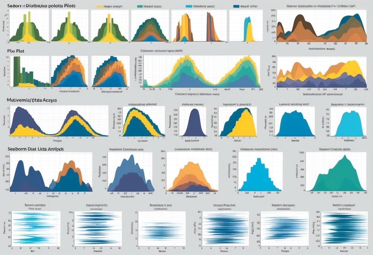
A computer screen showing a variety of Seaborn distribution plots with different plot types and customization options

Customizing plots in Seaborn helps reveal deeper insights and makes the visualizations more engaging. By adjusting color palettes and modifying plot sizes and bins, users can create aesthetically pleasing graphics that enhance data analysis.

Adjusting Color Palettes

Color palettes play a key role in how data is perceived. Seaborn offers a wide range of palettes to decorate plots effectively, improving clarity and emphasis.

For instance, users might choose the darkgrid theme for a professional look or whitegrid for a cleaner appearance. Each palette can highlight specific data points and trends.

Choosing colors that contrast well can make plots stand out. Seaborn makes it easy to experiment with different palettes like deep, muted, or colorblind to find the best fit for a dataset. This approach helps ensure that colors are not just visually appealing but also functional in emphasizing critical data points.

Modifying Plot Sizes and Bins

Adjusting plot sizes and bins is crucial for displaying data accurately.

Seaborn’s high-level interface allows easy resizing of plots, which ensures that visualizations fit well on various devices or publications. Modifying plot dimensions can prevent overcrowding or excessive whitespace, making information clearer.

Bins, particularly in histograms, determine the number of intervals that data is divided into. By increasing or decreasing bins, analysts can control the granularity of the data.

More bins can reveal detailed patterns, while fewer bins provide a broader overview, helping to avoid misleading interpretations.

For both size and bin adjustments, Seaborn provides flexibility, making plots more insightful and tailored to specific analytical needs.

Plot Types and Customization in Seaborn

Seaborn is a powerful library for creating a variety of plots. It offers different plot types like displot, relplot, and catplot, each serving specific purposes. Customization is possible through axes-level functions that allow users to tailor visuals to fit their data presentation needs.

Differentiating displot, relplot, and catplot

Displot is used for visualizing the distribution of data. It offers options for histograms and kernel density estimates. It’s ideal for understanding the frequency and spread of data points. This makes it useful for gaining insights into univariate data distributions.

Relplot focuses on relational data. It allows users to explore connections between variables.

This plot type is essential when examining trends or relationships, such as growth over time. Relplot can represent data using scatter plots or line plots, adaptable for both categorical and continuous data.

Catplot is best for categorical data visualization. It includes various plots like bar plots, box plots, and violin plots, among others. They help highlight different aspects of categorical variables.

Catplot is versatile for showing comparisons across categories in a dataset. These plot types allow for comprehensive and insightful data analysis.

Customizing with Axes-Level Functions

Axes-level functions are key for fine-tuning plots in Seaborn. Functions like sns.lineplot or sns.scatterplot provide granular control over the style and mapping of data.

They help customize aspects like color, markers, and line styles, which enhances the clarity of visual data representations.

Users can modify plots to highlight specific data points or trends by adjusting axes, labels, and titles. This customization supports clearer data interpretation.

Axes-level customization can make charts more informative and visually appealing. Customization empowers users by tailoring visuals to specific data analysis needs.

Statistical Data Visualization Techniques

Seaborn offers powerful tools for statistical data visualization, helping users understand complex datasets. This section explores methods for analyzing data distribution and regression, focusing on specific techniques to visualize general trends and detect outliers.

ECDF Plots for Distribution Analysis

Empirical Cumulative Distribution Function (ECDF) plots are crucial for understanding data distribution in a straightforward manner. The ECDF plot is a step function that displays the proportion of observations below or equal to each unique data value.

This plot is particularly useful for comparing multiple datasets, as it provides a visual representation of data spread and central tendencies.

Seaborn’s ecdfplot function is a handy tool for creating these graphs. By plotting data points on a uniform scale, users can easily assess distribution characteristics like skewness and identify outliers.

Compared to traditional histograms or density plots, ECDFs offer a clearer view of the distribution, especially in highlighting data tails. This makes ECDF plots a preferred choice for exploratory data analysis, especially when the goal is to compare distributions between different groups.

Regplot and lmplot for Regression

Seaborn also excels in regression analysis through functions like regplot and lmplot. These tools help visualize the relationship between two variables by fitting a regression line over scatter plots.

Such plots are essential in spotting trends, relationships, and potential outliers within the data.

The regplot function is useful for simply overlaying a linear fit on data, while lmplot offers more advanced options, such as faceting by additional variables. This allows for multi-panel plots that show the regression across subsets of data, thus providing deeper insights into complex relationships.

These plots help clarify whether a relationship is linear or if there are non-linear patterns present.

Incorporating regression plots into analysis allows for a clearer understanding of how variables interact statistically and visually.

Analyzing Distribution Characteristics

When analyzing data, understanding its distribution is key. Seaborn provides various tools to achieve this, especially through distribution plots. These plots help visualize how data points are spread across different values.

The histogram is one of the most common distribution plots. It groups data into bins and shows how many data points fall into each bin. This is useful for identifying patterns like skewness or data concentration.

Histogram Example

Another plot type is the density plot, which smooths out data distributions. It provides a more polished view compared to histograms, making it easier to see trends and peaks in the data.

Furthermore, the bivariate plots are excellent for exploring the relationship between two variables. These plots can include scatter plots or heatmaps.

For example, a bivariate distribution plot can reveal correlations by using a heatmap to display data density.

Seaborn also offers the pairplot, which combines different types of plots. This is useful for examining multiple variables at once, allowing for insightful multivariate analysis.

Analyzing distribution characteristics involves inspecting measures like skewness and kurtosis to understand the symmetry and peakedness of the distribution. With Seaborn’s distribution plots, users can effectively examine these features, providing a thorough overview of data characteristics.

Understanding Multivariate Data

A colorful array of Seaborn distribution plots showcasing various plot types and multivariate data analysis

Multivariate data involves observations with more than one variable. Analyzing these data points is essential for identifying patterns and relationships among variables. Tools like Seaborn provide versatile plots that reveal these complex structures.

Visualizing Multi-dimension Data

Visualizing multivariate data involves showing relationships between multiple variables. Pairplot is a powerful tool, offering comprehensive visuals by creating a grid of scatter plots for continuous variables. It helps identify clusters, trends, and correlations.

Another useful tool is FacetGrid, which lets users plot subsets of data across multiple facets. This is helpful to compare different categories of a categorical variable while analyzing continuous characteristics.

Seaborn’s scatter plots can also visualize multivariate data by using color to encode a third variable’s information. These methods are crucial in exploratory data analysis to understand and interpret complex datasets better. Learn more about these techniques by exploring the detailed guide on multivariate data analysis.

Frequently Asked Questions

A person studying a chart of different distribution plot types for Seaborn

Seaborn offers a variety of options for visualizing data distribution in Python. In this section, users will discover how to work with distribution plots and learn about specific plotting functions and customization techniques available in Seaborn.

How can one create and interpret a seaborn distribution plot in Python?

To create a distribution plot in Seaborn, use the distplot or displot function. These plots help visualize the distribution of a dataset, providing insights into patterns such as central tendency and variability. Interpreting these plots involves examining features like peak areas, spread, and any skewness present in the data.

What are the key differences between histogram and distribution plots in seaborn?

Histograms are used to group continuous variables into bins, showing the frequency of occurrences in each bin. Distribution plots, on the other hand, can include kernel density estimation (KDE) which smoothens the appearance, providing a more detailed view of the data’s distribution shape.

Which seaborn function is used to visualize data distribution?

Seaborn features several functions for visualizing data distribution, such as distplot, displot, and kdeplot. These functions offer flexibility in how data distributions are displayed, including options for histograms, KDE, and empirical cumulative distribution functions (ECDF).

In seaborn, which plots are most suitable for visualizing statistical distributions?

For visualizing statistical distributions, Seaborn’s KDE plots, histograms, and pair plots are quite effective. Each offers unique ways to understand data spread and relationships. KDE plots are particularly helpful for seeing smooth distribution curves, while pair plots can examine multi-variate relationships.

Can you outline the steps to customize the appearance of seaborn distribution plots?

Customization in Seaborn is straightforward. By altering parameters like color, alpha, and bins, users can tailor plot aesthetics. Additionally, using matplotlib settings, plots can be further refined with customized axes, titles, and labels for improved clarity and presentation.

What are the various options for plotting bivariate distributions using seaborn?

Seaborn offers several options for bivariate distributions, including scatterplot, kdeplot, and jointplot functions.

These plots help visualize relationships between two variables, showing patterns like correlation and clustering.

Joint plots, for instance, combine scatter plots with histograms or KDE for enhanced insights.

Categories
Uncategorized

Learning about DBSCAN: Mastering Density-Based Clustering Techniques

Understanding DBSCAN

DBSCAN stands for Density-Based Spatial Clustering of Applications with Noise.

This algorithm identifies clusters in data by looking for areas with high data point density. It is particularly effective for finding clusters of various shapes and sizes, making it a popular choice for complex datasets.

DBSCAN operates as an unsupervised learning technique. Unlike supervised methods, it doesn’t need labeled data.

Instead, it groups data based on proximity and density, creating clear divisions without predefined categories.

Two main parameters define DBSCAN’s performance: ε (epsilon) and MinPts.

Epsilon is the radius of the neighborhood around each point, and MinPts is the minimum number of points required to form a dense region.

Parameter Description
ε (epsilon) Radius of neighborhood
MinPts Minimum points in cluster

A strength of DBSCAN is its ability to identify outliers as noise, which enhances the accuracy of cluster detection. This makes it ideal for datasets containing noise and anomalies.

DBSCAN is widely used in geospatial analysis, image processing, and market analysis due to its flexibility and robustness in handling datasets with irregular patterns and noisy data. The algorithm does not require specifying the number of clusters in advance.

For more information about DBSCAN, you can check its implementation details on DataCamp and how it operates with density-based principles on Analytics Vidhya.

The Basics of Clustering Algorithms

In the world of machine learning, clustering is a key technique. It involves grouping a set of objects so that those within the same group are more similar to each other than those in other groups.

One popular clustering method is k-means. This algorithm partitions data into k clusters, minimizing the distance between data points and their respective cluster centroids. It’s efficient for large datasets.

Hierarchical clustering builds a tree of clusters. It’s divided into two types: agglomerative (bottom-up approach) and divisive (top-down approach). This method is helpful when the dataset structure is unknown.

Clustering algorithms are crucial for exploring data patterns without predefined labels.

They serve various domains like customer segmentation, image analysis, and anomaly detection.

Here’s a brief comparison of some clustering algorithms:

Algorithm Advantages Disadvantages
K-means Fast, simple Needs to specify number of clusters
Hierarchical No need to pre-specify clusters Can be computationally expensive

Each algorithm has strengths and limitations. Choosing the right algorithm depends on the specific needs of the data and the task at hand.

Clustering helps in understanding and organizing complex datasets. It unlocks insights that might not be visible through other analysis techniques.

Core Concepts in DBSCAN

DBSCAN is a powerful clustering algorithm used for identifying clusters in data based on density. The main components include core points, border points, and noise points. Understanding these elements helps in effectively applying the DBSCAN algorithm to your data.

Core Points

Core points are central to the DBSCAN algorithm.

A core point is one that has a dense neighborhood, meaning there are at least a certain number of other points, known as min_samples, within a specified distance, called eps.

If a point meets this criterion, it is considered a core point.

This concept helps in identifying dense regions within the dataset. Core points form the backbone of clusters, as they have enough points in their vicinity to be considered part of a cluster. This property allows DBSCAN to accurately identify dense areas and isolate them from less dense regions.

Border Points

Border points are crucial in expanding clusters. A border point is a point that is not a core point itself but is in the neighborhood of a core point.

These points are at the edge of a cluster and can help in defining the boundaries of clusters.

They do not meet the min_samples condition to be a core point but are close enough to be a part of a cluster. Recognizing border points helps the algorithm to extend clusters created by core points, ensuring that all potential data points that fit within a cluster are included.

Noise Points

Noise points are important for differentiating signal from noise.

These are points that are neither core points nor border points. Noise points have fewer neighbors than required by the min_samples threshold within the eps radius.

They are considered outliers or anomalies in the data and do not belong to any cluster. This characteristic makes noise points beneficial in filtering out data that does not fit well into any cluster, thus allowing the algorithm to provide cleaner results with more defined clusters. Identifying noise points helps in improving the quality of clustering by focusing on significant patterns in the data.

Parameters of DBSCAN

DBSCAN is a popular clustering algorithm that depends significantly on selecting the right parameters. The two key parameters, eps and minPts, are crucial for its proper functioning. Understanding these can help in identifying clusters effectively.

Epsilon (eps)

The epsilon parameter, often denoted as ε, represents the radius of the ε-neighborhood around a data point. It defines the maximum distance between two points for them to be considered as part of the same cluster.

Choosing the right value for eps is vital because setting it too low might lead to many clusters, each having very few points, whereas setting it too high might result in merging distinct clusters together.

One common method to determine eps is by analyzing the k-distance graph. Here, the distance of each point to its kth nearest neighbor is plotted.

The value of eps is typically chosen at the elbow of this curve, where it shows a noticeable bend. This approach allows for a balance between capturing the cluster structure and minimizing noise.

Minimum Points (minPts)

The minPts parameter sets the minimum number of points required to form a dense region. It essentially acts as a threshold, helping to distinguish between noise and actual clusters.

Generally, a larger value of minPts requires a higher density of points to form a cluster.

For datasets with low noise, a common choice for minPts is twice the number of dimensions (D) of the dataset. For instance, if the dataset is two-dimensional, set minPts to four.

Adjustments might be needed based on the specific dataset and the desired sensitivity to noise.

Using an appropriate combination of eps and minPts, DBSCAN can discover clusters of various shapes and sizes in a dataset. This flexibility makes it particularly useful for data with varying densities.

Comparing DBSCAN with Other Clustering Methods

DBSCAN is often compared to other clustering techniques due to its unique features and advantages. It is particularly known for handling noise well and not needing a predefined number of clusters.

K-Means vs DBSCAN

K-Means is a popular algorithm that divides data into k clusters by minimizing the variance within each cluster. It requires the user to specify the number of clusters beforehand.

This can be a limitation in situations where the number of clusters is not known.

Unlike K-Means, DBSCAN does not require specifying the number of clusters, making it more adaptable for exploratory analysis. However, DBSCAN is better suited for identifying clusters of varying shapes and sizes, whereas K-Means tends to form spherical clusters.

Hierarchical Clustering vs DBSCAN

Hierarchical clustering builds a tree-like structure of clusters from individual data points. This approach doesn’t require the number of clusters to be specified, either. It usually results in a dendrogram that can be cut at any level to obtain different numbers of clusters.

However, DBSCAN excels in dense and irregular data distributions, where it can automatically detect clusters and noise.

Hierarchical clustering is more computationally intensive, which can be a drawback for large datasets. DBSCAN, by handling noise explicitly, can be more robust in many scenarios.

OPTICS vs DBSCAN

OPTICS (Ordering Points To Identify the Clustering Structure) is similar to DBSCAN but provides an ordered list of data points based on their density. This approach helps to identify clusters with varying densities, which is a limitation for standard DBSCAN.

OPTICS can be advantageous when the data’s density varies significantly.

While both algorithms can detect clusters of varying shapes and handle noise, OPTICS offers a broader view of the data’s structure without requiring a fixed epsilon parameter. This flexibility makes it useful for complex datasets.

Practical Applications of DBSCAN

Data Mining

DBSCAN is a popular choice in data mining due to its ability to handle noise and outliers effectively. It can uncover hidden patterns that other clustering methods might miss. This makes it suitable for exploring large datasets without requiring predefined cluster numbers.

Customer Segmentation

Businesses benefit from using DBSCAN for customer segmentation, identifying groups of customers with similar purchasing behaviors.

By understanding these clusters, companies can tailor marketing strategies more precisely. This method helps in targeting promotions and enhancing customer service.

Anomaly Detection

DBSCAN is used extensively in anomaly detection. Its ability to distinguish between densely grouped data and noise allows it to identify unusual patterns.

This feature is valuable in fields like fraud detection, where recognizing abnormal activities quickly is crucial.

Spatial Data Analysis

In spatial data analysis, DBSCAN’s density-based clustering is essential. It can group geographical data points effectively, which is useful for tasks like creating heat maps or identifying regions with specific characteristics. This application supports urban planning and environmental studies.

Advantages:

  • No need to specify the number of clusters.
  • Effective with noisy data.
  • Identifies clusters of varying shapes.

Limitations:

  • Choosing the right parameters (eps, minPts) can be challenging.
  • Struggles with clusters of varying densities.

DBSCAN’s versatility across various domains makes it a valuable tool for data scientists. Whether in marketing, fraud detection, or spatial analysis, its ability to form robust clusters remains an advantage.

Implementing DBSCAN in Python

Implementing DBSCAN in Python involves using libraries like Scikit-Learn or creating a custom version. Understanding the setup, parameters, and process for each method is crucial for successful application.

Using Scikit-Learn

Scikit-Learn offers a user-friendly way to implement DBSCAN. The library provides a built-in function that makes it simple to cluster data.

It is important to set parameters such as eps and min_samples correctly. These control how the algorithm finds and defines clusters.

For example, you can use datasets like make_blobs to test the algorithm’s effectiveness.

Python code using Scikit-Learn might look like this:

from sklearn.cluster import DBSCAN
from sklearn.datasets import make_blobs

X, _ = make_blobs(n_samples=100, centers=3, random_state=42)
dbscan = DBSCAN(eps=0.5, min_samples=5)
clusters = dbscan.fit_predict(X)

This code uses DBSCAN from Scikit-Learn to identify clusters in a dataset.

For more about this implementation approach, visit the DataCamp tutorial.

Custom Implementation

Building a custom DBSCAN helps understand the algorithm’s details and allows for more flexibility. It involves defining core points and determining neighborhood points based on distance measures.

Implementing involves checking density reachability and density connectivity for each point.

While more complex, custom implementation can be an excellent learning experience.

Collecting datasets resembling make_blobs helps test accuracy and performance.

Custom code might involve:

def custom_dbscan(data, eps, min_samples):
    # Custom logic for DBSCAN
    pass

# Example data: X
result = custom_dbscan(X, eps=0.5, min_samples=5)

This approach allows a deeper dive into algorithmic concepts without relying on pre-existing libraries.

For comprehensive steps, refer to this DBSCAN guide by KDnuggets.

Performance and Scalability of DBSCAN

DBSCAN (Density-Based Spatial Clustering of Applications with Noise) is known for its ability to identify clusters of varying shapes and handle noise in data efficiently. It becomes particularly advantageous when applied to datasets without any prior assumptions about the cluster count.

The performance of DBSCAN is influenced by its parameters: epsilon (ε) and Minimum Points (MinPts). Setting them correctly is vital. Incorrect settings can cause DBSCAN to wrongly classify noise or miss clusters.

Scalability is both a strength and a challenge for DBSCAN. The algorithm’s time complexity is generally O(n log n), where n is the number of data points, due to spatial indexing structures like kd-trees.

However, in high-dimensional data, performance can degrade due to the “curse of dimensionality”. Here, the usual spatial indexing becomes less effective.

For very large datasets, DBSCAN can be computationally demanding. Using optimized data structures or parallel computing can help, but it remains resource-intensive.

The parameter leaf_size of tree-based spatial indexing affects performance. A smaller leaf size provides more detail but requires more memory. Adjusting this helps balance speed and resource use.

Evaluating the Results of DBSCAN Clustering

A computer displaying a scatter plot with clustered data points, surrounded by books and papers on DBSCAN algorithm

Evaluating DBSCAN clustering involves using specific metrics to understand how well the algorithm has grouped data points. Two important metrics for this purpose are the Silhouette Coefficient and the Adjusted Rand Index. These metrics help in assessing the compactness and correctness of clusters.

Silhouette Coefficient

The Silhouette Coefficient measures how similar an object is to its own cluster compared to other clusters. It ranges from -1 to 1, where higher values indicate better clustering.

A value close to 1 means the data point is well clustered, being close to the center of its cluster and far from others.

For DBSCAN, the coefficient is useful as it considers both density and distance. Unlike K-Means, DBSCAN creates clusters of varying shapes and densities, making the Silhouette useful in these cases.

It can highlight how well data points are separated, helping refine parameters for better clustering models.

Learn more about this from DataCamp’s guide on DBSCAN.

Adjusted Rand Index

The Adjusted Rand Index (ARI) evaluates the similarity between two clustering results by considering all pairs of samples. It adjusts for chance grouping and ranges from -1 to 1, with 1 indicating perfect match and 0 meaning random grouping.

For DBSCAN, ARI is crucial as it can compare results with known true labels, if available.

It’s particularly beneficial when clustering algorithms need validation against ground-truth data, providing a clear measure of clustering accuracy.

Using ARI can help in determining how well DBSCAN has performed on a dataset with known classifications. For further insights, refer to the discussion on ARI with DBSCAN on GeeksforGeeks.

Advanced Techniques in DBSCAN Clustering

In DBSCAN clustering, advanced techniques enhance the algorithm’s performance and adaptability. One such method is using the k-distance graph. This graph helps determine the optimal Epsilon value, which is crucial for identifying dense regions.

The nearest neighbors approach is also valuable. It involves evaluating each point’s distance to its nearest neighbors to determine if it belongs to a cluster.

A table showcasing these techniques:

Technique Description
K-distance Graph Helps in choosing the right Epsilon for clustering.
Nearest Neighbors Evaluates distances to decide point clustering.

DBSCAN faces challenges like the curse of dimensionality. This issue arises when many dimensions or features make distance calculations less meaningful, potentially impacting cluster quality. Reducing dimensions or selecting relevant features can alleviate this problem.

In real-world applications, advanced techniques like these make DBSCAN more effective. For instance, they are crucial in tasks like image segmentation and anomaly detection.

By integrating these techniques, DBSCAN enhances its ability to manage complex datasets, making it a preferred choice for various unsupervised learning tasks.

Dealing with Noise and Outliers in DBSCAN

DBSCAN is effective in identifying noise and outliers within data. It labels noise points as separate from clusters, distinguishing them from those in dense areas. This makes DBSCAN robust to outliers, as it does not force all points into existing groups.

Unlike other clustering methods, DBSCAN does not use a fixed shape. It identifies clusters based on density, finding those of arbitrary shape. This is particularly useful when the dataset has noisy samples that do not fit neatly into traditional forms.

Key Features of DBSCAN related to handling noise and outliers include:

  • Identifying points in low-density regions as outliers.
  • Allowing flexibility in recognizing clusters of varied shapes.
  • Maintaining robustness against noisy data by ignoring noise points in cluster formation.

These characteristics make DBSCAN a suitable choice for datasets with considerable noise as it dynamically adjusts to data density while separating true clusters from noise, leading to accurate representations.

Methodological Considerations in DBSCAN

DBSCAN is a clustering method that requires careful setup to perform optimally. It involves selecting appropriate parameters and handling data with varying densities. These decisions shape how effectively the algorithm can identify meaningful clusters.

Choosing the Right Parameters

One of the most crucial steps in using DBSCAN is selecting its hyperparameters: epsilon and min_samples. The epsilon parameter defines the radius for the neighborhood around each point, and min_samples specifies the minimum number of points within this neighborhood to form a core point.

A common method to choose epsilon is the k-distance graph, where data points are plotted against their distance to the k-th nearest neighbor. This graph helps identify a suitable epsilon value where there’s a noticeable bend or “elbow” in the curve.

Selecting the right parameters is vital because they impact the number of clusters detected and influence how noise is labeled.

For those new to DBSCAN, resources such as the DBSCAN tutorial on DataCamp can provide guidance on techniques like the k-distance graph.

Handling Varying Density Clusters

DBSCAN is known for its ability to detect clusters of varying densities. However, it may struggle with this when parameters are not chosen carefully.

Varying density clusters occur when different areas of data exhibit varying degrees of density, making it challenging to identify meaningful clusters with a single set of parameters.

To address this, one can use advanced strategies like adaptive DBSCAN, which allows for dynamic adjustment of the parameters to fit clusters of different densities. In addition, employing a core_samples_mask can help in distinguishing core points from noise, reinforcing the cluster structure.

For implementations, tools such as scikit-learn DBSCAN offer options to adjust techniques such as density reachability and density connectivity for improved results.

Frequently Asked Questions

DBSCAN, a density-based clustering algorithm, offers unique advantages such as detecting arbitrarily shaped clusters and identifying outliers. Understanding its mechanism, implementation, and applications can help in effectively utilizing this tool for various data analysis tasks.

What are the main advantages of using DBSCAN for clustering?

One key advantage of DBSCAN is its ability to identify clusters of varying shapes and sizes. Unlike some clustering methods, DBSCAN does not require the number of clusters to be specified in advance.

It is effective in finding noisy data and outliers, making it useful for datasets with complex structures.

How does DBSCAN algorithm determine clusters in a dataset?

The DBSCAN algorithm identifies clusters based on data density. It groups together points that are closely packed and labels the isolated points as outliers.

The algorithm requires two main inputs: the radius for checking points in a neighborhood and the minimum number of points required to form a dense region.

In what scenarios is DBSCAN preferred over K-means clustering?

DBSCAN is often preferred over K-means clustering when the dataset contains clusters of non-spherical shapes or when the data has noise and outliers.

K-means, which assumes spherical clusters, may not perform well in such cases.

What are the key parameters in DBSCAN and how do they affect the clustering result?

The two primary parameters in DBSCAN are ‘eps’ (radius of the neighborhood) and ‘minPts’ (minimum points in a neighborhood to form a cluster).

These parameters significantly impact the clustering outcome. A small ‘eps’ might miss the connection between dense regions, and a large ‘minPts’ might result in identifying fewer clusters.

How can you implement DBSCAN clustering in Python using libraries such as scikit-learn?

DBSCAN can be easily implemented in Python using the popular scikit-learn library.

By importing DBSCAN from sklearn.cluster and providing the ‘eps’ and ‘minPts’ parameters, users can cluster their data with just a few lines of code.

Can you provide some real-life applications where DBSCAN clustering is particularly effective?

DBSCAN is particularly effective in fields such as geographic information systems for map analysis, image processing, and anomaly detection.

Its ability to identify noise and shape-based patterns makes it ideal for these applications where other clustering methods might fall short.

Categories
Uncategorized

Learning Statistics for Data Science: A Comprehensive Guide for Beginners

Learning Statistics For Data Science – Descriptive Statistics

Descriptive statistics provide summaries of datasets through calculations and visualizations. Understanding these summaries helps in analyzing the spread, central tendency, and variability of the data.

These concepts are foundational in data science for interpreting numerical data.

Mean

The mean, often called the average, represents the central value of a dataset. It is calculated by adding all the data points together and dividing by the number of data points.

The mean is a useful measure of central tendency because it takes all data points into account, providing a comprehensive view of the dataset’s overall size and distribution. It is especially useful in large datasets where individual data values might obscure general trends. However, it can be affected by extreme values or outliers, making it less reliable in such cases.

Median

The median is the middle value in a dataset when arranged in ascending or descending order. If there is an even number of data points, the median is the average of the two central numbers.

This measure of central tendency is helpful because it is not influenced by outliers, providing a more accurate reflection of a typical data point in skewed data. It is often preferred when the dataset includes extreme values or is not symmetrically distributed, ensuring that the center of the dataset is accurately represented without distortion from anomalies.

Mode

The mode is the most frequently occurring value in a dataset. In certain datasets, there can be more than one mode or no mode at all.

The mode is particularly useful in categorical data where numerical measures like mean and median may not be applicable. It highlights the most common category or response in a survey or experiment. In datasets with a uniform distribution, identifying the mode provides insight into repeated patterns or occurrences, enabling a more nuanced understanding of data clusters.

Skewness

Skewness measures the asymmetry of a data distribution. A distribution can be skewed to the right (positively skewed) or to the left (negatively skewed).

In a right-skewed distribution, the tail is on the right, and the bulk of the data points lie to the left. Conversely, a left-skewed distribution has a longer tail on the left side.

Skewness affects the measures of central tendency. For instance, in a positively skewed distribution, the mean is usually greater than the median. Understanding skewness helps in identifying potential biases and inaccuracies in data interpretation.

Range And IQR

The range is the difference between the maximum and minimum values in a dataset. It is a simple measure of variability but does not reflect how data is distributed between these values.

The interquartile range (IQR) provides a more robust measure by showing the range within which the central 50% of values lie, specifically between the first quartile (25th percentile) and the third quartile (75th percentile).

IQR is less affected by outliers and provides a better sense of data spread, particularly in distributions with extreme values or outliers.

Sample Vs Population

In statistics, a population includes all elements from a set in question, whereas a sample is a subset of the population.

When calculating statistics, it is crucial to distinguish between these two because it influences calculations like variance and standard deviation.

Population metrics are denoted without modifications, while sample metrics involve adjustments such as Bessel’s correction in sample standard deviation. Thus, when estimating statistics, sample data is used to make inferences about the population, ensuring relevance and accuracy in findings.

Variance And Standard Deviation

Variance measures the dispersion of a dataset by averaging the squared differences between each data point and the mean. A higher variance indicates greater variability.

Standard deviation, the square root of variance, provides a measure of dispersion relative to the mean in the same units as the data itself.

These concepts are crucial as they indicate how much data points vary from the average, assisting in identifying consistency, reliability, and spreading within datasets. High standard deviation suggests data is spread out over a wider range.

Scaling And Shifting

Scaling involves multiplying each data point by a constant, which affects measures like mean and range but not the distribution shape or skewness.

Shifting, or translating, involves adding or subtracting a constant to each data point, affecting the dataset’s location without changing its shape or spread.

These transformations are common in data preprocessing, allowing datasets to fit model requirements or improve algorithm performance.

Preserving relationships while standardizing input data enhances interpretability and comparison across different datasets.

Learning Statistics for Data Science – Distribution Theory

Understanding different types of probability distributions is crucial in data science for making predictions and conducting hypothesis tests. Distributions like the normal, binomial, and Poisson help describe data behavior and patterns effectively.

Normal Distribution

The normal distribution, also known as the Gaussian distribution, is vital in statistics. It has a symmetrical bell shape where most values cluster around the mean.

This distribution is significant because many natural phenomena, such as heights and test scores, follow this pattern.

In a normal distribution, the mean, median, and mode are all equal. Its standard deviation determines the spread. A smaller standard deviation means data points are close to the mean, while a larger one means they are more spread out.

Data scientists often assume normality to apply statistical methods. The normal distribution is also essential in constructing confidence intervals and performing hypothesis tests.

Furthermore, understanding its properties helps in transforming and normalizing data, enhancing the application of algorithms that require normally distributed data inputs.

Z-Scores

A Z-score measures how many standard deviations an element is from the mean of the distribution. Z-scores are crucial for comparing data points from different distributions or datasets.

They standardize data, allowing for comparisons across different scales.

Calculating Z-scores involves subtracting the mean from a data point and then dividing by the standard deviation. This transformation results in a standardized value.

Z-scores are especially helpful in identifying outliers, as scores beyond +/- 3 in a standard normal distribution are considered unusual.

Data scientists use Z-scores in various applications. One common use is in the normalization process, ensuring different datasets are comparable.

Z-scores also enable understanding of the probability of a data point occurring within a certain distance from the mean in a normal distribution.

Binomial Distribution

The binomial distribution describes the number of successes in a fixed number of binary experiments, like flipping a coin. It is characterized by two parameters: the number of trials and the probability of success in each trial.

This distribution is essential when analyzing events with two possible outcomes, such as success/failure, yes/no, or true/false scenarios. Each trial is independent, and the likelihood of success remains constant throughout.

Data scientists apply the binomial distribution to model scenarios in fields such as quality control and genetics.

For instance, predicting the number of defective items in a batch can use the binomial model.

Formula for probability in this distribution often includes combinations, helping to determine the likelihood of a certain number of successes occurring.

Poisson Distribution

The Poisson distribution models the number of events occurring within a fixed interval of time or space, given a known constant mean rate and the events occurring independently of each other. It’s well-suited for rare events.

Unlike the binomial distribution, the Poisson distribution can take on infinitely many values as events don’t have a predefined number of occurrences.

This distribution is characterized by the parameter lambda (λ), which is both the mean and the variance.

Common applications of Poisson distribution include modeling occurrences of events like typing errors in a book or the arrival of customers at a store.

The Poisson model is useful for understanding the likelihood of a given number of events happening over a certain period or in a specific area, making it valuable in fields like telecommunications and epidemiology.

Learning Statistics For Data Science – Probability Theory

Probability theory is essential for data science as it underpins many statistical methods. It helps in making predictions and understanding data patterns.

Key concepts like independent and dependent events are foundational for mastering data science. Understanding these concepts supports skills like inferential statistics and random sampling.

Understanding Probability

Probability measures the likelihood of an event occurring. It ranges from 0 to 1, with 0 meaning an event will not happen, and 1 indicating it will definitely occur.

This concept is important for making predictions based on data. In data science, probability helps in evaluating the uncertainty and variability of data.

With the basics of probability, data scientists can assess risks and make informed decisions.

Calculating Simple Probabilities

Simple probabilities refer to the likelihood of a single event happening. Calculating these involves dividing the number of favorable outcomes by the total number of possible outcomes.

For example, the probability of drawing a red card from a standard deck of cards is calculated by dividing the number of red cards by the total cards.

Mastering these calculations is essential for building complex probability models.

Rule Of Addition

The Rule of Addition helps in finding the probability of either of two events happening.

For example, when rolling a die, the probability of rolling a 2 or a 3 is calculated by adding the probabilities of each event. If the events are not mutually exclusive, adjust the calculation to avoid double-counting.

This rule is crucial for scenarios with overlapping events where either outcome is acceptable.

Rule Of Multiplication

The Rule of Multiplication calculates the probability of two or more independent events occurring together.

For instance, finding the probability of flipping two heads with a coin involves multiplying the probability of one head by itself.

This rule is essential in predicting combined outcomes. When dealing with dependent events, incorporating conditional probabilities is vital to get accurate results.

Bayes Theorem

Bayes Theorem is a method that calculates the probability of a hypothesis based on prior knowledge.

This theorem is particularly useful in data science for updating predictions as new data becomes available.

Conditional probability is central to Bayes Theorem. It adjusts initial beliefs in light of evidence, making it invaluable for fields like machine learning and predictive analytics.

Expected Values

Expected values provide an average outcome that one can expect from a random experiment, over many repetitions.

It is calculated by multiplying each possible outcome by its probability and summing the results.

Expected value helps in making decisions about uncertain situations. By using expected values, data scientists can evaluate different strategies and choose the one with the optimal anticipated return.

Law Of Large Numbers

The Law of Large Numbers states that, as the number of trials increases, the experimental probability of an event will get closer to the theoretical probability.

This concept ensures that results stabilize and become predictable over large samples. In inferential statistics, this law explains why averages become more reliable indicators of expected values as sample sizes grow.

Central Limit Theorem

The Central Limit Theorem is a fundamental principle stating that the distribution of sample means will approximate a normal distribution, even if the original data is not normally distributed, provided the sample size is sufficiently large.

This theorem is crucial for inferential statistics. It allows data scientists to make predictions about population parameters, making it possible to generalize findings from a sample to a whole population.

Learning Statistics For Data Science – Testing Hypotheses

Hypothesis testing is a crucial tool in statistics that helps determine the validity of an assumption or claim.

It provides a way to make informed decisions based on data, focusing on significance levels, p-values, confidence intervals, and more. Understanding these concepts is essential for analyzing data accurately.

Understanding A Hypothesis

A hypothesis is a statement that proposes an explanation for a phenomenon. It is usually formulated in a way that can be tested with data. In hypothesis testing, two main types of hypotheses are considered: the null hypothesis and the alternative hypothesis.

The null hypothesis (H0) often suggests no effect or difference, while the alternative hypothesis (H1) indicates the presence of an effect or difference.

These hypotheses are critical for conducting a test. By examining data samples, researchers can determine whether to reject the null hypothesis in favor of the alternative. This process is central to various fields, helping to validate claims and support data-driven decisions.

Significance Level

The significance level, denoted by alpha (α), is a threshold used to judge whether the results of a hypothesis test are statistically significant. Typically, a significance level of 0.05 is used as a standard in many fields. This means there is a 5% chance of rejecting the null hypothesis when it is true.

Choosing the right significance level is crucial. A lower significance level means stricter criteria for rejecting the null hypothesis, possibly reducing the risk of a Type I error. However, it may also increase the chance of a Type II error. Balancing these errors is important for accurate statistical analysis.

P-Value

The p-value is a measure used in hypothesis testing to assess the strength of the evidence against the null hypothesis. It indicates the probability of observing the test result, or more extreme, if the null hypothesis is true. A smaller p-value suggests stronger evidence against the null hypothesis.

If the p-value is less than the chosen significance level, the null hypothesis is rejected. For example, a p-value of 0.03 would indicate a significant result at the 0.05 level. In statistical testing, p-values help determine if an observed effect is real or due to random chance.

Errors: Type I And Type II

In hypothesis testing, two types of errors can occur: Type I and Type II errors. A Type I error occurs when the null hypothesis is incorrectly rejected, also known as a false positive. The probability of making a Type I error is represented by the significance level (α).

A Type II error happens when the null hypothesis is wrongly accepted, known as a false negative. The probability of this error is denoted by beta (β). Reducing one type of error may increase the other, so careful consideration is needed in designing tests to balance these errors.

Confidence Intervals

Confidence intervals provide a range of values that likely contain the population parameter. They give an idea of the uncertainty around a sample statistic. A common confidence level is 95%, which implies that the interval would contain the true parameter 95 times out of 100 repeated samples.

Confidence intervals are crucial in hypothesis testing as they offer more information than a simple test result. They help quantify the precision of an estimate and support conclusions about the population, making them valuable in decision-making processes.

Margin Of Error

The margin of error indicates the amount of random sampling error in a survey’s results. It is the range in which the true population parameter is expected to lie. The margin of error depends on factors such as sample size and variability in the data.

In hypothesis testing, the margin of error helps understand the precision of estimates. A smaller margin of error means a more accurate estimate. Considering this aspect is important when evaluating statistical results and interpreting data.

Calculating Sample Size And Power

Sample size calculation is crucial for designing an effective hypothesis test. It impacts the power of the test, which is the probability of correctly rejecting the null hypothesis when it is false. Adequate sample size ensures reliable and valid results.

Calculating sample size involves factors like desired power, significance level, effect size, and population variability. A well-calculated sample size helps achieve meaningful results in research, improving the robustness of statistical findings.

How To Conduct A Hypothesis Test

Conducting a hypothesis test involves several steps. First, formulate the null and alternative hypotheses. Second, choose an appropriate test and set the significance level.

Next, collect and analyze data to calculate the test statistic. Compare the test statistic to critical values or compute a p-value to make a decision. If the p-value is below the significance threshold, reject the null hypothesis.

T-Test

A t-test is a statistical test used to compare the means of two groups. It is useful when the sample size is small and population variance is unknown. There are several types of t-tests, including one-sample, independent two-sample, and paired-sample t-tests.

The choice of t-test depends on the data structure. By comparing means, t-tests help determine if observed differences are statistically significant, aiding in hypothesis testing and decision-making processes.

T-Distribution

The t-distribution is a probability distribution used in statistical hypothesis testing. It is similar to the normal distribution but has heavier tails, which makes it suitable for small sample sizes. As sample size increases, the t-distribution approaches the normal distribution.

T-distributions are fundamental when conducting t-tests as they adjust for sample size, providing more accurate results. This distribution is a key tool for making inferences about population parameters based on sample data.

Proportion Testing

Proportion testing is used to assess if the proportions of two or more groups are different. It is often applied when comparing binary outcomes like success/failure rates. The test evaluates if observed differences in proportions are statistically significant.

Proportion tests are widely used in fields such as medicine and marketing to determine the effectiveness of interventions. They help validate assumptions about group differences, supporting data-driven conclusions.

Important P-Z Pairs

In hypothesis testing, understanding p-z pairs is important for interpreting results. The p-value helps determine statistical significance, while the z-score indicates how many standard deviations an observation is from the mean.

These pairs are often used in large sample tests like z-tests, which compare sample and population means. By analyzing these pairs, researchers can confidently ascertain if their findings are significant, thus aiding in making informed decisions based on statistical evidence.

Learning Statistics For Data Science – Regressions

Regressions are key to understanding relationships in data science. They help in predicting outcomes and assessing how variables relate. This section covers different regression concepts crucial for data science.

Linear Regression

Linear regression is a method used to model the relationship between a dependent variable and one or more independent variables. It aims to find the best-fitting straight line through data points. This line is known as the regression line.

In a simple linear regression, the relationship between variables is expressed by the equation (y = mx + c), where (m) is the slope and (c) is the intercept.

Through this approach, data scientists can predict outcomes and understand how changes in independent variables affect the dependent variable. For example, linear regression can predict sales growth based on marketing spend. When applied properly, it provides valuable insights into the direction and strength of relationships between variables.

Correlation Coefficient

The correlation coefficient is a measure that describes the strength and direction of a linear relationship between two variables. It ranges from -1 to 1.

A value close to 1 indicates a strong positive correlation, meaning that as one variable increases, so does the other. Conversely, a value close to -1 indicates a strong negative correlation.

This coefficient helps in understanding how well changes in one variable predict changes in another, which is useful in regression analysis. It is important to note that a correlation coefficient close to zero suggests no linear relationship. Correlations do not imply causation but aid in identifying patterns and potential predictors within datasets.

Residual, MSE, And MAE

Residuals are the differences between observed values and the values predicted by a regression model. They indicate the errors in the predictions.

Mean Squared Error (MSE) is the average of the squares of these residuals and measures the model’s accuracy. A smaller MSE indicates better accuracy in the model’s predictions.

Mean Absolute Error (MAE), on the other hand, is the average of the absolute values of the residuals. It provides a straightforward measure of prediction error without squaring the residuals.

Both MSE and MAE are crucial in evaluating the performance of a regression model, helping data scientists choose the most effective model for their data.

Coefficient Of Determination

The Coefficient of Determination, often denoted as (R^2), explains the proportion of variance in the dependent variable that is predictable from the independent variable(s). An (R^2) value close to 1 means a high level of predictive accuracy by the model. It provides insight into the goodness of fit of a regression model.

Despite its usefulness, (R^2) alone does not determine if a regression model is good. Instead, it should be evaluated in combination with other metrics. A high (R^2) value, along with low MSE and MAE, indicates a robust and reliable model.

Root Mean Square Error

The Root Mean Square Error (RMSE) is another metric used to evaluate the accuracy of a regression model. It is the square root of the MSE and measures the difference between observed and predicted values.

The RMSE is expressed in the same units as the dependent variable, offering an intuitive sense of prediction error.

Lower RMSE values signify better model performance. RMSE is particularly useful when comparing different models or evaluating the same model’s performance over different datasets. By analyzing RMSE, data scientists can refine their models to make more accurate predictions and improve decision-making processes.

Learning Statistics For Data Science – Advanced Regressions And ML Algorithms

A computer screen displaying advanced regression and machine learning algorithms with statistical formulas and data visualizations

Advanced regression techniques and machine learning algorithms play a crucial role in addressing complex data science problems. These methods help in model building, tackling challenges like overfitting, and effectively dealing with missing data.

Multiple Linear Regression

Multiple linear regression is used when predicting the outcome based on several predictor variables. This method assumes a linear relationship between the dependent and independent variables. In data science, it’s essential for understanding how multiple factors simultaneously affect a response variable.

The process involves estimating regression coefficients using methods like least squares. One must check for multicollinearity, as it can skew results.

Multicollinearity occurs when predictor variables are too similar to each other. It’s important to assess model performance using metrics like R-squared and adjusted R-squared.

Overfitting

Overfitting happens when a model learns the training data too well, capturing noise along with the signal. This results in a poor performance on new, unseen data. It is especially a problem in complex models with many parameters.

To combat overfitting, techniques such as cross-validation, regularization, and pruning in decision trees are used.

Regularization methods like Lasso and Ridge add penalties to the model parameters to avoid complexity.

Cross-validation helps verify model stability by checking its performance on different data subsets.

Polynomial Regression

When the relationship between variables is not linear, polynomial regression is useful. This method allows the inclusion of polynomial terms to model curved relationships. For instance, it can provide a better fit for data that shows a quadratic trend.

The main challenge with polynomial regression is the risk of overfitting, as higher-degree polynomials can fit the training data too well. A balance must be struck between model complexity and generalization.

Visualization of the fit can aid in selecting the appropriate degree for the polynomial.

Logistic Regression

Logistic regression is used for modeling binary outcomes. Unlike linear regression, it predicts the probability of an event occurring by fitting data to a logistic curve. It’s widely used in classification tasks within machine learning.

Key features include the use of maximum likelihood estimation to find parameters and the ability to work with both binary and multinomial cases.

Interpretation of coefficients involves understanding their effect on the log-odds of the outcome, providing insights into data trends.

Decision Trees

Decision trees are simple yet powerful tools for decision-making in machine learning. They split data into subsets based on the value of different attributes, forming a tree-like structure.

Trees are easy to interpret but prone to overfitting.

To improve robustness, techniques like pruning are used to remove parts of the tree that do not provide power.

They work well for both classification and regression tasks, with clear visual representation making them easy to understand.

Regression Trees

Regression trees specialize in predicting a continuous outcome. Unlike decision trees, which handle classification, regression trees work well for numerical data.

They split the data into regions with a simple model, like a mean, used in each.

These trees help handle non-linear relationships by partitioning data into increasingly homogeneous groups.

A regression tree’s splits are chosen to minimize variance in each section, making them valuable for specific regression problems.

Random Forests

Random forests are ensembles of decision trees, enhancing model accuracy and robustness. Each tree in the forest votes on the prediction, reducing overfitting and improving performance compared to a single tree.

By using random subsets of data and features, random forests achieve bagging, which improves prediction stability.

This method is effective for both classification and regression tasks in machine learning, providing more reliable and generalized models.

Dealing With Missing Data

Handling missing data is a critical step in data preprocessing. It involves techniques like imputation, where missing values are filled using the mean, median, or a predicted value.

In some models, such as trees, handling missing data can be done more naturally.

Strategies depend on the data and the problem context. Imputation methods must be chosen carefully to avoid bias.

Sometimes, data can be dropped if its absence is not crucial. Good handling ensures high-quality inputs for machine learning models.

Learning Statistics for Data Science – Analysis of Variance (ANOVA)

ANOVA is a technique used to compare the means from different groups and determine if they are significantly different from each other. It is particularly useful when dealing with more than two groups.

Understanding ANOVA is crucial for data science, where comparing and analyzing data efficiently is key.

Basics and Assumptions

ANOVA is built on certain assumptions. First, it assumes that the samples are independent. This means the data from one group should not influence another.

Second, the populations from which the samples are drawn need to be normally distributed. It’s also important that these populations have the same variance, known as homogeneity of variance.

Another important assumption is that ANOVA works best with interval or ratio scale data. This kind of data provides more meaningful measures for the test.

Knowing these assumptions helps to ensure the validity of the ANOVA test results. If these conditions aren’t met, the reliability of the test could be compromised, leading to inaccurate conclusions.

One-Way ANOVA

One-way ANOVA is used when comparing the means of three or more groups based on one independent variable. This test helps in determining whether there is a statistically significant difference between the group means.

For example, it can be applied in testing the effectiveness of three different teaching methods on students’ scores.

In a one-way ANOVA, the key component is calculating the F-statistic. This value is determined by the ratio of variance between the groups to the variance within the groups.

A higher F-statistic suggests a greater difference among group means, indicating a potential significant effect.

F-Distribution

ANOVA uses the F-distribution to test the hypothesis. The F-distribution is a family of curves that are defined by two types of degrees of freedom: one for the numerator and another for the denominator.

It is positively skewed and only takes on positive values.

This distribution is crucial in determining the probability of observed data under the null hypothesis, which states that all group means are equal.

By comparing the F-statistic to this distribution, one can assess whether the differences observed are statistically significant. Understanding the F-distribution helps in interpreting ANOVA results correctly.

Two-Way ANOVA – Sum of Squares

Two-way ANOVA is an extension of one-way ANOVA. It analyzes the effect of two independent variables at once. It helps in understanding if there is an interaction between these two factors.

The main focus here is on the sum of squares, which helps break down the total variation in the data.

The sum of squares in two-way ANOVA includes three components: sum of squares for each factor and the interaction sum of squares.

Each part contributes to understanding the variability attributed to each factor and their interaction. This thorough breakdown aids in identifying which factors significantly affect the outcomes.

Two-Way ANOVA – F-Ratio and Conclusions

The F-ratio in two-way ANOVA examines both main effects and interactions. This involves comparing the mean squares of each factor and their interaction to the mean square of the error.

Each F-ratio tests the significance of its respective factor or interaction.

If the calculated F-ratio is larger than the critical value from the F-distribution, it means the factor or interaction significantly affects the outcome.

This allows for determining which independent variables have meaningful impacts on the dependent variable. A clear understanding of the F-ratio aids in making informed conclusions about data relationships.

Frequently Asked Questions

A stack of books on statistics surrounded by question marks and data charts

Statistics for data science involves learning core topics and techniques. It includes mastering statistical methods and using tools like R for data analysis. Here are some common questions and their answers.

What are the essential statistics topics I need to master for a career in data science?

Key topics include statistical inference, exploratory data analysis, and data cleaning. Understanding probability, hypothesis testing, and regression analysis is crucial.

Familiarity with statistical techniques to interpret data is important as well.

Can you recommend any free resources to learn statistics for data science?

Platforms like Coursera and edX offer free courses like Statistics for Data Science Essentials. Many libraries also provide free access to textbooks and online resources.

How long, on average, does it take to become proficient in statistics for entering the data science field?

The time varies based on prior experience. Generally, dedicated study over several months is typical.

Beginners might need six months to a year, combining academic material with practical projects.

What are the best online courses or books to study statistics for data science?

Online courses from Coursera and resources like “The Elements of Statistical Learning” by Hastie, Tibshirani, and Friedman are excellent. These provide a solid foundation in statistical methods.

How does statistical learning differ from traditional statistics in the context of data science?

Statistical learning focuses on algorithms and models for prediction and insights, whereas traditional statistics emphasizes hypothesis testing and estimation.

It integrates machine learning techniques to handle large datasets.

Are there any community-driven platforms where I can learn statistics for data science?

Yes, platforms like TidyTuesday offer community-driven learning spaces. TidyTuesday is a weekly data analysis meetup. Participants can practice R programming and apply statistical learning techniques.

Categories
Uncategorized

Learning Window Functions – RANK and DENSE_RANK: Mastering Advanced SQL Techniques

Understanding Window Functions

Window functions in SQL are essential for tasks like data analysis. They offer capabilities that standard aggregate functions cannot. They allow operations across a set of table rows that are related to the current row, providing insights without collapsing the data set.

Key Features:

  • Rankings: Functions like RANK() and DENSE_RANK() offer ways to assign ranks to rows within a partition. Unlike traditional aggregates, they maintain the detail of each row.
  • Running Totals: By using window functions, it is possible to calculate cumulative sums or other totals that add value with each row processed.
  • Moving Averages: These provide a way to smooth data over a specified window, helping to identify trends by averaging out fluctuations.

Aggregate vs. Analytic:
Aggregate functions summarize data, often reducing it to a single result per group. In contrast, window functions don’t summarize down—they provide additional metadata across the existing records, such as running totals or rankings.

Syntax Basics:

SELECT column_name, 
  RANK() OVER(PARTITION BY column_name ORDER BY some_value) AS rank
FROM table_name;

This example demonstrates the power of window functions by ranking within partitions, useful for complex data analysis. For instance, ranking data in financial reports gives insights into high sales performers without altering the data structure.

Exploring Ranking Window Function

Ranking window functions in SQL are essential for ordering and assigning ranks to data. These functions include RANK(), DENSE_RANK(), and ROW_NUMBER(), each providing unique advantages depending on the requirements. Understanding their usage helps in efficiently sorting and ranking datasets in a database.

Differentiating RANK, DENSE_RANK, and ROW_NUMBER

Each of these functions has distinct characteristics. RANK() provides a ranking with possible gaps in the sequence when ties occur. For example, if two rows tie for second place, the next rank will be four.

DENSE_RANK() assigns ranks without gaps, maintaining a continuous sequence even when ties exist.

ROW_NUMBER() assigns a unique sequential integer to rows, without considering ties, ensuring no repeating numbers. Understanding these differences is crucial for applying the correct function for specific needs.

Implementing RANK() Function

The RANK() function assigns ranks based on the order of a specified column. It returns the same rank for duplicate values, skipping subsequent numbers.

This function is ideal when understanding relative positions with gaps is essential. Example syntax:

SELECT column_name, RANK() OVER (ORDER BY column_name) AS rank
FROM table_name;

This example ranks data based on the specified column, helpful when analyzing ranked data with gaps.

Implementing DENSE_RANK() Function

DENSE_RANK() is similar to RANK(), but it does not skip numbers after a tie. It assigns consecutive rankings, making it useful when continuous ranking is necessary, such as leaderboard scenarios.

A basic example is:

SELECT column_name, DENSE_RANK() OVER (ORDER BY column_name) AS dense_rank
FROM table_name;

This ensures no ranking gaps, providing a continuous rank list for tied values.

Implementing ROW_NUMBER() Function

ROW_NUMBER() is used for assigning unique ranks to each row in a dataset. It does not consider ties and generates a sequential rank across the dataset. This is beneficial for tasks requiring unique identifiers within partitions or the entire dataset.

Here is an example:

SELECT column_name, ROW_NUMBER() OVER (ORDER BY column_name) AS row_num
FROM table_name;

This example provides a unique number for each row, useful for pagination or ordered listings.

SQL Syntax for Window Functions

A computer screen displaying SQL syntax for window functions with examples of RANK and DENSE_RANK

SQL window functions are powerful tools for performing calculations across a set of table rows. These functions allow users to return additional information in a query without altering the original dataset.

The basic syntax involves three main clauses: OVER(), PARTITION BY, and ORDER BY.

  • OVER(): This clause is essential for window functions and specifies the window or set of rows used for the calculations. It’s required in SQL window functions and works like a container defining the scope for each calculated value.

  • PARTITION BY: This clause is optional and divides the result set into partitions. The function is then applied to each partition as if it were a separate dataset. For example, to rank employees by department, one can partition by the department column.

  • ORDER BY: When ranking data, the ORDER BY clause is necessary to define the sequence within each partition. This determines how ranks are assigned. For example, to rank sales data by revenue, you might order by the revenue column.

Here is an example showing the syntax with placeholders:

RANK() OVER(PARTITION BY column_name ORDER BY column_name)

The example above ranks rows within each partition created by PARTITION BY. Adjust the clauses based on your data analysis needs. Use different window functions like RANK(), DENSE_RANK(), or ROW_NUMBER() as needed for varied results.

Utilizing OVER() Clause

The OVER() clause is essential in SQL for applying window functions. It defines the set of rows, or the “window,” over which the function operates. This clause is key for functions like RANK, DENSE_RANK, and ROW_NUMBER.

Key Components

  1. PARTITION BY: This part of the OVER() clause allows users to divide the query result into partitions. Each partition is processed separately by the window function.

  2. ORDER BY: After dividing the data into partitions, the ORDER BY clause determines the order in which rows are processed. It is fundamental for ranking functions to assign ranks based on specific criteria.

For instance, when using RANK with a specified PARTITION BY clause and an ORDER BY clause, each partition will have a ranking sequence starting from one. If using DENSE_RANK, ties will not create gaps in ranks.

Examples

  • RANK OVER ORDER BY:

    SELECT RANK() OVER(ORDER BY salary DESC) AS Rank
    FROM employees;
    
  • DENSE_RANK WITH PARTITION:

    SELECT DENSE_RANK() OVER(PARTITION BY department ORDER BY salary DESC) AS DenseRank
    FROM employees;
    

These examples show how the OVER() clause can be used to apply ranking functions. Correct application of the clause can lead to more insightful data analysis.

Partitioning Data with PARTITION BY

In SQL, the PARTITION BY clause is essential for organizing data into distinct groups, known as partitions. It allows each segment to be processed independently while still being part of a larger dataset. This means computations like ranking can be performed separately within each partition.

The PARTITION BY clause is particularly useful when combined with window functions like RANK() and DENSE_RANK(). These functions calculate rank based on specific criteria within each partition, providing a way to efficiently sort and rank rows alongside other metrics.

Unlike the GROUP BY clause, which aggregates results and reduces the number of rows returned, the PARTITION BY clause keeps all rows intact. This distinction is crucial when detailed row-by-row analysis is necessary without losing any data from the result set.

Example SQL Query

SELECT 
    Employee_ID, 
    Department_ID, 
    Salary, 
    RANK() OVER (PARTITION BY Department_ID ORDER BY Salary DESC) as SalaryRank 
FROM 
    Employees;

In this example, employees are ranked by salary within each department, thanks to the PARTITION BY Department_ID clause. Each department’s employees are treated as separate groups, allowing for more targeted analysis of salary distribution.

By using PARTITION BY, businesses can perform detailed data analysis while maintaining data integrity across partitions. It enables better insights without the constraints present in more traditional grouping methods. Explore more detailed usage at GeeksforGeeks – Window Functions in SQL.

Ordering Rows with ORDER BY

In SQL, the ORDER BY clause is essential for sorting query results. This clause can sort data in ascending or descending order based on one or more columns. When used in database queries, it ensures that the data is presented in a specific sequence.

The ORDER BY clause can function with or without the PARTITION BY clause. Without PARTITION BY, ORDER BY will sort the entire result set. This is useful when a global order is needed across all rows.

Using ORDER BY with PARTITION BY allows sorting within each partition separately. This means that each subset of data defined by PARTITION BY will have its own order, often used with window functions such as RANK or DENSE_RANK for more granular control over data ordering.

Here’s a simple syntax example:

SELECT column1, column2
FROM table_name
ORDER BY column1 [ASC|DESC];

In this example, the data is sorted by column1 in either ascending or descending order, as specified.

When implementing ORDER BY in SQL window functions, it is crucial to carefully select the columns that dictate the order. The choice of columns can significantly impact how functions like RANK and DENSE_RANK are applied, affecting the final output and data analysis.

Computing Running Totals and Averages

In SQL, window functions like SUM() and AVG() are used to calculate running totals and averages over a set of rows.

Running Total: This calculates a cumulative sum of a column’s values. For example, a sales dataset can show a running total of sales over time. This helps see the overall growth trend.

SELECT
    date,
    sales,
    SUM(sales) OVER (ORDER BY date) AS running_total
FROM
    sales_data;

Running Average: Similar to running totals, this calculates the average of values up to each row in the dataset. This is useful for spotting changes in trends or performance.

SELECT
    date,
    sales,
    AVG(sales) OVER (ORDER BY date) AS running_average
FROM
    sales_data;

Moving Average differs slightly as it uses a specific range of rows. It smoothens out fluctuations by averaging a fixed number of previous rows.

These functions are widely used in analytics for various calculations and insights. They allow data analysts to compare individual data points against overall trends without complicated joins or subqueries. Exploring more about these can be beneficial for efficient data analysis, which you can read about in this comprehensive guide.

Handling Ties in Rankings

When working with SQL rankings, ties can occur, especially when ranking sports scores, sales figures, or test results. The RANK and DENSE_RANK functions handle these ties differently.

RANK assigns the same position to tied rows. For instance, if two students have the same score and rank first, the next student will be ranked third, leaving a gap.

Student Score RANK
A 95 1
B 95 1
C 90 3

DENSE_RANK also assigns the same position to tied rows but does not leave gaps in the ranking sequence. This can be useful in tight competitions where every rank matters.

Student Score DENSE_RANK
A 95 1
B 95 1
C 90 2

In databases like SQL Server, both functions are pivotal for sorting and ordering queries efficiently, helping users decide the best way to display results based on their specific needs. More on this can be found in GeeksforGeeks discussing RANK and DENSE_RANK.

Choosing between these functions depends on whether gaps in rankings are important for the context. Understanding their differences is crucial for effective database management.

Leveraging LEAD and LAG Functions

The LEAD() and LAG() functions in SQL are powerful tools used to compare values between rows in a dataset. They are part of the window functions, providing insights into data patterns.

LEAD() allows access to data in subsequent rows without needing to join the table with itself. For example, it can show future sales projections by viewing data from the next row in a column. This function is useful for calculating differences between consecutive data points.

On the other hand, LAG() can pull data from preceding rows. It helps observe trends by accessing prior values, making it easier to calculate changes over time. This is especially helpful in financial data, such as viewing a stock’s previous day prices alongside the current day’s.

Here’s a concise example of how these functions work:

Function Purpose Use Case
LEAD() Access future row values Sales forecasting
LAG() Access previous row values Analyzing stock trends

Both functions include optional parameters, such as specifying a default value if the requested row does not exist. This feature is essential when dealing with datasets containing nulls or incomplete sequences.

By incorporating LEAD() and LAG(), users can efficiently handle tasks like calculating running totals or comparing past and future trends. This makes data analysis more effective and insightful in various applications.

Advanced SQL Window Function Concepts

Advanced SQL window functions provide powerful tools for analyzing data. They offer features like window frames and range clauses, which allow users to perform calculations over specific sets of rows.

Window frames are defined using keywords like ROWS and RANGE. These define how rows are selected relative to the current row. For example, ROWS BETWEEN 1 PRECEDING AND 1 FOLLOWING includes the row before, the current row, and the row after.

The range clause considers all rows with the same value as the current row, making it useful when working with aggregated data. This is different from row-based operations, offering more precise analysis options.

In SQL, window functions like RANK and DENSE_RANK are essential for ranking data. These functions assign rank numbers to rows, but handle ties differently. DENSE_RANK() ranks rows without gaps, while RANK() leaves gaps in case of ties.

The concept of the current row is central to understanding these functions, as calculations are performed with reference to it. This allows for dynamic and flexible data exploration across ordered data sets.

By incorporating these advanced features, SQL queries can move beyond basic aggregations. They support complex calculations, offering insights into trends and patterns in the data.

Applied Techniques in Data Analysis

In data analysis, window functions are pivotal tools for enhancing insights from datasets. Among these, RANK and DENSE_RANK are commonly used to assign rankings to rows based on specific criteria.

Rankings help in observing positions or levels within a category. For instance, with RANK(), if two items share the top spot, their next rank skips a number, creating gaps. Conversely, DENSE_RANK() ensures no such gaps, maintaining sequential order.

Analyzing trends over time is crucial. Functions like FIRST_VALUE() and LAST_VALUE() allow analysts to extract the initial or final values in a dataset, helping identify changes. These functions can be particularly useful in time series analysis, where the beginning and end points are vital.

The NTILE function divides data into a specified number of groups, which is beneficial for creating quantiles or percentiles. For example, NTILE(4) splits data into four equal parts, allowing comparisons across quartiles. This technique can be used in analyzing sales across different categories.

When performing calculations in databases, these functions are supported by most SQL platforms including MySQL. MySQL allows the execution of these window functions, making it easier to conduct advanced analysis on relational data.

Using these techniques, data analysts can derive more meaningful insights from structured data, allowing for a deeper understanding of patterns and distributions across datasets.

Practical Exercises and SQL Courses

A computer screen displaying a SQL course with exercises on window functions RANK and DENSE_RANK

SQL window functions are crucial tools for handling data analysis tasks. These functions allow users to perform calculations across rows related to the current row. Practicing SQL window functions through exercises enhances understanding and application.

Online SQL Courses are a great way to start. Courses such as the Window Functions Practice Set offer step-by-step exercises focusing on RANK, DENSE_RANK, and ROW_NUMBER. By practicing different scenarios, learners can master these functions effectively.

Interactive platforms also provide numerous exercises aimed at strengthening skills. The SQL Window Functions Exercises challenge users with practical problems. These exercises cater to varying levels of expertise, from beginners to advanced users, helping them grow at their own pace.

Key Topics in Exercises:

  • Ranking and Numbering Rows: Using RANK and DENSE_RANK, users rank items in a dataset. The exercises often involve finding top elements.

  • Practical Datasets: Real-world datasets are often incorporated into the problems, such as those available in these SQL questions. This real-world approach ensures that skills learned are applicable in various professional settings.

Tips for Success:

  • Start with basics and gradually tackle more complex problems.
  • Use platforms that provide detailed solutions and explanations.
  • Regular practice is key to mastering SQL window functions.

Frequently Asked Questions

SQL window functions, particularly RANK, DENSE_RANK, and ROW_NUMBER, are valuable tools for assigning ranks to rows based on specific rules. Each function addresses ties and sequences differently. Understanding their applications across different databases like PostgreSQL and Oracle can enhance data analysis skills.

What are the differences between RANK, DENSE_RANK, and ROW_NUMBER in SQL?

The RANK function assigns the same rank to tied rows but introduces gaps in rankings. DENSE_RANK also gives the same rank to ties but maintains consecutive numbers. Meanwhile, ROW_NUMBER assigns a unique number to each row, regardless of ties. More information can be found on window functions.

Can you provide real-world examples where RANK and DENSE_RANK are used?

In business analytics, DENSE_RANK can rank products based on sales performance, ensuring consistent ranking without gaps for tied sales figures. Meanwhile, RANK is useful in scenarios such as competition rankings where gaps are acceptable.

How do you use the RANK and DENSE_RANK window functions in SQL Server?

In SQL Server, use RANK and DENSE_RANK with the OVER() clause to define the partition and order. For example, ranking employees by sales involves placing RANK() OVER (PARTITION BY department ORDER BY sales DESC). A guide to DENSE_RANK is available on SQLServerCentral.

What is the correct order of execution for window functions in an SQL query?

Window functions are typically executed after FROM, WHERE, GROUP BY, and SELECT. This order ensures data is first filtered and grouped before ranks or row numbers are assigned.

How does the RANK function differ in usage and result from DENSE_RANK in PostgreSQL?

In PostgreSQL, RANK causes gaps when ties occur, while DENSE_RANK assigns consecutive ranks for tied rows. Both functions help in organizing data for report generation and analysis.

What are some practical examples of using RANK and DENSE_RANK in Oracle database queries?

In Oracle, DENSE_RANK can sort customer transactions to find top spenders, maintaining rank without gaps.

RANK can determine the placement of athletes in a race, highlighting ties with gaps.

Usage examples are detailed on SQL Tutorial.

Categories
Uncategorized

Learning about Polynomial Regression – Exploring L2 Regularization and Ridge Regression Theory

Fundamentals of Polynomial Regression

Polynomial regression extends linear regression by allowing relationships between the independent and dependent variables to be modeled as polynomials. This approach provides flexibility to capture more complex patterns, making it a crucial tool in various regression problems.

Understanding Polynomial Features

In polynomial regression, new features are created by raising the original input features to varying powers. For instance, a single feature ( X ) becomes ( X^2, X^3 ), and so on.

This transformation results in a more complex regression model.

The newly derived features interact with coefficients to predict outcomes. This allows the model to fit the data more precisely, effectively handling non-linear patterns.

However, the addition of polynomial terms increases model complexity, which may lead to overfitting, especially if the training data is not sufficiently diverse.

Role of Polynomial Regression in Machine Learning

Polynomial regression plays a significant role in machine learning by modeling complex relationships that linear models cannot describe. By adjusting the polynomial degree, the model can adapt to varying levels of intricacy within the data.

This adaptability is useful in capturing complicated data trends while managing the trade-off between bias and variance.

Regularization techniques, such as Ridge regression, are often paired with polynomial regression to address overfitting. This approach penalizes excessive complexity by adjusting the magnitude of the coefficients, ensuring that the model remains generalizable to unseen data.

Employing polynomial regression in this manner offers a balance of flexibility and accuracy, which is valuable in predictive analytics and other real-world applications.

Ridge Regression Explained

Ridge regression, a form of L2 regularization, addresses overfitting in linear models by adding a penalty to the loss function. This technique is beneficial when dealing with multicollinearity in datasets, enhancing model stability and predictions.

Defining Ridge Regression

Ridge regression is a technique used to prevent overfitting in linear regression models. It achieves this by adding a regularization term to the objective function. This term is proportional to the square of the magnitude of coefficients (L2 regularization).

By penalizing large coefficients, ridge regression stabilizes the model’s predictions.

The objective function in ridge regression is modified by the addition of this penalty. It is expressed as:

Objective function:
RSS + λΣβ²

  • RSS is the residual sum of squares.
  • λ is the regularization parameter
  • Σβ² represents the sum of squared coefficients.

This approach is useful in scenarios with high-dimensional data or where predictor variables are highly correlated.

Ridge regression can effectively manage multicollinearity, improving the reliability of predictions by ensuring that the coefficients are not excessively large.

Benefits and Applications

Ridge regression offers several advantages in data modeling. It helps in managing multicollinearity and improving prediction accuracy.

A significant benefit is its ability to handle datasets with many independent variables, especially when these predictors are closely related.

The regularization parameter, λ, controls the extent of the penalty. Choosing a suitable λ involves balancing between bias and variance. A larger λ increases bias but reduces variance, stabilizing the model.

Ridge regression is widely used in machine learning applications where prediction accuracy is crucial. It is particularly beneficial in fields like finance and biology, where multicollinearity is common.

Its capacity to mitigate overfitting makes it a valuable tool for building robust predictive models.

L2 Regularization and Its Impact

L2 regularization, also known as Ridge Regression, plays a crucial role in addressing overfitting by adding a penalty term to the cost function. This approach maintains the balance between fitting the data well and keeping model complexity in check.

Mathematical Foundation of L2 Regularization

In L2 regularization, a penalty term proportional to the square of the magnitude of coefficients is added to the loss function. This penalty term, denoted as λ∑(coef_²), discourages large coefficients.

When λ is large, coefficients shrink significantly, reducing the model’s complexity. This helps prevent overfitting by ensuring the model doesn’t fit noise in the data.

The goal is to improve the model’s generalization to new data, making it a vital technique in machine learning.

For further detail, see the diagram on regularization in this Stanford University document.

Contrast with L1 Regularization

While L2 regularization prevents overfitting by controlling the magnitude of the coefficients, L1 regularization, or Lasso Regression, uses a different approach. L1 adds a penalty equal to the absolute value of the coefficients, λ∑|coef_|.

This can lead to some coefficients becoming exactly zero, effectively selecting features. This makes L1 useful for feature selection in high-dimensional data.

Both techniques can be combined in Elastic Net, which leverages L1’s feature selection and L2’s shrinkage. Each technique addresses different needs, ensuring flexibility in creating robust models.

You can learn more about these differences at Dataquest’s blog.

Preventing Overfitting in Practice

Preventing overfitting in machine learning is crucial for building efficient models. Two key areas are understanding the balance between overfitting and underfitting and tuning the regularization strength, often referred to as alpha.

Comparing Overfitting and Underfitting

Overfitting occurs when a model learns the training data too well, capturing noise along with the underlying pattern. This makes the model perform poorly on new data due to high variance.

Underfitting, conversely, happens when a model is too simple, failing to capture the data’s complexity, leading to high bias. Both extremes increase the mean squared error on unseen data.

To avoid these issues, it’s essential to monitor the model’s performance on both training and validation data.

Balance can be assessed through learning curves that plot error rates against the training set size.

Alpha: Tuning the Regularization Strength

The parameter alpha is vital for controlling the regularization strength in Ridge regression, which uses L2 regularization.

A higher alpha increases the penalty on large coefficients, reducing model complexity and potential overfitting.

Conversely, too high an alpha leads to underfitting as the model becomes overly simple.

Choosing an optimal alpha depends on the specific dataset and model goals.

Cross-validation is a practical technique to test different alpha values and find the one offering the best balance between bias and variance. This process ensures the model generalizes well to new data, maintaining a low mean squared error.

Working with Sklearn for Ridge Regression

Using Sklearn for Ridge Regression allows users to build and fine-tune models efficiently with built-in functions that simplify the process. Key considerations include implementation and understanding how hyperparameters like alpha and max_iter affect the model.

Implementing Ridge Regression with Sklearn

Ridge Regression can be implemented using the Ridge class from the sklearn.linear_model module. This allows for effective prediction while handling multicollinearity by adding an L2 penalty to the loss function. Here’s a simple example:

from sklearn.linear_model import Ridge

ridge = Ridge(alpha=1.0, random_state=42)
ridge.fit(X_train, y_train)
predictions = ridge.predict(X_test)

In this code, alpha controls the amount of regularization. A value of 1.0 is a starting point, but this can be adjusted accordingly.

Setting random_state ensures reproducibility, and fit trains the model on the training data. Predictions are easily made using the predict method on test data.

Hyperparameters and Their Effects

Hyperparameters like alpha, max_iter, and tol play vital roles in model performance.

The alpha parameter influences the strength of the regularization. A higher value typically increases bias and reduces variance, which can help prevent overfitting.

The max_iter parameter sets the maximum number of iterations for the solver. Increasing this may help convergence, especially for complex datasets, but can lead to longer computation times.

Threshold tol decides the solver’s tolerance for stopping. Lower values may increase accuracy but can also raise computational cost.

Understanding and tuning these parameters is essential to optimize Ridge Regression models effectively.

Understanding the Cost Function

In ridge regression, the cost function is crucial in managing the balance between fitting the training data and keeping model simplicity. It helps in controlling the complexity of the model by adding a regularization term that adjusts the coefficients.

The Role of the Cost Function in Ridge Regression

The cost function of ridge regression is an extension of the traditional mean squared error used in linear regression. What sets it apart is the addition of an L2 regularization term.

This term penalizes large coefficients by adding their squared values to the error. This way, the model not only focuses on minimizing the error but also reduces overfitting by shrinking the coefficients.

By integrating the squared magnitude of coefficients into the cost, ridge regression addresses issues like multicollinearity.

In datasets with highly correlated variables, the model performance improves as it prevents any variable from dominating the prediction. This stabilization makes ridge regression a reliable choice for handling complex datasets.

For more insights on this, the article on ridge regression provides useful information.

Minimizing the Cost for Better Model Performance

Minimizing the cost function in ridge regression means finding a set of coefficients that yield the smallest error while maintaining control over their size.

The process involves optimizing both the data fit and the penalty term. Regularization strength, controlled by a parameter known as lambda, plays a key role in this balance.

As lambda increases, the penalty on large coefficients also grows. This usually results in smaller coefficients, which helps in combating overfitting.

The trick is to choose a lambda that achieves a desirable bias-variance trade-off, where the model remains accurate on new data despite slight errors on the training set.

For a practical approach to implementing this, refer to the guide on ridge regression.

Key Model Evaluation Metrics

In evaluating polynomial regression models, understanding key metrics is vital. These include how the model’s score signifies its ability to predict accurately, along with interpreting the coefficients and the intercept to understand the model’s composition and influence.

Assessing Model Performance with Score

The score of a regression model typically refers to the R² value, which indicates how well the independent variables explain the variability in the dependent variable.

An R² value close to 1 implies that the model explains most of the variability.

Ridge Regression, using L2 regularization, adds a penalty to high coefficient values, which helps improve stability and prevent overfitting.

Models with excessively high coefficient values may perform well on training data but poorly on unseen data, a problem known as overfitting. Ridge Regression remedies this by moderating the importance given to each feature.

Calculating the adjusted R² can further refine insights by adjusting for the number of predictors in the model, ensuring a fair assessment.

Interpreting Coefficient Values and Intercept_

In regression analysis, coefficient values represent the amount of change in the dependent variable for a one-unit change in the independent variable, while all other variables are held constant.

In Ridge Regression, these coefficients are shrunk towards zero through L2 regularization, which controls multicollinearity and enhances model stability.

The intercept_ is the expected value of the dependent variable when all independent variables are zero. It provides a baseline prediction.

Adjusting coefficient values in the presence of high correlation among predictors is crucial for valid analysis. The process requires careful balancing to ensure that the model remains interpretable while effectively capturing the nuances of the data dynamics.

Regularized Linear Regression for Feature Selection

Regularized linear regression techniques like L2 regularization help in managing model complexity while selecting important features. These methods can reduce overfitting by controlling the size of the coefficients, leading to more generalizable models.

How Regularization Affects Feature Selection

Regularization modifies the learning algorithm to prevent overfitting by adding a penalty term to the loss function.

In ridge regression, this penalty is the sum of squared coefficients. When this penalty is applied, less important features tend to have their coefficients shrink.

Feature selection arises from this shrinking effect, as it leads to identifying which features have the most influence on the prediction.

By using L2 regularization, models can maintain a balance between fitting the training data and avoiding overly complex models. This approach helps in improving the model’s performance on unseen data.

Balancing Complexity and Performance

Balancing complexity and performance is critical in model development.

Regularization assists in striking this balance by penalizing large coefficients, which helps limit model complexity.

Notably, ridge regression is suitable for situations with many correlated features.

In scenarios where a large number of features are present, regularization techniques ensure that the model does not become just a memorization of the training data.

The regularization parameter, often denoted as λ, controls the strength of the penalty, enabling fine-tuning of the model’s complexity. This process results in a model that is neither too simple nor too complex, achieving both accuracy and generalization.

Optimizing Model Complexity for Generalization

Optimizing model complexity is crucial for ensuring a model’s ability to generalize well. This process involves finding the right balance between bias and variance while using regularization techniques to enhance model performance.

Understanding the Balance between Bias and Variance

Balancing bias and variance is vital in machine learning.

A model with high bias may be too simplistic, missing important patterns (underfitting). On the other hand, a model with high variance may capture noise instead of actual patterns, which leads to overfitting.

To achieve better generalization, a model should manage this balance effectively. Bias-variance trade-off refers to the balance between these two elements.

Lowering variance often involves accepting a bit more bias to avoid overfitting, thus improving the model’s performance on new data.

Finding this balance involves evaluating and adjusting model parameters, often requiring experimentation and iteration to identify the optimal settings.

It’s important to remember that neither extreme is desirable, and the goal is to find the middle ground where the model performs well on unseen data.

Applying Regularization for Generalization

Regularization helps prevent overfitting by adding a penalty to model parameters, which discourages complex models.

L2 regularization, also known as Ridge Regression, is a popular method that adds a penalty proportional to the square of the magnitude of coefficients.

This approach keeps coefficients small and helps maintain simpler models.

L1 regularization and other techniques are also used, but Ridge Regression is particularly effective for linear models.

By controlling model complexity, regularization enhances a model’s capacity to generalize well to unseen data, making it a crucial practice in designing robust machine learning models.

Data Handling for Robust Regressions

A chalkboard filled with equations and graphs related to polynomial regression and L2 regularization, surrounded by books and papers on data handling and ridge regression theory

Handling data effectively is critical for achieving strong regression models. Addressing outliers and properly splitting data into training and test sets are crucial steps that influence the reliability of predictive outcomes.

Dealing with Outliers in the Data

Outliers can skew the results of regression models, leading to inaccurate predictions. Identifying these outliers is essential, and methods such as box plots or statistical tests like the Z-score can help detect them.

Once identified, outliers may be treated in different ways. They might be removed, modified, or studied in depth to understand their significance.

For ridge regression, outliers can affect the penalty applied to variables, leading to possible biases. Proper handling ensures that the model’s coefficients remain stable and true to the data’s core patterns.

By maintaining a clean dataset, the predictability and reliability of the regression model are enhanced.

Preparing Training and Test Data

Proper preparation of training and test data is vital for creating robust regression models.

Data should be split into distinct sets—typically, 70% for training and 30% for testing. This ensures that the model learns on one set and is evaluated on another, minimizing overfitting.

Training data is crucial for parameter tuning, especially in ridge regression, where the regularization parameter λ must be optimized.

A good practice is to use techniques like cross-validation to determine the best parameter values. The test data, on the other hand, assesses how well the model generalizes to new, unseen samples.

This division ensures the prediction model remains robust and adaptable to real-world scenarios.

Advanced Topics in Ridge Regression

Ridge regression plays a crucial role in regularized linear regression. It addresses multicollinearity and overfitting by using a penalty on the size of coefficients. This section covers different ways to solve ridge regression problems and methods to prepare polynomial features for use in this technique.

Closed-Form Solution Versus Iterative Methods

The closed-form solution for ridge regression is often preferred for its computational efficiency. It involves using matrix operations to find the optimal coefficients by minimizing the regularized cost function.

This solution can be derived by adjusting the ordinary least squares formula to include the regularization term. This approach uses the formula:

[ hat{beta} = (X^TX + lambda I)^{-1}X^Ty ]

where (lambda) is the regularization parameter and (I) is the identity matrix.

This method quickly gives results for small to medium-sized data sets, but it may become impractical for very large matrices due to memory limitations.

On the other hand, iterative methods like gradient descent or coordinate descent are valuable for handling large-scale data sets. These methods iteratively adjust the coefficients, progressively moving toward the optimal solution.

While often slower on small problems, they scale more effectively with bigger data, making them an important alternative in ridge regression analysis.

Engineering Polynomial Features for Ridge Regression

Engineering polynomial features involves transforming original data into polynomial terms to capture more complex relationships. This process makes ridge regression more flexible when dealing with non-linear data patterns.

New features are created by raising the existing features to various powers, creating terms such as (X^2, X^3), and so on.

However, adding polynomial features can cause overfitting, especially with high-degree polynomials. Ridge regression helps manage this risk by including the regularization term that penalizes excessive model complexity.

Practitioners should carefully select the degree of polynomial features and tune the regularization parameter (lambda) for optimal model performance.

When engineering these features, it’s crucial to normalize or standardize the data. This ensures all features are on a similar scale, which favors the effectiveness of ridge regression.

Overall, constructing polynomial features paired with ridge regression allows for sophisticated modeling of complex data patterns while controlling for multicollinearity and overfitting.

Applying Ridge Regression to Unseen Data

A graph with a curved line representing polynomial regression, with a smaller, smoother line overlaying it to depict the L2 regularization and ridge regression

Applying ridge regression to unseen data requires careful handling to maintain robust predictive performance. This approach helps to prevent overfitting and allows the regression model to generalize well when introduced to new datasets.

Predictive Performance on New Data

When a regression model is exposed to unseen data, how well it predicts is crucial.

Ridge regression introduces a penalty term to handle overfitting by keeping coefficient values small. This regularization helps the model maintain stable predictive performance even with different datasets compared to models without such techniques.

Testing on unseen data provides a realistic measure of how well the model will perform in practical scenarios.

Evaluating ridge regression’s predictive performance often involves comparing R-squared values from training and test datasets. Consistently high values across both suggest the model’s ability to generalize well.

The goal is to ensure the model predicts outcomes accurately across diverse datasets, minimizing errors.

Case Studies and Practical Applications

In real-world applications, ridge regression shows effectiveness in fields such as finance, healthcare, and social sciences.

In finance, it helps in forecasting stock prices by accounting for numerous variables. In healthcare, predicting disease outcomes benefits from the model’s ability to manage multicollinearity in patient data.

Academic studies often demonstrate the advantages of ridge regression. For instance, ridge regression is applied in clinical research to predict patient responses based on multiple factors.

Such case studies emphasize the practical applications of ridge regression for handling complex data with many predictors while maintaining accuracy and interpretability.

Frequently Asked Questions

A chalkboard filled with equations and graphs related to polynomial regression and L2 regularization, with a focus on ridge regression theory

Ridge Regression, a type of L2 regularization, aids in addressing overfitting and multicollinearity issues in regression models. It is distinct from Lasso Regression and has specific applications in machine learning.

What is the purpose of using Ridge Regression in machine learning?

Ridge Regression is used to improve the predictive performance of linear models by adding a penalty for large coefficients, which helps prevent overfitting. This method is particularly useful when dealing with multicollinearity, where independent variables are highly correlated, thereby stabilizing the model.

How does L2 regularization in polynomial regression prevent overfitting?

L2 regularization, also known as Ridge Regression, adds a penalty term to the loss function proportional to the square of the magnitude of coefficients. This discourages complex models by shrinking coefficients, ensuring that the model generalizes better to unseen data rather than capturing noise from the training set.

What distinguishes Ridge Regression from Lasso Regression?

The key difference between Ridge and Lasso Regression lies in their penalty terms. Ridge Regression uses the L2 norm, which shrinks coefficients without setting any to zero. In contrast, Lasso Regression uses the L1 norm, which can shrink some coefficients to zero, effectively performing variable selection.

Can you explain the concept of Ridge Regression and L2 Regularization?

Ridge Regression involves enhancing linear models through L2 regularization, which adds a penalty on the size of coefficients. This helps mitigate issues caused by overfitting and multicollinearity by keeping the model coefficients small, thus leading to more robust predictions and reduced variance in the model’s output.

In what scenarios is Ridge Regression preferred over other types of regression?

Ridge Regression is suitable when dealing with datasets where independent variables are highly correlated, known as multicollinearity. It is also preferred when the goal is to mitigate overfitting without eliminating predictors from the model, making it a reliable choice for complex datasets with numerous predictors.

How is Ridge Regression implemented in programming languages like R?

In R, Ridge Regression can be implemented using packages like glmnet. This package provides functions to fit linear and generalized linear models with regularization paths. This enables the use of Ridge Regression through simple function calls.

Users can specify the regularization strength through the lambda parameter to control the penalty applied to the coefficients.

Categories
Uncategorized

Learning How to Work with Files and Folders in Python: A Comprehensive Guide

Understanding Python File Operations

File operations in Python are essential for handling data efficiently. These operations include opening and closing files, reading and writing data, and managing file modes.

Python offers tools like context managers to streamline these tasks and handle resources effectively.

Essentials of Open and Close File Operations

Opening and closing files in Python is done using the open() function. This function requires a file name and mode, such as read ('r') or write ('w').

Once a file is open, resources are allocated to it. It is crucial to close files using the .close() method to free these resources, avoiding potential memory leaks.

A table summarizing file modes is helpful:

Mode Description
‘r’ Read only
‘w’ Write only, creates
‘a’ Append to a file
‘b’ Binary mode

Using the correct mode ensures that operations like reading or writing perform as expected.

Reading and Writing Data in Python

Reading and writing data are common file operations. To read data from files, use methods like .read(), .readline(), and .readlines() depending on the need. These provide flexibility for processing data line by line or in chunks.

Writing data involves using methods like .write() and .writelines().

When files are opened in write mode ('w'), existing content gets replaced. Use append mode ('a') to add data to a file without altering current contents.

Efficient data handling is achieved by choosing the correct methods for specific tasks.

Working with File Context Managers

Python’s file context managers simplify file handling using the with syntax. This technique automatically handles file opening and closing, reducing the risk of errors like forgetfully leaving files open.

Here’s a basic example:

with open('example.txt', 'w') as file:
    file.write('Sample text.')

The with statement ensures that file.close() is called automatically once the block of code is executed, making the code cleaner and more reliable.

Handling Files in Binary and Text Modes

Python differentiates between binary and text modes. Text mode, the default, handles string operations, while binary mode deals with byte-by-byte data using the 'b' in file modes ('rb', 'wb').

Binary mode is ideal for non-text files like images or executable files, ensuring data integrity during read or write operations.

When working with text data, explicit encoding ('utf-8', for example) ensures accurate data processing across locales and systems.

Proper mode selection guarantees effective file operations tailored to distinct data types.

Navigating the File System with os and pathlib Modules

Python provides powerful tools for file system navigation through the os and pathlib modules. These tools allow for exploring directories, handling files, and leveraging both procedural and object-oriented approaches.

Exploring Directories and Files with os

The os module is essential for interacting with the file system in Python. Key functions include os.listdir() for listing files and directories, and os.getcwd() to get the current working directory.

You can change the working directory using os.chdir("path"), which is useful when working with different directories.

Listing Files:

  • Use os.listdir("path") to list files in a directory.
  • This returns a list of files and subdirectories.

Paths:

  • Supports both absolute and relative paths, facilitating navigation across systems such as Linux and Windows.

The Pathlib Module for Object-Oriented Filesystem Paths

The pathlib module introduces an object-oriented approach to file system paths. The Path object represents file system paths and integrates various functionalities, making path manipulations more intuitive.

Unlike the os.path module, pathlib handles paths as objects rather than strings, providing methods directly on path objects.

Key Features:

  • Supports pathlib.Path for creating path objects.
  • Methods like .exists(), .is_file(), and .is_dir() allow checking file or directory status easily.

Cross-Platform:

  • pathlib ensures consistent operation across operating systems by handling slashes and path formats internally.

Combining os and pathlib for Enhanced File Handling

Combining os and pathlib leverages the strengths of both modules for more comprehensive file handling tasks.

Use os functions for tasks like directory changes and environment queries, and pathlib for path manipulations and attributes.

Working with Files:

  • Use pathlib.Path("filename").open() to open a file with the with statement for safer file operations.

This hybrid approach streamlines operations such as file listing using os.listdir() in conjunction with pathlib‘s path objects, allowing for flexible file management in various coding environments. These tools together enable efficient and effective navigation and management of the file system within Python.

File Management: Creation, Copying, and Deletion

Managing files effectively in Python involves creating, copying, and deleting files and directories. These operations are made simpler with built-in modules like os and shutil, which provide a range of functions to handle these tasks efficiently.

Essential File Management Techniques

File management in Python allows users to create, copy, and delete files effortlessly.

To create new files, the open() function can be used in write mode, which generates a new file if it doesn’t exist. For renaming files and directories, the os.rename() function is quite effective.

When deleting files, os.remove() is commonly used. It deletes a file at a specified path. For directories, os.rmdir() will remove a directory only if it’s empty.

These basic functions are essential for handling files and directories efficiently.

Automating File Operations with shutil

The shutil module offers powerful functions for automating file operations like copying and moving files.

To copy files, the shutil.copy() function can duplicate files from one location to another. If directories need to be duplicated, shutil.copytree() can be used to copy entire directory trees.

For moving files and directories, shutil.move() provides an easy way to relocate files. This function covers moving files between directories and can overwrite existing files at the destination.

These tools make file management tasks more efficient and decrease the chances of human error during repetitive tasks.

Secure File Deletion Practices

When it comes to securely deleting files, simply using basic delete commands like os.remove() or shutil.rmtree() might not be enough.

While these commands remove files and directories, they don’t ensure that the data is irretrievable.

For more secure deletion, consider using the pathlib module with the Path.unlink() method. This can be combined with third-party libraries for overwriting files before removal, making data recovery more difficult.

Additionally, using shutil.rmtree() on directories ensures that all contents are wiped out, but be cautious with its irreversible nature.

Working with Directories in Python

Directories in Python are essential for organizing and managing files. The mkdir() and rmdir() functions are key tools for creating and deleting directories. Creating subdirectories helps keep data organized, while advanced directory operations offer more complex file management options.

The Use of mkdir() and rmdir() Functions

The mkdir() function in Python is used to create new directories. This function is part of the os module, making it easy to create folders programmatically.

To create a directory named “new_folder,” one would use os.mkdir('new_folder'). On the other hand, the rmdir() function removes directories. For example, os.rmdir('new_folder') would delete “new_folder.”

When using rmdir(), ensure the directory is empty, as it cannot delete non-empty folders.

Python 3.5 introduced pathlib which also supports directory operations. The methods Path.mkdir() and Path.rmdir() offer similar functionalities with an object-oriented approach. These techniques provide a more modern way to handle directory operations alongside os.

Creating Subdirectories for Organized Data

Creating subdirectories is crucial for keeping data in a structured manner. In Python, using the os.makedirs() function lets users create multiple levels of directories at once.

For instance, os.makedirs('parent/child/grandchild') creates a nested directory structure without needing prior directories.

Subdirectories help in categorizing files, ensuring easy navigation and retrieval. They also promote a cleaner workspace, especially when dealing with large datasets.

Using os.listdir() or pathlib.Path.iterdir() can list files within these directories, aiding in data management and organization. This practice not only enhances workflow efficiency but also improves data accessibility.

Advanced Directory Operations

Advanced directory operations improve file management capabilities.

os.walk() is a powerful function that generates the file names in a directory tree, from top to bottom. This is useful for deep directory searches and file manipulation.

Combining os.walk() with file filtering allows users to locate specific files quickly.

To move directories, one can use shutil.move(). This function helps in reorganizing folder structures without manual intervention.

Users seeking to automate directory operations will find these features beneficial. Python also supports setting directory permissions using os.chmod(), ensuring secure access and modification rights.

Inspecting and Modifying File Attributes

When working with files in Python, it’s essential to know how to inspect and modify file attributes, such as permissions and timestamps. Understanding these aspects helps in managing access and ensuring security.

Understanding File Permissions and Metadata

File attributes tell you much about a file, including its permissions, which control who can read, write, or execute it. Permissions are essential for securing data and managing user access.

In Python, the os module can be used to retrieve these details. Functions like os.stat() provide metadata, including file size and modification time.

Using the os.stat() method, you can check properties such as st_mode, which directly relates to permission bits. The os module also allows for more advanced operations by combining it with os.path to manage file paths effectively.

Modifying File Timestamps and Permissions

To change file timestamps, such as access and modification times, Python provides convenient solutions.

The os.utime() function allows you to update these times manually. Meanwhile, the shutil module helps move files, which can also alter file metadata while preserving some attributes.

Python’s os.chmod() method is used to modify file permissions. By specifying permission codes, you can control file access more strictly.

For a more modern approach to file management, the pathlib module can simplify interacting with paths, offering methods like .chmod() to change permissions directly on Path objects.

Discovering Files with Glob Patterns

The glob module in Python is a powerful tool for locating files within directories and subdirectories. It uses pattern matching to identify files and directories based on specific criteria, making it easier to manage and process files.

Using glob to Find Files

Python’s glob module helps in searching for files and directories through pattern matching. This is useful when dealing with large sets of files.

The basic syntax glob.glob() returns a list of file paths that match a specified pattern. For instance, calling glob.glob('*.txt') will find all text files in the current directory.

Consider using pathlib.Path().glob() for more advanced searches. Using path.glob('**/*.txt') helps find text files in a directory and all its subdirectories. Such pattern-based search aids in efficient file management, especially in projects with complex folder structures.

Applying Wildcards for File Searching

Wildcards like * and ? expand the flexibility of glob patterns. The * represents any number of any characters, while ? represents any single character.

For example, using glob.glob('file_?.txt') searches for files like ‘file_1.txt’ or ‘file_2.txt’. Wildcards are instrumental in narrowing or broadening search parameters based on file name patterns.

When listing files in a directory, glob can specify certain patterns to match. This method is effective for filtering files with specific extensions or names.

By applying wildcards strategically, users can customize file searches, making file retrieval simpler and faster in extensive directory structures.

Exception Handling for File Operations in Python

When working with files in Python, handling errors is crucial for maintaining stable code. Proper error management ensures programs can deal with unexpected situations gracefully.

This involves using specific techniques like try-except blocks to manage potential issues effectively.

Preventing Runtime Errors When Working with Files

Python provides various tools to prevent runtime errors associated with files. One way to avoid errors is by checking if a file or directory exists before trying to read or write to it.

The os.path.exists() function is useful for this purpose, as it checks for the existence of a path.

Another handy method is to use is_file or is_dir to confirm whether a target path is a file or a directory. This verification helps avoid mistakes when performing operations meant for files but mistakenly used on directories, or vice versa.

These checks, combined with try-except blocks, ensure that the program can handle situations where paths are not as expected.

Best Practices for Handling File-related Errors

To deal with file-related errors effectively, using try-except blocks is essential. They help manage exceptions, such as attempting to open a non-existent file.

Inside a try block, one can safely attempt operations, while the except block catches errors like FileNotFoundError. This not only prevents crashes but also allows programmers to take corrective actions.

Another best practice is using a with statement. This statement automatically closes the file, even if exceptions occur, reducing the risk of corrupted data.

Additionally, handling permissions errors and ensuring paths are correct with functions like os.path.exists() can further solidify the robustness of the program. These practices ensure a smooth handling of file operations in Python.

Efficient Directory Traversal and File Listing

Efficiently navigating through directories and listing files in Python is key for smooth file system operations. Python offers powerful tools like os.walk() and pathlib for these tasks, allowing programmers to handle directories effectively.

Implementing Recursive Directory Walking

To traverse directories recursively, the os.walk() function is a versatile choice. It generates file names in a directory tree by walking either top-down or bottom-up. Users can access the directory path, and lists of folders and files.

This method is particularly useful when dealing with complex folder structures.

Alternatively, pathlib provides an object-oriented approach, offering methods like Path().rglob() to walk directories. This method simplifies code and improves readability by using path objects rather than strings.

Programmers can choose between these options based on their preference and project needs.

Filtering and Listing Files Effectively

Filtering files during traversal helps in focusing on relevant data. The os.listdir() function lists directory contents but requires additional steps to filter, usually with os.path functions like isfile() and join().

Using pathlib, one can apply filters directly on path objects through methods like Path().iterdir(), which makes the process more intuitive.

For instance, to list only text files, one can loop through iterdir() and apply conditions to check file extensions.

Python’s rich set of tools for managing file systems offers programmers flexibility and efficiency when working with directories. By combining these methods smartly, effective directory traversal and file listing become streamlined tasks.

Advanced File Operations with pathlib

The pathlib module in Python simplifies handling complex file and directory tasks, offering a powerful alternative to traditional os and os.path modules. It enhances path management and streamlines file system operations, making programming more efficient and concise.

Streamlining Path Management with pathlib

The pathlib module provides a flexible, object-oriented approach to path management in Python. Users can easily create, modify, and navigate through paths.

By using the Path object, programmers can perform operations like joining paths and checking file existence with straightforward methods.

To create a path, instantiate Path('your_path_here'), which allows access to various methods for directory traversal. For instance, Path.cwd() obtains the current working directory. Additionally, Path().resolve() is used to get the absolute path.

By leveraging pathlib, file operations become more readable and compact, promoting efficiency in coding practices.

Pathlib Techniques for File System Tasks

Pathlib is adept at handling numerous file system tasks, enhancing Python’s file API. It supports reading from and writing to files seamlessly.

Methods such as .read_text() and .write_text() allow direct interaction with file contents. It also includes .glob() and .rglob() for pattern matching, which simplifies tasks like retrieving all files of a certain type within directories.

For file manipulation, pathlib provides robust methods to copy, move, and delete files effortlessly. Path components can be picked apart using attributes like .name and .suffix, allowing for detailed file operations in Python.

These features make the pathlib module a versatile tool for managing directories and working with files effectively. This kind of comprehensive functionality is essential for streamlined programming and effective file management.

Wrapping Up File Operations: Closing and Cleanup

Efficient file management in Python is crucial in programming, especially for tasks like reading data from files and writing to files. It’s vital to properly close file handles and employ effective cleanup strategies.

Ensuring Proper Closure of File Handles

In Python, closing a file is done using the close() method. This releases system resources associated with the file.

Failing to close a file can lead to resource leaks, which affect applications over time, especially in data analysis or app development where multiple files are handled.

To ensure proper closure, it’s recommended to use the with statement. This approach automatically closes the file when the block of code is exited, even if exceptions occur.

For example:

with open('file.txt', 'r') as file:
    content = file.read()

This pattern simplifies code and makes it more reliable by handling file closure automatically, making it favored among Python developers for its robustness.

Cleanup Strategies for Robust Code

Beyond closing a file, other cleanup strategies are necessary for maintaining code health. A robust practice is to implement exception handling using try and except blocks.

This approach ensures that files are closed even when errors occur during file operations.

For instance, handling exceptions can prevent incomplete writes or other errors during file operations:

try:
    with open('file.txt', 'w') as file:
        file.write('Data')
except IOError as e:
    print(f"An error occurred: {e}")

Including error logs is advisable as it provides insights when things go awry, further aiding developers and data analysts.

Employing context managers and cleanup techniques ensures efficient file operations, reducing the likelihood of resource waste, and bolstering application performance.

Leveraging Python Scripts for File Automation Tasks

Python is a powerful tool for automating tasks related to files and directories. This section explores how to use Python scripts to streamline repetitive tasks and handle files efficiently.

Readers with basic programming skills can automate file management tasks with simple scripts.

Automating Repetitive File Tasks with Python

Repetitive file tasks can be automated effectively using Python. Tasks like moving files based on extension can be achieved by writing scripts that monitor folders such as the Downloads directory. This makes use of Python’s os and shutil libraries.

These libraries offer functions for listing files, checking extensions, and moving them to designated folders.

For example, coding exercises often involve sorting files, which can help learners reinforce their understanding of programming concepts while building practical skills.

Automation can reduce time spent on mundane tasks, allowing data analysts and other professionals to focus on more critical work. By integrating Python scripts into a routine, users can significantly improve workflow efficiency.

Writing Python Scripts for File Batch Processing

Python is ideal for batch processing files, a task involving modifying several files at once. This can be particularly helpful for data analysts who need to update data files regularly. Using libraries like os, scripts can be developed to rename files in bulk or convert file formats.

Learning to code these scripts can be part of an interactive course on Python basics. For instance, a script might loop through all files in a directory, rename them with a formatted timestamp, and save them in a new location.

This practical skill can be developed in a Python course, enhancing file management techniques.

Essential for handling large datasets efficiently, such automation saves both time and effort, demonstrating the power and versatility of Python programming.

Frequently Asked Questions

Python provides several powerful tools for managing files and directories, such as creating folders, reading files, and differentiating between file types.

How do you create and manage directories in Python?

Directories can be created using os.mkdir() or os.makedirs(). While os.mkdir() creates a single directory, os.makedirs() is used to create nested directories. For removing directories, os.rmdir() can be used.

What are the various ways to list all files in a directory using Python?

Python offers different methods to list directory contents. The os.listdir() function is useful for getting a list of files and folders. For more detailed information, os.scandir() is preferred, as it can retrieve file properties as well.

How can you open and read the contents of a file in Python?

Files can be opened with the open() function, using modes like 'r' for reading. The read() method retrieves the contents. For efficient file handling, the with statement ensures files are properly closed after use.

What methods are available in Python to discern between a file and a folder?

os.path.isfile() and os.path.isdir() are functions used to check if a given path is a file or folder. They help in distinguishing between different types of file system entities.

How can I practice file handling in Python effectively?

Practicing file handling can involve working with projects that require frequent file read and write operations. Tasks like writing scripts to copy files or organize directories can enhance practical understanding.

In Python, what are the best practices for working with file system paths?

The os.path module is crucial for managing paths across platforms. Functions like os.path.join() and os.path.abspath() help create and manage file paths, ensuring code compatibility across different operating systems.

Categories
Uncategorized

Learning K-Means Clustering Theory and How to Implement in Python: A Practical Guide

Understanding K-Means Clustering

K-Means clustering is a method used in machine learning to group data points into clusters. It is an unsupervised learning algorithm that finds patterns without pre-labeled data.

At its core, K-Means assigns data points to clusters based on proximity to centroids, which are central points within the data sets.

Defining K-Means and Its Purpose in Machine Learning

K-Means clustering is an essential algorithm in machine learning, especially for dividing datasets into distinct groups. It is mainly used when there’s no prior knowledge about the data’s structure.

The process involves selecting a number of clusters (K) and iteratively adjusting until each data point belongs to a specific group, making it suitable for exploratory data analysis.

Machine learning practitioners use this method to identify natural groupings, such as customer segmentation or image compression. By identifying patterns in data, it enhances decision-making processes.

Additionally, K-Means is computationally efficient, making it practical for large data sets. It works by minimizing the variance within each cluster, thus achieving compact and well-separated groups.

Key Concepts: Centroid, Labels, and Clusters

The algorithm’s effectiveness relies on several key concepts: centroids, labels, and clusters.

Centroids are the center points of each cluster. They are calculated as the mean of all the data points within the cluster.

Once the initial centroids are set, data points are classified based on their proximity to these centroids.

Labels are identifiers assigned to each data point to indicate which cluster they belong to. Through iterative updates, these labels may change until the algorithm reaches a stable configuration.

Clusters are groups of data points aggregated based on similarity and proximity to the centroids. By adjusting centroids and recalculating distances, the algorithm strives to optimize cluster compactness and separation.

Mathematical Foundation of K-Means

K-Means is a widely used clustering algorithm that relies heavily on mathematics, particularly in terms of distance calculations and variance optimization. Understanding these concepts is essential for grasping how the algorithm works and how to effectively implement it.

Euclidean Distance and Its Role in Clustering

Euclidean distance is crucial in K-Means clustering. It measures the straight-line distance between two points in a multi-dimensional space.

In the context of K-Means, this distance determines how points are grouped into clusters. Each data point is assigned to the nearest centroid, which represents the cluster’s center.

The smaller the Euclidean distance, the closer a data point is to a centroid, indicating a better fit for that cluster.

The algorithm iteratively updates centroid positions to minimize the distance from all points to their respective centroids, a process that improves cluster accuracy. This approach ensures that clusters are as compact as possible.

Variance Within Clusters and Optimization Goals

Variance is another key component of K-Means. The goal of the algorithm is to minimize the variance within each cluster.

Variance measures how much data points in a cluster differ from the centroid. Lower variance means that the points are tightly packed around their centroid, indicating a cohesive cluster.

K-Means aims to reduce this variance during each iteration by adjusting centroids to better fit the data points. This process involves calculating new centroids by averaging the positions of all points in a cluster.

As iterations progress, the centroids move, and variance lessens, leading towards optimal clustering. This reduction in variance is a primary optimization goal of the K-Means algorithm.

Python and Its Libraries for Machine Learning

Python is a popular language for machine learning due to its simplicity and powerful libraries. Key libraries like NumPy, Pandas, and Scikit-learn offer tools for data manipulation and implementing algorithms, making it easier to work on clustering tasks such as K-means.

Introduction to Numpy and Pandas

NumPy and Pandas are essential libraries for data analysis in Python.

NumPy is crucial for numerical computations, offering array objects for multi-dimensional data. This helps in performing fast operations and statistical tasks.

Pandas expands on this by offering data structures like DataFrames, making data manipulation more intuitive. Users can easily handle missing data, merge datasets, and perform group operations.

Both libraries are pivotal when preparing data for machine learning tasks, enabling efficient data organization and preprocessing before applying models.

Scikit-Learn for Clustering Algorithms

Scikit-learn is a robust library tailored for machine learning, featuring various algorithms including clustering methods.

It allows streamlined implementation of models with minimal effort. Users can implement the K-means algorithm, among others, using Scikit-learn’s easy-to-use interface.

With functions for model evaluation and hyperparameter tuning, Scikit-learn offers tools to optimize clustering models effectively.

The library’s integration with NumPy and Pandas ensures smooth data handling, providing a cohesive experience for building and assessing machine learning models. This makes it ideal for developing efficient clustering solutions in Python.

Preparing Your Dataset for K-Means Clustering

To effectively use K-Means clustering, it’s crucial to prepare your dataset correctly. This involves exploring and cleaning the data and ensuring features are properly scaled. Each step is essential for achieving accurate clustering results.

Exploring and Cleaning Data

Before applying K-Means clustering, understanding the dataset is vital. Begin by examining the data points to identify missing values or errors. Tools like Python’s Pandas can help visualize these problems quickly.

Cleaning involves removing duplicates and handling missing or incorrect data. Missing values can be filled using techniques such as mean imputation or, if too extensive, removing the affected data points.

Ensuring only numerical data is present is key since K-Means relies on mathematical distances to form clusters.

Next, assess the dataset for outliers, as these can skew clustering results. Box plots or scatter plots are effective for spotting outliers. Once outliers are identified, decide whether to remove them or adjust their values.

Feature Scaling with StandardScaler

After cleaning, scaling numerical data ensures all features contribute equally to the analysis. Since K-Means uses distance measures, features of different scales can affect the results significantly. For instance, a feature in kilometers may dwarf another in meters.

The StandardScaler from the Scikit-learn library is an effective tool for feature scaling. It standardizes features by removing the mean and scaling to unit variance. This ensures each data point is treated equally during clustering.

Implementing StandardScaler involves fitting it to the training data and transforming both training and testing datasets. This process helps maintain consistency and improve the clustering accuracy by removing biases caused by varying scales of numerical data.

Implementing K-Means in Python with Sklearn

Implementing the k-means clustering algorithm in Python is simplified with the use of the sklearn library. Key steps involve utilizing datasets and setting essential parameters to effectively cluster data.

Utilizing SKlearn.Datasets and Make_Blobs

The sklearn.datasets module provides tools for generating sample datasets. One of its functions, make_blobs, is particularly useful for k-means clustering. This function creates a dataset consisting of clusters, which is perfect for testing clustering algorithms.

Using make_blobs, users can define the number of features and cluster centers. It generates data points with labels based on different clusters, making it easier to see how well the k-means algorithm groups the data.

This built-in functionality reduces the time needed to prepare datasets manually, allowing for a smooth learning curve and testing environment in Python.

Setting Parameters: N_Clusters and Random_State

When implementing k-means with sklearn, it’s crucial to set parameters such as n_clusters and random_state.

The n_clusters parameter defines how many clusters the algorithm should attempt to find. Choosing the right value depends on the data and the problem you’re addressing.

On the other hand, random_state ensures that the results are reproducible by controlling the random number generator.

Consistent results across different runs are important for verifying the reliability of clustering. By setting these parameters thoughtfully, users ensure that their clustering aligns well with the intended analysis and generates stable outcomes across different executions.

Analyzing and Interpreting Cluster Assignments

Analyzing cluster assignments is a crucial part of the clustering process in data science. By visualizing clusters and understanding their centroids, one can gain insights into how data is grouped and structured.

Visualizing Clusters with Matplotlib

Matplotlib is a powerful tool for visualizing clusters. Once data points are grouped through clustering, plotting them helps to illustrate how well-defined these groups are.

By using different colors for each cluster assignment, it becomes easier to see patterns and separations.

Scatter plots are commonly used to represent clusters in two-dimensional space. Adding centroids to the plot can provide extra context, showing the central point of each cluster. Titles, labels, and legends further enhance the readability of these plots.

By making visualization clear, analysts can better understand the spatial distribution of their data.

Understanding Cluster Centroids

Cluster centroids are central points that represent each cluster. They are calculated as the mean of all points in a cluster and serve as a reference for new data.

In K-means clustering, centroids are recalculated iteratively to refine the partitioning of the data set.

The position of centroids can reveal much about the cluster they represent. A centroid’s location provides insights about the average feature values within its cluster.

Understanding these centroids is crucial for interpreting the results of a clustering algorithm and making informed decisions about the data. They serve as a summary of the core characteristics of each group.

Evaluating Model Performance

When evaluating a clustering model like K-Means, it’s crucial to understand how well the algorithm has grouped data. Two of the most common evaluation metrics are Inertia and Silhouette Score, which help in measuring the effectiveness of the clustering.

Inertia: Measuring Within-Cluster Sum-of-Squares

Inertia is a key metric in assessing the performance of K-Means. It represents the sum of squared distances between each data point and its assigned cluster center.

A lower inertia value indicates that data points are closer to their respective centroids, suggesting more compact clusters.

K-Means++ is often used to improve cluster quality. It enhances the initial placement of centroids, leading to reduced inertia and better clustering outcomes.

Though inertia offers valuable insights, it should not solely determine cluster numbers. Sometimes lower inertia may result from more clusters, leading to overfitting. Balancing inertia with other metrics can help achieve effective unsupervised learning performance.

Silhouette Score: Understanding Cohesion and Separation

Silhouette Score provides another way to evaluate how well a dataset has been clustered by measuring how similar a data point is to its own cluster compared to other clusters.

Scores range from -1 to 1. A high score indicates that data points are well matched within their clusters and distinct from other clusters.

By using both cohesion and separation, the Silhouette Score offers an insightful evaluation, balancing internal compactness against cluster separation.

The silhouette method also assists in determining the optimal number of clusters, which can be especially helpful in unsupervised machine learning.

These metrics, combined with other evaluation techniques, allow for a comprehensive assessment of K-Means clustering effectiveness. Evaluating the clustering model holistically ensures more reliable and interpretable outcomes.

Optimizing K-Means Clustering

Optimizing K-Means clustering involves selecting the right number of clusters and improving initialization methods to avoid poor performance.

Key techniques include the elbow method for choosing cluster numbers and K-Means++ for better initial centroids.

Choosing the Optimal Number of Clusters with the Elbow Method

The elbow method is a widely used technique to determine the optimal number of clusters in K-Means clustering.

It involves plotting the sum of squared distances (SSE) against different numbers of clusters. The goal is to find the “elbow” point where adding more clusters leads to minimal improvement in SSE. This point typically represents a good balance between accuracy and simplicity.

For example, if plotting the SSE results in a sharp decrease up to five clusters and then stabilizes, five is likely the optimal number of clusters.

This method provides a visual way to understand when the addition of more clusters no longer significantly decreases the error. It can be particularly useful in datasets where the true number of distinct groups is unknown or not obvious.

Addressing Random Initialization with K-Means++

In K-Means clustering, the choice of initial cluster centers can significantly affect results due to the random initialization process.

K-Means++ is an enhancement that selects initial centers more strategically to improve clustering outcome. This algorithm starts by choosing the first centroid randomly and then selects the remaining based on a probability proportional to their distance from the already chosen centroids.

The method ensures that the initial centroids are spread out, which reduces the chance of poor clustering. This approach is often more robust than the standard practice of random initialization.

By using K-Means++, the likelihood of reaching the global optimum increases, and the clustering process becomes more stable and faster.

The n_init parameter can be adjusted to determine how many times the K-Means algorithm is run with different centroid seeds to find the best result.

Comparing K-Means to Other Clustering Methods

K-means clustering is popular in unsupervised machine learning, but exploring its use alongside other methods reveals important strengths and weaknesses.

Comparisons often involve hierarchical clustering and other various techniques, each offering unique benefits and limitations.

Hierarchical Clustering for Different Use Cases

Hierarchical clustering organizes data into a tree-like structure of clusters, starting with individual data points and merging them step by step.

Unlike K-means, which requires specifying the number of clusters, hierarchical clustering doesn’t need a predetermined number. This feature is useful when the number of clusters is unknown at the start. It provides a visual representation called a dendrogram, making it easier to decide on the number of clusters later.

In applications where data naturally form nested clusters, hierarchical clustering is especially effective. It’s a suitable choice for cases where understanding hierarchical relationships within the data is crucial.

However, hierarchical clustering is often more computationally intensive and can be less efficient with large datasets, making scalability a concern.

Pros and Cons of Various Clustering Techniques

Each clustering method has pros and cons.

K-means is simple and works well with spherical clusters of equal size. It’s computationally efficient for large datasets. However, it struggles with clusters of different sizes and densities, and requires the number of clusters, known as k, to be predetermined.

Hierarchical clustering, as mentioned, doesn’t need a pre-defined k, making it flexible for exploratory data analysis. It’s visually interpretable but can be resource-intensive with bigger datasets.

Other methods, like DBSCAN, handle noise well and identify clusters of varying shapes, but require careful parameter tuning.

Choosing the right method depends on the specific requirements and constraints of the analysis.

Applying K-Means to Real-World Problems

K-Means clustering is a versatile tool in data science that handles both unlabeled datasets and real-world applications. It is particularly useful in customer segmentation and image compression, offering practical solutions in various fields.

Customer Segmentation for Marketing Strategies

Retailers use K-Means clustering to group customers into segments based on shopping behavior. This allows companies to craft targeted marketing strategies, which can lead to increased sales and customer satisfaction.

By analyzing purchase history and interactions, businesses create personalized marketing efforts, effectively reaching diverse customer groups.

A real-world dataset can reveal patterns in spending habits, product preferences, and customer demographics. Using these insights, companies can develop specific campaigns that cater to each segment’s needs and preferences. This approach maximizes marketing efficiency and offers customers a more tailored experience.

Image Compression for Reduced Storage Usage

K-Means clustering enhances image compression by reducing file sizes without sacrificing quality. This is valuable for data storage and transmission efficiency.

The process begins by representing an image with fewer colors, which are the cluster centers or centroids. Pixels are then grouped into clusters based on these colors, resulting in a less complex image with a smaller file size.

This technique is particularly useful for managing large volumes of image data in areas like web development and online publishing.

By using K-Means on a dataset of images, companies can achieve significant storage savings while maintaining visual quality. The approach helps in optimizing resources and managing storage costs effectively.

Frequently Asked Questions

K-Means clustering involves several steps, from implementation in Python using libraries like scikit-learn to understanding parameters that influence the results. It also includes writing algorithms from scratch and determining the optimal number of clusters for different datasets.

How do you implement the K-Means clustering algorithm in Python using scikit-learn?

Implementing K-Means in Python using scikit-learn involves importing the necessary libraries, such as numpy and sklearn.

The user creates a model with KMeans and fits it to the data. Scikit-learn provides an easy interface for adjusting parameters like the number of clusters.

What are the steps involved in writing a K-Means clustering algorithm from scratch in Python?

To write K-Means from scratch, initialize cluster centroids randomly.

Assign each data point to the nearest centroid, then update centroids based on the mean of assigned points. Repeat this process until centroids stabilize.

This iterative method helps in grouping similar data.

What is the purpose of the ‘n_init’ parameter in the K-Means algorithm, and how does it affect the results?

The ‘n_init’ parameter in K-Means defines how many times the algorithm will be run with different centroid seeds.

The best output in terms of inertia is selected. This approach helps in achieving a better solution by preventing poor cluster formation from unlucky centroid initializations.

How can multiple variables be incorporated into a K-Means clustering model in Python?

Multiple variables can be included by creating a feature matrix where each dimension represents a variable.

Normalization might be necessary to ensure all variables contribute equally.

K-Means will then group the data points into clusters considering these multiple dimensions, identifying patterns across varied data spaces.

Can you provide an example of applying K-Means clustering to a dataset in Python without using external libraries?

To apply K-Means without external libraries, first, handle data input and initialize centroids.

Manually compute distances, assign points to the nearest centroid, and update centroids. Continue iterating until no significant change occurs in centroids.

Basic Python libraries like numpy might be used for calculations.

How do you determine the optimal number of clusters when performing K-Means clustering in Python?

The elbow method is commonly used to find the optimal number of clusters. It involves plotting the explained variance as a function of the number of clusters and looking for an “elbow” point where the change in variance slows down. This point suggests a balance between cluster compactness and complexity.

Categories
Uncategorized

Learning How Important Big O and Algorithms Are: Key Skills for Data Science

Understanding Big O Notation

Big O notation is a central concept in computer science, describing how algorithm performance scales with input size. It is crucial for evaluating both time and space complexity.

By analyzing an algorithm’s asymptotic behavior, developers can gauge efficiency and plan for worst-case scenarios.

Defining Big O Notation

Big O notation is a mathematical expression used to describe the complexity of algorithms. It indicates the growth rate of an algorithm’s resource requirements as the input size increases.

Using Landau’s symbol, Big O helps identify how quickly an algorithm’s time or space needs grow.

In essence, Big O notation provides a high-level understanding of an algorithm’s efficiency by focusing on the dominant factors impacting performance.

Common Big O Notations

Big O notations, such as O(1), O(n), O(n²), and O(log n), represent different complexity classes. O(1), for instance, signifies constant time complexity regardless of input size.

O(n) indicates linear complexity, where time increases linearly with input. Quadratic complexity, or O(n²), grows quickly with larger inputs, making it less efficient.

O(log n) represents logarithmic complexity, which is more efficient for large datasets.

Big O and Asymptotic Behavior

The concept of asymptotic behavior in Big O notation involves assessing the upper bounds of algorithm performance. It focuses on worst-case scenarios to determine maximum growth rates.

This analysis is vital for algorithms with unpredictable inputs.

Understanding asymptotic behavior allows developers to choose appropriate algorithms for given tasks by examining worst-case time and space complexity. This is essential for making informed decisions in the design and optimization of software solutions.

Relevance of Algorithms in Data Science

Algorithms play a crucial role in data science and machine learning. Their efficient selection and analysis greatly impact how data scientists process and analyze information.

Algorithm Selection Criteria

Choosing the right algorithm is essential for effective data analysis. Data scientists often consider factors such as accuracy, speed, and scalability. These criteria help in determining which algorithm will handle data most efficiently.

Accuracy refers to how well an algorithm predicts or classifies data. More accurate algorithms are preferred in settings where precision is crucial.

Speed indicates how quickly an algorithm processes information, which is important when dealing with large datasets.

Scalability involves the algorithm’s ability to maintain performance as data size grows. A scalable algorithm is vital for projects expected to handle increasing data volumes.

Algorithms are also chosen based on the specific problem they solve. For example, regression algorithms predict numerical values while classification algorithms sort data into categories.

Algorithms and Data Analysis

In data science, algorithms are foundational tools for data analysis. They help in extracting meaningful insights from complex datasets.

By applying algorithms, data scientists can identify patterns, trends, and anomalies in data, leading to informed decision-making.

Certain algorithms are specifically tailored for data analysis tasks. Machine learning algorithms like clustering and classification are commonly used.

Clustering algorithms group similar data points, revealing inherent structures in the data. Meanwhile, classification algorithms are used in scenarios to categorize data accurately and efficiently.

Moreover, the use of algorithms in data analysis includes measuring their time and space complexity. This analysis ensures that the chosen algorithms will perform well even as the dataset scales.

Understanding these aspects helps data scientists enhance their overall analytical capabilities, leading to better outcomes.

Algorithm Complexity and Efficiency

Algorithm complexity and efficiency are crucial in data science, directly affecting the performance of data processing tasks. Understanding these helps in choosing the right algorithm for specific problems, optimizing both time and space resources.

Time Complexity Explained

Time complexity refers to the amount of time an algorithm takes to complete as a function of the input size. This measure is essential because it can predict whether an algorithm runs efficiently under various circumstances.

For instance, an algorithm with O(n²) time complexity might work for small inputs but struggle with larger ones.

Analyzing an algorithm’s time complexity involves considering its execution time as the input grows.

Common time complexities include constant time O(1), logarithmic time O(log n), linear time O(n), and quadratic time O(n²).

Efficient algorithms usually aim for the lowest possible growth rates because lower complexity means faster execution times for larger datasets.

Space Complexity Insights

Space complexity is the measure of the amount of working storage an algorithm needs. It is important for determining how efficiently an algorithm can handle data, especially in memory-constrained environments.

An algorithm’s space complexity can dictate whether it is feasible to use on devices with limited RAM.

Considerations include not only the primary memory consumed during execution but also auxiliary space used by data structures within the algorithm.

Analyses often focus on patterns such as linear space O(n) or constant space O(1) to determine the data capacity an algorithm can handle without excessive resource use.

Efficient space usage is key for maintaining performance when processing large volumes of data.

Exploring Common Complexity Classes

Understanding different complexity classes helps evaluate algorithm performance. This section delves into various time complexities, like constant, linear, quadratic, and more, to highlight their impact on algorithm efficiency.

Constant Time: O(1)

An algorithm with constant time complexity performs in the same amount of time, regardless of the input size. For instance, accessing an element by index in an array happens swiftly, taking O(1) time.

This efficiency stems from the direct access mechanism, which does not depend on the quantity of data.

Frequent examples include mathematical operations or retrieving the first item of a list. Such operations are desired when speed is crucial and predictable performance is necessary. Constant time complexity is ideal for operations needing consistent execution time.

Linear Time: O(n)

Linear time complexity indicates that an algorithm’s runtime grows directly with the input size. An example is searching for a particular element in an unsorted list. For n elements, an O(n) algorithm checks each item once.

Linear time is easy to predict, aligning with input length. This predictability aids in understanding how performance changes with data volume.

While not as fast as constant time, it is efficient for many practical cases. It efficiently handles reasonably sized data sets without significant slowdowns.

Quadratic Time: O(n^2)

Quadratic time complexity is common in algorithms involving nested iterations, with performance degrading as input size increases. Examples include bubble sort and similar comparison-based sorting methods.

For n elements, an O(n^2) algorithm performs operations proportional to the square of n.

These algorithms are suited for small datasets due to their exponential increase in operations with larger inputs. As input size grows, performance rapidly declines, making them less efficient for high-volume data tasks.

Logarithmic Time: O(log n)

Logarithmic time complexity describes algorithms that reduce the problem size each step. Binary search is a prime example. With each iteration, it cuts the data set in half, leading to a time complexity of O(log n).

This efficiency is ideal for large data sets, as time increases logarithmically rather than linearly. It significantly reduces computation times for tasks like searching in sorted arrays.

Algorithms performing divide-and-conquer tasks typically exhibit logarithmic time complexity, providing an efficient approach to large-scale operations.

Polynomial Time

Polynomial time refers to complexities like O(n^3), where runtime grows polynomially with input size. These algorithms perform multiple nested loops, with each level affecting the next, such as in matrix multiplication.

While not as desirable as lower complexities, polynomial time indicates a manageable growth rate for smaller inputs.

As inputs increase, the number of operations can become substantial, leading to slower execution. Understanding the polynomial growth pattern helps in designing balanced algorithms for certain applications.

Exponential and Factorial Time

Exponential time complexity, such as O(2^n), describes algorithms with execution time growing exponentially with input size. Examples include the brute force method for the traveling salesman problem.

These methods are practical for very small inputs but become impractical quickly.

Factorial time, like O(n!), grows even faster. These computations become infeasible with only slightly larger datasets.

Frequently, these algorithms act as baseline comparisons for optimization, emphasizing the need for alternate solutions in handling complex problems effectively.

Impact of Input Size on Complexity

A computer screen displaying a complex algorithm with various input sizes, surrounded by mathematical equations and data visualizations

The size of the input significantly affects both the time and space complexity of algorithms. Understanding how these complexities scale with input size is crucial for algorithm efficiency and scalability.

Input Size and Time Complexity

Time complexity measures how the runtime of an algorithm changes with varying input sizes. For example, an algorithm with a time complexity of O(n) will see its runtime double if the input size doubles.

This linear relationship helps predict and manage performance. Algorithms might have different complexities, such as O(1), O(n^2), or O(log n), each responding uniquely to input size changes.

When selecting algorithms for data science tasks, considering their time complexity is essential.

Scalability becomes a critical factor, especially as datasets grow. For machine learning algorithms, time complexity can indicate how quickly a model can process data and make predictions.

Understanding Big O notation helps in evaluating these aspects effectively.

It’s important to choose algorithms whose time complexity aligns well with the projected input size.

Input Size and Space Complexity

Space complexity refers to the amount of memory an algorithm requires relative to the input size. As input size increases, it directly impacts how much memory is needed.

Algorithms with space complexity, such as O(n) or O(n^2), require careful consideration, especially when memory is limited.

For data-intensive applications, managing space complexity is crucial. Knowing the space requirements ensures that applications can run efficiently without crashing due to memory limitations.

Developers often choose data structures that minimize space use while maintaining performance.

For instance, a well-designed algorithm can optimize both time and memory usage, fostering better algorithm efficiency.

Scalability is a key concern, as efficient use of memory resources is vital for processing large datasets.

Algorithm Design Principles

Algorithm design is key to creating programs that solve problems efficiently and effectively. Understanding design principles helps in developing algorithms that have optimal runtime and resource usage.

For data scientists, mastering these principles ensures they can create algorithms that scale well with data size.

Designing Efficient Algorithms

Developing efficient algorithms is at the heart of computer science and data science. Efficiency is crucial as it directly impacts runtime and the ability to handle large datasets.

Analyzing algorithms involves evaluating their time and space complexity, often using Big O notation.

Key steps in designing an efficient algorithm include selecting appropriate data structures that complement the algorithm’s goals. Using lists, trees, or hash maps can reduce complexity and improve performance.

Additionally, optimizing repetitive tasks and minimizing unnecessary calculations enhances algorithm efficiency.

Principles of Algorithm Design

The principles of algorithm design focus on achieving clarity, correctness, and efficiency.

Clear algorithms are easier to read and maintain, which reduces errors. Correctness ensures the algorithm solves the problem under all specified conditions.

Efficiency pertains to the balance between time and space complexity.

An important aspect of design is modularity. Breaking down complex problems into smaller, manageable components makes algorithms easier to build and test.

Moreover, using iterative methods or recursion strategically can further reduce complexity.

Consistently evaluating and analyzing algorithms against these principles leads to more robust and scalable solutions.

Role of Data Structures in Efficiency

Data structures play a crucial role in determining the efficiency of algorithms. They affect how quickly data can be accessed and modified, which directly influences time complexity and overall performance.

Choosing the Right Data Structure

Selecting the appropriate data structure is essential for optimizing algorithm efficiency.

For example, arrays allow fast access to elements if the index is known, but linked lists offer quick insertions and deletions without reordering elements.

By understanding the characteristics of various structures, a developer can reduce time complexity and improve performance.

Trees, like binary search trees, support efficient searching, while hash tables provide constant-time access for many operations due to their unique key-value pair design.

Each data structure has strengths typically matching specific tasks, making careful analysis vital for efficiency in data processing and storage.

For more insights into data structures and their impact on big data management, consider the information provided on efficient data structures and algorithms.

Programming Language Influence on Algorithms

The choice of programming language is crucial in determining how efficiently an algorithm runs.

Different languages provide various features that impact performance, especially in data science.

Python stands out as a popular choice due to its readability and robust libraries.

Python and Algorithm Efficiency

Python is widely used for algorithm implementation, primarily because of its simplicity and readability.

Its syntax allows programmers to express complex ideas concisely, making it an excellent choice for data science.

One key aspect is its extensive library support, such as NumPy and Pandas, which help in optimizing performance.

Another factor in Python’s efficiency is its ability to handle large datasets.

Although it’s an interpreted language and can be slower than compiled ones like C++, Python’s community-developed libraries often include wrapper functions that call optimized C or C++ code.

This bridging allows Python to achieve significant speed improvements in algorithm execution.

For more in-depth analysis of algorithm efficiency and Python’s role, the Big O Notation Tutorial provides valuable insights.

Comparative Analysis of Searching Algorithms

In data science, understanding the efficiency of searching algorithms is crucial. These algorithms impact how data is processed and accessed.

The focus here is on comparing linear and binary search in terms of their efficiency and application.

Linear vs Binary Search

Linear Search:

Linear search is a straightforward algorithm. It checks each element in a list one by one until it finds the target or reaches the end. This method is simple to implement and requires no prior knowledge about the data’s structure. However, its time complexity is (O(n)), meaning it gets slower as the dataset grows larger. This can be inefficient for large datasets.

Binary Search:

Binary search, on the other hand, is more efficient but requires the list to be sorted.

It works by repeatedly dividing the list in half and comparing the target to the middle element. If the middle element is not the target, the algorithm eliminates half of the list.

This reduces the search space quickly, achieving a time complexity of (O(log n)). This makes binary search far more suitable for large datasets, provided they are sorted.

Sorting Algorithms and Data Science

Sorting algorithms are crucial in data science for organizing data efficiently. They help process and analyze large data sets faster.

Two popular sorting methods, Bubble Sort and Merge Sort, illustrate different levels of efficiency and complexity.

Understanding Sorting Algorithms

Sorting algorithms arrange data in a specific order, often numerical or alphabetical. Their main goal is to make the data easier to work with.

Speed and efficiency differ among algorithms, making analysis important to pick the best one for a given situation.

Algorithms such as Bubble Sort are simple and easy to understand, but they can be slow for large datasets.

They operate by repeatedly stepping through the list, comparing adjacent elements and swapping them if they are in the wrong order.

In contrast, other sorting methods like Merge Sort use a divide and conquer technique. This strategy breaks down the list into smaller parts, sorts them, and then merges them back together, ensuring faster performance on larger datasets.

Examples: Bubble Sort and Merge Sort

Bubble Sort is one of the simplest sorting algorithms to comprehend. It works by iteratively passing through the list, comparing each pair of adjacent items and swapping them if necessary. Though simple, Bubble Sort can become inefficient on large datasets because its worst-case and average-case complexities are both (O(n^2)).

On the other hand, Merge Sort uses a more refined approach. It splits the data into smaller sections, sorts each one, and then merges them back together.

This divide-and-conquer method allows Merge Sort to be more efficient, with a time complexity of (O(n log n)). Because of its efficiency, Merge Sort is often preferred for larger datasets.

Best Practices for Analyzing Algorithms

Understanding algorithm analysis is crucial in evaluating the efficiency of different solutions. It helps in identifying the best algorithm for specific data challenges, ensuring optimal performance and resource management.

This section delves into essential analysis techniques.

Algorithm Analysis Techniques

When analyzing algorithms, using Big O notation is a fundamental practice. It provides a way to express how an algorithm’s runtime grows with input size.

For instance, a linear algorithm has a Big O of O(n), signifying its execution time increases linearly with input.

Another technique is considering the worst-case scenario. Knowing how algorithms perform under maximum load allows for effective planning.

This is crucial in environments requiring reliability under stress, such as servers handling high traffic.

Profiling tools are beneficial, too. They analyze different parts of the code, identifying bottlenecks and suggesting performance improvements.

By measuring execution time and identifying inefficient code sections, developers can optimize algorithms effectively.

Using appropriate data structures also impacts algorithm analysis. Choosing the right structure can simplify an algorithm, significantly improving speed and efficiency.

Understanding this relationship helps optimize both time and space complexity.

For additional insights, refer to comprehensive guides like the Big O Notation Tutorial.

Scalability and Long-Term Considerations

Scalability of algorithms is crucial for handling big data efficiently. As datasets grow, selecting algorithms with favorable growth rates is key to maintaining manageable runtimes.

Thoughtful choices can significantly enhance the effectiveness of data science applications.

Scaling Algorithms for Large Datasets

Choosing the right algorithm is essential for scalability in data science.

Algorithms need analysis using Big O notation, considering their growth rate as data volumes increase. For instance, an algorithm with O(n log n) is often more efficient than one with O(n²) for large datasets.

Processing big data requires careful evaluation of runtime implications. Algorithms must perform optimally under constraints.

Utilizing approaches like distributing computations across different nodes or employing parallel processing techniques can accelerate performance.

This allows data science tasks to scale smoothly, broadening the scope of potential applications.

Algorithms like quicksort or mergesort are often preferred in these situations because of their scalability benefits.

Effective scaling ensures that the computational cost remains feasible as data grows. By prioritizing algorithms with lower complexity, projects become more sustainable and adaptable to future challenges.

Frequently Asked Questions

A deep understanding of Big O notation and algorithms can improve the efficiency and effectiveness of data science tasks. These concepts are essential for developing skills necessary to tackle complex data problems.

Why is a solid understanding of Big O notation beneficial for a Data Scientist?

A solid understanding of Big O notation helps data scientists measure algorithm efficiency precisely. This knowledge allows them to choose the best approaches for handling large datasets.

How do data structures and algorithms enhance the efficiency of a Data Scientist’s work?

By using well-designed data structures and algorithms, data scientists can handle data more efficiently. This streamlines processes, reduces computation times, and optimizes overall resource use.

In what ways are data structures and algorithms relevant to machine learning projects?

Data structures and algorithms are vital in managing, processing, and analyzing data in machine learning projects. They ensure models are trained quickly and accurately, improving performance and results.

What role does Big O notation play in optimizing the performance of data analysis?

Big O notation helps data scientists evaluate the scalability of their analytical techniques. By understanding it, they can anticipate performance issues and optimize their code accordingly.

Can a strong grasp of algorithms and Big O notation improve a Data Scientist’s problem-solving skills?

A strong grasp of algorithms and Big O notation enhances a data scientist’s ability to solve complex problems efficiently. It enables them to devise effective solutions and apply the best techniques for various tasks.

How frequently do Data Scientists utilize Big O notation in their daily work?

Although not used constantly, Big O notation remains a key tool for data scientists.

They frequently assess algorithm performance, especially when handling large datasets or optimizing model training.

Categories
Uncategorized

Learning Pandas for Data Science: Mastering Tabular Data with Pandas

Understanding Pandas and Its Ecosystem

Pandas is an essential tool for data analysis in Python. It provides powerful features for handling tabular data. It works alongside other key Python libraries like NumPy to create a comprehensive ecosystem for data science.

Overview of Pandas Library

The pandas library simplifies data manipulation with its robust tools for working with datasets in Python. It offers easy-to-use data structures like Series and DataFrame that handle and process data efficiently.

DataFrames are tabular structures that allow for operations such as filtering, aggregating, and merging.

Pandas is open source and part of a vibrant community, which means it’s continually updated and improved. Its intuitive syntax makes it accessible for beginners while offering advanced functionality for seasoned data scientists.

Python for Data Science

Python has become a leading language in data science, primarily due to its extensive library support and simplicity. The pandas library is integral to this, providing tools for complex data operations without extensive code.

Python packages like pandas and scikit-learn are designed to make data processing smooth.

With Python, users have a broad ecosystem supporting data analysis, visualization, and machine learning. This environment allows data scientists to leverage Python syntax and develop models and insights with efficiency.

The Role of Numpy

NumPy is the backbone of numerical computation in Python, forming a foundation on which pandas builds its capabilities. It provides support for arrays, allowing for fast mathematical operations and array processing.

Using NumPy in combination with pandas enhances performance, especially with large datasets.

Pandas relies on NumPy’s high-performance tools for data manipulation. This offers users the ability to execute vectorized operations efficiently. This synergy between NumPy and pandas is crucial for data analysts who need to handle and transform data swiftly.

Fundamentals of Data Structures in Pandas

Pandas provides two main data structures essential for data analysis: Series and DataFrames. These structures allow users to organize and handle data efficiently.

Exploring DataFrames with commands like info() and head() helps in understanding data’s shape and contents. Series proves useful for handling one-dimensional data with versatility.

Series and DataFrames

The Pandas Series is a one-dimensional array-like object that can hold various data types. Its unique feature is the associated index, which can be customized.

DataFrames, on the other hand, are two-dimensional and consist of rows and columns, much like an Excel spreadsheet. They can handle multiple types of data easily and come with labels for rows and columns. DataFrames allow for complex data manipulations and are a core component in data analysis tools. This versatility makes Pandas a powerful tool for handling large datasets.

Exploring DataFrames with Info and Head

Two useful methods to examine the contents of a DataFrame are info() and head().

The info() method provides detailed metadata, such as the number of non-null entries, data types, and memory usage. This is crucial for understanding the overall structure and integrity of the data.

The head() method is used to preview the first few rows, typically five, of the DataFrame. This snapshot gives a quick look into the data values and layout, helping to assess if any cleaning or transformation is needed. Together, these methods provide vital insights into the dataset’s initial state, aiding in effective data management and preparation.

Utilizing Series for One-Dimensional Data

Series in Pandas are ideal for handling one-dimensional data. Each element is linked to an index, making it easy to access and manipulate individual data points.

Operations such as filtering, arithmetic computations, and aggregations can be performed efficiently on a Series. Users can capitalize on this to simplify tasks like time series analysis, where a Series can represent data points indexed by timestamp. By leveraging the flexibility of Series, analysts and programmers enhance their ability to work with one-dimensional datasets effectively.

Data Importing Techniques

Data importing is a crucial step in any data analysis workflow. Using Pandas, data scientists can efficiently import data from various sources like CSV, Excel, JSON, and SQL, which simplifies the preparation and exploration process.

Reading Data from CSV Files

CSV files are one of the most common formats for storing and sharing data. They are plain text files with values separated by commas.

Pandas provides the read_csv function to easily load data from CSV files into a DataFrame. This method allows users to specify parameters such as the delimiter, encoding, and column names, which ensures the data is read correctly.

By tailoring these parameters, users can address potential issues like missing values or incorrect data types, making CSV files easy to incorporate into their analysis workflow.

Working with Excel Files

Excel files are widely used in business and data management. They often contain multiple sheets with varying data formats and structures.

Pandas offers the read_excel function, allowing data import from Excel files into a DataFrame. This function can handle Excel-specific features like sheets, headers, and data types, making it versatile for complex datasets.

Users can specify the sheet name or number to target exact data tables saving time and effort. Given that Excel files can get quite large, specifying just the columns or rows needed can improve performance and focus on the required data.

Loading Data from JSON and SQL

JSON files are used for data exchange in web applications because they are lightweight and human-readable.

The read_json function in Pandas helps convert JSON data into a DataFrame, handling nested structures with ease and flexibility.

SQL databases are another common data source, and Pandas provides functions to load data via SQL queries. This is done using pd.read_sql, where a connection is established with the database to execute SQL statements and retrieve data into a DataFrame.

By seamlessly integrating Pandas with JSON and SQL, data scientists can quickly analyze structured and semi-structured data without unnecessary data transformation steps, allowing broader data access.

Data Manipulation with Pandas

Pandas provides powerful tools for data manipulation, allowing users to efficiently filter, sort, and aggregate data. These operations are essential for preparing and analyzing structured datasets.

Filtering and Sorting Data

Filtering and sorting are key tasks in data manipulation. Filtering involves selecting rows that meet specific criteria. Users can accomplish this by applying conditions directly to the DataFrame. For instance, filtering rows where a column value equals a specific number can be done using simple expressions.

Sorting helps organize data in ascending or descending order based on one or more columns. By using the sort_values() method, you can sort data effectively. Consider sorting sales data by date or sales amount to identify trends or outliers. This functionality is crucial when dealing with large datasets.

Advanced Indexing with Loc and iLoc

Pandas offers advanced indexing techniques through loc and iloc. These methods provide more control over data selection.

loc is label-based indexing, allowing selection of rows and columns by their labels. It’s useful for accessing a specific section of a DataFrame.

For example, using loc, one can select all rows for a particular city while selecting specific columns like ‘Date’ and ‘Sales’.

On the other hand, iloc is integer-based, making it possible to access rows and columns by their numerical index positions. This is beneficial when you need to manipulate data without knowing the exact labels.

Aggregation with GroupBy

The groupby function in Pandas is a powerful tool for data aggregation. It allows users to split the data into groups based on unique values in one or more columns, perform calculations, and then combine the results.

Use groupby to calculate metrics like average sales per region or total revenue for each category.

For example, in a sales dataset, one might group by ‘Region’ to aggregate total sales.

The ability to perform operations such as sum, mean, or count simplifies complex data analysis tasks and provides insights into segmented data. GroupBy also supports combining multiple aggregation functions for comprehensive summaries. This feature is essential for turning raw data into meaningful statistics.

Data Cleaning Techniques

Data cleaning is essential to prepare data for analysis. In this section, the focus is on handling missing data, techniques for dropping or filling voids, and converting data types appropriately for accurate results using Pandas.

Handling Missing Data in Pandas

Missing data is common in real-world datasets. It can occur due to incomplete data collection or errors. In Pandas, missing values are typically represented as NaN. Detecting these gaps accurately is crucial.

Pandas offers functions like isnull() and notnull() to identify missing data. These functions help in generating boolean masks that can be used for further operations.

Cleaning these discrepancies is vital, as they can skew analysis results if left unmanaged.

Dropping or Filling Missing Values

Once missing data is identified, deciding whether to drop or fill it is critical.

The dropna() function in Pandas allows for removing rows or columns with missing values, useful when the data missing is not substantial.

Alternatively, the fillna() function helps replace missing values with specified values, such as zero, mean, or median.

Choosing the appropriate method depends on the dataset context and the importance of missing fields. Each method has its consequences on data integrity and analysis outcomes. Thus, careful consideration and evaluation are necessary when dealing with these situations.

Type Conversions and Normalization

Data type conversion ensures that data is in the correct format for analysis. Pandas provides astype() to convert data types of Series or DataFrame elements.

Consistent and accurate data types are crucial to ensuring efficient computations and avoiding errors during analysis.

Normalization is vital for datasets with varying scale and units. Techniques like Min-Max scaling or Z-score normalization standardize data ranges, bringing consistency across features.

This process is essential, especially for algorithms sensitive to feature scaling, such as gradient descent in machine learning. By maintaining uniform data types and scale, the data becomes ready for various analytical and statistical methods.

Exploratory Data Analysis Tools

Exploratory Data Analysis (EDA) tools in Pandas are essential for understanding data distributions and relationships. These tools help handle data efficiently and uncover patterns and correlations.

Descriptive Statistics and Correlation

Descriptive statistics provide a simple summary of a dataset, giving a clear picture of its key features.

In Pandas, the describe() function is commonly used to show summary statistics, such as mean, median, and standard deviation. These statistics help identify data quirks or outliers quickly.

Correlation looks at how variables relate to each other. It is important in data analysis to find how one variable might influence another.

Pandas has the corr() function to compute correlation matrices. This function helps to visualize relationships among continuous variables, providing insight into potential connections and trends.

Data Exploration with Pandas

Data exploration involves inspecting and understanding the structure of a dataset. Pandas offers several functions to assist with this, like head(), tail(), and shape().

Using head() and tail(), one can view the first and last few rows of data, providing a glimpse of data structure. The shape attribute gives the dataset’s dimensions, showing how many rows and columns exist.

These tools facilitate detailed data exploration, enhancing comprehension of data characteristics. They are essential for effective and efficient data analysis, allowing one to prepare the data for further modeling or hypothesis testing.

Visualization of Data in Pandas

Visualizing data in Pandas involves leveraging powerful libraries to create charts and graphs, making it easier to analyze tabular data.

Matplotlib and Seaborn are key tools that enhance Pandas’ capabilities for plotting.

Additionally, pivot tables offer visual summaries to uncover data patterns and trends efficiently.

Plotting with Matplotlib and Seaborn

Matplotlib is an essential library for creating static, interactive, and animated visualizations in Python. It provides a comprehensive framework for plotting various types of graphs, such as line charts, histograms, and scatter plots.

This library integrates well with Pandas, allowing users to plot data directly from DataFrames.

Users often choose Matplotlib for its extensive customization options, enabling precise control over each aspect of the plot.

Seaborn, built on top of Matplotlib, offers a simpler way to create attractive and informative statistical graphics. It works seamlessly with Pandas data structures, providing beautiful color palettes and built-in themes.

With its high-level interface, Seaborn allows the creation of complex visualizations such as heatmaps, violin plots, and box plots with minimal code. This makes it easier to uncover relationships and patterns in data, enhancing data visualization tasks.

Creating Pivot Tables for Visual Summaries

Pivot tables in Pandas are a powerful tool for data analysis. They offer a way to summarize, sort, reorganize, and group data efficiently.

By dragging fields into the row, column, or value area, users can quickly transform vast tables into meaningful summaries, showcasing trends, patterns, and comparisons.

Visualizing data with pivot tables can also be combined with the plotting libraries to present data visually.

For example, after creating a pivot table, users can easily plot the results using Matplotlib or Seaborn to glean insights at a glance. This combination provides a more interactive and informative view of the dataset, aiding in quick decision-making and deeper analysis.

Exporting Data from Pandas

When working with Pandas, exporting data is an essential step. Users often need to convert DataFrames into various formats for reporting or sharing. Below, you’ll find guidance on exporting Pandas data to CSV, Excel, and HTML formats.

Writing Data to CSV and Excel Files

Pandas makes it straightforward to write DataFrame content to CSV files using the to_csv method. This function allows users to save data efficiently for further analysis or distribution.

Users can specify options like delimiters, headers, and index inclusion.

For Excel files, the to_excel function is used. This method handles writing Pandas data to an Excel spreadsheet, providing compatibility with Excel applications.

Options like sheet names, columns, and index status are customizable. Both CSV and Excel formats support large datasets, making them ideal choices for exporting data.

Exporting DataFrame to HTML

HTML exports are useful when sharing data on web pages. The to_html function in Pandas converts a DataFrame to an HTML table format.

This creates a representation of the DataFrame that can be embedded in websites, preserving data layout and style.

Users can customize the appearance of HTML tables using options such as border styles and column ordering. This is beneficial for creating visually appealing displays of data on the web. Exporting to HTML ensures that the data remains interactive and accessible through web browsers.

Performance Optimization in Pandas

A laptop displaying a Pandas code editor with a dataset, surrounded by books on data science and a notebook with handwritten notes

Optimizing performance in Pandas is crucial for handling large datasets efficiently. Key approaches include improving memory usage and employing vectorization techniques for faster data operations.

Memory Usage and Efficiency

Efficient memory management is vital when working with large datasets. One way to reduce memory usage in Pandas is by optimizing data types.

For example, using int8 instead of int64 can save space. The category dtype is also useful for columns with a limited number of unique values. It can significantly lower memory needs by storing data more compactly.

Monitoring memory usage can be done using the memory_usage() method. This function offers a detailed breakdown of each DataFrame column’s memory consumption.

Another method is using chunking, where large datasets are processed in smaller segments. This approach minimizes the risk of memory overflow and allows for more manageable data computation.

Vectorization in Data Operations

Vectorization refers to processing operations over entire arrays instead of using loops, making computations faster.

In Pandas, functions like apply() can be replaced with vectorized operations to improve performance. For instance, using numpy functions on Pandas objects can lead to significant speed improvements.

The numexpr library can also be used for efficient array operations. It evaluates expressions element-wise, enabling fast computation.

Utilizing built-in Pandas functions, such as merge() and concat(), can also enhance speed. They are optimized for performance, unlike custom Python loops or functions. These methods ensure data operations are handled swiftly and efficiently, reducing overall processing time.

Integrating Pandas with Other Tools

A laptop displaying a Pandas dataframe alongside other data science tools like Jupyter Notebook and Python code

Pandas is a powerful library widely used in data science. It can be combined with various tools to enhance data analysis, machine learning, and collaboration. This integration improves workflows and allows for more effective data manipulation and analysis.

Analysis with Scikit-Learn and SciPy

For machine learning tasks, combining Pandas with Scikit-Learn is highly effective. Data stored in Pandas can be easily transformed into formats that Scikit-Learn can use.

This allows seamless integration for tasks like model training and data preprocessing. Scikit-Learn’s extensive API complements Pandas by providing the tools needed for predictive modeling and machine learning workflows.

SciPy also integrates well with Pandas. It offers advanced mathematical functions and algorithms.

By using Pandas dataframes, these functions can perform complex computations efficiently. This collaboration makes it easier for data scientists to run statistical analyses and visualization.

Utilizing Pandas in Jupyter Notebooks

Jupyter Notebooks are popular in the data science community for their interactive environment. They allow users to run code in real-time and visualize data instantly.

Pandas enhances this experience by enabling the easy manipulation of dataframes within notebooks.

By using Pandas in Jupyter Notebooks, data scientists can explore datasets intuitively. They can import, clean, and visualize data all in one place. This integration streamlines workflows and improves the overall efficiency of data exploration and analysis.

Collaboration with Google Sheets and Kaggle

Pandas can be effectively used alongside Google Sheets for collaborative work. Importing data from Google Sheets into Pandas enables team members to analyze and manipulate shared datasets.

This is particularly useful in teams where data is stored and updated in the cloud. The seamless connection allows for continuous collaboration with live data.

On Kaggle, a popular platform for data science competitions, Pandas is frequently used to explore and preprocess datasets. Kaggle provides an environment where users can write and execute code.

By utilizing Pandas, data scientists can prepare datasets for analysis or machine learning tasks efficiently. This aids in model building and evaluation during competitions.

Frequently Asked Questions

A laptop open to a webpage titled "Frequently Asked Questions Learning Pandas for Data Science – Tabular Data and Pandas."

This section addresses common inquiries about using Pandas for data science. It covers importing the library, handling missing data, differences between key data structures, merging datasets, data manipulation techniques, and optimizing performance.

What are the initial steps to import and use the Pandas library in a data science project?

To start using Pandas, a data scientist needs to have Python installed on their system. Next, they should install Pandas using a package manager like pip, with the command pip install pandas.

Once installed, it can be imported into a script using import pandas as pd. This shorthand label, pd, is commonly used for convenience.

How does one handle missing data within a DataFrame in Pandas?

Pandas provides several ways to address missing data in a DataFrame. The isnull() and notnull() functions help identify missing values.

To manage these, functions like fillna() allow for filling in missing data with specific values. Alternatively, dropna() can be used to remove any rows or columns with missing data.

What are the main differences between the Pandas Series and DataFrame objects?

A Pandas Series is a one-dimensional labeled array capable of holding any data type, similar to a single column of data. In contrast, a DataFrame is a two-dimensional labeled data structure with columns of potentially different types. Think of a DataFrame as a table or spreadsheet with rows and columns.

Could you explain how to perform a merge of two DataFrames and under what circumstances it’s utilized?

Merging DataFrames in Pandas is done using the merge() function. This is useful when combining datasets with related information, such as joining a table of customers with a table of orders.

Merges can be conducted on shared columns and allow for inner, outer, left, or right join operations to control the outcome.

What methodologies are available in Pandas for data manipulation and cleaning?

Pandas offers robust tools for data manipulation and cleaning. Functions like rename() help in modifying column labels, while replace() can change values within a DataFrame.

For rearranging data, pivot() and melt() are useful. Data filtering or selection can be done efficiently using loc[] and iloc[].

What are some best practices for optimizing Pandas code performance when processing large datasets?

When working with large datasets, it is crucial to improve performance for efficient processing. Using vectorized operations instead of iterating through rows can speed up execution.

Memory optimization can be achieved by using appropriate data types. Additionally, leveraging built-in functions and avoiding unnecessary copies of data can enhance performance.