Understanding Scatter Plots in Seaborn
Scatter plots are essential tools in data visualization, allowing viewers to see relationships between variables. Seaborn enhances these capabilities by providing an intuitive library for Python that generates detailed and attractive scatter plots.
Defining Scatter Plots and Their Importance in Data Visualization
A scatter plot displays data points on a Cartesian plane, showing the relationship between two variables. Each point represents the values of these variables, making it easy to identify patterns, trends, or potential outliers.
This type of plot is crucial in data visualization because it clearly illustrates whether variables correlate, helping researchers or analysts draw insightful conclusions.
For instance, a scatter plot can help demonstrate how sales figures might be affected by advertising budgets. Its simplicity and clarity make it widely used for initial data exploration and hypothesis testing.
Overview of Seaborn as a Visualization Library
Seaborn is a popular Python data visualization library built on top of Matplotlib. Known for its ease of use, it offers high-level interfaces for creating statistically informative plots, including scatter plots.
Seaborn simplifies complex visualizations by handling statistical estimations and providing built-in themes and color palettes that make the plots more visually appealing.
Using Seaborn, users can create scatter plots that incorporate additional dimensions using parameters like hue, size, and style. These features allow different subsets of data to be distinguished through color, point size, or marker style, enhancing the analytical depth of the visualization.
For a comprehensive look at Seaborn’s capabilities, visiting the documentation on Seaborn’s scatter plot is recommended.
Getting Started with Seaborn
To effectively use Seaborn, users need to start by installing the package and integrating it with Matplotlib and Pandas. These steps are essential for creating sophisticated data visualizations in Python.
Installation of Seaborn and Required Dependencies
To install Seaborn, Python must first be installed on the system. Seaborn can be added using pip, a powerful package manager. Open a terminal or command prompt and run the following command:
pip install seaborn
This command will install all necessary dependencies, including Matplotlib. It’s important to ensure Python and pip are up to date to avoid any compatibility issues.
Many prefer using a virtual environment to keep project dependencies organized. Create one using:
python -m venv myenv
Activate it before installation to prevent conflicts with other projects.
Integrating Seaborn with Matplotlib and Pandas
Seaborn works seamlessly with Matplotlib and Pandas, enhancing visualization capabilities. After installing Seaborn, import it alongside these libraries at the start of your scripts:
import seaborn as sns
import matplotlib.pyplot as plt
import pandas as pd
Pandas handles data manipulation, making it easier to manage datasets before plotting. This integration allows the efficient use of DataFrames, which are excellent for handling large data sets.
When combined with the powerful plotting functions of Seaborn, users can easily create complex plots by working with simple, intuitive code commands. This makes the combination of Seaborn, Matplotlib, and Pandas a powerful choice for data analysis and visualization.
Crafting the Basic Scatter Plot
Creating a basic scatter plot with Seaborn helps you visualize relationships between two variables. This section covers using sns.scatterplot for simple scatter plots and explores how to adjust axes and figure sizes for better presentation.
Utilizing sns.scatterplot for Simple Scatter Plots
Seaborn provides a straightforward way to draw scatter plots through the sns.scatterplot function. This function allows for quick visualization by plotting x and y data points on a two-dimensional graph.
The command to create a scatter plot typically looks like this:
import seaborn as sns
sns.scatterplot(x='variable_x', y='variable_y', data=data_frame)
Using sns.scatterplot, you can also incorporate hues to distinguish different subsets of data. For example, adding a hue parameter allows you to see variations within a category. This is achieved by:
sns.scatterplot(x='variable_x', y='variable_y', hue='category', data=data_frame)
This feature helps make patterns and trends clearer in the data.
Customizing Axes and Figure Sizes
Axes customization in Seaborn enhances the readability of scatter plots. Modifying the axes labels and their limits can provide better context for the data.
import matplotlib.pyplot as plt
plt.xlabel('X Axis Label')
plt.ylabel('Y Axis Label')
plt.xlim(min_x, max_x)
plt.ylim(min_y, max_y)
Adjusting the figure size is another method to improve visualization, especially when dealing with large datasets. The plt.figure function from Matplotlib is commonly used alongside Seaborn to set the desired figure size:
plt.figure(figsize=(width, height))
These techniques make the data more accessible and visually appealing.
Styling Scatter Plots for Enhanced Visibility
Styling scatter plots in Seaborn can significantly improve the clarity and impact of data visualizations. Utilizing default styles and customizing color palettes and markers enhances data contrast and audience engagement.
Exploring Seaborn’s Default Styles and Palettes
Seaborn offers various default styles to improve the appearance of scatter plots. By setting the theme using sns.set_theme(), users can easily adopt styles like darkgrid, whitegrid, and ticks, which introduce distinct visual elements like gridlines and tick adjustments. These styles provide immediate improvements in readability, making data easier to analyze.
Color palettes in Seaborn further enhance visibility. The library includes palettes like deep, muted, and colorblind, each suited for different data types.
For instance, the colorblind palette is helpful for creating accessible visualizations that are clear to a wider audience.
Customizing Color Palettes and Markers
When default styles and palettes don’t quite meet user needs, customizing color palettes in Seaborn offers flexibility. Using the sns.set_palette() function, users can define a personalized color scheme that aligns with their dataset’s nature. This customization ensures specific data points stand out effectively.
Besides colors, markers shape the way data is presented. Users can choose from various marker styles, like circles or squares, through the style parameter in sns.scatterplot().
Adjusting marker size with the size parameter allows for highlighting particular data subsets. These customizations make data visualization not only more attractive but also more informative, facilitating better insights.
For further customization tips, readers can refer to articles such as 7 Points to Create Better Scatter Plots with Seaborn.
Analyzing Data Trends with Scatter Plot Features
Scatter plots are key tools for visualizing relationships between variables in data. By adjusting parameters like hue, size, and style, these plots can reveal trends and outliers, enhancing data interpretation and analysis.
Incorporating Hue, Size, and Style Parameters
Incorporating hue into a scatter plot introduces a visual distinction based on variable categories. By mapping a third variable to color, it becomes easier to differentiate data points and observe group patterns.
The hue parameter is particularly useful in Seaborn scatter plots for exploring variable interactions.
The size parameter can be used to signify another variable by varying the dot size. This is helpful in depicting the weight or intensity of data points, adding another dimension to standard plots.
Larger points can quickly draw attention to significant values or anomalies.
Style, often used to change markers or line patterns, provides additional layers of meaning. Customizing styles helps in distinguishing data series without relying solely on color.
This is beneficial for differentiating variables in complex datasets.
Leveraging FacetGrid for Multifaceted Data Analysis
FacetGrid in Seaborn is a powerful tool for creating intricate visualizations. It allows users to construct multiple scatter plots within a single figure, effectively analyzing various facets of a dataset. This capability is especially useful when combining categorical and numeric variables to explore data deeply.
Creating Multiple Scatter Plots with FacetGrid
FacetGrid helps in generating multiple scatter plots by dividing a dataset into subsets. Each subset can be plotted separately within the same visualization. This method is ideal for comparing relationships across different conditions.
When using Seaborn’s FacetGrid, users can map scatter plots onto grid facets, using axis variables to compare data across different dimensions.
For example, a dataset with two categorical variables can result in a grid showcasing their interactions. FacetGrid will handle various types of scatter plots seamlessly, providing an informative way to visualize how variables interact overall.
One can also define the aesthetic order of plots to maintain consistency across these facets.
Utilizing Categorical and Numeric Variables
Seaborn’s FacetGrid is effective in analyzing both categorical data and numeric variables together. Users often need to explore how different categories impact certain numeric variables.
By mapping different categories to facets, one can observe variations and trends across categories. Seaborn’s tutorial often recommends using hue for a clear distinction in scatter plots when working with categorical data.
FacetGrid also ensures that any numeric data is displayed accurately, helping to highlight differences or similarities across categories.
By adjusting parameters, including aspect and size, users can achieve a balanced and clear presentation of multifaceted data without unnecessary complexity. The organization of data in this manner is accessible and understandable, making it easier to draw meaningful conclusions.
Advanced Data Groupings in Scatter Plots
Advanced data groupings in scatter plots allow for visual distinction between subsets of data. By utilizing parameters like hue and style, users can add layers of information to their plots effectively.
Semantic Groupings with Hue and Style
Semantic groupings in scatter plots provide an effective way to categorize data visually. The hue parameter changes the color of data points based on a categorical feature. This helps to distinguish between different groups, making it easier to see trends and patterns.
Additionally, the style parameter can modify the appearance of data points, such as changing the shape of markers to represent different subsets.
By combining both hue and style, users can encode multiple variables into a single plot. For example, the hue might represent a categorical variable, such as gender, while style could represent a different variable, like education level. This multi-layered approach gives viewers the ability to quickly grasp complex datasets at a glance.
Plotting with Grouping Variables for Comparison
Grouping variables are essential when comparing different subsets of data in scatter plots. They act as identifiers for different groups, allowing for clear visual comparisons across categories.
When combined with seaborn’s scatterplot, these grouping variables help in highlighting specific trends or differences among subsets.
In practice, users can incorporate multiple grouping variables into a scatter plot using hue, size, and style to reflect distinct data structures. This enables a more nuanced comparison of related variables.
For instance, one might visualize how different age groups react to a particular variable while using color, shape, and size to communicate additional layers of information. A detailed approach enhances the plot’s ability to provide insights amidst complex datasets and varying conditions.
Custom Scatter Plot Enhancements
Customizing scatter plots in Seaborn allows for conveying complex data insights more effectively. By using a mix of built-in Seaborn functions and custom code, graphs can reflect unique data stories through enhanced visuals.
Modifying Scatter Plots with Advanced Seaborn Functions
Seaborn provides several built-in features to enhance scatter plots. Using the hue, size, and style parameters, users can categorize data visually.
For instance, hue can set colors for different data categories, providing a clear distinction between groups. When considering plots with numerous data points, adjusting the size parameter can emphasize or minimize elements based on importance.
Markers are another useful customization tool. Seaborn’s built-in styles can differentiate data points for clarity, with options like circles, squares, or triangles.
Seaborn functions also support axis labeling and titles. Implementing set_title or set_xlabel and set_ylabel can make plots self-explanatory, focusing on the relationship between data points.
For more advanced techniques, it’s beneficial to explore the official Seaborn documentation.
Tailoring Scatter Plots Through Custom Code and Aesthetics
Beyond built-in features, Python allows for deeper customization through code. Using Matplotlib alongside Seaborn lets developers modify plot aspects like color gradients and figure sizes.
By importing both libraries, users can create more dynamic scatter plots tailored to specific data sets.
Custom aesthetics, such as background color or grid lines, can enhance readability and presentation. For instance, adding a transparent background with a light grid can make data points stand out. Titles and annotations can be positioned creatively to offer more context without cluttering visuals.
Understanding the practical application and aesthetic aspects of customization enriches data visualizations, ensuring they serve their intended purpose effectively. Utilizing resources like this tutorial can also provide valuable insights and techniques for customizing scatter plots.
Integrating Scatter Plots with Other Plot Types
Integrating scatter plots with other plot types in Seaborn enhances data visualization by providing context and additional insights. Techniques such as adding histograms, regression lines, and transitioning to categorical plots offer diverse ways to represent data.
Combining Scatter Plots with Histograms and Regression Lines
Scatter plots are effective for showing relationships between two continuous variables. By adding histograms, one can examine the distribution of each variable. This pairing helps in identifying patterns or anomalies.
In Seaborn, a popular tool for this is the jointplot() function. It creates scatter plots with marginal histograms or kernel density estimates.
Adding a regression line to a scatter plot helps in visualizing the linear relationship between variables. The regplot() function in Seaborn is used for this purpose.
Regression lines are essential for understanding trends. They help in predicting outcomes based on the given data. Including these features provides a balanced view of both raw data and its potential implications.
Transitioning Between Scatter Plots and Categorical Plots
Scatter plots focus on relationships between continuous data, whereas categorical plots illustrate differences among categories. Transitioning between these types helps in exploring various perspectives.
The catplot() function in Seaborn is a versatile tool that allows the integration of scatter plots into categorical data analysis by providing options like strip and swarm plots.
Relational plots are also useful in this context. These plots display data with respect to two dimensions and help compare various aspects of categories effectively.
By utilizing color and shape aesthetics, certain groupings or patterns can emerge more clearly. Transitioning between scatter plots and categorical plots can reveal underlying patterns that might not be apparent when using only one visualization technique.
Best Practices for Data Visualization with Scatter Plots
Scatter plots are a powerful tool for visualizing relationships between variables. By making thoughtful choices about figure size, style, and color palette, and understanding how scatter plots can explore joint distributions, one can create clear and informative data visualizations.
Effective Use of Figure Size, Style, and Color Palette
Choosing the right figure size is crucial. A well-sized plot can reveal patterns that might otherwise be hidden. Adjusting the size to fit the context, like in presentations or reports, ensures clarity.
Style and color palette are also important. Consistent styles can make the data more understandable.
For instance, using grid lines helps in referencing specific points. Meanwhile, the Seaborn library offers styles that improve readability without unnecessary distractions.
Color palettes should be carefully selected too. Colors can differentiate data groups, draw attention to key sections, or represent data intensity.
Opt for a palette that provides contrast but remains visually appealing. Seaborn provides various options that are compatible with matplotlib, helping to match the aesthetic to the data’s story.
The Role of Scatter Plots in Exploring Joint Distributions
Scatter plots are ideal for exploring joint distributions between two continuous variables. They display correlations and relationships clearly, revealing trends such as clusters or potential outliers. This makes them invaluable for initial data exploration.
They often show how one variable changes concerning another, helping in hypotheses generation.
When enhanced with elements such as regression lines or density estimations using the Seaborn or Matplotlib libraries, scatter plots can provide deeper insights.
Using FacetGrids allows for plotting multiple scatter plots across different subsets, offering a comprehensive view of how relationships shift under different conditions. This feature emphasizes the scatter plot’s role in detailed data analysis.
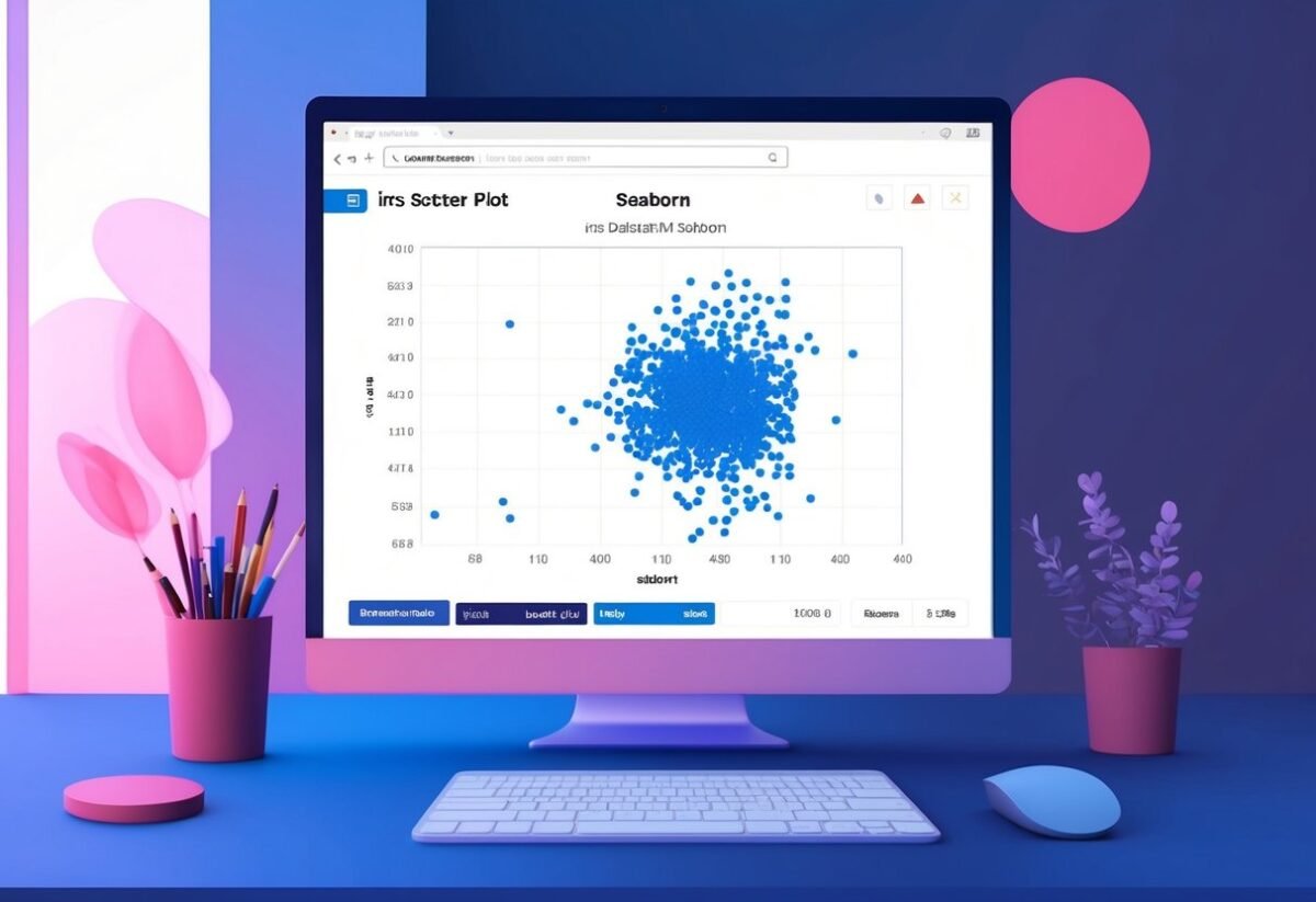
Real-world Example: Analyzing the Iris Dataset

The Iris dataset is a standard in machine learning for testing data visualization techniques. Using Seaborn in Python, one can create scatter plots to reveal insights into relationships between various flower species and their attributes. This approach aids in performing statistical analysis and understanding multivariate patterns.
Deploying Scatter Plots for Multivariate Analysis
Scatter plots are effective for visualizing relationships in datasets with multiple variables. In the Iris dataset, these plots help display the correlation between features like petal length and width.
Using Seaborn, the coding involves a few lines, making it accessible and efficient. For instance, the scatter plot can illustrate how sepal length varies among species, helping clarify distinct patterns.
Using Seaborn’s intuitive interface, users can integrate color coding by species, making patterns easy to identify.
This process provides quick insights into the dataset’s structure, helping detect clusters or trends. By observing how variables interact, one can gain a deeper comprehension of the dataset’s dynamics.
Insights from Scatter Plots in the Iris Dataset Context
Analyzing the Iris dataset with scatter plots reveals significant insights. For example, patterns relating to petal dimensions often differentiate flower species clearly. A scatter plot of sepal width versus sepal length indicates these differences vividly. Color coding adds clarity, highlighting species-specific groupings.
Statistical analysis becomes straightforward with these visualizations, as trends and anomalies are immediately apparent.
Such plots reveal not only correlations but also potential outliers, useful for further investigation.
By employing data visualization in Python with scatter plots, researchers can efficiently explore how variables relate. This method uncovers more than just raw data, allowing scientists to draw meaningful conclusions from complex datasets. Understanding these relationships is crucial for tasks that require precise data interpretation.
Frequently Asked Questions

Creating scatter plots in Seaborn involves simple commands, and users can enhance plots with features like regression lines or multiple data columns. Adjusting marker sizes or integrating plots with Matplotlib provides flexibility. For those interested in 3D visuals, Seaborn requires additional steps for such scatter plots.
How can I create a basic Seaborn scatter plot using Python?
To create a basic scatter plot, use sns.scatterplot() from the Seaborn library. Begin by importing Seaborn and specify the data for the x and y axes. This will produce a simple scatter plot visualizing the relationship between the chosen variables.
What steps are necessary to overlay a regression line on a Seaborn scatter plot?
To add a regression line, sns.regplot() can be used. This function integrates a scatter plot with a regression line by default, giving a clear view of the trend. Specify the data, and Seaborn automatically computes and displays the regression line.
Can you plot multiple columns in a single Seaborn scatter plot, and if so, how?
Seaborn allows plotting multiple columns by using the hue parameter in sns.scatterplot(). By setting hue to a categorical variable, different colors are used to distinguish between the data groups, making it easy to compare them within the same plot.
In what ways can you adjust the marker size in a Seaborn scatter plot?
Marker size can be adjusted using the size parameter in sns.scatterplot(). This parameter allows users to vary marker sizes according to a data variable, or set a specific size for all markers to customize the plot’s appearance.
How can I integrate Seaborn’s scatter plot functionalities with Matplotlib?
Seaborn is built on top of Matplotlib, so they work well together. Matplotlib functions like plt.title() or plt.xlabel() can be used alongside Seaborn plots to add titles, labels, and other customizations. This integration allows for more detailed control over plot styling.
Is it possible to create a 3D scatter plot in Seaborn, and what is the approach?
Seaborn does not support 3D scatter plots directly. For 3D visualizations, users can use Matplotlib’s Axes3D.
This requires importing mpl_toolkits.mplot3d. Users can then create 3D plots, but it involves more manual configuration compared to Seaborn’s 2D plots.