Getting Started with Seaborn
Seaborn is a powerful Python library for creating engaging statistical graphics. It is built on top of Matplotlib, offering a more user-friendly interface for creating visually appealing plots.
This guide will outline how to install Seaborn and provide a basic introduction to the library’s features.
Installing Seaborn
To start using Seaborn, it’s important to first ensure that it is properly installed.
Seaborn can be installed in a Python environment using pip, the Python package manager. Run the following command in your terminal or command prompt:
pip install seaborn
If you are using the Anaconda distribution, you can install Seaborn using Conda, which is another package manager. The command for this is:
conda install seaborn
In addition to Seaborn, it’s necessary to have both Python and Matplotlib installed in your environment, as Seaborn relies on these to function.
To verify the installation, try importing Seaborn in a Python script:
import seaborn as sns
A successful import indicates that the installation went smoothly.
Understanding the Seaborn Library
Seaborn is designed to build on top of Matplotlib, simplifying complex visualizations. It is particularly noted for its built-in themes, which give plots a professional appearance with minimal effort.
The library also supports visualization of complex datasets, including heatmaps and pairwise scatter plots. These features are useful for exploring relationships between variables in data.
Seaborn offers specialized plot types like violin and swarm plots, which are not readily available in Matplotlib. Use Seaborn to easily customize these visuals and tailor them to specific needs.
For detailed examples and tutorials, visit resources such as the Python Seaborn Tutorial on GeeksforGeeks or the Seaborn Tutorial on DataCamp.
Essentials of Seaborn Plots
Seaborn plots are valuable tools for creating clear and appealing visualizations in Python. They work especially well with Pandas DataFrames and come with various themes to enhance readability and presentation.
Plotting with Pandas DataFrames
Seaborn integrates seamlessly with Pandas, which makes it ideal for plotting data stored in DataFrames. DataFrames are collections of data organized into labeled columns, making them perfect for handling datasets.
By accepting DataFrames directly, Seaborn allows users to specify which columns contain the data to be plotted, simplifying the plotting process.
This integration provides a straightforward way to visualize relationships between variables. For example, scatter plots, bar plots, and heatmaps can be quickly generated to express patterns or trends within the data.
Using Seaborn with Pandas not only enhances data efficiency but also supports complex visualizations with minimal code.
Seaborn Themes and Aesthetics
Seaborn offers various themes to improve plot aesthetics, providing an appealing look by default.
Users can choose from themes like dark, white, and ticks, among others. These themes adjust the plot’s overall appearance, catering to different presentation needs.
Color palettes further enhance plot clarity by customizing colors. Options like deep, muted, or user-defined palettes enable standout visualizations.
The use of themes and colors is vital during presentations or in a Jupyter Notebook, where a talk style might be appropriate. By setting these aesthetics, Seaborn ensures that data visuals not only convey information accurately but also look professional and polished.
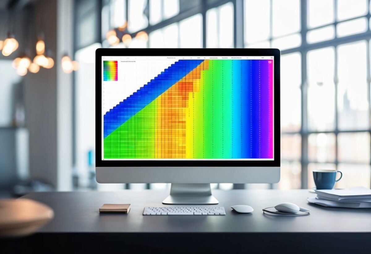
Matrix Plots and Heatmaps
Matrix plots and heatmaps are powerful tools in data visualization, allowing users to display complex data like correlation matrices or pivot tables in an easy-to-read format. These plots use color-coded cells to represent data values, making patterns and relationships easier to spot.
Creating a Simple Heatmap
A simple heatmap can be created using the sns.heatmap function from the Seaborn library. This function requires a 2D dataset, such as a correlation matrix or a pivot table.
The library translates data values into a color gradient specified by the cmap parameter. Popular color maps include 'viridis', 'plasma', and 'coolwarm'.
For clarity, additional parameters can be used to enhance the display. Setting annot=True will add numeric labels to each cell. Adjusting the fmt parameter allows for control over the number formatting of these annotations.
The combination of color and annotations helps users quickly grasp data insights.
For example:
import seaborn as sns
import matplotlib.pyplot as plt

data = [...]  # Your dataset here
sns.heatmap(data, cmap='viridis', annot=True)
plt.show()
This code creates a visual map of the data, where each cell’s color depends on the data’s value, helping viewers visually assess variable relationships.
Advanced Heatmap Customizations
For more complex data visualization needs, advanced customizations are available.
Adjusting the linewidths parameter can create space between the cells for clarity. Adding cbar arguments allows control over the color bar placement and appearance.
Users may customize the axis labels or titles to better explain their dataset.
To make an annotated heatmap more engaging, modifying the cmap for contrasting colors can emphasize variations in data. Another customization involves setting the limits using vmin and vmax, which can help focus on specific data ranges.
These customizations drive home the data’s story, allowing users to highlight key aspects tailored to their audience and specific analytical requirements. Enhanced heatmaps present a polished and insightful view, critical for in-depth data analysis.
Cluster Maps
Cluster maps in Seaborn are powerful tools for visualizing data patterns through hierarchical clustering. They not only rearrange data into a more insightful view but also allow high customization, including color palettes and scaling options.
Understanding Hierarchical Clustering
Hierarchical clustering is a method used to categorize data points into nested clusters.
In Seaborn, the sns.clustermap function provides a visual representation by arranging data into a heatmap accompanied by dendrograms. These tree-like diagrams show how clusters are grouped at various levels.
A key feature is its ability to reorder both rows and columns of the dataset, making patterns more obvious.
Users can access the reordered indices through clustergrid.dendrogram_row.reordered_ind and clustergrid.dendrogram_col.reordered_ind, which can help in further data analysis.
This technique is especially useful for identifying relationships and trends within complex datasets.
Customizing Cluster Maps
Customizing a cluster map is essential for adapting the visualization to specific requirements.
With Seaborn’s clustermap, adjustments can be made to the color palette, which affects how data values are represented visually. Options are available for various palettes like coolwarm or viridis.
Another feature is standard_scale, which standardizes data along rows or columns to make comparisons clearer. Users can set this parameter to 0 for scaling across columns or 1 for rows.
Additionally, options like figsize and col_cluster help tailor the size and clustering of columns, respectively.
Cluster maps are highly customizable, enabling users to create clear and informative visualizations that suit their specific data analysis needs.
Examining Distributions
When examining data distributions in Seaborn, understanding both histograms and KDE plots is crucial. These tools help visualize a dataset’s spread, providing insights into the underlying patterns and density.
Creating Histograms
Histograms are essential for visualizing frequency distributions. They display data by grouping values into bins, allowing readers to understand how data points are spread across different ranges. Each bin is shown as a bar, with the height indicating the number of data points within that range.
Using Seaborn, histograms can be easily created to provide a clear view of data distributions.
For example, a histogram can quickly show if the data is skewed or exhibits bimodality, revealing different peaks. This makes it easier to identify trends and anomalies.
The choice of bin size can significantly impact the histogram’s appearance and interpretation. Too few bins can oversimplify the data, while too many can make the graph cluttered, complicating analysis.
Understanding KDE Plots
KDE (Kernel Density Estimation) plots provide a smooth estimate of the data distribution. Unlike histograms, which use bins, KDE plots use a kernel to estimate the probability density function. This results in a smooth curve that represents data trends.
KDE plots are particularly useful for identifying the underlying structure of data without being affected by bin size. They can reveal multimodal distributions and subtle data patterns that histograms might miss.
In Seaborn, KDE plots can be combined with histograms for a more comprehensive view. This combination allows for a clearer comparison between the observed frequencies in the histogram and the estimated probability density.
This technique offers a deeper insight into the data’s distribution and density, which is essential for detailed analysis.
Comparative Data Analysis
In the field of data visualization, comparing datasets effectively can reveal patterns and insights that are less obvious in raw data. Seaborn offers versatile tools such as bar, box, and violin plots to highlight these differences and trends. These plots help illustrate categorical comparisons and the distribution of data features.
Bar Plots for Categorical Comparison
Bar plots are a staple for visualizing categorical data. They display data using rectangular bars where lengths represent the value of each category, making them ideal for comparing quantities across different groups.
In Seaborn, categorical plots like bar plots are easy to create and customize. Users can change the color maps (cmaps) and order of categories to emphasize specific features of the dataset.
These plots are particularly useful for assessing differences in frequencies or averages across categories. Adding error bars can provide additional context by showing variability within each category. This lets users see not just mean values, but also how much these values can vary.
Seaborn’s ability to layer additional statistical graphics makes bar plots a powerful choice for comparative analysis.
Utilizing Box and Violin Plots
Box plots offer a concise summary of data distributions through their five-number summary: minimum, first quartile, median, third quartile, and maximum. This makes them excellent for highlighting differences in features, particularly when comparing between groups. Box plots can also identify outliers, providing insight into potential anomalies or unusual data points within the dataset.
Violin plots extend box plots by incorporating density information. They add detail about the distribution’s shape and spread by showing the probability density of the data at different values.
This additional layer is beneficial when distinguishing between multiple datasets or comparing variations within the same category. When analyzing the distribution of datasets, the visual depth provided by pair plots can offer meaningful insights.
Multivariate Data Exploration
Multivariate data exploration involves analyzing datasets with multiple variables to uncover meaningful patterns and insights. Effective visualization tools like pair plots and facet grids in Seaborn can significantly enhance the analysis process, helping to make complex data more understandable.
Leveraging Pair Plots
Pair plots are a powerful way to explore relationships between several continuous variables. They create a grid of scatter plots for each pair of variables, which makes it easy to spot trends or correlations.
In Seaborn, the pairplot() function is used to generate these plots, displaying bivariate relationships and offering insights into distributions with histograms along the diagonal.
This function is particularly useful for identifying linear relationships and potential outliers in datasets.
Pair plots also support customization for exploring trivariate interactions by using hue to add a categorical variable, thus adding a third dimension to the analysis.
This visualization method is efficient for initial data exploration, providing a broad view of the data’s structure.
Facet Grids for Subgroup Comparisons
FacetGrids enhance multivariate exploration by allowing subgroup comparisons across categorical variables. This tool excels in visualizing the distribution of data across different levels of a categorical variable, such as gender or region.
In Seaborn, a FacetGrid is used to map a function like a scatter plot onto multiple axes. Each plot represents a different subgroup, making it easier to detect patterns or differences.
This approach is beneficial for datasets with both continuous and categorical variables, leveraging grid layouts to present comparisons clearly.
FacetGrids make large datasets more manageable, ensuring that each subgroup’s data can be individually inspected while maintaining a consistent visual style across multiple plots.
Line Plots and Time Series
Line plots are essential tools in data visualization, showcasing changes over time in a clear, interpretable manner. In time series analysis, they reveal patterns, trends, and cycles, essential for data-driven decision-making.
Time Series Visualization
Time series visualization highlights data over a time continuum, displaying trends and seasonal patterns. A line plot with Seaborn is ideal for this purpose, plotting data points with a connected line that emphasizes changes between them.
By handling datetime data on the x-axis, Seaborn formats the tick marks effectively, enhancing readability.
Such visualization is crucial for identifying recurring patterns and anomalies in datasets like stock prices or weather records, aiding in forecasting and monitoring. Pairing line plots with additional components like highlighting specific events can make the insights even more meaningful.
Line Plot Customizations
Customization in line plots enhances the clarity and impact of the visual representation. Users can modify attributes like line style, color, and marker type to better convey the data’s message.
In Seaborn’s documentation, versatility in customization is highlighted, allowing adjustments to suit various datasets and visualization requirements.
For instance, using different colors or line styles for different data categories can make multivariate data easier to interpret. Incorporating transparency and error bands, as seen in timeseries plot examples, provides a more comprehensive view by indicating variability and uncertainty.
Such customizations leverage the full power of Seaborn’s functionality, creating compelling and informative visualizations.
Advanced Plot Types
Exploring advanced plot types can greatly enhance data visualization capabilities. This section covers the use of joint plots with hexbins and how data reshaping allows for complex visualizations.
Joint Plots and Hexbins
Joint plots are powerful tools in data visualization, combining different plot types to explore relationships between two variables. They often mix scatter plots with histograms or density plots.
A popular enhancement of the scatter plot in these is the hexbin plot, which aggregates data points into hexagonal bins. This is especially useful for large datasets where overplotting might obscure patterns.
Hexbins improve clarity by displaying the density of points, helping identify trends and correlations in matrix data.
Seaborn provides straightforward methods to create these, using joint plot syntax with options to incorporate hexbins. The ability to interpret high-density regions in data sets sets them apart from plain scatter plots.
Reshaping Data for Complex Visualizations
Reshaping data is essential for creating complex visualizations, such as those involving matrix data. In Seaborn, this often requires adjusting data formats to fit specific plot requirements like pivot tables or reorganizing data into long or wide forms.
Matrix plots benefit from data reshaping by allowing the representation of 3D data relationships in 2D formats. Tools in Seaborn, like FacetGrid and PairGrid, make it easier to handle such data modifications.
These tools enable the visualization of multiple variables simultaneously, providing insights into broader data patterns and interactions. With complex visualizations, users can interpret intricate datasets more effectively.
Categorical Data Representation
Categorical data can be visualized effectively using various plot types in Seaborn. Understanding which plot to use depends on the specific details you want to highlight, such as individual data distributions or frequency counts.
Strip and Swarm Plots
Strip plots and swarm plots are valuable for displaying individual data points within categories. These plots can help identify patterns or outliers in a dataset.
The strip plot scatters data points along a single line for each category, which can show the distribution but may overlap, making it hard to read with larger datasets. In contrast, the swarm plot adjusts for overlap by spreading points along the categorical axis, ensuring each point is visible. This approach provides a clear visualization when categories contain many data points.
Using strip or swarm plots is beneficial in data analysis, especially if understanding specific details about the data distribution is crucial. These plots offer insights that are sometimes not visible in aggregated data representations.
Count Plots for Frequency Visualization
Count plots are an effective tool for illustrating the frequency of categories in a dataset. This plot represents the number of occurrences of each category as bars.
By visualizing frequency, one can quickly identify which categories are most or least common.
Count plots help with comparative analysis among categories, allowing easy spotting of trends or imbalances. For example, a count plot can highlight which products are most popular in sales data or survey responses. Using count plots supports data-driven decisions by revealing simple count-based insights that might dictate different analysis strategies or business actions.
Interactive Visualizations

Interactive visualizations enhance the user experience by allowing dynamic exploration of data. While Seaborn is primarily a static visualization library, tools and methods can be used to make its plots interactive, especially when combined with other libraries.
Dynamic Plots with Seaborn
Seaborn integrates closely with Matplotlib, which serves as a base for creating dynamic plots. Although Seaborn itself doesn’t offer native interactivity, users can leverage the capabilities of Matplotlib to add interactivity.
This feature allows users to interact with plots through zooming, panning, and more.
To make plots interactive in environments like Jupyter Notebooks, libraries like ipympl can be used.
ipympl provides an interactive Matplotlib backend that makes Seaborn plots interactive within the notebook environment. Installing and enabling ipympl can transform static plots into interactive ones, enhancing the visualization experience significantly.
Integrating with Other Libraries
Beyond Matplotlib, integrating Seaborn with other libraries enhances interactivity.
For instance, using Plotly alongside Seaborn can create dynamic plots that allow hover effects and drill-down capabilities. Plotly is well-known for its ability to handle interactive graphing efficiently.
Another tool to consider is Bokeh, which works well for creating interactive visualizations that can be embedded into web pages.
Bokeh’s server functionality is particularly useful for deploying interactive visualizations at scale.
These integrations enable data analysts and scientists to transform static Seaborn plots into powerful, interactive tools, providing more insightful and engaging data experiences.
Practical Tips and Tricks
This section offers strategic advice on enhancing Seaborn plots’ efficiency and tackling common obstacles. Learn how to handle the tips dataset for better performance and gain insights into practical troubleshooting methods.
Performance Optimization
When working with large datasets like the tips dataset, performance can be enhanced by reducing data size and complexity. Use sampling techniques to work with a smaller subset of data without losing important insights.
Preprocessing data efficiently can also save computation time. When plotting, setting parameters like dpi for increased resolution improves clarity without redrawing large plots repeatedly.
Choosing the right plot type is key. For example, using heatmaps in matrix plots can provide comprehensive data visualization without overloading the system. Ensure to update Seaborn and related libraries to their latest versions for optimized performance.
Troubleshooting Common Issues
Users often encounter issues such as mismatched plot sizes or rendering errors in tutorials. Checking for inconsistencies in datasets, such as the tips dataset, can prevent these errors.
Ensure data types are correctly formatted; for example, converting categorical data into numeric types where necessary.
Sometimes plots appear cluttered. Simplifying data and removing unnecessary dimensions can help. Users might face installation problems; confirming the proper installation of dependencies like Matplotlib and Pandas is essential.
Quick Tip: Use online forums and resources when errors persist. They’re rich in community-driven solutions that pinpoint specific Seaborn issues. For more detailed guidance, see the troubleshooting section in relevant documentation on Seaborn matrix plots.
Frequently Asked Questions

Seaborn is a powerful tool for creating matrix plots with customizable features. It provides easy ways to manipulate color palettes, manage axis labels, and create specific types of plots like scatterplot matrices and pairplots.
How can you customize the color palette of a heatmap in Seaborn?
To customize the color palette of a heatmap in Seaborn, use the cmap parameter. It allows the selection of color maps such as 'viridis', 'coolwarm', or any other Matplotlib colormap.
Users can also create custom palettes with Seaborn’s color_palette() function, enhancing visual presentations significantly.
What are the steps to create a pairplot in Seaborn?
Creating a pairplot in Seaborn involves using the pairplot() function. Import necessary libraries and data, then call sns.pairplot(data).
This function generates pairwise relationships in a dataset, automatically adjusting labels and legends for convenience. It’s helpful for exploring data distributions and relationships.
How is a matrix plot implemented in Seaborn differently from Matplotlib?
Seaborn builds on Matplotlib’s capabilities by providing more advanced statistical graphics. Seaborn’s matrix plots, like heatmaps or correlation matrices, integrate better with Pandas data structures, offering additional features like easier customization and automatic legend generation, as noted in its documentation.
Can you provide an example of using Seaborn to plot a correlation matrix?
To plot a correlation matrix in Seaborn, first calculate the correlation using df.corr() with a DataFrame df. Then, use sns.heatmap(corr) to visualize the matrix.
Options like annot=True can add value labels to each cell, making the matrix easier to interpret.
What options are available for controlling the axis labels in Seaborn matrix plots?
Controlling axis labels in Seaborn matrix plots involves parameters like xticklabels and yticklabels. Users can specify label rotation or frequency displayed on axes.
Additionally, functions like sns.set() can adjust style and global settings, providing flexibility in label presentation.
In what scenarios is Seaborn’s scatterplot matrix preferred over a simple scatterplot?
A scatterplot matrix is preferred when analyzing relationships between multiple variables simultaneously. It displays all pairwise scatterplots for a dataset rather than focusing on just two variables.
This helps in understanding complex data interactions more thoroughly and efficiently.