
Getting Started with Seaborn
Seaborn is a popular Python library for data visualization. It offers an intuitive interface and is built on top of Matplotlib, making it easier to create informative and attractive statistical graphics.
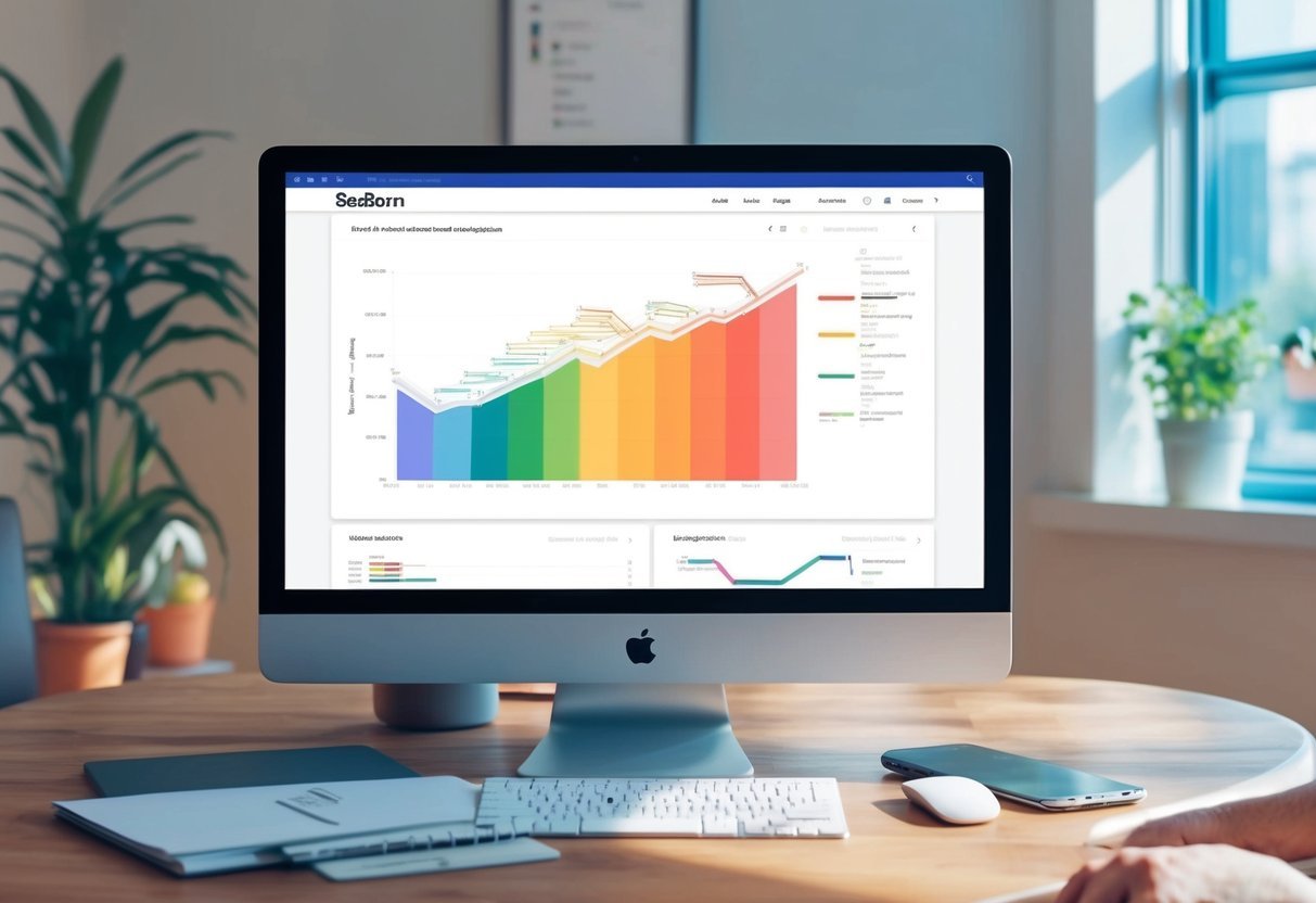
Seaborn Overview
Seaborn enhances Python’s data visualization capabilities and simplifies the creation of complex graphs.
It works efficiently with pandas data structures, making it ideal for handling data frames directly. This library is particularly useful for visualising statistical relationships, data distributions, and categorical data.
Seaborn addresses some limitations of Matplotlib by providing default styles and themes that make plots visually appealing.
Users can easily customize styles to match their needs, improving the readability and presentation of their data visualizations.
Built-in functions simplify drawing common charts like bar plots, heatmaps, and violin plots.
Installation and Setup
To begin using Seaborn, it needs to be installed on your system.
This can be done using a command line by typing pip install seaborn. If you are working in an Anaconda environment, using conda install seaborn is recommended.
Post-installation, import Seaborn in your Python scripts with import seaborn as sns. It’s also important to import Matplotlib to control various plot aspects like titles and axes labels.
For executing code, tools like Jupyter Notebook provide an interactive platform, enabling real-time visualizations and adjustments.
Ensure Python and pip are updated to avoid compatibility issues during installation.
Understanding the Dataset-Oriented API
Seaborn’s design efficiently handles data-focused tasks using a dataset-oriented API.
This approach allows users to input datasets directly and specify variables for plots, streamlining the visualization process. Functions like lineplot(), scatterplot(), and barplot() interpret input data frames, determining the best way to display them.
This API design eliminates the need for manually preparing data, offering automatic aggregation and transformation for summarization and visualization purposes.
This functionality is particularly beneficial for statistical analysis and exploration, making Seaborn a powerful tool for data scientists and analysts working with complex datasets.
Fundamentals of Data Visualization

Seaborn simplifies the process of creating stunning data visualizations by offering tools to work with Python’s pandas and numpy libraries.
Key aspects include using powerful plotting functions, handling dataframes efficiently, and following a structured workflow for data analysis.
Exploring Basic Plotting Functions
Seaborn offers a wide range of plotting functions that make it easy to create compelling visuals.
Users can craft line plots, scatter plots, and bar plots with simple syntax. For example, a scatter plot can be made using the scatterplot() function.
Seaborn also allows for customization, such as changing color palettes or adding legends and titles.
One crucial benefit is the option to create statistical graphics that reveal insights clearly. Functions like pairplot() help visualize relationships within multidimensional data. These plots help researchers and data analysts communicate complex patterns with clarity.
Diving into Pandas Dataframes
Seaborn integrates seamlessly with the pandas dataframe structure.
This integration allows users to manipulate and visualize large datasets with ease. Pandas dataframes hold structured data in tabular form, making them ideal for analysis and plotting in Seaborn.
Using dataframes, users can filter and sort data, or perform operations like grouping or aggregation. Seaborn relies on dataframes to access data efficiently, providing convenience through its data-handling capabilities.
This integration empowers users to conduct thorough data analysis while leveraging Seaborn’s visualization power.
Visualization Workflow
Following a structured visualization workflow is crucial in data analysis.
This begins with data preparation, where pandas and numpy play critical roles in cleaning and organizing the data. Once ready, selecting the right Seaborn plotting functions is key to highlighting data insights.
The workflow includes choosing the right plots to communicate the message effectively. Users must then customize the visuals to ensure clarity, adapting elements like axis labels and plot size.
Throughout this process, Seaborn’s documentation and community support provide valuable resources, guiding users to optimize their data visualization efforts.
Understanding Seaborn’s Plotting Syntax
Seaborn is a powerful tool for data visualization in Python, built on top of Matplotlib. It offers a simple interface for creating complex graphics with minimal coding.
Key elements include how data is handled and how semantic mappings are used to convey additional information visually.
The Role of Data in Seaborn
In Seaborn, data is typically managed using dataframes. This format makes it easy to specify data directly in the plots.
Users need to focus on selecting the appropriate columns and determine how they should map to the axes.
For example, when plotting, the data parameter takes a dataframe, while x and y parameters specify the respective columns.
Additionally, Seaborn automatically handles missing data, which simplifies processing and visualization. It integrates well with tools like Pandas, making the transition from data processing to visualization seamless.
Using dataframes, it becomes straightforward to perform exploratory data analysis and generate plots without extensive coding. This role of data handling in Seaborn aims to reduce the complexity of data selection and comparison.
Semantic Mapping Concepts
Semantic mapping is key to creating meaningful plots with Seaborn. This involves using visual elements to represent dimensions of the data, such as size, color, or style.
Seaborn allows users to add semantic mappings that enhance plot interpretation. For instance, data can be mapped to different hue, size, or style aesthetics.
This lets users differentiate data categories and better understand relationships within the data. For example, in a scatter plot, points could vary by color to represent different categories.
By using these semantic elements, users can enrich their visualizations, making them more informative and aesthetically appealing. These tools help highlight patterns or differences within the data that might not be visible otherwise.
Styling and Themes in Seaborn
Seaborn makes it easy to enhance data visualization with various styling options and themes. Users can adjust aesthetic parameters, explore customizable color palettes, and apply built-in themes for better presentation.
Setting the Aesthetic Parameters
Seaborn offers simple ways to improve the appearance of plots. Users can set the aesthetic parameters using the sns.set_style() function.
Five styles are available: darkgrid, whitegrid, dark, white, and ticks. These styles make it easier to tailor the look of plots to suit different needs.
Additionally, the sns.despine() function can remove the top and right spines from plots, giving them a cleaner appearance.
Adjusting the aesthetic settings helps in creating visuals that are both clear and attractive.
Customizing with Color Palettes
Color palettes in Seaborn enable precise control over plot colors. Users can select from built-in palettes or create custom ones using sns.color_palette().
Palettes are important for distinguishing between data groups or highlighting specific data points.
Visual clarity is improved with contrasting colors, and sns.palplot() can be used to display a palette for preview.
Using these tools, users can ensure their data visualizations are visually appealing and informative.
Applying Default Themes
Seaborn has five default themes that cater to different presentation needs: darkgrid, whitegrid, dark, white, and ticks.
The default is usually darkgrid, but users can switch to another theme with sns.set_theme() by passing a theme’s name.
For example, using a white background with white is ideal for publishing, while dark is suited for presentations.
These themes help users quickly adjust plot appearances to match their intended output, ensuring a professional and polished look.
Statistical Data Exploration
Statistical data exploration in Seaborn involves examining individual variables and their relationships. It uses various plots to reveal patterns, trends, and connections within datasets. Through univariate and bivariate analysis, users can gain insights into distributions and interactions.
Univariate and Bivariate Analysis
Univariate analysis focuses on a single variable, analyzing its distribution and central tendencies like the mean.
Seaborn offers several plots for univariate analysis, such as histograms and box plots. Histograms display frequency distributions, allowing users to see how data is spread. Box plots show the quartiles and any potential outliers, helping to identify the spread and symmetry of the data.
Bivariate analysis examines relationships between two variables. Scatter plots and heatmaps are common choices for this type of analysis.
Scatter plots, often used in regression analysis, depict correlations and relationships, providing a visual representation of statistical relationships. Heatmaps visualize data matrices, showing variations and concentrations through color grading.
Understanding Statistical Plots
Statistical plots are essential in exploratory data analysis. They offer visual representations of data that make it easier to notice patterns and outliers.
Seaborn enhances these plots with features like color palettes and themes, increasing readability and visual appeal.
Seaborn’s ability to combine multiple plots helps to illustrate complex relationships in data. For example, regression analysis can be visualized with scatter plots and regression lines, showing trends and predicting new data points.
The combination of these plots aids in making more informed decisions in data exploration and analysis.
Distributions and Relationships
When exploring data with Seaborn, it’s essential to understand how distributions and relationships are visualized. These concepts help in revealing patterns, making it easier to interpret statistical relationships between variables.
Creating Histograms and Kernel Density Plots
Histograms are valuable tools in data visualization, offering a simple way to display the distribution of a dataset.
Seaborn provides several functions to create histograms, such as histplot(), which helps in dividing the data into discrete bins. This makes it easy to see how data points are spread out across different ranges.
Kernel Density Plots (KDE plots) add a smooth, continuous curve to represent data distribution. Seaborn’s kdeplot() function facilitates this, providing an easy way to signal the data’s underlying pattern.
Unlike histograms, which show data in blocks, KDE plots offer a more elegant, fluid visualization. This smoothness helps in understanding the data’s peak areas and overall distribution shape.
Seaborn also integrates functions like distplot() (deprecated), which combined histograms with KDE plots, offering a comprehensive view of the data distribution.
Understanding these tools can significantly enhance one’s ability to analyze and visualize statistical data effectively.
Visualizing Pairwise Data Relations
When examining how different variables relate to each other, Seaborn’s scatter plots and pairwise plots are indispensable.
Scatter plots, using functions like relplot(), graphically display data points on two axes, making trends and outliers evident.
Pair plots, created using the pairplot() function, offer a more detailed view by plotting multiple pairwise relationships across an entire dataset.
This approach is beneficial for exploring relationships and spotting correlations between variables. Additionally, pair plots often include histograms or KDE diagonal plots to show univariate distributions.
Joint plots, through jointplot(), combine scatter plots with additional univariate plots like histograms near the axes, offering insights into how two datasets interact.
These plots are helpful to explore potential causal relationships or identify patterns. By using these tools, users can gain a comprehensive view of relational data dynamics.
Categorical Data Visualization
Categorical data visualization is crucial for identifying patterns and insights in datasets where variables are divided into discrete groups. Tools like box plots, violin plots, count plots, and bar plots play a major role in illustrating differences and distributions.
Comparing Box and Violin Plots
Box plots and violin plots are great for visualizing distributions in categorical data.
The box plot provides a summary of data using a box to show the interquartile range and whiskers to indicate variability outside the upper and lower quartiles. This plot is helpful in comparing the spread and any outliers across different categories.
In contrast, violin plots include not just the summary statistics but also the kernel density estimation. This gives a deeper understanding of the data distribution across range categories.
Violin plots are especially useful when the data has multiple peaks or is asymmetrical. Comparing these plots helps users decide which details they need to focus on based on their data characteristics.
Understanding Count and Bar Plots
Count plots and bar plots are essential for visualizing categorical data by displaying frequencies of data points.
A count plot is straightforward; it shows the count of observations in each category, often using bars. This is ideal for understanding the distribution and frequencies at a glance.
The bar plot (or barplot() in Seaborn) is more flexible. It represents data with bars where the length of each bar corresponds to a numerical value, suitable for comparing different categorical groups using additional variables like hue.
For categorical data analysis, these plots provide clear insights by representing quantities and comparisons effectively.
Advanced Plotting with Seaborn
Advanced plotting with Seaborn involves techniques that allow for creating complex visualizations.
Techniques like faceting with FacetGrid and multi-plot grids enable users to visualize data in different dimensions, enhancing the depth of analysis and presentation.
Faceting with FacetGrid
FacetGrid is a powerful tool in Seaborn for creating multiple plots side by side, helping to reveal patterns across subsets of data.
By using FacetGrid, one can map different variables to rows and columns, showcasing how data changes across dimensions.
For instance, when using FacetGrid, a user can specify a variable to facet along rows or columns. This results in a grid of plots, each representing a subset of the data. This method is particularly useful when comparing distributions or trends across different categories.
When combined with functions like relplot, catplot, or lmplot, FacetGrid becomes even more versatile.
Users can choose the type of plot to display in each facet, using options such as scatter plots, line plots, or bar plots. This flexibility allows for creating detailed and informative multi-plot visualizations.
Multi-Plot Grids and Customizations
Multi-plot grids in Seaborn, such as those created with pairplot and jointplot, are designed to provide a comprehensive view of data relationships.
These grids can display different visualizations in a single figure, each showing unique aspects of the dataset.
With pairplot, users can visualize pairwise relationships in a dataset across multiple dimensions. It showcases scatter plots for each pair of variables and histograms along the diagonal. This approach helps in understanding correlations and distributions effectively.
On the other hand, jointplot combines scatter plots with marginal histograms or density plots, offering insights into both joint and individual distributions.
Customizing these plots can further enhance their impact. Users may adjust aesthetics, add annotations, or refine layouts to create clear and compelling visual stories.
Regression and Estimation Techniques
In this section, the focus is on using Seaborn for creating regression plots and employing estimation techniques to analyze data. Understanding linear relationships and the role of confidence intervals in assessing these models is crucial.
Creating Regression Plots
Regression plots are key tools in understanding relationships between variables.
In Seaborn, two main functions used for this purpose are lmplot and regplot.
regplot is known for its simplicity and is great for adding a regression line to scatter plots. It offers quick insights into data trends.
On the other hand, lmplot provides more flexibility and can handle additional features like faceting, which is helpful for examining complex datasets.
Users can visualize how a dependent variable changes in response to an independent variable.
Customization options include altering line aesthetics and color, allowing for clear visual communication. Utilizing these functions effectively helps illustrate relationships and uncover patterns in data.
Applying Estimators for Mean and Confidence Intervals
Estimators are used to summarize data by calculating means and confidence intervals, helping users make informed judgments about datasets.
Regression analysis in Seaborn allows for the display of confidence intervals alongside regression lines, providing a visual indicator of model reliability.
The confidence interval typically appears as shaded regions around the regression line. This shading indicates the range within which the true regression line is expected to lie with a certain level of confidence, often 95%. This can be adjusted to suit different statistical needs.
Understanding these intervals helps in assessing the precision of predictions and the likelihood of these predictions being representative of true outcomes.
Utilizing Multi-Dimensional Data
Seaborn is a powerful Python data visualization library that can help users make sense of complex, multi-dimensional data. By using tools like joint and pair plots and examining heatmaps and cluster maps, users can uncover hidden patterns and relationships in their datasets.
Building Joint and Pair Plots
Joint and pair plots are essential for visualizing relationships between variables. A jointplot combines a scatterplot and marginal histograms, providing a simple way to observe correlations and distributions.
Users can enhance these plots with regression lines using Seaborn’s high-level interface.
Pair plots extend this concept, enabling the comparison of multiple variable pairs within a dataset. This multi-dimensional approach helps illustrate relationships, detect outliers, and identify trends.
When dealing with large datasets, the integration with pandas dataframes is beneficial, as it allows for seamless data manipulation and plotting. Utilizing these tools is crucial for efficient exploratory data analysis.
Exploring Heatmaps and Cluster Maps
Heatmaps and cluster maps are vital for assessing data through color-coded matrices.
A heatmap visualizes the magnitude of values, making it easier to spot significant variations in data. Seaborn excels at creating detailed heatmaps, which are ideal for analyzing correlations between variables.
Cluster maps expand on heatmaps by incorporating clustering algorithms. They group similar rows and columns together, revealing structures or patterns that might not be immediately evident.
This tool is particularly useful for data with multiple plots, enabling axes-level plotting for more granular insights. By leveraging numpy for numerical operations, users can handle large volumes of multi-dimensional data with ease.
Seaborn in Practice
Seaborn is a powerful tool for data visualization in Python. By using built-in example datasets, it simplifies plotting and presentation.
Working with Example Datasets
Seaborn comes with several built-in datasets like the iris and tips datasets. These datasets allow users to practice and understand different plotting techniques without needing to find external data.
The iris dataset includes measurements of iris flowers, useful for classification plots. For instance, users can create scatter plots to explore relationships between features.
The tips dataset, on the other hand, is great for learning about statistical plots. It shows daily tipping habits, allowing users to create bar plots or box plots to summarize the data.
To visualize these datasets, users can load them with functions like sns.load_dataset("iris"). Once data is loaded, various graphs can be created using functions such as sns.scatterplot() and sns.boxplot(). Users should remember to use plt.show() to display plots effectively in their scripts or notebooks.
Tips and Tricks for Effective Data Visualization
Utilizing Themes and Contexts: Seaborn offers customization options with themes and contexts. For example, sns.set_context() adjusts the plot elements’ sizes, which helps in creating visuals for different environments such as presentations or reports. Users can switch between contexts like [‘notebook’, ‘talk’, ‘poster’] depending on their needs.
Enhancing Aesthetics: Users can customize plots by modifying parameters. For example, changing color palettes, adjusting aspect ratios, or incorporating facet grids to show multiple plots in one figure. Experimenting with these settings can help highlight key data insights.
User Guide: Seaborn’s user guide contains valuable information for mastering these features and improving data visualization skills.
Fine-Tuning Seaborn Plots

Fine-tuning Seaborn plots involves adjusting their aesthetics and structure using tools like axes-level functions and applying context settings. These adjustments help create more polished and informative visualizations.
Enhancing Plots with Axes-Level Functions
In Seaborn, axes-level functions provide direct ways to modify individual plots. These functions plot data onto a single matplotlib.pyplot.Axes object, offering precise control over each aspect of the plot.
Functions such as sns.lineplot and sns.scatterplot are common tools used for relational plots. These allow users to customize their plot’s appearance by changing the color, size, and style of plot elements.
Modifying these attributes involves parameters like hue, size, and style, which distinguish different data variables by color, size, or line style.
Users can adjust these settings to emphasize key data points and relationships, making the plots more visually appealing and easier to interpret. This customization enhances the chart’s overall readability and impact.
Final Touches: Despine and Context Settings
Seaborn also provides the ability to adjust the plot’s style and context, which further refines its appearance.
The function sns.despine helps remove unwanted chart spines, providing a cleaner look. This is particularly useful for plots that need minimal distractions from data.
Context settings, managed with sns.set_context, allow scaling of plot elements like labels and lines for different viewing situations, such as presentations or reports.
By using context settings, users can adapt their plots for their specific audience. These final touches turn basic visualizations into more effective and attractive graphical representations, ensuring the plot communicates its message clearly and effectively.
Frequently Asked Questions

This section addresses common inquiries regarding getting started with Seaborn for data visualization, how it differs from Matplotlib, and resources for learning. It also covers popular visualizations available in Seaborn and how to integrate it into coding projects.
How do I start learning Seaborn for data visualization?
Begin with a strong foundation in Python, as Seaborn is built on it. Familiarity with data structures like lists and dictionaries will help.
Installing Seaborn is a key first step, followed by exploring basic plots and experimenting with different styles.
What are the differences between Seaborn and Matplotlib?
Seaborn builds on Matplotlib, offering more visually appealing themes and easier creation of complex plots. While Matplotlib is great for basic plotting, Seaborn automates many visualizations, making it powerful for statistical graphics.
More information can be found in this discussion of Matplotlib and Seaborn.
Can you recommend any reliable tutorials for Seaborn beginners?
For beginners, Coursera offers courses that walk through the fundamentals of Seaborn alongside Python essentials. These courses can provide structured learning and practical projects to build skills effectively.
What are common data visualizations that Seaborn is particularly good for?
Seaborn excels in creating statistical plots like pair plots, heatmaps, and distribution plots. It makes it easy to detect patterns and trends in data, which is essential for analysis.
For a detailed understanding, you can check this introduction to Seaborn.
How do I import Seaborn and integrate it with my coding projects?
To use Seaborn, it must be installed using pip. Once installed, import it into your Python projects with import seaborn as sns.
This allows access to Seaborn’s powerful visualization functions and integration with Matplotlib for advanced customizations.
What are some resources to find comprehensive Seaborn learning material?
The official Seaborn documentation is a great resource, providing detailed examples and explanations.
Online courses, like those on Coursera, also provide structured learning paths.
Blogs and tutorials are plentiful and can offer step-by-step guides tailored to different skill levels.