
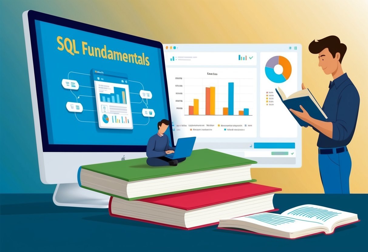
Understanding SQL for Data Visualization
SQL, or Structured Query Language, is a powerful tool for interacting with relational databases. It’s essential for retrieving and manipulating data, making it crucial for data visualization tasks.
This section explores the basic SQL concepts necessary to enhance data understanding and extraction from databases.
Essentials of SQL Concepts
SQL serves as the backbone for managing relational databases, enabling users to perform operations such as querying, updating, and organizing data.
At the core, the SELECT statement is vital for choosing specific data columns. This makes it easy to tailor the data that is visualized.
Another key concept, FROM, specifies the tables to pull data from, creating a focus on relevant data sources.
The WHERE clause is critical for filtering data, ensuring that only relevant records are included in analyses. These features help transform raw data into meaningful insights.
Basic data exploration using SQL provides a solid foundation for building complex visualizations. Understanding these elements allows for the creation of effective visual displays that highlight important data trends and relationships.
Data Preparation Techniques

Data preparation is crucial for effective data visualization. It involves ensuring high data quality and performing necessary manipulations to make the data ready for visualization.
Data Quality and Cleaning
Maintaining data quality is essential. Analysts must identify and correct inaccuracies in the dataset. This process involves checking for missing values, removing duplicates, and correcting inconsistencies.
Tools like SQL allow for efficient quality checks using functions such as IS NULL, DISTINCT, and UPDATE.
Consistency is vital. Data must be in a uniform format before analysis. Data types should be standardized, and data entries should follow the same naming conventions. This may include converting date formats or ensuring all text entries are uniform, such as ensuring all names are capitalized.
Regular audits of the dataset can help spot errors. Implementing constraints in SQL, like NOT NULL and UNIQUE, can prevent future errors, ensuring the dataset remains reliable for continuous analysis.
Data Manipulation with SQL
SQL provides robust methods for data manipulation.
Filtering data is one of the primary tasks, and it is done using the WHERE clause. This allows analysts to work with relevant data subsets by specifying conditions the data must meet.
Aggregating data is another critical step. SQL functions like SUM, AVG, and COUNT are used to summarize data, providing insights into large datasets. These functions help in interpreting data trends and patterns by focusing on key metrics.
Grouping and ordering data improve clarity. Using GROUP BY organizes data into categories, while ORDER BY arranges data to highlight trends. This approach enhances the ability to extract actionable insights from datasets, making SQL a powerful tool in data visualization preparation.
SQL Query Fundamentals
Understanding the basics of SQL queries is essential for working with data. Key operations include selecting, filtering, sorting, and grouping data, allowing users to manipulate and view information as needed.
Selecting and Filtering Data
The SELECT statement is a crucial part of SQL queries. It retrieves specific columns from a database table. For example, SELECT name, age FROM people; will get names and ages from the table people.
Filtering enhances this by using the WHERE clause. It allows retrieval of rows that meet specific conditions. For instance, SELECT name FROM people WHERE age > 30; will fetch names of individuals older than 30.
Multiple conditions can be combined with AND or OR to refine results further.
Understanding these basic commands helps users focus on desired data without loading entire datasets, thus improving query efficiency. By filtering data at the query stage, unnecessary data processing is minimized, leading to better performance.
Sorting and Grouping Data
Sorting data is achieved using the ORDER BY clause. It sorts the result set by one or more columns. For example, SELECT name, age FROM people ORDER BY age DESC; will list people by age in descending order. This is useful for organizing data based on priority or significance.
Grouping data is managed through the GROUP BY clause. It aggregates data based on one or more columns. For example, SELECT department, COUNT(*) FROM employees GROUP BY department; calculates the number of employees in each department.
The HAVING clause can further filter these groups, for instance, HAVING COUNT(*) > 10 would only include groups with more than 10 members.
These tools allow for powerful data analysis by enabling users to view data from different perspectives and summarize large datasets effectively.
Advanced SQL Queries
Advanced SQL queries help analysts and developers extract more complex insights from databases. This involves using tools like Common Table Expressions (CTEs) and SQL Window Functions, which enhance query clarity and enable sophisticated data analysis.
Common Table Expressions
Common Table Expressions (CTEs) simplify complex queries by breaking them into more manageable parts. They allow users to define a temporary result set within a SQL statement, making the code cleaner.
CTEs are particularly useful for recursive queries, which require iterative processing without the complexity of self-joins or subqueries.
Using a CTE can streamline tasks such as hierarchical data processing or creating complex aggregations. Instead of writing multiple nested queries, a CTE allows the query writer to define a named temporary result that can be referenced multiple times within a single SQL statement. This improves readability and maintainability of SQL scripts by providing clarity and reducing redundancy.
SQL Window Functions
SQL Window Functions perform calculations across rows related to the current row within the result set, without collapsing them into a single output row. This feature is distinct from regular SQL aggregate functions as it retains the rows’ individuality while applying functions like rankings, running totals, and moving averages.
Window functions are defined within the OVER() clause, enabling calculations such as the cumulative sum or moving averages over a specified range.
With SQL Window Functions, users can analyze trends over sequences such as sales growth over time, without altering the structure of the dataset.
They are indispensable in financial analysis and data trend observations, where understanding changes over specified periods is crucial. This set of functions empowers analysts to deliver nuanced insights directly from SQL, facilitating a deeper analysis while keeping the data intact.
Integrating SQL with Data Analysis Tools

Integrating SQL with modern data analysis tools enhances the ability to handle, process, and visualize data efficiently. This integration combines SQL’s robust querying capabilities with the advanced analytical features of programming languages like Python and R.
SQL and Python Integration
Python is a versatile programming language used widely in data analysis and visualization. It pairs well with SQL for data manipulation and extraction, using libraries like Pandas for data handling.
These libraries can connect directly to SQL databases, allowing users to execute queries and import data easily.
Visualization tools such as Matplotlib and Seaborn work seamlessly with SQL data in Python. Users can create detailed plots that offer deeper insights into datasets.
For interactive charts, Plotly provides features that enable users to build rich, interactive visualizations reflecting real-time SQL data updates.
The flexible integration between SQL and Python is valuable for performing complex data analysis, ensuring data accuracy and enhancing the visual output. This collaboration empowers analysts to use SQL queries to gather data and leverage Python’s analytical strengths to transform and visualize it meaningfully.
SQL and R for Statistical Analysis
R is a powerful language specifically used for statistical analysis and graphical data representation. When integrated with SQL, it becomes a formidable tool for handling complex datasets and performing in-depth analyses.
Libraries like DBI and RMySQL provide interfaces for R to connect to SQL databases, enabling efficient data retrieval.
R’s strong statistical capabilities allow users to perform complex analysis on SQL data outputs. Statistical functions in R can be directly applied to data fetched from SQL databases, facilitating both predictive modeling and hypothesis testing.
Visualization packages in R, such as ggplot2, allow for the creation of custom plots that can highlight trends and patterns within data extracted from SQL.
This synergy enables analysts to capitalize on SQL’s management efficacy and R’s sophisticated statistical tools to comprehensively analyze datasets.
Creating Basic Visualizations with SQL

Creating visualizations in SQL involves translating data into a visual format such as charts and graphs. By manipulating SQL queries, data analysts can build visual tools to make data insights clear and accessible.
Basic visualization types include bar charts, pie charts, histograms, and line charts to represent different kinds of data stories effectively.
Charts and Graphs Essentials
Bar charts are ideal for showing comparisons among discrete categories. SQL queries that aggregate data like SUM or COUNT can help prepare data for these charts. Analysts can group and count items to show frequency or totals within each category.
Pie charts represent part-to-whole relationships. Using GROUP BY in SQL helps divide data into segments to display proportions.
Histograms are useful for showing distribution and identifying patterns in data. SQL can be used to calculate and group data into bins, which are then visualized to reflect the data frequency distribution.
Line charts effectively display trends over time. SQL can select and order data chronologically to visualize how data points change over periods. By selecting and arranging data sets appropriately, SQL queries guide in producing straightforward and insightful line charts.
Integrating SQL with visualization tools can enhance the capability to present complex data stories simply and effectively. Data analysts benefit from this synergy by crafting clear visual representations of comprehensive datasets.
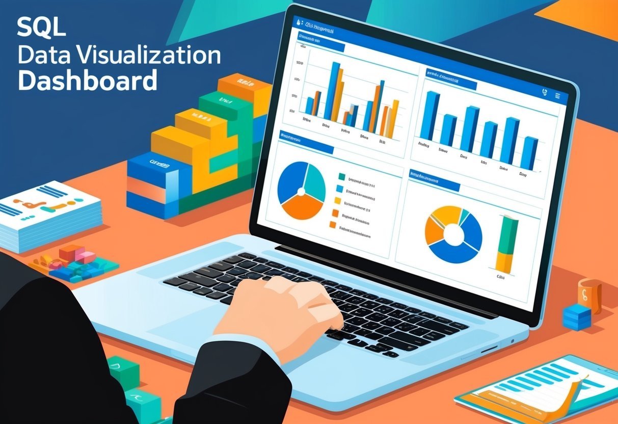
Interactive Visualizations and Dashboards

Creating interactive visualizations involves using SQL to design engaging dashboards that help users explore data. Utilizing powerful tools like Tableau and Power BI, these dashboards allow for dynamic data presentations, enhancing data analysis and decision-making.
Designing Interactive SQL Dashboards
When designing an interactive SQL dashboard, clarity and usability are critical. Developers focus on arranging visual elements like charts and graphs for easy navigation. Colors and fonts are chosen to make data readable.
Important metrics and KPIs should be upfront. Incorporating filters and drill-down options lets users explore data subsets.
For e-commerce data, displaying sales trends and customer demographics can be useful. The aim is to present complex datasets in an easily digestible format.
Dashboard Tools and Platforms
Several tools facilitate the creation of interactive dashboards.
Tableau is known for its intuitive interface, allowing users to create complex visualizations without deep technical skills. It supports various data sources, including SQL databases, enabling detailed visualization.
Power BI is another popular choice, offering robust features for data connection and visualization. Its integration with Microsoft products makes it a preferred choice for businesses using SQL.
Both tools support real-time data updates, ensuring dashboards reflect the latest information. They offer customizable templates and widgets, allowing users to tailor dashboards to specific needs.
Analyzing Trends and Patterns

Analyzing trends and patterns in data is essential for gaining insights and making informed decisions. This involves examining time-series data and identifying outliers or anomalies that may affect the analysis.
Time-Series Analysis
Time-series analysis focuses on data points collected or recorded at specific time intervals. It helps in recognizing patterns over time, such as seasonality, trends, and cyclic behaviors.
Businesses often utilize this technique to forecast future events based on historical data.
By examining patterns in time-series data, analysts can develop strategies for managing inventory and anticipating market demands.
Using SQL, time-series analysis can identify trends by employing functions such as moving averages or exponential smoothing. These techniques help smooth out short-term fluctuations and highlight longer-term trends.
Visual tools, like line graphs, are common for displaying trends, making it easier to communicate insights to stakeholders. Visualization tools such as Power BI can enhance this process by allowing for more dynamic presentations of data trends.
Identifying Outliers and Anomalies
Outliers and anomalies can skew the interpretation of data, making it crucial to identify and address them properly. These are data points that deviate significantly from the majority of a dataset and can indicate errors, novel insights, or unexpected events.
In SQL, outlier detection can be achieved by using statistical techniques such as standard deviation or percentile ranks. This helps in isolating points that do not fit the expected pattern.
Handling anomalies involves deciding whether to remove them, investigate their causes, or consider them in further analysis.
Analyzing trends often involves identifying these deviations to ensure accurate modeling. Anomalies might uncover new patterns or trends that were previously unnoticed, offering unique insights into the data being studied.
Working with Different Dataset Types

Analyzing diverse data types can enhance decision-making processes. Focusing on sales data and customer feedback can provide crucial insights for businesses.
Sales and Marketing Data
Sales data is fundamental for understanding a company’s performance in the market. Analyzing these datasets allows businesses to track revenue, identify trends, and optimize strategies.
Key metrics such as total sales volume, product category performance, and regional sales variations are essential when working with sales datasets.
A common approach involves using SQL to extract, aggregate, and filter sales data. This helps to create visualizations that highlight sales trends over time or by demographic segments.
Additionally, interactive dashboards can be developed to offer more detailed breakdowns and comparisons, improving strategic planning and resource allocation.
Customer Feedback Analysis
Customer feedback data provides valuable insights into customer satisfaction and areas for improvement. This dataset often includes survey responses, reviews, and service tickets.
It is crucial for identifying patterns in customer preferences and common issues faced by customers.
By using SQL queries, analysts can segment feedback by category, rating, or geographic location. This helps in pinpointing strengths and weaknesses in products or services.
Visual tools can then translate this data into actionable insights, enhancing customer experience by addressing specific concerns and recognizing positive trends. The analysis of customer feedback can lead to improved products and more effective marketing strategies.
Data Visualization for Business Decision-Making
Effective data visualization is key to making business decisions. By transforming complex data into visual formats, companies can gain insights rapidly. Visual tools like charts and graphs make patterns and trends clear.
Businesses rely on visualizations to create insightful reports. These reports help stakeholders understand the data’s impact on strategic goals. Graphs and charts can illustrate sales performance and market trends.
Data-driven insights support informed decision-making. Visualizations allow decision-makers to assess data credibility quickly. This approach minimizes risks and fosters confidence in choices made.
List of Benefits:
- Simplifies complex data
- Enhances trend identification
- Aids in storytelling
A compelling visualization captures the audience’s attention. It presents information in an engaging manner, ensuring stakeholders comprehend the message. This ensures that the data can drive meaningful actions that align with goals.
For those looking to deepen their understanding, the importance of data visualization in business settings is emphasized through various resources. Understanding how to leverage visual tools can help businesses navigate complex environments effectively.
Best Practices for SQL Data Visualization
In the realm of SQL data visualization, accuracy and ethical considerations are crucial. Ensuring precise representations avoids misleading results, while ethical presentation maintains integrity and trust.
Ensuring Accurate Representations
Accurate data visualization starts with clean and correct data. Analysts should employ SQL queries that minimize errors.
Using SQL’s error-checking features helps avoid mistakes during data extraction and manipulation.
A significant aspect of accuracy is selecting appropriate visualization types. For example, bar charts effectively compare values, while line graphs are ideal for trends over time.
Consistency in scales, colors, and formats ensures clarity. Automatic tools and libraries, like Plotly and Bokeh, assist in maintaining standards by offering pre-set structures and validation options.
Ethical Considerations in Data Presentation
Ethics in data visualization deal with honesty and transparency. Presenting data without bias avoids skewing audience perceptions.
It’s vital to clearly label axes and scales to prevent misunderstanding. Avoid using exaggerated scales that might mislead viewers.
Ethical considerations also encompass data privacy. Data professionals must ensure data is anonymized if required, protecting individual identities.
Following ethical guidelines preserves trust and demonstrates professionalism. Organizations, such as Five, emphasize the importance of filters and reports that align with ethical standards, ensuring end-users receive true insights.
Frequently Asked Questions

Learning data visualization in SQL involves understanding best practices, utilizing tools, and grasping concepts such as schema visualization and the role of psychology. Exploring practical applications like using Tableau Public can enhance the effectiveness of SQL-based data visualizations.
What are the best practices for learning data visualization with SQL Server?
Best practices include starting with basic queries to manipulate and extract data. Understanding different SQL functions and how they impact visualization is crucial.
Regular practice and experimenting with real datasets helps build skills. Learning to use SQL Server’s built-in visualization tools can also be beneficial.
What open-source SQL data visualization tools are available?
Open-source tools like Grafana and Metabase can be used to create interactive visualizations from SQL data. They offer user-friendly interfaces and support multiple data sources.
Exploring these tools provides valuable experience in data visualization without needing proprietary software.
How can one visualize a SQL database schema?
Visualizing a SQL database schema can be done with tools like DBDiagram or using SQL Server Management Studio’s diagram functionality. These tools help in creating visual representations of tables, relationships, and keys, making it easier to understand and manage complex databases.
Are there online SQL visualization tools for beginners?
Yes, beginners can use Chartio or Google Data Studio to create simple visualizations from SQL queries. These platforms offer drag-and-drop features and intuitive interfaces, making it easier for newcomers to get started with data visualization.
What is the role of psychology in effective data visualization?
Psychology plays a crucial role by influencing how visual elements are perceived. Understanding concepts like color theory, cognitive load, and visual hierarchy can enhance the clarity and impact of data visualizations. Effective visuals can lead to better insights and decision-making.
How can Tableau Public be utilized for SQL-based data visualizations?
Tableau Public is a free tool that allows users to connect to SQL databases and create interactive dashboards. By leveraging its features, users can transform complex data into compelling visuals.
This tool provides an excellent platform for sharing insights derived from SQL data.