
Understanding SQL and Its Role in Data Analysis

SQL, or Structured Query Language, is essential in the world of data analysis. It is primarily used to manage and manipulate relational databases.
Analysts use SQL to extract, organize, and process data in a structured manner.
SQL queries are at the heart of data retrieval. The SELECT statement allows users to specify the exact columns they need. It is often combined with clauses such as WHERE to filter rows based on specific conditions.
Example:
SELECT name, age FROM users WHERE age > 18;
To further refine results, the ORDER BY clause can be used to sort data.
For more complex operations, JOIN statements merge data from multiple tables, allowing analysts to combine information efficiently.
Grouping data is achieved through GROUP BY, which helps in summarizing information like averages or counts. The HAVING clause refines results further after grouping, offering control over aggregated data.
Example:
SELECT department, COUNT(*) FROM employees GROUP BY department HAVING COUNT(*) > 10;
Subqueries, or nested queries, provide additional flexibility. They allow for filtering based on results from another query, making complex data manipulations more manageable.
Fundamentals of Data Visualization
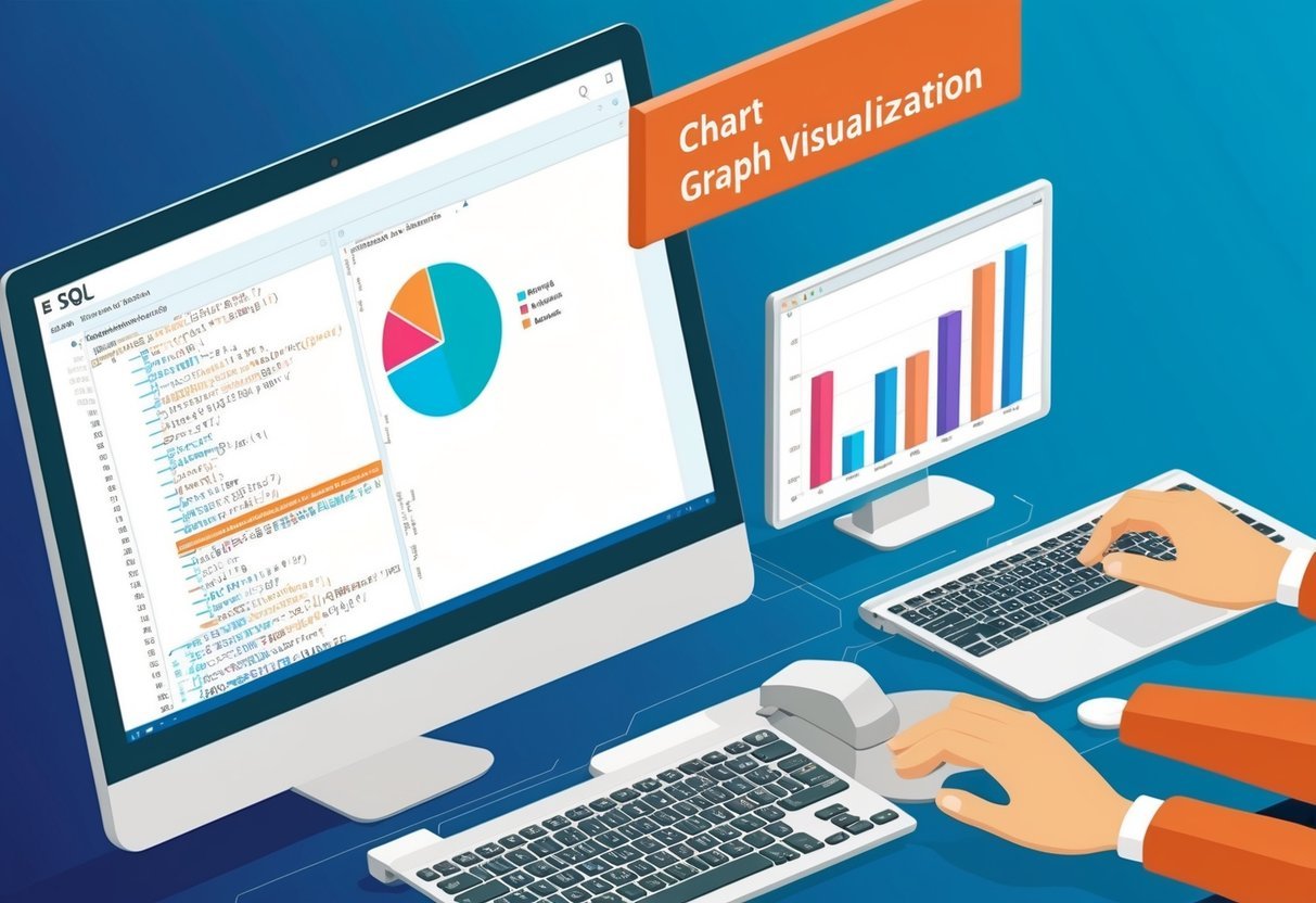
Data visualization involves converting data into graphical formats, such as charts and graphs, to make it easier to spot patterns, trends, and outliers.
By selecting the right visualization techniques, data professionals can effectively interpret and communicate complex datasets.
Choosing the Right Chart Types
Selecting the appropriate chart type is crucial to convey the data’s message accurately.
Bar charts are best for comparing quantities across different categories. They are simple yet powerful, highlighting differences effectively.
Line charts excel in showing trends over time. They illustrate changes and patterns, helping to reveal ongoing trends and forecasts.
Pie charts are used to show proportions and percentages. They are ideal for presenting a part-to-whole relationship in a clear visual format.
Knowing when to use each type ensures the data’s story is told clearly and accurately. By understanding the strengths and weaknesses of each chart type, data visualization becomes more meaningful and insightful.
Identifying Data Patterns and Trends
Uncovering data patterns and trends is a key aspect of effective visualization. Trends reveal the general direction in which data points move over time, such as upward or downward shifts.
Patterns can include cycles, seasonal variations, or other recurring movements in the data.
Using tools like line charts helps identify long-term trends and short-term patterns, making it easier to draw insights.
Spotting these trends and patterns can be crucial for data analysts looking to forecast future behavior or outcomes.
Visual cues provided in well-chosen charts enable quick comprehension and support data-driven decision-making.
Addressing Outliers and Data Anomalies
Outliers are data points that stand significantly apart from others in a dataset. They can skew results and may indicate errors, anomalies, or novel phenomena worth investigating.
Handling outliers correctly is essential for accurate data interpretation.
Visualization techniques like scatter plots can help identify these outliers quickly, highlighting any unusual data patterns.
Recognizing and addressing outliers involve assessing whether they result from data errors or represent significant new insights.
By visualizing outliers clearly, analysts can decide how to treat them effectively—either by investigating further or adjusting analyses accordingly.
Integrating SQL with Data Visualization Tools
Seamless integration between SQL and data visualization tools is crucial for optimizing data exploration and analysis. Key aspects include establishing connections with data sources and managing real-time data transformations.
SQL Queries and Data Source Connectivity
To start with data visualization, establishing a robust connection between SQL databases and visualization tools is essential.
These tools can extract real-time data through SQL queries, which allows analysts to work with live data. Understanding how to configure these connections improves data accessibility and analysis speed.
Flexible connectivity options are important.
Many tools, such as Looker Studio, offer built-in connections to popular databases like SQL Server. Ensuring compatibility with existing data infrastructure enhances performance and reduces the setup time for data analysts.
Real-Time Data Transformation and Management
Real-time data management is vital for accurate and timely insights.
SQL helps in transforming data before visualization, playing a crucial role in data preparation.
Transformation capabilities include data filtering, aggregation, and joining tables to prepare datasets that are ready for visualization.
Data visualization tools often provide customization features that can handle real-time data updates.
Tools like Power BI allow users to create dynamic dashboards that reflect the latest data. This capability ensures that users can interact with real-time data, making quick decisions based on current information.
Exploration of Popular Visualization Tools

In the realm of data visualization, several tools stand out for their unique capabilities and features. These tools offer powerful options for creating interactive dashboards, customizing reports, and performing advanced data analysis.
Tableau: Interactive Dashboards and Security Features
Tableau excels in creating visually engaging and interactive dashboards. It allows users to connect with a wide array of data sources, making it a versatile choice for data professionals.
Security is a priority in Tableau, with options for role-based permissions and user authentication.
Users can track performance metrics and generate detailed visual reports. The tool’s ability to handle large data sets efficiently makes it ideal for organizations that require scalable solutions.
The interface is designed to be intuitive, encouraging users to explore data insights freely.
Power BI: Business Intelligence and Customization
Power BI is known for its robust business intelligence capabilities and extensive customization options.
It integrates seamlessly with SQL databases and other data platforms, allowing users to create dynamic and interactive visualizations.
Customization is a highlight of Power BI. Users can tailor dashboards to fit specific business needs, incorporating branding elements and personalized layouts.
The tool provides real-time analytics for immediate decision-making, making it a powerful ally in business strategy. Its cloud-based service ensures accessibility, enabling teams to collaborate on data projects efficiently.
Looker and QlikView: Advanced Analysis Capabilities
Looker and QlikView provide advanced data analysis features, catering to professionals who need in-depth analysis capabilities.
Looker integrates well with SQL databases, offering real-time data modeling and visual reporting. It helps teams gain insights by sharing interactive dashboards across the organization.
QlikView focuses on in-memory data processing, allowing rapid analysis of large datasets. Its associative data model encourages exploration without predefined hierarchies.
This unique approach facilitates quick insights, making it suitable for businesses that require agile data analysis.
Both tools offer strong data visualization capabilities, ensuring that users can present complex data in a comprehensible format.
Enhancing BI with SQL-Based Data Manipulation

SQL plays a vital role in boosting business intelligence by offering advanced data manipulation capabilities. It allows for efficient handling of complex datasets through operations such as filtering and sorting. These operations refine data, making it more suitable for analysis.
Joining Tables
A powerful feature of SQL is the ability to join tables. This can merge data from different sources and provide a more complete picture.
By using tables from multiple sources, businesses can uncover insights that might otherwise remain hidden.
Improving Data Quality
Data quality is crucial for meaningful analysis. SQL excels at cleaning and transforming data to ensure its accuracy and consistency.
Tasks such as removing duplicates and correcting inconsistencies help improve the reliable use of data in BI tools like Power BI.
Integrating SQL with BI tools enhances visualization by providing cleaned and well-structured data.
Tools such as Power BI and Tableau can easily connect with SQL databases, simplifying the process of creating dynamic reports and dashboards.
Integrating SQL with Bi tools like Power BI adds value to BI processes.
Interactive Reports and User-Friendly Design

Creating interactive reports involves balancing user engagement with straightforward design. Tools like Looker Studio and Power BI emphasize a user-friendly interface through features like drag-and-drop mechanisms and customizable reports which benefit data analysts. The importance of a smooth learning curve and engaging interactive elements ensures effective data visualization.
Designing for a Smooth Learning Curve
When adopting new visualization tools, a critical factor is how easily users can learn and operate them.
Tools with a drag-and-drop interface are especially beneficial, allowing users to arrange data intuitively without coding skills. This usability is vital for both beginners and experienced analysts, making the transition seamless.
Power BI and Looker Studio excel in this area by offering pre-built templates and intuitive layouts. Templates guide users in designing reports efficiently, reducing the time needed to adapt.
Moreover, these interfaces focus on providing all necessary visualization options without overwhelming the user, enabling quick adaptation and improved productivity.
Interactive Elements: Tooltips and Drill-Down Features
Interactive elements in reports elevate the user experience by providing deeper insights without clutter. These include tooltips, which give users additional information on hover, and drill-down features that allow users to explore data points in detail. Such interactivity makes reports dynamic and informative.
For example, tooltips reveal detailed metrics when a user points over a chart element, enhancing data comprehension. The drill-down feature allows navigation from general to specific data layers, which is crucial for thorough analysis.
SQL visualization tools like Tableau and Power BI integrate these elements, helping analysts uncover trends and insights effectively.
These features not only make reports more engaging but also support thorough and interactive data exploration.
Data Security and Privacy in SQL and Visualization

Data security and privacy are crucial when integrating SQL with visualization tools. Data encryption plays a vital role in protecting sensitive information. By encrypting data, organizations can ensure that even if unauthorized access occurs, the information remains unreadable.
Access control is essential for maintaining data privacy. It involves setting permissions to restrict who can view or modify specific data. This ensures that only authorized personnel can access sensitive information, reducing the risk of data breaches.
Governance ensures that data handling complies with regulations. Organizations implement governance policies to manage how data is used, shared, and stored. This helps maintain data integrity and trust among stakeholders.
It’s important to address data privacy concerns, especially with increasing data collection. Visualization tools must integrate privacy-preserving techniques to minimize risks.
For example, using anonymized datasets can help protect individual identities.
To combine SQL and visualization, businesses must prioritize security measures. Secure integration methods should be adopted to safeguard databases and visualizations.
This includes implementing robust security protocols to prevent unauthorized access to both SQL servers and visualization platforms.
Focusing on these security aspects can help businesses effectively protect their data while benefiting from the powerful insights provided by SQL and visualization tools.
SQL for Aggregating and Analyzing Complex Data
SQL plays a vital role in the manipulation and analysis of complex datasets. It offers tools like GROUP BY and ORDER BY to sort and categorize data efficiently.
These commands help transform raw data into meaningful insights.
When dealing with aggregating data, SQL’s ability to perform calculations such as sums or averages helps in summarizing data effectively. Commands like SUM, AVG, COUNT, and MAX are crucial for this purpose.
Window functions are a powerful feature in SQL, allowing analysts to perform calculations across a set of table rows related to the current row. These functions are useful for tasks like calculating running totals or moving averages.
A CASE statement in SQL provides flexibility in data analysis by allowing users to create conditional logic in queries. It can be used for categorizing or transforming data based on certain criteria.
These SQL tools are essential for processing, analyzing, and extracting insights from complex data. This makes it easier for analysts to deliver clear, data-driven conclusions.
Advanced SQL Techniques for Data Exploration

Advanced SQL techniques can significantly boost data exploration capabilities. By using Common Table Expressions (CTEs), analysts can break complex queries into simpler parts. This makes it easier to read, debug, and maintain code.
CTEs are especially useful when dealing with recursive queries or when a subquery is used multiple times.
Another powerful tool is the WHERE clause, which allows for precise data filtering. By using logical operators like AND, OR, and NOT, complex conditions can be set.
This makes it possible to focus on specific data subsets that meet certain criteria, enabling a more targeted exploration process.
Data cleaning is a critical step in data exploration. SQL offers several functions and expressions to facilitate this process. Techniques such as using TRIM() to remove whitespace or employing CASE statements for data standardization can make datasets more manageable and easier to analyze.
Lists are useful for outlining concepts:
- Common Table Expressions simplify complex queries.
- WHERE clause helps filter datasets.
- Functions like TRIM() aid in data cleaning.
By mastering these techniques, analysts enhance their ability to extract meaningful insights efficiently. This contributes to better decision-making and more accurate conclusions drawn from data.
Reporting and Sharing Insights with Decision Makers

Effective reporting is key to communicating data insights to decision-makers. Using SQL with visualization tools allows data teams to create clear and understandable reports.
These reports help in data-driven decision-making by highlighting trends and patterns.
Interactive dashboards play a crucial role in this process. They offer a dynamic way to view data, enabling users to explore the information through filters and drill-downs.
This interactivity aids in better analysis and supports more informed decisions.
Sharing insights across teams helps foster collaboration. By making reports accessible to different departments, everyone can align their strategies based on shared data insights.
This improves cooperation and ensures that decisions are backed by comprehensive data.
A strong collaboration between IT and data departments ensures that the right tools and data sets are available for the users. Together, they can create and maintain effective dashboards that adapt to the evolving needs of the organization.
In today’s data-centric world, having well-designed dashboards and reports ensures that decision-makers have the necessary tools to make informed choices. This not only enhances efficiency but also supports the overall business strategy.
Some SQL visualization tools provide real-time insights, which are crucial for swift decision-making in fast-paced environments. For instance, Seek offers real-time insights with natural language queries. This allows decision-makers to get timely updates and act accordingly.
By integrating SQL data into visualization tools, organizations can transform raw data into actionable insights, streamlining the decision-making process. This approach fosters a culture of continuous learning and adaptability within teams.
Artificial Intelligence and Machine Learning Integration

AI and ML technologies are revolutionizing data workflows by offering new levels of automation and insight. They enhance the power of SQL and visualization tools, providing predictive analytics and simplifying data analysis tasks.
Predictive Analytics and Visualization
Predictive analytics transforms raw data into valuable insights using AI and machine learning. Python and R, programming languages well-suited for data tasks, are integral in building models to predict future trends and outcomes.
These models use historical SQL data to identify patterns and project future scenarios.
Visualization of these predictive insights helps in understanding complex data at a glance. AI and ML enhance dashboards by embedding model outputs directly, making it easier to view predicted trends through intuitive charts and graphs.
The combination of SQL’s data management capabilities with AI-powered analytics creates a comprehensive system for exploring and forecasting data-driven insights. More information can be found here.
Automating Data Analysis with AI and ML
Using AI and ML automates various stages of data analysis, speeding up processes that typically require significant human effort. For example, machine learning algorithms can handle tasks like data preparation, cleaning, and sorting.
This automation lets analysts focus on interpreting data instead of getting bogged down with manual tasks.
SQL can be enhanced with AI and ML by embedding code that processes large datasets quickly. Stored procedures using machine learning models can, for example, classify or predict data trends seamlessly.
Integrating these technologies into an SQL environment reduces the time spent on routine data handling, making the analysis quicker and more efficient. Learn more about how AI and ML streamline operations.
Scalability and Performance Optimization

Scalability is a key factor when integrating SQL with visualization tools. A system that scales well can handle growing amounts of data efficiently.
When planning for scalability, it’s important to consider how the system will perform as data volumes increase. SQL editors and business intelligence platforms must support this growth without sacrificing speed or functionality.
Performance optimization is crucial for fast data processing. Techniques such as query rewriting and using execution plans can enhance SQL query performance.
These methods help identify and eliminate bottlenecks, which is essential for maintaining a responsive system.
Optimizing SQL queries can significantly reduce costs associated with data processing.
Key Aspects of Optimization:
- Execution Plans: Understanding query performance.
- Query Rewriting: Avoid unnecessary joins.
- Indexing: Consider column cardinality and data types.
Business intelligence platforms benefit from optimized data pipelines. These tools enable organizations to make data-driven decisions quickly.
By ensuring scalability and performance optimization, businesses can better leverage their SQL databases for real-time analytics.
Incorporating real-time analytics into SQL environments also relies on the systems’ ability to handle rapid data changes. The integration of SQL with visualization tools should support seamless data flow and analysis, ensuring users always have access to the latest insights.
Frequently Asked Questions
Integrating SQL with visualization tools involves using specific methods and technologies to enhance data analysis and presentation. Various SQL databases support direct visualization, and numerous tools help in leveraging SQL data effectively.
How can data visualization be achieved directly within SQL databases?
Some SQL databases offer built-in tools for visualization. For instance, a data grid can display database tables in a user-friendly format. This feature allows users to visualize data without exporting it to another platform, providing a straightforward way to view and analyze data.
Which tools are considered most efficient for visualizing data from SQL databases?
Tools such as Tableau, Power BI, and Looker stand out for their efficiency. They provide powerful visualization capabilities and integrate well with SQL databases, allowing users to create dynamic and interactive reports.
What techniques are available for embedding SQL query visualizations in Databricks dashboards?
In Databricks, SQL query visualizations can be embedded using custom widgets and display functions available in the platform. These techniques help integrate SQL query results directly into dashboards, making it easy to present data insights.
Can artificial intelligence assist in generating SQL queries for data analysis tasks?
AI can significantly assist in generating SQL queries. By using AI-driven tools, users can automate the creation of complex queries, thus streamlining the data analysis process and reducing the need for deep technical expertise.
How does BlazeSQL enhance the integration of SQL databases with visualization capabilities?
BlazeSQL enhances integration by simplifying the data workflow between SQL databases and visualization tools. It optimizes query execution and provides seamless connectivity, allowing users to focus on data insights rather than technical challenges.
What are the advantages of using tools like Tableau or Power BI for SQL database visualizations?
Tableau and Power BI provide interactive and aesthetically pleasing visualizations.
These tools allow for real-time data updates and are highly customizable, giving users flexibility in presenting their SQL database data effectively.