Categories
Uncategorized

Learning about Linear Regression and its Algorithm History: A Comprehensive Overview

Fundamentals of Linear Regression

Linear regression is a basic yet powerful tool used in statistics and machine learning to model and analyze relationships between variables. This section explores the definition, key components, and historical development of linear regression algorithms.

Defining Linear Regression

Linear regression is a method for modeling the relationship between a dependent variable and one or more independent variables. It is widely used due to its simplicity and effectiveness in identifying trends.

The simplest form, known as simple linear regression, describes a straight-line relationship between two variables. The equation for this line is typically written as ( y = mx + b ), where ( y ) is the predicted value, ( m ) is the slope, ( x ) is the independent variable, and ( b ) is the y-intercept.

Components of a Linear Regression Model

A linear regression model comprises several key components: the dependent and independent variables, parameters such as the slope and intercept, and the error term. The linear regression model aims to minimize the sum of squared differences between observed and predicted values.

Understanding these components helps in fitting the model to data. The slope indicates the strength and direction of the relationship, while the intercept shows where the line crosses the y-axis. The error term accounts for data points not precisely on the line, reflecting variability or noise.

History of Linear Regression Algorithms

The history of linear regression algorithms dates back to the 19th century with Carl Friedrich Gauss, who developed the method of least squares. This statistical approach is integral to linear regression, aiming to find the best-fitting line by minimizing error.

Over time, linear regression has evolved with advancements in computational power, becoming a staple in machine learning. Tools like scikit-learn have simplified the implementation of linear regression, making it accessible for beginners and experts alike. The technique continues to be foundational in various fields, from economics to data science.

Mathematical Foundations

A chalkboard with equations and graphs depicting linear regression, surrounded by historical mathematical texts and tools

Linear regression relies on a combination of methods to establish a relationship between variables. Key aspects include the least squares method, cost functions, and gradient descent, each playing a crucial role in fine-tuning predictions and understanding data trends.

Understanding Least Squares Method

The least squares method is a foundational technique used in linear regression to minimize the differences between observed and predicted values. It involves finding the best-fit line by minimizing the sum of squared differences between data points and the line itself. This ensures that the line represents data trends as accurately as possible.

In practice, this means adjusting the slope and intercept of the line to reduce the overall error. The use of the least squares approach is critical in determining how well the line fits the data, facilitating accurate predictions. Its straightforward application has made it a core component of various statistical analyses.

Interpreting the Cost Function

The cost function, often represented as the mean squared error (MSE), evaluates how well a regression model predicts the data. It calculates the average of the squared differences between the actual and predicted values. The aim is to minimize this value to improve model accuracy.

A lower cost function value indicates a model that predicts data effectively. It is crucial in assessing model performance and guiding adjustments in model parameters. By continually refining the cost function, researchers and data analysts can enhance predictions, making it indispensable for accurate modeling.

Gradient Descent in Linear Regression

Gradient descent is an optimization algorithm that adjusts model parameters to minimize the cost function. By iteratively moving towards the steepest descent, it fine-tunes both the slope and intercept to achieve the lowest possible cost.

This process involves calculating the gradient (slope) of the cost function and updating parameters accordingly. It’s especially beneficial for large datasets where manual adjustments are impractical. Gradient descent uses a learning rate to determine step size, balancing between speed and accuracy. Through its use, linear regression models become more reliable and accurate, ensuring well-fitted results to the given data.

Extending to Multiple Variables

Expanding from simple to multiple linear regression allows for the modeling of relationships between one dependent variable and several independent variables. This approach improves the model’s predictive ability by incorporating more data points, allowing for nuanced insight.

Transition to Multiple Linear Regression

When moving from simple to multiple linear regression, the complexity increases as more independent variables are introduced to the model. In simple linear regression, the relationship between two variables is represented by a straight line. However, multiple linear regression uses a plane or hyperplane to fit the data. This process involves solving for coefficients that best describe the linear relationship between the combination of independent variables and the dependent variable.

Each coefficient in a multiple regression model represents the change in the dependent variable for a one-unit change in an independent variable, assuming other variables remain constant. This ability to account for the simultaneous influence of multiple factors makes multiple linear regression a cornerstone of statistical modeling and predictive analytics. By extending beyond a single dimension, it allows analysts to draw deeper insights and make more accurate predictions.

Handling Multiple Independent Variables

Incorporating multiple independent variables requires careful consideration of each variable’s significance to the model. Multivariate linear regression models can become complex due to interactions between variables. Therefore, ensuring that each variable contributes meaningfully is crucial. Analysts typically use statistical techniques like calculating correlation coefficients to understand these relationships before including them in a model.

Regularization methods, such as ridge regression and lasso, help manage multicollinearity by penalizing the size of coefficients, ensuring more stable and accurate models. Handling multiple variables involves balancing the complexity of the model with its predictive accuracy. Access to more data and computing power helps in efficiently analyzing large data sets with many variables. This enables detailed predictions and offers comprehensive insights across various fields like economics, biology, and machine learning.

Leveraging Statistical Principles

A chalkboard with equations and graphs depicting linear regression, surrounded by statistical textbooks and historical algorithm diagrams

Linear regression is a valuable tool in statistics, used to discover relationships between data points. By understanding regression analysis and correlations, one can make informed predictions and uncover patterns within the data.

Analyzing Data Points and Correlation

Data points can help in understanding the connection between different variables. Correlation measures the strength and direction of this connection. When examining data, it is crucial to determine how closely variables are related, as a strong or weak correlation can impact predictions.

A scatter plot visually represents this relationship by plotting data points on a graph. This visual can help identify trends or outliers. If data points align closely around a line, there is a strong correlation. Such analysis allows researchers to make predictions based on observed data patterns, emphasizing the importance of correlation in statistical models.

Importance of Regression Analysis

Regression analysis is key in understanding how one variable affects another within a dataset. It goes beyond simple correlation by providing a method to model relationships between variables. This can help in predicting outcomes or understanding the impact of changes in data.

In regression analysis, a line of best fit is determined, which minimizes the distance between data points and the line. This line provides a clear mathematical model of the relationship between variables. By using regression analysis, researchers can quantify the strength of these relationships, enhancing decision-making in various fields.

Refining Accuracy and Predictions

A chalkboard filled with equations and graphs, surrounded by books on statistics and computer science. A computer screen displaying a linear regression algorithm in action

Improving predictions in linear regression involves handling outliers and using techniques like regularization to optimize models. These strategies ensure better fitting to data while preventing overfitting.

Dealing with Outliers and Noise

Outliers can significantly impact the accuracy of a linear regression model. They may skew the best fit line, leading to incorrect predictions. Identifying and managing outliers is crucial. Techniques such as statistical tests can help detect these points.

Noise in data, which refers to random errors or variability, can also affect the model. Techniques like smoothing and filtering reduce noise. By addressing both outliers and noise, the model can provide more reliable results.

Optimization with Regularization Techniques

Regularization techniques help to prevent overfitting, a common issue where a model performs well on training data but poorly on unseen data. Ridge regression and lasso regression are popular methods used for this purpose.

Ridge regression adds a penalty to the loss function based on the square of the coefficients, helping to minimize extreme values. Lasso regression, on the other hand, uses the absolute value of coefficients, which can lead to some coefficients being zeroed out, effectively selecting the most important predictors.

Both techniques aim to refine the balance between fitting the training data and maintaining generalization for better predictions.

Practical Implementation in Machine Learning

A chalkboard with equations and graphs of linear regression, surrounded by historical documents and books on machine learning algorithms

Linear regression is a fundamental tool in machine learning for predicting continuous outcomes. Practical applications involve understanding its role within ML frameworks and applying techniques related to learning algorithms and learning rates.

Role of Linear Regression in ML

Linear regression is essential in machine learning as it helps predict values by modeling relationships between dependent and independent variables. It drives many practical applications like forecasting, resource estimation, and even financial modeling. The model seeks to establish a linear equation where a dependent variable is predicted from one or more independent variables.

A regression coefficient quantifies the strength and direction of this relationship. By using training data, the model learns these coefficients. The process of fitting a linear regression model in frameworks like Scikit Learn is straightforward, making it accessible and widely used.

Learning Algorithm and Learning Rate

The core of linear regression in practical machine learning hinges on the learning algorithm. Gradient descent is widely used, minimizing errors by iteratively updating model parameters. Adjustments are controlled by the learning rate, a critical parameter that decides how much to change the weights in response to the estimated error.

Choosing the right learning rate influences how quickly and accurately the model converges. A rate too high can overshoot the minimum error point, while a rate too low can result in a slow convergence. Thus, balancing this rate is crucial for achieving optimal regression coefficients and model performance. This iterative process is essential for efficient and effective model training.

Optimization Algorithms

A chalkboard filled with equations and graphs, surrounded by books on optimization algorithms and linear regression

Optimization algorithms play a crucial role in linear regression. They help find the best fit line by adjusting the model parameters. This section highlights the workings of gradient descent, its variations, and how loss functions and partial derivatives are used in optimization.

Gradient Descent Variants

Gradient descent is an optimization algorithm that minimizes the cost function by iteratively adjusting parameters. It calculates the partial derivative of the cost function concerning each parameter to determine the direction of movement. There are several variants of gradient descent.

  • Batch Gradient Descent: This uses the entire dataset to calculate the gradient. While accurate, it can be slow for large datasets.

  • Stochastic Gradient Descent (SGD): This algorithm uses one random data point per iteration. It is faster but less stable than batch gradient descent.

  • Mini-batch Gradient Descent: This combines batch and SGD by using a small subset of the dataset. It balances speed and accuracy efficiently, making it popular in practice.

These variants help tune the learning process and improve model performance.

Loss Functions and Partial Derivatives

A loss function measures how well a model’s predictions match actual outcomes. Common choices include the mean squared error for linear regression. The aim is to reduce this error by adjusting model parameters.

Partial derivatives are essential in this process. They indicate how changes in each parameter affect the loss function. Calculating these derivatives provides a direction to update model parameters to minimize loss.

Optimization algorithms use these derivatives to guide parameter updates. Ensuring the loss function value decreases after each iteration is key to training a model effectively. By iteratively using the gradient of the loss function, the algorithm finds a local minimum, optimizing the model.

Coding Linear Regression with Python

Python is widely used to implement linear regression due to its powerful libraries that simplify the process. Key components include using Python libraries like NumPy and SciPy to handle calculations and data manipulation efficiently.

Python Libraries for Linear Regression

Python offers a variety of libraries that make implementing linear regression straightforward and efficient.

NumPy is crucial for handling arrays and performing mathematical operations needed for regression. It supports multi-dimensional data and offers high-performance functionalities.

Additionally, Scikit-learn is a robust machine learning library built on NumPy. It is particularly popular for its ease of use and comprehensive tools for regression tasks.

Another useful library is Pandas, which assists in data manipulation and preparation, ensuring datasets are ready for analysis.

Together, these libraries create a powerful toolkit for building linear regression models in Python.

Python Implementation of a Regression Model

When implementing a regression model in Python, the first step is to prepare the data, typically using Pandas for data cleaning and organizing.

After data preparation, use Scikit-learn to split the data into training and testing sets.

The model is created using the LinearRegression class from Scikit-learn, which fits the training data.

Here’s a simple example:

from sklearn.model_selection import train_test_split
from sklearn.linear_model import LinearRegression
import pandas as pd

data = pd.read_csv("data.csv")
X = data[['feature1', 'feature2']]
y = data['target']

X_train, X_test, y_train, y_test = train_test_split(X, y, test_size=0.2, random_state=42)

model = LinearRegression()
model.fit(X_train, y_train)

This code snippet outlines how data can be prepared and fed into a linear regression model using Scikit-learn, which leverages the powerful capabilities of both NumPy and Pandas for efficient computation and data handling.

Advanced Linear Regression Models

Advanced linear regression models extend the basic linear regression to address more complex relationships and limitations. They often incorporate techniques like regularization and transformations to improve predictive accuracy and model performance.

Exploring Polynomial and Lasso Regression

Polynomial regression builds on linear regression by modeling the relationship between variables as an nth-degree polynomial. This approach captures non-linear patterns within the data, making it useful for datasets with curved trends.

Despite increasing the model’s flexibility, polynomial regression can risk overfitting, especially with high-degree polynomials.

Lasso regression, or Least Absolute Shrinkage and Selection Operator, adds regularization to the mix. It introduces a penalty on the coefficients of the variables, effectively shrinking some to zero.

This helps in feature selection, making the model easier to interpret while reducing the risk of overfitting.

Lasso regression can result in sparse models, retaining only the most significant variables, thus improving the model’s predictive power.

Insight into Ridge Regression

Ridge regression, another regularization technique, addresses issues such as multicollinearity. It adds a penalty equal to the square of the magnitude of coefficients to the cost function.

This technique helps by shrinking the coefficients but not necessarily setting any to zero.

The primary benefit of ridge regression is its ability to handle multicollinearity, which occurs when independent variables are highly correlated. It stabilizes the estimates and often enhances the predictive accuracy.

While ridge regression won’t simplify the model as Lasso does, it is valuable in scenarios where all predictors can offer some meaningful insights. This makes it well-suited for datasets with many variables contributing to the final predictive model.

Evaluating Model Performance

In evaluating linear regression models, understanding key metrics like the Residual Sum of Squares (RSS) and R Squared is vital. These metrics help determine how well a model fits the data and predict future outcomes.

Additionally, using error metrics ensures the reliability and validity of the model.

Understanding Residual Sum of Squares and R Squared

Residual Sum of Squares (RSS) measures the variation of data not explained by the model. Smaller RSS values suggest a better fit, implying the model accurately captures the data’s trends. In contrast, larger RSS indicates inadequacies in the model’s predictions.

R Squared, or the coefficient of determination, gauges how well model parameters predict actual outcomes by showing the proportion of variance explained.

An R Squared value close to 1 means a strong relationship between the predictors and the response variable, signaling effective model performance.

It’s important for practitioners to understand these measures which assess the quality and fitting of regression models accurately. Evaluating both RSS and R Squared provides a complete picture of a model’s capability.

Error Metrics and Model Validation

Error metrics such as Root Mean Squared Error (RMSE) and others are crucial in regression analysis. RMSE provides the average magnitude of prediction errors, serving as a gauge for model accuracy.

Lower RMSE signifies a more precise model.

These metrics are essential parts of model validation, which ensures models perform well under different conditions.

Validation involves comparing predicted results with actual data, checking if the model reliably captures trends without overfitting.

Using metrics like RMSE alongside validation techniques helps refine models for real-world applications. Proper validation establishes trust in model forecasts and parameter accuracy, ensuring robust decision-making in various fields.

Frequently Asked Questions

A chalkboard with a graph showing the progression of linear regression algorithm history, surrounded by books and research papers

Linear regression is an essential tool in machine learning, known for its ability to model relationships between variables. Here, you’ll find answers to common questions about its components, examples, variations, implementation steps, historical evolution, and significance.

What are the key components of a linear regression model in machine learning?

A linear regression model in machine learning primarily consists of variables—dependent and independent—the coefficients, and the intercept. The model predicts the dependent variable using the independent variables.

The model’s effectiveness is measured by its ability to minimize the distance between actual and predicted values.

Can you provide an example to explain how linear regression works?

Consider a dataset of students’ study hours and their corresponding test scores. By applying linear regression, a line of best fit can be drawn. This line helps predict a student’s test score based on their study hours.

The closer the data points are to this line, the more accurate the prediction.

How does multiple linear regression differ from simple linear regression?

Simple linear regression examines the relationship between two variables: one dependent and one independent. In contrast, multiple linear regression involves more than one independent variable.

This allows for modeling more complex relationships, as multiple factors are taken into account when predicting the outcome.

What are the main steps involved in implementing a linear regression algorithm?

Implementing a linear regression algorithm involves several key steps.

First, gather and prepare the dataset. Next, split the data into training and testing sets. Then, an algorithm calculates the best-fitting line.

Finally, the model’s accuracy is validated using error metrics like mean squared error.

How has linear regression evolved since its inception?

Linear regression has evolved significantly, from basic statistical applications to becoming integral in sophisticated machine learning models. Initially used for simple predictions, it now serves as a building block for complex algorithms and techniques in various fields such as finance, biology, and social sciences.

Why is linear regression considered crucial in predictive modeling?

Linear regression is crucial because of its simplicity, efficiency, and interpretability. It provides clear insights into data relationships, making it easier to understand and explain predictions.

This attribute makes it a preferred choice for many predictive modeling applications, especially when quick and straightforward predictions are needed.

Categories
Uncategorized

Learning Pandas for Data Science – Summary Statistics Tips and Techniques

Getting Started with Pandas

Pandas is a powerful Python library for data analysis. It simplifies working with large datasets through efficient data structures like DataFrames and Series.

This section covers how to install pandas, use its core data structures, and import various data types.

Installing Pandas

To begin with pandas, ensure that Python is installed on the system.

Pandas can be installed using a package manager like pip. Open a command prompt or terminal and execute the command:

pip install pandas

This command installs pandas and also handles dependencies such as NumPy.

It is advisable to have a virtual environment to manage different projects. Using a virtual environment helps isolate dependencies, preventing conflicts between packages needed by different projects.

Understanding DataFrames and Series

DataFrames and Series are the two core components of pandas.

A DataFrame is a two-dimensional table-like data structure with labeled axes (rows and columns). It is similar to an Excel spreadsheet or SQL table.

DataFrames can be created from various data structures like lists, dictionaries, or NumPy arrays.

A Series is a one-dimensional array, similar to a single column in a DataFrame. Each value in a Series is associated with a unique label, called an index.

DataFrames are essentially collections of Series. Understanding these structures is crucial for efficient data manipulation and analysis.

Importing Data in Pandas

Pandas simplifies data importing with its versatile functions.

To import CSV files, the pd.read_csv() function is commonly used:

import pandas as pd
data = pd.read_csv('file.csv')

Pandas also supports importing other file formats. Use pd.read_excel() for Excel files and pd.read_json() for JSON files.

This flexibility makes it easy to handle large datasets from different sources. Specifying parameters like file path and data types ensures correct data import, facilitating further analysis.

Basic Data Manipulation

Basic data manipulation in Pandas involves essential tasks like filtering, sorting, and handling missing data. It helps to shape data into a more usable format, allowing for easier analysis and calculation of summary statistics.

Beginners to dataframes will find these steps crucial for effective data handling.

Selecting and Filtering Data

Selecting and filtering data in Pandas is straightforward, providing flexibility in how data is accessed and modified.

Users often utilize Boolean indexing, which allows for data retrieval based on specific conditions (e.g., selecting all rows where a column value exceeds a certain threshold).

Another method is using the loc and iloc functions. loc helps in selecting rows or columns by label, while iloc is used for selection by position.

This ability to extract precise data ensures more efficient analysis and accurate summary statistics.

Sorting and Organizing Data

Sorting and organizing data helps in arranging dataframes in an orderly manner.

Pandas offers functions like sort_values() to sort data by specific columns. This function can sort in ascending or descending order, enabling clearer insights into trends and patterns.

Multi-level sorting can also be performed by passing a list of column names.

Sorting dataframes this way makes it easier to compare rows and identify data patterns. Being able to effectively sort data saves time and improves analysis outcomes.

Handling Missing Values

Handling missing values is crucial, as data often contains null values that can disrupt analysis.

Pandas provides several methods for dealing with these, such as dropna(), which removes rows or columns with missing values, and fillna(), which fills in nulls with specified values.

Users can choose methods depending on the context—whether removing or replacing based on significance to the analysis.

Effectively managing missing data prevents skewed results and ensures better data integrity.

Understanding Data Types

A laptop displaying a Pandas data frame with summary statistics, surrounded by charts and graphs

Data types play a crucial role in data analysis using pandas. Different data types impact how data is manipulated and analyzed. For instance, numeric variables are often used for mathematical operations, while categorical variables are useful for grouping and summarization. String variables require special handling to ensure data consistency and accuracy.

Working with Numeric Variables

Numeric variables in pandas are often used for calculations and statistical analysis. These can include integers and floats.

When working with a DataFrame, numeric columns can be easily manipulated using functions from libraries like NumPy. Calculations might involve operations such as sum, average, and standard deviation.

Conversion between data types is also possible. For instance, converting a column to float allows division operations, which might be necessary for certain analyses.

Ensuring numeric accuracy is important, so checking for missing values or erroneous entries is essential.

Handling Categorical Variables

Categorical variables represent a fixed number of possible values or categories, like ‘Yes’/’No’ or ‘Red’/’Blue’. They can be stored as category data types in pandas. This can often save memory and provide efficient operations.

Categorical data is useful for grouping data into meaningful categories which can then be summarized.

Using pandas, categorical columns can be aggregated to reveal patterns, such as frequency of each category. Visualizations can help display these patterns.

When converting a string column to categorical variables, careful attention must be paid to ensure correct mapping of categories.

Dealing with String Variables

String variables often contain text data which can include names, addresses, or other non-numeric information.

Manipulating string data in pandas can involve operations like concatenation, splitting, and formatting. Functions provided by pandas, such as .str.split() and .str.contains(), can assist in string processing.

When working with a DataFrame, ensuring that string columns are clean and consistent is important. This might involve removing unwanted characters or correcting typos.

Keeping string data accurate ensures reliable data analysis and helps in the effective use of other functions, like matching or merging datasets.

Performing Descriptive Statistics

Descriptive statistics help summarize and describe the main features of a dataset. Using tools in Pandas, practitioners can quickly calculate various useful metrics.

Summary Statistics provide a snapshot of data by giving basic descriptive numbers. This includes the mean, which is the average of all data points, and the median, the middle value when data is sorted.

Calculating these helps understand the data’s central tendency.

The mode is another measure of central tendency, representing the most frequently appearing value in the dataset. It is often used when the data contains categorical variables.

Understanding spread is crucial for grasping the distribution of data. Measures like standard deviation indicate how much data varies from the mean. A small standard deviation points to data points being close to the mean, while a large one indicates the opposite.

Quartiles divide the dataset into four equal parts and are useful for understanding the data distribution. The maximum value in a dataset shows the upper extreme, which can be crucial for spotting outliers or unusual values.

Pandas provides functions to easily compute these statistics, making it a preferred tool among data analysts.

In addition, visual tools like box plots and histograms also help illustrate these statistical concepts. This helps in making well-informed decisions by interpreting datasets accurately.

Exploratory Data Analysis Techniques
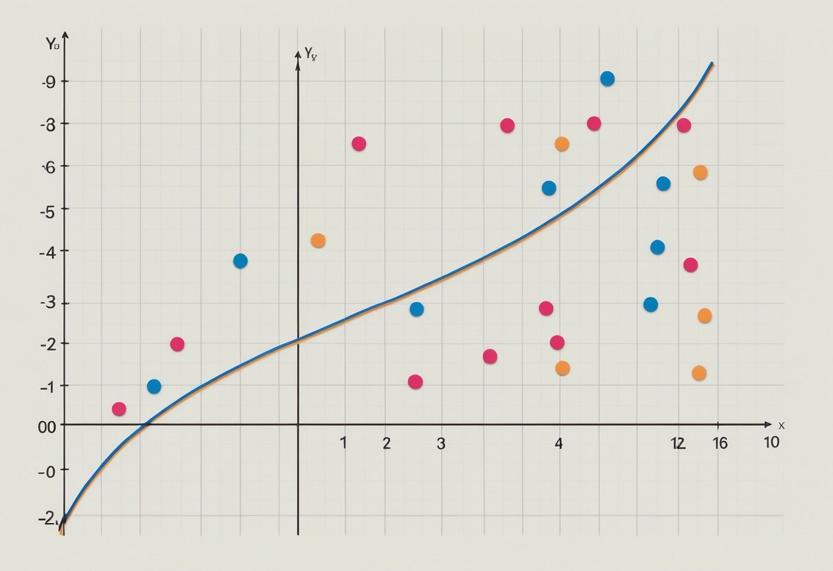
A laptop displaying a Pandas code for summary statistics, surrounded by data visualization charts and graphs

Exploratory data analysis helps data scientists understand the data they’re working with, paving the way for deeper insights. Through summary metrics and visualization, it achieves comprehensive data exploration by uncovering patterns and trends.

Using .describe() for Summary Metrics

The .describe() function is a key tool in exploratory data analysis for those using Pandas. It provides essential summary metrics like mean, median, standard deviation, and quartiles for numerical data.

This function helps identify data distribution, central tendency, and variability in datasets.

It quickly gives an overview of a dataset’s statistical properties. For example, it shows the data range by providing minimum and maximum values, helping to identify outliers.

Users can see if the data is skewed by comparing mean and median. This quick statistical summary is instrumental in interpreting data patterns and preparing for further, detailed analysis.

Visualizing Data Distributions

Data visualization is crucial in exploratory data analysis. Techniques such as bar plots, histograms, and line plots using libraries like Matplotlib reveal data patterns and distributions effectively.

A bar plot compares categorical data, showing frequency or count. Meanwhile, a histogram shows how data is distributed over continuous intervals, highlighting skewness or normality.

Line plots are useful to depict trends over time or sequence. They show how variables change, making them useful for time-series analysis.

Visualization also helps in spotting anomalies, identifying correlations, and offering visual insights that purely numerical data may not convey.

Overall, these tools make complex data more accessible and understandable through insightful graphical representation.

Advanced Grouping and Aggregation

This section covers the practical use of grouping and aggregation in data analysis. It includes methods like groupby, calculating summary statistics, and techniques for reshaping and wrangling data.

Applying GroupBy Operations

The groupby() function in pandas is a powerful tool for splitting data into groups for analysis. By grouping data based on unique values in one or or more columns, users can perform operations on these groups separately. This is particularly useful for category-based analysis.

For example, if one has sales data with a column for regions, they can group the data by region to analyze each region’s performance.

Grouping allows for targeted analysis, ensuring specific trends or patterns are not overlooked in the broader dataset.

The groupby() operation is crucial for detailed data wrangling, providing insights into how different segments perform. It also lays the foundation for more advanced analysis like aggregating data and calculating statistics.

Calculating Aggregates

Calculating aggregates follows the groupby() operation and involves computing summary statistics like mean, median, and sum for each group.

This process helps in understanding the dataset’s overall distribution and variations between different groups.

For instance, in a sales dataset grouped by product category, the mean sales value for each category provides insights into which products perform better. This can guide business decisions like inventory adjustments or marketing focus.

Aggregating data into concise numbers makes large datasets easier to analyze and interpret. Users can apply functions like .mean(), .sum(), or .count() to quickly retrieve the needed statistics.

Pivoting and Reshaping Data

Pivoting and reshaping data involve rearranging the layout of a DataFrame to provide a different perspective.

Through pandas, users can use functions like pivot_table() to summarize and compare values in a customizable table format.

By reshaping, one can condense the dataset, focusing on key metrics without losing important data points. For example, pivoting a sales dataset by region and month will present a clear view of performance over time.

Reshaping is essential in data wrangling, allowing the transition between long and wide formats. It ensures that users have the flexibility to prepare their data for advanced analysis or visualization efforts efficiently.

Statistical Analysis with Pandas

Pandas is a powerful tool for statistical analysis. It allows the user to quickly compute statistics such as the mean, median, and mode. This makes analyzing data distributions and relationships straightforward and efficient.

Computing Correlation

Correlation measures the strength and direction of a relationship between two variables. In Pandas, this can be done using the corr() function.

This function calculates the correlation coefficient, giving insight into how closely two sets of data are related. A result close to 1 or -1 indicates a strong positive or negative relationship, respectively.

Understanding correlation is crucial for data analysis, as it helps identify trends and predict outcomes.

The corr() function can handle dataframes and series, allowing users to compare columns within a dataset easily. This is particularly useful in fields such as finance, where understanding relationships between variables like stock prices and trading volumes is important.

Analyzing Frequency and Distribution

Frequency analysis involves examining how often certain values occur within a dataset. This can be achieved with Pandas using functions like value_counts(). This function provides the frequency of each unique value in a series. It helps in understanding the distribution of categorical data, highlighting trends and anomalies.

For numerical data, distribution analysis involves calculating statistics such as the mean, median, and mode. These statistics provide a comprehensive view of the dataset’s central tendencies. The mean() function calculates the average of the data, while median() finds the middle value, and mode() identifies the most frequent value. This analysis is helpful in various applications, including marketing and social sciences, to understand data patterns and make informed decisions.

Data Cleaning Practices

Data cleaning is a vital step in data science. It ensures that datasets are accurate and reliable. This process involves handling missing values, filtering, and data manipulation.

Missing Values
Missing values can affect data analysis. To address them, they can be removed or filled with the mean, median, or mode of the dataset. These methods help maintain data integrity and provide more accurate results.

Null Values
Null values often indicate missing or incomplete data. Using functions in Pandas, like fillna(), can replace null values with other numbers. This step is crucial for making datasets usable for analysis.

Filtering
Filtering data involves selecting specific parts of a dataset based on certain conditions. This technique helps in focusing on relevant data points. For example, using Pandas’ query() method can filter datasets efficiently.

Data Manipulation
Data manipulation includes modifying data to derive insights. It involves operations like merging, joining, and grouping data. Tools in Pandas make these tasks straightforward, helping users explore datasets in depth.

Applying these practices ensures cleaner and more reliable datasets, which are essential for accurate data analysis. Check out Hands-On Data Analysis with Pandas for more insights on data cleaning techniques.

Input and Output Operations

A laptop displaying a pandas dataframe with summary statistics, surrounded by data science textbooks and a notebook with handwritten notes

Utilizing pandas for data science involves efficiently reading and writing data. This includes working with different formats like CSV and JSON, and using functions like read_csv for importing data into a pandas DataFrame. Additionally, seamless data export is essential for analysis and sharing results.

Reading Data from Various Formats

Pandas can easily read data from multiple formats. A common method is using the read_csv function to import data from CSV files into a pandas DataFrame. This function is versatile, handling large datasets efficiently and supporting options like reading specific columns or skipping rows.

JSON is another format pandas supports. The read_json function allows for importing JSON files, a format popular in settings with nested data structures. This gives flexibility in data integration from web APIs or configuration files.

Besides CSV and JSON, pandas can connect with SQL databases. With functions like read_sql, users can run queries directly from a database, importing data into DataFrames for smooth analysis. This helps in leveraging existing databases without exporting data manually.

Writing Data to Files

Writing data to files is a crucial aspect of pandas functionality. The to_csv method allows exporting DataFrames to CSV files, enabling data sharing and collaboration. Users can specify details like index inclusion or column delimiter, customizing the output according to their needs.

Besides CSV, pandas also supports writing to JSON using the to_json method. This is helpful when the data needs to be shared with systems reliant on JSON formatting, such as web applications.

Moreover, exporting data to databases using to_sql offers seamless integration with SQL-based systems. This is useful in environments where data storage and further processing happen in structured database systems, ensuring consistency and reliability in data operations.

Working with Time Series Data

Time series data can be analyzed effectively using Pandas. Time series refers to data points indexed in time order. It is commonly used for tracking changes over periods, such as stock prices or weather data.

A Pandas DataFrame is a powerful tool to handle time series data. Utilizing the datetime functionality, a DataFrame can manage dates and times seamlessly. Converting a column to datetime type lets you harness Pandas’ time series capabilities.

import pandas as pd

df['date'] = pd.to_datetime(df['date_column'])

Data manipulation becomes straightforward with Pandas. One can easily filter, aggregate, or resample data. Resampling adjusts the frequency of your time series data. For example, converting daily data to monthly:

monthly_data = df.resample('M').mean()

Handling missing data is another feature of Pandas. Time series data often has gaps. Fill these gaps using methods like fillna():

df.fillna(method='ffill', inplace=True)

For exploratory data analysis, visualization is key. Plotting time series data helps identify patterns or trends. Use matplotlib alongside Pandas for effective plotting:

df.plot(x='date', y='value')

Pandas also allows combining multiple time series data sets. Using merge() or concat(), one can join data frames efficiently.

Visualization Techniques

A laptop displaying a Pandas library tutorial, with a notebook and pen nearby, surrounded by data charts and graphs

Visualization in data science allows researchers to represent data graphically. Using Python’s Pandas and versatile libraries like Matplotlib, these techniques help users get insights from complex datasets by making them more understandable.

Creating Histograms and Bar Plots

Histograms are essential for displaying the distribution of data points across different value ranges. They group numeric data into bins and show the frequency of data within each bin. This is particularly helpful to see the underlying frequency distribution. In Matplotlib, histograms can be created with the hist() function. Users can adjust the number of bins to review different data patterns.

Bar plots are another effective way of visualizing data, especially categorical data. They display data with rectangular bars representing the magnitude of each category. This type of plot is helpful for comparing different groups or tracking changes over time. By using bar() in Matplotlib, users can customize colors, labels, and orientation, providing clarity and context to the data being analyzed. More details can be found in resources like the book on Hands-On Data Analysis with Pandas.

Generating Line Plots and Scatter Plots

Line plots illustrate data points connected by lines, making them ideal for showing trends over time. They are especially useful for time-series data. By using Matplotlib‘s plot() function, users can interpolate between data points. This helps to spot trends, fluctuations, and cycles quickly.

Scatter plots, on the other hand, use points to show relationships between two variables. Each axis represents a different variable. They are valuable for visualizing potential correlations or detecting outliers in the data. The scatter() function in Matplotlib allows customizations such as point color, size, and style. With these graphs, users can draw quick conclusions about the relationship between variables. More insights on these techniques are available in references like the book on Python: Data Analytics and Visualization.

Integrating Pandas with Other Libraries

A laptop displaying code with pandas library, surrounded by books on data science and statistics

Pandas is widely used for data manipulation and analysis. When combined with libraries like Matplotlib and Scikit-learn, it becomes a powerful tool for data visualization and machine learning tasks. This integration helps streamline processes and improve efficiency in data science projects.

Pandas and Matplotlib

Pandas works seamlessly with Matplotlib, a popular library for creating static, interactive, and animated visualizations in Python. By using Pandas data frames, users can create graphs and plots directly with Matplotlib functions. This enables analysts to visualize data trends, patterns, and distributions quickly.

A common approach is plotting data directly from a Pandas data frame using Matplotlib. By calling methods like .plot(), one can generate line graphs, bar charts, and more. For example, plotting a basic line chart can be as simple as df.plot(x='column1', y='column2'). Additionally, Pandas provides built-in plotting capabilities, which are powered by Matplotlib, making it easier to produce quick and useful graphs.

Integrating these two libraries is well-documented, with the Pandas documentation offering numerous examples to guide users in creating effective visualizations.

Pandas and Scikit-learn

Scikit-learn is a machine learning library in Python that can be combined with Pandas to prepare data for analysis and model training. The process typically involves cleaning and transforming data using Pandas before feeding it into Scikit-learn models.

Data preparation is crucial, and Pandas provides functionalities for handling missing values, data normalization, and feature extraction. Once data is prepared, it can be split into training and testing sets. Scikit-learn’s train_test_split function allows users to partition datasets directly from Pandas data frames.

Integration is facilitated by Scikit-learn’s ability to handle Pandas data structures, which simplifies post-modeling analysis. Users often refer to resources to better integrate these tools, ensuring data is clean and models are accurate.

Both Pandas and Scikit-learn are vital in the data science ecosystem, providing robust solutions for analyzing data and deploying machine learning models efficiently.

Frequently Asked Questions

A laptop open to a webpage on "Learning Pandas for Data Science – Summary Statistics" with a notebook and pen nearby

Pandas is a powerful tool for data analysis, providing many functions and methods for summarizing data. It can handle numerical and categorical data, offer statistical summaries, and aggregate data efficiently.

How can I generate summary statistics for numerical columns using Pandas?

Pandas provides the describe() function, which offers summary statistics such as mean, median, and standard deviation. This can be directly applied to numerical columns in a DataFrame to get a quick overview of the data’s statistical properties.

What methods are available in Pandas to summarize categorical data?

To summarize categorical data, functions like value_counts() and groupby() are essential. value_counts() calculates the frequency of each category, while groupby() can perform aggregate operations like count(), mean(), and more, based on the category.

In Pandas, how do you use the describe function to obtain a statistical summary of a DataFrame?

The describe() function, when called on a DataFrame, provides a summary of statistics for each numerical column, including count, mean, and other key metrics. It gives a comprehensive snapshot of the data aligned with its columns.

What is the process for calculating the sum of a DataFrame column in Pandas?

To calculate the sum of a DataFrame column, use the sum() function. By specifying the column name, you can quickly obtain the total sum of that column’s values, which is helpful for aggregating numerical data.

How can the groupby function in Pandas aid in statistical analysis of grouped data?

The groupby() function is a robust tool for grouping data based on one or or more keys. It allows for applying aggregation functions like mean(), sum(), or count(), facilitating detailed analysis of subsets within the data.

What are the best practices for performing summary statistics on a DataFrame in Python using Pandas?

Best practices include cleaning data before analysis to handle missing or inconsistent values.

Use functions like describe() for a broad overview. Tailor additional analyses using groupby() and specific aggregation functions to address more complex queries.

Categories
Uncategorized

Learning How to Work with Files and Folders in Python: A Comprehensive Guide

Understanding Python File Operations

File operations in Python are essential for handling data efficiently. These operations include opening and closing files, reading and writing data, and managing file modes.

Python offers tools like context managers to streamline these tasks and handle resources effectively.

Essentials of Open and Close File Operations

Opening and closing files in Python is done using the open() function. This function requires a file name and mode, such as read ('r') or write ('w').

Once a file is open, resources are allocated to it. It is crucial to close files using the .close() method to free these resources, avoiding potential memory leaks.

A table summarizing file modes is helpful:

Mode Description
‘r’ Read only
‘w’ Write only, creates
‘a’ Append to a file
‘b’ Binary mode

Using the correct mode ensures that operations like reading or writing perform as expected.

Reading and Writing Data in Python

Reading and writing data are common file operations. To read data from files, use methods like .read(), .readline(), and .readlines() depending on the need. These provide flexibility for processing data line by line or in chunks.

Writing data involves using methods like .write() and .writelines().

When files are opened in write mode ('w'), existing content gets replaced. Use append mode ('a') to add data to a file without altering current contents.

Efficient data handling is achieved by choosing the correct methods for specific tasks.

Working with File Context Managers

Python’s file context managers simplify file handling using the with syntax. This technique automatically handles file opening and closing, reducing the risk of errors like forgetfully leaving files open.

Here’s a basic example:

with open('example.txt', 'w') as file:
    file.write('Sample text.')

The with statement ensures that file.close() is called automatically once the block of code is executed, making the code cleaner and more reliable.

Handling Files in Binary and Text Modes

Python differentiates between binary and text modes. Text mode, the default, handles string operations, while binary mode deals with byte-by-byte data using the 'b' in file modes ('rb', 'wb').

Binary mode is ideal for non-text files like images or executable files, ensuring data integrity during read or write operations.

When working with text data, explicit encoding ('utf-8', for example) ensures accurate data processing across locales and systems.

Proper mode selection guarantees effective file operations tailored to distinct data types.

Navigating the File System with os and pathlib Modules

Python provides powerful tools for file system navigation through the os and pathlib modules. These tools allow for exploring directories, handling files, and leveraging both procedural and object-oriented approaches.

Exploring Directories and Files with os

The os module is essential for interacting with the file system in Python. Key functions include os.listdir() for listing files and directories, and os.getcwd() to get the current working directory.

You can change the working directory using os.chdir("path"), which is useful when working with different directories.

Listing Files:

  • Use os.listdir("path") to list files in a directory.
  • This returns a list of files and subdirectories.

Paths:

  • Supports both absolute and relative paths, facilitating navigation across systems such as Linux and Windows.

The Pathlib Module for Object-Oriented Filesystem Paths

The pathlib module introduces an object-oriented approach to file system paths. The Path object represents file system paths and integrates various functionalities, making path manipulations more intuitive.

Unlike the os.path module, pathlib handles paths as objects rather than strings, providing methods directly on path objects.

Key Features:

  • Supports pathlib.Path for creating path objects.
  • Methods like .exists(), .is_file(), and .is_dir() allow checking file or directory status easily.

Cross-Platform:

  • pathlib ensures consistent operation across operating systems by handling slashes and path formats internally.

Combining os and pathlib for Enhanced File Handling

Combining os and pathlib leverages the strengths of both modules for more comprehensive file handling tasks.

Use os functions for tasks like directory changes and environment queries, and pathlib for path manipulations and attributes.

Working with Files:

  • Use pathlib.Path("filename").open() to open a file with the with statement for safer file operations.

This hybrid approach streamlines operations such as file listing using os.listdir() in conjunction with pathlib‘s path objects, allowing for flexible file management in various coding environments. These tools together enable efficient and effective navigation and management of the file system within Python.

File Management: Creation, Copying, and Deletion

Managing files effectively in Python involves creating, copying, and deleting files and directories. These operations are made simpler with built-in modules like os and shutil, which provide a range of functions to handle these tasks efficiently.

Essential File Management Techniques

File management in Python allows users to create, copy, and delete files effortlessly.

To create new files, the open() function can be used in write mode, which generates a new file if it doesn’t exist. For renaming files and directories, the os.rename() function is quite effective.

When deleting files, os.remove() is commonly used. It deletes a file at a specified path. For directories, os.rmdir() will remove a directory only if it’s empty.

These basic functions are essential for handling files and directories efficiently.

Automating File Operations with shutil

The shutil module offers powerful functions for automating file operations like copying and moving files.

To copy files, the shutil.copy() function can duplicate files from one location to another. If directories need to be duplicated, shutil.copytree() can be used to copy entire directory trees.

For moving files and directories, shutil.move() provides an easy way to relocate files. This function covers moving files between directories and can overwrite existing files at the destination.

These tools make file management tasks more efficient and decrease the chances of human error during repetitive tasks.

Secure File Deletion Practices

When it comes to securely deleting files, simply using basic delete commands like os.remove() or shutil.rmtree() might not be enough.

While these commands remove files and directories, they don’t ensure that the data is irretrievable.

For more secure deletion, consider using the pathlib module with the Path.unlink() method. This can be combined with third-party libraries for overwriting files before removal, making data recovery more difficult.

Additionally, using shutil.rmtree() on directories ensures that all contents are wiped out, but be cautious with its irreversible nature.

Working with Directories in Python

Directories in Python are essential for organizing and managing files. The mkdir() and rmdir() functions are key tools for creating and deleting directories. Creating subdirectories helps keep data organized, while advanced directory operations offer more complex file management options.

The Use of mkdir() and rmdir() Functions

The mkdir() function in Python is used to create new directories. This function is part of the os module, making it easy to create folders programmatically.

To create a directory named “new_folder,” one would use os.mkdir('new_folder'). On the other hand, the rmdir() function removes directories. For example, os.rmdir('new_folder') would delete “new_folder.”

When using rmdir(), ensure the directory is empty, as it cannot delete non-empty folders.

Python 3.5 introduced pathlib which also supports directory operations. The methods Path.mkdir() and Path.rmdir() offer similar functionalities with an object-oriented approach. These techniques provide a more modern way to handle directory operations alongside os.

Creating Subdirectories for Organized Data

Creating subdirectories is crucial for keeping data in a structured manner. In Python, using the os.makedirs() function lets users create multiple levels of directories at once.

For instance, os.makedirs('parent/child/grandchild') creates a nested directory structure without needing prior directories.

Subdirectories help in categorizing files, ensuring easy navigation and retrieval. They also promote a cleaner workspace, especially when dealing with large datasets.

Using os.listdir() or pathlib.Path.iterdir() can list files within these directories, aiding in data management and organization. This practice not only enhances workflow efficiency but also improves data accessibility.

Advanced Directory Operations

Advanced directory operations improve file management capabilities.

os.walk() is a powerful function that generates the file names in a directory tree, from top to bottom. This is useful for deep directory searches and file manipulation.

Combining os.walk() with file filtering allows users to locate specific files quickly.

To move directories, one can use shutil.move(). This function helps in reorganizing folder structures without manual intervention.

Users seeking to automate directory operations will find these features beneficial. Python also supports setting directory permissions using os.chmod(), ensuring secure access and modification rights.

Inspecting and Modifying File Attributes

When working with files in Python, it’s essential to know how to inspect and modify file attributes, such as permissions and timestamps. Understanding these aspects helps in managing access and ensuring security.

Understanding File Permissions and Metadata

File attributes tell you much about a file, including its permissions, which control who can read, write, or execute it. Permissions are essential for securing data and managing user access.

In Python, the os module can be used to retrieve these details. Functions like os.stat() provide metadata, including file size and modification time.

Using the os.stat() method, you can check properties such as st_mode, which directly relates to permission bits. The os module also allows for more advanced operations by combining it with os.path to manage file paths effectively.

Modifying File Timestamps and Permissions

To change file timestamps, such as access and modification times, Python provides convenient solutions.

The os.utime() function allows you to update these times manually. Meanwhile, the shutil module helps move files, which can also alter file metadata while preserving some attributes.

Python’s os.chmod() method is used to modify file permissions. By specifying permission codes, you can control file access more strictly.

For a more modern approach to file management, the pathlib module can simplify interacting with paths, offering methods like .chmod() to change permissions directly on Path objects.

Discovering Files with Glob Patterns

The glob module in Python is a powerful tool for locating files within directories and subdirectories. It uses pattern matching to identify files and directories based on specific criteria, making it easier to manage and process files.

Using glob to Find Files

Python’s glob module helps in searching for files and directories through pattern matching. This is useful when dealing with large sets of files.

The basic syntax glob.glob() returns a list of file paths that match a specified pattern. For instance, calling glob.glob('*.txt') will find all text files in the current directory.

Consider using pathlib.Path().glob() for more advanced searches. Using path.glob('**/*.txt') helps find text files in a directory and all its subdirectories. Such pattern-based search aids in efficient file management, especially in projects with complex folder structures.

Applying Wildcards for File Searching

Wildcards like * and ? expand the flexibility of glob patterns. The * represents any number of any characters, while ? represents any single character.

For example, using glob.glob('file_?.txt') searches for files like ‘file_1.txt’ or ‘file_2.txt’. Wildcards are instrumental in narrowing or broadening search parameters based on file name patterns.

When listing files in a directory, glob can specify certain patterns to match. This method is effective for filtering files with specific extensions or names.

By applying wildcards strategically, users can customize file searches, making file retrieval simpler and faster in extensive directory structures.

Exception Handling for File Operations in Python

When working with files in Python, handling errors is crucial for maintaining stable code. Proper error management ensures programs can deal with unexpected situations gracefully.

This involves using specific techniques like try-except blocks to manage potential issues effectively.

Preventing Runtime Errors When Working with Files

Python provides various tools to prevent runtime errors associated with files. One way to avoid errors is by checking if a file or directory exists before trying to read or write to it.

The os.path.exists() function is useful for this purpose, as it checks for the existence of a path.

Another handy method is to use is_file or is_dir to confirm whether a target path is a file or a directory. This verification helps avoid mistakes when performing operations meant for files but mistakenly used on directories, or vice versa.

These checks, combined with try-except blocks, ensure that the program can handle situations where paths are not as expected.

Best Practices for Handling File-related Errors

To deal with file-related errors effectively, using try-except blocks is essential. They help manage exceptions, such as attempting to open a non-existent file.

Inside a try block, one can safely attempt operations, while the except block catches errors like FileNotFoundError. This not only prevents crashes but also allows programmers to take corrective actions.

Another best practice is using a with statement. This statement automatically closes the file, even if exceptions occur, reducing the risk of corrupted data.

Additionally, handling permissions errors and ensuring paths are correct with functions like os.path.exists() can further solidify the robustness of the program. These practices ensure a smooth handling of file operations in Python.

Efficient Directory Traversal and File Listing

Efficiently navigating through directories and listing files in Python is key for smooth file system operations. Python offers powerful tools like os.walk() and pathlib for these tasks, allowing programmers to handle directories effectively.

Implementing Recursive Directory Walking

To traverse directories recursively, the os.walk() function is a versatile choice. It generates file names in a directory tree by walking either top-down or bottom-up. Users can access the directory path, and lists of folders and files.

This method is particularly useful when dealing with complex folder structures.

Alternatively, pathlib provides an object-oriented approach, offering methods like Path().rglob() to walk directories. This method simplifies code and improves readability by using path objects rather than strings.

Programmers can choose between these options based on their preference and project needs.

Filtering and Listing Files Effectively

Filtering files during traversal helps in focusing on relevant data. The os.listdir() function lists directory contents but requires additional steps to filter, usually with os.path functions like isfile() and join().

Using pathlib, one can apply filters directly on path objects through methods like Path().iterdir(), which makes the process more intuitive.

For instance, to list only text files, one can loop through iterdir() and apply conditions to check file extensions.

Python’s rich set of tools for managing file systems offers programmers flexibility and efficiency when working with directories. By combining these methods smartly, effective directory traversal and file listing become streamlined tasks.

Advanced File Operations with pathlib

The pathlib module in Python simplifies handling complex file and directory tasks, offering a powerful alternative to traditional os and os.path modules. It enhances path management and streamlines file system operations, making programming more efficient and concise.

Streamlining Path Management with pathlib

The pathlib module provides a flexible, object-oriented approach to path management in Python. Users can easily create, modify, and navigate through paths.

By using the Path object, programmers can perform operations like joining paths and checking file existence with straightforward methods.

To create a path, instantiate Path('your_path_here'), which allows access to various methods for directory traversal. For instance, Path.cwd() obtains the current working directory. Additionally, Path().resolve() is used to get the absolute path.

By leveraging pathlib, file operations become more readable and compact, promoting efficiency in coding practices.

Pathlib Techniques for File System Tasks

Pathlib is adept at handling numerous file system tasks, enhancing Python’s file API. It supports reading from and writing to files seamlessly.

Methods such as .read_text() and .write_text() allow direct interaction with file contents. It also includes .glob() and .rglob() for pattern matching, which simplifies tasks like retrieving all files of a certain type within directories.

For file manipulation, pathlib provides robust methods to copy, move, and delete files effortlessly. Path components can be picked apart using attributes like .name and .suffix, allowing for detailed file operations in Python.

These features make the pathlib module a versatile tool for managing directories and working with files effectively. This kind of comprehensive functionality is essential for streamlined programming and effective file management.

Wrapping Up File Operations: Closing and Cleanup

Efficient file management in Python is crucial in programming, especially for tasks like reading data from files and writing to files. It’s vital to properly close file handles and employ effective cleanup strategies.

Ensuring Proper Closure of File Handles

In Python, closing a file is done using the close() method. This releases system resources associated with the file.

Failing to close a file can lead to resource leaks, which affect applications over time, especially in data analysis or app development where multiple files are handled.

To ensure proper closure, it’s recommended to use the with statement. This approach automatically closes the file when the block of code is exited, even if exceptions occur.

For example:

with open('file.txt', 'r') as file:
    content = file.read()

This pattern simplifies code and makes it more reliable by handling file closure automatically, making it favored among Python developers for its robustness.

Cleanup Strategies for Robust Code

Beyond closing a file, other cleanup strategies are necessary for maintaining code health. A robust practice is to implement exception handling using try and except blocks.

This approach ensures that files are closed even when errors occur during file operations.

For instance, handling exceptions can prevent incomplete writes or other errors during file operations:

try:
    with open('file.txt', 'w') as file:
        file.write('Data')
except IOError as e:
    print(f"An error occurred: {e}")

Including error logs is advisable as it provides insights when things go awry, further aiding developers and data analysts.

Employing context managers and cleanup techniques ensures efficient file operations, reducing the likelihood of resource waste, and bolstering application performance.

Leveraging Python Scripts for File Automation Tasks

Python is a powerful tool for automating tasks related to files and directories. This section explores how to use Python scripts to streamline repetitive tasks and handle files efficiently.

Readers with basic programming skills can automate file management tasks with simple scripts.

Automating Repetitive File Tasks with Python

Repetitive file tasks can be automated effectively using Python. Tasks like moving files based on extension can be achieved by writing scripts that monitor folders such as the Downloads directory. This makes use of Python’s os and shutil libraries.

These libraries offer functions for listing files, checking extensions, and moving them to designated folders.

For example, coding exercises often involve sorting files, which can help learners reinforce their understanding of programming concepts while building practical skills.

Automation can reduce time spent on mundane tasks, allowing data analysts and other professionals to focus on more critical work. By integrating Python scripts into a routine, users can significantly improve workflow efficiency.

Writing Python Scripts for File Batch Processing

Python is ideal for batch processing files, a task involving modifying several files at once. This can be particularly helpful for data analysts who need to update data files regularly. Using libraries like os, scripts can be developed to rename files in bulk or convert file formats.

Learning to code these scripts can be part of an interactive course on Python basics. For instance, a script might loop through all files in a directory, rename them with a formatted timestamp, and save them in a new location.

This practical skill can be developed in a Python course, enhancing file management techniques.

Essential for handling large datasets efficiently, such automation saves both time and effort, demonstrating the power and versatility of Python programming.

Frequently Asked Questions

Python provides several powerful tools for managing files and directories, such as creating folders, reading files, and differentiating between file types.

How do you create and manage directories in Python?

Directories can be created using os.mkdir() or os.makedirs(). While os.mkdir() creates a single directory, os.makedirs() is used to create nested directories. For removing directories, os.rmdir() can be used.

What are the various ways to list all files in a directory using Python?

Python offers different methods to list directory contents. The os.listdir() function is useful for getting a list of files and folders. For more detailed information, os.scandir() is preferred, as it can retrieve file properties as well.

How can you open and read the contents of a file in Python?

Files can be opened with the open() function, using modes like 'r' for reading. The read() method retrieves the contents. For efficient file handling, the with statement ensures files are properly closed after use.

What methods are available in Python to discern between a file and a folder?

os.path.isfile() and os.path.isdir() are functions used to check if a given path is a file or folder. They help in distinguishing between different types of file system entities.

How can I practice file handling in Python effectively?

Practicing file handling can involve working with projects that require frequent file read and write operations. Tasks like writing scripts to copy files or organize directories can enhance practical understanding.

In Python, what are the best practices for working with file system paths?

The os.path module is crucial for managing paths across platforms. Functions like os.path.join() and os.path.abspath() help create and manage file paths, ensuring code compatibility across different operating systems.

Categories
Uncategorized

Azure Data Studio Export Table to CSV: Step-by-Step Guide

Understanding Azure Data Studio

Azure Data Studio is a powerful tool for data professionals. It offers a user-friendly interface and is designed for use across various operating systems.

It provides capabilities that make it a versatile choice compared to older tools.

Azure Data Studio vs. SQL Server Management Studio

Azure Data Studio (ADS) and SQL Server Management Studio (SSMS) are both used to manage SQL databases, but they have different features.

ADS is built with modern needs in mind, offering an appealing user interface and extensions like Jupyter notebooks. This makes it ideal for data analysis and visualization tasks.

In contrast, SSMS provides a more traditional experience with comprehensive database management and administrative functions. It is well-suited for database administrators who need a full range of SQL Server features.

ADS focuses on being lightweight and fast, which is beneficial for day-to-day data querying and scripting tasks.

Supported Operating Systems

Azure Data Studio supports multiple operating systems, providing flexibility for users. It can run on Windows, macOS, and Linux, making it accessible to a wide range of professionals.

This cross-platform support allows teams using different systems to collaborate more effectively.

SQL Server Management Studio, on the other hand, is traditionally available only on Windows.

For users involved in cross-platform data operations, ADS provides the convenience and capability to work seamlessly across different environments. This flexibility ensures high productivity and efficient data management, regardless of the operating system.

Preparing Data for Export

Preparing data for export in Azure Data Studio involves a few critical steps. These steps ensure the data is ready for conversion into formats like CSV, Excel, or JSON.

Selecting the Database and Table

It is essential to choose the correct database and table in Azure Data Studio. This step ensures that users are working with the right data set.

Begin by opening the desired database in Azure Data Studio. Navigate through the list of databases and select the one containing your data.

Within the database, choose the appropriate table from which the data needs to be exported.

Ensuring the right selection prevents errors and makes the exporting process smoother. Double-checking these choices guarantees the correct data is prepared for export.

Using Select Query for Specific Data

To focus on specific data, a well-crafted select statement is important. This SQL query extracts the needed data from a table, allowing users to choose only relevant fields.

For instance, to export customer names and emails, the select query should point to these columns only.

Refining queries in this way helps minimize data volume, improving performance. The precision of the select query ensures clarity and relevance in exported files.

Adjusting queries can also help organize data into a more digestible format for export.

Understanding Data Types and Formats

Recognizing data types and selecting the correct export format, such as CSV or Excel, can impact data usability.

CSV format is often preferred for its simplicity and widespread compatibility. It handles plain text data effectively but may not support complex data types like certain SQL Server-specific formats.

Excel could be a better choice for data with intricate structures, preserving layout and formulas.

Knowledge of different formats ensures data integrity during translation from the database. Being mindful of the data types in the database helps choose the best export format.

Exporting Data to CSV

Exporting data to a CSV file in Azure Data Studio is a straightforward process that can be accomplished in a few different ways. Database administrators have the flexibility to choose between using the Export Wizard or the Save As CSV option, depending on their specific needs.

Using the Export Wizard

The Export Wizard is a powerful tool for database administrators who need to export data in a user-friendly manner. This feature can be accessed through SQL Server Management Studio (SSMS) and provides a step-by-step guide to export tables to a CSV file.

The wizard allows users to select the source data, specify the destination format—CSV in this case—and configure settings like delimiters and text qualifiers.

It is especially useful for handling large datasets, offering options to export entire tables or specific query results.

Users can easily navigate through the wizard’s interface to customize their export configurations. It provides a reliable method to ensure data can be shared or imported into other applications efficiently.

Save As CSV Option

The Save As CSV option in Azure Data Studio is a quick method to export results directly from a query.

After running a select statement, users can find icons on the notebook’s right margin to choose from different export formats, including CSV.

This functionality makes it easy to save query results as CSV without additional steps.

This option is particularly effective for quick exports, enabling data to be ready for immediate use or analysis in other programs. Database administrators favor this feature for its simplicity and speed, allowing them to efficiently handle tasks that do not require large-scale data transfers.

Advanced Export Techniques

An open laptop displaying Azure Data Studio exporting a table to a CSV file

Advanced methods for exporting data from Azure Data Studio to CSV can streamline the process and enhance efficiency. These techniques include using PowerShell for precision tasks and automating export processes with scripts.

Exporting with PowerShell

PowerShell is a powerful tool for managing data exports. Users can write specific scripts to extract tables from Azure Data Studio, making the process quick and customizable.

By using PowerShell, exports can be automated without needing to access the GUI each time. This is especially useful for tasks requiring regular data extraction.

For instance, a user can set up a PowerShell script to export data from a SQL Server Import Extension. The script can also create backup copies by scheduling it to run at certain times.

This ensures data consistency without manual intervention.

Automating Exports with Scripts

Automation is a key aspect of managing exports efficiently. Writing scripts that automate the export process reduces manual errors and saves time.

Scripts can be designed to handle various tasks, such as exporting data on a specific schedule or integrating with other tools like Data Factory.

This approach helps in maintaining a consistent workflow, especially for large datasets.

Automating exports with scripts allows for seamless integration with other systems and can improve data handling capabilities. Scripts can be modified to include features like automatic data backup, which is crucial for protecting data integrity over time.

Post-Export Considerations

A laptop screen displaying Azure Data Studio with a table export to CSV

Exporting data from Azure Data Studio into a CSV file is a straightforward process. However, it’s essential to ensure that the data maintains its integrity and is well-managed after the export. This involves verifying data accuracy and organizing the exported files efficiently.

Verifying Data Integrity

After exporting data to a CSV file, it’s crucial to check its integrity. This involves comparing the CSV file data against the original database tables.

Check for missing rows, duplicate entries, or misaligned columns. Pay particular attention to the primary key fields, as these are critical for maintaining unique records.

Relational databases often rely on precise data structuring, so ensure the exported CSV reflects this structure accurately.

Validate any import data processes to ensure they align with the intended database name and structure. This helps prevent data mix-ups or corruption in later stages.

Managing Exported CSV Files

Once the CSV files are verified, managing them efficiently is key.

Organize these files using a consistent naming convention, perhaps including the database name or export date, to easily identify them later.

Consider setting up a dedicated folder hierarchy to store CSV files, grouping them by project or department.

Additionally, address any security concerns by implementing access controls or encryption if needed. This is particularly important if the data contains sensitive information.

Regularly back up your files to prevent data loss.

By ensuring proper file management, future data retrieval, analysis, or import processes will be more streamlined.

Importing CSV Data Back into SQL Server

A computer screen displaying SQL Server Azure Data Studio exporting a table to CSV format

Importing CSV data into SQL Server can be done efficiently with tools that handle various file types, such as CSV, Excel, JSON, and XML. Using these methods ensures data is correctly formatted and inserted into the desired SQL table.

Using the Import Wizard

The Import Wizard in Azure Data Studio provides a user-friendly interface to import CSV files into SQL Server. This tool guides users through a step-by-step process, making it easier for those who may not be familiar with SQL commands.

Users can select their CSV file, map columns to the appropriate SQL fields, and specify data types to ensure accurate data import.

The wizard also allows adjustments for format settings, like delimiters and text qualifiers, which are important for correctly interpreting the data.

The SQL Server Import Wizard is designed for convenience and is integrated with Azure Data Studio, making it accessible for many users. It supports complex data types and can handle large datasets, ensuring that even extensive files are managed efficiently.

Importing Flat Files

The Import Flat File Wizard is another feature that simplifies importing CSV and other flat file formats into SQL Server. This tool automatically detects data types and schema, reducing manual setup and potential errors.

It is particularly useful for importing files that have a consistent format.

To import a flat file, users select the file and destination table, and the wizard performs schema detection to match the CSV structure.

This process minimizes errors by eliminating mismatches in data types or column counts.

It’s ideal for users who deal with recurring imports of flat files. The tool also supports adjustments after the initial import, allowing fine-tuning without repeated manual input.

By using the Import Flat File Wizard, users can quickly integrate data from CSV files into their SQL Server databases.

Frequently Asked Questions

An open laptop displaying the interface of Azure Data Studio, with the "Export Table to CSV" feature highlighted and ready to be used

Exporting data from Azure Data Studio is a crucial skill for database management. This section addresses common questions regarding exporting tables to CSV, importing data, and more.

What are the steps to export a table to a CSV file in Azure Data Studio?

To export a table to a CSV file, execute the desired SQL query and ensure results are displayed. Click on the save icon beside the results grid, and choose the CSV format option.

This straightforward process allows users to download and save query results as a CSV file directly from Azure Data Studio to CSV format.

Can you export query results to Excel from Azure Data Studio?

Yes, after running a query, you can export results to Excel. Once the query results appear, click the export button on the right margin and select the Excel option.

This provides an efficient way to handle data analysis within Excel from Azure Data Studio.

How do I export an entire database schema using Azure Data Studio?

To export an entire database schema, use the export wizard within Azure Data Studio. This feature may allow you to configure and save the database schema.

Ensure full access to necessary permissions for a smooth export.

What is the process for exporting a database to a SQL file with Azure Data Studio?

Exporting a database to a SQL file can involve using built-in tools in Azure Data Studio. Although primarily for querying and visualizations, users can script out elements of the database to SQL files by using extensions or command-line tools within the platform.

How can you import data from a CSV file into Azure Data Studio?

To import data from a CSV file, use the import wizard. Open the desired database, select the import option, and follow the steps.

The wizard allows for column mapping and data type selections to ensure accurate data incorporation.

Is it possible to export connection settings from Azure Data Studio?

Exportation of connection settings is generally not supported natively. However, users can manually document these settings. Alternatively, they can use external tools for configuration file management. These tools store connection details securely for use across different environments.

Categories
Uncategorized

Learning DAX – Table and Filter Functions Explained

Understanding DAX Basics

Data Analysis Expressions (DAX) is a library of functions and operators used for data analysis in Power BI, Excel, and more. It helps professionals create powerful calculations.

DAX Syntax involves formulas that include functions, operators, and statements. These elements combine to perform tasks on data sets.

Functions are key in DAX. They perform calculations like SUM, AVERAGE, or FILTER. These functions can work with various data types like numbers, text, and dates.

Errors can occur if the syntax is incorrect. Syntax errors are common for beginners. It is important to understand the required format.

Operators like +, -, *, and / allow combinations of functions and data. They enable calculations across different tables.

Statements in DAX are used for logical operations such as IF statements. These help in decision-making within formulas.

To avoid errors, understanding the formula syntax is crucial. This includes knowing how to parenthesize and nesting functions correctly.

DAX supports various data types like integers, decimals, and text. Correct usage of these ensures effective calculations.

Exploring DAX Functions and Their Uses

Data Analysis Expressions (DAX) functions are essential for creating dynamic calculations and data analysis in tools like Power BI. They offer a wide range of capabilities, from aggregations to logical reasoning. Understanding these functions enhances one’s ability to perform advanced data manipulations.

Aggregation Functions

Aggregation functions in DAX help summarize and analyze data across tables or datasets. Common examples include SUM, AVERAGE, and COUNTROWS.

The SUM function adds up all values in a given column. It is useful for calculating totals or combining numerical data.

COUNTROWS counts the number of rows in a table, allowing users to understand dataset size quickly. These functions enable users to derive meaningful insights from large datasets by focusing on key numerical metrics.

Logical Functions

DAX also includes logical functions that help control the flow of calculations based on specific conditions. Functions like IF, AND, and OR are fundamental.

The IF function evaluates a condition and returns different results depending on whether the condition is true or false.

These functions help create complex calculations by allowing decisions to be made within formulas. They play a crucial role in setting criteria that adjust outputs based on data inputs.

Mathematical Functions

Mathematical functions within DAX provide the capability to perform calculations that go beyond simple math. They include functions like ROUND, INT, and ABS, which manipulate numerical data to suit specific needs.

The ABS function returns the absolute value of a number, useful in scenarios where directional values (positive or negative) need to be standardized. By using these functions, users can transform data effectively to meet analytical requirements.

Statistical Functions

Statistical functions in DAX give users tools for analyzing data patterns and distributions. Examples are COUNT, MEDIAN, VAR, and STDEV.

These functions help in assessing variability and central tendencies within datasets.

For instance, the MEDIAN function finds the middle value in a set of numbers, which can be critical for analyses focused on central tendency rather than averages. Statistical functions are essential for understanding and interpreting complex data distributions.

Deep Dive into Calculated Columns and Measures

A person working at a desk surrounded by computer monitors and papers, studying DAX functions

Calculated columns and measures in DAX are powerful tools used to analyze data. Calculated columns provide static data at a row level, while measures offer dynamic summaries based on context. Understanding these differences helps optimize the performance and usability of Power BI and Excel reports.

Creating a Calculated Column

A calculated column adds a new column to a table, where each row contains values based on DAX formulas. Calculated columns are evaluated in a row context, meaning each row is calculated separately.

For example, if a table contains product prices and quantities, a calculated column might multiply these to find total sales per product.

Creating a calculated column is straightforward in Power BI or Excel. Users simply select the table, click on “New Column,” and enter the DAX formula.

Since calculated columns are stored in the data model, they can impact performance, especially with large datasets. Therefore, they should be used when static data is sufficient for analysis, like categorizing or sorting rows.

Calculated columns are particularly useful for data that doesn’t change often, as they allow for a one-time calculation instead of dynamic updates every time the data is accessed.

Defining Measures

Measures, unlike calculated columns, perform calculations based on the filter context. This makes them dynamic and ideal for aggregations like sums, averages, or counts.

Measures adjust their computation according to user interactions, such as selecting filters or slicers, making them essential for dynamic reporting.

To define a measure, users choose “New Measure” and input a DAX formula.

Measures are not stored as additional columns, which makes them efficient for handling large datasets. They primarily differ from calculated columns in that they use both row and filter contexts to determine results.

This adaptability means they can reflect different outcomes based on current filters, providing insightful data analytics without storing extra information.

The agility of measures lies in their ability to use functions like CALCULATE, allowing for complex expressions that adjust dynamically. Thus, they are highly suited for real-time insights within dashboards.

Mastering Contexts in DAX: Row vs Filter Context

Row context is essential in DAX calculations. It refers to the current row being processed in a table. When a function like SUMX is used, it moves through each row, evaluating expressions for each one.

Filter context is a bit different. It integrates filters applied to data models, like those from slicers or manually added filters in a report.

Evaluation contexts combine both row and filter contexts to calculate a result.

When performing DAX calculations, understanding the interaction between row and filter context is crucial.

Row context doesn’t automatically apply filters, but filter context can effectively limit the data visible to the calculation.

Here’s a summary of key differences:

Aspect Row Context Filter Context
Applies To Individual row in a table Defined filters in a model
Initiated By Iterative functions like SUMX Filters from slicers or measures
Combined Context Limited by current row Includes all current filters

Manipulating these contexts allows precise control over data, crucial for advanced use of DAX in applications like Power BI. With proper mastery, creating dynamic and interactive reports becomes more effective and efficient.

Leveraging DAX for Time Intelligence Analysis

A person studying a book on DAX with a laptop open, surrounded by charts and graphs

DAX provides robust capabilities for time intelligence, enabling users to track and analyze data over specific periods. These techniques are crucial for evaluating metrics like sales over time, comparing periods, and performing detailed time-based calculations.

Understanding Time Intelligence Functions

DAX offers several time intelligence functions that are essential for analyzing date-related data.

Functions like DATESYTD, DATESMTD, and DATESQTD help calculate totals from the start of a year, month, or quarter. These are useful for creating year-to-date or month-to-date summaries.

The PREVIOUSQUARTER function allows examining sales or other metrics from the last quarter, enabling a comparison between current and prior periods.

Another important function is SAMEPERIODLASTYEAR, which compares metrics for the same timeframe in the past year. This is particularly useful for identifying seasonal trends in sales data.

Implementing these functions can assist in forecasting and strategic planning.

Advanced Time-Based Calculations

Advanced calculations incorporate more complex scenarios like shifting date ranges or aggregating data across non-standard periods.

Techniques such as moving averages smooth out short-term fluctuations in sales data to reveal long-term trends. Calculations like cumulative totals can show total sales over time, providing insights into growth patterns.

Additionally, using custom calendars in DAX allows businesses to define fiscal years or custom period ranges.

Functions like PARALLELPERIOD can calculate data from parallel periods, aiding in performance tracking over custom timelines. These advanced tools enable precise and tailored analyses, essential for in-depth business intelligence and decision-making.

Effective Use of Filter Functions in DAX

Filter functions in DAX are essential for creating dynamic calculations and handling data models efficiently. Understanding how to use functions like ALL and CALCULATE can enhance data insights.

Utilizing the ALL Function

The ALL function plays a crucial role in DAX by removing filters from columns or entire tables. This function proves beneficial when calculations need to consider all available data, regardless of existing filters.

For instance, combining ALL with CALCULATE can help calculate total sales without regional filters. It enables comparisons and better insights into local performance versus global trends.

Another variant, ALLEXCEPT, is helpful when all columns need filtering removal except specific ones, allowing for more refined data analysis.

Demystifying the CALCULATE Function

The CALCULATE function transforms the filter context in which data is evaluated. As a powerful tool, it adjusts the data being considered for visualizations and calculations.

By working with FILTER, users can modify and refine datasets, tailoring analytics to meet specific needs.

CALCULATE enables advanced scenarios, such as adjusting profit calculations by excluding shipping costs. This change is achievable by embedding other functions like FILTER within CALCULATE, demonstrating its adaptability and strength.

Mastering CALCULATE empowers users to harness DAX’s full potential, offering precise and insightful data analysis.

The Role of Values and Relationships in DAX

In DAX, managing data effectively relies on understanding values and how tables relate to each other. This includes handling distinct values in calculations and using relationships between tables to perform complex data manipulations.

Working with Distinct Values

DAX provides functions like DISTINCT and VALUES to extract unique entries from a column or table. These functions are crucial when creating measures that depend on unique data points.

For example, using CALCULATE with DISTINCT helps filter data for specific analyses.

Distinct values are essential in scenarios such as counting unique customers or evaluating sales from distinct regions. This approach ensures precise and meaningful results by avoiding duplicate impacts on calculations.

Leveraging Related Tables

Relationships between tables in DAX allow for advanced data modeling. Functions like RELATEDTABLE enable users to access and combine data from different tables based on predefined relationships. This function is often used in scenarios where calculations need context from another related table.

By establishing relationships, users can create dynamic and responsive reports. This setup helps in filtering and summarizing data efficiently, allowing calculations to span across multiple tables.

For instance, one can summarize sales data while drawing in attributes like product categories stored in separate tables.

Understanding these concepts enhances data manipulation, simplifies complex queries, and improves the accuracy of business intelligence solutions.

Working with Tables: Understanding DAX Table Functions

DAX table functions are essential for creating and manipulating tables within data models. They allow users to create calculated tables and perform table manipulation using filter functions and other DAX tools.

Creating a Calculated Table

Calculated tables are an effective way to generate new tables in your data model using DAX expressions. These tables are defined by a DAX formula, making them dynamic and responsive to changes in your data.

To create a calculated table, users often rely on functions like CALCULATETABLE. This function allows you to define the contents of the table using expression and filter parameters.

For example, CALCULATETABLE can create a filtered subset of an existing table.

Using calculated tables, analysts can perform what-if analysis or group and summarize data efficiently. The flexibility provided by calculated tables helps in crafting tailored data solutions to fit specific business needs.

Exploring Table Manipulation Functions

Table manipulation in DAX involves using functions that allow the transformation and organization of data. Functions like SELECTCOLUMNS and ADDCOLUMNS specify and calculate new columns in a table.

SELECTCOLUMNS extracts specific columns, while ADDCOLUMNS allows the addition of computed columns.

Another critical function is FILTER, which is useful for narrowing down table data based on conditions.

By employing functions like these, users can refine large datasets to match their analytical requirements.

Using table manipulation functions, professionals can shape data models to improve analytical capabilities. This flexibility can result in more meaningful insights by structuring data in useful formats.

Optimizing DAX for Better Performance

Improving DAX performance often begins with understanding its optimization strategies. DAX, or Data Analysis Expressions, is a powerful tool for data modeling and analysis. It’s used with Microsoft products like Excel and Power BI to perform complex calculations.

Best Practices for Optimization:

  • Use filters wisely to focus on relevant data. Filtering data efficiently reduces processing time.

  • Avoid using large tables when smaller tables can serve the same purpose. This decrease in data size can lead to better performance.

  • Precalculate results when possible. Precalculating can save significant time, especially in complicated calculations.

Table and Filter Functions:

Function Usage
FILTER Applies conditions on data
CALCULATE Modifies a filter context
SUMMARIZE Creates a summary of data

Learning to effectively utilize these and other functions is key to optimizing performance. Each function has its specific use case in optimizing queries and reporting speed.

Understanding the impact of query design can also enhance performance. Efficient queries lead to shorter processing times and faster results.

For example, knowing when to use calculated columns versus measures can greatly affect speed and accuracy.

Developers should always focus on minimizing the use of complex functions that can slow down performance. It’s important to test and refine DAX expressions regularly to ensure optimal results.

Integrating DAX with Power BI and Excel

Integrating DAX with Power BI and Excel enhances data analysis capabilities significantly. This approach enables powerful data modeling, visualization, and the creation of insightful reports.

Utilizing DAX in Power BI

Power BI users can leverage DAX functions to perform complex calculations and create dynamic visuals. These functions can be used with Power BI Desktop to build and customize data models.

Users can create measures and calculated columns to perform precise data analysis.

In Power BI, DAX’s CALCULATE function is essential for modifying filter contexts. Another useful function is FILTER, which allows narrowing down data to specific requirements.

These features help in building interactive dashboards that reflect real-time changes in data, making them extremely powerful for business intelligence tasks.

Applying DAX in Excel Scenarios

In Excel, DAX is often used with Power Pivot to enhance Excel’s analytical abilities. Power Pivot allows users to manage large data sets and perform advanced calculations not typically possible with standard Excel formulas.

Users can integrate tables easily and use DAX for complex aggregations.

DAX functions like SUMX or RELATED extend Excel’s functionality by enabling cross-table calculations and more intricate analyses.

Excel scenarios benefit significantly from DAX when it comes to summarizing, forecasting, and gaining insights from complex data sets.

By using these tools together, analysts can maximize their data evaluation capabilities efficiently.

DAX Error Handling and Troubleshooting

In DAX, managing errors effectively is crucial for accurate data analysis. Common issues include syntax errors, which occur when the code does not follow the proper structure.

Using tools like the formula bar in Power BI can highlight these errors, allowing users to correct them quickly.

Another aspect of DAX is error handling, which involves using functions like IFERROR to manage errors gracefully. This function allows developers to specify a result when a formula encounters an error, ensuring that calculations continue smoothly.

Troubleshooting in DAX often involves checking if the formula is using the correct column names. It’s important to use fully qualified column names to avoid ambiguity, especially in large data models.

Employing conditional logic is key to effective DAX programming. For instance, using the SWITCH function can simplify complex logic, making it easier to read and debug.

Understanding these functions can help minimize errors and improve readability.

To ensure robust DAX code, regularly test functions with different data sets. This practice helps identify hidden errors, allowing for more reliable results. Awareness and proper handling of errors significantly enhance the performance and reliability of DAX calculations.

Advancing Skills with Practical DAX Examples

Enhancing DAX abilities involves mastering real-world applications and understanding various use cases. Practicing with realistic data sets helps to develop confidence in applying DAX functions.

Example 1: Calculating Total Sales
To find the total sales in a dataset, they can use the SUM function. For instance, using SUM(Sales[Amount]) adds up all sales amounts. This fundamental operation forms the building block for more complex calculations.

Example 2: Filtering Data
The FILTER function is crucial for narrowing data. An example might be using FILTER(Sales, Sales[Amount] > 1000) to see sales above a threshold. Such filtering is essential in business analysis for targeting specific data segments.

Tabular Data Manipulation
Working with tables often requires creating calculated columns or measures.

Calculated columns can be created with simple DAX expressions like Sales[Discounted Price] = Sales[Amount] * 0.9. These columns update in real-time as data changes.

Real-World Applications
In business intelligence, DAX is used in tools like Power BI. Companies leverage DAX for dashboard creation and interactive reporting, which aids in strategic decision-making.

DAX’s capabilities extend to creating dynamic measures, enabling users to compare current sales to previous periods seamlessly. By incorporating functions like CALCULATE and ALL, one can evaluate data across multiple criteria, providing deeper insights into business trends.

Mastering these skills allows practitioners to unlock the full potential of analytics platforms, enhancing their ability to derive valuable insights from data.

Frequently Asked Questions

Learning DAX, particularly table and filter functions, is crucial for anyone working with data in Power BI. This section addresses common questions, covering basic table functions, techniques for building complex filters, and methods to optimize filter functions for efficient data processing.

What are the basic table functions to understand when starting with DAX in Power BI?

Newcomers to DAX should familiarize themselves with functions like FILTER, ALL, and CALCULATETABLE. These functions form the foundation for manipulating and analyzing datasets.

The FILTER function, for instance, helps apply conditions to data, while ALL removes filters from a specific column or table.

How can you utilize DAX to filter data using multiple conditions?

DAX allows the use of logical operators to apply multiple conditions in filters. Using AND and OR within the FILTER function enables users to refine datasets precisely.

These operators make it possible to handle complex queries by combining several conditions that a dataset must satisfy.

Can you provide examples of common filter expressions in DAX?

Common DAX filter expressions often include the use of CALCULATE with conditions. For instance, CALCULATE(SUM(Sales), Sales[Region] = “West”) tallies sales only for a specific region.

This way, users can derive insights specific to various criteria by applying direct conditions within functions.

What techniques are used to create complex filters within DAX?

To create complex filters, users often combine functions such as FILTER and CALCULATE with nested conditions. Using nested conditions inside CALCULATETABLE can also refine results further.

Testing and layering conditions enables precise data manipulation and helps achieve the desired queries.

How vital is the understanding of filter context in mastering DAX for Power BI?

Understanding filter context is essential in mastering DAX, as it affects how calculations are performed in different scenarios. It determines which data is being used for any given calculation.

Deep comprehension of filter context allows for more accurate and efficient data analysis.

What are the best practices for optimizing DAX filter functions in large datasets?

For optimizing DAX filter functions, it’s crucial to minimize the use of resource-intensive operations. Using lazy calculations, maintaining simplicity in expressions, and reducing unnecessary filtering can improve performance.

Accurate indexing and summary tables also help streamline processing in large datasets.

Categories
Uncategorized

Learning Intermediate Python Skills for Data Analysis: Boost Your Data Proficiency

Foundations of Python for Data Analysis

Learning the foundational aspects of Python is essential for data analysis.

This involves understanding Python’s programming basics, its data structures and algorithms, and practical skills that are crucial for working effectively with data.

Overview of Python Programming

Python is an accessible programming language known for its readability and versatility.

It’s widely used in data science thanks to its ease of use and robust libraries.

A strong introduction to Python involves grasping its syntax, data types, and functions. Knowing these basics helps individuals to script more efficiently and solve problems quickly.

Functions in Python allow for reusable code, aiding in quicker data manipulations.

Conditionals and loops are also key elements. They enable the execution of tasks based on conditions and repetitive actions without redundant code.

Understanding these fundamentals provides the groundwork necessary for progressing to intermediate and advanced tasks in data analysis with Python.

Data Structures and Algorithms

Python offers powerful data structures such as lists, dictionaries, and sets. These structures store data efficiently and allow for easy manipulation, which is vital for data analysis.

Lists are ordered collections while dictionaries store data in key-value pairs, perfect for quick lookups. Sets hold unique items, beneficial for exclusion operations.

Algorithms play a critical role in processing and analyzing data. Sorting and searching algorithms are foundational as they help in organizing and retrieving data efficiently.

By combining effective data structures and algorithms, individuals can handle large datasets and perform complex data analysis operations in Python, a key skill for data scientists.

Practical Python Skills

Practical Python skills for data analysis include working with libraries like Pandas, NumPy, and Matplotlib.

Pandas provide tools for data manipulation and analysis, offering structures like DataFrames. NumPy supports large multidimensional arrays and matrices, along with math functions to operate on these arrays.

For data visualization, Matplotlib and Seaborn are important. They make it possible to create revealing charts and plots that uncover insights from the data.

Developing these skills is crucial as they allow an analyst to present data findings clearly and effectively, ultimately supporting decision-making processes in real-world applications.

Core Python Programming Concepts

Python programming involves foundational techniques like control structures, loops, object-oriented programming (OOP), and error handling. These building blocks help create efficient and organized code.

Control Structures and Loops

Control structures allow for decision-making and repetition in code. If-else statements are used to execute code based on conditions. With loops, Python can repeat code segments efficiently.

For loops iterate over sequences, providing an easy way to traverse lists or strings. While loops continue until a condition is satisfied, which can be useful for indefinite iterations.

These tools are crucial for automating repetitive tasks and handling data in bulk.

Object-Oriented Programming

Object-oriented programming (OOP) enables developers to create classes and objects for structuring code. OOP helps organize complex code by grouping related properties and methods. It promotes code reuse through inheritance, where new classes derive attributes from existing ones.

Encapsulation ensures data hiding, while polymorphism allows methods to operate differently based on object type. This approach leads to more maintainable and scalable applications.

Error Handling and Debugging

Error handling in Python uses try-except blocks to catch and manage exceptions without crashing programs. This tool allows for a graceful response to errors, such as logging an error message or retrying an operation.

Debugging involves finding and fixing bugs through print statements or using tools like the Python debugger (PDB).

Effective error handling and debugging are vital for creating reliable software.

Function Definitions and Generators

Functions in Python encapsulate logic for reuse and clarity. Functions take inputs, perform actions, and return results, making programming modular.

Generators are a special type of function that use yield instead of return. They produce a sequence of results lazily, saving memory by generating items on-the-fly.

This technique is beneficial for working with large datasets, as it avoids storing entire sequences in memory.

Effective Data Handling in Python

Efficient data handling is crucial when working with Python for data analysis. Key components include powerful libraries that simplify data manipulation and cleaning tasks. Managing dates and times effectively also plays a significant role in organizing data for analysis.

Python Libraries for Data Analysis

Python is equipped with numerous libraries that enhance data analysis processes.

Libraries like NumPy provide support for large, multi-dimensional arrays and matrices, along with mathematical functions.

Pandas is another essential library that offers data structures and operations for manipulating numerical tables and time series. For data visualization, Matplotlib and Seaborn are highly popular.

They enable the creation of static, animated, and interactive visualizations, helping make sense of raw data more visually.

Data Manipulation with Pandas

Pandas offers versatile data structures known as DataFrames that allow users to easily manipulate and analyze data.

With Pandas, one can efficiently handle missing data and perform tasks like data cleaning. It also allows easy filtering, grouping, and sorting of data.

Handling categorical variables becomes straightforward with Pandas, as it converts them into discrete values, making them easier to analyze and interpret.

Working with Dates and Times

Handling dates and times accurately is crucial in data analysis.

Python’s standard library includes the datetime module which simplifies date and time manipulation. Pandas builds on this with its own methods to handle date and time data efficiently.

This includes converting date strings into datetime objects and working with different time zones.

Date handling is vital when organizing time series data or analyzing data trends over time.

Data Analysis Techniques

Data analysis requires a strong understanding of various techniques that are essential for extracting insights from data. These techniques include exploratory data analysis, descriptive statistics, and interpreting data distributions.

Exploratory Data Analysis (EDA)

Exploratory Data Analysis is a crucial first step in data analysis. It involves looking at datasets to summarize their main characteristics, often using visual methods.

EDA allows analysts to identify patterns, detect outliers, and find relationships between variables.

Charts like histograms, scatter plots, and box plots are commonly used. These tools help in revealing underlying structures in the data.

EDA is about making sense of data by employing a hands-on approach. It emphasizes visualization, encouraging analysts to view data from different perspectives.

While performing EDA, one often starts by cleaning the data. This involves handling missing values and checking for data entry errors.

Only after this can the true power of EDA unfold in revealing meaningful insights.

Descriptive Statistics in Python

Descriptive statistics provide a summary of the main features of a dataset. In Python, libraries like NumPy and Pandas are widely used for this purpose.

These statistics include measures of central tendency like mean, median, and mode. Each measure gives a different view of the data’s center.

Mean is calculated as the average of values. It is helpful in understanding the overall level of a dataset but can be skewed by extreme values.

The median gives the middle value of ordered data, making it more robust to outliers. Mode is the most frequently occurring value and is useful for categorical data.

Python makes it easy to compute these statistics with functions such as mean() and median(), providing a clear picture of the data with minimal code.

Understanding Distributions of Data

Grasping the distribution of data is key to advanced analysis. Distributions describe how values are spread across a dataset.

Common distributions include normal, skewed, and uniform. Recognizing them helps in choosing the right statistical tests and models.

Visual tools like histograms and kde plots in Python can reveal the shape of a dataset’s distribution.

A normal distribution is symmetric and bell-shaped, while a skewed distribution is asymmetrical. Understanding these properties helps predict kurtosis and variability.

By analyzing the distribution, data scientists can detect anomalies and potential biases in datasets. This knowledge enhances predictive modeling and improves the reliability of conclusions drawn from the data.

Data Visualization Fundamentals

Data visualization is a crucial tool for interpreting complex datasets. Understanding library functions, like Matplotlib, helps in creating clear and effective visual representations. Additionally, learning to create interactive visualizations can enhance user engagement and data analysis depth.

Charting with Matplotlib

Matplotlib is a versatile library used to create static, animated, and interactive visualizations in Python. It supports a range of plot types like line charts, bar graphs, histograms, and scatter plots. These charts help in identifying trends, patterns, and outliers in data.

One of the standout features of Matplotlib is its customization capability.

Users can adjust color schemes, line styles, and fonts to make charts more informative and visually appealing. It also integrates well with Jupyter notebooks, making it ideal for sharing insights interactively.

The library supports various output formats, enabling the saving of visualizations for reports or presentations.

By mastering Matplotlib, users can enhance their ability to communicate data insights effectively.

Creating Interactive Visualizations

Interactive visualizations engage users by allowing them to explore data dynamically.

Libraries like Plotly and Bokeh, in conjunction with Matplotlib, can produce these types of visualizations.

Interactive features might include zooming, panning, and tooltips that display data values on hover.

Interactive elements help users investigate data without needing extensive coding knowledge. This is valuable in fields like business intelligence and data science, where interpreting large datasets quickly is crucial.

Creating interactive visualizations requires understanding both the data and the audience’s needs.

By offering an engaging way to explore data, interactive visualizations can lead to more insightful conclusions and better decision-making.

Leveraging Advanced Python Features

A person sitting at a desk with a computer, surrounded by books on Python programming and data analysis. Code snippets and data visualizations are displayed on the computer screen

Advanced Python features can significantly enhance data analysis capabilities. By utilizing advanced data structures, and mastering decorators and context managers, data handling and code efficiency are greatly improved.

Advanced Data Structures

Using advanced data structures in Python can transform the way data is stored and accessed.

Dictionaries and sets are pivotal for efficient data manipulation. Dictionaries allow storing data in key-value pairs, enabling quick lookups and modifications. This feature is crucial for tasks requiring rapid access to data, such as indexing large datasets.

Lists and tuples offer flexible ways to handle ordered data. Lists are mutable, allowing changes to data. Tuples, being immutable, provide a secure way to store data that must not change.

Using these data structures effectively requires understanding their strengths and weaknesses. This understanding improves code performance and resource management in larger projects.

Mastering Decorators and Context Managers

Decorators and context managers add functionality to Python code without modifying its structure.

Decorators allow the enhancement of functions or methods, offering a powerful way to modify behavior or add logging features seamlessly.

Context managers manage resources like file or network connections. By using a with statement, they ensure resources are adequately handled, avoiding potential issues like memory leaks.

They are invaluable in scaling projects where resource handling becomes complex.

Mastering these tools enhances Python’s readability and maintainability. Implementing them effectively requires a solid understanding of Python syntax and practice in real-world scenarios.

These skills not only streamline code but also contribute to more robust and efficient applications.

Machine Learning with Python

A person using a computer to study Python for data analysis

Machine learning with Python offers a powerful combination of flexibility and simplicity for developing data-driven solutions. Python skills are crucial for data scientists to implement machine learning algorithms efficiently and solve complex problems.

Fundamentals of Machine Learning

Understanding the basics of machine learning is essential for any aspiring data scientist.

Machine learning involves teaching computers to recognize patterns and make decisions based on data. It primarily consists of supervised and unsupervised learning.

In supervised learning, the system is trained on a labeled dataset, such as classifying emails as spam or not spam.

Unsupervised learning, by contrast, involves finding hidden patterns without predefined labels, like grouping customers based on purchasing behavior.

Python is widely used for these tasks due to its vast library support, including tools like scikit-learn for model training and Pandas for data manipulation. Model evaluation metrics like accuracy and F1 score are also crucial here.

Implementing Machine Learning Algorithms

Implementing machine learning algorithms involves using Python’s rich ecosystem of libraries.

Libraries like SciPy and scikit-learn provide interfaces for running classic algorithms.

For instance, decision trees and support vector machines (SVM) are common in supervised learning tasks.

Python makes it easy to test and apply different algorithms to find the best fit for specific problems.

Project work often includes data preprocessing, feature selection, and model tuning.

Efficient use of these libraries requires solid Python skills, focusing on writing clear, maintainable code.

Machine learning projects often conclude with model evaluation and deployment, where Python’s versatility shines, enabling seamless integration into larger data analytics pipelines.

Project and Workflow Management

A desk with a laptop, notebook, and pen. A whiteboard with project flowchart. Python code on a computer screen

Effective management of projects and workflows is crucial for successful data analysis.

By leveraging tools like Jupyter Notebooks and embracing version control, data scientists and software engineers can enhance productivity and promote seamless collaboration.

Using Jupyter Notebooks Effectively

Jupyter Notebooks are powerful tools that help in organizing code, visualizations, and notes in an integrated environment.

They provide an interactive platform for experimenting with data, making it easier to document and share insights.

Notebooks support various programming languages but are most commonly used for Python, making them ideal for data analysis projects.

Key features include:

  • Interactive data visualizations
  • Easy modification and testing of code snippets
  • Inline documentation capabilities

Best practices involve structuring notebooks with clear headings, meaningful comments, and segregating code into understandable blocks.

This ensures that analyses and results are presented clearly, assisting others in replicating or reviewing the work.

Version Control and Collaboration

Version control systems like Git play a crucial role in managing code changes and collaboration among team members.

This ensures that all project stakeholders can access the latest updates without erasing past work.

Key features of version control include:

  • Tracking changes over time
  • Facilitating collaborative editing
  • Reverting to previous code states if needed

For effective collaboration, using platforms like GitHub allows for distributed development, where software engineers and data scientists can work simultaneously on different aspects of the project.

Tools such as pull requests and issue tracking further streamline workflow management, fostering a collaborative environment where everyone can contribute efficiently and confidently to the project’s goals.

Building a Professional Portfolio

A person working on a laptop surrounded by books and papers, with graphs and charts on the screen

A professional portfolio in data analysis demonstrates proficiency in Python and technical skills and shows creativity and problem-solving abilities. This resource is essential for standing out to employers and advancing in a data analyst career.

Hands-On Projects and Case Studies

Hands-on projects and case studies are vital for an appealing portfolio. They show potential employers the ability to apply theoretical knowledge to real-world problems.

Projects should include tasks like data cleaning, analysis, and visualization.

Case studies can demonstrate skills in Python coding, machine learning, and data analytics.

When creating a project portfolio, variety is key. Include projects that showcase different skills, such as statistical analysis or creating visualizations from datasets.

Collaborating with others on group projects can also add depth. Participating in data hackathons or online competitions is a great way to gather diverse experiences and enhance project work.

Showcasing Your Work to Employers

Effectively showcasing a portfolio is crucial for catching the eye of potential employers.

Use platforms like GitHub to host and share projects. Each project should have clear, concise documentation. Include details about the problem solved, the methods used, and the results achieved.

Additionally, consider writing blogs or articles that explain projects in more detail. This not only demonstrates communication skills but also highlights expertise.

Another approach is to present portfolio work on a personal website. This offers a central place for all projects and can include a resume and contact information. Using links to guide potential employers to specific projects can make it easier for them to navigate and understand the work.

Advancing Your Career in Data Analysis

To grow in data analysis, it’s essential to focus on certifications and targeted learning paths. Online courses and interactive lessons are key resources for building skills efficiently and effectively.

Certifications and Learning Paths

Certifications can greatly boost a data analyst’s career. They validate one’s skills to employers and can distinguish an individual from other candidates.

Key certifications like the Microsoft Certified: Data Analyst Associate or the Data Science Professional Certificate offer technical and analytical learning paths.

These certifications often cover data visualization, database management, and statistical analysis.

Pursuing a certification shows a commitment to continuous education, which is highly valued in the industry.

Choose a certification that aligns well with career goals and areas of interest. These structured paths provide a clear framework for skill development.

Online Courses and Interactive Lessons

Online courses provide accessible ways to learn new skills at your own pace.

Platforms like Coursera and Dataquest offer courses focused on data analysis with Python, which is highly recommended due to Python’s widespread use in the industry.

Interactive lessons engage learners with real-world scenarios, enhancing understanding.

These platforms often offer practice problems and projects that mimic actual data challenges.

Many courses also include community forums where learners can discuss topics and resolve doubts, making learning more collaborative.

Look for ones that offer a Dataquest guarantee, which ensures satisfaction through quality education and practical experience.

Working with Real-world Data

A person sitting at a desk with a computer, surrounded by books and papers, working on coding and data analysis

When dealing with real-world data, understanding how to manipulate text, analyze large datasets, and visualize results is essential. These skills are crucial for transforming raw information into valuable insights.

String Manipulation and Text Data

String manipulation is key in cleaning and organizing data. Text data can be messy, containing irregular spacing, punctuation, and mixed cases.

Using Python’s string methods, one can modify text by removing unwanted characters, splitting strings into lists, or changing letter cases to achieve uniformity.

Regular expressions (regex) are powerful in identifying patterns in text. They can extract emails, dates, or any specific format within strings, making data cleaner and more usable.

Python libraries like re simplify regex tasks, helping to automate complex text processing efficiently.

Processing text data often involves using data structures like lists and dictionaries to store and iterate over text collections. These tools make it easier to organize, search, and retrieve data quickly.

Analyzing and Visualizing Large Datasets

Handling large datasets requires efficient analysis techniques to uncover trends and patterns.

Python libraries like pandas and NumPy enable users to perform complex calculations and transformations on extensive data collections swiftly.

To make datasets more understandable, data visualization tools such as matplotlib and seaborn are invaluable.

These libraries can create a wide range of graphs and charts, like histograms or scatter plots, which present data visually, highlighting key insights.

When dealing with large datasets, efficient data structures like DataFrames provide a way to manage and manipulate data without excessive memory use.

This enhances performance, allowing for quick access and processing, crucial when working with real-world data complexities.

Staying Current with Python Developments

A person studying Python code while surrounded by data analysis tools and resources

Continuous learning is crucial for professionals in Python-related fields. Staying informed about new updates and connecting with the community are keys to maintaining expertise. This ensures data scientists and software engineers are always up-to-date.

Continuing Education for Python Professionals

Python professionals should focus on ongoing education to keep their skills sharp.

Courses from platforms like DataCamp and Codecademy offer valuable resources.

These platforms provide structured learning paths covering advanced modules, libraries, and data analysis techniques.

For data scientists, enrolling in specialized training like machine learning or data visualization can expand expertise.

Participating in webinars and workshops presents an opportunity to learn from industry leaders.

Keeping abreast with the latest Python versions and updates is essential, ensuring they know recent language enhancements and best practices.

Community Engagement and Networking

Joining Python communities offers great benefits for learners and professionals.

Forums like Reddit’s Python community and Stack Overflow provide opportunities for problem-solving and exchanging knowledge.

Engaging with these platforms allows professionals to ask questions, share experiences, and obtain solutions quickly.

Networking at industry conferences, such as PyCon, lets data scientists and software engineers meet peers and industry leaders.

These events offer sessions on trends and innovations. Community involvement ensures professionals build a support system, gaining insights and potential career opportunities.

Participants in online study groups can also collaborate on projects, fostering skill development and idea exchange.

Frequently Asked Questions

A person working on a laptop with Python code on the screen, surrounded by books and notes on data analysis

Intermediate Python skills are crucial for anyone looking to excel in data analysis. Key areas include proficiency in essential libraries, data manipulation, data visualization, statistical analysis, and the implementation of machine learning techniques.

What are the essential Python libraries one should be proficient in for data analysis?

Python libraries play a vital role in data analysis. Libraries such as Pandas and NumPy are essential for data manipulation and numerical computations.

For data visualization, Matplotlib and Seaborn are widely used, while SciPy offers advanced statistical functions to enhance data analysis capabilities.

Which Python data structures are most commonly used in data analysis tasks?

Data analysis often involves working with data structures like lists, dictionaries, and data frames.

Lists and dictionaries are fundamental, but data frames, primarily through Pandas, provide a flexible way to store and manipulate large datasets, making them crucial for data analysis tasks.

How can one efficiently handle data manipulation in Python?

Efficient data manipulation can be achieved using Pandas for organizing and cleaning data.

Techniques like filtering, aggregation, and handling missing values are straightforward with this library. Understanding these operations enhances one’s ability to prepare data for further analysis.

What are the best practices for visualizing data in Python?

Data visualization is key to understanding data insights.

Best practices include using Matplotlib for creating basic charts and plots, while Seaborn is suited for more advanced visualizations. Both libraries help in presenting data in a clear and understandable way.

In what ways can Python be used to perform statistical data analysis?

Python offers a range of tools for statistical analysis.

Libraries like SciPy make it possible to perform complex statistical operations. This includes hypothesis testing, regression analysis, and descriptive statistics, all of which are essential for thorough data analysis.

How does one implement machine learning techniques in Python for data analysis?

Machine learning in Python involves using libraries like scikit-learn. This library provides tools for implementing algorithms such as classification, regression, and clustering.

These techniques can enhance data analysis by allowing predictions and insights from complex datasets.

Categories
Uncategorized

Learning Pandas for Data Science: Mastering Tabular Data with Pandas

Understanding Pandas and Its Ecosystem

Pandas is an essential tool for data analysis in Python. It provides powerful features for handling tabular data. It works alongside other key Python libraries like NumPy to create a comprehensive ecosystem for data science.

Overview of Pandas Library

The pandas library simplifies data manipulation with its robust tools for working with datasets in Python. It offers easy-to-use data structures like Series and DataFrame that handle and process data efficiently.

DataFrames are tabular structures that allow for operations such as filtering, aggregating, and merging.

Pandas is open source and part of a vibrant community, which means it’s continually updated and improved. Its intuitive syntax makes it accessible for beginners while offering advanced functionality for seasoned data scientists.

Python for Data Science

Python has become a leading language in data science, primarily due to its extensive library support and simplicity. The pandas library is integral to this, providing tools for complex data operations without extensive code.

Python packages like pandas and scikit-learn are designed to make data processing smooth.

With Python, users have a broad ecosystem supporting data analysis, visualization, and machine learning. This environment allows data scientists to leverage Python syntax and develop models and insights with efficiency.

The Role of Numpy

NumPy is the backbone of numerical computation in Python, forming a foundation on which pandas builds its capabilities. It provides support for arrays, allowing for fast mathematical operations and array processing.

Using NumPy in combination with pandas enhances performance, especially with large datasets.

Pandas relies on NumPy’s high-performance tools for data manipulation. This offers users the ability to execute vectorized operations efficiently. This synergy between NumPy and pandas is crucial for data analysts who need to handle and transform data swiftly.

Fundamentals of Data Structures in Pandas

Pandas provides two main data structures essential for data analysis: Series and DataFrames. These structures allow users to organize and handle data efficiently.

Exploring DataFrames with commands like info() and head() helps in understanding data’s shape and contents. Series proves useful for handling one-dimensional data with versatility.

Series and DataFrames

The Pandas Series is a one-dimensional array-like object that can hold various data types. Its unique feature is the associated index, which can be customized.

DataFrames, on the other hand, are two-dimensional and consist of rows and columns, much like an Excel spreadsheet. They can handle multiple types of data easily and come with labels for rows and columns. DataFrames allow for complex data manipulations and are a core component in data analysis tools. This versatility makes Pandas a powerful tool for handling large datasets.

Exploring DataFrames with Info and Head

Two useful methods to examine the contents of a DataFrame are info() and head().

The info() method provides detailed metadata, such as the number of non-null entries, data types, and memory usage. This is crucial for understanding the overall structure and integrity of the data.

The head() method is used to preview the first few rows, typically five, of the DataFrame. This snapshot gives a quick look into the data values and layout, helping to assess if any cleaning or transformation is needed. Together, these methods provide vital insights into the dataset’s initial state, aiding in effective data management and preparation.

Utilizing Series for One-Dimensional Data

Series in Pandas are ideal for handling one-dimensional data. Each element is linked to an index, making it easy to access and manipulate individual data points.

Operations such as filtering, arithmetic computations, and aggregations can be performed efficiently on a Series. Users can capitalize on this to simplify tasks like time series analysis, where a Series can represent data points indexed by timestamp. By leveraging the flexibility of Series, analysts and programmers enhance their ability to work with one-dimensional datasets effectively.

Data Importing Techniques

Data importing is a crucial step in any data analysis workflow. Using Pandas, data scientists can efficiently import data from various sources like CSV, Excel, JSON, and SQL, which simplifies the preparation and exploration process.

Reading Data from CSV Files

CSV files are one of the most common formats for storing and sharing data. They are plain text files with values separated by commas.

Pandas provides the read_csv function to easily load data from CSV files into a DataFrame. This method allows users to specify parameters such as the delimiter, encoding, and column names, which ensures the data is read correctly.

By tailoring these parameters, users can address potential issues like missing values or incorrect data types, making CSV files easy to incorporate into their analysis workflow.

Working with Excel Files

Excel files are widely used in business and data management. They often contain multiple sheets with varying data formats and structures.

Pandas offers the read_excel function, allowing data import from Excel files into a DataFrame. This function can handle Excel-specific features like sheets, headers, and data types, making it versatile for complex datasets.

Users can specify the sheet name or number to target exact data tables saving time and effort. Given that Excel files can get quite large, specifying just the columns or rows needed can improve performance and focus on the required data.

Loading Data from JSON and SQL

JSON files are used for data exchange in web applications because they are lightweight and human-readable.

The read_json function in Pandas helps convert JSON data into a DataFrame, handling nested structures with ease and flexibility.

SQL databases are another common data source, and Pandas provides functions to load data via SQL queries. This is done using pd.read_sql, where a connection is established with the database to execute SQL statements and retrieve data into a DataFrame.

By seamlessly integrating Pandas with JSON and SQL, data scientists can quickly analyze structured and semi-structured data without unnecessary data transformation steps, allowing broader data access.

Data Manipulation with Pandas

Pandas provides powerful tools for data manipulation, allowing users to efficiently filter, sort, and aggregate data. These operations are essential for preparing and analyzing structured datasets.

Filtering and Sorting Data

Filtering and sorting are key tasks in data manipulation. Filtering involves selecting rows that meet specific criteria. Users can accomplish this by applying conditions directly to the DataFrame. For instance, filtering rows where a column value equals a specific number can be done using simple expressions.

Sorting helps organize data in ascending or descending order based on one or more columns. By using the sort_values() method, you can sort data effectively. Consider sorting sales data by date or sales amount to identify trends or outliers. This functionality is crucial when dealing with large datasets.

Advanced Indexing with Loc and iLoc

Pandas offers advanced indexing techniques through loc and iloc. These methods provide more control over data selection.

loc is label-based indexing, allowing selection of rows and columns by their labels. It’s useful for accessing a specific section of a DataFrame.

For example, using loc, one can select all rows for a particular city while selecting specific columns like ‘Date’ and ‘Sales’.

On the other hand, iloc is integer-based, making it possible to access rows and columns by their numerical index positions. This is beneficial when you need to manipulate data without knowing the exact labels.

Aggregation with GroupBy

The groupby function in Pandas is a powerful tool for data aggregation. It allows users to split the data into groups based on unique values in one or more columns, perform calculations, and then combine the results.

Use groupby to calculate metrics like average sales per region or total revenue for each category.

For example, in a sales dataset, one might group by ‘Region’ to aggregate total sales.

The ability to perform operations such as sum, mean, or count simplifies complex data analysis tasks and provides insights into segmented data. GroupBy also supports combining multiple aggregation functions for comprehensive summaries. This feature is essential for turning raw data into meaningful statistics.

Data Cleaning Techniques

Data cleaning is essential to prepare data for analysis. In this section, the focus is on handling missing data, techniques for dropping or filling voids, and converting data types appropriately for accurate results using Pandas.

Handling Missing Data in Pandas

Missing data is common in real-world datasets. It can occur due to incomplete data collection or errors. In Pandas, missing values are typically represented as NaN. Detecting these gaps accurately is crucial.

Pandas offers functions like isnull() and notnull() to identify missing data. These functions help in generating boolean masks that can be used for further operations.

Cleaning these discrepancies is vital, as they can skew analysis results if left unmanaged.

Dropping or Filling Missing Values

Once missing data is identified, deciding whether to drop or fill it is critical.

The dropna() function in Pandas allows for removing rows or columns with missing values, useful when the data missing is not substantial.

Alternatively, the fillna() function helps replace missing values with specified values, such as zero, mean, or median.

Choosing the appropriate method depends on the dataset context and the importance of missing fields. Each method has its consequences on data integrity and analysis outcomes. Thus, careful consideration and evaluation are necessary when dealing with these situations.

Type Conversions and Normalization

Data type conversion ensures that data is in the correct format for analysis. Pandas provides astype() to convert data types of Series or DataFrame elements.

Consistent and accurate data types are crucial to ensuring efficient computations and avoiding errors during analysis.

Normalization is vital for datasets with varying scale and units. Techniques like Min-Max scaling or Z-score normalization standardize data ranges, bringing consistency across features.

This process is essential, especially for algorithms sensitive to feature scaling, such as gradient descent in machine learning. By maintaining uniform data types and scale, the data becomes ready for various analytical and statistical methods.

Exploratory Data Analysis Tools

Exploratory Data Analysis (EDA) tools in Pandas are essential for understanding data distributions and relationships. These tools help handle data efficiently and uncover patterns and correlations.

Descriptive Statistics and Correlation

Descriptive statistics provide a simple summary of a dataset, giving a clear picture of its key features.

In Pandas, the describe() function is commonly used to show summary statistics, such as mean, median, and standard deviation. These statistics help identify data quirks or outliers quickly.

Correlation looks at how variables relate to each other. It is important in data analysis to find how one variable might influence another.

Pandas has the corr() function to compute correlation matrices. This function helps to visualize relationships among continuous variables, providing insight into potential connections and trends.

Data Exploration with Pandas

Data exploration involves inspecting and understanding the structure of a dataset. Pandas offers several functions to assist with this, like head(), tail(), and shape().

Using head() and tail(), one can view the first and last few rows of data, providing a glimpse of data structure. The shape attribute gives the dataset’s dimensions, showing how many rows and columns exist.

These tools facilitate detailed data exploration, enhancing comprehension of data characteristics. They are essential for effective and efficient data analysis, allowing one to prepare the data for further modeling or hypothesis testing.

Visualization of Data in Pandas

Visualizing data in Pandas involves leveraging powerful libraries to create charts and graphs, making it easier to analyze tabular data.

Matplotlib and Seaborn are key tools that enhance Pandas’ capabilities for plotting.

Additionally, pivot tables offer visual summaries to uncover data patterns and trends efficiently.

Plotting with Matplotlib and Seaborn

Matplotlib is an essential library for creating static, interactive, and animated visualizations in Python. It provides a comprehensive framework for plotting various types of graphs, such as line charts, histograms, and scatter plots.

This library integrates well with Pandas, allowing users to plot data directly from DataFrames.

Users often choose Matplotlib for its extensive customization options, enabling precise control over each aspect of the plot.

Seaborn, built on top of Matplotlib, offers a simpler way to create attractive and informative statistical graphics. It works seamlessly with Pandas data structures, providing beautiful color palettes and built-in themes.

With its high-level interface, Seaborn allows the creation of complex visualizations such as heatmaps, violin plots, and box plots with minimal code. This makes it easier to uncover relationships and patterns in data, enhancing data visualization tasks.

Creating Pivot Tables for Visual Summaries

Pivot tables in Pandas are a powerful tool for data analysis. They offer a way to summarize, sort, reorganize, and group data efficiently.

By dragging fields into the row, column, or value area, users can quickly transform vast tables into meaningful summaries, showcasing trends, patterns, and comparisons.

Visualizing data with pivot tables can also be combined with the plotting libraries to present data visually.

For example, after creating a pivot table, users can easily plot the results using Matplotlib or Seaborn to glean insights at a glance. This combination provides a more interactive and informative view of the dataset, aiding in quick decision-making and deeper analysis.

Exporting Data from Pandas

When working with Pandas, exporting data is an essential step. Users often need to convert DataFrames into various formats for reporting or sharing. Below, you’ll find guidance on exporting Pandas data to CSV, Excel, and HTML formats.

Writing Data to CSV and Excel Files

Pandas makes it straightforward to write DataFrame content to CSV files using the to_csv method. This function allows users to save data efficiently for further analysis or distribution.

Users can specify options like delimiters, headers, and index inclusion.

For Excel files, the to_excel function is used. This method handles writing Pandas data to an Excel spreadsheet, providing compatibility with Excel applications.

Options like sheet names, columns, and index status are customizable. Both CSV and Excel formats support large datasets, making them ideal choices for exporting data.

Exporting DataFrame to HTML

HTML exports are useful when sharing data on web pages. The to_html function in Pandas converts a DataFrame to an HTML table format.

This creates a representation of the DataFrame that can be embedded in websites, preserving data layout and style.

Users can customize the appearance of HTML tables using options such as border styles and column ordering. This is beneficial for creating visually appealing displays of data on the web. Exporting to HTML ensures that the data remains interactive and accessible through web browsers.

Performance Optimization in Pandas

A laptop displaying a Pandas code editor with a dataset, surrounded by books on data science and a notebook with handwritten notes

Optimizing performance in Pandas is crucial for handling large datasets efficiently. Key approaches include improving memory usage and employing vectorization techniques for faster data operations.

Memory Usage and Efficiency

Efficient memory management is vital when working with large datasets. One way to reduce memory usage in Pandas is by optimizing data types.

For example, using int8 instead of int64 can save space. The category dtype is also useful for columns with a limited number of unique values. It can significantly lower memory needs by storing data more compactly.

Monitoring memory usage can be done using the memory_usage() method. This function offers a detailed breakdown of each DataFrame column’s memory consumption.

Another method is using chunking, where large datasets are processed in smaller segments. This approach minimizes the risk of memory overflow and allows for more manageable data computation.

Vectorization in Data Operations

Vectorization refers to processing operations over entire arrays instead of using loops, making computations faster.

In Pandas, functions like apply() can be replaced with vectorized operations to improve performance. For instance, using numpy functions on Pandas objects can lead to significant speed improvements.

The numexpr library can also be used for efficient array operations. It evaluates expressions element-wise, enabling fast computation.

Utilizing built-in Pandas functions, such as merge() and concat(), can also enhance speed. They are optimized for performance, unlike custom Python loops or functions. These methods ensure data operations are handled swiftly and efficiently, reducing overall processing time.

Integrating Pandas with Other Tools

A laptop displaying a Pandas dataframe alongside other data science tools like Jupyter Notebook and Python code

Pandas is a powerful library widely used in data science. It can be combined with various tools to enhance data analysis, machine learning, and collaboration. This integration improves workflows and allows for more effective data manipulation and analysis.

Analysis with Scikit-Learn and SciPy

For machine learning tasks, combining Pandas with Scikit-Learn is highly effective. Data stored in Pandas can be easily transformed into formats that Scikit-Learn can use.

This allows seamless integration for tasks like model training and data preprocessing. Scikit-Learn’s extensive API complements Pandas by providing the tools needed for predictive modeling and machine learning workflows.

SciPy also integrates well with Pandas. It offers advanced mathematical functions and algorithms.

By using Pandas dataframes, these functions can perform complex computations efficiently. This collaboration makes it easier for data scientists to run statistical analyses and visualization.

Utilizing Pandas in Jupyter Notebooks

Jupyter Notebooks are popular in the data science community for their interactive environment. They allow users to run code in real-time and visualize data instantly.

Pandas enhances this experience by enabling the easy manipulation of dataframes within notebooks.

By using Pandas in Jupyter Notebooks, data scientists can explore datasets intuitively. They can import, clean, and visualize data all in one place. This integration streamlines workflows and improves the overall efficiency of data exploration and analysis.

Collaboration with Google Sheets and Kaggle

Pandas can be effectively used alongside Google Sheets for collaborative work. Importing data from Google Sheets into Pandas enables team members to analyze and manipulate shared datasets.

This is particularly useful in teams where data is stored and updated in the cloud. The seamless connection allows for continuous collaboration with live data.

On Kaggle, a popular platform for data science competitions, Pandas is frequently used to explore and preprocess datasets. Kaggle provides an environment where users can write and execute code.

By utilizing Pandas, data scientists can prepare datasets for analysis or machine learning tasks efficiently. This aids in model building and evaluation during competitions.

Frequently Asked Questions

A laptop open to a webpage titled "Frequently Asked Questions Learning Pandas for Data Science – Tabular Data and Pandas."

This section addresses common inquiries about using Pandas for data science. It covers importing the library, handling missing data, differences between key data structures, merging datasets, data manipulation techniques, and optimizing performance.

What are the initial steps to import and use the Pandas library in a data science project?

To start using Pandas, a data scientist needs to have Python installed on their system. Next, they should install Pandas using a package manager like pip, with the command pip install pandas.

Once installed, it can be imported into a script using import pandas as pd. This shorthand label, pd, is commonly used for convenience.

How does one handle missing data within a DataFrame in Pandas?

Pandas provides several ways to address missing data in a DataFrame. The isnull() and notnull() functions help identify missing values.

To manage these, functions like fillna() allow for filling in missing data with specific values. Alternatively, dropna() can be used to remove any rows or columns with missing data.

What are the main differences between the Pandas Series and DataFrame objects?

A Pandas Series is a one-dimensional labeled array capable of holding any data type, similar to a single column of data. In contrast, a DataFrame is a two-dimensional labeled data structure with columns of potentially different types. Think of a DataFrame as a table or spreadsheet with rows and columns.

Could you explain how to perform a merge of two DataFrames and under what circumstances it’s utilized?

Merging DataFrames in Pandas is done using the merge() function. This is useful when combining datasets with related information, such as joining a table of customers with a table of orders.

Merges can be conducted on shared columns and allow for inner, outer, left, or right join operations to control the outcome.

What methodologies are available in Pandas for data manipulation and cleaning?

Pandas offers robust tools for data manipulation and cleaning. Functions like rename() help in modifying column labels, while replace() can change values within a DataFrame.

For rearranging data, pivot() and melt() are useful. Data filtering or selection can be done efficiently using loc[] and iloc[].

What are some best practices for optimizing Pandas code performance when processing large datasets?

When working with large datasets, it is crucial to improve performance for efficient processing. Using vectorized operations instead of iterating through rows can speed up execution.

Memory optimization can be achieved by using appropriate data types. Additionally, leveraging built-in functions and avoiding unnecessary copies of data can enhance performance.

Categories
Uncategorized

Create SQL Server Notebooks in Azure Data Studio: A Step-by-Step Guide

Setting Up Azure Data Studio for SQL Server Notebooks

Setting up Azure Data Studio to work with SQL Server notebooks involves specific steps to ensure smooth operation.

Key aspects include installing the software and configuring connections to SQL Server instances for efficient database management.

Installation and Configuration

To start, download and install Azure Data Studio. The application is available for various operating systems, including Windows, macOS, and Linux.

Installation is straightforward; just follow the prompts to complete the setup.

Once installed, open Azure Data Studio. Navigate to File > Preferences to configure the environment.

Customizing settings like themes or key bindings can enhance usability.

Make sure to install any necessary extensions. Some popular ones include SQL Server Management Studio (SSMS) and database dashboard widgets.

These enhance functionality and offer tools for monitoring and managing SQL Server instances.

Connecting to SQL Server Instances

Connecting to SQL Server instances is the next crucial step.

In Azure Data Studio, select New Connection from the Connections pane.

Enter the server name and authentication type. Windows Authentication is often used in secure environments.

For easier management, organize connections into a server group. This can be done during setup by choosing a group name in the connection dialog box.

After configuring these settings, test the connection to ensure it’s working.

This involves verifying the ability to run basic queries and view database structures, ensuring everything is set up correctly.

Use Azure Data Studio’s quickstart guide to troubleshoot any connection issues.

Creating and Managing Notebooks in Azure Data Studio

Azure Data Studio (ADS) provides a flexible environment for working with notebooks. Users can create SQL notebooks to visualize data and use Git for efficient version control. These tools streamline the development and sharing of insights.

Create a Notebook

To create a notebook in Azure Data Studio, users can start by connecting to a SQL Server or other supported data sources.

They should navigate to the File menu and select New Notebook. This will open a new file with a .ipynb extension, which supports both text and code cells.

When a notebook is opened, it requires a kernel to execute the code.

In most cases, users choose the SQL kernel for database interactions, allowing real-time query execution and results display.

They can embed their SQL queries, and alongside, they can add markdown text to document their processes.

For more detailed steps, see the guide on creating SQL Server notebooks.

Managing Notebook Files with Git

Managing notebook files using Git in Azure Data Studio allows seamless collaboration.

Git integration facilitates version control right from the ADS interface.

Users can make changes, commit, and push these updates to remote repositories like GitHub, thereby maintaining a history of modifications.

With Git, users can track different versions of their notebooks and collaborate with team members.

They can perform operations like cloning a repository, checking status, and merging changes directly within ADS.

This integration ensures that all edits are automatically tracked, preventing overwrites or loss of data.

The streamlined workflow makes it easy for teams to maintain consistency in projects.

For complete management capabilities, refer to the Git integration guide.

Working with Code and Queries in Notebooks

Creating and managing code within notebooks in Azure Data Studio offers extensive possibilities. Users can seamlessly integrate T-SQL and Python scripts while leveraging tools like code snippets and Markdown to enhance readability and functionality.

Writing and Executing T-SQL Code

In Azure Data Studio, users can easily execute T-SQL code directly within a notebook. This is achieved by selecting the SQL kernel option, which allows users to run SQL queries and T-SQL scripts efficiently.

By doing so, database administrators and developers can interact with SQL Server databases without leaving the IDE.

Users can enter SQL code into a cell and execute it to view results immediately.

This interactive approach facilitates real-time data exploration and testing. Moreover, it supports the creation of comprehensive database documentation, combining query results with descriptive text.

Integrating Python Scripts

Notebooks can also run Python scripts, which is useful for data analysis tasks.

By choosing the Python kernel, users can write Python code alongside their SQL code.

This integration is beneficial for data scientists who may need to perform advanced data processing or visualization.

The Python kernel allows running scripts that interact with the database, enabling users to fetch data, process it, and even generate plots or charts.

This seamless integration makes Azure Data Studio a versatile tool for professionals combining data engineering and analytics tasks.

Leveraging Code Snippets and Markdown

Azure Data Studio supports the use of code snippets, which allow users to quickly insert reusable pieces of code.

This feature helps streamline the development process by reducing the need to rewrite common queries or scripts. Users can access these snippets from a library or create their own for repetitive tasks.

Markdown language is another powerful feature, enabling users to add formatted text, lists, and images to their notebooks.

This functionality is ideal for documenting processes, explanations, or insights derived from the executed code.

With Markdown, the notebook becomes a comprehensive document that communicates not just results but insights, supported by both code and text.

Visualizing and Presenting Data

A laptop open to an SQL server notebook in Azure Data Studio, with charts and graphs displayed on the screen

Visualizing and presenting data in SQL Server notebooks with Azure Data Studio involves incorporating various elements such as query results, images, and markdown text. This enhances clarity and engagement for readers, making complex data more understandable.

Incorporating Query Results and Images

In Azure Data Studio, users can run SQL queries and directly display the results within the notebook. This feature is crucial for presenting data findings in a seamless, integrated manner.

After executing a query, the results are shown in tabular format, which users can copy or save.

Images can also be embedded to complement the data. Users might include charts generated from query outputs.

For those using Visual Studio Code, image functionality extends to saving or copying results into other applications such as Word or Excel.

This dual capability of integrating data tables and visual elements increases the notebook’s utility for sharing insights.

Using Markdown for Document Structuring

Markdown is a powerful tool for structuring SQL Server notebooks. It allows the inclusion of formatted text, links, and even inline images to document and explain data analysis findings comprehensively.

This format supports headers, lists, and tables, which organize content logically and make it reader-friendly.

For example, users can insert links directly into the text to direct readers to more detailed resources or related content.

The flexibility of markdown emphasizes clarity and aids in the smooth navigation of complex topics. By combining markdown with query results and images, users create interactive documents that not only inform but engage.

Advanced Notebook Features for Database Administration

A person using a laptop to create SQL server notebooks in Azure Data Studio

Azure Data Studio not only allows creating SQL Server notebooks, but it also provides advanced features that enhance database administration tasks. These features include database scripting, version control, and task automation.

Database Scripting and Stored Procedures

Notebooks can streamline scripting by allowing DBAs to write and execute a query directly within the SQL editor.

This setup is ideal for complex script executions such as creating a table or accessing stored procedures. Using notebooks, they can manage operations like defining a primary key or checking active processes with tools like sp_who.

Scripts and results can be documented in a single file, making it easy to share insights with team members.

This integration of code and results helps in maintaining transparency in database operations.

Version Control Integration and Collaboration

Collaborating and maintaining version control is much easier with notebooks in Azure Data Studio.

Integration with tools like Git enables DBAs to track changes in their scripts. They can commit code, share updates, and collaborate on database administration tasks more effectively.

This integration ensures that changes are documented, and earlier versions of scripts can be retrieved if needed.

Sharing notebooks through Git allows teams to work together remotely, aligning database changes with project goals.

Automating Repetitive Tasks with PowerShell

Automating repetitive tasks is crucial for efficiency.

Notebooks support PowerShell scripts, enabling DBAs to automate processes like scheduled backups or monitoring database health.

By embedding these scripts in a notebook, they can automate tasks that would otherwise take time if done manually.

This feature reduces human error and ensures that necessary administration tasks are consistently performed.

Automations help in maintaining the database’s performance without constant manual intervention.

Using PowerShell within notebooks, DBAs can effectively manage their workload, focusing more on strategic planning rather than routine maintenance.

Frequently Asked Questions

A person using a computer to create SQL server notebooks in Azure Data Studio

This section addresses common inquiries about using SQL Server notebooks in Azure Data Studio. It covers setting up notebooks, integrating Python, managing multiple connections, finding examples, and utilizing various capabilities for managing SQL databases.

How can I set up a new SQL Server notebook in Azure Data Studio?

Setting up a new SQL Server notebook in Azure Data Studio involves opening the application and selecting “New Notebook” from the File menu.

Users must ensure the correct SQL kernel is selected before connecting to the desired SQL Server instance.

What steps are involved in connecting a Python notebook to SQL Server within Azure Data Studio?

To connect a Python notebook to SQL Server in Azure Data Studio, users should first create a new notebook and set the kernel to Python. Then, they can use Python libraries, such as pyodbc or sqlalchemy, to establish a connection.

Can multiple connections be managed within a single notebook in Azure Data Studio?

Yes, Azure Data Studio allows users to manage multiple connections in a single notebook. This feature is useful for accessing different databases or servers within the same document, enhancing the flexibility of data analysis and management tasks.

Where can I find examples of SQL Server notebooks for Azure Data Studio?

Examples of SQL Server notebooks for Azure Data Studio can be found in the Azure documentation.

This resource provides sample notebooks that demonstrate various scenarios and functionalities available in the application.

What are the capabilities of Azure Data Studio when it comes to managing SQL notebooks?

Azure Data Studio offers features like live code execution, the inclusion of rich text, and visualization capabilities within SQL notebooks.

Users can perform data cleaning, transformation, statistical analysis, and more, making it a versatile tool for data management tasks.

How do you create and manage a SQL database using Azure Data Studio notebooks?

Creating and managing a SQL database using Azure Data Studio notebooks involves writing and executing SQL scripts within a notebook.

Users can create tables, insert data, perform queries, and visualize results, all within the interactive and user-friendly environment of the notebook interface.

Categories
Uncategorized

Learning about Merge Sort and How to Implement in Python: A Comprehensive Guide

Understanding Merge Sort

Merge Sort is a popular sorting algorithm known for its efficiency and reliability. It follows the divide-and-conquer strategy, which means it works by dividing a problem into smaller sub-problems, solving them independently, and then combining their solutions.

The algorithm splits an array into two halves, repeatedly doing this until each sub-array contains a single element. At this point, these elements are considered sorted.

Next, the algorithm merges the sorted sub-arrays to produce new sorted arrays. This process is repeated until the entire array is sorted.

One of the key benefits of Merge Sort is its stability. Being a stable sort, it maintains the relative order of equal elements, which can be important in cases where the original order carries meaning.

Merge Sort Key Features

  • Time Complexity: O(n log n) for all cases (best, average, worst).
  • Space Complexity: Requires additional storage proportional to the array size.
  • Stability: Keeps the order of equal elements consistent.

Merge Sort is often compared with other sorting algorithms such as Quick Sort and Bubble Sort. Its predictable performance makes it an excellent choice for larger datasets or when memory usage can be accommodated.

By employing the divide and conquer algorithm structure, Merge Sort remains an essential tool in the collection of sorting algorithms, providing consistent results and predictable performance. For more details on implementation, visit Merge Sort: A Quick Tutorial and Implementation Guide.

Basics of Divide and Conquer in Sorting

Divide-and-conquer is a common strategy used in sorting algorithms like merge sort. This approach involves breaking down a problem into smaller, more manageable parts, then solving those parts and combining them. In sorting, this typically means dividing a list into sub-arrays, sorting those, and merging them back together to form a sorted array.

Splitting the List

The first step in divide-and-conquer sorting is splitting the list. In merge sort, the unsorted list is divided into two halves until each sub-array contains a single element. This process continues recursively. By breaking the list down, it’s easier to manage and sort smaller pieces rather than dealing with a large unsorted list at once.

For example, consider a list of eight numbers. It gets split into two lists of four numbers each and then those are split further into lists of two and finally into single elements.

This step is crucial because it simplifies the merging process later. A completely divided list allows for more efficient subsequent operations and accurate sorted results.

Sub-Array Management

Once the list is split into sub-arrays, each sub-array is managed separately. This involves sorting each sub-array before merging them back together into a sorted array.

The merge function plays a pivotal role, operating on the assumption that each sub-array is already sorted. It compares elements from each sub-array, selecting the smallest currently available item to build a new sorted array.

Managing these sub-arrays effectively is key, for ensuring accuracy and efficiency in sorted outputs. It reduces complexity when dealing with larger data sets. This process not only optimizes sorting but also makes the merge sort algorithm highly effective, especially for larger data sets, due to its time complexity of O(n log n).

The Merge Procedure Explained

The merge procedure in merge sort is essential for combining sorted subarrays to form a single, sorted list. This step involves a clear process that ensures efficiency and stability in sorting the entire dataset.

Merging Subarrays

During the merging of subarrays, the merge function plays a critical role. First, it takes two sorted subarrays. For example, consider an array divided into arr[l..m] and arr[m+1..r]. The merge function compares the smallest elements from both subarrays.

The smaller element is added to a new temporary array. This comparison continues until all elements from one subarray are exhausted. Subsequently, any remaining elements from the other subarray are directly copied to the temporary array. This systematic merging results in a single sorted sequence.

Creating a Sorted List

Once the subarrays are merged, the next step is forming a sorted list. The merge function ensures that all elements are in order by continually checking and inserting the smallest available element into the temporary list.

Once merged, this list replaces the original unsorted section of the array. This temporary sorted list maintains the stability of the sort, meaning it preserves the original order of identical items. This final sorted sequence represents the successful sorting of elements, ready for further processing or evaluation by the program.

Analysis of Time Complexity

In analyzing the time complexity of Merge Sort, it’s essential to explore different scenarios it may encounter and how it compares to other sorting algorithms. Knowing these details helps in understanding its efficiency.

Best, Average, and Worst Cases

Merge Sort consistently performs with a time complexity of O(n log n) across best, average, and worst cases. This is because it always divides the array into halves and requires linear time to merge them back. Unlike other algorithms, Merge Sort doesn’t have a worst-case scenario more complex than its average, making it a reliable choice for sorting large datasets.

This makes Merge Sort more predictable. For arrays that aren’t already sorted or those with complex ordering, it maintains its efficiency. Even in cases where many sorting algorithms slow down, Merge Sort demonstrates its stability and performance advantage by maintaining a lower upper limit on operations needed.

Comparing with Other Sorting Algorithms

When compared to other algorithms like QuickSort, Merge Sort offers more consistent performance. QuickSort has a best-case time complexity of O(n log n) but can degrade to O(n²) if not properly optimized or if the data is poorly distributed. This indicates that for certain datasets, QuickSort may require more operations and time than Merge Sort.

A key advantage of Merge Sort is its stability and predictability. It performs steadily regardless of the initial data configuration. In contrast, Selection Sort or Bubble Sort often appear slower due to their O(n²) complexity. These attributes give Merge Sort an edge in environments where consistent operation speed is crucial.

Space Complexity Considerations

Space complexity is an important aspect when analyzing algorithms. It refers to the amount of memory space an algorithm requires during its execution. Understanding space complexity helps in evaluating the efficiency of sorting algorithms.

The space complexity of merge sort is O(n). This means the algorithm needs additional memory equal to the size of the input array. This extra space is used to store temporary arrays during the merging process.

Merge sort is particularly useful for external sorting, which is sorting large datasets that are too big to fit in main memory. In such scenarios, merge sort can be adapted to work efficiently by writing parts of the sorted data to disk during the process.

Memory space considerations are crucial when deciding on the appropriate algorithm for a task. Although merge sort is efficient for large datasets, its linear space requirement may not be optimal for smaller in-memory datasets where other algorithms, like quicksort, might be more suitable.

Merge Sort Implementation in Python

Merge sort is a popular algorithm due to its efficiency and predictability. It works by dividing an array into halves, sorting them, and merging them back together in order.

Python Program Essentials

To implement merge sort in Python, several key components must be in place. Begin by importing necessary libraries, though Python’s built-in functions often suffice. Understanding the basic data structure, such as lists, is crucial since merge sort primarily works by altering list elements.

Defining variables and ensuring proper input handling are fundamental. Start with an unsorted list and plan how it will be divided. The merge sort algorithm involves splitting lists continuously until each sub-list contains a single element. This division forms the backbone of the algorithm. By focusing on smaller parts, it handles the elements efficiently.

Include inline comments in your code to ensure clarity, and leverage Python’s syntax to write clean, efficient code. A proper setup lays the groundwork for a smooth implementation.

Writing the Recursive Function

The key to merge sort is its recursive nature. The recursive function repeatedly splits the array until single elements remain. This base case is crucial—it stops the recursion once there’s only one element. Use the function’s parameters to track the sub-array boundaries.

The recursive function calls itself for each half of the array. Once the splitting is complete, the merge function comes into play. It merges sorted sub-arrays back into a single sorted array. This crucial operation assembles the original list in order.

Efficiency comes from managing these splits and merges effectively. It’s essential to ensure stability by preserving the order of equal elements. This characteristic makes merge sort a reliable choice, aligning with theoretical predictions on its performance.

Developing a Stable Sorting Solution

Merge sort is a prime example of a stable sorting algorithm. “Stable sort” means that it maintains the relative order of equal elements. This is especially helpful when sorting arrays containing duplicate values or custom objects with identical keys.

For example, consider sorting a list of students by grade, where several students have the same grade. A stable sorting method like merge sort ensures these students remain in the same order they appeared in the original list. This property is crucial for applications where the original data order provides additional context.

Merge sort works by dividing the array into smaller sub-arrays, sorting them, and combining them back together. This approach, known as “divide and conquer,” makes it efficient as well.

Merge sort uses extra space in order to handle this splitting and merging, which is a trade-off for achieving stability. Despite this, its ability to sort data consistently makes it valuable for various situations, especially when working with custom objects that carry context-sensitive details. More about merge sort can be found in this Python program for merge sort guide.

For situations that require both stability and efficiency, merge sort serves as a solid choice. It processes data methodically, maintaining stable order while being capable of handling large datasets. This makes it ideal for real-world applications where data integrity and order consistency are priorities.

Efficiency and Performance

Merge sort is known for its efficiency, especially on large datasets. It uses a divide-and-conquer approach, which splits the data into smaller subarrays, sorts them, and then merges them back together.

The time complexity of merge sort is O(n log n). This is consistent across best, average, and worst-case scenarios. This makes it an attractive choice for situations where performance is crucial.

While the time complexity is efficient, merge sort has a drawback in terms of space complexity. It requires additional memory for temporary arrays used in the merging process, leading to a space complexity of O(n).

Merge sort is also a stable sorting algorithm. This means that if two elements are equal, their original order is preserved in the sorted output. This property is essential in scenarios where the order of equal elements matters.

In terms of practical implementation, merge sort can be executed in Python either recursively or iteratively. Both methods strive to achieve the same sorting performance but require different coding structures.

For tasks requiring parallel processing, merge sort is advantageous. Its ability to independently handle subarrays makes it a suitable candidate for parallel execution, enhancing its efficiency further. This characteristic is beneficial in environments that leverage multi-core processing.

Recursion in Merge Sort

Merge sort is a divide-and-conquer algorithm. It works by breaking down a list into smaller parts and then sorting those parts recursively.

The recursive function in merge sort splits an array into two halves. This is the “divide” part of the algorithm. Each half is then processed separately.

Once each half is divided, the algorithm continues to break them down until it reaches individual elements. These single elements are naturally sorted.

After reaching the smallest list size, the merging begins. This is the “conquer” part of the algorithm. The merge step combines these small, sorted lists into larger sorted lists.

In Python, a recursive function calls itself to handle each division. It contains a base case to stop the recursion. Usually, this base case is when the list has zero or one element.

The advantage of merge sort’s recursion process is that it efficiently handles large data sets. Each recursive call reduces the problem size, keeping the process structured and manageable.

For more details on how merge sort divides and processes each step, one can refer to this guide.

Advanced Concepts

Merge sort can be better understood by exploring its more intricate variations. The bottom-up merge sort is a key concept that brings a fresh perspective to the traditional divide-and-conquer approach.

Bottom-Up Merge Sort

In the bottom-up approach, the merge sort algorithm begins by sorting smaller subarrays and gradually builds up to larger arrays. Instead of recursive division, it systematically merges pairs of elements into sorted sequences, which are then merged into larger ones. This method is less reliant on the stack, unlike the top-down approach.

This technique is especially effective in scenarios involving external sorting, where large datasets that do not fit into memory are sorted. By breaking the dataset into smaller chunks that are sorted and merged, it optimizes resource usage. This method is valuable when dealing with large files in data-heavy applications. The iterative nature reduces the complexity of recursive calls, making it more suitable for certain system architectures.

Applying Merge Sort to Real-World Problems

Merge sort is a popular sorting algorithm used in many computer science applications. Its ability to efficiently sort data makes it ideal for various real-world scenarios. In database systems, merge sort helps organize and retrieve data quickly, enhancing system performance.

For software engineers, merge sort offers a way to handle large data sets with precision. It’s especially useful in applications like data analysis, where sorting can significantly speed up data processing. Its stability ensures that identical elements maintain their relative order, an advantage over other algorithms.

Another common use is in file systems for external sorting. It manages large files by breaking them into smaller, sortable chunks. Once sorted, these chunks are merged back together, forming an organized whole.

Merge sort’s application extends to search algorithms, where having sorted data allows for faster searches. It divides data into smaller sections, sorting and combining them efficiently, which aids in quick data access and management.

Though merge sort requires additional memory for merging processes, its predictable performance, characterized by a time complexity of O(n log n), makes it a reliable choice. This complexity remains consistent, regardless of data order, providing an advantage in predictable environments.

Frequently Asked Questions

Merge sort is a powerful sorting algorithm with distinct steps for implementation, examples of both iterative and recursive methods, and specific time complexity considerations.

What are the steps involved in implementing a merge sort algorithm in Python?

In the merge sort algorithm, the main steps include dividing the list into two halves, sorting each half, and then merging these sorted halves back together. This approach is commonly referred to as “divide and conquer.”

Can you provide an example of a merge sort implementation in Python?

An example of a merge sort in Python involves using a function to split the list, recursively sorting the sublists, and then merging them in sorted order. To see a detailed guide, check out the merge sort implementation guide.

How does recursive merge sort work in Python, and how do you write it?

Recursive merge sort involves calling a function on smaller sections of the list until you reach lists of one element. It sorts each section and then combines them in order. This method ensures an organized way to handle sorting efficiently.

What are the differences between iterative and recursive merge sort implementations in Python?

Recursive merge sort uses a divide and conquer strategy, calling itself with smaller arrays. Iterative merge sort, on the other hand, uses loops to manage the split and merge tasks without recursive calls. Understanding how each method approaches the problem helps in selecting the right one for your needs.

How can one analyze the time complexity of the merge sort algorithm in Python?

Merge sort has a time complexity of O(n log n), making it efficient for large datasets. This complexity arises because the array is divided multiple times, and each division involves merging sorted lists. For more on efficiency, refer to the merge sort advantages.

What are some common pitfalls or mistakes to avoid when implementing merge sort in Python?

Common mistakes include improperly merging lists or failing to correctly handle base cases in recursion.

It’s important to ensure the merge function maintains the order and handles sorting accurately.

Avoiding these issues ensures the algorithm functions correctly and efficiently.

Categories
Uncategorized

Learning about Matplotlib Figures and Axes: A Comprehensive Guide

Overview of Matplotlib

Matplotlib is a popular library in the Python programming ecosystem, used extensively for creating static, interactive, and animated visualizations.

It plays a critical role in data visualization, enabling data scientists and analysts to transform complex datasets into understandable charts and graphs.

The library is built on top of NumPy, providing a foundation of mathematical functions that aid graphical representation.

As a versatile tool, Matplotlib supports various types of plots, including line, bar, scatter, and histogram plots. This flexibility is vital for customizing visual outputs according to specific needs.

One of the core components of Matplotlib is the Figure object. It acts as a container for all plot elements.

Inside the Figure, users can create Axes, which represent the plotting area where visual data is displayed. Each Axes holds features like titles, labels, and gridlines.

Matplotlib is part of the wider Python data science suite, often used alongside libraries like Pandas and Seaborn. This integration makes it a preferred choice for data scientists, particularly for handling and visualizing large datasets.

Users can manipulate plot features with ease, thanks to functions that offer fine-tuned control over graph appearances.

The user-friendly approach allows even individuals new to data science to produce professional graphs, supporting tasks ranging from simple data inspections to comprehensive analytical reports.

For those looking to learn more about Matplotlib, resources like tutorials and documentation provide extensive guidance.

This powerful tool continues to evolve, adapting to the needs of modern analytics and enhancing the efficiency of data visualization in Python.

Fundamentals of Figures and Axes

In Matplotlib, two core components are essential for creating plots: the Figure and the Axes. Understanding their roles is crucial for effective data visualization.

Figures serve as the main canvas, while Axes are where the data is actually drawn.

Figure Object Essentials

The Figure is the primary container in a Matplotlib plot. It acts like a blank page ready for drawing. This “big-picture” component can hold multiple Axes, also known as subplots, along with elements like titles and legends.

A Figure is created using plt.figure() in the matplotlib.pyplot module. The Figure object has several properties such as size, resolution, and background color, which can be customized to suit the needs of the visualization.

Each component within a Figure, like Axes, can be tailored further. Functions like add_axes and add_subplot allow users to insert Axes at specific locations inside a Figure.

Users benefit from the flexibility of arranging multiple plots or charts within a single Figure, making it an essential tool for efficient data representation.

Axes Object Explained

Axes in Matplotlib are the true workhorses of any plot. They define the space where data is plotted, like x- and y-coordinates, using methods like ax.plot or ax.imshow. Each Axes object contains a pair of Axis Artists responsible for setting up the data coordinate system.

Axes can feature additional elements such as labels, titles, and ticks. Through ax.set_xlabel and ax.set_ylabel, users can specify axis labels, enhancing plot clarity. Axes can also display legends, which differentiate elements within the same plot.

Adding Axes to a Figure can be done using methods like fig.add_axes() or plt.subplots(), which helps in organizing data presentation within the Figure.

Creating Custom Figures

To create custom figures in Matplotlib, it’s important to understand how to initiate a figure instance, add various types of axes, and use tools like subplot_mosaic for more complex layouts. Each method provides unique capabilities to fine-tune and organize your visualizations.

Initiating a Figure Instance

Creating a figure is the first step in Matplotlib. The figure() function from the pyplot module is typically used. This function allows setting parameters such as figsize, which controls the width and height of the figure in inches. Larger figures can display more or clearer details.

A custom figure class can also be created to extend the capabilities of a basic figure. For instance, a Custom Figure subclass can add unique features like watermarks or specific styling options.

These features enable tailored presentations and add utility beyond the standard figure functions.

Adding Axes with add_axes

Once a figure is initiated, axes are needed to plot the data. The add_axes() method is a versatile function that allows specific placement of axes. It uses a list of four numbers, indicating the left, bottom, width, and height of the axes relative to the figure’s dimensions.

This method is beneficial when precise control over the placement and size of plot elements is essential. Unlike grid-based methods, add_axes allows for non-standard configurations, making it useful for overlaying plots or when working with limited space on a figure.

Using subplot_mosaic for Complex Layouts

For organizing complex visualizations, the subplot_mosaic() function is a powerful tool. It arranges axes into a specified grid layout defined by a nested list or dictionary, where each element represents a subplot position.

This approach provides flexibility where different axes can span multiple rows or columns. Arranging multiple Axes using this method simplifies creating dashboards or multi-plot interfaces that require coordinated layouts and shared features like legends or color bars.

Using subplot_mosaic enriches the capability to explore multi-faceted data through enhanced visual arrangements.

Configuring Plot Elements

A person configuring plot elements on a computer screen using Matplotlib

Matplotlib allows users to fine-tune various elements of a plot to better convey information visually. By adjusting line properties, setting colors and markers, and applying text and annotations, users can enhance the plot’s clarity and aesthetic appeal.

Adjusting Line Properties

In Matplotlib, the properties of lines such as linewidth and linestyle can be customized to distinguish different data series or to highlight specific parts of a plot.

The linewidth parameter controls the thickness of a line. A thicker line can draw more attention to important data, while thinner lines might be used for less critical information.

The linestyle parameter changes the pattern of the line, offering options like solid ('-'), dashed ('--'), or dotted (':'). These styles help differentiate multiple lines within a single plot.

Additionally, adjusting the alpha parameter allows users to set the transparency of plot lines, which is particularly useful for overlapping lines, enabling better visibility of each data series.

Setting Colors and Markers

Colors and markers are vital for making plots stand out and ensuring data points are clear.

In Matplotlib, users can select from a wide range of predefined color names or RGB codes to change the plot elements’ colors. This ability aids in emphasizing specific datasets or trends.

Markers refer to symbols used to represent individual data points. Options include circles ('o'), squares ('s'), and others, making it easy to differentiate datasets at a glance.

Combinations of color and marker types enhance visual distinction without overcrowding the graphic. Adjusting alpha for markers can further refine the appearance, ensuring clarity when points overlap.

Applying Text and Annotations

Text and annotations are essential for providing context and insights within a plot.

In Matplotlib, the text function lets users add titles, labels, and other descriptors directly onto a plot. This feature clarifies axes and data points, enhancing the information conveyed.

Annotations go a step further, making use of arrows and other pointers to highlight important areas or values. By controlling position and appearance, annotations guide the viewer’s attention directly to critical regions or specific data points, making the plotted information easier to interpret.

Customizing Axes and Scales

Customizing axes and scales in Matplotlib involves setting labels, modifying tick locations, and adjusting aspect ratios for better data visualization. These modifications enhance the readability and presentation of plots.

Setting Axis Labels and Titles

Labels and titles help identify axes and provide context for the data presented. Using set_xlabel and set_ylabel, users can label the x and y axes with descriptive text. These functions take in string arguments to specify the labels.

Titles can be added with set_title, allowing for a succinct description at the top of a plot.

For instance, one might label axes “Time (seconds)” and “Distance (meters)” while the title describes “Motion Over Time.” These text elements are crucial for understanding a plot’s data at a glance.

Using clear and concise labels (https://matplotlib.org/stable/users/explain/axes/axes_intro.html) ensures effective communication.

Modifying Axes Limits and Ticks

Adjusting the limits of axes refines the data display. set_xlim and set_ylim specify the range of data shown along the x and y axes, respectively. Users can tailor these values to focus on areas of interest in the dataset.

Ticks, which are marks indicating axis values, can be customized to enhance readability. The tick_params function allows users to change the size, direction, and location of ticks.

While setting the scale, a LogLocator and LogFormatter might be used for log scales to format ticks and labels accurately over different orders of magnitude.

Adjusting the Aspect Ratio and Scales

The aspect ratio relates to the proportional dimensions of a plot. It can be controlled using set_aspect, which determines how axes scale relative to each other.

A setting of ‘equal’ makes units on both axes the same length, which is useful in plots where true distance needs depiction.

Scales determine the distribution and appearance of data. A linear scale shows data uniformly while a logarithmic scale changes axis spacing to accommodate a wide range of values.

Understanding how to configure these settings allows for more meaningful and clearer data presentations.

Implementing Plots and Subplots

Creating plots and subplots in Matplotlib allows for a versatile display of data. With tools like plt.subplots() and figure layouts, users can design complex visualizations.

Leveraging plt.subplots() for Efficient Plotting

The plt.subplots() function in Matplotlib provides an easy way to create a set of subplots. This method simplifies how figures and axes are generated in a grid layout.

Users specify the number of rows (nrows) and columns (ncols), which creates a grid of subplots. This can be particularly useful for displaying multiple datasets side by side.

By using pyplot.subplots(), both the figure and an array of axes are returned, making it simple to update each subplot individually.

In addition, plt.subplots() allows for detailed control over layout spacing. Options like tight_layout ensure there is minimal overlap between subplots, which enhances the visual appeal of the plots.

This makes it ideal for creating datasets that require well-organized and clean presentation.

Managing Multi-figure Layouts

Handling multiple figures in Matplotlib involves organizing different plotting areas within a single display. Each figure can have its own set of axes, enabling separate configurations.

This is essential when dealing with complex visualizations that require distinct settings or styles for each figure.

Users can use subplots to maintain consistency across multiple figures by keeping a standardized layout for all charts.

Additionally, options such as Figure.add_axes() allow for positioning axes manually within figures, providing flexibility for custom visualization needs.

Managing these elements effectively helps showcase intricate data comparisons across several plots without losing coherence in presentation.

Enhancing Plot Aesthetics

Enhancing the aesthetics of a plot involves strategic use of legends, colorbars, titles, and suptitles. These elements can help clarify the data, making the visualization more engaging and informative.

Incorporating Legends and Colorbars

Using legends in a plot provides crucial context by explaining the data represented by various colors or symbols. Legends detail the significance of different lines or markers in a chart.

Adding them is essential when multiple data sets or conditions are represented on the same axes.

Colorbars complement legends by providing a scale that indicates the value ranges of colors in visualizations like heatmaps or scatter plots. This addition is especially useful in plots involving gradients or a spectrum of values.

Both legends and colorbars should be placed where they easily relate to the graph elements without obstructing data clarity.

For readers interested in integrating these elements, Matplotlib offers numerous customization options available in its documentation.

Utilizing Figure Titles and Suptitles

Titles and suptitles play a pivotal role in conveying the main message of a plot. A well-crafted title gives insight into the visualization’s purpose and content.

When creating multi-plot figures, suptitles provide overarching descriptions, allowing for a cohesive presentation of related data.

These text elements should be concise yet descriptive, offering enough context for viewers to understand the data at a glance.

Matplotlib’s title and suptitle functions allow adjustments in font size, style, and positioning, enabling a mix of functionality and aesthetic appeal.

Effectively applying these features contributes to a polished and professional presentation.

Working with Data Structures

Handling data structures like NumPy arrays and Pandas DataFrames is crucial for plotting in Matplotlib. Understanding how to work with these structures allows for efficient and effective data visualization. It is also important to deal with categorical variables properly.

Plotting from Numpy Arrays and Pandas DataFrames

NumPy arrays provide a fast, flexible option for handling numerical data. With NumPy, performing mathematical operations on data is efficient due to its array manipulation capabilities.

Plotting data stored in these arrays involves simple syntax using Matplotlib.

Pandas DataFrames offer a robust structure for tabular data. They make it easy to manage datasets with multiple columns, accommodating both numerical and categorical data.

Plotting directly from DataFrames is practical by leveraging built-in methods that integrate seamlessly with Matplotlib. This allows users to create plots like line graphs and bar charts effortlessly.

By using column names as labels, the clarity of plots is enhanced, making analysis more interpretable.

Handling Categorical Variables Within Plots

Many datasets contain categorical variables, which are non-numeric data types that represent categories. Handling these variables requires conversion into a format suitable for plotting.

Pandas simplify this by offering functions like pd.get_dummies() to convert categorical data into a numerical format.

Once converted, Matplotlib can visualize these variables using plots such as bar graphs or pie charts. Legends become key in these plots to ensure readers understand category representation.

Another useful approach is to assign specific colors to categories, making them visually distinct. This enhances the interpretability of plots, helping users convey the insights hidden within the categorical variables clearly.

Interactive Visualizations in Jupyter

Interactive visualizations in Jupyter make data analysis more engaging. With the help of Matplotlib and specific backends, users can create plots that allow for interaction like zooming and panning.

Integrating with Jupyter Notebooks

Jupyter Notebooks provide a flexible environment for interactive data exploration. Users can leverage the %matplotlib magic command to enhance their visualizations.

This command enables tools like matplotlib.pyplot to connect with different backends, offering flexibility in how data is displayed.

Typically, %matplotlib inline is used to embed static images. For more interactivity, %matplotlib notebook can be applied, allowing users to interact directly with plots—zoom in, pan around, or update them dynamically within the notebook environment.

The integration extends further with interactive widgets such as sliders and buttons.

Tools like ipywidgets can be paired with matplotlib.pyplot, providing users with control over plot parameters.

This feature is valuable in scenarios where real-time updates are necessary for thorough data exploration.

Embedding Interactive Backends

Embedding interactive backends within Jupyter involves more than just simple plots. By using backends like %matplotlib widget, users tap into richer interactive functionality.

Matplotlib when integrated with ipympl, makes it possible to include complex features in JupyterLabs.

The IPython display system, when set up correctly, allows smooth embedding of interactive plots.

ipympl offers a robust framework within Jupyter environments, making it seamless to switch between different types of interactivity.

For ease of use, installation of both the matplotlib and ipympl packages should be ensured first. This setting supports real-time plot rendering, facilitating dynamic data interaction, and teaching or presentations where user input is critical.

Saving and Exporting Figures

When using Matplotlib, it is crucial to know how to save and export figures effectively. This ensures that visualizations are preserved for future use and can be shared or included in reports and presentations.

Using savefig to Preserve Visualizations

The savefig function in Matplotlib is used to save high-quality visualizations. It allows users to specify the file name and format, ensuring the figure retains its original look.

Users should ensure all plot details are included before saving, as changes made after calling plt.show() may not appear in the saved file.

Adjusting the dpi (dots per inch) setting can improve image quality by controlling the resolution. A higher DPI results in a clearer picture, especially when figures are used in print materials or large displays.

Figures can be saved in different modes depending on user preference. For color accuracy, using the rgb setting guarantees the saved figure matches on-screen colors.

Incorporating these options helps in creating professional and visually appealing graphics.

Exporting in Various Formats like PNG, SVG, and PDF

Matplotlib supports exporting figures in several formats such as PNG, SVG, and PDF, each having its benefits.

PNG files are popular for web use due to their transparency support and lossless compression. They are easy to share and widely supported across platforms.

SVG files are vector-based, making them ideal for scalable graphics that need resizing without losing quality. This is especially useful for charts and diagrams that may appear at different sizes in publications.

PDF format combines the benefits of both by maintaining vector elements and ensuring consistent layout across devices.

Choosing the right format depends on the intended use case. Whether sharing online, printing, or embedding in digital documents, proper format selection helps achieve the best results.

Advanced Plotting Techniques

Advanced plotting techniques can enhance data visualization by making plots interactive and adaptable. These techniques involve creating animations, implementing custom functions, and exploring other plotting libraries to increase efficiency and visual appeal.

Creating Animations and Dynamic Updates

Creating animations and dynamic updates in Matplotlib allows users to bring data to life. By using functions like FuncAnimation from matplotlib.animation, one can animate data over time, which is particularly helpful for illustrating trends or changes.

For instance, animated plots can effectively showcase fluctuating stock prices or weather changes.

Dynamic updates can also be achieved with the blit parameter, which improves performance by only redrawing parts of the plot that have changed.

This feature is useful when working with large datasets, as it helps in maintaining high performance without compromising on quality.

Implementing Custom Plotting Functions

Custom plotting functions in Matplotlib enable users to tailor plots to specific needs. By defining their own functions, users can create unique visual elements or modify existing ones.

This flexibility supports a wide range of customized features, from personalized axis scales to specialized markers.

To create a custom plot, users can start by using matplotlib.pyplot to layer different plot elements. This approach allows the integration of multiple plot types within one figure.

For those who need more customization, Matplotlib supports plugins or extensions that further enhance functionality.

Exploring Alternative Plotting Libraries

Beyond Matplotlib, alternative plotting libraries like Bokeh and Plotly offer additional features tailored for interactive and web-based visualization.

Bokeh excels in creating interactive plots with minimal code, making it ideal for dashboards that require real-time data updates.

Plotly, on the other hand, is well-known for its ease of use in building complex, interactive plots. Its seamless compatibility with Python makes it a popular choice for projects that demand visually appealing and responsive plots.

These libraries provide diverse tools and features that can complement Matplotlib, expanding the user’s visualization toolkit.

Frequently Asked Questions

An open book with a page showing a graph, surrounded by a pencil, ruler, and computer with a coding window open

Matplotlib is a powerful library for creating plots and visualizations. Understanding how figures and axes work is key to using it effectively. The following sections answer common questions about creating and using figures and axes in Matplotlib.

How do I create a figure with multiple axes in Matplotlib?

To create multiple axes within a figure, use the pyplot.subplots() function. This function allows the user to specify the number of rows and columns of the layout grid. Each cell in the grid can contain an individual axes object.

What are the main components of a Matplotlib figure, and how do they relate to each other?

A Matplotlib figure is the entire window in which plotting occurs. Inside the figure, there can be one or more axes. Each axes is a plot within the figure and includes elements like labels, titles, and legends. These components work together to display data visually.

What are the steps involved in plotting data using figures and axes in Matplotlib?

Start by creating a figure using pyplot.figure(). Then, add axes to the figure with fig.add_axes() or pyplot.subplots().

With the axes ready, plot data using various plotting functions, like .plot() or .scatter().

Customize the plot with labels and titles as needed.

Can you explain the differences between subplots, figures, and axes in Matplotlib?

In Matplotlib, figures are the containers for one or more plots. Axes are individual plots within a figure, where data is drawn. Subplots refer to the arrangement of multiple axes in a grid layout within a figure, created using commands like pyplot.subplots().

How can beginners effectively learn and utilize Matplotlib figures and axes for data visualization?

Beginners should start by exploring simple plots and gradually advance to complex visualizations. Try used tutorials and documentation from the Matplotlib website.

Practical experience and experimentation are key to mastering figure and axes manipulation.

What are some common properties of axes objects in Matplotlib and how do you modify them?

Axes objects include properties like x-labels, y-labels, title, limits, and tick settings.

These can be modified using methods like .set_xlabel(), .set_ylabel(), and .set_title().

Adjust axis limits with .set_xlim() and .set_ylim(). This customization allows for precise control over the appearance of plots.