Categories
Uncategorized

Learning DAX – Quick Measures: A Guide to Streamlining Calculations

Data Analysis Expressions (DAX) play a vital role in managing data for business intelligence and analytics.

It is a powerful tool used to create measures and calculations in Power BI, enabling users to generate insights efficiently.

Understanding how to use DAX, particularly through quick measures, can significantly enhance data analysis capabilities.

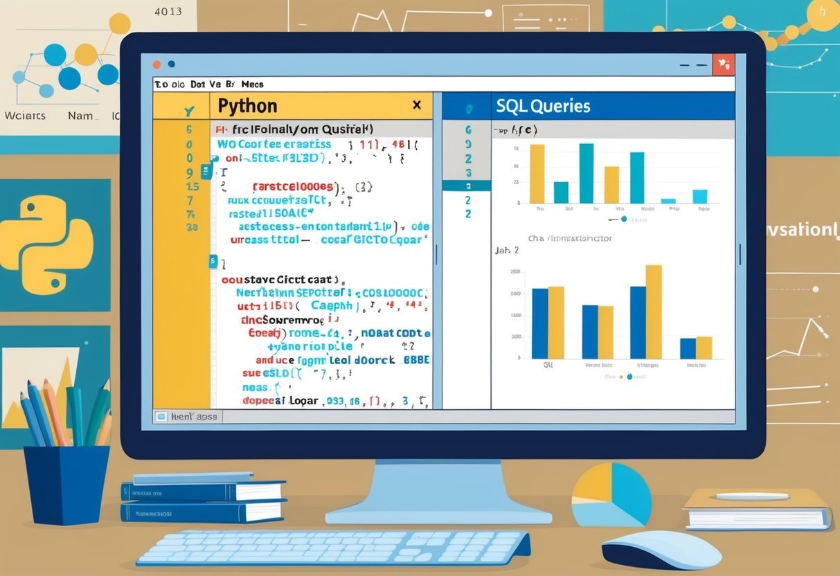
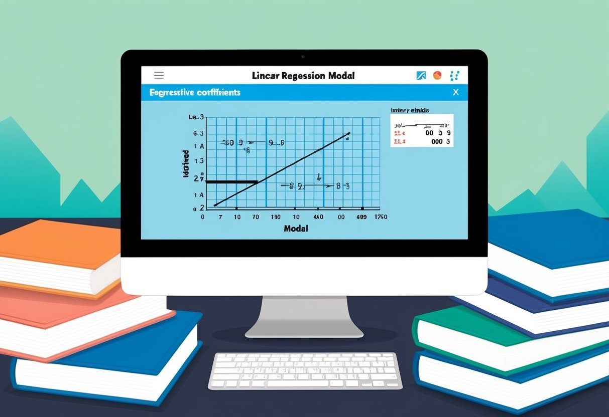
A person using a computer to learn DAX, surrounded by books and notes

Quick measures offer a simplified approach to creating DAX formulas, making it easier for users to perform complex data analysis without deep technical expertise.

This approach allows individuals to leverage templates for commonly used measures, which can save time and improve accuracy.

The ability to implement and utilize quick measures effectively can transform data analysis processes and outcomes.

1) SUMX Calculation

The SUMX function in DAX is a powerful tool for performing calculations on a table before summing up. It evaluates an expression for each row in a table and returns the sum of those expressions.

This makes it ideal for scenarios where there is a need to apply dynamic calculations to each row individually.

Unlike the simple SUM function, SUMX allows for more complex calculations. It is particularly useful when calculations are not simply additive.

For instance, users can calculate the total sales by multiplying two columns, such as price and quantity, for each row in a sales table.

When using SUMX, the function takes in two main arguments: the table and an expression that defines the calculation. The table can be a direct table reference or a filtered table.

The expression is evaluated for each row within the specified table. Check out Microsoft’s SUMX function guide for more details.

Filtering conditions can be applied within the SUMX function using DAX functions like FILTER. This flexibility allows for precise data analysis, such as calculating sales for only specific product categories.

Choosing between using SUMX with FILTER or other methods like CALCULATE with SUM can depend on the specific requirements of the dataset. More guidance on this can be found in discussions about best practices for SUMX.

By combining SUMX with other DAX functions, users can perform intricate calculations across datasets in Power BI. This makes it a versatile choice for data professionals seeking to enhance their data models.

2) AVERAGEX Function

The AVERAGEX function in DAX is a powerful tool for analyzing data. It helps compute the average of a set of numbers in a table by considering an expression for each row.

This function is similar to the AVERAGE function, but AVERAGEX is used when you need to consider calculations row by row.

For example, if a table holds sales data, AVERAGEX can average the profit margin by performing the calculation for each item sold. It takes two arguments: a table and an expression.

The table specifies the data to work with, and the expression determines the calculation for each row.

Additionally, AVERAGEX is helpful in contexts where filtering is necessary. Filters applied to tables can change the data considered by the function.

This feature makes it suitable for dynamic reports in Power BI.

The expression part of AVERAGEX can include other DAX functions, allowing for complex calculations. This versatility makes it a preferred choice for users who need in-depth insights into their data.

Another advantage is that AVERAGEX works well with quick measures in Power BI, making it accessible for those less familiar with writing DAX code.

It is important to ensure that AVERAGEX is used correctly. Misuse can lead to unexpected results, especially if the data has inconsistent row structures or missing values. Hence, understanding its application thoroughly is essential.

3) Ranking with RANKX

RANKX is a powerful DAX function used to add ranking to data based on specific criteria. It helps users arrange data in order and see relative rankings. Often used in Power BI, RANKX evaluates and ranks data within a selected column or table.

To use RANKX effectively, it’s crucial to understand its syntax. The basic syntax includes the function name and parameters like table, expression, and order.

By inputting these details, RANKX can rank data based on given measures.

For a practical example, ranking sales data per product can be achieved with RANKX. By applying the function to the sales column, users can see which products are best sellers.

This data-driven approach helps in making informed business decisions.

In some cases, RANKX may show the same rank for different entries. This happens when values are tied. Adjusting the function to handle ties can provide more specific insights.

Learning the nuances of this function can greatly enhance data analysis skills.

It’s worth noting that RANKX has proven useful in various scenarios. For detailed guidance, exploring specific use cases can be beneficial.

Resources like the guide on using RANKX with calculated measures can offer deeper insights.

Additionally, understanding the importance of accurate measures is highlighted in articles on protecting code with RANKX.

4) Time Intelligence Date Filtering

Time intelligence date filtering is a powerful feature in Data Analysis Expressions (DAX) used to analyze and manipulate data over specific time periods. It allows users to perform calculations constrained by defined time periods like days, months, quarters, or years.

Users can create dynamic reports to compare these periods effectively.

When using time intelligence functions, it’s crucial to mark one of the tables containing a date column as a Date Table. This ensures the date calculations are accurate and consistent.

Tools like Power BI and Excel utilize these functions to help users filter data based on dates easily.

Several vital functions in DAX facilitate time intelligence by providing straightforward ways to calculate over different periods.

Functions like SAMEPERIODLASTYEAR, PREVIOUSMONTH, and PARALLELPERIOD are commonly used. These functions allow comparisons with similar periods in prior years, months, or other intervals.

Moreover, quick measures in Power BI offer pre-defined calculations to simplify time-based analysis.

Users can calculate year-to-date, quarter-to-date, and month-to-date totals without deep DAX knowledge. This is particularly helpful for those less familiar with the intricacies of DAX syntax.

For those working with external tabular models in Power BI, ensuring the primary date column is correctly marked as a date table is essential.

This step is necessary to take full advantage of time intelligence quick measures within the software. More details on using custom date tables can be found through resources like Microsoft Learn’s guide on quick measures.

A thorough understanding of time intelligence functions and their implementation can significantly enhance data analysis capabilities. This makes it an essential skill for anyone working with large datasets over various time periods.

5) Dynamic Cumulative Total

A dynamic cumulative total, also known as a running total or cumulative sum, is a calculation frequently used in data analysis to track the sum of values over a period. It provides insights into trends over time.

Dynamic cumulative totals are often used in Power BI. They allow users to see the changing sum of data points as new data is added. This feature is especially helpful in financial reports and inventory tracking.

In Power BI, dynamic cumulative totals can be created using DAX functions. This involves calculating current values plus all previous ones. Such a total is adaptable, changing as the data context or filter changes.

To create a dynamic cumulative total, DAX functions like CALCULATE and FILTER can be utilized. These functions adapt the cumulative total to new data as it appears in the report, providing real-time updates.

Using a built-in feature in Power BI called Quick Measure, users can create running totals without complex formulas. Quick Measure generates the necessary DAX code automatically.

Understanding how to apply these components can significantly enhance data exploration and reporting. As users manipulate data ranges or filters, the cumulative total reflects those changes instantly.

6) Year-Over-Year Growth

Year-over-year (YoY) growth is a key metric in data analysis and reporting. It helps businesses understand how their performance has changed over different periods. By comparing results from one year to the next, companies can spot trends and make informed decisions.

In Power BI, calculating YoY growth involves using DAX formulas. DAX, short for Data Analysis Expressions, is a powerful language used to perform calculations and data analysis.

One common approach is to use a DAX formula to calculate the percentage change between two time periods.

For example, to find YoY growth of sales, a formula calculates the difference between the current year and the previous year sales.

This involves subtracting last year’s sales from the current year’s sales, then dividing by last year’s sales, and multiplying by 100 to get a percentage. Power BI offers features to simplify this process.

The use of quick measures in Power BI can be especially helpful for those who don’t want to write DAX code manually. Quick measures provide pre-made templates of common calculations.

Users can apply these without needing deep knowledge of DAX.

For more tailored or complex business scenarios, writing a custom DAX formula might be necessary.

For instance, in specific cases, like the comparison of a unique calendar week, developers might create custom year-over-year calculations using DAX expressions.

Learning how to calculate YoY growth using tools like Power BI enhances decision-making by providing clear insights into business trends over time. Understanding these processes is valuable for anyone looking to gain deeper business insights through data analysis.

7) Rolling Average Measures

Rolling average measures are a handy tool in data analysis. They help smooth out fluctuations and highlight trends over a specific period.

By averaging data over time, analysts can better understand key movements without the noise of daily variations.

To create rolling average measures in Power BI, start by ensuring you have a comprehensive date table. This is crucial because the rolling average needs a continuous timeline to function correctly.

With the date table in place, use DAX formulas to define the rolling average period, like 7 days or 30 days.

Quick measures in Power BI simplify this process. They provide pre-made templates, which automatically generate the DAX formula needed for the rolling average.

By using these, you can save time and reduce errors.

For instance, selecting “-6” or “-7” will determine whether your rolling average spans 7 days when setting it up in the panel. This ensures the average includes the current day or spans completely past days, depending on the selection.

Utilizing rolling averages can enhance reports, particularly in visualizations. They allow for smoother trends and make it easier to spot overall patterns in the data over time.

You can see examples of their application in Power Tech Tips, which explains how rolling averages are calculated in Power BI.

For those new to these concepts, rolling averages present a straightforward way to start exploring more advanced data analysis techniques. They offer an entry point into more complex measures, allowing users to gradually build their skills and understanding of data trends.

8) Custom Format Strings

Custom format strings in Power BI let users change how fields appear in visuals, ensuring reports look precise. They work by applying a specific format to numbers, dates, or text, making information easier to understand.

This feature is vital in creating reports that are not only functional but also visually appealing.

Within Power BI, users can set these formats at different levels. The model level is one option where users can define a format string for fields. This provides consistency across all visuals using that field.

For a more flexible approach, dynamic format strings offer the ability to adjust based on the data context, enhancing the overall presentation.

In Power BI Desktop, adding a custom format is straightforward. Users can navigate to the Measure tools ribbon and explore the Format dropdown to find various options.

Selecting the right format can present data clearly, highlighting key metrics effectively.

Dynamic format strings are particularly useful as they allow for more responsive displays. This means that the format can change according to the values or other conditions set in the report.

This helps in emphasizing specific data points and can improve the way the content communicates insights.

Immersing oneself in options like these not only saves time when building reports but also ensures that reports are more intuitive for users.

For users seeking more information, exploring resources such as the deep dive into dynamic format strings can offer further insights into optimizing data presentations.

9) Top N Filter Measure

A Top N filter measure is a way to show only the top entries from a data set based on specific criteria. It helps in analyzing top performers, such as best-selling products or high-revenue customers.

This feature is valuable in focusing on significant contributors to business results.

In DAX, the TOPN function is often used to create this measure. This function selects a defined number of top items from a table according to an expression or criteria.

By applying it to a measure, users can filter data visuals to highlight top performers effectively.

For example, users might apply a Top 5 filter on sales data to show only the five customers with the highest sales volume. This approach simplifies complex data sets, allowing users to concentrate on key data points and uncover valuable insights.

When implementing a Top N filter, it’s important to determine the specific ranking criteria. Usually, this involves calculating a measure like total sales or quantity, over which the top entries will be ranked.

Once determined, adjustments may be needed to fine-tune the filter according to particular analysis requirements.

Using Top N filters can enhance reports and dashboards by focusing on the most relevant information. This enables better decision-making by providing clear insights into which items or performers are leading in specific metrics.

For further details on implementing these filters, consider examining examples and methodologies shared in community discussions, such as those found on the Microsoft Fabric Community.

10) Dynamic Segmentation Techniques

Dynamic segmentation in DAX is an advanced method used to classify data based on specific metrics. This technique helps in categorizing entities like customers based on data such as purchase volume or transaction frequency.

Dynamic segmentation is valuable because it adjusts automatically. For example, customers can be grouped based on their spending patterns, changing as new data updates. This provides flexible insights for decision-making.

When using dynamic segmentation in Power BI, selecting data through slicers can influence the segmentation groupings. This allows users to adjust views based on different time frames or criteria, making analysis more interactive and insightful.

A common application is clustering customers by the count of their orders. This method uses measures to distinguish customer groups dynamically, reflecting real-time changes and selections made by users in reports.

The basis of this technique involves using DAX measures, which are expressions that calculate and return data based on conditions set in the report.

DAX measures enable segmentation to be sensitive to filters and parameters, making the analysis robust and adaptable.

Creating dynamic and custom groupings is possible through DAX patterns, which might be categorized as a more advanced approach. This involves understanding the data model and how different elements interact with each other in Power BI.

The flexibility and depth provided by dynamic segmentation are important for users looking to perform detailed data analysis. Techniques, like custom groupings, offer powerful methods for uncovering insights into customer behaviors and sales trends.

Using resources such as those found in the DAX Patterns guide can provide further insights into implementing these techniques effectively.

Understanding DAX Basics

Data Analysis Expressions (DAX) is crucial for anyone working with Power BI, Power Pivot, or SQL Server Analysis Services. It is a formula language that enables users to work with data models to perform advanced calculations and data manipulation.

What is DAX?

DAX stands for Data Analysis Expressions. It is a collection of functions, operators, and constants that are used in Power BI and other Microsoft services like Power Pivot.

DAX formulas are similar to Excel formulas but are more powerful in handling relational and tabular data.

This language is specifically designed to work with a model-driven approach, allowing users to perform dynamic and complex calculations.

Whether creating calculated columns or measures, DAX is essential for enriching data analysis. For beginners, it may seem challenging, but with practice, it becomes a powerful tool in data modeling.

For more on learning DAX quickly, resources like the DAX Basics in Power BI guide can be useful.

Key Concepts in DAX

Understanding DAX requires familiarity with several key concepts such as functions, context, and relationships.

Functions in DAX include a range of operations like mathematical calculations, logical tests, and text manipulation.

Context, in DAX, refers to the environment in which a DAX formula is evaluated—either row context or filter context. Row context applies when functions are used to process each row individually, while filter context applies when filters are applied to data tables.

Relationships are crucial as they dictate how tables are connected and how data flows between them.

Mastering these concepts enables users to write efficient and complex DAX formulas.

Useful tools like quick measures in Power BI can help beginners understand and apply DAX expressions effectively.

Creating Quick Measures

Creating quick measures in Power BI simplifies the process of implementing calculations using DAX. These pre-made templates make it easy for users to generate complex formulas efficiently.

Benefits of Quick Measures

Quick measures offer significant advantages for both beginners and experienced Power BI users. They allow users to perform calculations without needing to write DAX code manually, which can save time and reduce errors.

Quick measures automatically generate the necessary DAX formulas based on user input, enhancing the user’s ability to produce accurate reports efficiently.

Additionally, they provide a great learning tool, as users can see the DAX behind each calculation and understand how it functions within their reports. This educational aspect can help users become more proficient with DAX over time.

How to Implement Quick Measures

Implementing quick measures in Power BI is straightforward. Users start by selecting the data they want to analyze and then choose from a variety of quick measure templates. These templates cover common calculations such as month-over-month changes and running totals.

To add a quick measure, navigate to the desired report and select the field on which you want to apply the calculation. Then, choose “Quick Measure” from the menu, and pick the calculation type.

After providing necessary parameters, Power BI generates the DAX formula automatically. This process significantly speeds up report creation and ensures consistency across multiple visuals in a project.

Advanced Techniques in DAX

DAX, or Data Analysis Expressions, in Power BI offers many advanced techniques to enhance data modeling and calculations. These techniques include using variables for simplification and optimizing calculations for performance improvements.

Using Variables in DAX

In DAX, variables enhance readability and efficiency. They allow complex formulas to be broken down into simpler parts.

For instance, using variables helps by storing a value or result that can be used multiple times in a formula, reducing repetition and potential errors.

Variables are defined with VAR followed by the variable name and expression. To utilize a variable, the RETURN statement is used.

This technique is beneficial for debugging since it allows the developer to check intermediate results.

When using variables effectively, the overall complexity of writing, reading, and maintaining formulas is reduced, leading to cleaner and more understandable code. It also improves performance by preventing the recalculation of repeated expressions within a formula.

Optimizing DAX Calculations

Performance is key when working with DAX, so optimizing calculations is crucial.

One technique is to minimize the use of row-level operations. Instead, using aggregate functions across columns can reduce computational load.

Avoiding iterative calculations like SUMX or FILTER on large datasets can also enhance performance. Instead, using calculated columns or measures can be more efficient.

To further optimize, developers can use smaller, more specific tables for analysis, and filter data early in calculations.

Using tools like DAX Studio can help in analyzing queries for optimization opportunities. These strategies ensure faster report performance and better resource management in Power BI.

Frequently Asked Questions

Power BI offers a wide range of tools, including quick measures, which streamline the process of creating DAX calculations. Understanding the differences between quick measures and regular measures is vital. Below are key questions often asked by users starting their journey with DAX in Power BI.

How can I create a quick measure in Power BI for common calculations?

Creating a quick measure in Power BI involves using a set of built-in templates for frequent calculations like month-over-month change.

Users simply select the desired calculation from a list, and Power BI generates the associated DAX formula automatically.

What distinguishes a quick measure from a regular measure in Power BI?

Quick measures are pre-defined calculations that utilize templates, making them easier for beginners. They are designed to simplify the creation of common measures, whereas regular measures require manual input of DAX code and offer more flexibility for customized calculations.

Where can I find a comprehensive list of DAX formulas used in Power BI measures?

Comprehensive lists of DAX formulas are available in various online resources and documentation provided by Microsoft.

These resources cover formulas for a range of operations in Power BI, which help both beginners and advanced users in their tasks.

What are the initial steps to learning DAX for Power BI effectively?

Starting with the basics of DAX, such as understanding its syntax and common functions, is crucial.

Resources like QuickStart: Learn DAX Basics in 30 Minutes provide a helpful introduction to get started efficiently.

Can you explain the difference between calculated columns and measures in DAX?

Calculated columns are added to data tables and evaluated for each row. They are used to create new data based on calculations.

Measures, however, are calculations used in aggregation and evaluation contexts, often providing insights across entire datasets rather than row-by-row.

Approximately how much time is required to become proficient in DAX for Power BI?

The time required to become proficient in DAX varies based on prior experience with similar tools.

Some users may grasp basic concepts in a few weeks, especially if focusing on common functions like SUMX or AVERAGEX, but advanced proficiency can take several months of practice and study.

Categories
Uncategorized

Learning T-SQL – Number Types and Functions Explained

Understanding T-SQL and Its Functions

Transact-SQL (T-SQL) is an extension of SQL used predominantly in Microsoft SQL Server. It adds programming constructs and advanced functions that help manage and manipulate data.

SQL Functions in T-SQL are tools to perform operations on data. They are categorized into two main types: Scalar Functions and Aggregate Functions.

Scalar Functions return a single value. Examples include mathematical functions like ABS() for absolute values, and string functions like UPPER() to convert text to uppercase.

Aggregate Functions work with groups of records, returning summarized data. Common examples are SUM() for totals and AVG() for averages. These functions are essential for generating reports and insights from large datasets.

Example:

  • Scalar Function Usage:

    SELECT UPPER(FirstName) AS UpperName FROM Employees;
    
  • Aggregate Function Usage:

SELECT AVG(Salary) AS AverageSalary FROM Employees;

Both types of functions enhance querying by simplifying complex calculations. Mastery of T-SQL functions can significantly improve database performance and analytics capabilities.

Data Types in SQL Server

Data types in SQL Server define the kind of data that can be stored in a column. They are crucial for ensuring data integrity and optimizing database performance. This section focuses on numeric data types, which are vital for handling numbers accurately and efficiently.

Exact Numerics

Exact numeric data types in SQL Server are used for storing precise values. They include int, decimal, and bit.

The int type is common for integer values, ranging from -2,147,483,648 to 2,147,483,647, which is useful for counters or IDs. The decimal type supports fixed precision and scale, making it ideal for financial calculations where exact values are necessary. For simple binary or logical data, the bit type is utilized and can hold a value of 0, 1, or NULL.

Each type provides distinct advantages based on the application’s needs. For example, using int for simple counts can conserve storage compared to decimal, which requires more space. Choosing the right type impacts both storage efficiency and query performance, making the understanding of each critical.

Approximate Numerics

Approximate numeric data types, including float and real, are used when precision is less critical. They offer a trade-off between performance and accuracy by allowing rounding errors.

The float type is versatile for scientific calculations, as it covers a wide range of values with single or double precision. Meanwhile, the real type offers single precision, making it suitable for applications where memory savings are essential and absolute precision isn’t a requirement.

Both float and real are efficient for high-volume data processes where the data range is more significant than precise accuracy. For complex scientific calculations, leveraging these types can enhance computational speed.

Working with Numeric Functions

Understanding numeric functions in T-SQL is important for handling data efficiently. These functions offer ways to perform various computations. This section covers mathematical functions that do basic calculations and aggregate mathematical functions that summarize data.

Mathematical Functions

Mathematical functions in T-SQL provide tools for precise calculations. ROUND(), CEILING(), and FLOOR() are commonly used functions.

ROUND() lets users limit the number of decimal places in a number. CEILING() rounds a number up to the nearest integer, while FLOOR() rounds down.

Another useful function is ABS(), which returns the absolute value of a number. This is especially helpful when dealing with negative numbers.

Users often apply mathematical functions in data manipulation tasks, ensuring accurate and efficient data processing.

Aggregate Mathematical Functions

Aggregate functions in T-SQL perform calculations on a set of values, returning a single result. Common functions include SUM(), COUNT(), AVG(), MIN(), and MAX(). These help in data analysis tasks by providing quick summaries.

SUM() adds all the values in a column, while COUNT() gives the number of entries. AVG() calculates the average value, and MIN() and MAX() find the smallest and largest values.

These functions are essential for generating summaries and insights from large datasets, allowing users to derive valuable information quickly.

Performing Arithmetic Operations

Arithmetic operations in T-SQL include addition, subtraction, multiplication, division, and modulus. These operations are fundamental for manipulating data and performing calculations within databases.

Addition and Subtraction

Addition and subtraction are used to calculate sums or differences between numeric values. In T-SQL, operators like + for addition and - for subtraction are used directly in queries.

For instance, to find the total price of items, the + operator adds individual prices together. The subtraction operator calculates differences, such as reducing a quantity from an original stock level.

A key point is ensuring data types match to avoid errors.

A practical example:

SELECT Price + Tax AS TotalCost
FROM Purchases;

Using parentheses to group operations can help with clarity and ensure correct order of calculations. T-SQL handles both positive and negative numbers, making subtraction versatile for various scenarios.

Multiplication and Division

Multiplication and division are crucial for scaling numbers or breaking them into parts. The * operator performs multiplication, useful for scenarios like finding total costs across quantities.

Division, represented by /, is used to find ratios or distribute values equally. Careful attention is needed to avoid division by zero, which causes errors.

Example query using multiplication and division:

SELECT Quantity * UnitPrice AS TotalPrice
FROM Inventory
WHERE Quantity > 0;

The MOD() function calculates remainders, such as distributing items evenly with a remainder for extras. An example could be dividing prizes among winners, where MOD can show leftovers.

These operations are essential for any database work, offering flexibility and precision in data handling.

Converting Data Types

Converting data types in T-SQL is essential for manipulating and working with datasets efficiently. This process involves both implicit and explicit methods, each suited for different scenarios.

Implicit Conversion

Implicit conversion occurs automatically when T-SQL changes one data type to another without requiring explicit instructions. This is often seen when operations involve data types that are compatible, such as integer to float or smallint to int.

The system handles the conversion behind the scenes, making it seamless for the user.

For example, adding an int and a float results in a float value without requiring manual intervention.

Developers should be aware that while implicit conversion is convenient, it may lead to performance issues if not managed carefully due to the overhead of unnecessary type conversions.

Explicit Conversion

Explicit conversion, on the other hand, is performed by the user using specific functions in T-SQL, such as CAST and CONVERT. These functions provide greater control over data transformations, allowing for conversion between mismatched types, such as varchar to int.

The CAST function is straightforward, often used when the desired result is a standard SQL type.

Example: CAST('123' AS int).

The CONVERT function is more versatile, offering options for style and format, especially useful for date and time types.

Example: CONVERT(datetime, '2024-11-28', 102) converts a string to a date format.

Both methods ensure data integrity and help avoid errors that can arise from incorrect data type handling during query execution.

Utilizing Functions for Rounding and Truncation

Functions for rounding and truncation are essential when working with numerical data in T-SQL. They help in simplifying data by adjusting numbers to specific decimal places or the nearest whole number.

Round Function:
The ROUND() function is commonly used to adjust numbers to a specified number of decimal places. For example, ROUND(123.4567, 2) results in 123.46.

Ceiling and Floor Functions:
The CEILING() function rounds numbers up to the nearest integer. Conversely, the FLOOR() function rounds numbers down.

For instance, CEILING(4.2) returns 5, while FLOOR(4.2) yields 4.

Truncate Function:
Though not a direct T-SQL function, truncation is possible. Using integer division or converting data types can achieve this. This means removing the decimal part without rounding.

Abs Function:
The ABS() function is useful for finding the absolute value of a number, making it always positive. ABS(-123.45) converts to 123.45.

Table Example:

Function Description Example Result
ROUND Rounds to specified decimals ROUND(123.4567, 2) 123.46
CEILING Rounds up to nearest whole number CEILING(4.2) 5
FLOOR Rounds down to nearest whole number FLOOR(4.2) 4
ABS Returns absolute value ABS(-123.45) 123.45

For further reading on T-SQL functions and their applications, check this book on T-SQL Fundamentals.

Manipulating Strings with T-SQL

Working with strings in T-SQL involves various functions that allow data transformation for tasks like cleaning, modifying, and analyzing text. Understanding these functions can greatly enhance the ability to manage string data efficiently.

Character String Functions

Character string functions in T-SQL include a variety of operations like REPLACE, CONCAT, and LEN.

The REPLACE function is useful for substituting characters in a string, such as changing “sql” to “T-SQL” across a dataset.

CONCAT joins multiple strings into one, which is handy for combining fields like first and last names.

The LEN function measures the length of a string, important for data validation and processing.

Other useful functions include TRIM to remove unwanted spaces, and UPPER and LOWER to change the case of strings.

LEFT and RIGHT extract a specified number of characters from the start or end of a string, respectively.

DIFFERENCE assesses how similar two strings are, based on their sound.

FORMAT can change the appearance of date and numeric values into strings.

Unicode String Functions

T-SQL supports Unicode string functions, important when working with international characters. Functions like NCHAR and UNICODE handle special characters.

Using NCHAR, one can retrieve the Unicode character based on its code point.

To analyze string data, STR transforms numerical data into readable strings, ensuring proper formatting and length.

REVERSE displays the characters of a string backward, which is sometimes used in diagnostics and troubleshooting.

These functions allow for comprehensive manipulation and presentation of data in applications that require multi-language support.

By leveraging these functions, handling texts in multiple languages becomes straightforward. Additionally, SPACE generates spaces in strings, which is beneficial when formatting outputs.

Working with Date and Time Functions

Date and time functions in T-SQL are essential for managing and analyzing time-based data. These functions allow users to perform operations on dates and times.

Some common functions include GETDATE(), which returns the current date and time, and DATEADD(), which adds a specified number of units, like days or months, to a given date.

T-SQL provides various functions to handle date and time. Other functions include DAY(), which extracts the day part from a date. For instance, running SELECT DAY('2024-11-28') would result in 28, returning the day of the month.

Here’s a simple list of useful T-SQL date functions:

  • GETDATE(): Current date and time
  • DATEADD(): Adds time intervals to a date
  • DATEDIFF(): Difference between two dates
  • DAY(): Day of the month

Understanding the format is crucial. Dates might need conversion, especially when working with string data types. CONVERT() and CAST() functions can help transform data into date formats, ensuring accuracy and reliability.

By utilizing these functions, users can efficiently manage time-based data, schedule tasks, and create time-sensitive reports. This is invaluable for businesses that rely on timely information, as it ensures data is up-to-date and actionable.

Advanced Mathematical Functions

T-SQL’s advanced mathematical functions offer powerful tools for data analysis and manipulation. These functions can handle complex mathematical operations for a variety of applications.

Trigonometric Functions

Trigonometric functions in T-SQL are essential for calculations involving angles and periodic data. Functions such as Sin, Cos, and Tan help in computing sine, cosine, and tangent values respectively. These are often used in scenarios where waveform or rotational data needs to be analyzed.

Cot, the cotangent function, offers a reciprocal perspective of tangent. For inverse calculations, functions like Asin, Acos, and Atan are available, which return angles in radians based on the input values.

Radians and Degrees functions are helpful in converting between radians and degrees, making it easier for users to work with different measurement units.

Logarithmic and Exponential Functions

Logarithmic and exponential functions serve as foundational tools for interpreting growth patterns and scaling data. T-SQL provides Log and Log10 to calculate logarithms based on any positive number and base 10 respectively.

The Exp function is used to determine the value of the exponential constant, e, raised to a specific power. This is useful in computing continuous compound growth rates and modeling complex relationships.

T-SQL also includes constant values like Pi, which is essential for calculations involving circular or spherical data. These functions empower users to derive critical insights from datasets with mathematical accuracy.

Fine-Tuning Queries with Conditionals and Case

In T-SQL, conditionals help fine-tune queries by allowing decisions within statements. The CASE expression plays a key role here, often used to substitute values in the result set based on specific conditions. It is a flexible command that can handle complex logic without lengthy code.

The basic structure of a CASE expression involves checking if-else conditions. Here’s a simple example:

SELECT 
  FirstName,
  LastName,
  Salary,
  CASE 
    WHEN Salary >= 50000 THEN 'High'
    ELSE 'Low'
  END AS SalaryLevel
FROM Employees

In this query, the CASE statement checks the Salary. If it’s 50,000 or more, it labels it ‘High’; otherwise, ‘Low’.

Lists of conditions within a CASE statement can adapt queries to user needs. For instance:

  • Single condition: Directly compares values using simple if-else logic
  • Multiple conditions: Evaluates in sequence until a true condition occurs

T-SQL also supports the IF...ELSE construct for handling logic flow. Unlike CASE, IF...ELSE deals with control-of-flow in batches rather than returning data. It is especially useful for advanced logic:

IF EXISTS (SELECT * FROM Employees WHERE Salary > 100000)
  PRINT 'High salary detected'
ELSE
  PRINT 'No high salaries found'

The IF...ELSE construct doesn’t return rows but instead processes scripts and transactions when certain conditions are met.

Tables and conditional formatting allow data presentation to match decision-making needs effectively. Whether using a CASE expression or IF...ELSE, T-SQL provides the tools for precise query tuning.

Understanding Error Handling and Validation

In T-SQL, error handling is crucial for creating robust databases. It helps prevent crashes and ensures that errors are managed gracefully. The main tools for handling errors in T-SQL are TRY, CATCH, and THROW.

A TRY block contains the code that might cause an error. If an error occurs, control is passed to the CATCH block. Here, the error can be logged, or other actions can be taken.

The CATCH block can also retrieve error details using functions like ERROR_NUMBER(), ERROR_MESSAGE(), and ERROR_LINE(). This allows developers to understand the nature of the error and take appropriate actions.

After handling the error, the THROW statement can re-raise it. This can be useful when errors need to propagate to higher levels. THROW provides a simple syntax for raising exceptions.

Additionally, validation is important to ensure data integrity. It involves checking data for accuracy and completeness before processing. This minimizes errors and improves database reliability.

Using constraints and triggers within the database are effective strategies for validation.

Performance and Optimization Best Practices

When working with T-SQL, performance tuning and optimization are crucial for efficient data processing. Focusing on index utilization and query plan analysis can significantly enhance performance.

Index Utilization

Proper index utilization is essential for optimizing query speed. Indexes should be created on columns that are frequently used in search conditions or join operations. This reduces the amount of data that needs to be scanned, improving performance. It’s important to regularly reorganize or rebuild indexes, ensuring they remain efficient.

Choosing the right type of index, such as clustered or non-clustered, can greatly impact query performance. Clustered indexes sort and store the data rows in the table based on their key values, which can speed up retrieval. Non-clustered indexes, on the other hand, provide a logical ordering and can be more flexible for certain query types.

Query Plan Analysis

Analyzing the query execution plan is vital for understanding how T-SQL queries are processed. Execution plans provide insight into the steps SQL Server takes to execute queries. This involves evaluating how tables are accessed, what join methods are used, and whether indexes are effectively utilized. Recognizing expensive operations in the plan can help identify bottlenecks.

Using tools such as SQL Server Management Studio’s Query Analyzer can be beneficial. It helps in visualizing the execution plan, making it easier to identify areas for improvement. By refining queries based on execution plan insights, one can enhance overall query performance.

Can you explain the three main types of functions available in SQL Server?

SQL Server supports scalar functions, aggregate functions, and table-valued functions. Scalar functions return a single value, aggregate functions perform calculations on a set of values, and table-valued functions return a table data type. Each type serves different purposes in data manipulation and retrieval.

Categories
Uncategorized

Learning DAX – Calculated Table Joins Made Simple

Understanding DAX and Its Functions

Data Analysis Expressions (DAX) is a formula language used in Microsoft Power BI, Excel, and SQL Server Analysis Services. DAX includes a wide array of functions essential for creating measures and calculated columns. These help in powerful data analysis and reporting.

Introduction to Data Analysis Expressions (DAX)

DAX is designed to work with relational data, making it ideal for business intelligence tools. It enables users to create custom calculations in calculated columns and measures.

One of the primary goals of DAX is to allow for dynamic calculations over table data without requiring a deep knowledge of programming. By using DAX, users can establish sophisticated data models. It supports functions including aggregation, filtering, and row-level computations, making it versatile for various analytical tasks.

Key DAX Functions for Data Analysis

Several key functions in DAX can significantly enhance data analytics. SUM and AVERAGE provide basic aggregations, while CALCULATE is often used to change the context in which data is computed. This function is particularly powerful for creating dynamic measures.

The RELATED function retrieves data from related tables, simplifying complex calculations. Meanwhile, calculated columns use DAX functions to aggregate and transform raw data into meaningful insights. Combined, these functions create efficient models, enabling data-driven decisions without extensive programming knowledge. Visit The Definitive Guide to DAX for detailed explanations of DAX’s full set of functions.

Setting Up the Data Model

Creating a robust data model is crucial for efficient data analysis in Power BI. It involves defining data types accurately and establishing relationships between tables, which can greatly influence the performance and accuracy of reports.

Defining Data Types and Relationships

Data types are the backbone of any data model. In Power BI, setting the correct data types helps ensure that calculations and data processing are accurate. For example, numerical data can be set as integers or decimals, which affects how it’s aggregated or used in calculations. Meanwhile, text data might be used for categorical information.

Relationships between tables are equally important. These links allow for the integration of data from multiple sources into a cohesive data set. Users can create relationships by joining tables based on common columns, which is essential for performing complex queries and generating insightful reports. Power BI provides intuitive tools to map these relationships, making it easier to fetch related data from different tables, ultimately enhancing the overall data analysis process.

Importance of a Well-Structured Data Model

A well-structured data model is key to leveraging the full power of Power BI. It streamlines report generation and ensures that data retrieved is precise and relevant. A coherent model minimizes errors during data slicing and dicing. This clarity is vital for users to trust the outputs and make data-driven decisions.

Structured models also improve performance, as optimized data paths reduce load times and improve query speed. A thoughtful design allows analysts to easily update or expand the model without disrupting existing workflows. Moreover, it provides a clear visual representation, allowing stakeholders to grasp insights quickly and effectively.

Exploring Table Joins in DAX

Table joins in DAX allow users to combine data from different tables, making data analysis more manageable and insightful. Understanding how to effectively use different types of joins can significantly improve the accuracy and efficiency of data models.

Join Types and Their Uses

Several join types are available in DAX, each serving specific needs for combining tables. An inner join retrieves records present in both tables, only showing data where a match exists. This is particularly useful when analyzing data that requires all records to meet a condition from both tables, such as confirmed sales items across regions.

On the other hand, a left outer join includes all records from the first table and matched records from the second. Unmatched rows from the first table still appear, displaying nulls for the second table’s columns. This join is advantageous when it’s important to keep all entries from the primary table, like a list of employees with or without assigned projects.

Outer joins, in general, encompass variations like left, right, and full outer joins, with each including different sets of matched and unmatched data. However, DAX primarily supports inner and left outer joins, offering robust solutions for many analytical tasks.

Join Operation Essentials

Executing join operations in DAX requires attention to key elements such as table relationships and data integrity. It’s crucial to ensure relationships between tables are correctly defined, typically through common columns or keys. Without this, join operations might result in errors or incomplete data retrieval.

When performing a join operation, users typically employ DAX functions like RELATED or LOOKUPVALUE. These functions facilitate integration of related information from one table into another, supporting detailed analytics. For example, aggregating sales data by adding product pricing from another table can enhance revenue analysis.

Tables must be structured properly before joins are executed, ensuring they contain relevant data fields and no unnecessary duplications. A careful approach can optimize performance and result in more meaningful insights from complex datasets. Additionally, considering the size of the tables and the performance impact during join operations is vital for maintaining system efficiency.

Advanced Joining Techniques

Advanced joining techniques in DAX focus on creating relationships between tables to enhance data analysis. These methods allow users to create precise connections, using various joins such as calculated tables and cross joins. This approach gives users a powerful way to manage complex data structures efficiently.

Utilizing Calculate Table Join

The calculated table join in DAX is an essential technique for advanced users. This involves using a DAX function to generate a table on the fly. Calculated tables are typically used when more dynamic relationships are needed, like combining data from different tables based on specific criteria.

Calculated tables allow analysts to perform complex calculations that can link data effectively. For instance, one might use the NATURALINNERJOIN to filter rows from two table sets based on key columns. This requires understanding the relationships within the dataset, ensuring proper alignment of data types in each table.

Join operations in calculated tables enhance data modeling by providing alternate pathways for data connections. This is crucial for scenarios where traditional relationships do not suffice or where additional context needs to be extracted. Such joins are performed with intentional precision to avoid errors in analysis.

Application of Cross Join

The cross join is another powerful tool in DAX. It creates a table combining every row from two tables. Unlike other joins, cross join doesn’t require matching columns, which makes it unique. This technique is beneficial when users need every possible combination of rows for analysis.

Using a cross join can be particularly useful for exploring potential scenarios or combinations of data points. When combined with other DAX functions, it can offer a detailed picture of data interactions that are not immediately visible through standard joins.

To effectively implement a cross join, one needs to consider the size and complexity of the data. Large datasets may result in exponentially more rows, which can affect performance. However, with careful planning and execution, the cross join provides a robust method for deep data analysis and modeling.

Calculated Columns and Measures

In Power BI and data modeling, calculated columns and measures play distinct roles. Calculated columns are useful for adding new data to tables, while measures help perform calculations on aggregated data based on user queries.

Difference Between Columns and Measures

Calculated columns are formulas applied to rows within a table, resulting in new data fields added to the existing data model. They are stored in the model, showing unique values that can be used for slicers or filters. Columns are computed during data refresh, providing static results unless refreshed.

Measures, on the other hand, calculate results dynamically in response to user interactions. They offer aggregated data, such as sums or averages, by using powerful DAX functions. Measures are computed at query time, which means they can change based on filters or slicers applied by users. While both calculated columns and measures use DAX functions, their applications are fundamentally different.

Implementing Calculated Measures

To create a calculated measure in Power BI, begin by selecting the appropriate table in the data model. Use the DAX formula bar to input expressions like [Total Sales] = SUM(Sales[Amount]). This measure dynamically sums sales amounts based on user input within the report.

Measures enhance data models by providing insights over large datasets. They support different functions like AVERAGE or COUNT, allowing for varied analyses in reports. The flexibility of measures makes them essential for generating meaningful insights from a Power BI report, helping users interpret and manipulate data based on their needs.

Optimizing Data Retrieval

Optimizing data retrieval in DAX involves using functions effectively to manage and access data efficiently. Proper use of functions like RELATED, VALUES, SELECTCOLUMNS, and SUMMARIZE can significantly impact performance and data accuracy.

Applying Related and Values Functions

The RELATED function is essential for bringing data from related tables. It allows for seamless data integration across relationships, reducing the need for complex calculations. When RELATED is applied correctly, it accesses and returns a corresponding value from another table, ensuring the data remains consistent and simplifies retrieval.

Meanwhile, VALUES provides a unique list of values from a column. It can be used to display distinct values or filter datasets efficiently. This function is handy for creating summaries or when calculations require input from a specific data range. Using VALUES helps maintain data integrity by focusing on distinct entries without duplication, contributing to an organized dataset.

Efficient Use of SelectColumns and Summarize

SELECTCOLUMNS is crucial for creating new tables with specific columns. It allows users to extract only the needed columns, which helps in focusing calculations on relevant data, saving processing resources. By selecting only important fields, datasets become more manageable, speeding up data processing and retrieval.

On the other hand, SUMMARIZE generates a summary table for a set of data. It groups data by specified columns and calculates aggregates, which aids in creating reports or deeper analyses. This function is particularly effective in large datasets, as it reduces data to concise summaries, making it easier to identify patterns or trends. The clarity and conciseness of output from SUMMARIZE make it a powerful tool in DAX modeling.

Managing Table Relationships

Managing table relationships in a data model is crucial in tools like Power BI. Effective management ensures that data interactions are smooth and accurate. Key aspects include setting up active relationships and handling multiple relationships to ensure data is queried correctly.

Creating Active Relationships

Active relationships play a pivotal role in how data models handle queries. These relationships are the default connections between tables, allowing Power BI and other tools to automatically connect tables and pull relevant data.

To create an active relationship, users must select the primary keys in both connecting tables. This ensures that the link is valid and can be utilized for data queries. In Power BI, the active relationship is typically indicated by a solid line between tables, showing that the connection is in use. Choosing the right active relationship is important because a model can only have one active relationship between two tables at a time.

Errors in data retrieval often stem from incorrectly set active relationships. Thus, ensuring that the selected active relationship is the most relevant helps in avoiding such issues. This selection optimizes the data model for better performance and accuracy.

Handling Multiple Relationships

Managing multiple relationships demands careful attention, particularly when using Power BI. The data model might have several possible connections between tables, but only one can be active. The other relationships are inactive but can still be utilized when needed. You can use DAX functions like USERELATIONSHIP to activate them.

Multiple relationships are useful in complex models where the same tables might interact in different contexts. For example, a sales table might connect to a date table based on both order dates and shipping dates. Users can switch between these connections for different analyses using DAX.

Correctly managing these multiple relationships ensures flexibility. It allows users to perform varied analyses without altering the underlying model structure significantly, thereby maintaining the integrity and performance of the data model.

Working with SQL and DAX Comparisons

Working with SQL and DAX involves understanding their syntax and how they handle table joins. While both are integral to database management and analysis, SQL is often seen as foundational knowledge, and DAX is used for dynamic calculations, especially in Power BI. Recognizing both their similarities and contrasts can improve data operations.

Similarities Between SQL and DAX Syntax

SQL and DAX share several syntactic elements that are beneficial for users familiar with both. Each uses clauses, functions, and operators to manipulate data.

For instance, SQL’s SELECT statement and DAX’s functions like CALCULATE are both used to query data, although DAX functions incorporate filters more dynamically.

Both languages facilitate working with aggregate functions. SQL’s SUM and AVG functions find parallels in DAX. DAX, however, adds additional layers with time-intelligence functions, which are essential for complex metrics across different periods. Despite these different focuses, the logical approach remains similar, allowing experienced SQL users to adapt to DAX with some ease.

Contrasts in Joining Tables

Joining tables with SQL involves using keywords like JOIN, ON, and WHERE to combine data from multiple tables based on related columns. SQL is highly flexible with various types of joins, including inner, left, and right joins, enabling complex data retrieval tasks.

In contrast, DAX uses calculated tables and specific functions to perform similar operations. Although both can handle joins, DAX often requires more explicit relationships between tables, as seen in calculated table joins. This explicit modeling reflects a key difference with SQL, which can sometimes lead to increased transparency in how data is linked.

While SQL shines in general database management, DAX’s strength lies in its ability to create insightful business metrics, especially when visualized in an environment like Power BI. This specialization makes understanding the contrasts between them essential for efficient data modeling.

Leveraging DAX in Power BI Desktop

In Power BI Desktop, DAX offers powerful tools for creating interactive reports and gaining meaningful insights through precise data analysis. Understanding how to use DAX effectively can enhance the usability and impact of your reports.

Building Interactive Reports

Power BI Desktop allows users to create engaging and interactive reports using DAX. The flexibility of DAX functions enables customization of visual data presentations. This means users can manipulate data dynamically to highlight key performance indicators or trends.

By using calculated columns and measures, users can generate specific data visualizations. For instance, DAX formulas help create time-based comparisons, which enable businesses to track growth over various periods easily. Additionally, using interactive features like slicers and filters allows users to drill down into data, providing a more tailored analysis experience.

Gaining Insights with DAX Calculations

DAX calculations are at the heart of data analysis in Power BI Desktop. They allow users to perform complex calculations on data sets to extract meaningful insights that drive business decisions.

Measures, a type of DAX calculation, play a crucial role by summarizing data into useful metrics like averages, sums, and ratios. These calculations can be displayed in dashboards, making it easier for stakeholders to comprehend the data.

For example, calculating sales growth percentage or average order size provides valuable business context. The ability to use DAX to refine these calculations means that Power BI Desktop users can uncover insights that weren’t previously evident, significantly enhancing the decision-making process.

Understanding Query Editor Tools

A person working at a computer, using query editor tools to learn DAX and create calculated table joins

The Query Editor in Power BI is essential for shaping and transforming data before using it in reports. It provides tools for data cleaning, transformation, and advanced editing to refine datasets for accurate analysis.

Data Cleaning and Transformation

The Query Editor offers powerful features for data cleaning and transformation. Users can remove duplicates, fill in missing values, and change data types to ensure consistency. The interface allows for straightforward actions like filtering rows or splitting columns.

Data profiling helps identify quality issues. It offers an overview of column distributions and highlights possible errors in the data. These tools make sure that the final data set is both clean and reliable.

Advanced Query Editing Techniques

Advanced techniques in the Query Editor allow users to customize their data preparation process. Creating conditional columns can automate complex if-then logic. Users can also write custom formulas in the M language to perform more sophisticated transformations.

For those needing specific adjustments, merging and appending queries combine data from different sources efficiently. This flexibility can save time and provide deeper insights into the data.

Power Query Editor offers a range of tools designed to manipulate data precisely. Understanding these features can transform raw data into actionable insights, setting a solid foundation for analysis.

DirectQuery and Its Impact on DAX

DirectQuery in Power BI offers a dynamic way to connect with data. Unlike importing data, it allows live querying on the data source. This means any update in the source reflects instantly in Power BI.

The benefit is real-time analytics, which is crucial for industries relying on up-to-date data. However, using DirectQuery can affect the performance of DAX calculations. As data is queried directly from the source, this can lead to slower response times for complex calculations.

DirectQuery impacts how DAX formulas operate. When using DirectQuery, certain DAX functions behave differently compared to when working with imported data models. For example, performance is key, so optimizing DAX queries for efficiency is important.

It’s noteworthy that not all DAX functionalities are available in DirectQuery mode. Calculated tables and several complex operations might be limited. Users may need to adapt their models to account for these restrictions.

Exploring New Table in DAX

A computer screen showing a DAX table joining process with multiple tables and calculations

When working with DAX, integrating new tables can enhance your data analysis. This section focuses on how to extend your data model and manage complex data manipulation. These strategies allow for richer insights and more flexible reporting.

Using New Table to Extend the Data Model

A new table in DAX serves as an extension to the existing data model. By using the New Table feature in Power BI, users can create calculated tables based on existing data. This is especially useful for creating tables that are derived from complex calculations.

For instance, a calculated table can combine data from different sources, enabling more dynamic reports. Adding these tables allows users to generate more detailed views and insights. Calculated tables can also simplify complex data by focusing necessary calculations in one place, making the data model easier to manage.

Strategies for Complex Data Manipulation

DAX allows for intricate data manipulation by using functions like GENERATE and SUMMARIZECOLUMNS. These functions empower users to create powerful data sets.

For example, GENERATE can join tables in a way that resembles SQL’s LEFT OUTER JOIN. By mastering these techniques, users can perform advanced data transformations without altering the original data. Complex queries can be streamlined, enabling faster reports. Leveraging calculated joins ensures that the data model remains clean and efficient, allowing for scalable solutions.

Frequently Asked Questions

When working with DAX in Power BI, users often need help with tasks like performing joins and creating new tables. These tasks require an understanding of specific DAX functions and approaches. This section covers common questions related to calculated table joins.

How do I perform an inner join on two tables using DAX functions in Power BI?

In Power BI, an inner join can be achieved using the NATURALINNERJOIN function. This function helps combine tables where records are matched based on common columns. It requires that tables have the same column names for the join.

What steps are involved in joining tables with multiple columns using DAX?

To join tables with multiple columns, you can use the SELECTCOLUMNS function along with CROSSJOIN. This approach allows users to specify multiple columns for selection and join the data precisely. Adjust column selections to match the intended join results.

Can you create a table from other tables in DAX, and if so, how?

Yes, users can create a table from other tables using the CALCULATETABLE function. This function enables users to filter and manipulate existing tables, generating a new calculated table with the desired data and filters applied.

What are the key differences between the CALCULATE and CALCULATETABLE functions in DAX?

CALCULATE modifies filter contexts for calculations within measures or columns, while CALCULATETABLE returns a full table. This makes CALCULATETABLE more suitable for scenarios where a table result is required instead of a single value.

Which DAX function is used specifically for creating new calculated tables?

The GENERATE function is specifically used for creating new calculated tables. It combines two tables by taking a set of values from one table and applying a function that generates a table from each value.

In what scenarios would you join tables without establishing a relationship in Power BI, and how would you do it using DAX?

Joining tables without a relationship is often done for temporary analysis or when relationships complicate the data model.

Use CROSSJOIN to combine tables. This allows you to analyze the data without creating a permanent relationship within Power BI.

Categories
Uncategorized

Learning Power BI – Data Modeling with DAX Calculations: A Comprehensive Guide

Understanding DAX and Its Role in Power BI

DAX, or Data Analysis Expressions, plays a crucial role in shaping how Power BI processes and presents data. It consists of formulas and functions used to perform calculations and define custom calculations. DAX is essential for users who want to create sophisticated data models and perform detailed data analysis.

The Fundamentals of DAX

DAX is a collection of functions, operators, and constants used in Power BI and other Microsoft products like Excel. It allows users to create calculated columns, measure performance, and manipulate data. It shares some similarities with Excel formulas but is tailored for data modeling.

One important aspect of DAX is its ability to deal with time-based data and relationships. It uses a calculated column to store complex calculations efficiently. DAX enhances Power BI models by allowing the creation of calculated tables, which add new data to the model without requiring a data source input.

Exploring Data Analysis Expressions

Data Analysis Expressions, or DAX, empower users to generate expressions that calculate values dynamically. It leverages functions from libraries that target mathematical, logical, and statistical operations. These libraries include functions like SUM, AVERAGE, and COUNT, allowing precise data analytics within Power BI.

Data Analysis Expressions can enable the creation of highly interactive dashboards. Users can apply filters and slicers to explore various data dimensions and insights in real-time, providing a detailed view of business metrics. Mastering the use of DAX functions is vital for anyone looking to delve deeper into data insights.

DAX Syntax and Operators

Understanding DAX syntax is key to writing effective expressions. Syntax in DAX mirrors Excel, but it includes unique elements specific to Power BI. For example, DAX requires column references enclosed in square brackets and table names before column names.

Operators in DAX include arithmetic, comparison, and text operators. Arithmetic operators handle basic calculations, while comparison operators evaluate the relationship between two expressions.

Tables and lists can further enhance learning. Here’s an example of a simple DAX expression:

  • Expression: Sales[Total] + Sales[Tax]
  • Result: Adds the Total and Tax columns from the Sales table.

Data Modeling Essentials

Data modeling is crucial for effective reporting and analysis in Power BI. It involves creating a structured framework that integrates data sources and defines the analytical logic.

Defining Relationships and Data Types

Establishing relationships among tables is a critical step in building a data model. In Power BI, relationships define how tables connect with one another. Users need to select a primary key in one table and a foreign key in another to form these connections.

Data types also play an essential role. It’s important to assign correct data types to each column. This ensures that calculations and aggregations are accurate. Common types include texts, numbers, and dates. Proper data types help in decreasing errors while performing analysis.

Understanding the Star Schema

The star schema is a simple but powerful way to organize data for analysis. It consists of a central fact table connected to dimension tables. The fact table holds quantitative data like sales or revenue, while dimension tables contain descriptive data such as dates or categories.

This structure simplifies queries, making them faster and easier to write. By separating facts from dimensions, users can efficiently analyze and slice data. Fact tables can reference multiple dimensions, providing a flexible framework for complex analysis tasks.

Best Practices for Data Modeling

Effective data modeling requires following certain best practices. One tip is to keep the data model as simple as possible. Remove unnecessary columns and tables that do not contribute to analysis.

Another best practice is to name columns and tables logically. Use meaningful names to make the data model easier to navigate and understand. Consistency in naming conventions helps all users work efficiently.

It’s also advisable to maintain a consistent level of detail across datasets.

Foundations of DAX Calculations

DAX calculations are crucial features in Power BI, enhancing the capability to handle and analyze data. Calculated columns, measures, and calculated tables form the backbone of data modeling with DAX.

Understanding Calculated Columns

Calculated columns in DAX are used to add data computed from other columns in a data model. They operate on a row-by-row basis within a table, and the result is stored as a column that can be used in reports. For instance, a calculated column can be used to derive a “Total Price” by multiplying “Quantity” by “Unit Price”.

Using calculated columns can help simplify complex data transformations. They help in scenarios where filtering context is not necessary. When using calculated columns, it’s important to ensure efficient use to avoid impacting the performance of the data model.

Mastering Measures in DAX

Measures are dynamic calculations used for aggregating data within a data model and are essential for creating meaningful insights. Unlike calculated columns, measures evaluate their expressions at query time and depend on the context in which they are used.

For example, a measure could calculate “Total Sales” by summing the “Sales Amount” column. Measures adapt to user selections, allowing dynamic and responsive reporting. This flexibility makes measures crucial for advanced data analysis in Power BI, helping users to generate relevant insights effortlessly. Combining these techniques allows for more complex data analysis and richer visualizations.

Creating Calculated Tables

Calculated tables provide a way to create tables based on DAX queries rather than underlying data sources. They are useful for creating summaries or special views for analysis. For example, a calculated table might aggregate sales data by region or product category.

The use of calculated tables enables users to manage data without altering the original source. While powerful, these tables can impact performance, so it’s essential to use them judiciously. They are created using specific DAX functions and are pivotal for scenarios requiring customized tables for specific analytical purposes. Adjusting these elements can significantly enhance data analysis capabilities.

Evaluation Contexts in DAX

Understanding evaluation contexts in DAX is key for using Power BI effectively. These concepts govern how the data model processes calculations, impacting performance and accuracy. Evaluation contexts include types such as row and filter contexts. Additionally, variables and context transition play significant roles in determining results.

Row Context versus Filter Context

In DAX, row context pertains to calculating formulas for each row in a table. It allows column values to be accessed directly from the current row. Row contexts are primarily used in calculated columns and row-based operations.

On the other hand, filter context involves applying filters to tables. It determines which data is considered during calculations. Measures in Power BI often rely on filter context to compute results. Combining these contexts enables more flexible and dynamic calculations. Understanding how they influence computations helps create accurate and efficient data models. For further insights, the Definitive Guide to DAX explores these foundations in detail.

Variables and Context Transition

Variables in DAX make code more readable and calculations more efficient. They allow users to store values and reuse them within a formula. When variables are declared, they inherit the current evaluation context, which helps maintain calculation consistency.

Context transition occurs when row context transforms into filter context, usually when a measure calls another measure. This transition is vital when working with nested calculations or multi-layered data models. Understanding context transition aids in preventing unexpected results and ensures that formulas evaluate with the intended data context.

The discussion about context in Up and Running with DAX provides further understanding and explanation of these concepts within real-world applications.

DAX Functions Deep Dive

DAX functions are essential for creating effective models in Power BI, providing tools for aggregation, time intelligence, and more. They enhance the capability to analyze data dynamically and make sophisticated calculations.

Aggregation Functions Explained

Aggregation functions in DAX allow users to summarize and analyze data efficiently. Key functions include SUM, AVERAGE, MIN, and MAX. These are used to perform calculations across tables and columns to return a single value.

An important feature is the context in which these functions operate. It ensures that calculations reflect the filters applied in Power BI reports. Users can learn more about aggregation techniques in resources such as The Definitive Guide to DAX.

Time Intelligence Functions

Time intelligence functions are vital for dealing with date and time data. They enable dynamic calculations based on time periods. Functions like DATESYTD and TOTALYTD help examine performances over specific periods.

These functions make it easier to create year-to-date, quarter-to-date, and comparisons across different years. Power BI users can implement these functions to accurately track metrics over fiscal periods and gain insights into trends. Exploring further with books like Beginning DAX with Power BI can be beneficial.

Iterator and Filter Functions

Iterator functions, such as SUMX and AVERAGEX, perform row-by-row evaluations, allowing for detailed calculations based on conditions within each row. They prove crucial when individual row information needs to influence results.

Filter functions like FILTER and CALCULATE refine data by applying conditions. They transform how data is analyzed, allowing for tailored calculations based on specific criteria.

Users can leverage these powerful tools to create more detailed reports and visualizations in Power BI. For a deeper understanding, see Power BI Data Modeling.

Advanced DAX Formulas

Advanced DAX formulas offer powerful tools for creating effective Power BI models. Key techniques include dynamic measures, time-based analytics, and complex filtering, which can enhance decision-making capabilities.

Dynamic Measures Using IF and SWITCH

Dynamic measures are essential for making reports interactive and adaptable. The IF function is used to create conditional calculations, which helps in scenario analysis. With IF, users set conditions to display different outputs based on data conditions.

The SWITCH function offers a clearer alternative for handling multiple conditions. It simplifies DAX code by allowing multiple logical expressions and returns specific results.

This can be particularly useful for creating customized views or switching between different metrics without rewriting formulas. These tools equip users with flexibility to tailor reports as needed.

Time-Based Calculations

Incorporating time-based calculations is key to examining data over specific periods. Time intelligence functions like DATEADD and SAMEPERIODLASTYEAR allow comparisons such as current versus previous year performance.

These calculations improve forecasting and trend analysis by providing insights into seasonal impacts or growth over time.

DAX offers robust capabilities to manipulate dates and time periods. Using these functions can help in identifying cyclical patterns or understanding short and long-term business cycles. Leveraging these time intelligence functions deepens temporal analysis and enhances report usefulness.

Complex Filtering with CALCULATE and FILTER

CALCULATE is a versatile function in DAX, crucial for modifying the context in which data is evaluated. It allows users to alter filter contexts dynamically, enabling them to derive new insights. For example, you might use CALCULATE to isolate data for a specific region by adjusting the filter context.

The combination of CALCULATE and FILTER can create refined views of data, crucial for detailed analysis. FILTER functions allow additional criteria to be applied to tables, snipping data down to relevant segments.

This dual approach is instrumental when users need intricate data interpretations or segment-specific insights. It empowers analysts to generate precise, customized analytics.

Performance Tuning for DAX

Boosting performance in DAX calculations involves optimizing data models and writing efficient code. By focusing on these areas, users can enhance the functionality and speed of their Power BI applications.

Optimizing Data Models for DAX

A well-structured data model is crucial for performance optimization. An efficient model often reduces the number of tables and relationships to streamline data querying.

Renaming fields and tables can also improve clarity and reduce processing time by avoiding potential conflicts.

For improved results, it’s essential to filter unnecessary data early in the process. This can minimize the data load and improve speed.

The use of star or snowflake schemas is also recommended, as they simplify relationships and improve query efficiency.

Properly indexing columns used in relationships ensures faster query resolution. Utilizing the right data types for attributes can also reduce memory usage and speed up calculations.

Efficient DAX Code Writing

Writing efficient DAX code requires attention to function selection and usage. Certain functions, like CALCULATE, can be optimized by avoiding complex filter conditions. Instead, simpler expressions that achieve the same result should be used whenever possible.

Using variables helps break down complex calculations into simpler steps. This not only enhances readability but can also improve computational efficiency.

Variables can prevent repeated evaluation of the same expression, saving processing time.

When designing DAX code, consider using aggregate functions that perform calculations at the desired level of granularity. This approach can prevent unnecessary computations and improve performance.

Careful testing of DAX expressions is essential to identify potential bottlenecks. Utilizing [performance tools]((https://books.google.com/books?hl=en&lr=&id=JpxlEAAAQBAJ&oi=fnd&pg=PT21&dq=Performance+Tuning+for+DAX+Learning+Power+BI+%E2%80%93+Data+Modeling+with+DAX+Calculations+&ots=yyKJFrHzJ-&sig=XqL3nGTOJNVWGPpvq89gasmTo5Y) in Power BI helps in detecting problems early and refining the code to achieve optimal performance.

Incorporating Time Intelligence

Time intelligence in Power BI is essential for analyzing data across various time periods. It helps users compare data from different years, months, or dates and calculate growth and trends.

Building Time-Based Metrics

Creating time-based metrics involves using DAX functions to analyze data over specific periods. These metrics help in examining data trends over time. Date and time functions such as DATESYTD, DATESMTD, and DATESQTD are commonly used.

For business intelligence, comparing metrics from the same period in the previous year is essential. By using functions like SAMEPERIODLASTYEAR, users can easily track how metrics have changed.

Implementing these metrics provides insights into seasonal patterns. It is a crucial step in leveraging data for predictive analytics and strategic planning.

Calculating Year-Over-Year Growth

Year-over-year growth calculation is vital to understanding business performance changes. Using DAX, one can easily compute this by comparing data from the current year to the previous year.

Applying the PARALLELPERIOD function helps in shifting periods, such as months or years, to compare past and present performance. This aids in identifying growth patterns and potential challenges.

Analyzing year-over-year growth provides a clear picture of long-term trends. It is an effective method for evaluating strategic initiatives and understanding market position. Businesses rely on these calculations for budgeting and forecasting needs.

Using Time Navigation Functions

Time navigation functions allow users to traverse data effectively across different periods. These functions enhance interactivity in reports by providing dynamic filtering options.

Using functions like LASTDATE and FIRSTDATE, one can find boundaries in data for specific periods. This enhances the ability to pinpoint exact timeframes for deeper analysis.

Time navigation also includes using slicers and filters in Power BI, enabling users to explore data in more detail. These tools enhance user experience by allowing for customizable views of data. It helps highlight trends and changes across years and months, supporting comprehensive data exploration.

Key Metrics and KPIs with DAX

In Power BI, mastering DAX expressions is essential for calculating key metrics like KPIs and analyzing data trends. These calculations help businesses understand performance and market positioning. Here, the focus is on important metrics such as total sales and how these can be visualized as performance indicators.

Total Sales and Market Trends

Total sales is a crucial metric for any business. It helps in understanding revenue streams and market behavior.

In Power BI, calculating total sales using DAX involves summing sales data over a specific period. This can be achieved with functions like SUM and CALCULATE, allowing users to filter and refine data.

For analyzing market trends, DAX can create complex calculations to compare sales over months or quarters. Visual comparisons of such trends offer insights into growth or decline.

Additionally, integrating seasonality and external factors helps in forecasting future sales.

Visualizing Performance Indicators

Visualizing KPIs in Power BI provides a clear view of whether business targets are met. Key metrics like sales growth rate or profit margin can be presented through interactive dashboards. DAX enables these visualizations by creating measures that represent data relationships.

Graphs and charts make it easy to compare against targets, helping in strategic decision-making. Power BI offers various visuals, such as line graphs and pie charts, each suitable for different types of data. The clear representation of these indicators helps stakeholders quickly grasp essential performance details.

DAX in Practice: Real-World Examples

DAX, or Data Analysis Expressions, is a powerful tool in Power BI that helps in analyzing and modeling data effectively. This section looks at real-world scenarios where DAX is used to tackle sales and financial challenges, and how custom solutions can enhance data analysis.

Sales and Financial Analysis Scenarios

In sales analysis, DAX formulas can be used to create insightful reports that track metrics like revenue, profit margins, and customer acquisition costs. For example, businesses often use DAX to calculate the year-over-year growth or compare sales figures across different regions. This helps decision-makers spot trends and make informed choices.

Financial analysis benefits from DAX’s ability to model complex data relationships. DAX allows users to calculate financial ratios such as ROI, gross margin, and other key performance indicators.

By building these calculations within the model, analysts can move beyond basic spreadsheets to creating interactive and dynamic financial dashboards. Accessing such detailed information lets companies strategize better and adjust budgets based on current performance.

Improving Data Analysis with Custom DAX Solutions

Custom DAX solutions are essential for organizations needing specific insights tailored to their unique data circumstances. For instance, custom functions can help in segmenting customers by behavior, identifying which groups contribute most to revenue.

These functionalities extend beyond predefined calculations, allowing analysts to innovate their approaches.

By utilizing advanced DAX features like calculated columns and measures, analysts can compute bespoke metrics that answer specific business questions. Whether it’s tracking seasonal sales patterns or predicting future sales using historical data, custom DAX solutions can turn raw data into actionable insights.

In many cases, implementing these tailored solutions leads to significant improvements in understanding and responding to market demands. Hence, DAX serves as a bridge between raw data and actionable business intelligence.

Frequently Asked Questions

Learning Data Analysis Expressions (DAX) in Power BI is crucial for data modeling and effective business intelligence solutions.

This section focuses on essential functions, learning resources, and best practices.

What are the essential DAX functions I should learn for effective data modeling in Power BI?

Key DAX functions include SUM, AVERAGE, CALCULATE, and FILTER. These functions form the foundation for more complex calculations.

For example, CALCULATE is used to change the context in which data is evaluated, making it a powerful tool.

How can I learn to implement DAX calculations in Power BI through a free online course?

Online platforms like Microsoft’s Learn offer free courses. These courses cover basic to advanced DAX functions and their implementation in Power BI.

YouTube channels dedicated to Power BI also provide valuable tutorials.

Can you provide examples of using DAX functions within Power BI for common data analysis tasks?

In Power BI, DAX can perform tasks like calculating year-to-date totals or filtering data by specific criteria.

For instance, using the FILTER function allows the creation of custom subsets of data for analysis.

Where can I find a comprehensive DAX cheat sheet to assist with Power BI data modeling?

Cheat sheets for DAX functions are available on websites like Microsoft and community forums.

A detailed DAX cheat sheet provides function syntax, descriptions, and examples, aiding quick learning and reference.

What are the best practices for mastering DAX calculations in the context of Power BI data modeling?

Practice consistently and understand the relationships between tables.

Optimize data models by reducing unnecessary columns and using efficient DAX formulas.

Engage with online communities for tips and problem-solving strategies.

Approximately how much time is required to become proficient in data modeling with DAX in Power BI?

Becoming proficient can take several weeks to months, depending on prior experience and learning pace. Regular practice and engaging with real-world projects can accelerate learning.

Categories
Uncategorized

Learning Linear Algebra for Data Science – Matrix Multiplication: A Key Skill for Modern Analytics

Understanding the Foundations of Linear Algebra

Linear algebra is a key part of data science. It helps with things like matrix multiplication and vector operations. It is crucial for understanding algorithms and improving data handling.

Defining Matrices and Vectors

Matrices are grids of numbers arranged in rows and columns, with each element having an index. They are used to represent data or systems.

Vectors are similar but consist of a single row or column. These matrices and vectors are fundamental in linear algebra.

Matrices can be denoted by uppercase letters (e.g., A, B), while vectors are often represented by lowercase letters (e.g., v, w).

Understanding their operations, such as addition and scalar multiplication, is important for advanced computations.

Operations like matrix multiplication allow data scientists to perform complex transformations and solve linear equations efficiently. Knowledge of these concepts makes it easier to apply sophisticated machine learning algorithms.

Importance of Linear Algebra in Data Science

Linear algebra is vital for data science due to its role in numerous algorithms and data processing techniques. Operations like matrix multiplication and vector addition help in tasks such as regression analysis and classification.

By using these operations, data scientists can handle large datasets effectively.

One key application is in machine learning models, which rely heavily on linear algebra for functions like gradient descent. This optimization technique adjusts model parameters to minimize error, improving performance.

Matrices and vectors also aid in transforming and visualizing multidimensional data, providing deeper insights.

Understanding linear algebra concepts strengthens the ability to work with data science tools, making it easier to execute and enhance algorithms.

Core Concepts of Matrix Multiplication

Matrix multiplication is an essential operation in linear algebra, especially in data science applications. Understanding its rules and properties as well as the implications of different matrix operations is crucial for data scientists.

Rules and Properties of Matrix Multiplication

Matrix multiplication involves combining two matrices to produce another matrix, but it isn’t as straightforward as multiplying regular numbers. A key rule is that matrices can only be multiplied when the number of columns in the first matrix equals the number of rows in the second matrix.

Non-Commutative Property: Unlike regular multiplication, matrix multiplication is not commutative. This means that multiplying matrix A by matrix B (AB) is generally not the same as multiplying matrix B by matrix A (BA).

Associative and Distributive Properties: It is associative, meaning (AB)C = A(BC), and distributive, meaning A(B + C) = AB + AC. Understanding these properties helps manage complex calculations and transformations more efficiently.

Matrix Operations and Their Significance

Matrix operations play a significant role in various data science tasks. Matrix transformations are used to change data perspectives, such as rotating or scaling data points in space, which is crucial in visualizations and simulations.

Matrix addition and subtraction allow the combination or separation of data sets. The inverse of a matrix, when it exists, is used in solving systems of linear equations.

Being able to manipulate matrices efficiently is critical in machine learning algorithms, particularly in neural networks, where weight matrices are manipulated.

For those interested in real-world applications, resources like this practical guide to linear algebra offer insight into how these core concepts are applied.

Applications of Matrix Multiplication in AI and Machine Learning

Matrix multiplication is a key tool that powers many AI and machine learning algorithms. It plays a crucial role in enhancing the efficiency and effectiveness of these technologies, with significant applications in both neural networks and dimensionality reduction techniques.

Neural Networks and Deep Learning

Neural networks rely heavily on matrix multiplication to handle the vast amounts of data processed in each layer. In deep learning, each layer of a neural network involves numerous operations where input data is multiplied with weights—and this computation is performed using matrices.

As data passes through the network, matrix multiplication helps adjust weights, optimizing network performance to recognize patterns or make predictions.

Matrix multiplication is especially critical in training and inference, which are key stages of deep learning applications. Efficient multiplication reduces computational costs and speeds up processing, enabling the handling of large datasets, which is common in AI tasks like image and speech recognition.

Dimensionality Reduction and PCA

Matrix multiplication is vital in dimensionality reduction techniques like Principal Component Analysis (PCA). In PCA, a high-dimensional dataset is transformed into a lower-dimensional space while retaining essential variance. This involves matrix operations to compute covariance matrices and eigenvectors that form the basis for transformation.

Reducing dimensions with PCA simplifies datasets and enhances the performance of machine learning algorithms.

When dealing with high-dimensional data, matrix multiplication allows for effective computations, aiding in tasks like noise filtering and data visualization. This approach can improve processing speed and model interpretability, making machine learning applications more accessible and efficient.

Advanced Matrix Concepts

In linear algebra, advanced matrix concepts are critical for understanding data transformations. Key ideas include eigenvalues, eigenvectors, the determinant, and the matrix inverse, which are essential for various applications like machine learning and data analysis.

Eigenvalues and Eigenvectors

Eigenvalues and eigenvectors are fundamental in data science for simplifying complex matrix operations. An eigenvalue is a scalar that, when multiplied by an eigenvector, produces a scaled version of that vector without changing its direction. This property is useful for processes like Principal Component Analysis (PCA), which is often used to reduce dimensionality in datasets.

Eigenvectors help in analyzing linear transformations and understanding how data behaves in a high-dimensional space. They represent directions along which a matrix act by stretching or compressing.

Example:

  • Matrix: (A)
  • Equation: (A \times v = \lambda \times v)

Here, (v) is the eigenvector, and (\lambda) is the eigenvalue of matrix (A).

Matrix Determinant and Inverse

The determinant of a matrix offers insights into the matrix properties, such as invertibility. A non-zero determinant indicates that the matrix is invertible.

Calculating the matrix inverse is vital for applications that require reversibility, like solving linear systems and transformations.

The inverse matrix reverses the effect of the original matrix transformation, essentially working as the “undo” function for matrix operations.

Table: Matrix Inverse Properties

Property Description
Identity (A \times A^{-1} = I)
Existence Exists only if determinant (\neq 0)

These tools are instrumental for tasks like optimization, where finding an inverse can adjust parameters to fit data models accurately.

Solving Systems of Linear Equations

Solving systems of linear equations is a fundamental aspect of data science. This involves finding the values of variables that satisfy multiple equations simultaneously. Two common techniques include using the elimination method and converting matrices to row echelon form.

Applying the Elimination Method

The elimination method involves simplifying a system of equations to find solutions. This technique removes variables and reduces the system’s complexity. Here, each equation is manipulated to cancel out one or more variables across equations.

For instance, in a two-equation system, adding or subtracting equations can help eliminate one variable. Once a variable is removed, simple arithmetic can find the values of remaining variables.

This method is particularly useful for smaller systems or when dealing with variables that can easily be isolated. It provides a straightforward path to solutions by reducing the complexity of equations systematically.

Understanding Row Echelon Form

Row echelon form is a matrix form used to solve systems of equations more efficiently. This form transforms a matrix into a triangular shape with leading coefficients of one. Each row has more zeros than the previous one, helping simplify finding solutions.

To achieve row echelon form, Gaussian elimination is often applied. It involves operations like row switching, scalar multiplication, and row addition.

Once in this form, back substitution can quickly determine variable values. This method is particularly powerful for larger systems, making the process organized and efficient. Understanding how to manipulate matrices into row echelon form is crucial for anyone dealing with complex data science problems.

Linear Transformations and Their Role

Linear transformations play a crucial role in data science, especially in how data is visualized and transformed. These transformations help convert data into more understandable forms and significantly impact graphics and visual representations.

Exploring Linear Transformation

A linear transformation is a function that maps vectors from one vector space to another while preserving vector addition and scalar multiplication. This property means that the output is directly proportional to the input, making computations predictable. In data science, matrices are often used to represent these transformations.

Matrices allow large datasets to be manipulated efficiently, aiding in tasks like linear transformations. They can rotate, scale, or skew data, enhancing the understanding of complex datasets.

Linear transformations ensure that results are consistent across different datasets and operations.

Implications for Visualizations and Graphics

Linear transformations are vital for creating effective data visualizations. They help in translating, rotating, and scaling visual elements like points, lines, and shapes on graphs and charts.

This is important for rendering data in forms that are easy to interpret and compare.

Graphics in various software tools use linear transformations to alter the position and shape of graphical elements. This allows for dynamic data presentation, helping users to see patterns and insights at a glance.

In the context of transformations in data, these visual adjustments provide clarity and improve communication of data-driven insights.

Statistical Methods in Data Science

Statistical methods are crucial for analyzing data effectively in data science. Understanding these methods helps in making informed decisions based on data patterns and relationships.

Regression Analysis

Regression analysis is a vital statistical tool where the main goal is to identify the relationship between variables. In data science, linear regression is often used to model the relationship between a dependent variable and one or more independent variables.

Linear regression assumes that there is a linear relationship between these variables and uses this assumption to predict outcomes.

The technique is essential for forecasting trends, such as stock prices or consumer demand.

Regression analysis also helps in determining the strength of predictors, identifying outliers, and providing insights into the relative importance of different variables.

Data scientists often apply multiple regression techniques to examine complex datasets with many influencing factors. This helps in refining models for better accuracy and interpretability. In practice, regression analysis is foundational in areas like finance, healthcare, and marketing to drive strategic decisions.

Covariance and Correlation

Covariance and correlation are measures used to assess the relationship between two variables.

While covariance indicates the direction of the linear relationship, correlation quantifies the strength and direction, making it easier to interpret.

A covariance matrix shows the covariance between different variables and is a key component in multivariate statistics.

It summarizes the way variables change together, which can be crucial in feature selection and dimension reduction techniques like Principal Component Analysis (PCA).

Correlation values range from -1 to 1. A value of 1 suggests a perfect positive relationship, -1 a perfect negative, and 0 no relationship at all.

Understanding these relationships allows data scientists to explore dependencies and predict future trends effectively.

These concepts are also fundamental in constructing algorithms that require an understanding of variable interactions.

Programming with Linear Algebra

Linear algebra is vital for computational tasks in data science.

Proficiency in Python and libraries like Numpy can make matrix operations efficient and straightforward.

Additionally, implementing linear algebra concepts in frameworks is crucial for optimization methods like gradient descent.

Using Python and Numpy for Matrix Operations

Python, paired with Numpy, offers a powerful environment for executing matrix operations.

Numpy provides a wide array of functions to perform complex linear algebra tasks with ease.

For instance, matrix multiplication can be done using the numpy.dot() function, which efficiently handles large matrices.

Numpy is also used to compute inverse matrices and determinants.

This is essential in solving linear systems and optimizations.

Its built-in functions, such as numpy.linalg.inv() for inversing matrices and numpy.linalg.det() for determinants, streamline these complex calculations, making Python a preferred choice for data scientists.

Implementing Algorithms in Computational Frameworks

Frameworks like TensorFlow and PyTorch rely heavily on linear algebra for building machine learning models.

They use matrix operations to optimize models through practices like gradient descent.

This optimization technique adjusts weights in neural networks, reducing error in predictions.

Understanding the integration of linear algebra concepts in such frameworks is crucial for developers.

They can create robust models by effectively implementing these operations, which are fundamental to deep learning algorithms.

As shown in the Mathematics for Machine Learning and Data Science course by deeplearning.ai, mastering these techniques is essential for success in the field.

Vector Spaces and Their Properties

Vector spaces are foundational in linear algebra, offering a structure consisting of vectors equipped with operations such as addition and scalar multiplication.

Understanding these properties is crucial for applications in data science and machine learning, where they are used to model and solve complex problems.

Basis and Dimension

A basis of a vector space is a set of vectors that are linearly independent and span the entire space.

These vectors provide the framework needed to describe every vector within the space through a unique linear combination.

The dimension of the vector space is the number of vectors in its basis, representing the minimum number of coordinates needed to express any vector in the space.

A vector space with dimension ( n ) can be represented using ( n ) basis vectors.

Each vector in the space is a linear combination of these basis vectors.

In practical terms, identifying a basis allows for the simplification of complex vector calculations and transformations.

For instance, the dimension of a vector space directly impacts the complexity of data models in machine learning, influencing both computational efficiency and algorithm performance.

Subspaces and Independence

A subspace is a subset of a vector space that itself forms a vector space under the same operations.

Subspaces maintain the same properties of vector addition and scalar multiplication as the larger vector space.

The idea of linear independence is fundamental here, where a set of vectors in a subspace is independent if no vector in the set can be written as a combination of others.

Linear independence is critical when analyzing data.

In data science, a set of linearly independent vectors corresponds to features that provide unique information.

For instance, if features are not independent, they may introduce redundancy, complicating models and potentially reducing accuracy.

Exploring subspaces can clarify these relationships and refine data representation, thus aiding more precise model building.

Real-World Applications of Linear Algebra

Linear algebra is essential in various fields, significantly impacting data science and technology. Two prominent areas are signal processing with Fourier transforms and image processing in computer vision.

Signal Processing and Fourier Transforms

Signal processing relies heavily on linear algebra, especially when using Fourier transforms.

These mathematical techniques convert time-based signals into frequency components, making it easier to analyze and interpret data.

Fourier transforms are crucial in telecommunications, enabling efficient data compression and signal filtering.

In audio processing, linear algebra helps in noise reduction and sound enhancement by transforming signals into manageable formats.

It also plays a key role in digital image and video compression, ensuring efficient storage and transmission.

This field heavily benefits from linear algebra methods for speeding up computations and achieving accurate results.

Image Processing and Computer Vision

Image processing and computer vision use linear algebra to manipulate and analyze visual data.

Techniques like matrix operations are employed to enhance images, detect edges, and convert color spaces, making visual content clearer and more informative.

Linear algebra is fundamental in algorithms that help cameras recognize patterns and objects, such as facial recognition and autonomous driving technologies.

Computers use matrix representations to process images, allowing for tasks like scaling, rotating, and morphing images seamlessly.

This is integral in medical imaging, where clear and detailed visual data aids diagnosis and treatment planning.

Linear algebra’s role in computer vision extends to motion detection and 3D reconstruction, paving the way for innovative applications in various industries.

Accelerating Your Data Science Career

Advancing in data science requires strategic learning and skill development. Leveraging online courses and certifications, along with acquiring job-relevant skills, can significantly boost career prospects.

Online Courses and Certifications

Online courses are a convenient way for aspiring data scientists to enhance their knowledge.

Platforms like Coursera offer a flexible schedule and access to career certificates.

Programs such as Coursera Plus provide learners access to thousands of courses for a comprehensive learning experience.

Many courses offer a shareable certificate upon completion, which can be a valuable addition to a resume.

Engaging in courses led by industry experts ensures that learners receive insights from professionals actively working in the field.

The structure often includes hands-on projects, which are crucial for practical understanding and application of theoretical concepts.

Building Job-Relevant Skills

Acquiring skills directly applicable to the data science industry can make candidates more attractive to potential employers.

Important areas include programming, statistical analysis, and data visualization.

Focusing on these areas helps align skills with the demands of the job market.

Participating in structured online degree programs can further enhance technical and analytical abilities.

These programs are designed to build foundational knowledge and develop advanced expertise.

Industry experts often design these curriculums, ensuring relevance to current industry needs.

Practical projects and assignments simulate real-world scenarios, helping to build the necessary competence required in data roles.

Frequently Asked Questions

This section answers common questions about matrix multiplication in data science, including where to find resources and practical examples, as well as potential learning challenges and how to fix them.

What are the fundamentals of matrix multiplication necessary for data science?

Matrix multiplication is essential for many data science tasks.

Understanding how to multiply matrices involves knowing how to compute dot products of rows and columns.

These operations are vital for algorithms. It forms the backbone of techniques like dimensionality reduction which is explained in greater detail in Linear Algebra for Data Science: Explained in Detail.

Can you recommend any comprehensive textbooks for learning linear algebra in the context of data science?

Some respected textbooks cover linear algebra in the context of data science.

“Introduction to Linear Algebra” by Gilbert Strang is popular among learners.

“Linear Algebra and Its Applications” by David C. Lay offers thorough insights for those wanting to dive deep into the subject with a focus on practical applications.

Where can I find practical examples of linear algebra applied to data science and machine learning?

For hands-on learning, consider GeeksforGeeks’ article on Linear Algebra Techniques.

It presents practical applications such as understanding linear pipelines in data processing. These real-world examples help bridge theory with practice.

What online courses offer the best instruction on linear algebra specifically for data science and machine learning?

Numerous online platforms cover this topic.

Coursera’s course Linear Algebra for Machine Learning and Data Science is well-reviewed.

It is designed to cater to students with high school math skills, making it accessible to a wide audience interested in progressing to data science.

How is Python used to perform linear algebra operations for data science applications?

Python is highly effective for linear algebra, offering libraries like NumPy and SciPy that simplify operations like matrix multiplication.

These tools support data manipulation in machine learning tasks, making them indispensable for practitioners.

Python’s simplicity and strong community support further enhance its utility in data science.

What are some common challenges when learning matrix multiplication for data science and how can they be addressed?

Many students struggle with the abstract nature of matrix concepts. Visualization tools and software can aid in comprehending these operations more intuitively.

Practice with software tools and engaging in courses and tutorials helps overcome these hurdles over time. This gradually builds confidence and understanding.

Categories
Uncategorized

Learning Pandas for Data Science – Mastering Data Preparation and Feature Creation

Getting Started with Pandas

Pandas is a powerful tool for data science in Python. It allows users to efficiently handle and analyze data.

This section covers key aspects like DataFrames and setting up your programming environment, which are crucial steps in utilizing pandas effectively.

Understanding Pandas and DataFrames

Pandas is a Python library used for data manipulation and analysis. The core of pandas is the DataFrame, a two-dimensional, size-mutable, and potentially heterogeneous tabular data structure.

DataFrames are similar to tables in a database or spreadsheets. They allow easy formatting of data with labeled axes, which makes data cleaning and analysis straightforward.

DataFrames support operations such as merging, reshaping, and pivoting tables. This flexibility is what makes pandas indispensable in data science projects.

Users can load data from various sources like CSVs or databases, perform operations and export the results in different formats. Understanding how DataFrames work is essential for anyone looking to do data analysis with pandas.

Setting Up Your Environment

To use pandas, installing Python is the first step. Python is the programming language that hosts pandas, so ensure you have the latest version.

After Python is installed, use a package manager like pip to install pandas. This is done by running the command pip install pandas in your command line or terminal.

Another setup task is choosing an integrated development environment (IDE) such as Jupyter Notebook or PyCharm. These IDEs provide tools for writing, testing, and debugging code.

Jupyter Notebook is particularly popular for its ease of use and ability to combine written explanations with code. This environment is suited for interactive exploration and quick data experiments, which is ideal for data science projects.

Data Structures in Pandas

Pandas is a powerful library in Python used for data analysis. It primarily deals with two important data structures: Series and DataFrames. Understanding how to use these structures effectively can greatly enhance data manipulation and preparation tasks.

Series and DataFrames

A Series is a one-dimensional labeled array capable of holding any data type. It acts like both a list and a dictionary. Each data point in a Series has an index, making data retrieval simple. Series are perfect for storing single columns from a dataset.

Example:

0   10
1   15
2   20
dtype: int64

A DataFrame is a two-dimensional data structure, similar to a table. DataFrames consist of rows and columns, which are themselves a collection of Series. They are ideal for representing datasets. Users can manipulate and analyze these tables with ease.

Example:

Index Column1 Column2
0 A 1
1 B 2
2 C 3

Choosing the Right Data Structure

Choosing between Series and DataFrames depends on the data and analysis goals. For single-variable datasets, a Series is efficient and straightforward. It allows for easy operations on individual columns.

DataFrames, on the other hand, are suitable for more complex datasets involving multiple variables. Their table-like structure enables advanced data operations like filtering, grouping, and aggregation.

When working with relational data, DataFrames provide a familiar layout for structuring and analyzing information. Consider the data’s complexity and required operations to determine the most fitting data structure. Proper selection enhances performance and facilitates effective data processing.

Data Importing Techniques

Data importing is a crucial step in working with data science projects. It involves bringing in data from various formats such as CSV, JSON, SQL, and Excel. Each format requires specific methods for efficient importing. Mastering these techniques ensures smoother data analysis with Pandas.

Reading from CSV and JSON Files

CSV files, known for their simplicity, are widely used for data storage due to their compatibility. Pandas offers the read_csv function, making it easy to import CSV files. Users can handle large datasets by using parameters like chunksize to manage memory usage efficiently.

JSON files are another popular format, especially for web data. Pandas provides read_json for seamless data import. This function can parse nested JSON structures into data frames. Users should pay attention to parameters such as orient to correctly interpret the data’s layout.

Importing Data from SQL and Excel

SQL databases are essential for large-scale data storage. With Pandas, data from SQL can be imported using read_sql. Users can perform SQL queries to extract specific data directly into data frames, allowing focused analysis. This method supports both SQLAlchemy and database connection objects.

Excel is a common tool for business data storage. The read_excel function in Pandas enables importing data from Excel worksheets. Users can specify sheets with the sheet_name parameter and handle multiple sheets by providing a list.

Make sure to have necessary libraries like openpyxl installed for smooth Excel file handling.

Data Cleaning Essentials

Data cleaning is a vital step in data preparation. It ensures accuracy and helps in building reliable models. Two important aspects include handling missing values and data type conversion.

Handling Missing Values

Missing values can lead to biased results and potential inaccuracies. Pandas offers several methods to address this issue.

One approach is using the fillna() function, which replaces missing data with specified values. Methods like forward fill (ffill) and backward fill (bfill) are common to propagate values.

Another method involves dropping rows or columns with missing data using dropna(). This is useful when the amount of missing data is substantial. Analyzing the pattern of missing values can help decide whether to fill or drop them.

Using interpolation is also an option when dealing with sequential data.

Data Type Conversion and Normalization

Data type conversion is crucial for efficient data manipulation. Pandas provides functions like astype() to change data types. This is useful when numbers are stored as strings but need to be used as integers or floats.

Normalization scales data to a common range, often 0 to 1. This is important for algorithms sensitive to the scale of the data.

Techniques like Min-Max scaling and Z-score standardization help in normalizing data. The sklearn.preprocessing library offers functions such as MinMaxScaler for this purpose.

Proper data type setup and normalization enhance the data preparation process, making further analysis straightforward.

Exploratory Data Analysis

Exploratory Data Analysis (EDA) is crucial for understanding and preparing data in data science. It involves looking for patterns, identifying anomalies, testing hypotheses, and checking assumptions.

Statistical Analysis Techniques

Statistical methods help uncover the structure of data. Key techniques include calculating measures such as mean, median, variance, and standard deviation. These metrics offer insights into the data’s central tendency and spread.

In EDA, correlation analysis is also a focus. Using correlation coefficients, analysts can measure how variables are related. These analyses can predict relationships and ensure data quality by finding inconsistent or unusual data points.

Unveiling Patterns with Visualization

Visualization tools like matplotlib reveal data patterns and relationships. They transform complex datasets into clear visual formats. Common types of charts include histograms, scatter plots, and box plots.

With data visualization, analysts can spot trends and outliers effectively. It’s a powerful process in data exploration, allowing for a deeper understanding of underlying patterns.

By visualizing data, they can communicate findings more clearly and enable better decision-making.

Data Manipulation with Pandas

Data manipulation with Pandas involves powerful techniques for modifying and analyzing large datasets. It includes manipulating DataFrames and using functions like groupby for complex operations. These tools allow users to transform raw data into valuable insights.

Advanced DataFrame Operations

DataFrames are central to performing advanced operations in Pandas. Users can filter rows using conditions, such as selecting data entries where a column value meets a criterion. Slicing of DataFrames aids in extracting specific parts of the data, facilitating targeted analysis.

Example:

import pandas as pd

df = pd.DataFrame({'A': [1, 2, 3], 'B': [4, 5, 6]})
filtered_df = df[df['A'] > 1]

The ability to add or modify columns provides flexibility. Adding derived columns based on calculations is a common need.

Using the apply function can perform operations on rows or columns. This can be useful in data preparation or feature creation.

Aggregation and Grouping

Aggregation simplifies data analysis by summarizing information. Functions like sum(), mean(), and count() provide quick insights.

The groupby function splits data into groups based on values in one or more columns, enabling simultaneous computation of statistics for each group.

Example:

grouped = df.groupby('A').sum()

Grouping is crucial when handling large datasets. For instance, grouping sales data by region or products reveals trends. This approach aids in identifying relationships and patterns. Understanding grouped data behavior is key for many data science tasks.

Feature Engineering

A laptop displaying a data science tutorial with pandas library open, surrounded by scattered papers and a cup of coffee

Feature engineering is crucial in preparing data for machine learning models. It involves creating new variables and transforming existing features to improve model performance. The process can involve techniques like feature selection, binning, and scaling, all of which are essential for effective data analysis and model accuracy.

Creating New Variables

Creating new variables, or feature creation, allows data scientists to derive additional insights from raw data. This can include combining existing features or breaking down complex ones into more understandable parts.

For instance, a date column can be split into separate columns for the year, month, and day, providing more granular insights.

Another approach is to use mathematical operations on features, such as calculating the ratio between two variables. These new variables can highlight hidden patterns or trends that weren’t apparent when viewing the original dataset.

Binning, which groups continuous data into discrete intervals, simplifies data analysis and uncovers relationships between variables.

Transforming Features for Modeling

Transforming features is essential to ensure that data is in a format suitable for machine learning models. This often involves scaling, where numeric features are standardized or normalized to fit a particular range.

Such transformation helps in maintaining the stability and performance of models, especially those sensitive to feature scales like k-nearest neighbors (KNN).

Another transformation technique is encoding categorical variables into numerical ones, often necessary for algorithms that require only numerical input.

Feature selection, which identifies and retains useful features while discarding irrelevant ones, enhances model efficiency by reducing complexity and improving prediction accuracy.

By carefully transforming features, data scientists enhance both the training speed and the predictive power of their models.

Improving Performance

A person working at a computer, analyzing and manipulating data using the Pandas library for data science. Multiple data sets and charts are visible on the screen

Enhancing performance when using Pandas for data preparation is crucial. It mostly involves optimizing memory and speeding up computations. Essential techniques include minimizing memory usage and utilizing vectorization to accelerate operations. These methods help in handling larger datasets more efficiently.

Optimizing Memory Usage

Reducing memory load is vital, especially with large datasets.

One effective method is data type adjustment. By changing data types to more efficient ones, memory usage decreases. For instance, use float32 instead of float64 for floating-point data if the precision is acceptable.

Another strategy is dropping unnecessary columns early in data processing. This avoids retaining irrelevant data that can consume memory.

Indexing is another important aspect; setting the index to the most relevant column can speed up lookups and reduce memory load.

Categorical data can further optimize memory, as converting strings to category types can save significant space.

Monitoring memory usage with methods like .info() ensures that data adjustments are effective.

These techniques aim to maintain performance while managing resources efficiently.

Vectorization for Speed

Vectorization in Pandas involves executing operations on entire arrays rather than individual elements, providing a speed advantage.

Utilizing libraries like NumPy is crucial due to its efficient handling of vectorized operations.

Vectorized operations replace slower Python loops with operations that run at C speed. For example, applying functions across a column without explicit loops can greatly enhance execution time.

Leveraging Pandas’ built-in functions that utilize vectorization also boosts performance.

Additionally, understanding function implications is crucial. Some functions may not support vectorization, leading to slower speeds.

Always prefer vectorized built-in methods for data manipulation. This approach ensures that data processing is both effective and efficient, maximizing Pandas’ speed capabilities.

Data Preparation for Machine Learning

Data preparation is essential for machine learning to ensure accurate models. It involves cleaning, transforming, and organizing data so that algorithms perform well.

Efficient data preparation can greatly improve the quality of machine learning results.

Data Preprocessing Steps

Data preprocessing is a key part of preparing data for machine learning. It includes several important tasks:

  1. Cleaning Data: Remove or correct any inaccurate records to ensure data quality.
  2. Handling Missing Values: Imputation techniques, such as mean or median replacement, fill gaps where data is missing.
  3. Normalization and Scaling: Adjust the data so that each feature contributes equally to analysis. This often involves scaling values to a 0-1 range or standardizing them to have a mean of zero and a standard deviation of one.
  4. Encoding Categorical Variables: Convert non-numeric categories into numeric formats using techniques like one-hot encoding.

These steps ensure the data is in the best shape for machine learning algorithms.

Integration with Scikit-learn

Scikit-learn is a popular library in machine learning that provides tools for data preprocessing. It has built-in functions to automate data preparation tasks:

  • Imputation: The library offers the SimpleImputer class for filling missing values effectively.
  • Data Transformation: With StandardScaler and MinMaxScaler, scikit-learn helps in scaling and normalizing data seamlessly.
  • Encoding: It supports transforming categorical data into numeric using OneHotEncoder.

These capabilities make scikit-learn a powerful tool for preparing data efficiently, reducing the time and effort needed to manually process data for machine learning models.

Understanding Correlations

Correlations are essential in data analysis, helping to identify the relationships between different variables. This section explores key metrics used to measure correlations and how to visualize these relationships effectively using plotting tools.

Correlation Metrics

Correlation metrics are measures used to assess how strongly two variables are related.

The most common metric is Pearson’s correlation coefficient, which ranges from -1 to 1. A value of 1 indicates a perfect positive relationship, while -1 indicates a perfect negative relationship. A value of 0 means no correlation.

Spearman’s rank correlation coefficient is another useful metric, particularly when dealing with ordinal data. It assesses the monotonic relationship between two variables.

Kendall’s Tau is also helpful for non-parametric data, offering another way to measure relationships without assuming normal distribution.

Choosing the right correlation metric is crucial, depending on the data’s nature and distribution. It helps in uncovering patterns that can be critical for predictive analysis and decision-making in data science projects.

Visualizing Correlations

Data visualization is a vital tool for understanding correlations.

Graphical representations like scatter plots provide a simple way to see relationships between variables.

Using tools like Matplotlib, one can create detailed visualizations that clearly indicate the strength and direction of a correlation.

Correlation matrices are also effective, displaying correlations between multiple variables in a table format. Heatmaps, which color-code the correlation values, make it easy to recognize patterns.

For interactive visual exploration, libraries such as Seaborn offer enhanced plotting capabilities integrated with Matplotlib, improving readability and interpretation.

Visualizations not only make the data more accessible but also help communicate findings clearly to stakeholders.

Advanced Visualization Techniques

Advanced visualization techniques in data science are crucial for gaining insights from data. Techniques like interactive plots enhance user engagement, while best practices ensure clarity and accuracy in data representation.

Interactive Plots with Matplotlib

Creating interactive plots can significantly enhance data visualization.

Matplotlib, a popular library in Python, offers tools to create interactive charts and graphs. These plots allow users to zoom, pan, and update data dynamically.

Interactive plots are beneficial in data science as they provide a deeper understanding of patterns and trends.

Using tools like mpld3, the standard matplotlib plots can be made interactive.

Embedding these plots in web applications or reports can further enrich data storytelling, giving analysts better control over the way data narratives are constructed.

Data Visualization Best Practices

Adhering to best practices in data visualization ensures that the data is both clear and informative.

It’s essential to choose the right type of visualization for the data being analyzed. For instance, line charts are great for time series, while bar charts are suitable for categorical data.

Clarity is crucial, so avoiding clutter is important. Limit the use of unnecessary elements such as heavy grid lines or excessive colors.

Proper labeling and scales help in accurately interpreting the data.

Tools like Matplotlib provide options to customize plots to follow these practices effectively, ensuring that the final output is both visually appealing and insightful.

Learning Resources and Next Steps

For those eager to master data science with Pandas, plenty of resources are available to guide the journey. These include comprehensive Python courses and books, and opportunities to practice coding with online platforms.

Python Courses and Books

Several books provide detailed insights into using Pandas for data science.

“Python for Data Analysis” is popular for beginners and experts alike, offering step-by-step guidance on data wrangling and feature creation. If hands-on learning is preferred, “Hands-On Data Analysis with Pandas” can be quite helpful for practical applications.

Both books cover essential principles of Pandas, NumPy, and IPython.

Online courses complement these books by providing interactive learning. Many platforms offer courses that introduce the Pandas library and Python fundamentals. These courses often include projects for students to apply what they’ve learned, which can boost their coding experience.

Practicing with Online Platforms

Online platforms like Google Colab offer a practical environment to practice coding with Pandas.

Google Colab enables users to write Python code in a collaborative notebook interface. This is great for hands-on experience, as users can run code online without setting up a local environment.

Furthermore, websites like Kaggle provide datasets and challenges to sharpen data analysis skills.

Participating in these challenges helps apply skills in real-world scenarios, improving proficiency in utilizing Pandas for data manipulation.

These platforms are perfect for continuous learning and application in data science projects.

Frequently Asked Questions

A person working at a computer, using pandas library for data science, with charts and graphs on the screen

In data science, using Pandas for data preparation and feature creation is essential. Many want to know how to use this tool to its fullest. This section answers common questions about creating new features, handling missing data, and finding the best learning resources.

How can I create new features from existing data using Pandas?

Creating new features involves using Pandas functions like apply(), map(), and transform(). These can modify existing columns or combine them in new ways.

Methods like groupby() allow users to aggregate data, creating new insights from existing datasets.

What are the best practices in data preparation for data science with Pandas?

Best practices include cleaning data by removing duplicates and handling missing values.

Consistent data types across columns are important. Using astype() can help convert data types.

Ensure data is normalized and consistent, which helps in making accurate models later.

Where can I find a comprehensive tutorial for learning Pandas for data analysis?

Books like Learning pandas provide detailed insights.

Online platforms like Coursera and DataCamp offer step-by-step tutorials. These resources include examples of real-world applications, making it easier to understand.

What steps should I follow to master Pandas in the context of data science?

Start with basic operations like loading and filtering data.

Practice using functions like merge(), concat(), and pivot_table() for data manipulation.

Explore advanced functions such as apply() for custom transformations. Consistent practice on datasets will solidify skills.

How do I handle missing data when preparing my dataset with Pandas?

Handling missing data can be done using functions like fillna() and dropna().

Decide whether to fill missing values with the mean, median, or a constant value, or remove them altogether.

Consider the impact on your analysis and choose the right approach.

Can you suggest any resources for advanced data manipulation techniques using Pandas?

Hands-On Data Analysis with Pandas provides advanced techniques like data wrangling and visualization. It also covers using Python packages to extend Pandas capabilities. This resource is excellent for those already familiar with basic operations and looking to deepen their skillset.

Categories
Uncategorized

Learning How to Sort Algorithms Visually with Python: A Step-by-Step Guide

Understanding Sorting Algorithms

Sorting algorithms are a key concept in computer science. They organize data into a specific order.

This helps improve efficiency when accessing and processing data.

Common Sorting Algorithms:

  • Bubble Sort: Simple but not efficient for large datasets.
  • Merge Sort: Utilizes a divide-and-conquer method. It is more efficient for larger datasets.
  • Quick Sort: Also uses divide-and-conquer. Well-suited for average cases.

Sorting methods have different levels of efficiency. They are often categorized by their time complexity, which is expressed using Big O notation.

This measures how the runtime of an algorithm grows with the size of the input data.

Time Complexity Examples:

Algorithm Best Case Worst Case
Bubble Sort O(n) O(n²)
Merge Sort O(n log n) O(n log n)

These sorting strategies can handle vast ranges of data. Some are more suited for small or large datasets.

Sorting algorithms can be visualized through platforms like Sort Visualizer.

These visual tools help users grasp sorting concepts easily.

Data structures also play a vital role. They dictate how data is stored and accessed.

Efficient sorting often depends on the right choice of a data structure.

Setting Up the Python Environment

A computer screen displaying a Python code editor with a visual sorting algorithm in progress

To get started with visualizing sorting algorithms in Python, it’s essential to install Python and manage any necessary dependencies.

These steps will ensure a smooth development process.

Installing Python

Python is an open-source programming language available for various platforms. Visit the official Python website to download and install it.

Choose the version compatible with your operating system, and follow the on-screen instructions.

After installation, verify it by opening the terminal or command prompt. Type python --version to check if the installation was successful. If a version number appears, Python is ready to use.

This setup ensures consistent progress in developing sorting visualizations.

Managing Dependencies

Dependencies are packages or modules required by your Python project. They handle various tasks, such as data visualization or mathematical computations.

Use a package manager like pip, included with Python, to install dependencies.

Create a requirements.txt file to list the necessary packages for your project.

Common dependencies for sorting visualization include libraries such as matplotlib or numpy.

Install them by running pip install -r requirements.txt in the terminal.

This automates the process of setting up the environment, allowing focus on writing and improving the sorting visualizations.

Introduction to Python’s Pygame Library

Python’s Pygame library is a popular choice for those looking to create interactive graphics, such as visualizations for sorting algorithms. It is a set of Python modules designed for writing video games, providing functionality like creating graphics and handling events.

Getting Started with Pygame

To start using Pygame, it needs to be installed on your system. This can be done using the Python package manager pip with the command pip install pygame.

Once installed, it is essential to initialize Pygame in your script with pygame.init(). This setup step ensures that all the necessary modules are ready to use.

After setting up, you can create a window for display with pygame.display.set_mode().

Pygame’s main loop is crucial. This loop keeps the application running until an event tells it to quit.

Events like mouse clicks or keyboard presses are handled using the pygame.event.get() function, which allows the program to respond to user inputs.

Drawing on Canvas with Pygame

The canvas in Pygame is where all the visual elements are drawn. The canvas size is defined when the display is set, for example, pygame.display.set_mode((width, height)).

Drawing functions like pygame.draw.line, pygame.draw.rect, and pygame.draw.circle are used to add shapes and visuals to this canvas. Each function requires parameters such as color, position, and size to render the shapes correctly.

Double buffering is often used to avoid flickering. It refreshes the canvas smoothly by updating it with pygame.display.flip(). This technique helps in creating smoother animations.

Keeping the canvas updated with screen-refresh techniques ensures a clear visual output, vital for visual illustrations like sorting algorithm animations.

Creating a Sorting Visualizer in Python

In building a sorting visualizer, it is crucial to set up the project with a clear directory structure, define the algorithm class efficiently, and implement the visualizer to display sorting processes.

Setting Up the Project Directory

Begin by organizing the files for the sorting visualizer. Create a primary folder, perhaps named SortingVisualizer, to house all files.

Inside this folder, develop subfolders like algorithms and visuals. The algorithms folder will hold specific Python files for different sorting methods, such as quickSort.py and mergeSort.py.

Include a main.py file in the main project directory. This file will integrate all components and serve as the entry point for running the visualizer.

Proper organization ensures that each part of the visualizer is easily accessible and enhances productivity during development.

Regularly update folder names if the project scope changes to maintain clarity.

Defining the Algorithm Class

In the algorithms folder, create a Python file where the main logic for sorting algorithms is implemented. For example, a file called algorithm.py can define a base class named Algorithm.

This class should include methods for setting up the array and starting the sort.

Each specific sorting algorithm should then inherit from the Algorithm class. For instance, classes like QuickSort and MergeSort can be created, which extend the base class and implement specific sorting logic.

This setup enhances modularity, allowing new algorithms to be added with ease.

Ensure that all algorithms are well-commented to aid in understanding their functionality.

Implementing the Visualizer

The visuals folder should contain Python scripts that display sorting using libraries like matplotlib or pygame.

Create methods in the Visualizer class to plot data points in real-time as the algorithms sort the data. Use colors and sound to make the visualization more engaging.

Link the visualization to each algorithm in main.py. When an algorithm is selected, the visualizer should dynamically showcase the sorting progress.

Design the interface to allow the user to choose different algorithms, making the tool versatile.

Test the visualizer frequently to ensure the display is accurate and responsive. Keep improving visual elements to make the experience educational and interactive.

Designing the User Interface

Designing a user interface for sorting algorithms involves creating a layout that effectively displays the sorting process and handling user interactions. This ensures that users can easily understand and interact with the visualizer using libraries like Pygame.

Developing the UI Layout

A well-designed UI layout is crucial when creating a sorting visualizer. The layout should include distinct areas for displaying the list or array of elements being sorted.

Using Pygame, developers can draw graphical representations of data, such as bars, to indicate element values.

Including buttons or sliders can enhance the experience by allowing users to choose different sorting algorithms or adjust the speed. A labeled control panel helps users navigate the different functionalities.

Proper use of colors is important to highlight comparisons, swaps, and completed sorting stages. This ensures users can follow the process step-by-step.

Implementing a clean and organized structure makes the interface intuitive, improving user engagement and understanding.

Event Handling in Pygame

Handling events efficiently is key in Pygame to make the interface interactive. Events like mouse clicks or keyboard presses can trigger actions such as starting or stopping the sort.

Pygame’s event loop listens for inputs and responds accordingly.

For instance, clicking a button might change the sorting algorithm or adjust the speed.

Efficient event handling ensures these inputs are processed smoothly without lag.

To implement event handling, developers use Pygame’s pygame.event.get() method. This captures events and enables the program to respond appropriately.

Well-structured event handling enhances the user experience by ensuring the program’s responsiveness and reliability.

Additionally, developers should consider edge cases, like user attempts to restart sorting mid-process, to maintain a seamless experience.

Visualizing Classic Sorting Algorithms

Visualizing classic sorting algorithms can greatly enhance comprehension by transforming abstract concepts into interactive visuals. By using Python, these algorithms are brought to life through visualizations that demonstrate their operations clearly.

This section explores the visual techniques for Bubble Sort, Insertion Sort, and Selection Sort.

Visualizing Bubble Sort

Bubble Sort is a simple sorting algorithm where elements are repeatedly swapped if they are in the wrong order. This process resembles bubbles rising to the surface.

Visualizations of Bubble Sort emphasize its step-by-step nature. In animations, two adjacent elements are highlighted and swapped if necessary, creating a ripple effect.

The algorithm is slow for large data sets as it has a time complexity of O(n²). This makes visualizing each step important to understand its inefficiency.

Python libraries like Pygame or Matplotlib can create these animations, allowing users to observe each iteration.

Users can adjust the speed to see how Bubble Sort performs on different data sizes. Seeing the algorithm in action helps clarify its mechanics and limitations.

Visualizing Insertion Sort

Insertion Sort builds a sorted array one element at a time, placing each element into its correct position. It’s similar to sorting playing cards by picking one up and placing it into the proper spot.

This method is easily visualized by displaying a series of cards being picked up and inserted in order. Each step highlights the current element and its comparisons, showcasing its O(n²) time complexity in the worst case.

Visualization tools can slow down these insertions to enhance clarity.

Animating Insertion Sort in Python often involves dynamically shifting elements and reinserting them. This helps illustrate its workings and efficiency for smaller datasets, emphasizing its practicality in everyday sorting tasks.

Visualizing Selection Sort

Selection Sort works by dividing the array into a sorted and an unsorted part, then repeatedly selecting the smallest element from the unsorted section.

Visualization shows this by highlighting the smallest unsorted element and swapping it with the first unsorted position. This process is repeated until all elements are sorted.

Understanding its O(n²) time complexity through visualizations reveals its simplicity yet inefficiency for larger lists.

Python-based visual demonstrations use animations to differentiate sorted and unsorted parts distinctly and in real-time, providing learners with clear insights into how this algorithm functions.

This highlights why Selection Sort is practical only for small to moderate-sized arrays.

Advanced Sorting Algorithms and Visualization

Advanced sorting algorithms such as merge sort and quick sort play a crucial role in efficiently organizing data. These algorithms can be visualized to enhance comprehension and grasp their mechanics more effectively.

By breaking these processes into visual steps, learners can better understand how these algorithms manage data sorting tasks.

Exploring Merge Sort

Merge sort is a classic example of the divide-and-conquer technique. The algorithm splits the unsorted list into sublists, each containing one element, which are then merged back together in order, step by step. This method effectively reduces the problem size at each level of recursion.

A key aspect of merge sort is its efficiency in handling large data sets, maintaining a time complexity of O(n log n). This consistency, regardless of input order, makes it valuable for scenarios where performance predictability is essential.

Visualizing merge sort can significantly aid in comprehending how pairs of lists are merged, which is crucial to the algorithm’s operation. Tools that animate list division and merging phases can provide a clear view of its systematic approach to sorting.

Implementing Quick Sort

Quick sort, or quicksort, is known for its speed and efficiency. It sorts by selecting a ‘pivot’ element and partitioning the data into elements less than and greater than the pivot.

This partition process is repeated recursively for the subarrays.

With an average time complexity of O(n log n), quick sort is often faster than other quadratic algorithms. However, its performance heavily depends on pivot selection, which can affect efficiency in the worst-case scenarios.

The visualization of quick sort highlights the partitioning process, helping learners see the dynamic positioning of elements around the pivot.

This visual aid is beneficial for understanding how quick sort manages differently sized data sets with its strategic approach.

Interactivity and Real-Time Sorting

Interactive tools for visualizing sorting algorithms offer a dynamic way to understand complex processes. These tools demonstrate algorithms in real-time, showing how data transforms step by step.

Key aspects include generating random arrays and animating sorting actions to help users grasp these concepts visually.

Generating a Random Array

Creating a random array is essential for demonstrating sorting algorithms. This process involves generating a list of numbers in a random order.

By using different algorithms like Bubble Sort or Quick Sort, the impact of the initial sequence on sorting efficiency can be observed.

Users can frequently customize parameters like array size and range, making it possible to explore how various inputs affect sorting times.

Randomness brings unpredictability, which emphasizes the strengths and weaknesses of each algorithm. For example, Bubble Sort may struggle with larger arrays due to its quadratic time complexity, whereas Quick Sort typically handles such situations more efficiently.

Leveraging tools like Python and libraries such as Numpy can make generating complex arrays straightforward.

Animating Sorting Actions

Animating sorting actions involves visually representing the algorithm’s process, showing how elements are rearranged over time.

This is achieved using graphical libraries like Pygame in Python, which turn sorting into a dynamic, engaging experience.

In visually appealing ways, these animations highlight important steps taken by the algorithms.

Each algorithm has unique actions, such as swapping or merging elements. Through animations, users can see these actions in real-time, making abstract concepts more concrete.

This visual representation aids in understanding how different algorithms perform under various conditions.

Animations can also reveal patterns, such as the way Merge Sort divides and conquers an array.

Further customization might involve changing the animation speed to observe each action more thoroughly or quickly demonstrate the sorting process from start to finish.

Leveraging Matplotlib for Static Visuals

Matplotlib is a powerful tool used to create static visuals that represent sorting algorithms. It provides a way to plot data, helping learners visualize how these algorithms manipulate data structures like arrays.

Plotting Data with Matplotlib

Matplotlib can be used to plot static graphs that help illustrate sorting algorithms. It is effective in showing the changes that occur in an array’s order as sorting progresses.

This can be particularly useful for visualizing complex algorithms like merge sort or quicksort.

When using Matplotlib, users can create bar graphs to represent elements of an array. These graphs help indicate swaps and shifts during sorting processes.

By updating these plots with each significant sorting step, learners can see the algorithm in action.

An understanding of data structures is useful when using Matplotlib. It helps one comprehend how elements move around during sorting.

These plots can provide an essential learning aid, making abstract algorithm concepts more tangible.

Adding New Features and Contributions

Expanding a sorting algorithm visualizer involves two key aspects: welcoming open source contributions and integrating additional sorting algorithms. These enhance user engagement and ensure continuous improvement of the tool.

Encouraging Open Source Contributions

Open source platforms like GitHub are ideal for fostering community involvement. Developers looking to improve sorting algorithm visualizers can contribute by identifying bugs, proposing enhancements, or adding new features.

A well-documented project with a clear contribution guide can motivate participation.

Project maintainers should provide issues and discussion boards for contributors to communicate and coordinate effectively. Recognizing contributions by merging pull requests promptly and acknowledging contributors in project changelogs can also boost community spirit and encourage ongoing collaboration.

Incorporating New Sorting Algorithms

Incorporating more sorting algorithms not only enhances the educational value but also attracts a broader audience. Implementing popular algorithms such as Quick Sort, Merge Sort, and newer innovative algorithms can diversify the options available to users.

Integration involves coding the algorithm, ensuring efficient performance, and adding visual representations.

Using tools like Matplotlib enhances animations and clarity. Documenting the algorithm’s purpose, use cases, and limitations helps users understand its relevance.

Regular updates and feedback loops with users and contributors ensure the visualizer remains cutting-edge and educational.

Best Practices for Code Structure and Timing

A series of colorful blocks arranged in a visual representation of sorting algorithms, with lines connecting them to show the flow of the code

Organizing code effectively and measuring the time it takes for algorithms to run are essential skills in Python programming. Proper code structure improves readability and maintainability, while accurate timing helps optimize performance.

Organizing the Codebase

A well-organized codebase starts with a clear structure. Keeping functions and classes organized is crucial. Consider using modules and packages to separate different parts of the application. This makes the code easier to navigate and understand.

Naming conventions play a significant role. Use descriptive names that clearly indicate the purpose of variables and functions. Consistent naming helps others understand the code more quickly.

Following the PEP 8 style guide can provide consistency and readability throughout the codebase.

Documentation is also key. Including comments and docstrings helps in explaining the logic behind the code.

Comments should be concise and relevant to provide clarity without cluttering the code. Regularly updating the documentation ensures it remains useful for anyone reading or modifying the code.

Timing Algorithms with Time Module

Timing an algorithm provides insight into its performance. The time module in Python is a practical tool for this purpose. By using methods like time.sleep() and time.time(), developers can measure how long it takes for a piece of code to execute.

Start by noting the current time before running the code block. Then, record the time again after the execution.

Subtracting the earlier timestamp from the latter gives the running time. This method is simple, yet effective for gaining a better understanding of algorithm efficiency.

For more precise timing, consider using the timeit module. It offers a better way to time small code snippets.

As shown in resources like the Real Python tutorial on timing, timeit can provide repeated results to ensure accuracy and reliability in performance evaluations.

Publishing the Project and Future Directions

Sharing a sorting visualizer project involves using platforms like GitHub to reach a wider audience and gather feedback. Future improvements may include integrating additional features or exploring AI enhancements for better user interaction and experience.

Sharing on GitHub

Posting your project on GitHub allows for collaboration and feedback from other developers. By organizing the project directory clearly, users can easily navigate through files and documentation.

Creating a detailed README file is essential to explain how to set up and use the visualizer. Including examples and screenshots in the README can make it more appealing.

Additionally, using keywords in the project’s description helps in discoverability. Contributors can fork the repository and suggest enhancements or bug fixes, promoting community interaction. You can demonstrate various algorithms such as Bubble Sort, Merge Sort, and so on.

Exploring Potential Enhancements

Future directions for the sorting visualizer could involve implementing more advanced algorithms or adding a graphical user interface (GUI) using libraries like Tkinter.

Introducing AI can make the tool smarter. For example, AI could suggest optimal algorithms based on the data types being sorted.

Further enhancements might include integrating the project with blogging platforms like Medium to document the journey of creating the visualizer.

Regularly updating the project based on user feedback can ensure it remains relevant and useful, and experimenting with features like performance analytics can offer users insights into algorithm efficiency.

Frequently Asked Questions

Learning to visualize sorting algorithms in Python can greatly enhance understanding of how they work. This section addresses common queries about visualizing these algorithms, the tools used, and potential challenges.

How can I visualize different sorting algorithms using Python?

To visualize sorting algorithms in Python, one can use libraries such as matplotlib and matplotlib.animation. These tools help illustrate comparisons and swaps in the algorithm, making it easier to see how data is sorted step by step.

What are some examples of visualizing sorting algorithms in Python?

Examples include animations of Bubble Sort and Merge Sort. These visualizations demonstrate the algorithm’s operations in real-time, enhancing comprehension. A practical example can be found in a tutorial on visualizing sorting algorithms.

Which library is most suitable for creating sorting algorithm visualizations in Python?

matplotlib is a popular choice due to its powerful plotting capabilities. It allows for creating dynamic visualizations through its animation module. This makes it well-suited for animating sorting processes in Python.

What are the key benefits of visualizing sorting algorithms through Python programming?

Visualizing sorting algorithms helps to grasp their functioning better by offering a clear view of each step. It makes abstract concepts tangible and can improve debugging skills by identifying where and why errors occur.

How can I compare the efficiency of sorting algorithms using Python visualizations?

Efficiency can be compared using visualizations by measuring time complexity and operation count. Libraries like timeit can be used in conjunction with visualizations to provide insight into the runtime of different sorting algorithms.

What are the common pitfalls to avoid when creating sorting algorithm visualizations in Python?

Common pitfalls include ignoring time complexity, which affects performance, and overlooking readability in code, making it hard to maintain.

Also, selecting the wrong visualization library can limit the effectiveness of the explanation. Using matplotlib can help avoid these issues.

Categories
Uncategorized

Learning Window Functions – RANK and DENSE_RANK: Mastering Advanced SQL Techniques

Understanding Window Functions

Window functions in SQL are essential for tasks like data analysis. They offer capabilities that standard aggregate functions cannot. They allow operations across a set of table rows that are related to the current row, providing insights without collapsing the data set.

Key Features:

  • Rankings: Functions like RANK() and DENSE_RANK() offer ways to assign ranks to rows within a partition. Unlike traditional aggregates, they maintain the detail of each row.
  • Running Totals: By using window functions, it is possible to calculate cumulative sums or other totals that add value with each row processed.
  • Moving Averages: These provide a way to smooth data over a specified window, helping to identify trends by averaging out fluctuations.

Aggregate vs. Analytic:
Aggregate functions summarize data, often reducing it to a single result per group. In contrast, window functions don’t summarize down—they provide additional metadata across the existing records, such as running totals or rankings.

Syntax Basics:

SELECT column_name, 
  RANK() OVER(PARTITION BY column_name ORDER BY some_value) AS rank
FROM table_name;

This example demonstrates the power of window functions by ranking within partitions, useful for complex data analysis. For instance, ranking data in financial reports gives insights into high sales performers without altering the data structure.

Exploring Ranking Window Function

Ranking window functions in SQL are essential for ordering and assigning ranks to data. These functions include RANK(), DENSE_RANK(), and ROW_NUMBER(), each providing unique advantages depending on the requirements. Understanding their usage helps in efficiently sorting and ranking datasets in a database.

Differentiating RANK, DENSE_RANK, and ROW_NUMBER

Each of these functions has distinct characteristics. RANK() provides a ranking with possible gaps in the sequence when ties occur. For example, if two rows tie for second place, the next rank will be four.

DENSE_RANK() assigns ranks without gaps, maintaining a continuous sequence even when ties exist.

ROW_NUMBER() assigns a unique sequential integer to rows, without considering ties, ensuring no repeating numbers. Understanding these differences is crucial for applying the correct function for specific needs.

Implementing RANK() Function

The RANK() function assigns ranks based on the order of a specified column. It returns the same rank for duplicate values, skipping subsequent numbers.

This function is ideal when understanding relative positions with gaps is essential. Example syntax:

SELECT column_name, RANK() OVER (ORDER BY column_name) AS rank
FROM table_name;

This example ranks data based on the specified column, helpful when analyzing ranked data with gaps.

Implementing DENSE_RANK() Function

DENSE_RANK() is similar to RANK(), but it does not skip numbers after a tie. It assigns consecutive rankings, making it useful when continuous ranking is necessary, such as leaderboard scenarios.

A basic example is:

SELECT column_name, DENSE_RANK() OVER (ORDER BY column_name) AS dense_rank
FROM table_name;

This ensures no ranking gaps, providing a continuous rank list for tied values.

Implementing ROW_NUMBER() Function

ROW_NUMBER() is used for assigning unique ranks to each row in a dataset. It does not consider ties and generates a sequential rank across the dataset. This is beneficial for tasks requiring unique identifiers within partitions or the entire dataset.

Here is an example:

SELECT column_name, ROW_NUMBER() OVER (ORDER BY column_name) AS row_num
FROM table_name;

This example provides a unique number for each row, useful for pagination or ordered listings.

SQL Syntax for Window Functions

A computer screen displaying SQL syntax for window functions with examples of RANK and DENSE_RANK

SQL window functions are powerful tools for performing calculations across a set of table rows. These functions allow users to return additional information in a query without altering the original dataset.

The basic syntax involves three main clauses: OVER(), PARTITION BY, and ORDER BY.

  • OVER(): This clause is essential for window functions and specifies the window or set of rows used for the calculations. It’s required in SQL window functions and works like a container defining the scope for each calculated value.

  • PARTITION BY: This clause is optional and divides the result set into partitions. The function is then applied to each partition as if it were a separate dataset. For example, to rank employees by department, one can partition by the department column.

  • ORDER BY: When ranking data, the ORDER BY clause is necessary to define the sequence within each partition. This determines how ranks are assigned. For example, to rank sales data by revenue, you might order by the revenue column.

Here is an example showing the syntax with placeholders:

RANK() OVER(PARTITION BY column_name ORDER BY column_name)

The example above ranks rows within each partition created by PARTITION BY. Adjust the clauses based on your data analysis needs. Use different window functions like RANK(), DENSE_RANK(), or ROW_NUMBER() as needed for varied results.

Utilizing OVER() Clause

The OVER() clause is essential in SQL for applying window functions. It defines the set of rows, or the “window,” over which the function operates. This clause is key for functions like RANK, DENSE_RANK, and ROW_NUMBER.

Key Components

  1. PARTITION BY: This part of the OVER() clause allows users to divide the query result into partitions. Each partition is processed separately by the window function.

  2. ORDER BY: After dividing the data into partitions, the ORDER BY clause determines the order in which rows are processed. It is fundamental for ranking functions to assign ranks based on specific criteria.

For instance, when using RANK with a specified PARTITION BY clause and an ORDER BY clause, each partition will have a ranking sequence starting from one. If using DENSE_RANK, ties will not create gaps in ranks.

Examples

  • RANK OVER ORDER BY:

    SELECT RANK() OVER(ORDER BY salary DESC) AS Rank
    FROM employees;
    
  • DENSE_RANK WITH PARTITION:

    SELECT DENSE_RANK() OVER(PARTITION BY department ORDER BY salary DESC) AS DenseRank
    FROM employees;
    

These examples show how the OVER() clause can be used to apply ranking functions. Correct application of the clause can lead to more insightful data analysis.

Partitioning Data with PARTITION BY

In SQL, the PARTITION BY clause is essential for organizing data into distinct groups, known as partitions. It allows each segment to be processed independently while still being part of a larger dataset. This means computations like ranking can be performed separately within each partition.

The PARTITION BY clause is particularly useful when combined with window functions like RANK() and DENSE_RANK(). These functions calculate rank based on specific criteria within each partition, providing a way to efficiently sort and rank rows alongside other metrics.

Unlike the GROUP BY clause, which aggregates results and reduces the number of rows returned, the PARTITION BY clause keeps all rows intact. This distinction is crucial when detailed row-by-row analysis is necessary without losing any data from the result set.

Example SQL Query

SELECT 
    Employee_ID, 
    Department_ID, 
    Salary, 
    RANK() OVER (PARTITION BY Department_ID ORDER BY Salary DESC) as SalaryRank 
FROM 
    Employees;

In this example, employees are ranked by salary within each department, thanks to the PARTITION BY Department_ID clause. Each department’s employees are treated as separate groups, allowing for more targeted analysis of salary distribution.

By using PARTITION BY, businesses can perform detailed data analysis while maintaining data integrity across partitions. It enables better insights without the constraints present in more traditional grouping methods. Explore more detailed usage at GeeksforGeeks – Window Functions in SQL.

Ordering Rows with ORDER BY

In SQL, the ORDER BY clause is essential for sorting query results. This clause can sort data in ascending or descending order based on one or more columns. When used in database queries, it ensures that the data is presented in a specific sequence.

The ORDER BY clause can function with or without the PARTITION BY clause. Without PARTITION BY, ORDER BY will sort the entire result set. This is useful when a global order is needed across all rows.

Using ORDER BY with PARTITION BY allows sorting within each partition separately. This means that each subset of data defined by PARTITION BY will have its own order, often used with window functions such as RANK or DENSE_RANK for more granular control over data ordering.

Here’s a simple syntax example:

SELECT column1, column2
FROM table_name
ORDER BY column1 [ASC|DESC];

In this example, the data is sorted by column1 in either ascending or descending order, as specified.

When implementing ORDER BY in SQL window functions, it is crucial to carefully select the columns that dictate the order. The choice of columns can significantly impact how functions like RANK and DENSE_RANK are applied, affecting the final output and data analysis.

Computing Running Totals and Averages

In SQL, window functions like SUM() and AVG() are used to calculate running totals and averages over a set of rows.

Running Total: This calculates a cumulative sum of a column’s values. For example, a sales dataset can show a running total of sales over time. This helps see the overall growth trend.

SELECT
    date,
    sales,
    SUM(sales) OVER (ORDER BY date) AS running_total
FROM
    sales_data;

Running Average: Similar to running totals, this calculates the average of values up to each row in the dataset. This is useful for spotting changes in trends or performance.

SELECT
    date,
    sales,
    AVG(sales) OVER (ORDER BY date) AS running_average
FROM
    sales_data;

Moving Average differs slightly as it uses a specific range of rows. It smoothens out fluctuations by averaging a fixed number of previous rows.

These functions are widely used in analytics for various calculations and insights. They allow data analysts to compare individual data points against overall trends without complicated joins or subqueries. Exploring more about these can be beneficial for efficient data analysis, which you can read about in this comprehensive guide.

Handling Ties in Rankings

When working with SQL rankings, ties can occur, especially when ranking sports scores, sales figures, or test results. The RANK and DENSE_RANK functions handle these ties differently.

RANK assigns the same position to tied rows. For instance, if two students have the same score and rank first, the next student will be ranked third, leaving a gap.

Student Score RANK
A 95 1
B 95 1
C 90 3

DENSE_RANK also assigns the same position to tied rows but does not leave gaps in the ranking sequence. This can be useful in tight competitions where every rank matters.

Student Score DENSE_RANK
A 95 1
B 95 1
C 90 2

In databases like SQL Server, both functions are pivotal for sorting and ordering queries efficiently, helping users decide the best way to display results based on their specific needs. More on this can be found in GeeksforGeeks discussing RANK and DENSE_RANK.

Choosing between these functions depends on whether gaps in rankings are important for the context. Understanding their differences is crucial for effective database management.

Leveraging LEAD and LAG Functions

The LEAD() and LAG() functions in SQL are powerful tools used to compare values between rows in a dataset. They are part of the window functions, providing insights into data patterns.

LEAD() allows access to data in subsequent rows without needing to join the table with itself. For example, it can show future sales projections by viewing data from the next row in a column. This function is useful for calculating differences between consecutive data points.

On the other hand, LAG() can pull data from preceding rows. It helps observe trends by accessing prior values, making it easier to calculate changes over time. This is especially helpful in financial data, such as viewing a stock’s previous day prices alongside the current day’s.

Here’s a concise example of how these functions work:

Function Purpose Use Case
LEAD() Access future row values Sales forecasting
LAG() Access previous row values Analyzing stock trends

Both functions include optional parameters, such as specifying a default value if the requested row does not exist. This feature is essential when dealing with datasets containing nulls or incomplete sequences.

By incorporating LEAD() and LAG(), users can efficiently handle tasks like calculating running totals or comparing past and future trends. This makes data analysis more effective and insightful in various applications.

Advanced SQL Window Function Concepts

Advanced SQL window functions provide powerful tools for analyzing data. They offer features like window frames and range clauses, which allow users to perform calculations over specific sets of rows.

Window frames are defined using keywords like ROWS and RANGE. These define how rows are selected relative to the current row. For example, ROWS BETWEEN 1 PRECEDING AND 1 FOLLOWING includes the row before, the current row, and the row after.

The range clause considers all rows with the same value as the current row, making it useful when working with aggregated data. This is different from row-based operations, offering more precise analysis options.

In SQL, window functions like RANK and DENSE_RANK are essential for ranking data. These functions assign rank numbers to rows, but handle ties differently. DENSE_RANK() ranks rows without gaps, while RANK() leaves gaps in case of ties.

The concept of the current row is central to understanding these functions, as calculations are performed with reference to it. This allows for dynamic and flexible data exploration across ordered data sets.

By incorporating these advanced features, SQL queries can move beyond basic aggregations. They support complex calculations, offering insights into trends and patterns in the data.

Applied Techniques in Data Analysis

In data analysis, window functions are pivotal tools for enhancing insights from datasets. Among these, RANK and DENSE_RANK are commonly used to assign rankings to rows based on specific criteria.

Rankings help in observing positions or levels within a category. For instance, with RANK(), if two items share the top spot, their next rank skips a number, creating gaps. Conversely, DENSE_RANK() ensures no such gaps, maintaining sequential order.

Analyzing trends over time is crucial. Functions like FIRST_VALUE() and LAST_VALUE() allow analysts to extract the initial or final values in a dataset, helping identify changes. These functions can be particularly useful in time series analysis, where the beginning and end points are vital.

The NTILE function divides data into a specified number of groups, which is beneficial for creating quantiles or percentiles. For example, NTILE(4) splits data into four equal parts, allowing comparisons across quartiles. This technique can be used in analyzing sales across different categories.

When performing calculations in databases, these functions are supported by most SQL platforms including MySQL. MySQL allows the execution of these window functions, making it easier to conduct advanced analysis on relational data.

Using these techniques, data analysts can derive more meaningful insights from structured data, allowing for a deeper understanding of patterns and distributions across datasets.

Practical Exercises and SQL Courses

A computer screen displaying a SQL course with exercises on window functions RANK and DENSE_RANK

SQL window functions are crucial tools for handling data analysis tasks. These functions allow users to perform calculations across rows related to the current row. Practicing SQL window functions through exercises enhances understanding and application.

Online SQL Courses are a great way to start. Courses such as the Window Functions Practice Set offer step-by-step exercises focusing on RANK, DENSE_RANK, and ROW_NUMBER. By practicing different scenarios, learners can master these functions effectively.

Interactive platforms also provide numerous exercises aimed at strengthening skills. The SQL Window Functions Exercises challenge users with practical problems. These exercises cater to varying levels of expertise, from beginners to advanced users, helping them grow at their own pace.

Key Topics in Exercises:

  • Ranking and Numbering Rows: Using RANK and DENSE_RANK, users rank items in a dataset. The exercises often involve finding top elements.

  • Practical Datasets: Real-world datasets are often incorporated into the problems, such as those available in these SQL questions. This real-world approach ensures that skills learned are applicable in various professional settings.

Tips for Success:

  • Start with basics and gradually tackle more complex problems.
  • Use platforms that provide detailed solutions and explanations.
  • Regular practice is key to mastering SQL window functions.

Frequently Asked Questions

SQL window functions, particularly RANK, DENSE_RANK, and ROW_NUMBER, are valuable tools for assigning ranks to rows based on specific rules. Each function addresses ties and sequences differently. Understanding their applications across different databases like PostgreSQL and Oracle can enhance data analysis skills.

What are the differences between RANK, DENSE_RANK, and ROW_NUMBER in SQL?

The RANK function assigns the same rank to tied rows but introduces gaps in rankings. DENSE_RANK also gives the same rank to ties but maintains consecutive numbers. Meanwhile, ROW_NUMBER assigns a unique number to each row, regardless of ties. More information can be found on window functions.

Can you provide real-world examples where RANK and DENSE_RANK are used?

In business analytics, DENSE_RANK can rank products based on sales performance, ensuring consistent ranking without gaps for tied sales figures. Meanwhile, RANK is useful in scenarios such as competition rankings where gaps are acceptable.

How do you use the RANK and DENSE_RANK window functions in SQL Server?

In SQL Server, use RANK and DENSE_RANK with the OVER() clause to define the partition and order. For example, ranking employees by sales involves placing RANK() OVER (PARTITION BY department ORDER BY sales DESC). A guide to DENSE_RANK is available on SQLServerCentral.

What is the correct order of execution for window functions in an SQL query?

Window functions are typically executed after FROM, WHERE, GROUP BY, and SELECT. This order ensures data is first filtered and grouped before ranks or row numbers are assigned.

How does the RANK function differ in usage and result from DENSE_RANK in PostgreSQL?

In PostgreSQL, RANK causes gaps when ties occur, while DENSE_RANK assigns consecutive ranks for tied rows. Both functions help in organizing data for report generation and analysis.

What are some practical examples of using RANK and DENSE_RANK in Oracle database queries?

In Oracle, DENSE_RANK can sort customer transactions to find top spenders, maintaining rank without gaps.

RANK can determine the placement of athletes in a race, highlighting ties with gaps.

Usage examples are detailed on SQL Tutorial.

Categories
Uncategorized

Learning about SQL Flattening Data with PIVOT: A Comprehensive Guide

Understanding SQL and Its Role in Data Analysis

SQL, or Structured Query Language, is a fundamental tool for those working in data analysis. It allows data analysts to manage and query data stored in relational databases with precision and efficiency.

SQL is essential for retrieving data. Data analysts and data scientists frequently use SQL to extract the necessary information from large datasets.

The ability to filter and sort data sets SQL apart as a powerful tool.

Data analysis involves various tasks like grouping and aggregating data. SQL makes these tasks easier by providing functions like GROUP BY and AGGREGATE, which help analysts find trends and patterns.

These functions simplify managing large volumes of data.

One of the common uses of SQL in analysis is data manipulation. Through SQL commands, data analysts can insert, update, and delete data. This flexibility is vital for maintaining accurate and updated databases.

SQL is also adept at dealing with multiple tables. Analysts can join tables together, merging data from different sources, which is crucial for comprehensive analysis. This capability is a key reason why SQL remains a staple in the data analysis field.

Learning SQL empowers data professionals with skills that are applicable in various contexts. As data volumes grow and diversify, having a solid SQL foundation remains incredibly valuable. Its role in structured data manipulation cannot be overstated. The adaptability and efficiency offered by SQL make it indispensable for effective data analysis.

Introduction to the Pivot Operation

In database management, a pivot operation is a technique used for transforming data to create a new structure. This method helps in reorganizing and summarizing data efficiently, making complex datasets more accessible and easier to analyze.

The pivot operator is commonly utilized in SQL databases to convert table rows into columns. This transformation allows users to view data from different angles, making it particularly useful in reporting and data analysis. For example, sales data for multiple products can be presented in a more readable way by displaying months as column headers.

Pivot functions in SQL are versatile tools that support operations across various platforms. They enable analysts to perform aggregations on datasets, grouping data by categories to highlight trends and patterns. This capability makes pivots a powerful feature for anyone dealing with large and complex datasets.

Using the pivot operator, users can perform important data transformations, such as creating cross-tabulations. This transformation enhances the readability of data, letting users view information in structured formats. Analysts frequently employ pivots in scenarios requiring quick insights and adaptable data presentations.

A data transformation with pivots involves selecting key columns to rotate, which changes the display format of the dataset. This process can optimize data visualization and helps users derive insights rapidly. Platforms like SQL Server and Oracle offer built-in support for pivot functions, making it easier for analysts to manipulate and explore data without extensive programming.

Essential Syntax of Pivot

The SQL PIVOT feature is used to transform data from rows into columns. This capability is particularly useful when summarizing information for reporting and data analysis.

A basic PIVOT operation requires a few key components:

  • Source Table: The table containing the original data.
  • Pivot Column: The column whose unique values will become the new columns.
  • Value Column: The column whose data will be used in the new columns.
  • Aggregate Function: A function like SUM(), COUNT(), or AVG() to perform calculations on the value column.

Here’s a simple example of the PIVOT syntax:

SELECT [column_list]
FROM [source_table]
PIVOT (
  [aggregate_function]([value_column])
  FOR [pivot_column] IN ([new_column_1], [new_column_2], ...)
) AS [alias_name];

This statement helps to create pivot tables, which offer a more structured view of the data. The result is a new table format that can be more intuitive to read and analyze.

When using the SQL Server PIVOT operator, it is crucial to correctly identify the necessary components in your dataset. Properly structuring the syntax is essential to generate meaningful insights from the data.

Aggregation Functions in SQL

Aggregation functions in SQL are essential tools for transforming and summarizing data sets. They help in counting entries, calculating totals, finding averages, and more. These functions are critical when working with databases to derive meaningful insights from large amounts of data.

Summing Data with SUM

The SUM function is used to add up all the values in a column. It’s perfect when calculating totals, like sales, expenses, or any numerical data. This function can handle both simple and complex queries, making it versatile in summing large data sets.

For example, in a sales database, you might use SUM to calculate total sales for a specific period. This aggregation function helps identify trends by comparing totals across different time frames or categories. It’s crucial for businesses tracking performance and budgeting effectively.

Finding Minimum Values with MIN

The MIN function returns the smallest value from a set of values. It’s useful in various scenarios, such as finding the least expense in budget reports or identifying the smallest measurement in a data set. When querying large databases, MIN provides a straightforward way to locate minimum values without manually scanning all entries.

Using MIN, a business can determine the lowest price of a product over time. This is essential for competitive analysis and pricing strategy development. By discovering the smallest values, companies can make informed decisions on pricing adjustments.

Using AVG for Average Calculation

AVG calculates the average of a set of values. It’s useful for analyzing trends and making sense of large data sets. When monitoring performance metrics like average sales, response times, or scores, AVG provides a clear picture of trends without the noise of peaks and troughs.

For instance, educators might use AVG to evaluate students’ average scores over a term. Businesses can leverage this function to gain insights into average sales or customer reviews, allowing them to enhance their strategies based on comprehensive data analysis.

Counting Unique Values with COUNT

COUNT is used to determine the number of entries in a database, including rows that match specific conditions. It helps in assessing the volume of data entries, such as the number of customers, sales transactions, or unique products.

When paired with unique constraints, COUNT can isolate distinct values. For example, finding how many distinct customers have made purchases over a period. Businesses can use this information to understand customer reach and engagement, which aids in developing targeted marketing strategies. Using the SQL COUNT function effectively allows businesses to manage data efficiently, supporting informed decision-making.

Flattening Data Using PIVOT

The PIVOT function in SQL is a powerful tool for transforming rows into columns. This technique is useful when there’s a need to restructure data for better readability or specific reporting purposes. By converting row-based data into a columnar format, users can simplify complex datasets.

To use PIVOT, it’s crucial to know the columns that need transformation. The process involves specifying which values will move from rows to columns. You can learn more about the basics of using SQL PIVOT in this step-by-step tutorial.

When dealing with different datasets, PIVOT helps in data manipulation by organizing data into a clearer format. It allows for easier aggregation and data analysis. For instance, if a table lists sales by date, PIVOT can transform this to show total sales by month, enhancing quick insights.

Using PIVOT often involves a static approach where the columns must be known beforehand. This is common when the dataset has a defined structure. If not, some might use dynamic SQL to cater to variable column names. An example of such usage can be seen with specific cases involving schemaId.

Examples of PIVOT include rearranging vehicle data to show Year, Make, and Model for each entry. This ensures that datasets with up to two vehicles get aligned correctly, with missing data marked as NULL for easier interpretation. Further examples and SQL code snippets are available here.

Advanced PIVOT Techniques

Multiple data tables merging into one, columns transforming into rows, and SQL queries running in the background

Understanding how to effectively use advanced PIVOT techniques can transform complex queries into streamlined solutions. These strategies can manage dynamic data and handle large datasets efficiently, enhancing the utility of SQL in data analysis.

Exploring Dynamic SQL with PIVOT

Dynamic SQL is crucial when dealing with unpredictable datasets. It allows the creation of flexible queries that can adapt to varying data structures. The PIVOT function, when combined with dynamic SQL, enables users to handle columns that change frequently.

By incorporating placeholders and loops, dynamic SQL can construct queries that adjust to the available data. This approach is particularly useful in creating reports where column headers need to adapt based on the data. For example, a sales report might require adjustments based on fluctuating product lines. The integration of dynamic SQL with PIVOT ensures that queries remain efficient and relevant as datasets evolve.

Handling Large Datasets in Pivot Tables

Managing large datasets in pivot tables can be challenging, but with the right techniques, it becomes manageable. Optimizing performance starts with indexing key columns to speed up data retrieval. Proper indexing reduces the time taken to execute the pivot operation, which is essential when dealing with voluminous data.

Another important aspect is filtering data before applying the PIVOT operation. Pre-filtering reduces the number of rows processed, which can significantly improve performance. Consider using SQL functions like WHERE and GROUP BY to limit data scope before the transformation process. Distinctive grouping can also help in summarizing data effectively, making large datasets more manageable within a pivot table.

Handling Data Aggregation Levels

Multiple data sets merging into one with SQL PIVOT, creating a flattened, aggregated view

Understanding how to handle data aggregation levels is important when using SQL’s PIVOT function. Aggregation helps in summarizing data, making it easier to spot patterns and trends.

In SQL, aggregation functions like SUM, AVG, COUNT, and others can be applied to combine data at different levels. This makes the data more useful for analysis. By applying these functions, one can convert detailed data into summary tables that provide a clearer view of the data patterns.

Using PIVOT, users can transform rows into columns to highlight the aggregated data at desired levels. For example, one can pivot sales data to show the total sales for each product category over different months. This approach helps in comparing performance across various periods or categories.

With hierarchical data, it is crucial to maintain consistent levels of aggregation. For instance, in a normalized hierarchy table, each level might represent a different department or team. Each level must be carefully aggregated to provide an accurate summary without losing important details.

By managing these aggregation levels, analysts can perform more effective data analysis. This allows them to understand complex datasets better and make informed decisions based on clear evidence. Applying these techniques can also improve the readability and usability of reports, making them more impactful in organizational settings.

Reporting and Analysis with Pivot Tables

A person analyzing data on a computer using pivot tables and learning about SQL

Pivot tables are a powerful tool for data analysis and reporting. They allow users to transform rows into columns, which helps in presenting complex data clearly.

By using pivot tables, businesses can gain a structured view of data, such as sales figures or customer demographics.

In the realm of reporting, pivot tables are invaluable. They enable users to highlight key metrics like revenue and identify trends without manually sorting through endless rows of data. This makes it easier to create detailed and precise reports that stakeholders can rely on.

Users can employ pivot tables for various types of analysis. For instance, by summarizing sales data, a company can quickly identify the most profitable product categories. This insight is crucial for making informed business decisions.

The flexibility to update and change the fields in pivot tables ensures that data remains relevant.

Pivot tables also enhance the visualization of data. Users can produce clear and concise charts and graphs, aiding in a better understanding of complicated datasets.

Tools like Microsoft Excel and Google Sheets offer straightforward methods to create these tables, making them accessible to many users.

Advanced users can employ SQL to create dynamic pivot tables for more complex datasets. In SQL Server, the PIVOT operator transforms data, offering a structured format ideal for in-depth analysis. This allows users to efficiently handle large volumes of data without losing context or meaning.

Generating Complex Queries with UNION SELECT

A computer screen displaying SQL code with multiple queries and data manipulation functions

Creating complex SQL queries can help merge data from multiple sources. The UNION SELECT command is a powerful tool to combine results from two or more queries. It brings together data with similar structures, making it easier for users to analyze comprehensive datasets.

One key aspect of using UNION SELECT is ensuring that each query has the same number of columns, and each column should have compatible data types. This alignment is essential for the command to work correctly, enabling seamless data integration.

Here’s a simple example:

SELECT id, name FROM employees
UNION
SELECT id, name FROM managers;

Exploring UNION SELECT helps in generating helpful complex queries by combining data like sales figures from different regions or department summaries. For instance, combining quarterly sales data can offer a better view of annual performance.

In addition to regular usage, UNION SELECT can be combined with other SQL functions like PIVOT for data transformation. This allows users to reshape and display their SQL queries results in a more meaningful format.

Careful planning while constructing queries with UNION SELECT can enhance efficiency and data clarity, providing significant insights for decision-making.

SQL Server-Specific Pivot Features

A table with rows and columns of data being transformed and flattened using SQL pivot features

SQL Server provides a useful feature called PIVOT to transform data. This feature is essential when needing to convert rows into columns, which can make data easier to analyze and compare.

A typical SQL PIVOT query involves selecting the right columns and using aggregation functions. This helps in summarizing data neatly.

SQL PIVOT in SQL Server is particularly useful in generating reports. By reorganizing tables, it allows users to create more accessible views of data, aiding in decision-making processes.

An example of a PIVOT function in SQL Server can be found in resources like Microsoft Learn. Here, users can find practical examples and detailed explanations on how to apply the PIVOT operation effectively.

This tool enables customization of output, allowing developers and data analysts to present information in a format that suits their specific needs. Using PIVOT efficiently can help in handling large datasets, thus saving time and enhancing productivity.

For a more in-depth exploration of best practices, examining resources such as RisingWave can offer valuable insights. These resources provide tips and demonstrations to ensure users can leverage the full potential of the PIVOT function within SQL Server.

Optimizing Queries for Better Performance

A computer screen displaying a complex SQL query with data being transformed using the PIVOT function for better performance

Optimizing SQL queries is crucial, especially when working with large datasets. Poorly written queries can slow down performance and affect data processing.

Using efficient data types, such as integers instead of strings, can significantly reduce data size and speed up processing times.

Indexes are another key aspect. By indexing frequently queried columns, like IDs or foreign keys, search times can decrease, improving query performance.

Another approach is to simplify complex queries. Breaking down a large query into sub-queries or using temporary tables can sometimes increase efficiency. This makes it easier for SQL to process and return results quicker.

Using the PIVOT function effectively requires some strategies for optimization. For instance, when large datasets are involved, it can be useful to optimize pivot tables by using efficient data types and indexing.

Consider the execution plan in SQL Server. By analyzing it, developers can see where queries might be getting stuck or taking longer than expected. It helps identify bottlenecks and provides a chance to refine queries.

Moreover, caching frequently accessed data can reduce the load on the database. This is particularly beneficial when the same datasets are queried regularly. It minimizes data retrieval times and maximizes efficiency.

Best Practices for Data Transformation

A computer screen displaying SQL code for data transformation using PIVOT

When transforming data, it’s crucial to adhere to a set of best practices to ensure clarity and efficiency. Using the SQL PIVOT function can help convert rows into columns, making complex data easier to interpret.

1. Understand Your Data Needs
Before beginning any transformation process, identify what you aim to achieve. This might involve improving how data is presented, making it more accessible and organized.

2. Choose the Right Tools
SQL offers powerful tools like the PIVOT function for rearranging data. Understanding when to use it can significantly enhance data presentation.

3. Optimize for Performance
Efficiency is key in handling large datasets. Ensure that queries are optimized to handle the scale of data, which minimizes computation time and resource use.

4. Maintain Data Integrity
Always verify the integrity of transformed data. Check for accuracy and consistency to avoid any potential errors or misinterpretations.

5. Use Clear Naming Conventions
When applying PIVOTs, use clear and consistent naming conventions for columns to avoid confusion. This makes the data model easier to read and maintain.

By adhering to these practices, data transformation using SQL becomes more effective and manageable. Understanding the best way to utilize tools like PIVOT can lead to improved data insights and decision-making capabilities.

Frequently Asked Questions

A computer screen displaying a webpage with the title "Frequently Asked Questions Learning about SQL Flattening data with PIVOT"

Understanding how to use the PIVOT function in SQL can make data easier to analyze. This involves techniques such as transforming rows into columns, using dynamic SQL queries, and pivoting by date columns.

How can you transform rows into columns using the PIVOT function in SQL?

Transforming rows into columns can be done with the PIVOT function. By selecting an aggregate function and grouping fields appropriately, data can be reshaped into a more readable format. This technique is especially useful for creating reports.

What are the syntax and examples for creating pivot tables in SQL Server?

Creating pivot tables involves specifying a unique column for column headers, choosing values to aggregate, and a base table. Syntax typically includes the PIVOT clause in a SELECT statement, which rearranges the data for easier analysis. For detailed syntax, check the SQL Server PIVOT guide.

How do you use the PIVOT clause with dynamic SQL queries?

Dynamic SQL queries allow flexibility by generating SQL statements dynamically at runtime. Inserting the PIVOT clause in a dynamic SQL query involves building the SQL string using system tables to fetch column names. This is particularly useful when the number of pivot columns is not known in advance.

In what scenarios is it advantageous to flatten data using the PIVOT operator in SQL?

Flattening data with PIVOT is advantageous in reporting scenarios, where data needs to be presented in a tabular format for easier understanding. It is also useful in transforming normalized data structures into a summarized form for quick insights.

What steps are involved in pivoting a table by date column in SQL Server?

To pivot a table by date, select a date column as a pivot key, decide on aggregates, and apply the PIVOT function. Each unique date becomes a column header. This technique is useful for monthly reports or time-based data summaries. Read more about it here.

Can you provide common exercises or challenges to practice SQL PIVOT operations?

Practicing SQL PIVOT operations can be done through exercises that involve converting sales data by region or transforming survey results.

Challenges might include writing dynamic SQL to pivot unknown columns or creating detailed performance reports.

Solving these will enhance understanding of PIVOT functions in practical scenarios.

Categories
Uncategorized

Learning about SQL Procedural Programming Techniques: Master Variables and IF Statements

Introduction to SQL Procedural Programming

SQL procedural programming combines the power of SQL with procedures, enabling developers to write code that can handle complex tasks within databases.

This coding approach is fundamental for managing databases efficiently.

Procedural Programming Features

Procedural programming in SQL allows for control-flow structures like loops and conditional statements. These structures make it possible to create programs that can perform a series of operations, one after the other.

Examples of SQL Control Structures:

  • IF Statements: Control logic by executing different code paths based on conditions.
  • Loops: Enable repetitive execution of code blocks until a specified condition is met.

Unlike some programming languages that require complex syntax, SQL simplifies procedures by allowing direct integration of SQL commands. This direct integration means less overhead when working with databases.

Advantages of SQL Procedural Programming

  • Efficiency: Easily manipulate data using built-in command structures.
  • Modularity: Code can be organized using procedures and functions, promoting reusable components.

One strength of this approach is handling transactions and data manipulations with robust error management. Developers can write comprehensive programs to manage large datasets without needing extensive knowledge of separate programming languages.

SQL procedural programming is widely used in applications that require structured data management. Its integration into popular databases like Oracle demonstrates its value in the tech industry.

For more on this topic, visit resources like PL/SQL Introduction.

Fundamentals of SQL Variables

SQL variables are essential tools in creating dynamic and flexible SQL statements, especially when dealing with procedures and functions. They allow the storage of temporary values during the execution of queries and scripts, enabling improved control over the logic and flow of your SQL code.

Variable Declaration and Assignment

In SQL, variables are declared to store data temporarily during the execution of a statement. The DECLARE statement is used for this purpose, and you can assign values to these variables using the SET statement or within cursor operations. Here’s an example:

DECLARE @UserName VARCHAR(50);
SET @UserName = 'JohnDoe';

When declaring, it’s important to specify the correct data type, such as INT, VARCHAR, or DATE. This ensures the variable can handle the intended data without issues.

The variables are often used to hold results from queries or calculations, making them a key part of SQL procedural programming.

Variable Scope and Best Practices

The scope of a variable in SQL indicates where it can be accessed or modified. Variables declared with the DECLARE statement have a local scope, meaning they are only usable within the block of code where they are defined. This could be within a batch, function, or BEGIN...END block.

To manage variables efficiently, adhere to meaningful naming conventions and avoid using too many variables in a single scope to limit complexity. Understand that variables can affect the performance of SQL operations, so they should only be used when necessary.

For further exploration of SQL variable usage, including examples and detailed practices, check the SQL Server Variable Examples resource.

Control Structures in SQL

Control structures in SQL allow for logical flow within queries, similar to procedural programming. Among the crucial elements are the IF statement and CASE expressions, which enable decision-making processes and conditional actions.

The IF Statement

The IF statement in SQL is a control structure used to execute a set of statements based on a condition. It is similar to conditional statements in other programming languages. If the condition meets the criteria, the related instruction is performed; otherwise, the program moves to the next step.

In SQL, the syntax generally looks like this:

IF condition THEN
  -- statements to execute
END IF;

This construct is vital for making decisions within stored procedures and functions. It helps handle different scenarios dynamically by executing code only when certain conditions are satisfied.

While standard SQL often lacks direct support for IF statements outside of procedural code, database systems like MySQL and Oracle support it inside procedures and functions, enhancing their capabilities.

Using CASE Expressions

CASE expressions in SQL are an essential control structure for evaluating conditions and returning results based on those conditions. They function similarly to IF statements but are particularly useful in SELECT queries.

The syntax for a CASE expression is:

CASE
  WHEN condition THEN result
  ELSE result
END

CASE expressions are beneficial for transforming data and deriving new values based on logic. In scenarios requiring multiple condition evaluations, SQL practitioners often find them invaluable for improving query efficiency and readability.

SQL developers commonly utilize CASE expressions to clean and structure data logically, adapting the query output to meet business requirements dynamically. These expressions also contribute to managing different conditions within a single query, making SQL more adaptable to complex data scenarios.

Writing Conditional Expressions

Conditional expressions are used in SQL to control data processing based on specific conditions. They help define precise criteria by which data is selected, grouped, or manipulated.

Boolean Logic with AND, OR, NOT

Boolean logic is a fundamental aspect of SQL. The AND operator combines conditions, requiring all to be true for the overall condition to be met. For instance, selecting records where both a category is ‘Books’ and the price is below 20.

OR is used when any condition can be true. This allows broader data selection, such as choosing items that are either ‘Books’ or ‘Electronics’.

The NOT operator inverts conditions. It’s used to exclude results that meet a specific criteria, such as records not marked as ‘Out of Stock’.

Boolean expressions, like these, are powerful tools for filtering and organizing data to meet specific analysis needs. They are essential for controlling the flow of logic in SQL queries.

Using WHERE to Filter Data

The WHERE clause filters records in SQL. It uses conditional expressions to specify criteria. Expressions can involve comparisons like equals (=), greater than (>), or patterns using LIKE. For example, retrieving records where a date is after January 1st, 2023 involves a simple comparison.

By combining WHERE with Boolean logic, complex queries can be written. Suppose you need to find employees with a salary over 50,000 and who work in ‘Sales’. The WHERE clause efficiently fetches data meeting these multiple conditions.

It’s a versatile component for defining how data subsets are returned from larger datasets, enhancing analysis precision.

Creating and Managing Stored Procedures

Stored procedures in SQL are essential tools that help streamline database operations by encapsulating SQL statements into reusable blocks. This section will cover the basics of creating stored procedures and how to handle parameters and return values effectively.

Basics of Stored Procedures

A stored procedure is a pre-compiled collection of SQL statements stored in the database. These procedures improve performance by eliminating the need to parse and optimize queries repeatedly.

In SQL Server, creating a stored procedure involves using the CREATE PROCEDURE statement followed by the procedure’s name.

For example:

CREATE PROCEDURE GetEmployeeData 
AS
BEGIN
    SELECT * FROM Employees;
END;

This command creates a procedure named GetEmployeeData.

Stored procedures reduce redundancy and make code management easier. They are similar to functions in other programming languages, providing consistency and reusability.

Parameters and Return Values

Parameters allow developers to pass data into stored procedures, making them dynamic and flexible.

You can define input, output, or both types of parameters within a stored procedure. For instance, in SQL Server, parameters are declared within parentheses after the procedure name.

Example:

CREATE PROCEDURE GetEmployeeById
    @EmployeeID INT
AS
BEGIN
    SELECT * FROM Employees WHERE ID = @EmployeeID;
END;

This procedure accepts an @EmployeeID parameter to retrieve specific employee data.

Stored procedures can also return values. While SQL Server does not support returning values directly as a typical function, output parameters can be utilized to achieve a similar outcome.

This capability is advantageous for retrieving status information or computed results.

SQL Functions and Their Uses

An open book with SQL code and examples, surrounded by programming symbols and a flowchart illustrating procedural programming techniques

SQL functions are crucial in database management for performing calculations, data manipulation, and business logic execution. Two main categories include system-defined functions and user-defined functions. These help automate tasks and improve code reusability.

System-Defined SQL Functions

System-defined functions are built-in within SQL databases to carry out standard tasks. They include aggregate functions like SUM, COUNT, and AVG, which help compute values from data sets.

String functions, such as UPPER and LOWER, are used to modify text data.

Another group is date functions like GETDATE, which retrieve current date and time values.

These functions provide efficiency by reducing the need to write custom code for common tasks. They are optimized for performance, making them essential tools for developers and database administrators.

These pre-existing functions are readily available in SQL Server and provide robust solutions for everyday data operations.

Creating User-Defined Functions

User-defined functions (UDFs) allow users to define custom operations that are not covered by system functions.

The CREATE FUNCTION command is used to make these functions, which can be either scalar or table-valued. Scalar functions return a single value, while table-valued functions return a table.

UDFs can encapsulate complex calculations, making code more readable and maintainable. They are especially beneficial when you need to perform specific tasks repeatedly.

Proper indexing and careful use are crucial to ensuring optimal performance.

For a deeper understanding of crafting these functions, the Pluralsight course on SQL Server functions offers valuable insights into managing and optimizing UDFs. These functions enhance the SQL environment by allowing tailored solutions for unique business requirements.

Advanced SQL Query Techniques

A computer screen displaying SQL code with variables and IF statements

Advanced SQL techniques help to streamline data analysis and complex operations. Key methods include using subqueries and Common Table Expressions (CTEs) for building complex queries and employing aggregate functions to efficiently group and analyze data.

Complex Queries with Subqueries and CTEs

Subqueries and CTEs are vital for managing complex SQL queries.

A subquery is a query nested inside another query, often in a SELECT statement, making it possible to dynamically filter data. They can be found in clauses like WHERE or FROM, allowing users to perform tasks like filtering results from a main query.

A CTE acts like a temporary result set, helping simplify complex queries and improving readability. They are defined using the WITH clause and can be recursive, allowing data from an initial query to be re-used or referenced multiple times.

This is helpful for queries that require repeated calculations or when organizing data for easier understanding.

Aggregate Functions and Grouping Data

Aggregate functions, such as SUM, AVG, MIN, MAX, and COUNT, are essential tools in SQL for summarizing and analyzing sets of data.

These functions are often used with the GROUP BY clause, which groups rows that have the same values in specified columns into summary rows.

Using GROUP BY with aggregate functions enables users to gain insights into large datasets by segmenting data into meaningful chunks and then performing operations on these segments.

For instance, SUM can calculate total sales per region, while COUNT can determine the number of orders per customer.

These techniques are crucial for data analysis tasks requiring dataset summarization and pattern recognition.

Implementing Transactions and Error Handling

A programmer writing code on a computer screen, surrounded by SQL procedural programming concepts and transactional error handling techniques

In SQL, handling transactions and errors efficiently is crucial for robust database management. Implementing these techniques ensures data integrity and smooth performance, even when facing unexpected issues.

Managing Transactions

Managing transactions in SQL involves controlling sequences of operations that must succeed or fail together.

The key commands include BEGIN TRANSACTION, COMMIT, and ROLLBACK.

A transaction begins with BEGIN TRANSACTION and ends with a COMMIT if all operations succeed, ensuring changes are saved. If any operation fails, a ROLLBACK is issued, reverting the database to its previous state.

This control helps maintain data consistency and prevent errors that can arise from partial updates.

Using transaction blocks effectively means only validated and complete transactions are stored, reducing the risk of corrupt or incomplete data.

Catching and Handling Errors

Error handling within SQL commands can be managed using the TRY and CATCH blocks.

Placing SQL statements within TRY allows the code to execute while monitoring for errors. If an error occurs, the control shifts to the CATCH block, where specific error processing can be implemented.

By capturing errors with functions like ERROR_NUMBER, ERROR_MESSAGE, and ERROR_SEVERITY, developers gain precise information about what went wrong.

This allows for graceful error management and the possibility to perform additional cleanup or logging actions. This approach aids in maintaining stable and reliable database operations.

Optimizing SQL Code for Performance

A programmer writing SQL code with variables and IF statements, optimizing for performance

Improving SQL performance involves carefully crafting queries and utilizing database features effectively. Key techniques include leveraging indexes to speed up data retrieval and understanding execution plans to refine query efficiency.

Using Indexes and Execution Plans

Indexes are vital for enhancing database performance. They work by allowing quick lookup of data within a table.

When a query is executed, the database checks if an index can be used to find the data faster. Proper use of indexes minimizes the number of table rows accessed and speeds up query responses significantly. However, excessive indexes can also impact performance negatively during data modification operations as each change needs to update the indexes too.

Execution plans provide insights into how a query is processed by the database.

By examining an execution plan, developers can identify bottlenecks, such as full table scans or inefficient joins. Adjusting the query or indexes based on this analysis can lead to better performance. Understanding and using execution plans is essential for fine-tuning SQL queries, ensuring they run efficiently within the database environment.

Writing Efficient SQL Statements

Efficient SQL statements are crucial for optimal performance.

Using specific SQL syntax, like JOIN instead of subqueries, can reduce the execution time.

Ensuring that only necessary columns and rows are queried avoids wasting resources on irrelevant data retrieval. Simplifying complex queries helps in maintaining clarity and performance.

Variables in SQL can help by storing intermediate results, reducing redundant calculations. Using set-based operations rather than row-based processing also enhances efficiency.

Regularly reviewing and refining SQL statements based on performance metrics is a recommended practice for maintaining a responsive and efficient database.

Security Aspects in SQL Programming

A computer screen displaying SQL code with variables and IF statements

Security in SQL programming is essential for protecting data against unauthorized access. Developers and database administrators need to understand how to implement security measures effectively, keeping data integrity and privacy at the forefront.

Understanding SQL Security Mechanisms

SQL security mechanisms play a crucial role in safeguarding databases. These include authentication, access control, encryption, and auditing.

Authentication verifies user identity, while access control limits data access based on user roles.

Encryption is used to protect sensitive data at rest and in transit. Auditing helps track and log user actions, making it easier to detect unauthorized activities.

Combining these mechanisms ensures a robust defense against potential threats.

Security tools, utilities, views, and functions in SQL Server can also assist in securing databases by configuring and administering security protocols. The use of these integrated tools is crucial for comprehensive protection.

Best Practices for Secure SQL Code

Writing secure SQL code requires developers to be vigilant against common vulnerabilities such as SQL injection.

They should construct SQL statements using parameterized queries, avoiding the direct use of user input.

Developers must regularly review and test code for weaknesses. Implementing strong password policies and keeping software updated are also important practices.

Security best practices suggest that developers avoid granting excessive permissions to users. They should adopt the principle of least privilege, ensuring users have only the essential access needed for their roles.

Reviewing permissions regularly can help maintain security integrity.

For a deeper understanding of SQL security, it is recommended to use SQL Server security best practices as a guideline. These principles help build a more secure and efficient database environment.

Interacting with SQL Using Other Programming Languages

A programmer writing code in multiple languages, with SQL commands and procedural techniques visible on the screen

Interacting with SQL can be enhanced by integrating it with other programming languages. This approach allows developers to execute SQL commands within their preferred coding environments, making processes more streamlined and efficient.

SQL and Python Integration

Python and SQL integration is popular due to Python’s versatility and readability.

Developers can use libraries like SQLite, PyMySQL, and SQLAlchemy to connect Python applications with SQL databases. These libraries provide tools to send SQL queries and handle data retrieval effectively.

For instance, SQLAlchemy is an ORM (Object Relational Mapper) that allows mapping Python classes to database tables. This feature helps developers interact with the database using Python objects, simplifying database manipulation.

Additionally, Python scripts can execute SQL commands to automate data processing tasks, enhancing productivity.

Python’s popularity in data analysis means that powerful libraries like Pandas are often used alongside SQL.

Developers can read data from SQL databases into Pandas DataFrames, enabling complex data analysis operations within Python itself. Python’s integration with SQL is a strong choice for projects requiring efficient data management.

SQL within Java and C#

Java and C# are commonly used in enterprise environments, where robust database interaction is crucial.

Both languages provide JDBC (Java Database Connectivity) and ADO.NET frameworks, respectively, facilitating SQL integration. These frameworks allow seamless execution of SQL commands from within Java or C# applications.

Using JDBC, Java applications can execute SQL queries and updates, manage transactions, and handle database connections effectively. This setup enables developers to embed SQL command execution directly into Java code, ensuring smooth database interaction.

Similarly, ADO.NET allows C# programs to access and manage SQL databases. This framework provides a broad range of components to execute SQL commands, handle different data types, and manage database connections.

Developers benefit from these capabilities when building complex enterprise applications that rely on SQL for data handling.

Frequently Asked Questions

A computer screen with a code editor open, displaying SQL procedural programming techniques and a list of frequently asked questions

This section focuses on procedural programming elements within SQL, exploring how variables and conditional logic are implemented. It covers the use of IF statements in queries, the syntax for conditional logic, and the differences between IF and CASE statements.

What are the essential procedural programming elements within SQL?

Procedural SQL programming includes elements like variables, loops, and conditional statements such as IF and CASE.

These elements help automate and control the flow of SQL code beyond just retrieving or modifying data. To learn more, visit additional resources like procedural programming with SQL.

How do SQL variables work within stored procedures and functions?

In SQL, variables are used to store data temporarily during code execution within stored procedures and functions. They are declared and assigned values, allowing for complex operations and calculations.

This helps in managing data efficiently across various SQL operations.

What is the syntax for using an IF statement in SQL for conditional logic?

The IF statement is used in SQL to execute specific code blocks when certain conditions are met.

It generally follows the syntax: IF (condition) THEN action END IF; This enables conditional logic to direct the flow of execution based on set criteria.

How can you use an IF statement within a SELECT query in SQL?

SQL allows the integration of IF statements within SELECT queries by using CASE expressions. This method enables conditions to return different values based on specified criteria within the query, without altering the underlying data structure.

What are the differences between the IF statement and the CASE statement in SQL?

The IF statement evaluates a condition and executes code based on its truthfulness, while the CASE statement evaluates multiple conditions to return the first matching result.

CASE is often used within queries, whereas IF is typically used in procedural code blocks.

How can multiple conditions be incorporated into an IF statement in SQL?

Combining multiple conditions in an IF statement involves using logical operators like AND, OR, and NOT. This allows for complex logical structures where multiple criteria need to be satisfied or evaluated to determine the execution flow within SQL code blocks.