
When working with Power BI, understanding the diverse range of visualizations available is crucial for creating impactful reports.
Power BI provides numerous options, from basic charts to complex data representations, each serving unique analytical purposes.
By learning about these visualizations, users can tailor their data presentation to effectively convey insights.
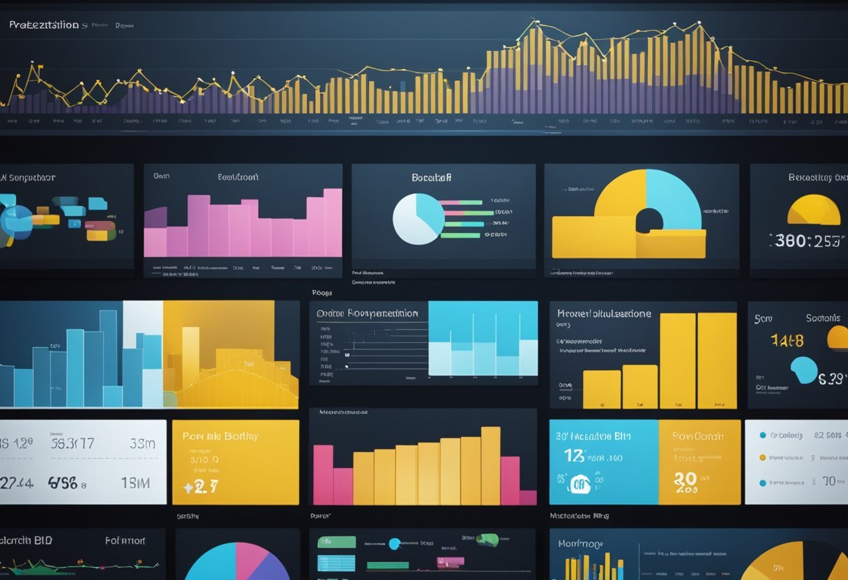
Visualizations in Power BI help transform raw data into meaningful information, allowing users to get a clearer picture of their data’s story.
Beginners and experienced users alike can benefit from exploring the wide array of tools offered, enabling them to craft more comprehensive and visually appealing reports.
1) Bar Chart
Bar charts are commonly used in Power BI. They display data with rectangular bars where the length of each bar is proportional to the value it represents.
This visual makes it easy to compare different categories at a glance. Bar charts can be vertical or horizontal, providing flexibility based on the data presentation needs.
In Power BI, bar charts are useful for visualizing categorical data. Each bar represents a category, and the height or length shows the value it holds. This feature makes bar charts ideal for showing comparisons between different groups, such as sales across different regions or age groups.
Creating a bar chart in Power BI involves selecting the bar chart type from the visualizations pane. Then, users can drag and drop their data fields into the appropriate areas, such as the axis and values fields.
This simple process makes bar charts accessible even to beginners, allowing for quick data visualization.
Customization is another strong point of bar charts in Power BI. Users can change colors, add labels, and adjust the axis to better highlight specific data points.
Customizing bar charts helps to give a clear view of the data, emphasizing important trends or differences between categories.
Advanced users can further customize bar charts using custom visuals from Microsoft AppSource. This feature expands the possibilities for unique chart designs, allowing for tailored solutions to meet specific reporting needs.
Column Chart
Column charts in Power BI are a powerful way to present data visually. They show information using vertical bars and are great for comparing data across categories.
To create a column chart, users can start from the Visualizations pane in Power BI Desktop. There, they select a column chart icon, which adds a visual placeholder to the canvas.
Next, they can open the Data pane and choose the fields they want to display.
These charts are helpful for showing changes over time or comparing different groups. By using a column chart, users can easily see patterns and trends. The bars make it clear which categories have higher or lower values.
Column charts have some considerations to keep in mind. They work best with a limited number of categories, as too many bars can clutter the chart.
Users should also think carefully about the order of their data to make the trends clear.
In some cases, a bar chart, which is a rotated version of a column chart, might be more suitable. Bar charts display data horizontally and can be better at handling long category names. This makes them useful in specific scenarios where column charts may fall short.
3) Line Chart
The line chart is a fundamental visualization tool in Power BI. It is used to display data trends over time, making it easy to identify patterns.
By connecting data points with a continuous line, users can quickly see changes and movements in data.
Creating a line chart in Power BI is straightforward. Users can start by selecting data from the Data pane, such as sales figures or website traffic.
After selecting the data, users can convert it into a line chart using the Visualizations pane. This process transforms the data into a visual representation that highlights trends.
Line charts are particularly useful for tracking changes over specific periods. For instance, they can show monthly sales or yearly revenue growth.
These visualizations allow users to compare different data series by using multiple lines on the same chart, which helps in analyzing data sets concurrently.
Customization is a key feature of line charts. Power BI allows users to adjust the color, style, and thickness of lines.
This ensures that the chart aligns with the visual identity of a report or presentation. Additionally, data labels can be added to show exact values at each point.
When there is a need to highlight a specific time period, users can apply filters to the line chart. This capability is useful for focusing on data from specific years, months, or other time frames, enhancing the precision of the analysis.
Further resources on line charts and their creation in Power BI can be found on the official Power BI documentation. This guide offers step-by-step instructions and additional tips for maximizing the effectiveness of line charts.
4) Pie Chart
Pie charts are a popular way to display data in Power BI. They are used to show proportions of a whole. Each slice of the pie represents a category’s share of the total.
This makes pie charts ideal for visualizing simple data comparisons.
Pie charts work best when there are a few categories to compare. Too many slices can make them hard to read. For data with many categories, consider combining smaller ones into an “Other” category. This can improve clarity and make the chart easier to understand.
Color is important in pie charts. Each slice can have a different color to distinguish categories.
Users can customize these colors in Power BI for better readability and visual appeal. Labels on each slice can help provide more detail, showing both category names and values.
When designing pie charts in Power BI, users can also adjust the layout. They might change the chart’s size, angle, or add borders for additional emphasis.
Due to their familiar shape, pie charts are easy to interpret at a glance. This makes them useful in reports and presentations where quick insights are needed. They can act as visual highlights to emphasize key parts of the data, ensuring the audience quickly understands the most important information.
5) Donut Chart
The donut chart is a popular visualization tool used in Power BI. It is similar to a pie chart but has a hollow center. This difference allows for an additional level of data to be displayed right in the center, making it more informative and visually appealing.
Donut charts are excellent for showing part-to-whole relationships. Specific categories are shown as slices of the donut, which makes it easier to understand proportions.
This format is visually effective for comparing smaller segments within a larger dataset.
In Power BI, creating a donut chart is straightforward. Users start with a blank report page and select their data, such as sales figures.
They then convert the data into a donut chart using the Visualizations pane. This ease of use makes it accessible for beginners and experts alike.
One limitation of donut charts is that all data should add up to 100%. This requirement can limit their use in some scenarios.
They are not the best choice for comparing categories that are similar in size. Charts like bar charts may be better suited for such comparisons.
When used correctly, a donut chart is a powerful tool for proportion-based data visualization. It allows insights into how individual categories contribute to the overall data. This makes it valuable for presentations and reports that require clear and concise data representation.
6) Area Chart
The area chart in Power BI is a valuable tool for visualizing data trends over time. It emphasizes the magnitude of changes by filling the area between the line and the axis with color.
This method helps viewers quickly grasp the data’s size and significance.
Area charts are often used to show the total value across a trend. They are especially effective when you want to highlight overall trends rather than minute details.
This makes them perfect for visualizing data like revenue growth or cumulative sales over a specific period.
In Power BI, users can utilize basic or stacked area charts. The basic area chart is derived from a line chart but distinguishes itself by filling the area beneath the line. This type is excellent for displaying trends in a single data series.
For comparing multiple data series, stacked area charts are more appropriate. They enable viewers to see the contribution of each series to the total over time.
This can be particularly useful for understanding how different segments add up.
Power BI allows easy conversion to area charts. Users can start by selecting a line chart and then choose the area chart icon from the Visualizations pane. This straightforward process assists users in maintaining focus on data analysis.
In addition, area charts provide fluid integration with other chart types. For example, in combo charts, area charts can complement column charts by adding background context. This combination enables a more comprehensive understanding of the data being presented.
7) Scatter Chart
A scatter chart in Power BI offers a unique way to display data that highlights relationships between two numerical values. Each point on the scatter chart represents a pair of values for two variables.
This chart type is essential for uncovering correlations or patterns in the dataset.
Creating a scatter chart in Power BI is straightforward. Users select their desired data, such as sales figures or customer feedback scores.
Power BI will then plot this data visually, showcasing any noticeable trends. For example, a scatter chart can reveal whether higher sales correlate with more customer visits.
Scatter charts support data analysis in various fields, including business, science, and education. This type of chart helps analysts identify trends or anomalies that might not be apparent in tabular data alone.
With this visualization, users can quickly spot data clusters and outliers, aiding in informed decision-making.
Power BI’s scatter chart can handle large datasets efficiently. It can display up to 10,000 data points, making it suitable for extensive analyses.
This capability ensures comprehensive insights are extracted without overwhelming the viewer.
Enhancing scatter charts with additional features is possible in Power BI. Users might add bubbles to each data point for representing a third data dimension.
This addition is practical for scenarios where another variable, like profit margins, plays a crucial role. For more information on scatter charts, explore Power BI’s scatter, bubble, and dot plot charts guidance.
8) Treemap
A Treemap is a data visualization tool used in Power BI to display hierarchical data. It shows data as rectangles of different sizes.
The size of each rectangle is determined by the values you want to compare. This makes it easy to see which categories are larger or more significant at a glance.
Treemaps are particularly helpful for displaying part-to-whole relationships. They allow you to see how individual parts contribute to the whole.
This visual is great for comparing proportions within a dataset. For instance, it can represent sales data where each rectangle size reflects the sales amount of a specific product category.
To create a Treemap in Power BI, you start by selecting the Treemap icon from the Visualizations pane.
Next, drag a categorical field into the “Category” area and a numerical field into the “Values” area, such as from a dataset imported from SQL Server.
This action generates a visual where each category appears as a rectangle sized based on its value in the dataset.
Treemaps offer interactive features like selecting a specific area to filter other visuals or dig deeper into a specific category. This makes them useful for exploring data dynamically during presentations or reports.
They are best suited for datasets with multiple categories that don’t need precise value comparisons. If precise values are needed, other charts like bar or line charts might be more suitable.
Treemaps shine in displaying the big picture quickly. Explore more about creating a Treemap on sites like SQL Server Tips or Binaryroots.
9) Histogram
A histogram in Power BI is a great tool for displaying the frequency of data within certain ranges. It helps users understand the distribution of a dataset by grouping numbers into bins.
This type of chart is useful for showing the underlying patterns in data.
When creating a histogram in Power BI, users can set up bins manually or use custom visuals. This flexibility allows for detailed and tailored visualizations to suit specific data analysis needs.
The bins in a histogram determine how the data is grouped, affecting the clarity of the insights.
One of the key strengths of using histograms is their ability to handle large amounts of data. They can be combined with other visual types, such as scatterplots or line graphs, to enhance analysis.
Mixing these visualizations can offer more powerful insights than a single chart. This feature makes Power BI a robust tool for data analysis.
Histograms also emphasize data patterns that may not be visible through other visualization methods. By visualizing frequency distributions, users can identify trends and outliers, providing a clearer picture of the dataset.
This makes histograms valuable for both beginners and advanced users.
Finally, the ability to customize visual properties further enhances histograms’ effectiveness. Users can adjust colors, labels, and other visual elements to create a chart that communicates information effectively.
This customization ensures that the histogram aligns with the design and reporting goals in Power BI.
10) Waterfall Chart
The waterfall chart in Power BI is a useful tool for visualizing the cumulative effect of sequentially added positive or negative values. It shows how an initial value is increased or decreased by a series of intermediate changes, leading to a final value.
This makes it great for financial analysis, where it can display the progression of profit or loss over a period.
Creating a waterfall chart involves selecting the waterfall option from the Power BI visualizations pane. Users can then drag data fields into specific areas such as Category, Breakdown, and Values.
This setup allows the chart to represent starting values, intermediate changes, and ending totals clearly. This chart type uses floating bars for intermediate values and distinct colors for increases and decreases.
The nested waterfall chart is a variation that shows hierarchies within data. Each level of the hierarchy forms its own waterfall chart within the main one.
This can help users visualize and understand contributions at different levels. It can be useful for seeing detailed breakdowns within departments or categories in a business.
By displaying data this way, waterfall charts provide insights into data trends and changes over time. They highlight key areas where significant changes occur, helping businesses identify patterns or issues.
This is especially valuable for those looking to understand complex data sets in a more digestible format.
These charts are not only limited to financial contexts. They can be adapted to show various scenarios where it is essential to track how multiple factors contribute to a final result.
With their clear visual representation, waterfall charts are a practical addition to any analytical toolkit.
Understanding Power BI Visualizations
Power BI visualizations enable users to present data effectively by using various graphical formats. This makes complex data more understandable and highlights important trends and insights.
Each type of visualization provides unique benefits, allowing for efficient data presentation and analysis.
Importance of Visual Representations
Visual representations in Power BI are crucial for transforming raw data into meaningful insights. They help users identify patterns, trends, and outliers that might be missed in numerical data alone.
Power BI offers a wide range of visuals, including charts, maps, and tables, which can be customized to fit the specific needs of a report or dashboard.
Using visuals like area charts can emphasize changes over time. These charts fill the space between lines and axes, making them effective for showing growth or decline.
The visualization types in Power BI include a variety of options that cater to different data stories.
Each visualization type serves a unique purpose, supporting the clear communication of data-driven stories. By selecting the right visual, users can ensure their audience understands the key points without overwhelming them with unnecessary details.
Choosing the Right Visualization
Picking the right Power BI visualization can greatly impact how data is understood and used. It’s crucial to consider factors like audience needs and data goals to ensure clarity and effectiveness.
Factors to Consider
When choosing a visualization, several key factors come into play. One important aspect is the type of data being represented.
Numerical data might benefit from line or bar charts, while categorical data might be better suited to pie charts.
Audience comprehension is another critical factor. Visualizations should be simple enough for the intended audience to understand but detailed enough to provide valuable insights.
It’s also essential to consider the volume of data. Large datasets may require condensed visuals like histograms or data tables.
Additionally, the design and aesthetic of the visualization should be considered to ensure clarity, avoiding clutter that can mislead or confuse viewers.
Knowing the purpose of the visualization helps in selecting the most effective format. For instance, area charts highlight trends over time efficiently.
Aligning with Data Goals
Aligning the visualization choice with data goals is crucial for effective analysis. If the goal is to identify trends, a line chart can be very effective.
For comparison across categories, a bar chart might be the best option.
It’s important that the visualization aligns with what the presenter wants to convey.
For decision-making, using visuals like dashboards can integrate multiple data points to give a comprehensive view.
When aiming to highlight relationships between variables, scatter plots might be ideal.
Choosing a visualization should help in efficiently drawing conclusions about the data and making informed decisions.
Advanced Visualization Techniques
In Power BI, advanced visualization techniques enhance data storytelling and allow for deeper insights. Custom visuals expand the tool’s capabilities, while AI features integrate intelligent data analysis.
Custom Visuals
Custom visuals in Power BI provide flexibility beyond the built-in options. Users can create or import visuals tailored to their specific needs, enriching reports with unique data representations.
The ability to integrate custom visuals created by the community or in-house developers opens up opportunities for innovation.
These visuals often help in displaying complex data relationships clearly. They also engage stakeholders by adding visual appeal and enhancing understanding.
Power BI supports these visuals through various formats like charts, maps, and gauges, ensuring that reports are not only functional but visually compelling.
Integration with AI Features
Power BI’s integration with AI enhances the analytical capabilities of reports. Users can leverage AI-driven insights through features like Q&A, which allows natural language queries.
This can be especially useful for those who wish to explore data without technical knowledge.
AI visuals help in predicting trends and uncovering hidden patterns, making them valuable for strategic decision-making.
Furthermore, AI can automate data preparation, reducing the workload on users.
This integration enables real-time data exploration and analysis, ensuring timely insights that are crucial for business operations.
Frequently Asked Questions
Power BI offers a variety of tools to enhance data visualization. It allows users to customize their experience with different charts and downloads while choosing visuals that best fit their needs.
How can I find and apply custom visuals in Power BI?
Custom visuals can be accessed through the AppSource community. After finding a visual, it can be downloaded and imported into Power BI Desktop.
Users can then apply these visuals to enhance their reports and dashboards.
What are the main categories of charts and visualizations available in Power BI?
Power BI provides a wide array of visualization types such as bar charts, column charts, line charts, pie charts, and donut charts. Each type serves a specific purpose, helping to display data clearly and effectively in reports.
Where can I download free visuals for Power BI, and how do I install them?
Free visuals are available from the Microsoft AppSource site. After downloading, these visuals can be added to Power BI Desktop through the “Import a custom visual” option in the visualizations pane.
Which Power BI visual is best suited for tracking progress over time?
Line charts are ideal for tracking progress over time. They effectively display trends and changes by connecting data points with lines, making it easy to see the flow of information over a specified period.
How do I select the most effective visualization for my Power BI dashboard?
Choosing the right visualization depends on the data type and the message to be conveyed. Understanding what each chart highlights can guide users.
For instance, bar charts are excellent for comparing quantities, while pie charts break down proportions in parts of a whole.
What are the differences between the various dashboard types in Power BI?
Dashboards vary by their capacity to showcase data relationships and trends.
Report pages allow for complex, interactive data stories, while simple dashboards may focus on key performance indicators or summaries.
Each dashboard is designed to serve distinct business insights and purposes.