Categories
Uncategorized

Azure Data Studio Extensions: Enhance Your Database Experience

Understanding Azure Data Studio

Azure Data Studio is a versatile tool developed by Microsoft for data management and development. It supports platforms such as Windows, macOS, and Linux. This makes it accessible to a wide range of users who work with databases in different environments.

One of the standout features of Azure Data Studio is its interface, which is reminiscent of Visual Studio Code. This familiarity is helpful to developers who have used Visual Studio Code, making the transition to Azure Data Studio smoother.

Cross-platform support is an essential feature. Azure Data Studio can connect seamlessly to popular cloud databases like Azure SQL and SQL Server.

Users can also connect to other databases, such as MySQL, PostgreSQL, and MongoDB, by adding extensions.

Additionally, Azure Data Studio is designed with cloud and on-premises databases in mind, so it’s suitable for various database management tasks. Its flexibility allows developers to query, design, and manage their databases effectively.

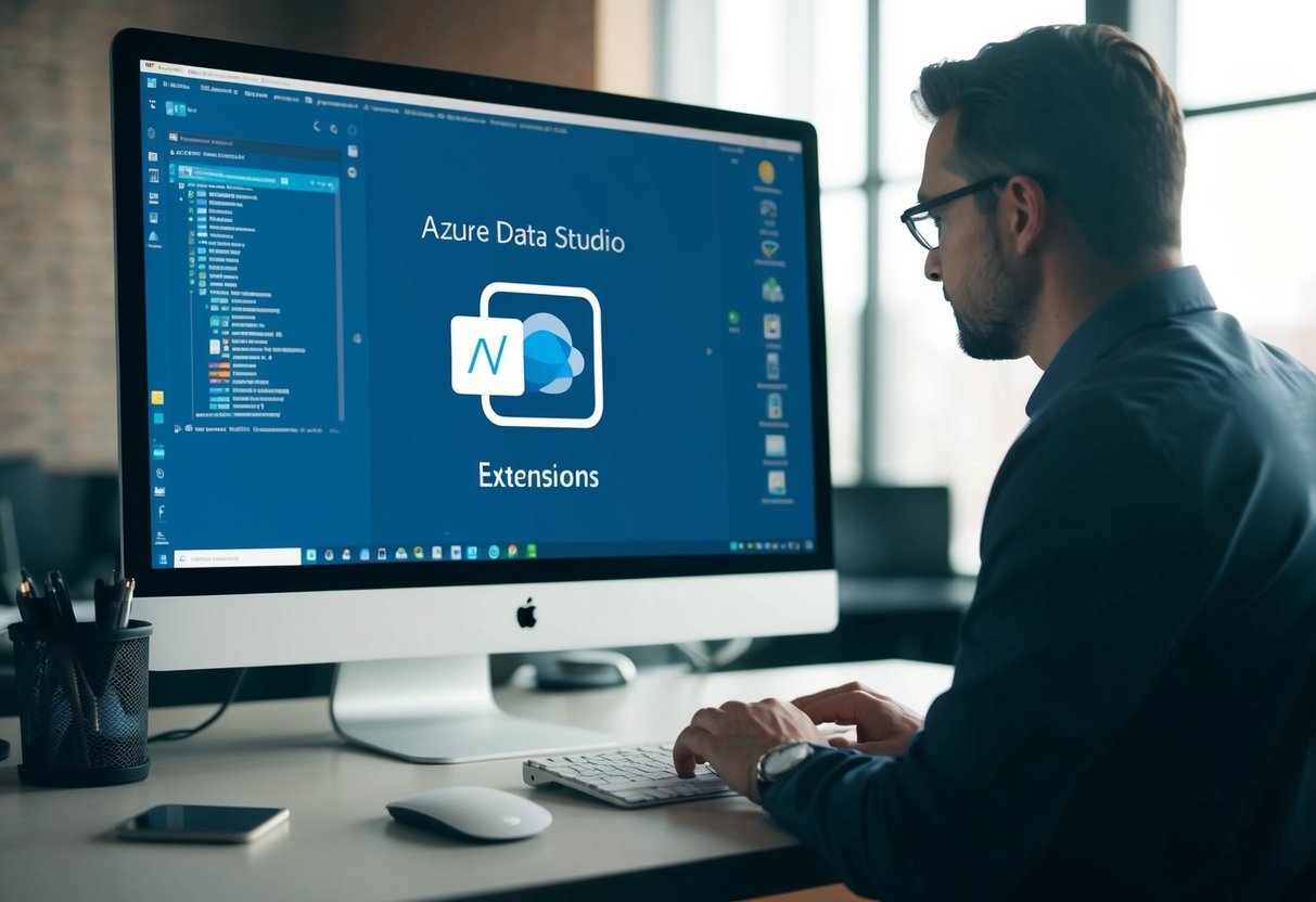
Extensions play a significant role in expanding the functionality of Azure Data Studio. They are available from both Microsoft and the community, offering a range of tools and functionalities to enhance the user experience.

For those looking to customize their experience, Azure Data Studio’s extension library offers many options. The ability to add new features as needed helps tailor the tool to individual needs, making it an indispensable resource for developers and data professionals.

Core Extensions for Enhanced Functionality

Azure Data Studio offers several essential extensions that enhance its capabilities, especially for SQL Server management and administration. These extensions help professionals efficiently handle various tasks, using familiar tools found in SQL Server Management Studio (SSMS).

SQL Server Agent

The SQL Server Agent extension is crucial for managing automated tasks. It allows users to schedule and execute routine jobs without manual intervention. This tool is particularly valuable for database administrators who need to manage repetitive T-SQL scripts or maintenance plans.

With this extension, users can create, edit, and manage SQL Server jobs directly from Azure Data Studio. It includes features like job history and alerts to monitor and troubleshoot any issues.

SQL Server Profiler

SQL Server Profiler is an extension that allows users to capture and analyze database events. It is useful for diagnosing slow queries, detecting problematic T-SQL code, and ensuring SQL Server performance optimization.

This tool mirrors the capability found in SSMS, helping users monitor live queries and identify long-running ones. Profiling in Azure Data Studio allows users to filter and sort events for targeted analysis, all integrated into one platform.

SQL Server Import

The SQL Server Import extension simplifies data import tasks. It is designed for users who need to quickly import spreadsheets or flat files into SQL Server databases. This tool supports various file formats, making data migration a straightforward process.

Using this extension, users can map source data to target SQL Server tables with an intuitive interface, allowing for seamless integration. Importing data has never been easier, reducing the need for complex scripting.

SQL Server Database Administration

Database administrators can leverage the SQL Server Database Administration extension for comprehensive management features. This extension offers insights into performance metrics, backup processes, and database integrity. It also supports managing DACPAC files for deploying and versioning databases.

Through the Extensions Manager, users can install and configure this extension to monitor server health, perform routine database checks, and optimize storage usage. It integrates tasks performed in SSMS, ensuring Azure Data Studio remains a robust tool for database administrators.

Database Development Workflows

The use of Azure Data Studio extensions enhances database development by managing SQL databases, tracking query history, and working efficiently with stored procedures and tables. These tools allow for streamlined workflows within the development environment.

Query History

Azure Data Studio keeps a detailed history of queries, which helps developers track past activities. This feature saves time by allowing them to revisit and rerun past queries. Users can filter through this history by workspace or timeline to quickly find important queries.

This capability is particularly useful in troubleshooting. By examining previous queries, it is easier to pinpoint errors or optimize performance. The integration with source control also means developers can maintain a consistent workflow.

SQL Databases Management

Managing SQL databases efficiently is vital for robust database development. Azure Data Studio supports connectivity to various databases such as Azure SQL, SQL Server, MySQL, and PostgreSQL. Users can easily connect to these from within the development interface.

The extension library expands this capability, allowing developers to work with different database types. This versatility aids in designing, editing, and publishing database schemas.

With features like schema comparison and automated deployment via CI/CD pipelines, managing SQL databases becomes highly efficient.

Stored Procedures & Tables

Stored procedures and tables are essential in organizing and executing SQL commands. Azure Data Studio provides tools to create and edit these components seamlessly.

Developers can use the SQL Database Projects extension to build source-controlled projects, ensuring consistency across development and production environments.

The extension supports designing complex stored procedures with version control. Tables and their relationships can be visualized, aiding in better understanding and efficient database management.

These capabilities simplify the development process, allowing developers to focus more on optimizing their databases. With these tools, both novice and experienced users can manage stored procedures and tables effectively.

Performance and Administration Tools

A desk with a computer monitor displaying azure data studio extensions. Various tools and administrative features are visible on the screen

In Azure Data Studio, performance and administration tools are essential for database administrators and developers managing different databases. These tools help in monitoring, analyzing, and optimizing database performance. They offer features to simplify tasks and increase efficiency across platforms like SQL Server, PostgreSQL, and Azure SQL Database.

Server Reports

Server reports provide a visual overview of server performance, helping administrators make informed decisions. These reports can show key metrics like CPU usage, memory consumption, and query performance.

By utilizing these reports, users can quickly identify bottlenecks or resource-intensive queries. This insight is crucial for maintaining optimal performance levels and ensuring that resources are used efficiently. Extensions in Azure Data Studio offer access to these reports, making them accessible and easy to use. Regularly reviewing server reports can also aid in predicting future needs and addressing potential issues before they escalate.

Whoisactive

Whoisactive is a powerful tool for identifying active sessions and queries running on SQL Server. Created by Adam Machanic, it is often used to troubleshoot performance issues by providing detailed information about active processes.

The tool shows what queries are consuming resources, which users are running them, and how they impact the server. It offers real-time insights, helping administrators pinpoint problems quickly. Integration with Azure Data Studio allows for an enhanced experience, making it easier to access and use. By keeping track of session activity with Whoisactive, database administrators can fine-tune their systems for better performance and stability.

Central Management Servers

Central Management Servers (CMS) offer a way to manage multiple SQL Server instances from one location. This tool helps streamline administrative tasks, making it easier to run scripts and query data across several servers simultaneously.

Using CMS, administrators can organize server instances into groups, execute queries across all instances, and quickly assess the status of each server. This function is particularly useful for large organizations with multiple environments.

CMS is supported natively in SQL Server Management Studio, and its integration into Azure Data Studio enhances the cross-platform administration capabilities, especially for SQL Server database administration.

Database Administration Tool

A robust database administration tool is crucial for maintaining healthy databases and ensuring smooth operations. Tools available in Azure Data Studio assist in tasks like backup, restoration, and configuration management.

These tools are designed to be user-friendly, offering both basic and advanced features. For example, the Admin Pack for SQL Server provides extensions that enhance the default capabilities of the platform, offering specialized functions for database management. PostgreSQL users also benefit from extensions tailored to their specific needs.

By leveraging these tools, administrators can efficiently manage their databases, ensuring reliability and performance across different database systems.

Customization and Productivity Enhancements

A laptop screen displaying various icons and tools for customization and productivity enhancements in Azure Data Studio extensions

Azure Data Studio offers various tools and features to enhance user productivity. Users can tailor their workspace to better suit their preferences and improve efficiency through code completion, visual customizations, and more.

Themes & Visual Customizations

Azure Data Studio allows users to personalize their environment with themes. These themes adjust the color scheme of the editor, helping developers work in a more comfortable setting. This feature is based on the Visual Studio Code platform, which offers a vast selection of themes.

Visual customizations also include adjusting fonts, layouts, and icon sets. While some themes focus on aesthetics, others aim to reduce eye strain during long coding sessions. Users can install themes from the Extensions Marketplace, allowing them to switch easily between different options.

Intelligent Code Completion

One of the most powerful productivity features in Azure Data Studio is Intelligent Code Completion. This tool is powered by technologies like IntelliSense and Visual Studio IntelliCode, which use machine learning to provide smart suggestions as you type. These suggestions help reduce errors and speed up the coding process.

By analyzing existing code patterns, it anticipates what the developer wants to write next. This means fewer keystrokes and a smoother workflow. The integration of IntelliCode offers AI-driven hints that adapt to the user’s coding habits, resulting in a highly personalized coding experience.

Keyboard Shortcuts & Snippets

Efficiency can be greatly improved with custom keyboard shortcuts and snippets. Azure Data Studio allows users to assign shortcuts to frequently used commands, making it faster to execute tasks without navigating through menus.

This customization helps streamline repetitive actions and saves valuable time.

Snippets are predefined code templates that reduce the time spent writing repetitive code structures. Users can create and customize their own snippets or use the ones available in the Extensions Marketplace.

These tools bring consistency to coding practices and help maintain a clean codebase, making them essential for any developer looking for productivity gains.

Advanced Extensions and Integration

A computer screen displaying Azure Data Studio with various advanced extensions and integration options open

Azure Data Studio offers advanced extensions that enhance its functionality, focusing on data exploration, source control, and third-party support. These extensions play a crucial role in improving efficiency and integrating smoothly with various tools.

Data Virtualization & Exploration

Data virtualization in Azure Data Studio enables users to access and explore data from different sources without moving it. This is achieved through tools like Kusto (KQL) and Azure Data Explorer, which allow querying large datasets efficiently.

SandDance for Azure Data Studio is a visual tool providing users with interactive views to explore data patterns. SQL Database Projects Extension allows for project-based database development, making it simpler to manage ongoing database changes.

These features support more dynamic and responsive data processes, enhancing user control over data assets.

Source Control Integration

Source control is a vital aspect of modern data management. Azure Data Studio supports integration with source control systems, aiding in versioning and collaboration.

Functions and SQL Server Schema Compare tools help in tracking changes between environments, supporting seamless deployment processes.

Users can leverage extensions like the Import Wizard to manage data import tasks efficiently. Redgate SQL Search assists in quickly finding database objects, streamlining development workflows.

These tools ensure that database development and management are as efficient as possible, minimizing errors and facilitating collaboration between developers.

Third-Party Extensions Support

Azure Data Studio’s extension ecosystem includes a variety of third-party tools that enhance its core features.

Extensions like First Responder Kit provide database health checks and performance insights, essential for database administrators. The Atom One Dark Theme offers a popular UI choice, improving the user interface visually.

Extensions such as Plan Explorer assist in analyzing query execution plans, while the SSMS Keymap provides familiar shortcuts for users transitioning from SSMS.

These third-party extensions expand the capabilities of Azure Data Studio, making it a flexible and comprehensive tool for developers and database managers.

What are the top Azure Data Studio extensions for enhanced productivity?

Extensions like the SQL Database Projects and the Admin Pack improve productivity. These extensions allow users to manage database projects and perform administrative tasks efficiently.

Exploring popular extensions in Azure Data Studio can help users find tools suited to their needs.

Where can I find a comprehensive tutorial for using extensions in Azure Data Studio?

A detailed guide on installing and using Azure Data Studio extensions can be found on Microsoft’s documentation page.

Tutorials from Fabric One Lake also provide step-by-step insights on utilizing these tools effectively.

How can I install a new extension from the Azure Data Studio marketplace?

To install an extension, users should go to the Extensions view in Azure Data Studio. They can search for the desired extension and click “Install” to integrate it into their environment.

This process is explained in detail by Microsoft.

What steps should I follow to develop my own extension for Azure Data Studio?

To create an extension, one can use Azure Data Studio’s extensibility mechanisms. This involves setting up the development environment and utilizing the Visual Studio Code APIs.

The guide on extension authoring gives in-depth information on getting started.

Can you list examples of Azure Data Studio extensions that improve SQL migration workflows?

The Azure SQL Migration extension streamlines database migrations, allowing users to save and resume tasks within the migration wizard. This tool, along with others, provides flexibility for managing SQL databases.

More examples can be found in the GitHub extension list.

How do I manage and update installed extensions in Azure Data Studio?

Managing and updating extensions involves visiting the Extensions view to check for updates.

Users can enable, disable, or uninstall extensions as needed.

Keeping extensions updated ensures access to the latest features and fixes.

Further information can be found on Microsoft’s documentation.

Categories
Uncategorized

Learning About Each Different Type of Visualizations in Power BI: A Comprehensive Guide

When working with Power BI, understanding the diverse range of visualizations available is crucial for creating impactful reports.

Power BI provides numerous options, from basic charts to complex data representations, each serving unique analytical purposes.

By learning about these visualizations, users can tailor their data presentation to effectively convey insights.

A laptop displaying various Power BI visualizations

Visualizations in Power BI help transform raw data into meaningful information, allowing users to get a clearer picture of their data’s story.

Beginners and experienced users alike can benefit from exploring the wide array of tools offered, enabling them to craft more comprehensive and visually appealing reports.

1) Bar Chart

Bar charts are commonly used in Power BI. They display data with rectangular bars where the length of each bar is proportional to the value it represents.

This visual makes it easy to compare different categories at a glance. Bar charts can be vertical or horizontal, providing flexibility based on the data presentation needs.

In Power BI, bar charts are useful for visualizing categorical data. Each bar represents a category, and the height or length shows the value it holds. This feature makes bar charts ideal for showing comparisons between different groups, such as sales across different regions or age groups.

Creating a bar chart in Power BI involves selecting the bar chart type from the visualizations pane. Then, users can drag and drop their data fields into the appropriate areas, such as the axis and values fields.

This simple process makes bar charts accessible even to beginners, allowing for quick data visualization.

Customization is another strong point of bar charts in Power BI. Users can change colors, add labels, and adjust the axis to better highlight specific data points.

Customizing bar charts helps to give a clear view of the data, emphasizing important trends or differences between categories.

Advanced users can further customize bar charts using custom visuals from Microsoft AppSource. This feature expands the possibilities for unique chart designs, allowing for tailored solutions to meet specific reporting needs.

Column Chart

Column charts in Power BI are a powerful way to present data visually. They show information using vertical bars and are great for comparing data across categories.

To create a column chart, users can start from the Visualizations pane in Power BI Desktop. There, they select a column chart icon, which adds a visual placeholder to the canvas.

Next, they can open the Data pane and choose the fields they want to display.

These charts are helpful for showing changes over time or comparing different groups. By using a column chart, users can easily see patterns and trends. The bars make it clear which categories have higher or lower values.

Column charts have some considerations to keep in mind. They work best with a limited number of categories, as too many bars can clutter the chart.

Users should also think carefully about the order of their data to make the trends clear.

In some cases, a bar chart, which is a rotated version of a column chart, might be more suitable. Bar charts display data horizontally and can be better at handling long category names. This makes them useful in specific scenarios where column charts may fall short.

3) Line Chart

The line chart is a fundamental visualization tool in Power BI. It is used to display data trends over time, making it easy to identify patterns.

By connecting data points with a continuous line, users can quickly see changes and movements in data.

Creating a line chart in Power BI is straightforward. Users can start by selecting data from the Data pane, such as sales figures or website traffic.

After selecting the data, users can convert it into a line chart using the Visualizations pane. This process transforms the data into a visual representation that highlights trends.

Line charts are particularly useful for tracking changes over specific periods. For instance, they can show monthly sales or yearly revenue growth.

These visualizations allow users to compare different data series by using multiple lines on the same chart, which helps in analyzing data sets concurrently.

Customization is a key feature of line charts. Power BI allows users to adjust the color, style, and thickness of lines.

This ensures that the chart aligns with the visual identity of a report or presentation. Additionally, data labels can be added to show exact values at each point.

When there is a need to highlight a specific time period, users can apply filters to the line chart. This capability is useful for focusing on data from specific years, months, or other time frames, enhancing the precision of the analysis.

Further resources on line charts and their creation in Power BI can be found on the official Power BI documentation. This guide offers step-by-step instructions and additional tips for maximizing the effectiveness of line charts.

4) Pie Chart

Pie charts are a popular way to display data in Power BI. They are used to show proportions of a whole. Each slice of the pie represents a category’s share of the total.

This makes pie charts ideal for visualizing simple data comparisons.

Pie charts work best when there are a few categories to compare. Too many slices can make them hard to read. For data with many categories, consider combining smaller ones into an “Other” category. This can improve clarity and make the chart easier to understand.

Color is important in pie charts. Each slice can have a different color to distinguish categories.

Users can customize these colors in Power BI for better readability and visual appeal. Labels on each slice can help provide more detail, showing both category names and values.

When designing pie charts in Power BI, users can also adjust the layout. They might change the chart’s size, angle, or add borders for additional emphasis.

Due to their familiar shape, pie charts are easy to interpret at a glance. This makes them useful in reports and presentations where quick insights are needed. They can act as visual highlights to emphasize key parts of the data, ensuring the audience quickly understands the most important information.

5) Donut Chart

The donut chart is a popular visualization tool used in Power BI. It is similar to a pie chart but has a hollow center. This difference allows for an additional level of data to be displayed right in the center, making it more informative and visually appealing.

Donut charts are excellent for showing part-to-whole relationships. Specific categories are shown as slices of the donut, which makes it easier to understand proportions.

This format is visually effective for comparing smaller segments within a larger dataset.

In Power BI, creating a donut chart is straightforward. Users start with a blank report page and select their data, such as sales figures.

They then convert the data into a donut chart using the Visualizations pane. This ease of use makes it accessible for beginners and experts alike.

One limitation of donut charts is that all data should add up to 100%. This requirement can limit their use in some scenarios.

They are not the best choice for comparing categories that are similar in size. Charts like bar charts may be better suited for such comparisons.

When used correctly, a donut chart is a powerful tool for proportion-based data visualization. It allows insights into how individual categories contribute to the overall data. This makes it valuable for presentations and reports that require clear and concise data representation.

6) Area Chart

The area chart in Power BI is a valuable tool for visualizing data trends over time. It emphasizes the magnitude of changes by filling the area between the line and the axis with color.

This method helps viewers quickly grasp the data’s size and significance.

Area charts are often used to show the total value across a trend. They are especially effective when you want to highlight overall trends rather than minute details.

This makes them perfect for visualizing data like revenue growth or cumulative sales over a specific period.

In Power BI, users can utilize basic or stacked area charts. The basic area chart is derived from a line chart but distinguishes itself by filling the area beneath the line. This type is excellent for displaying trends in a single data series.

For comparing multiple data series, stacked area charts are more appropriate. They enable viewers to see the contribution of each series to the total over time.

This can be particularly useful for understanding how different segments add up.

Power BI allows easy conversion to area charts. Users can start by selecting a line chart and then choose the area chart icon from the Visualizations pane. This straightforward process assists users in maintaining focus on data analysis.

In addition, area charts provide fluid integration with other chart types. For example, in combo charts, area charts can complement column charts by adding background context. This combination enables a more comprehensive understanding of the data being presented.

7) Scatter Chart

A scatter chart in Power BI offers a unique way to display data that highlights relationships between two numerical values. Each point on the scatter chart represents a pair of values for two variables.

This chart type is essential for uncovering correlations or patterns in the dataset.

Creating a scatter chart in Power BI is straightforward. Users select their desired data, such as sales figures or customer feedback scores.

Power BI will then plot this data visually, showcasing any noticeable trends. For example, a scatter chart can reveal whether higher sales correlate with more customer visits.

Scatter charts support data analysis in various fields, including business, science, and education. This type of chart helps analysts identify trends or anomalies that might not be apparent in tabular data alone.

With this visualization, users can quickly spot data clusters and outliers, aiding in informed decision-making.

Power BI’s scatter chart can handle large datasets efficiently. It can display up to 10,000 data points, making it suitable for extensive analyses.

This capability ensures comprehensive insights are extracted without overwhelming the viewer.

Enhancing scatter charts with additional features is possible in Power BI. Users might add bubbles to each data point for representing a third data dimension.

This addition is practical for scenarios where another variable, like profit margins, plays a crucial role. For more information on scatter charts, explore Power BI’s scatter, bubble, and dot plot charts guidance.

8) Treemap

A Treemap is a data visualization tool used in Power BI to display hierarchical data. It shows data as rectangles of different sizes.

The size of each rectangle is determined by the values you want to compare. This makes it easy to see which categories are larger or more significant at a glance.

Treemaps are particularly helpful for displaying part-to-whole relationships. They allow you to see how individual parts contribute to the whole.

This visual is great for comparing proportions within a dataset. For instance, it can represent sales data where each rectangle size reflects the sales amount of a specific product category.

To create a Treemap in Power BI, you start by selecting the Treemap icon from the Visualizations pane.

Next, drag a categorical field into the “Category” area and a numerical field into the “Values” area, such as from a dataset imported from SQL Server.

This action generates a visual where each category appears as a rectangle sized based on its value in the dataset.

Treemaps offer interactive features like selecting a specific area to filter other visuals or dig deeper into a specific category. This makes them useful for exploring data dynamically during presentations or reports.

They are best suited for datasets with multiple categories that don’t need precise value comparisons. If precise values are needed, other charts like bar or line charts might be more suitable.

Treemaps shine in displaying the big picture quickly. Explore more about creating a Treemap on sites like SQL Server Tips or Binaryroots.

9) Histogram

A histogram in Power BI is a great tool for displaying the frequency of data within certain ranges. It helps users understand the distribution of a dataset by grouping numbers into bins.

This type of chart is useful for showing the underlying patterns in data.

When creating a histogram in Power BI, users can set up bins manually or use custom visuals. This flexibility allows for detailed and tailored visualizations to suit specific data analysis needs.

The bins in a histogram determine how the data is grouped, affecting the clarity of the insights.

One of the key strengths of using histograms is their ability to handle large amounts of data. They can be combined with other visual types, such as scatterplots or line graphs, to enhance analysis.

Mixing these visualizations can offer more powerful insights than a single chart. This feature makes Power BI a robust tool for data analysis.

Histograms also emphasize data patterns that may not be visible through other visualization methods. By visualizing frequency distributions, users can identify trends and outliers, providing a clearer picture of the dataset.

This makes histograms valuable for both beginners and advanced users.

Finally, the ability to customize visual properties further enhances histograms’ effectiveness. Users can adjust colors, labels, and other visual elements to create a chart that communicates information effectively.

This customization ensures that the histogram aligns with the design and reporting goals in Power BI.

10) Waterfall Chart

The waterfall chart in Power BI is a useful tool for visualizing the cumulative effect of sequentially added positive or negative values. It shows how an initial value is increased or decreased by a series of intermediate changes, leading to a final value.

This makes it great for financial analysis, where it can display the progression of profit or loss over a period.

Creating a waterfall chart involves selecting the waterfall option from the Power BI visualizations pane. Users can then drag data fields into specific areas such as Category, Breakdown, and Values.

This setup allows the chart to represent starting values, intermediate changes, and ending totals clearly. This chart type uses floating bars for intermediate values and distinct colors for increases and decreases.

The nested waterfall chart is a variation that shows hierarchies within data. Each level of the hierarchy forms its own waterfall chart within the main one.

This can help users visualize and understand contributions at different levels. It can be useful for seeing detailed breakdowns within departments or categories in a business.

By displaying data this way, waterfall charts provide insights into data trends and changes over time. They highlight key areas where significant changes occur, helping businesses identify patterns or issues.

This is especially valuable for those looking to understand complex data sets in a more digestible format.

These charts are not only limited to financial contexts. They can be adapted to show various scenarios where it is essential to track how multiple factors contribute to a final result.

With their clear visual representation, waterfall charts are a practical addition to any analytical toolkit.

Understanding Power BI Visualizations

Power BI visualizations enable users to present data effectively by using various graphical formats. This makes complex data more understandable and highlights important trends and insights.

Each type of visualization provides unique benefits, allowing for efficient data presentation and analysis.

Importance of Visual Representations

Visual representations in Power BI are crucial for transforming raw data into meaningful insights. They help users identify patterns, trends, and outliers that might be missed in numerical data alone.

Power BI offers a wide range of visuals, including charts, maps, and tables, which can be customized to fit the specific needs of a report or dashboard.

Using visuals like area charts can emphasize changes over time. These charts fill the space between lines and axes, making them effective for showing growth or decline.

The visualization types in Power BI include a variety of options that cater to different data stories.

Each visualization type serves a unique purpose, supporting the clear communication of data-driven stories. By selecting the right visual, users can ensure their audience understands the key points without overwhelming them with unnecessary details.

Choosing the Right Visualization

Picking the right Power BI visualization can greatly impact how data is understood and used. It’s crucial to consider factors like audience needs and data goals to ensure clarity and effectiveness.

Factors to Consider

When choosing a visualization, several key factors come into play. One important aspect is the type of data being represented.

Numerical data might benefit from line or bar charts, while categorical data might be better suited to pie charts.

Audience comprehension is another critical factor. Visualizations should be simple enough for the intended audience to understand but detailed enough to provide valuable insights.

It’s also essential to consider the volume of data. Large datasets may require condensed visuals like histograms or data tables.

Additionally, the design and aesthetic of the visualization should be considered to ensure clarity, avoiding clutter that can mislead or confuse viewers.

Knowing the purpose of the visualization helps in selecting the most effective format. For instance, area charts highlight trends over time efficiently.

Aligning with Data Goals

Aligning the visualization choice with data goals is crucial for effective analysis. If the goal is to identify trends, a line chart can be very effective.

For comparison across categories, a bar chart might be the best option.

It’s important that the visualization aligns with what the presenter wants to convey.

For decision-making, using visuals like dashboards can integrate multiple data points to give a comprehensive view.

When aiming to highlight relationships between variables, scatter plots might be ideal.

Choosing a visualization should help in efficiently drawing conclusions about the data and making informed decisions.

Advanced Visualization Techniques

In Power BI, advanced visualization techniques enhance data storytelling and allow for deeper insights. Custom visuals expand the tool’s capabilities, while AI features integrate intelligent data analysis.

Custom Visuals

Custom visuals in Power BI provide flexibility beyond the built-in options. Users can create or import visuals tailored to their specific needs, enriching reports with unique data representations.

The ability to integrate custom visuals created by the community or in-house developers opens up opportunities for innovation.

These visuals often help in displaying complex data relationships clearly. They also engage stakeholders by adding visual appeal and enhancing understanding.

Power BI supports these visuals through various formats like charts, maps, and gauges, ensuring that reports are not only functional but visually compelling.

Integration with AI Features

Power BI’s integration with AI enhances the analytical capabilities of reports. Users can leverage AI-driven insights through features like Q&A, which allows natural language queries.

This can be especially useful for those who wish to explore data without technical knowledge.

AI visuals help in predicting trends and uncovering hidden patterns, making them valuable for strategic decision-making.

Furthermore, AI can automate data preparation, reducing the workload on users.

This integration enables real-time data exploration and analysis, ensuring timely insights that are crucial for business operations.

Frequently Asked Questions

Power BI offers a variety of tools to enhance data visualization. It allows users to customize their experience with different charts and downloads while choosing visuals that best fit their needs.

How can I find and apply custom visuals in Power BI?

Custom visuals can be accessed through the AppSource community. After finding a visual, it can be downloaded and imported into Power BI Desktop.

Users can then apply these visuals to enhance their reports and dashboards.

What are the main categories of charts and visualizations available in Power BI?

Power BI provides a wide array of visualization types such as bar charts, column charts, line charts, pie charts, and donut charts. Each type serves a specific purpose, helping to display data clearly and effectively in reports.

Where can I download free visuals for Power BI, and how do I install them?

Free visuals are available from the Microsoft AppSource site. After downloading, these visuals can be added to Power BI Desktop through the “Import a custom visual” option in the visualizations pane.

Which Power BI visual is best suited for tracking progress over time?

Line charts are ideal for tracking progress over time. They effectively display trends and changes by connecting data points with lines, making it easy to see the flow of information over a specified period.

How do I select the most effective visualization for my Power BI dashboard?

Choosing the right visualization depends on the data type and the message to be conveyed. Understanding what each chart highlights can guide users.

For instance, bar charts are excellent for comparing quantities, while pie charts break down proportions in parts of a whole.

What are the differences between the various dashboard types in Power BI?

Dashboards vary by their capacity to showcase data relationships and trends.

Report pages allow for complex, interactive data stories, while simple dashboards may focus on key performance indicators or summaries.

Each dashboard is designed to serve distinct business insights and purposes.

Categories
Uncategorized

Quick Sort in Python: Implementation Guide for Beginners

Understanding Quick Sort

Quick Sort is a popular sorting algorithm that relies on the divide-and-conquer technique. It is known for efficiently sorting large datasets and is favored for its average-case performance.

The selection of an optimal pivot plays a crucial role in determining its efficiency compared to other sorting methods.

Definition and Principles

Quick Sort is a divide-and-conquer algorithm. It divides an array into two smaller sub-arrays based on a pivot element.

The key steps of Quick Sort include selecting a pivot, partitioning the array into elements less than and greater than the pivot, and then recursively applying the same process to the sub-arrays.

The efficiency of Quick Sort lies in its ability to sort elements in place, minimizing additional memory usage. Its average time complexity is O(n log n), making it faster than algorithms like Bubble Sort or Insertion Sort, especially for large datasets.

Quick Sort vs Other Sorting Algorithms

Compared to other sorting algorithms, Quick Sort stands out for its speed and efficiency in practical applications. While its worst-case time complexity is O(n²), this typically occurs with poor pivot selections, such as when the smallest or largest element is always chosen.

Merge Sort, while also offering O(n log n) performance, requires additional memory for temporary arrays. Quick Sort, on the other hand, excels with its in-place sorting—no extra space is needed, making it suitable for systems with limited memory.

Selecting a Pivot

Selecting the right pivot is crucial for Quick Sort’s efficiency. A good pivot divides the array into balanced parts.

Common strategies include choosing the first, last, or middle element, or using a more complex method like the “median of three” where the pivot is the median of the first, middle, and last elements.

The pivot selection can significantly impact performance. For example, consistently poor choices may degrade Quick Sort into a slow O(n²) algorithm. Therefore, adaptive pivot strategies are often employed to optimize sorting performance, enhancing the overall efficiency and reliability of Quick Sort among various datasets.

Analyzing Performance

Quick Sort is a popular sorting algorithm known for its efficiency and practical performance. It uses a divide-and-conquer approach to sort elements quickly, though its efficiency depends on several factors, including the choice of pivot and the structure of the data.

Time Complexity of Quick Sort

The time complexity of Quick Sort varies based on different scenarios. In the best case, the pivot splits the list into two equal parts, leading to a time complexity of (O(n \log n)). This is typically achieved with random pivot selection or optimal data arrangement.

In the average case, where the pivot splits the array unevenly, the time complexity remains (O(n \log n)). This makes Quick Sort competitive for many practical applications.

The worst case occurs when the pivot is consistently the smallest or largest element. This scenario leads to a time complexity of (O(n^2)), often happening when the array is already sorted in ascending or descending order.

Space Complexity

Quick Sort’s space complexity is a key part of its efficiency. Unlike merge sort, it does not require additional memory for auxiliary arrays. The space complexity is (O(\log n)) due to the recursive calls building up the call stack.

This recursive space requirement depends on how balanced these calls are. In practice, Quick Sort’s resource use is minimal, making it a good choice when memory is a constraint.

Best, Average, and Worst Case Scenarios

The best case for Quick Sort occurs when the partitioning results in equally sized sub-arrays. This ideal scenario leads to (O(n \log n)) performance, maximizing efficiency.

In the average case, the algorithm still maintains (O(n \log n)) complexity. This scenario assumes a fair distribution of elements around the pivot.

The worst case happens when sub-arrays are unbalanced, such as entirely sorted arrays where the pivot is consistently one of the extremes. This results in (O(n^2)) performance, highlighting the importance of good pivot selection strategies to mitigate this risk.

Effective pivot strategies enhance Quick Sort’s advantages while reducing the likelihood of poor performance.

Python Implementation

Implementing Quick Sort in Python involves setting up the environment, writing the function, and handling recursive calls with partitioning. Each step is crucial for an efficient algorithm execution.

Setting Up the Environment

Before diving into code, it’s important to prepare a suitable environment. Python is versatile, making it a great choice for implementing sorting algorithms.

Ensure Python is installed on your system. Popular editors like Visual Studio Code or PyCharm can enhance the coding experience due to their features like syntax highlighting and debugging tools.

Start by opening your chosen editor and creating a new Python file. You can name it quicksort.py for clarity. This setup ensures you have a dedicated space to work on the Quick Sort implementation, keeping files organized as you progress.

Writing the Quick Sort Function

To implement Quick Sort, a function needs to be defined. Begin by considering the strategy for selecting a pivot. In some implementations, the pivot is chosen from the middle or last element of the list. Below is a simplified version using the middle element:

def quick_sort(arr):
    if len(arr) <= 1:
        return arr
    else:
        pivot = arr[len(arr) // 2]
        left = [x for x in arr if x < pivot]
        middle = [x for x in arr if x == pivot]
        right = [x for x in arr if x > pivot]
        return quick_sort(left) + middle + quick_sort(right)

This function handles the core logic of Quick Sort by breaking down the list into smaller segments. Each part is processed till the list becomes manageable and is eventually recombined into a sorted order.

Recursive Calls and Partitioning

The Quick Sort algorithm relies heavily on recursion and partitioning techniques. Recursive calls split the list into smaller pieces by comparing elements to the pivot. Partitioning involves rearranging elements so that those less than the pivot come before it in the list, and those greater follow.

The recursion continues until it meets the base condition, defined in the function as lists with a length of one or zero. These are inherently sorted.

Executing the recursive calls correctly ensures the list is broken down efficiently without infinite loops, leading to a complete and sorted output when all recursive instances are resolved.

Understanding the Partitioning Mechanism

The partitioning mechanism is crucial in the quick sort algorithm, allowing for efficient sorting by dividing the array into sub-arrays. This process involves careful rearrangement of elements around a chosen pivot.

Algorithm for Partitioning

The partitioning algorithm is a key step in quick sort. First, it selects a pivot element, often the last item in the array. The array is then rearranged so that elements less than the pivot are on its left, and greater ones are on its right. This involves two pointers: one that moves from the start and another from the end of the array.

As these pointers move, they swap elements when necessary to ensure all elements on the left are smaller. When the pointers cross, the pivot is positioned in its final sorted location. This effectively divides the array into two sub-arrays, which are recursively sorted to complete the algorithm.

Handling Duplicate Elements

Duplicate elements can complicate the partitioning process. They can lead to an inefficient sort if not handled correctly.

A common approach to manage duplicates is using a three-way partitioning strategy, which divides the array into parts: elements less than, equal to, and greater than the pivot.

This strategy helps prevent unnecessary swaps and reduces the number of recursive calls, making it more efficient for arrays with many duplicates.

Proper handling ensures that the algorithm maintains its efficiency, even with the presence of repeated values. By partitioning in this way, the algorithm ensures that a stable sorting process is maintained.

Step-by-Step Guide for Quick Sort

Quick Sort is a powerful sorting algorithm that uses a divide-and-conquer approach. This guide details how to break down an input array and rearrange the elements into sorted order. Each step involves specific tasks critical to efficiently sorting the array.

Dividing the Input Array

The first step in implementing Quick Sort is selecting a pivot element from the input array. This pivot helps in dividing the array into sub-arrays. A common choice is the last or middle element.

Once the pivot is selected, elements are arranged so that those less than the pivot are on one side and those greater are on the other. This process is called partitioning. As a result, the array is split into two sub-arrays around the pivot, which remains in its correct sorted position.

Picking the ideal pivot is crucial since it can greatly affect the efficiency. Choosing poorly can lead to unbalanced arrays, reducing performance, especially when sorting already sorted arrays in descending or ascending order.

Performing the Sort

Quick Sort then recursively sorts the sub-arrays. Each sub-array becomes a smaller problem of the same kind. The algorithm continues by selecting new pivot elements within each sub-array.

The performance of the sort often depends on how well the pivot divides the array. On average, when the pivot consistently splits arrays evenly, the sort operates efficiently, similar to algorithms like merge sort.

This recursive step is vital in achieving a sorted array in the desired order, whether ascending or descending. Recursion continues until each sub-array contains a single element, resulting in a fully sorted array.

Conquering Sub-Arrays

Finally, conquering involves systematically combining the sorted sub-arrays. Each partitioned section is joined back, ensuring the overall array remains sorted according to the desired order.

Through recursive calls, Quick Sort handles these sub-arrays independently, ensuring that every element finds its correct position.

The algorithm adapts efficiently to different input arrays, maintaining a balance between simplicity and speed.

The way each sub-array is managed can significantly impact the algorithm’s execution time, highlighting the importance of selecting pivots that produce balanced partitions. With its refined approach, Quick Sort is suitable for a wide range of sorting tasks.

Working with Large Datasets

Quick Sort is a powerful tool for sorting large datasets due to its efficient average time complexity of O(n log n). Understanding how to leverage its efficiency and optimize it can greatly improve sorting performance for large scale operations.

Efficiency on Large Scale

When working with large datasets, Quick Sort’s divide-and-conquer strategy is highly effective. This approach breaks down a large list into smaller sub-lists around a pivot. This method ensures that each recursive step handles a smaller portion of the data, maintaining an efficient sorting pace.

Compared to other algorithms like Merge Sort, Quick Sort typically requires less memory since it sorts in place. However, Merge Sort provides more predictable performance, with a stable O(n log n) complexity. Heap Sort is another alternative but usually slower due to its additional operations.

Selecting the right pivot is crucial. Strategies like the median-of-three can minimize the chances of hitting O(n²) worst-case scenarios.

Overall, Quick Sort remains a top choice for sorting large datasets, especially when fine-tuned for performance.

Optimizing Quick Sort for Performance

Optimizing Quick Sort for large datasets involves careful selection of the pivot and employing hybrid sorting methods. For example, integrating Quick Sort with Timsort or insertion sort can enhance its efficiency.

Using Timsort, which is Python’s built-in algorithm, can be beneficial since it combines Merge Sort and insertion sort. This way, it efficiently handles different data patterns by switching strategies mid-process.

Tail call optimization can further enhance Quick Sort. This technique minimizes stack overflow risks in recursive algorithms, maintaining optimal performance across large datasets.

By applying these optimizations, Quick Sort becomes a robust solution for efficient sorting in large-scale applications.

Comparison with Other Algorithms

Quick Sort is known for its efficiency and speed as a sorting algorithm. When comparing Quick Sort with other popular sorting methods, such as Merge Sort, Heap Sort, TimSort, and Insertion Sort, key differences arise in their approach, efficiency, and use cases.

Quick Sort versus Merge Sort

Quick Sort and Merge Sort are both divide and conquer algorithms, but they handle data differently.

Quick Sort works in-place, requiring less additional memory compared to Merge Sort, which needs extra space for merging.

Merge Sort runs in

How does the quick sort algorithm compare to the built-in sort function in Python in terms of efficiency?

Python’s built-in sort uses Timsort, which is a hybrid of Merge Sort and Insertion Sort.

Quick Sort often performs faster on average but can be slower in the worst case due to its (O(n^2)) complexity.

The built-in sort is stable and has a consistent (O(n \log n)) complexity, making it generally more reliable for varied datasets.

Categories
Uncategorized

Learning DAX – Measures vs Calculated Columns: Key Differences Explained

Data Analysis Expressions (DAX) play a crucial role in data modeling and reporting. Learning how to use them efficiently can greatly enhance a user’s ability to analyze data in tools like Power BI.

Measures and calculated columns are two core components of DAX that offer distinct functionalities and applications.

A person studying DAX, comparing measures and calculated columns on a computer screen with charts and graphs displayed

Understanding the difference between measures and calculated columns is essential for optimizing data models and reporting in tools like Power BI. Each serves different purposes and contexts, providing unique advantages in data manipulation and presentation.

Gaining proficiency in these concepts can lead to more insightful analyses and better decision-making.

1) Differences between DAX Measures vs Calculated Columns

DAX (Data Analysis Expressions) is widely used in tools like Power BI. It provides powerful options for data analysis, primarily through measures and calculated columns. These two features serve different purposes and have distinct characteristics.

A key difference is evaluation context.

A measure is evaluated based on the filter context. This means it adapts to filters applied during report generation. This makes measures dynamic, calculating values on the fly, which can be seen in context across different reports.

On the other hand, a calculated column works in a row context. It evaluates data row by row within a table. Once created, the value of a calculated column remains static unless the data itself changes. This can be useful for adding fixed information to a data set.

Measures impact memory usage less since they are only calculated when needed in a report. For example, a measure is stored as source code and executed in real-time when used. This efficiency is beneficial for large datasets where performance is a concern.

However, calculated columns increase the data model size because the results of the columns are stored in the model. Consider using them when specific row-level computations are necessary at all times, as they do not change with report filters.

Measures can interact dynamically with user interactions, such as slicers or other visuals. This interaction gives users the flexibility to explore data from various angles. Calculated columns lack this level of flexibility since they provide consistent values based on the data in the table.

2) When to Use DAX Measures

DAX Measures are an essential part of data analysis in Power BI. They are best used when the value needs to change dynamically based on filters and slicers in reports. This makes them highly flexible and powerful for interactive visualizations.

Measures are recommended for calculations that involve summing, averaging, or other aggregate functions. For example, if you want to calculate total sales or average profit, a measure is ideal. They respond to the context of data and can change as users interact with the report.

When working with large datasets, using measures can be more efficient.

Measures are evaluated only at the time of the report’s execution, consuming less memory compared to calculated columns, which are stored in the model. This makes measures better suited for optimizing performance and reducing memory usage.

For calculations that need to be reused across different reports or dashboards, measures offer a convenient solution. They can be defined once and applied wherever needed without repeating the formula.

Consider using measures when changes to the model’s filter context affect the desired result. Measures automatically adjust and provide results tailored to the current view, making them robust and adaptable in dynamic reporting environments.

Finally, measures are effective when dealing with complex calculations that need to be computed on-the-fly. By taking advantage of these scenarios, measures enhance analytical capabilities and improve the overall user experience in Power BI and other tools that support DAX.

3) Best Practices for DAX Calculated Columns

When creating DAX calculated columns, it’s important to ensure efficiency and clarity. Calculated columns are computed at the row level within a table, so they should only be used when necessary to enhance the data model.

Firstly, consider when to use calculated columns.

They are best for static data that doesn’t change based on user interaction. For example, a calculated column can be useful for categorizing data into specific groups that are always calculated the same way, such as age brackets.

Next, keep formulas simple. Complex formulas may slow down performance and are harder to maintain. Try to break down complex calculations into multiple simple steps or columns if necessary.

Remember that calculated columns consume storage because they are stored in the model. Be mindful of adding too many calculated columns, as they can inflate the data size. Careful planning of the data model can reduce unnecessary columns.

Make use of fully qualified column references when naming columns.

This means including the table name followed by the column name. It helps avoid conflicts with names and improves readability.

It’s essential to thoroughly test calculated columns to ensure they return the expected results. Checking different scenarios and edge cases can prevent errors in the final report.

4) Understanding Row Context in DAX

In DAX, the concept of row context is crucial for creating accurate calculations. Row context refers to the current row being evaluated in a table. This context is mainly relevant in scenarios where calculated columns are used.

Within a calculated column, each row operates separately. Since the calculation happens at the row level, DAX expressions have direct access to data in that specific row. This allows for straightforward computations without worrying about how values from other rows will influence the result.

Iterative functions in DAX, such as SUMX, AVERAGEX, and FILTER, create a row context.

These functions work by evaluating each row within the input table individually. They allow the computed expression to act upon every row of the table, making it possible to perform row-by-row operations.

Understanding row context is essential for mastering DAX. It lays the groundwork for more complex operations that involve both row and filter contexts. By mastering it, users can dive deeper into concepts like context transition, where a row context is transformed into a filter context for certain calculations.

For example, if a report or measure requires information from multiple tables or rows, understanding how the row context interacts with DAX functions becomes highly beneficial. This can ensure accurate calculations and prevent unexpected results.

The row context’s ability to define a singular row of operation is a fundamental part of how DAX functions. This concept is what enables DAX to perform powerful, dynamic calculations on large datasets effectively. For further details on row context, one can explore sources covering row context in DAX.

5) Using Filter Context with Measures

In DAX, measures are dynamic calculations that respond to filter contexts. The filter context depends on the different slicers and selections in a report. This makes measures powerful and flexible for analyzing data.

For example, if you use a measure with a chart, it changes dynamically as filters update.

Measures execute across all the data within a selected filter context. This means each visual element using a measure can display unique results based on that context. With measures, the same formula can yield different results depending on where it is used in a report.

When using measures, it’s crucial to understand how they interact with DAX’s aggregation functions like SUM and COUNT.

These functions depend heavily on the filter context. This approach allows for detailed and precise calculations in reports.

Good practices involve using measures to perform complex calculations that rely on active filters. They allow for seamless integration in report visuals. Measures automatically adapt, so you can create interactive and insightful dashboards.

A key advantage of measures is their ability to manage large datasets. They are calculated at query time, ensuring efficient performance. This makes measures ideal for real-time data analysis.

To make the best use of measures and filter context, regularly review and test your DAX formulas. This ensures accurate and meaningful results.

Measures, when used correctly, can unlock deep insights into your data by considering various filter scenarios. For more about how measures operate and interact with filter contexts, see Calculated Columns and Measures in DAX.

6) How to Create Calculated Columns in DAX

Creating calculated columns in DAX is straightforward and can add great value to your data models. Calculated columns are computed at the row level and help in data transformation within a table.

To start with, open your data model in Power BI Desktop. In the Fields pane, identify the table where you want to add a calculated column. Right-click on the table name or click the ellipsis next to it. Then, select “New Column.”

Once you select “New Column,” the Formula bar will appear above the Report canvas. Here, you can enter a DAX formula to define the calculated column. Give your new column a clear and descriptive name before proceeding with the formula.

The DAX formula you write will perform calculations for each row in the table. This can include simple arithmetic or more complex operations based on your data analysis needs. Ensure that your formula is accurate to avoid errors.

Calculations made in calculated columns are stored in the model and recalculated with dataset updates. Unlike measures, calculated columns do not change based on filters or slicers in reports.

Using calculated columns allows for detailed data insights and transformation at the granular level, enhancing the report-building process. For more detailed guidance on DAX formulas, Microsoft provides helpful tutorials.

7) Performance Considerations for DAX Measures

DAX measures are crucial in Power BI for their efficiency. They calculate results on-the-fly based on the context of the data, which often improves performance.

Unlike calculated columns that increase model size, measures use memory only during calculations and do not bloat the data model.

Measures rely heavily on filter context. This means they are influenced by slicers, rows, and columns in a report. When used correctly, they can be a powerful tool for dynamic reporting. This flexibility allows users to view different aspects of data without increasing memory usage.

In terms of optimization, DAX measures benefit from efficient use of RAM.

Unlike calculated columns, which store data permanently, measures only use RAM temporarily. Techniques such as minimizing complex calculations and using variables effectively can further enhance performance.

One important aspect is the complexity of the calculations. Measures with simple DAX expressions, such as basic aggregation functions, typically perform better than those with complex logic.

It’s advisable to test and optimize these expressions for the best results. Learning more about optimization can be helpful at sites like “Performance Optimization” in Power BI (https://www.c-sharpcorner.com/article/calculated-columns-vs-measures-in-power-bi).

Iterating functions within measures, such as SUMX or AVERAGEX, can impact performance because they compute over each row.

Proper use of these functions is essential for maintaining efficiency. Understanding the behavior of such functions can help in creating more efficient measures. This means measures can process information without often straining the system resources.

8) Use Cases for Calculated Columns in Power BI

Calculated columns are useful when working with specific row-level data that remains constant once it is calculated. They allow data analysts to create new columns within a table using DAX expressions.

One use case is when calculating a fixed attribute for each row, such as categorizing data.

For instance, if each sales transaction needs a category based on transaction size, a calculated column can classify each entry as “Small,” “Medium,” or “Large.”

Calculated columns are also beneficial in scenarios where the results need to be filtered or manipulated across reports.

For example, if an analyst is working on a table of products with sales figures, they might create a calculated column for “Sales Tax” by using the product price and tax rate. This new column can then be used in various visualizations.

Another common use case is generating static values needed for historical data analysis. If historical data changes over time, a calculated column can hold an initial value that analysts can compare against current figures to measure growth or decline in metrics over specific periods.

Calculated columns can help in deduplicating data.

When working with datasets containing duplicate records, adding a calculated column to flag unique rows can simplify later analysis.

While they add to the memory footprint of the dataset, calculated columns are indispensable in scenarios requiring fixed calculations and row-level data transformations, enabling robust data modeling and insights in Power BI.

9) DAX Functions for Building Measures

Creating measures in DAX involves using a wide variety of functions designed to perform calculations across data sets.

One common function is SUM, which adds up values in a column, providing insights such as total sales or total costs with ease.

Another important function is AVERAGE, giving the mean value from a column. This function helps in finding average sales or costs, making it useful for identifying trends over time.

For more complex calculations, the CALCULATE function changes the context in which data is processed. It’s versatile and can apply multiple filters to create more specific insights, like calculating sales for a particular region or period.

Functions like SUMX and AVERAGEX work by accepting a table as an argument and then performing row-by-row calculations before aggregation. This capability allows for more detailed and customized measures, especially when dealing with data that requires calculations at the row level.

The FILTER function is used to narrow down data in a table before performing calculations. It is often combined with CALCULATE to refine data further, ensuring the correct subset of data is used for a measure.

IF statements are also used in measures to apply conditional logic, allowing for calculations that depend on specific criteria. This function enables measures to return different results based on conditions within the data set.

10) Automatic Recalculation of DAX Measures

DAX Measures are an essential part of working with data in Power BI. They are dynamic calculations that respond to changes in the context. This means they automatically recalculate whenever the data in the report changes, ensuring that the information displayed is always up-to-date.

The context for DAX Measures includes filters, slicers, and rows in a table that restrict the data being evaluated.

When a user interacts with these elements, such as selecting a different date range or product category, the measure recalculates to reflect the new data subset.

This feature allows for real-time business insights and can enhance decision-making.

DAX Measures offer flexibility because they do not take up physical space in the data model. They are computed only when needed, which optimizes performance.

Unlike calculated columns, which are computed during data load and stored in the model, measures are computed on the fly.

This means recalculation is driven by the report’s current state rather than being fixed at data load time.

The ability to adjust dynamically based on user actions makes DAX Measures a powerful tool for creating interactive and detailed reports.

Understanding DAX

DAX, or Data Analysis Expressions, is a powerful formula language used in Power BI. It is essential for creating measures and calculated columns that allow more in-depth analysis of data. This section explores basic DAX concepts and its significant role within Power BI.

Basic Concepts of DAX

DAX helps with data modeling and analysis in Power BI by providing functions, operators, and constants. It operates through formulas, similar to those found in Excel, but with enhanced capabilities for managing relational data. Key features include:

  • Columns and tables: DAX is often used to create calculated columns and tables within the data model.
  • Functions: DAX has a rich set of functions for calculations, like SUM, COUNT, and AVERAGE.

The versatility and power of DAX allow users to create complex calculations, adjusting automatically to changes in data and filter contexts.

Beginners should start by learning about basic functions and operations to gain a solid foundation in using DAX effectively.

Role of DAX in Power BI

DAX plays a crucial role in Power BI by enabling dynamic data exploration and visualization. It powers measures and calculated columns, both essential for data analysis.

Measures are designed for aggregation and are highly efficient in memory usage because they don’t store data.

  • Measures: Used for dynamic aggregations, reacting to filters and interactions.
  • Calculated Columns: Provide row-by-row calculations stored in the model.

Knowledge of DAX enhances the ability to build powerful dashboards and reports. Users can slice and dice data, perform custom aggregations, and create comprehensive insights that are pivotal for informed decision-making in business contexts.

Measures vs Calculated Columns

When working with DAX, understanding the difference between measures and calculated columns is crucial. Both are used to perform calculations, but they operate differently. Measures adjust based on the context of a report, while calculated columns add static data to your tables.

Defining Measures

Measures are dynamic calculations performed on data in real-time. They adapt depending on the context of the cell that is being analyzed. This means if a user filters data, the measure automatically recalculates accordingly.

Examples of common functions used in measures include SUM, AVERAGE, and COUNT. They do not add extra columns to tables but are used in visualizations and reports. This makes them efficient because they do not consume additional storage space.

Measures are pivotal when performing aggregations or calculations that require adjusting to filters in data.

Exploring Calculated Columns

Calculated columns use DAX expressions to create new columns within a table. Each row is calculated independently, meaning it doesn’t automatically adjust to changes in the filter context. Instead, each result is stored as part of the dataset.

These columns are useful when you need to categorize data or create new fields.

For example, classify transactions by size or add a profit column based on sales and costs.

While calculated columns provide additional data manipulation possibilities, they increase the data model’s size as each calculated result is stored.

Key Differences and Use Cases

A primary difference between measures and calculated columns lies in their context: measures are dynamic, while calculated columns are static.

Measures require minimal storage since they are computed on-the-fly, adapting to filters and slicers in reports.

Calculated columns are best for creating new fields that rarely change and can be precalculated. They are stored in the data model, thus using more memory and disk space.

Opt for measures when dealing with large datasets and need calculations to update automatically. Calculated columns are better suited for fixed data transformations that are referenced in multiple tables or reports.

Optimization Techniques

Optimizing DAX calculations is crucial for improving the performance and efficiency of data models. This includes focusing on performance considerations and adopting best practices for efficient DAX code execution.

Performance Considerations

Performance in DAX can be affected by several factors, such as the use of calculated columns and measures.

Measures are calculated at query time, and performance can be improved by minimizing the use of complex calculations that involve multiple interactions between measures and filters. Keep track of how different measures aggregate data as it can lead to bottlenecks, especially with increased data size.

Using calculated columns is another consideration. They are computed during data import and can increase memory usage because the results are stored in the model.

A calculated column like calculating profit, by using a DAX expression to find the difference between sales and costs, is an example.

Measures, however, should be used when possible since they increase efficiency by recalculating on the fly based on context, rather than storing additional data.

Best Practices for Efficiency

For efficient DAX coding, avoid using overly complex expressions where possible.

Break down complex calculations into simpler components to improve readability and performance.

Using variables in DAX can also be helpful. They store intermediate calculations, which reduces repeated calculations, and therefore, speeds up processing time.

Reference other measures carefully. While doing so can simplify code, it may also cause performance challenges, especially if measures have different filter contexts.

It’s often beneficial to optimize DAX expressions involving multiple measures by consistently reducing complexity and ensuring measures don’t unnecessarily overlap.

Adopting these practices as part of regular DAX development can lead to significant improvements in model performance and resource management, resulting in faster and more efficient Power BI reports or Analysis Services models.

Frequently Asked Questions

Understanding the key differences and best use cases for measures and calculated columns in Power BI can greatly enhance efficiency and performance. Clarity on when to apply each can save time and optimize data models.

What are the main differences between measures and calculated columns in Power BI?

Measures are dynamic and adapt based on the user’s interactions, depending on the filter context. They provide calculations like totals and averages. In contrast, calculated columns have fixed values computed during data refreshes. This distinction plays a crucial role in how data is displayed and used in analysis.

When should I choose a calculated column over a measure in Power BI?

Calculated columns are beneficial when row-level calculations are needed. They’re ideal for scenarios like labeling data or creating categories. If the calculation needs to be aggregated dynamically based on user interaction or visual elements, measures are typically the better choice.

Can you explain the performance impacts of using calculated columns versus measures in DAX?

Calculated columns can increase data model size, as they store values in the dataset. This can lead to slower refresh times for larger datasets. Measures, on the other hand, don’t increase dataset size and leverage RAM only when needed, offering efficiency during aggregations and dynamic calculations.

How do measures and calculated columns in Power BI interact with each other?

Measures and calculated columns can work together to enhance data analysis. For instance, a column might categorize data, while a measure calculates aggregations based on those categories. Understanding their interaction helps design more effective Power BI reports.

What scenarios are best suited for implementing measures in Power BI?

Measures are best used for dynamic calculations that change with user interactions, such as dashboards requiring immediate updates or calculations. They excel in visualizations where filter context varies, providing real-time data insights without altering the base dataset.

What are some best practices for determining whether to use a measure or a calculated column?

Choosing between measures and calculated columns depends on the context.

Use measures for calculations needing real-time data adjustments. Opt for calculated columns when static, consistent calculations are necessary, like date classifications.

Keeping datasets manageable and using resources efficiently are critical practices.

Categories
Uncategorized

Database Optimization Strategies and Techniques: Boosting Performance Effectively

Smooth and fast databases are crucial for powering today’s applications.

Database optimization is the key to ensuring efficient performance and quick data retrieval. With the right strategies, developers can significantly improve the speed and reliability of database systems.

A large database being streamlined and organized, with data being sorted and restructured for efficient storage and retrieval

Effective optimization involves several techniques, such as query rewriting and indexing.

These methods help streamline data processing and reduce server load. By adopting these practices, the performance of database systems can be greatly enhanced, allowing for more efficient operations.

Exploring advanced strategies is essential for meeting different system needs.

Whether handling large volumes of data or ensuring quick access times, these techniques play a vital role. As systems grow and evolve, continuous optimization is necessary to maintain performance.

Key Takeaways

  • Database optimization ensures fast data access.
  • Techniques like indexing improve database efficiency.
  • Continuous strategy updates are vital for performance.

Understanding Database Optimization

Database optimization is essential for ensuring optimal performance and efficiency in data management systems.

Key elements include understanding how databases handle tasks and identifying specific goals that drive optimization processes.

Defining Database Performance

Database performance refers to how well a database accomplishes tasks it’s designed for, such as query execution, data retrieval, and transaction processing.

Efficient query execution is vital in achieving high performance. Query plans, indexing, and memory allocation play significant roles in managing system resources and reducing response times.

Performance is usually measured by metrics like transaction throughput, query response time, and resource utilization.

It’s important to allocate resources like CPU and memory effectively to handle peak loads without negatively affecting other operations. Optimizing these components helps maintain system reliability and user satisfaction.

Goals of Optimization

The primary goals of database optimization are to enhance speed, ensure data integrity, and maximize resource efficiency.

Performance tuning targets aspects such as memory usage, buffer management, and connection handling.

By optimizing resource allocation, databases can manage high-demand processes effectively. This includes methods like indexing improvement, query rewriting, and hardware upgrades.

Enhancing these areas allows databases to operate smoothly, minimizing lag and bottlenecks. Ensuring that databases handle their functions efficiently helps achieve smoother operations.

Frequently Asked Questions

Database optimization involves strategies like indexing, writing efficient SQL queries, and normalization. Partitioning and caching also play essential roles. Below are detailed answers to common questions related to these topics.

How can indexing improve database query performance?

Indexing helps by creating a data structure that makes searching faster.

This reduces the time it takes to retrieve data from tables. Using proper indexes ensures queries do not scan the entire table, which boosts performance significantly. Choosing the right columns for indexing is critical.

What are the best practices for writing efficient SQL queries?

Efficient SQL queries avoid unnecessary operations and use functions smartly.

Limiting the number of columns retrieved and employing conditions to filter data reduces processing. Writing precise joins and avoiding complex calculations directly in queries can also improve execution speed.

How does database normalization contribute to optimization?

Normalization eliminates data redundancy and ensures data integrity.

By organizing data into related tables, it reduces duplicate data storage, which optimizes disk space usage. A well-normalized database often leads to improved query performance, as it breaks down large tables into smaller, manageable ones.

What role does partitioning play in database optimization?

Partitioning divides large tables into smaller, more manageable pieces.

This process can improve query performance by allowing the database to read only relevant partitions, rather than the entire dataset. This not only speeds up queries but also aids in efficient data management and maintenance.

How can query caching be utilized to enhance database performance?

Query caching stores the results of a query for later use.

This reduces the need to rerun queries, saving computational resources. By serving frequently requested data directly from the cache, response times improve. Identifying repeated queries and caching them can lead to noticeable performance gains.

What techniques are used for optimizing complex joins in databases?

Optimizing complex joins involves reducing the amount of data being joined. This can be done by filtering data early in the process with WHERE clauses.

Using indexes on columns involved in joins and ensuring that join conditions are properly defined can also improve the efficiency and speed of complex joins.

Categories
Uncategorized

Learning about Binary Search Trees: Implementation Guide

Understanding Binary Search Trees

Binary search trees (BSTs) are special types of binary trees. They efficiently organize and manage data for operations like searching, inserting, and deleting.

By maintaining a specific order between nodes, BSTs allow quick data retrieval.

Definition and Properties

A binary search tree is a type of binary tree where each node has at most two children. Each node’s value determines its position relative to the root and other nodes.

The left child of a node always holds a value less than its parent node, while the right child holds a greater value.

This structure forms a sorted data tree, making operations like search and insertion much faster compared to unsorted structures.

BSTs are versatile and widely used in various applications due to their efficiency in data management.

Binary Search Property

The binary search property is fundamental to understanding BSTs. It ensures that for any node in the tree, all values in the left subtree are smaller, and all values in the right subtree are larger.

This property supports efficient search operations by allowing algorithms to ignore entire subtrees when searching for a value.

For example, if a value is less than the current node’s value, the search continues only in the left subtree. This reduces the number of nodes that need to be evaluated, leading to faster operations, which is the primary advantage of using a binary search tree.

Nodes and Their Roles

Nodes in a binary search tree play specific roles. The root node is the topmost node, serving as the starting point for all operations. Each node contains a value, and pointers to its left and right children.

The nodes create a hierarchical structure, forming the backbone of a BST. A node without children is called a leaf.

When inserting a new value, the tree is traversed from the root down, placing the node at the appropriate position based on its value. This structure maintains the binary search property and ensures the tree’s functionality remains efficient.

Traversal Methods in BSTs

Understanding tree traversal methods is crucial for efficiently navigating binary search trees (BSTs). There are three primary traversal methods: In-Order, Pre-Order, and Post-Order. Each offers a unique way to visit all the nodes in a binary search tree, revealing specific relationships and hierarchies.

In-Order Traversal

In-order traversal visits the nodes in ascending order, producing a sorted list from the binary search tree. This traversal begins at the leftmost node, moves to the parent, and then to the right child.

For a standard binary search tree, this sequence ensures that left children are explored before the parent node. Then, it moves to the right subtree.

This method is particularly useful when the goal is to sort values stored in a binary search tree. It can be implemented either recursively or iteratively, depending on the application requirements.

This traversal method is frequently employed in applications requiring ordered data output, making it essential for tasks like searching and data verification.

Pre-Order Traversal

Pre-order traversal focuses on visiting the parent node first before exploring its children. This method works by accessing each node in the order: root, left subtree, right subtree.

Pre-order traversal is helpful when one needs to create a copy of the tree.

This traversal is preferred in scenarios where it’s necessary to explore the parent nodes before any of the child nodes, making it ideal for generating prefix expressions.

It provides insights into the tree’s structure by visiting nodes in this specific order. Visualizing tree structures becomes easier with this traversal, as it outlines a top-down approach to exploring tree hierarchies.

Post-Order Traversal

Post-order traversal is distinct as it visits the children before their parent node, following the sequence of left subtree, right subtree, and then the root node.

In applications such as tree deletion operations, post-order traversal is especially useful.

This method is advantageous in scenarios involving cleanup processes or when the tree’s nodes need to be visited after verifying all their children.

It is particularly beneficial in applications like expression tree evaluations, where an operation depends on full sub-tree exploration before calculating results at the parent node.

This traversal ensures that dependent relationships are respected, making it a crucial technique in various algorithm implementations.

Basic Operations on BSTs

A Binary Search Tree (BST) supports several fundamental operations, including searching, inserting, and deleting nodes. Each operation leverages the BST’s properties to efficiently manage data. Understanding these operations is crucial for effectively using and implementing a BST.

Search Operation

The search operation in a Binary Search Tree involves finding a node with a specified value. The process starts at the root node and relies on the order properties of the BST.

If the search key is less than the current node, the search moves to the left child; if greater, it moves to the right child.

This step is repeated until the desired node is found or a leaf node is reached.

The efficiency of searching is O(log n) if the tree is balanced, but it can degenerate to O(n) in the worst case, such as in a skewed tree.

Insert Operation

The insert operation adds a new node with a specified value into the BST. It begins at the root and navigates down the tree, comparing the new node’s value with the current node to decide whether to move to the left or right child.

This continues until an external (leaf) node is reached.

At this point, the new node is inserted either as a left or right child.

The insert operation, like searching, ideally takes O(log n) time for a balanced tree but can reach O(n) for an unbalanced tree.

Delete Operation

The delete operation in a BST removes a node with a specified value. Deleting can be more complex than insertion and searching because it involves three scenarios: deleting a leaf node, deleting a node with one child, and deleting a node with two children.

  1. Leaf Node: Simply remove it.

  2. Node with One Child: Replace the node with its child.

  3. Node with Two Children: Replace it with its in-order successor or predecessor.

The time for deletion also ranges from O(log n) for balanced trees to O(n) for unbalanced ones. Managing the tree’s balance is crucial to maintaining efficient operations.

Implementing Insertion and Searching

Binary Search Trees (BSTs) are data structures that maintain a sorted order of elements, helping efficiently perform operations like insertion and searching. Both actions involve traversing nodes to maintain the tree properties and ensure balance.

Algorithm for Inserting

To insert a node into a BST, begin at the root. Compare the new value with the current node’s value.

If it’s less, move to the left child; if more, go to the right child. This process continues until reaching a leaf node, where the new value can be added.

Each comparison narrows down the possible insertion point, maintaining the tree structure.

When the node has two children, the insertion still operates by maintaining the left child less and the right child greater than the node.

This method ensures the search tree remains efficient in both storage and retrieval.

In a well-balanced BST, insertion has a time complexity of O(log n), providing quick updates to the tree. These steps allow effective data organization essential for many applications.

Searching for Values

Searching in a BST mirrors the insertion process. The algorithm begins at the root and moves down the tree, comparing each node’s value to the target.

If the target is smaller, it traverses the left child; if larger, it goes to the right.

This approach simplifies locating any element: start at the top and follow the path dictated by the comparisons.

When a node matches the target value, the search ends successfully. If a leaf node is reached without finding the target, the value is absent from the tree.

Efficient searching hinges on the BST’s structure, ensuring quick access to stored elements.

Staying aware of balance within the tree ensures consistently good search performance.

This operation, like insertion, works in O(log n) time for balanced trees, providing a robust tool for data handling.

Deletion Processes in BSTs

Understanding how to delete nodes in a Binary Search Tree (BST) involves handling three main cases: removing leaf nodes, nodes with one child, and nodes with two children. Each case requires a different approach to maintain the properties of the BST.

Removing Leaf Nodes

A leaf node in a BST has no children. Deleting a leaf node is straightforward since it does not affect the structure of the tree.

When the node to be deleted is found, simply disconnect it from its parent. This process ensures that the parent node no longer references the deleted node.

No rearrangement is necessary, and the tree’s sorted structure remains intact. This simplicity makes leaf nodes the easiest case to handle during deletion in a BST.

Handling Nodes with One Child

Nodes with one child present a slightly more complex deletion scenario. Parents of a node with a single child need to adopt the child to keep the tree connected.

To delete such a node, connect the parent of the node to its single child. This is done by changing the parent’s reference to bypass the node being removed.

This adjustment preserves the binary search property, as the remaining connections still maintain order within the tree. Both left and right single-child cases follow this method.

Deletion of Nodes with Two Children

Deleting a node with two children is the most involved process. Here, the tree must be restructured to preserve order.

The common method involves finding the node’s inorder successor (the smallest node in the right subtree). Replace the node to be deleted with its inorder successor. This ensures the left side contains smaller values and the right side contains larger values.

Next, delete the inorder successor, which will be easier since it typically has one or no children.

By carefully rearranging nodes, the BST remains sorted and structured correctly.

For more details on the process of deleting nodes in BSTs, including handling of different cases, check out this algorithm for deletion in Binary Search Tree.

Complexity Analysis

A person studying binary search trees, surrounded by books and computer code

Binary Search Trees (BST) have varying complexities based on the operation performed. It is important to understand these complexities to optimize performance. Key operations include searching, inserting, and deleting nodes. Each operation has its own time and space complexity.

Time Complexity

The time complexity of operations in a Binary Search Tree can change depending on the tree’s structure. For search, insertion, and deletion, the time complexity is usually O(h), where h is the height of the tree.

In the best-case scenario, for a balanced BST, the height is log(n), leading to a time complexity of O(log n).

However, in the worst-case situation, which occurs when the BST becomes a linear structure like a linked list, the height can be equal to the number of nodes (n), resulting in a time complexity of O(n).

Therefore, for efficient operations, maintaining tree balance is essential. Techniques like AVL or Red-Black Trees help keep the tree balanced, ensuring optimal time performance for operations.

Space Complexity

The space complexity of a Binary Search Tree mainly concerns the space needed for nodes and the recursive stack during operations. Typically, the space required for the tree structure is O(n), where n is the number of nodes.

For recursive operations like search and insertion, the recursive stack space can also be O(h), where h represents the tree’s height.

For balanced trees, this is O(log n). In poorly structured trees, it can reach O(n).

Regardless, no additional auxiliary space is required apart from the space allocated for tree nodes and any recursive operations performed during insertion or deletion.

BST Balancing Techniques

Balancing a Binary Search Tree (BST) is crucial for ensuring operations such as search, insertion, and deletion are efficient.

Two popular methods for maintaining balance in BSTs are AVL Trees and Red-Black Trees.

Introduction to AVL Trees

AVL Trees are a type of self-balancing BST where the difference in height between the left and right subtrees of any node, called the balance factor, is at most 1. Named after their inventors Adelson-Velsky and Landis, these trees automatically adjust to stay balanced after any operation.

Operations in AVL Trees involve rotations to maintain balance. When a node is inserted or removed, it might cause an imbalance, which is corrected through single or double rotations.

This ensures that the height of the tree remains logarithmic relative to the number of nodes. Due to this property, AVL Trees provide efficient operations, maintaining O(log n) complexity for insertions and deletions.

Concept of Red-Black Trees

Red-Black Trees are another self-balancing BST with additional properties that ensure balance. Each node is assigned a color, either red or black, with specific rules to maintain tree balance. These rules include:

  1. The root node is always black.
  2. Red nodes cannot have red children—no two red nodes are adjacent.
  3. Every path from a node to its descendant leaf has the same number of black nodes, known as the black height.

These properties help the tree maintain balance during insertions and deletions, often requiring fewer rotations compared to AVL Trees.

Although not always perfectly balanced, Red-Black Trees are easier to implement, ensuring efficient search, insertion, and deletion operations with O(log n) complexity. They are commonly used in many data structures across computer science.

Recursion in BST Operations

Recursion is a key concept in Binary Search Trees (BST) that simplifies the tasks such as searching and inserting nodes. This approach leverages the tree’s hierarchical structure to efficiently navigate and modify data.

Understanding Recursion

Recursion involves a function calling itself to solve smaller parts of a problem. In BSTs, recursion handles operations by breaking them into smaller sub-tasks.

Each node in the tree can be treated as a new smaller tree or a subproblem.

Using recursion, operations like searching and inserting are simplified. The process repeats until it reaches a base case, such as finding a null node during searching or inserting.

This makes complex tree structures easier to manage with concise code.

Recursive Insertion and Search

Recursive insertion and search in BSTs rely on the properties of the tree.

When inserting a node, the function compares values to determine if it should traverse the left or right subtree. It repeats until finding the right position, ensuring each node maintains the tree’s structure.

The search operation works similarly. Starting from the root, it checks the current node. If the value to search is smaller, it continues left; if larger, it goes right.

This continues until the value is found or it reaches a null node, indicating the item isn’t present.

Using recursion for these operations not only makes the code cleaner but also harnesses the natural structure of binary trees effectively. This method is preferred for its simplicity and alignment with the tree’s recursive nature.

Applications of Binary Search Trees

Binary Search Trees (BSTs) are essential in many computer applications because of their efficient data management. They allow for fast searching, insertion, and deletion. This makes them a popular choice in various applications.

A common use of BSTs is in databases for indexing. They help quickly find and sort records by utilizing an organized structure. In this way, databases can handle large data sets with ease, improving performance.

The balanced binary search trees like AVL and Red-Black trees ensure operations remain efficient by keeping heights nearly equal. This minimizes the time spent during data access, making them suitable for dynamic data storage systems.

BSTs also implement data storage in file systems. They organize files in an ordered way, allowing fast retrieval and modification. Systems using BSTs can efficiently process large volumes of data input/output.

Compilers employ BSTs to manage variables and function calls efficiently. In this context, they serve as symbol tables, maintaining the scope rules and context information required during program execution.

In networking, they are used in routing algorithms. BSTs manage path information effectively, providing fast access to routing tables which helps in efficient data packet transfer.

The use of BSTs extends to applications in priority queues and memory management systems, where quick lookup times are crucial for performance. Here, BSTs enable efficient memory allocation and deallocation, ensuring optimal resource usage.

Constructing a Binary Search Tree

Constructing a Binary Search Tree (BST) can be approached in different ways. Whether starting from scratch or organizing sorted data, understanding the key steps is crucial to ensure efficient data management.

Starting from Scratch

When starting from scratch, the first step is to decide on a root node. This is the initial node where all comparisons begin in the tree.

From here, each new value is added by comparing it to the current node.

If a value is less than the current node, it moves to the left. If greater, it moves to the right. This process continues until a suitable leaf position is found where the new value can be inserted as a child node.

This approach is efficient for inserting random or unsorted data. A key benefit of this method is its flexibility and ease of adding items as they come without needing them in a specific order initially.

Constructing from Sorted Data

When constructing a BST from sorted data, the key is to maintain balance. To do this, one often picks the middle value of the data set as the root node. This ensures that the tree remains balanced with an equal number of nodes on either side.

After choosing the root, the left subset becomes the left child tree, and the right subset becomes the right child tree.

This divide-and-conquer approach helps maintain efficient search, insertion, and deletion operations.

Using this method ensures that the tree does not become skewed, which could lead to inefficiencies. For detailed coding instructions, reference this Java Program to Construct a Binary Search Tree.

Languages and Tools

Binary Search Trees (BSTs) can be implemented using various programming languages, each with its own specific tools and libraries. This section will cover how to implement BSTs in Python and Java, highlighting key features, relevant libraries, and code structure.

Implementing BSTs in Python

Python provides simplicity and readability which makes it a good choice for implementing binary search trees. It supports dynamic typing and has a large collection of libraries that can assist in development.

A basic BST in Python can be created using classes to define nodes and the tree structure. Python’s list comprehensions and built-in functions can aid in simplifying traversal and manipulation tasks within the tree.

For those looking to extend functionality, using Python libraries such as NumPy for numerical computations or visualization tools like Matplotlib can be beneficial. These tools help visualize operations like insertions, deletions, and searches in the BST.

Here’s a simplified example of creating a node class:

class Node:
    def __init__(self, key):
        self.left = None
        self.right = None
        self.val = key

This code snippet creates a basic structure where each node holds a value and pointers to its left and right children. Python’s syntax allows for a clear and straightforward approach in building the BST from these basic components.

Implementing BSTs in Java

Java’s object-oriented nature and strong typing system make it a reliable choice for implementing BSTs. Java provides built-in support for data structures which can be leveraged for efficient BST creation and manipulation.

In Java, implementing a BST typically involves defining a class for nodes and another for tree management. The use of classes and objects in Java provides a structured way to manage tree operations like insertions and traversals. Java offers standard libraries such as Java Collections Framework, which can further aid in managing data.

A fundamental implementation involves defining a Node class:

class Node {
    int key;
    Node left, right;

    public Node(int item) {
        key = item;
        left = right = null;
    }
}

This setup creates a BST node with integer keys and pointers to its children. Java’s precise syntax and robust error checking facilitate a safe development process for BST operations.

Developers often use Integrated Development Environments (IDEs) like IntelliJ IDEA or Eclipse to streamline coding and debugging, providing a comprehensive environment for building BST applications in Java.

Best Practices and Optimization

Binary search trees (BSTs) are a fundamental part of computer science. When dealing with BSTs, ensuring the tree is well-balanced is crucial. This improves search efficiency, as a balanced tree has a lower height, typically resulting in a time complexity of O(log n) for operations such as insertion and searching.

One essential method for balancing is using self-balancing trees like AVL or Red-Black trees. These trees adjust their structure after each insertion or deletion to maintain balance, thus optimizing efficiency.

Another practice is to use an iterative approach instead of recursion for searching in binary search trees. Recursion can lead to high memory usage, especially in deep trees. Iterative methods can help prevent stack overflow and improve performance.

Mastering binary search trees means understanding both their implementation and the mathematical properties, such as node relationships and height management. This includes knowing when to use a basic BST versus an optimized structure like a zip tree, which combines leaf and root insertion techniques. More on zip trees can be learned about their implementation at Zip tree insertion: hybrid of leaf & root insertion.

Key Optimization Tips:

  • Ensure trees remain balanced.
  • Consider self-balancing trees for dynamic datasets.
  • Use iterative approaches for deep trees to save memory.

Understanding these technical fundamentals can greatly enhance the efficiency and performance of binary search tree operations. By following these best practices, developers can harness the power of BSTs in their applications effectively.

Frequently Asked Questions

Binary Search Trees (BSTs) are important in organizing data efficiently. This section addresses common queries such as how nodes are inserted, BST properties, and related algorithms.

What are the steps involved in inserting a new node into a binary search tree?

To insert a new node in a BST, one starts at the root and compares the node’s value to the root’s. If it’s smaller, move to the left; if larger, to the right. This process continues until an empty spot is found, where the new node is placed.

How can you create a binary search tree from an unordered list of numbers?

Creating a BST from an unordered list involves inserting each number into the tree sequentially. Starting with the first number as the root, each subsequent number is inserted into its appropriate position, following the rules for node insertion in BSTs.

What are the key properties that define a binary search tree?

A BST has a unique structure where each node has at most two children. The left child contains values less than the parent node, while the right child contains values greater than the parent node. This organization supports efficient searching and sorting.

Can you provide a clear example to demonstrate how a binary search tree operates?

Consider inserting the numbers 5, 3, 7, 2, and 4 into an empty BST. 5 becomes the root. 3 goes to the left of 5. 7 goes to the right. 2 goes to the left of 3, and 4 goes to the right of 3. This structure helps in quick searches and ordered data output.

What are common algorithms associated with the manipulation of binary search trees?

Key algorithms for BSTs include insertion, deletion, and traversal.

Traversal methods like in-order, pre-order, and post-order allow access to the tree’s elements in various orderings, which is essential for many computational tasks.

What is the basic structure of a binary search tree node in programming languages like C or C++?

In C or C++, a typical BST node is represented by a structure or class. It includes a data field and pointers to the left and right children.

For example, a node in C might be defined as:

struct Node {
    int key;
    struct Node* left;
    struct Node* right;
};

This structure helps in forming the hierarchical layout of a BST.