Getting Started with Azure Data Studio
Azure Data Studio offers a robust environment for managing SQL Server databases and integrating Jupyter Notebooks for a seamless data analysis experience. This guide will walk you through essential steps to begin using Azure Data Studio effectively, including setting up SQL Server and creating your first notebook.
Overview of Azure Data Studio
Azure Data Studio is a versatile tool ideal for data engineers and scientists working with SQL Server. It provides an intuitive SQL query editing interface alongside the flexibility of Jupyter Notebooks.
Users benefit from its cross-platform capabilities, allowing installation on Windows, macOS, and Linux.
The interface is focused and sleek, featuring built-in source control and a terminal, which aids in efficient data management tasks. With Azure Data Studio, users can manage SQL Server instances while utilizing Jupyter Notebooks to visualize and analyze data.
Setting Up a SQL Server Instance
Setting up a SQL Server instance is critical for using Azure Data Studio.
Users should first ensure SQL Server is installed on their machine. SQL Server 2019 is recommended due to its enhanced features and compatibility.
After installation, users can connect Azure Data Studio to a SQL Server instance. To do this, launch Azure Data Studio and select New Connection. Enter the server name, authentication type, and credentials.
Connecting successfully will enable access to the SQL environment where data can be managed and queries run seamlessly.
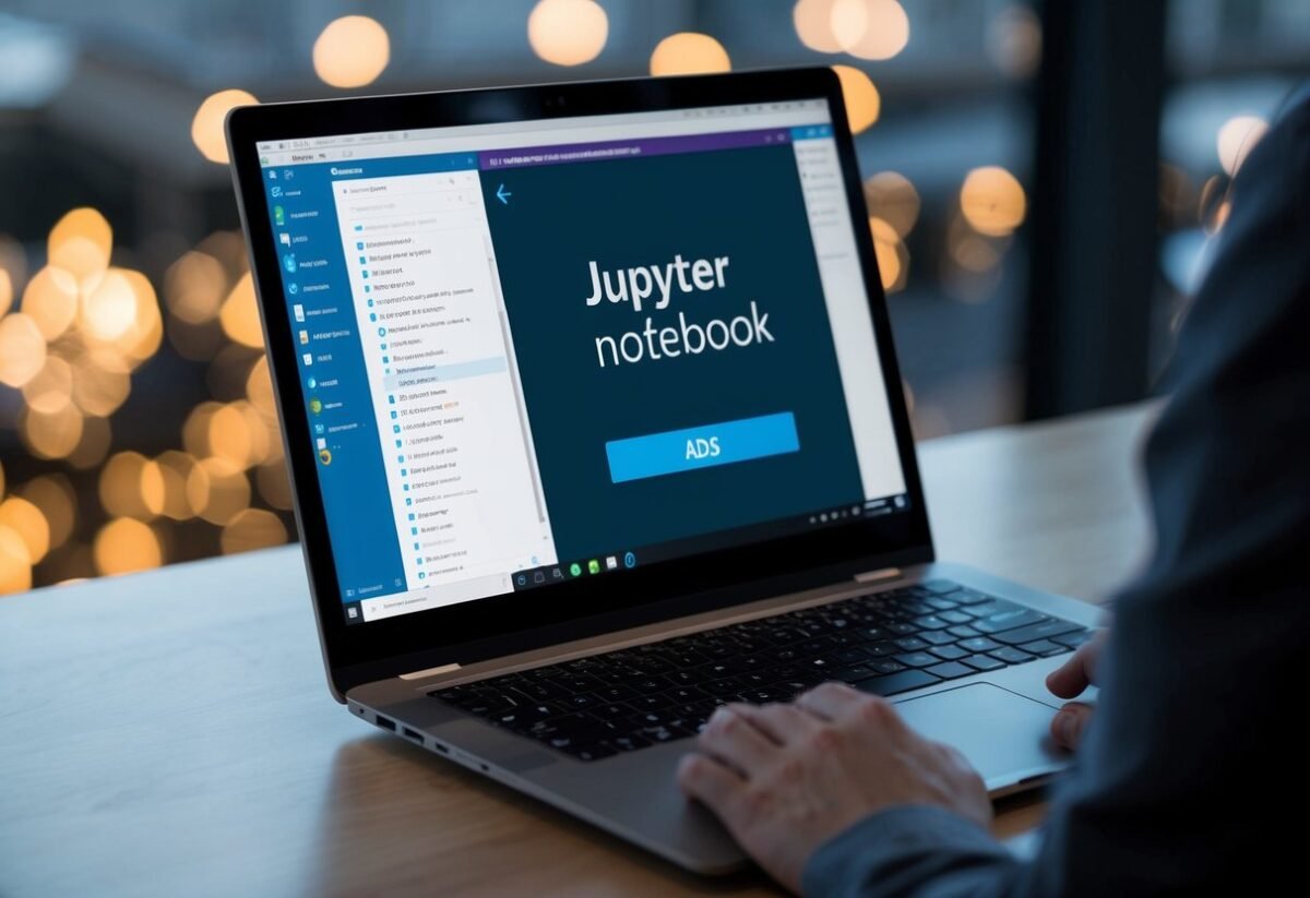
Creating Your First Jupyter Notebook in ADS
Creating a notebook in Azure Data Studio begins with opening the application and connecting to a SQL Server instance.
From there, navigate to the File Menu and select New Notebook to create an empty notebook. Users can also right-click a SQL Server connection or use the command palette by typing “new notebook.”
Once a notebook is open, users can write and execute SQL code or other supported languages using the available kernels.
Jupyter Notebooks allow the integration of live code, execution results, and rich text for documentation, facilitating advanced data analysis and real-time collaboration.
Working with Notebooks in ADS
Working with Jupyter Notebooks in Azure Data Studio (ADS) offers a comprehensive platform for combining code, text, and data visualization. Users can smoothly transition between coding and documentation, manage different programming languages, and keep their work organized.
Understanding Notebook Interface
The interface in ADS is user-friendly and designed to facilitate seamless interaction with your data.
Notebooks in ADS can integrate various elements like code cells and text cells in a single environment. This integration allows users to execute code and display the results immediately below.
Users can also make use of Markdown to add descriptive text, images, or links.
The toolbar in the interface offers options to save, run, and interrupt notebook execution. Overall, the interface helps in maximizing productivity by making several tools easily accessible.
Managing Kernels and Languages
Kernels play a significant role by enabling users to run code in different programming languages.
In ADS, users can select from various kernels like SQL, Python, or PowerShell, making it highly versatile. The choice of kernel determines which languages and libraries are available for use.
Switching kernels is straightforward, done by selecting the kernel drop-down menu at the top of the notebook. This feature is beneficial for projects requiring multiple languages, as it allows seamless transitions between them without switching platforms.
Writing and Running Code Cells
Code cells are the heart of any Jupyter Notebook in ADS.
Users can write code in these cells, which can then be executed to perform computations or manipulate data. Code cells support syntax highlighting, making it easier to read and write code.
Once written, users can run individual code cells or execute all cells at once. Results are displayed immediately below each cell, allowing for quick testing and iteration.
This functionality is key for data analysis, debugging, and exploratory programming, enabling live interaction with data.
Organizing with Text and Markdown Cells
Organization is crucial when working with extensive data and code.
In ADS, users can utilize text and Markdown cells to enhance readability and structure. Markdown allows formatting text with headlines, bullet points, and links, aiding in creating clear documentation alongside code.
Text cells often contain descriptions or notes, helping to explain the purpose of subsequent code blocks. This organization of content is instrumental for collaborative projects, as it provides context and explanations that are vital when sharing notebooks with others.
Data Operations in Jupyter Notebooks
Data operations in Jupyter Notebooks within Azure Data Studio enable users to perform critical tasks such as data cleaning, visualization, and statistical modeling. These activities are essential for refining and interpreting datasets effectively.
Performing Data Cleaning
Data cleaning in Jupyter Notebooks often involves using Python libraries such as Pandas to handle missing values, remove duplicates, and correct inaccuracies.
In Azure Data Studio, users can connect Jupyter Notebooks to a SQL Server, executing T-SQL commands directly within cells for seamless integration.
This integration allows for efficient data retrieval and preprocessing, ensuring datasets are ready for analysis. Simple-to-use functions in Python help clean data quickly, making large datasets more manageable. By leveraging these tools, users can streamline their data workflows.
Visualizing Data
Data visualization in Jupyter Notebooks is achieved using libraries such as Matplotlib and Seaborn. These libraries offer a range of plots and charts, making it easier to understand data patterns and trends.
Azure Data Studio supports these visualizations, enhancing its utility for analysts who need to interpret large datasets.
Creating plots involves writing concise Python scripts that transform data into graphical formats. This function is especially useful for identifying outliers and relationships in data. Visualizing data effectively aids in presenting clear insights, which is crucial for decision-making processes.
Statistical Modeling and Analysis
Statistical modeling in Jupyter Notebooks often employs Python libraries like SciPy and Statsmodels.
Users can build complex statistical models to analyze data relationships and predict future trends. This makes Jupyter Notebooks an ideal platform for performing comprehensive data analysis within Azure Data Studio.
Advanced models, including regression analyses, can be executed and tested efficiently. This functionality is crucial for researchers and analysts who need robust tools for exploring data hypotheses and deriving actionable insights. Using these models, users can confidently interpret and communicate their analytical outcomes.
Advanced Features in ADS

Azure Data Studio (ADS) provides robust tools for developers and data scientists. Users can harness the power of various programming languages and databases. This functionality enhances data processing and analysis capabilities.
Working with Python and PySpark Kernels
ADS supports both Python and PySpark kernels, making it a flexible environment for data scientists.
With the Python Kernel, users can easily create and run data scripts for data analysis and visualization. Python’s extensive library support allows for tasks ranging from simple data cleaning to advanced machine learning.
The PySpark Kernel provides a bridge to big data processing. It allows users to run distributed computing jobs, which is essential for handling vast datasets. This capability is crucial for industries working with large-scale data.
Integrating R Code and PowerShell Scripts
By integrating R Code, users can perform advanced statistical analysis within ADS. This allows for seamless deployment of R scripts, directly interacting with the data. R’s rich ecosystem supports intricate data visualization and statistical techniques.
ADS also accommodates PowerShell Scripts, enabling automated task management and system administration. PowerShell support is vital for connecting various software tools and managing data environments efficiently. This integration combines analytical and administrative tasks in one tool.
Connecting to PostgreSQL and Other Databases
ADS extends its functionality to connect with a range of databases, including PostgreSQL. This connectivity enables users to perform complex queries and visualize data effectively. Users can use built-in tools to manage and interact with database objects.
Connecting ADS with other databases expands its reach in multi-database environments. This compatibility is highly beneficial for projects requiring data integration across different platforms. It supports Machine Learning tasks by allowing easy access to training datasets stored in different databases.
Integration with Version Control and Workflow Automation

Integrating version control and workflow automation with Jupyter Notebooks in Azure Data Studio boosts collaboration and efficiency. By leveraging GitHub, users can manage projects and automate tasks effectively. They can create automated workflows with GitHub Actions, while custom YAML files detail specific processes.
Using GitHub Repositories and Actions
Jupyter Notebooks can be enhanced by using GitHub repositories. This allows for seamless version control. With Git, users can track changes and collaborate with others.
Saving changes to scripts and notebooks directly to a repository enhances team productivity.
GitHub Actions automate processes within these repositories, making it easier to handle repetitive tasks. Users can set up actions to automatically run tests or deploy notebooks upon changes. Actions are defined through straightforward configuration files, ensuring a streamlined experience.
Automating Workflows with GitHub Marketplace
GitHub Marketplace provides a vast selection of tools and applications to automate workflows efficiently.
Users can access pre-built workflows suitable for diverse needs, from data processing to deployment. Marketplace workflows simplify complex tasks by integrating powerful tools.
These workflows are easily accessible and compatible with Jupyter Notebooks, enhancing their functionality. Pre-defined actions reduce setup time. Users can kickstart automation without deep technical knowledge, accelerating their projects.
Creating Custom Workflows with YAML
Creating custom workflows using YAML file definitions allows users to tailor automation to specific requirements.
With YAML, they define actions that suit unique project needs. Each YAML file outlines specific steps, actions, and conditions, providing flexible control over processes.
For instance, a workflow can be triggered using workflow_dispatch, enabling manual starts. This flexibility aids in developing complex pipelines. By using YAML, teams can create tailored solutions that cater precisely to their operational goals. This adaptability ensures that workflows are both effective and reliable.
Best Practices and Tips for ADS Notebooks

Using Azure Data Studio (ADS) to manage Jupyter Notebooks can help improve workflow. Key practices include clearing outputs for privacy, using code snippets, and managing notebook performance efficiently.
Clearing Output for Security and Privacy
When working with Jupyter Notebooks, clearing outputs can enhance security and privacy. Before sharing or saving a notebook, users should remove any sensitive information.
In ADS, select “Clear All Outputs” under the “Cell” menu. This action ensures that no data is inadvertently shared.
Clearing output also reduces notebook size, making it quicker to load and share. It’s an essential step in maintaining privacy and optimizing performance, especially when collaborating with others.
Utilizing Code Snippets and Notebook Results
Code snippets in ADS can boost productivity. They allow users to insert commonly used code quickly without retyping.
Snippets can be accessed through the command palette, where users can save and organize them based on frequent tasks.
Incorporate notebook results effectively by creating detailed analyses that are easy to interpret. These results can be shared across different platforms, enhancing the way findings are communicated to broader audiences.
Running Cells and Managing Notebook Performance
Efficient cell management is crucial in a Jupyter Notebook. Running cells one at a time helps in troubleshooting and ensuring accuracy.
Use the “Run Cell” option or shortcut commands in Visual Studio Code to execute code efficiently.
Regularly saving work and using checkpoints can prevent data loss. Users should also monitor resource usage to avoid performance lags, ensuring the notebook runs smoothly and efficiently in ADS.
Frequently Asked Questions

Azure Data Studio provides a flexible environment for working with Jupyter Notebooks, allowing users to integrate their data workflows with SQL Server and other tools. The information below addresses common inquiries about getting started, utilizing languages like Python and R, and accessing free learning resources.
How can I get started with using Jupyter Notebooks in Azure Data Studio?
To begin, a new notebook can be created by navigating to the File Menu and selecting “New Notebook.” Right-clicking a SQL Server connection or using the command palette also offers options to create notebooks. This makes it easy for users to initiate their projects in Jupyter Notebooks.
What are some examples of using Jupyter Notebooks within Azure Data Studio?
Jupyter Notebooks are versatile within Azure Data Studio. Users can combine SQL query capabilities with data visualization and documentation features, enhancing both data analysis and presentation.
For example, they can perform SQL queries and instantly visualize the resulting data, making analysis more dynamic.
Can I use Azure Data Studio to connect a Python notebook to SQL Server?
Yes, Azure Data Studio supports running Python scripts alongside SQL queries. The integration with SQL Server enables seamless interaction between the two, allowing users to retrieve and process data efficiently.
Is there a way to use R language in Jupyter Notebooks through Azure Data Studio?
R can be utilized in Jupyter Notebooks by setting up an appropriate R language kernel within Azure Data Studio. Users can execute R scripts, perform statistical analysis, and visualize data alongside their SQL workflows.
This flexibility supports comprehensive data analysis projects.
How do I download and install Azure Data Studio for Jupyter Notebook integration?
Azure Data Studio can be downloaded from its official page. After installation, users can explore the built-in features for integrating Jupyter Notebooks, enabling quick setup for data projects.
Are there any free resources available for using Jupyter Notebooks in Azure Data Studio?
Yes, there are free tutorials and guides available online to help users explore Jupyter Notebooks within Azure Data Studio.
These resources provide guidance on creating and sharing notebooks, as well as utilizing advanced features.
The Microsoft Docs site is a helpful starting point for learning more.