Categories
Uncategorized

Learning MatPlotLib for Data Science – Bar Charts: A Comprehensive Guide

Getting Started with Matplotlib

Matplotlib is a powerful library in Python for creating a variety of charts and graphs, including bar charts. It is commonly used in data visualization.

Understanding the basics of installing and using Matplotlib will help in plotting intuitive and effective data charts.

Installing Matplotlib

To begin using Matplotlib, it must be installed in your Python environment. This can be done using pip, a package manager for Python.

Simply open your command line interface and type:

pip install matplotlib

This command downloads and installs the library.

Once installed, Matplotlib can be imported into your Python scripts with:

import matplotlib.pyplot as plt

This import gives access to various functions for creating plots. Ensuring that Matplotlib is correctly installed and imported is key. It allows users to start plotting data quickly and efficiently.

Basic Plotting with Pyplot

Once Matplotlib is installed, users can begin basic plotting using the pyplot module. This module is structured like MATLAB and provides functions to control the style and formatting of plots.

For creating a simple bar chart, users can utilize the bar() function:

plt.bar(['A', 'B', 'C'], [3, 8, 1])

This example plots a bar chart with categories ‘A’, ‘B’, and ‘C’, and respective values 3, 8, and 1.

After the data is plotted, the chart will not appear until the command plt.show() is executed. This displays the figure visually. Utilizing pyplot efficiently enables straightforward creation of a variety of plots.

Understanding the Bar Chart

Bar charts are essential tools in data representation, useful for comparing different categories or tracking changes over time. They visually display information through rectangular bars, making trends and patterns easy to see.

Components of a Bar Chart

A bar chart consists of several key components. Rectangular bars are the most noticeable, with their lengths representing values. These bars can be displayed horizontally or vertically, depending on preference or data orientation.

Labels play a crucial role in bar charts. Each bar is usually accompanied by a label that identifies the category or group it represents.

Axis labels on the x-axis and y-axis help indicate what the bars are measuring. A proper title clarifies what the chart is about. Adding color variations to bars can enhance readability and highlight differences between data points.

Bar Chart vs Histogram

While bar charts and histograms look similar, they serve different purposes. A bar chart is ideal for comparing categories based on discrete data. The bars can be arranged in any order, and gaps between them are typical. It showcases distinct groups, such as sales figures for different products.

A histogram represents continuous data, such as frequency distribution. Its bars are adjacent, showing data intervals that demonstrate data distribution over a range. Histograms are used in statistical analysis to illustrate underlying frequency distributions. Understanding these differences helps in selecting the appropriate chart type for the data at hand.

Working with Data in Matplotlib

When using Matplotlib for data visualization, it’s important to learn how to load datasets correctly and prepare them for plotting. This involves reading data from sources like CSV files and manipulating it into a usable format with tools like Pandas and NumPy.

Loading Data from CSV Files

CSV files are a common way to store data. They store data in a tabular format, making them easy to read into a program.

To load a CSV file in Python, one typically uses the Pandas library. Pandas provides the read_csv function, which converts a CSV file into a DataFrame. A DataFrame is a two-dimensional, size-mutable, and potentially heterogeneous tabular data structure like a spreadsheet. It includes labeled axes (rows and columns).

import pandas as pd

# Load CSV data into a DataFrame
df = pd.read_csv('data.csv')

Using Pandas, data is easily accessed and manipulated. Users can filter rows, select columns, and perform aggregates. This makes it efficient to prepare data for visualization in Matplotlib. Plots can be created using the structured data in the DataFrame.

Data Wrangling with Pandas and NumPy

Data wrangling is crucial for preparing data. Using Pandas, one can clean, transform, and organize datasets.

Numerical data might need adjustments, such as filling missing values or normalizing data. NumPy complements Pandas by providing mathematical functions needed for complex operations.

import numpy as np

# Fill missing values
df.fillna(df.mean(), inplace=True)

# Normalize data
df['column_name'] = (df['column_name'] - df['column_name'].mean()) / df['column_name'].std()

Creating a DataFrame and performing data wrangling with Pandas and NumPy ensures data is ready for visualization. These tools help transform raw data into forms that highlight key insights when plotted using Matplotlib.

Designing and Customizing Bar Charts

Designing bar charts involves several elements. Customizing colors and styles enhances readability, while adjusting width and layout ensures clarity and precision.

Choosing Colors and Styles

Selecting the right colors and styles is crucial for an effective bar chart. Using contrasting colors can make data stand out and improve understanding.

Matplotlib allows for a wide range of customization options including color palettes and gradient fills. It’s important to choose colors that are both vibrant and clear to ensure the chart is easy to interpret.

Styles can be adjusted for bars, including patterns like stripes or dots, which help differentiate between data sets. Consistency in colors and styles across charts aids in creating a cohesive look.

Adjusting Width and Layout

Bar chart width and layout play a significant role in how data is perceived. The width parameter in Matplotlib controls the thickness of bars.

A default width may not always suit the dataset, so it’s beneficial to experiment with different values for clarity.

Layout involves arranging the bars within the axes effectively. Options such as stacked bars or grouped layouts can be used to present comparative data clearly. Organizing the chart so that axes labels are easily readable ensures that the data conveys its intended message effortlessly.

Labeling and Annotating

Clear labels and annotations improve the understanding of bar charts by making data more accessible. Effective use of axis labels, titles, and annotations is essential to convey the information accurately and professionally.

Adding Axis Labels and Titles

Axis labels provide descriptive names for the data presented on the chart’s axes, making the information clear. The x-axis usually represents categories, while the y-axis indicates values.

To add labels, use the xlabel() and ylabel() functions in Matplotlib. For example:

plt.xlabel("Categories")
plt.ylabel("Values")

The chart title offers a brief overview of the data being presented, set using the title() function:

plt.title("Sales by Category")

This context helps the viewer quickly understand the chart’s purpose. Thoughtful labeling ensures that anyone can interpret the chart without prior knowledge of the dataset.

Utilizing Legends and Annotations

Legends identify different data series within a chart, especially useful when comparing multiple groups. In Matplotlib, the legend() function automatically generates a legend based on the labels assigned to data series:

plt.legend(["Series A", "Series B"])

Annotations are used to highlight specific data points or trends, adding context. The annotate() function allows you to place text at particular coordinates on the chart:

plt.annotate("Peak Month", xy=(2, 40), xytext=(3, 45),
             arrowprops=dict(facecolor='black', shrink=0.05))

These tools make the chart more informative, allowing viewers to grasp key insights and details efficiently. Utilizing these effectively can transform a basic chart into a powerful communication tool.

Analyzing Patterns and Trends

Understanding patterns and trends in data is essential for data-driven decision-making. Visualization tools like Matplotlib help highlight shifts over time and differences among data groups.

Visualizing Trends over Time

Visualizing trends over time is crucial for data analysis. Line plots and time series charts are useful for spotting changes in data.

Matplotlib provides flexible options for these types of visualizations. Users can customize axes, colors, and labels to highlight trends effectively.

For instance, a line plot of sales data can reveal seasonal patterns. Adding error bars can show the range of variability. This helps in understanding trends more accurately.

Using a consistent time interval, such as monthly or quarterly, ensures clarity in depicting trends. Matplotlib’s date handling functionality simplifies the plotting of these intervals.

Comparing Data Points and Groups

Comparing data points using bar charts is key in uncovering differences and patterns in data groups. Bar charts easily show totals across different categories.

In Matplotlib, they can be customized with different colors and styles to enhance clarity.

Stacked bar charts and grouped bar charts are often used for this purpose. They allow comparisons between different groups or data points.

For example, comparing sales figures across different regions can highlight strengths and weaknesses in different markets. By distinguishing groups using color coding, Matplotlib helps in making these comparisons visual and straightforward, aiding in better analysis.

Advanced Bar Chart Techniques

Advanced techniques in bar chart visualization allow data scientists to present complex data clearly. This section explores two key methods valuable for creating detailed and informative bar charts: stacked and grouped bar charts, and creating horizontal bar plots.

Stacked and Grouped Bar Charts

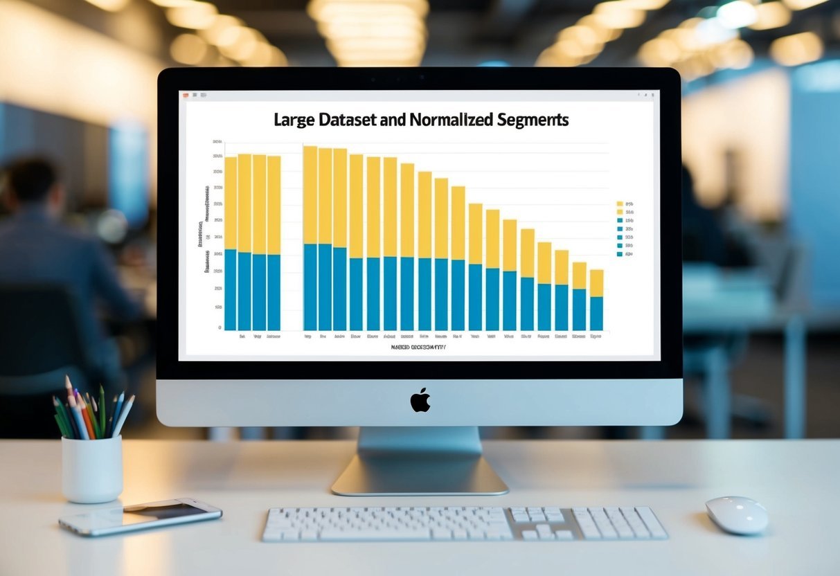
Stacked and grouped bar charts are useful when comparing multiple categories or data sets within a single visualization.

Stacked bar charts work by placing bars on top of each other, representing the total value as a whole, while also displaying the contribution of each category.

This makes it easier to see both individual data points and overall trends. The use of the groupby function in Python can enable efficient data organization before plotting.

Grouped bar charts, on the other hand, place bars side by side, which is ideal for comparing the same categories across different groups. This separation between bars enhances readability, especially when differences between categories are slight.

To implement these in Matplotlib, one might use plt.bar() with parameters such as bottom for stacking, and adjust the position using offsets for grouping.

Creating Horizontal Bar Plots

Horizontal bar plots are a powerful way to display categorical data, especially when category names are long or numerous. By flipping the axes, horizontal bars can improve readability and provide a fresh perspective on the data.

This can be achieved using Matplotlib’s plt.barh() function.

These plots are particularly beneficial when visualizing ranking data or distributions with wide ranges. Horizontal orientation ensures labels remain readable without cluttering the visualization.

Additionally, this approach can be helpful when comparing data across categories, as it provides a different layout which can highlight different aspects of the data. The flexibility of formatting options in Matplotlib, such as bar color and width, enhances visual appeal and clarity.

Incorporating Other Chart Types

Matplotlib offers various charts that enhance data visualization. By integrating different chart types, such as scatter and line plots with bar charts, users can present data from multiple perspectives and gain deeper insights. This flexibility is key in data analysis and storytelling.

Integrating Scatter and Line Plots

Scatter plots are effective for showing the relationship between two variables. They use dots to represent data points, emphasizing patterns or trends. Line plots, on the other hand, connect data points using lines, which helps in visualizing data progression over time.

Mixing scatter and line plots in a single visualization allows for a comprehensive view. Users can identify both individual data point distribution and overall trends.

For instance, visualize sales data where scatter plots show individual sales events, while a line chart illustrates monthly trends. This combination enables a deeper understanding of data behaviors. Adjusting color and style in Matplotlib enhances clarity, making the chart more readable and informative.

Combining Bar Charts with Pie Charts

Bar charts are essential for comparing quantities across categories. When combined with pie charts, which display data as parts of a whole, the comparison can highlight individual contributions as well as overall proportions. This duo is particularly effective in financial or demographic reports.

For example, one might use a bar chart to compare revenue across different products. A pie chart could then show the percentage contribution of each product to total revenue. This mixture provides a clear picture of performance and share.

Matplotlib supports this approach by allowing seamless integration of both chart types. Users can customize colors and labels to enhance understanding and ensure that the visualization effectively communicates the desired message.

Utilizing Subplots and Figures

Creating advanced visualizations often requires multiple plots within a single space. Using subplots and figures is essential for organizing these visualizations effectively and maintaining clarity. They allow data scientists to present complex data insights succinctly and clearly.

Organizing Multiple Charts

Subplots are a powerful feature in Matplotlib. They allow the arrangement of multiple graphs within the same figure, making it easier to compare data.

By using the subplot() function, users can specify the number of rows and columns for their plots. This aids in setting up a grid layout, where each chart occupies a specific grid position.

In Python, creating subplots can look like this:

import matplotlib.pyplot as plt

fig, axs = plt.subplots(2, 2)
axs[0, 0].plot(x1, y1)
axs[0, 1].plot(x2, y2)
axs[1, 0].plot(x3, y3)
axs[1, 1].plot(x4, y4)

This code sets up a 2×2 grid with four plots. Adjusting the sharex and sharey parameters helps synchronize axes for comparative analysis. Subplots streamline the process of displaying related visualizations together.

Working with Figures and Axes

Figures and axes are foundational elements in Matplotlib. A figure acts as a container for plots and is initialized using pyplot.figure(). This container helps maintain visual consistency across different datasets and configurations.

Within each figure, users can create axes to hold individual plots, customizing them with titles, labels, and limits.

Aligning the figure size and using the add_axes() method enables flexible positioning of these axes. For instance:

fig = plt.figure(figsize=(8, 6))
ax1 = fig.add_axes([0.1, 0.1, 0.8, 0.8])
ax1.plot(x, y)

This creates one plot with specific dimensions in the figure. Meanwhile, adjusting ticks and labels further enhances clarity. Efficient management of figures and axes leads to precise and informative data visualizations.

Exploring Data Distribution

A bar chart displaying data distribution with labeled axes and distinct bars of varying heights

Data distribution is crucial in understanding the spread and shape of data. It helps identify patterns and anomalies. Analyzing distributions is especially useful when using plots like histograms and box plots, which provide clear visual insights, and allow for distinguishing between categorical data and detecting outliers.

Creating Histograms and Box Plots

Histograms are useful for illustrating data distribution by displaying frequency. They divide data into bins, showing how often each range of values occurs. This makes it easy to see if data follows a normal distribution, skewed distribution, or is bimodal.

Box plots, on the other hand, summarize data using minimum, first quartile, median, third quartile, and maximum values. Box plots offer insights into data symmetry and highlight potential outliers. They are particularly good at showing the spread and identifying medians across different groups. Their comparison between different datasets aids in identifying similarities and differences in distributions.

Identifying Outliers and Categorical Data

Outliers can skew results and affect analysis. Identifying them is essential in gaining accurate insights.

In box plots, outliers appear as individual points outside the whiskers. Detecting these can prevent misleading conclusions.

Categorical data represents distinct groups or categories. Using histograms might not always be appropriate for categorical data since it deals with numerical groups. Instead, bar charts effectively display categorical data by representing the count or frequency of each category. These charts help distinguish between different levels of categorical variables, providing a visual means to compare segments within data.

Interactive and Animated Visualizations

Creating engaging and dynamic visualizations can make data exploration more effective. Interactive plots and animations, especially with tools like Matplotlib, enhance user experience by enabling easy comprehension of data patterns and trends.

Animating Bar Charts

Animating bar charts can bring data to life. By using libraries like Matplotlib, one can animate the transition of bar heights to show changes over time. Adding animation can help in showcasing trends more clearly.

For example, Matplotlib’s FuncAnimation module is commonly used for creating these effects. This technique is especially useful when highlighting the evolution of data metrics across different time periods.

Animation within Python is facilitated when working in environments like Jupyter Notebook or Google Colab. These platforms support visualization libraries and provide the computational power needed to render animations smoothly.

Developing Interactive Plots

Interactive plots allow users to explore data visually and obtain deeper insights by interacting with visuals. Tools such as Matplotlib enable developers to create plots that respond to user input.

By incorporating elements like sliders and buttons, users can manipulate visual data presentations to focus on specific parts of a dataset.

Interactive plots can be developed in Jupyter Notebook and Google Colab, utilizing libraries like Plotly, which are excellent for creating web-based data visualizations. These interactive features make it easier for non-technical audiences to understand complex datasets. Providing such interactivity can significantly enhance the decision-making process by summarizing large volumes of data in a concise format.

Applying Best Practices for Data Visualization

A computer screen displaying a bar chart with labeled axes and colorful bars representing data points

Applying effective strategies is key in enhancing the quality and impact of data visualization. Focusing on accessibility and readability ensures that visualizations are understandable by all, while adopting industry best practices optimizes clarity and usefulness of the data presented.

Ensuring Accessibility and Readability

Accessibility in data visualization means that everyone, including those with disabilities, can understand the data. Using clear labels and sufficient color contrast helps improve readability. Color-blind friendly palettes are essential, as they ensure graphs are clear to all viewers.

Data analysts should prioritize simplicity. Avoid cluttered designs by limiting unnecessary elements, like excessive gridlines or busy backgrounds. This enhances focus on the key data points.

Including alternative text and descriptive captions also facilitates comprehension, aiding those using screen readers. Accessibility isn’t just about compliance but empowers diverse audiences to engage with visual data effectively.

Adopting Visualization Best Practices

Efficient data visualizations are built on well-established principles. Using consistent scales and intervals for axes ensures accurate comparison and interpretation.

Implementing clear and descriptive titles, as well as legends, guides the viewer’s understanding of the chart’s message.

Data scientists often choose appropriate chart types based on data characteristics. For example, bar charts are ideal for comparing discrete categories, as noted in resources on Data Visualization with Python, making distinctions clearer and more intuitive.

Incorporating annotations is also priceless. Highlighting specific trends or anomalies helps direct attention to critical insights. By adopting these practices, data scientists create visualizations that not only convey complex information but do so in a digestible and compelling manner.

Frequently Asked Questions

This section provides answers to common questions about creating various types of bar charts using Matplotlib, including basic, grouped, horizontal, and stacked formats. It also explains how to plot bar charts using data from CSV files and how to integrate Pandas with Matplotlib.

How do you create a basic bar chart in Matplotlib?

To create a basic bar chart, use the bar() function from Matplotlib. First, import Matplotlib’s pyplot module. Then, define the data for the x-axis and the corresponding heights for the bars. Finally, call plt.bar(x, height) and use plt.show() to display the chart.

What is the process for making a grouped bar chart using Matplotlib in Python?

A grouped bar chart displays multiple datasets side by side. To create it, use the bar() function with different x-coordinates for each dataset. Offset each group’s x-values to display side by side. Adjust the bar width to prevent overlap. Use plt.show() to visualize the grouped chart.

Can you explain how to generate a horizontal bar chart with Matplotlib?

To generate a horizontal bar chart, use the barh() function instead of bar(). This function accepts x-coordinates as input for bar heights and y-coordinates for bar positions. Similar to a vertical bar chart, call plt.barh(y, x) and display it with plt.show().

What are the steps to create a stacked bar chart in Matplotlib?

In a stacked bar chart, data values stack on top of each other. Start by defining the x-coordinates and multiple datasets. Use the bottom parameter in the bar() function to stack datasets on top of each other. The bottom dataset should be specified for each subsequent bar layer.

How can you plot a bar graph using a CSV file in Python with Matplotlib?

To plot from a CSV file, first, read the data using Pandas’ read_csv() function. Extract the relevant columns for the x-axis and bar heights. Then, use plt.bar() to create the chart with these values. Display the result with plt.show().

What is the method for creating a bar plot with Pandas integration in Matplotlib?

Pandas DataFrames can simplify bar plot creation with Matplotlib. Use the plot.bar() method on the DataFrame. This function directly generates a bar chart from the DataFrame’s columns.

To tweak design and style, adjust arguments within plot.bar().

Use plt.show() to view the final plot.

Categories
Uncategorized

Learning About Recursion in Python: A Guide for Beginners

Understanding Recursion in Python

Recursion in Python involves a function calling itself directly or indirectly to solve problems, breaking them into smaller instances.

This technique contrasts with iteration, where loops solve problems by repeating a set of instructions.

Defining Recursion

Recursion is a method in programming where a function makes one or multiple calls to itself. This self-reference helps solve complex problems by dividing them into simpler parts.

A recursive function includes a base case, which stops further recursive calls, and a recursive call, which reduces the problem size. For instance, calculating the factorial of a number uses recursion by multiplying the number by the factorial of the number minus one, eventually reaching a base case of one.

Recursive definitions are often more intuitive and easier to read, though they require careful handling to avoid endless loops.

Recursion Vs. Iteration

Recursion and iteration are fundamental techniques for solving problems in programming.

Recursion uses function calls, where each recursive call reduces the problem size, and requires base cases to prevent infinite loops. In contrast, iteration employs loops to repeat actions until a condition is met.

Often, recursive solutions may be simpler and more elegant for problems like tree traversals, whereas iteration might be preferred for straightforward, small tasks due to lower memory consumption.

Notably, recursion can be less efficient as each recursive call consumes stack space, potentially leading to stack overflow if the call depth is too high. Understanding the trade-offs between these methods is key to choosing the appropriate solution for a given problem.

The Anatomy of a Recursive Function

A recursive function in Python can solve complex problems by calling itself with modified arguments. It consists of two key parts: the base case, which ends the recursion, and the recursive case, which continues the process.

The Base Case

The base case is the condition that stops the recursion. Without it, the function would keep calling itself indefinitely, leading to a stack overflow.

This part of the function typically contains a simple return statement that provides a result without further recursion.

Imagine a function designed to calculate the factorial of a number. The base case would occur when the function is given the number 1. At this point, the function simply returns 1, as 1 factorial is 1.

Ensuring the base case is clear and correctly designed is vital, as it directly influences whether the function will terminate properly.

The Recursive Case

The recursive case defines how the function calls itself with new arguments. It is crucial for breaking down the problem into smaller subproblems.

This part of the function usually involves calling the function itself, but with a simpler or smaller input.

For example, in the factorial function, the recursive case would multiply the current number by the factorial of the next smaller number. So, for a number n, it would call itself as n * factorial(n-1). This pattern continues until it reaches the base case.

Properly constructing the recursive case ensures the function can eventually reach a solution by systematically reducing the problem size.

Writing Recursive Functions in Python

To write effective recursive functions in Python, understanding the basic structure and importance of designing a clear base condition is crucial. These factors ensure that the function behaves as intended and avoids potential pitfalls like infinite loops.

Structure and Syntax

Recursive functions in Python are designed to call themselves within their definition. This requires organizing the function to handle specific tasks until a base condition is met.

Essential components include the function definition and the recursive call inside it. The function works on smaller inputs at each step, gradually approaching the base case.

Python’s flexibility allows functions to be defined with minimal syntax. For recursion, a function might include a regular condition to check for the base case and another to proceed with recursion. This ensures the function knows when to stop calling itself.

Proper indentation and clear code structure help maintain readability and prevent mistakes.

Designing the Base Condition

The base condition is critical to prevent a recursive function from calling itself indefinitely. It’s the condition under which the recursion ends, allowing the function to complete its process.

Without a proper base condition, a recursive function risks running endlessly, causing a stack overflow.

Designing a base condition involves recognizing the simplest form of the problem. For example, when calculating a factorial, the base condition might be when the input number is zero.

In this scenario, the function returns a value directly instead of continuing the recursive process.

Ensuring this base condition is clearly defined and correctly implemented is key to the function’s success.

Common Examples of Recursion

Recursion in Python is a powerful tool used to solve problems by breaking them into smaller subproblems. Two classic examples are calculating factorials and generating the Fibonacci sequence, both of which use recursive functions to achieve results.

Calculating Factorials

The factorial of a number is calculated by multiplying all integers from 1 up to that number. The factorial of zero is defined as one.

Recursion provides an elegant way to compute factorials using a function that repeatedly calls itself, each time reducing the problem size by one.

In a Python program, a recursive function checks if the input is zero or one. If true, it returns one. Otherwise, it returns the number multiplied by the factorial of that number minus one. This process continues until the base condition is met.

This approach is simple and efficient for small numbers but can be outperformed by Python’s built-in function math.factorial() for larger numbers.

Generating Fibonacci Sequence

The Fibonacci sequence is a series of numbers where each number is the sum of the two preceding ones, starting from 0 and 1.

The recursive approach calculates Fibonacci numbers by defining a function that calls itself with two arguments: the position of the number in the sequence minus one and minus two.

The base case checks if the position is zero or one and returns it if true. Otherwise, the function adds the results of the two recursive calls.

This technique is simple to implement but can be inefficient for large sequences due to repeated calculations. Optimizing this using memoization or iterative methods can greatly enhance performance.

Recursive Algorithms in Data Structures

Recursive algorithms play a vital role in handling complex data structures. They efficiently break down large problems into smaller, manageable ones using recursive functions. This approach is particularly advantageous in structures like trees and graphs, where data is often made up of interconnected components.

Exploring Trees

In computer science, trees are a common recursive data structure. They consist of nodes, each having zero or more child nodes.

The use of recursive functions in trees simplifies complex tasks like traversing or searching. For instance, a recursive approach can be used to perform operations such as in-order, pre-order, and post-order traversals, effortlessly navigating through each node.

A recursive method begins at the root, checks if child nodes exist, then calls itself for each child.

For example, a binary search tree (BST) makes sorted lists easier to search due to its structure, where each node references at most two children.

Recursion allows algorithms to elegantly explore these hierarchical structures, ensuring each node is processed efficiently.

Navigating Graphs

Graphs, like trees, can also benefit greatly from recursive strategies. They consist of vertices, which are nodes, and edges, which connect these nodes.

Recursive algorithms help in traversing graphs using techniques such as depth-first search (DFS) and breadth-first search (BFS). DFS, for instance, dives deep into one path before backtracking, employing recursion to manage its traversal through vertices.

By calling a function recursively for each vertex, graphs can be explored systematically.

This method is especially useful when detecting cycles or finding connectivity between different vertices.

Using recursive functions to navigate graphs not only simplifies the coding process but also helps manage the exploration of potentially vast networks in a more structured manner.

Identifying Recursion in Problem Solving

Recursion can help tackle complex problems in programming by breaking them into simpler parts. It involves repeated function calls, allowing for a solution that builds upon previous results.

Approaching Complex Problems

When faced with complicated tasks, recursion allows a programmer to break down problems into smaller, more manageable pieces.

For example, when dealing with a data structure like a tree or graph, recursion can navigate each node or vertex efficiently.

Each recursive call simplifies the problem until reaching a base case, where no further recursion is needed.

This structured approach is vital for programming challenges, ensuring that even the most complicated problem can be tackled with clarity and precision.

Recognizing such opportunities for recursion requires understanding the task’s inherent repetitive patterns and potential for division into subproblems.

Recursive Problem-Solving Strategies

Effective problem solving with recursion involves identifying the base and recursive cases clearly. The base case provides the stopping point to avoid infinite loops, while the recursive case reduces the problem continuously.

For instance, calculating factorials or executing specific sorting algorithms like quicksort utilizes these strategies.

Consider the factorial function, where n! is computed by multiplying n by (n-1)!. Each step reduces the problem size until reaching the base case of 0!, which equals 1.

Utilizing recursion in this manner improves code readability and structure, addressing complex problems methodically. This demonstrates recursion’s utility in solving problems that can be broken down into repeated patterns through recursive calls.

Debugging Recursive Functions

Debugging recursive functions can be challenging due to the complexity of call stacks and potential for infinite recursion. Recognizing common errors and preventing stack overflow are essential for troubleshooting effectively.

Common Errors

Recursive functions often encounter issues like infinite recursion, where the function continuously calls itself without a base case to stop. This can lead to a RecursionError in Python, indicating that the maximum recursion depth has been exceeded.

Logic errors might occur if the base case or recursive step is incorrect, causing unexpected results.

Debugging tools or recursion tracing libraries can be helpful to visualize the function’s call stack.

Tracking variable values with print statements or using a debugger can also aid in pinpointing logical errors.

Ensuring that each recursive call moves toward the base case is crucial for preventing infinite loops.

Preventing Stack Overflow

Stack overflow occurs when memory allocated for the stack is exhausted. This often happens when recursive calls are too deep, and there isn’t enough memory to handle them.

Implementing a proper base case is key to preventing this.

Limiting the recursion depth with functions like sys.setrecursionlimit() can provide temporary relief but should be done cautiously. Over-reliance on increasing the limit could lead to more severe issues.

Tail recursion is another technique used in some languages to optimize memory usage. Although Python does not support tail call optimization, structuring code logically and checking recursive depth can minimize stack overflow risks.

Reviewing the algorithm’s complexity and finding iterative alternatives can also be helpful.

Optimizing Recursive Functions

Optimizing recursive functions in Python involves managing recursion depth and using memoization to enhance performance. This helps in solving problems like the Fibonacci series more efficiently while mitigating disadvantages like excessive memory usage.

Understanding Recursion Depth

Recursion depth refers to how many times a function calls itself before reaching a base condition. Each call adds a new entry to the call stack, which can lead to a stack overflow if not managed properly.

One way to optimize is to use tail recursion, where the recursive call is the last statement executed by the function.

Python does not optimize tail calls, so deep recursion can still be problematic. Developers might switch to iterative solutions when faced with potential recursion depth issues.

It’s important to be aware of Python’s default recursion limit and use the sys.setrecursionlimit() function with caution to avoid crashes.

Memoization Techniques

Memoization is a technique that saves the results of expensive function calls to avoid repeated calculations. When implementing memoization, a data structure like a dictionary is often used to store previous results.

This is particularly useful in recursive functions like the Fibonacci series, where the same calculations are performed multiple times.

By caching results, recursive functions become more efficient. Python’s functools.lru_cache provides built-in support for memoization by automatically caching function outputs.

This reduces computation time and minimizes the disadvantages of recursion, making it a favorable choice for problems that involve repeated subproblem calculations.

Memoization effectively balances the advantages of recursion like clarity and simplicity with the need for efficiency.

Comparing Recursion in Different Programming Languages

A group of programmers studying code in Python, Java, and C++ to understand recursion in different programming languages

Recursion is a common concept in programming where a function calls itself. This section explores how different languages handle recursion, focusing on syntax variations and performance considerations.

Syntax Variations

The syntax of recursive functions can vary significantly between programming languages.

In Python, defining a recursive function is straightforward. For example, a recursive function to calculate factorial in Python looks like this:

def factorial(n):
    if n == 0:
        return 1
    else:
        return n * factorial(n-1)

In contrast, Lisp, a language known for its strong support for recursion, emphasizes simplicity. Here’s how a factorial function appears in Lisp:

(defun factorial (n)
  (if (= n 0)
      1
      (* n (factorial (- n 1)))))

Languages like C have recursion but require explicit stack management, which can be more error-prone. Here’s a factorial function in C:

int factorial(int n) {
    if (n == 0)
        return 1;
    else
        return n * factorial(n - 1);
}

Performance Considerations

Performance behavior also differs across programming languages.

In Python, recursion can be limited by a maximum call stack depth, typically set at 1000 calls. This can cause a stack overflow for deeply nested recursive calls explained in MIT’s review of recursion.

Languages like Haskell optimize recursive functions with tail recursion, allowing more recursive calls without increasing the call stack size. In C, compilers often optimize tail-recursive functions, reducing the overhead.

Using recursion efficiently depends on how well the language supports stack optimization. This is crucial for problems involving large data sets or when optimal performance is necessary. Different languages offer various ways to handle recursion, impacting how developers choose their tools for specific tasks.

Advanced Recursion Concepts

Advanced recursion involves techniques like tail recursion and recursive lambdas, both significant in optimizing programs and improving code efficiency. Tail recursion focuses on optimizing recursive calls to prevent stack overflow, while recursive lambdas offer flexibility in code structure.

Tail Recursion

Tail recursion is a specific form of recursion where the recursive call is the last operation in the function. This allows some compilers or interpreters to optimize the recursion, effectively transforming it into an iterative process.

This optimization, known as tail call optimization (TCO), reduces the chance of a stack overflow because it doesn’t need to hold onto the current function’s state once the recursive call is made.

Tail recursion is especially useful in programming languages that support TCO natively, like Scheme or JavaScript. Despite Python not inherently supporting TCO, understanding its mechanics can help in writing more efficient Python programs by simulating tail recursion through loop-based solutions.

Recursive Lambdas

Recursive lambdas introduce a unique way to utilize recursion within anonymous functions. In Python, lambdas are limited as they cannot call themselves directly. However, recursion can be achieved through clever techniques, such as using helper functions or fixed-point combinators like the Y-combinator.

This enables recursive call capabilities in a lambda-based environment.

Recursive lambdas can be useful for short, self-contained tasks that require recursion without the formality of defining a full function. They provide a concise way to incorporate recursion into functional programming paradigms, offering a flexible approach to solving problems that benefit from recursive methods while making the code succinct and readable.

Real-world Applications of Recursion

Recursion is a powerful tool used in various fields for solving complex problems by breaking them into simpler ones. In software development, recursion helps navigate data structures like trees and directories. It also plays a crucial role in scientific computing, enabling efficient solutions to mathematical computations and model simulations.

Recursion in Software Development

In software development, recursion is essential for managing data structures such as trees and graphs. A common example is the use of a recursive function to traverse a directory or file system, checking each node and its children. This approach simplifies coding when dealing with nested or linked data.

Recursion is also prevalent in algorithms for operations like sorting and searching. For instance, quicksort and mergesort use recursive techniques to divide and conquer data sets. Developers often prefer recursion over iteration for tasks involving hierarchical data due to its natural fit with these structures.

While recursion can be resource-intensive, it often leads to clearer and more concise code. This is particularly true in scenarios where the depth of recursion is limited.

Implementing recursion carefully is key to ensuring efficiency and avoiding issues like stack overflow.

Recursion in Scientific Computing

Scientific computing frequently uses recursion to address complex mathematical problems. Recursive methods are found in tasks such as calculating factorials, solving differential equations, and performing fractal image generation. Such methods enable scientists to break down intricate computations into manageable steps.

In modeling and simulations, recursion can efficiently handle repeated calculations. For example, the Fibonacci sequence is a classic problem that benefits from a recursive approach.

Despite its advantages, recursion must be applied judiciously in scientific computing. Deep recursion or large data sets can lead to performance issues or consume excessive memory.

Properly optimizing and recognizing recursion’s limitations helps leverage its benefits effectively.

Alternatives to Recursion

When working with recursion in programming, it may sometimes be necessary to consider other methods. Iterative solutions provide an efficient way to solve problems using loops, while hybrid approaches combine recursion with iteration, offering a balanced strategy.

Iterative Solutions

Iterative solutions make use of loops like for and while to repeat actions without the need for a function to call itself. This method of replacing recursion with iteration is often more memory-efficient, as it avoids the overhead associated with recursive function calls.

Iteration also allows programmers to easily manage and predict the memory usage because it typically maintains a single state rather than multiple recursive states.

Programs needing deep recursion may benefit from switching to iteration to avoid issues like stack overflow. By using a loop structure, programmers can solve repetitive tasks without increasing the call stack size. This approach is simple and effective for tasks that don’t rely on a naturally recursive structure.

Hybrid Approaches

Hybrid approaches combine the benefits of recursion and iteration. This technique can be suitable when parts of a problem fit well with recursion, but others need the efficiency of iteration.

By integrating both strategies, programmers can tackle complex problems that may require maintaining recursive elegance and iterative efficiency.

For example, in certain search algorithms, recursion might be used to break a problem into smaller parts, while iteration can handle repetitive elements within each part. This mix can optimize performance, memory use, and readability.

Frequently Asked Questions

This section explores important concepts related to recursion in Python, including how recursion works, examples for beginners, and common challenges. It also covers different types of recursion and methods to prevent issues like stack overflow.

What are the fundamental principles of recursion in Python?

Recursion in Python involves functions calling themselves to solve problems. Each call reduces the problem’s size, converging on a base case that ends recursion. This method efficiently handles tasks like searching and sorting with the repeated use of simpler sub-problems.

How do recursion calls work internally in Python?

Internally, each recursive call in Python adds a new layer to the call stack, storing local variables and return addresses. When a base case is reached, the stack unwinds, and results propagate back through the nested calls.

Python’s recursion depth is limited, impacting how deep these calls can go.

Can you provide simple recursion examples for a beginner in Python?

Simple recursive functions include calculating the factorial of a number or generating Fibonacci series. These examples help beginners understand recursion by showing how functions call themselves to achieve repeated operations. Here is a rudimentary example of calculating factorials:

def factorial(n):
    if n == 0:
        return 1
    else:
        return n * factorial(n - 1)

What is the difference between direct and indirect recursion in Python?

Direct recursion occurs when a function calls itself directly. Indirect recursion happens when a function calls another function, which then calls the first function back. Both types are used to tackle various computational problems, but direct recursion is more straightforward to implement and understand.

How does Python handle recursion limitations and what are best practices to avoid stack overflows?

Python has a default recursion depth limit to prevent stack overflow, often set at 1000 recursive calls. To manage this, developers can optimize the recursion by using tail recursion or converting recursive functions to iterative ones.

Understanding the task’s recursion demands will also help prevent issues.

Could you list some exercises to practice recursion in Python?

Recursion exercises to consider include solving the Towers of Hanoi, reversing a string, or creating a recursive binary search algorithm.

These challenges reinforce understanding by tackling diverse problems with recursive techniques, enhancing a programmer’s skill set in practical applications.

Categories
Uncategorized

Learning Advanced SQL Skills for Data Engineering: Elevate Your Data Handling Expertise

Understanding Advanced SQL Concepts

In advanced SQL, mastering complex queries and using sophisticated functions play a critical role.

These skills allow data engineers to handle intricate tasks such as data manipulation and analysis effectively.

Working with Complex SQL Queries

Complex SQL queries are essential for managing large datasets and extracting valuable insights.

These queries often involve multiple tables and require operations like joins, subqueries, and set operations. They help in combining data from various sources to produce comprehensive results.

One useful aspect of complex queries is subqueries, which are nested queries that allow for more refined data extraction.

Joins are also pivotal, enabling the combination of rows from two or more tables based on a related column. This ability to link data is crucial in data engineering tasks where diverse datasets must be integrated.

Utilizing Advanced Functions for Data Analysis

Advanced SQL functions enhance analytical capabilities, enabling detailed data examination.

Window functions provide insights by performing calculations across a set of rows related to the current row, without collapsing them. This is useful for analyzing trends over time or within specific partitions of data.

Aggregate functions, like SUM and AVG, assist in consolidating data, offering summaries that reveal patterns or anomalies.

Other specialized functions, like PIVOT, transform data in columns to enhance readability and reporting capabilities. These functions elevate SQL skills, making them indispensable for data manipulation and analysis tasks.

For comprehensive resources on advanced SQL, consider exploring materials such as advanced SQL concepts with examples and courses that focus on data engineering.

Database Design and Management

In the realm of database management, security and performance are paramount. Understanding how to secure data and optimize databases can enhance the functionality and efficiency of any system.

Ensuring Robust Database Security

Ensuring database security involves multiple layers of protection to safeguard sensitive information.

Proper access control is crucial; users should only have permissions necessary for their roles. Implementing strong passwords and regular audits can prevent unauthorized access.

Data encryption, both in transit and at rest, is another key strategy. Encrypting sensitive data makes it unreadable without the proper decryption key, adding an essential layer of protection.

Firewalls should be configured to block unwanted traffic, and network segmentation can limit access to certain parts of the database.

Regular updates and patches are vital to protect against vulnerabilities. Databases like RDS (Relational Database Service) offer built-in security features, simplifying the management of security protocols.

Optimizing Database Performance with Indexes

Indexes are a powerful tool for improving database performance by allowing faster retrieval of records.

In a relational database, an index functions like an efficient roadmap, reducing the time it takes to find specific data. Well-designed indexes can significantly reduce query times, benefiting database management.

However, careful planning is necessary. Over-indexing can lead to performance issues as it increases the time needed for insertions and updates. Understanding how to balance the number and type of indexes is essential.

Clustered and non-clustered indexes serve different purposes and should be used according to data access patterns.

Tools like SQL query optimizers can help in determining the most effective indexing strategies, ensuring databases run more efficiently and effectively.

SQL Data Structures and Views

In the realm of data engineering, understanding SQL data structures and the use of views is crucial. These tools allow professionals to manage, optimize, and access complex datasets efficiently.

Implementing and Querying Views

Views are essential in organizing and accessing data in SQL. They act as virtual tables, providing a snapshot of data from one or more tables. This makes it easier to handle complex SQL queries by encapsulating frequently used join operations or selecting specific columns.

Using views improves data security by restricting access to specific data. Read-only views limit accidental data modification, maintaining data integrity.

Materialized views store the results of a query and can be refreshed periodically, improving performance for large datasets where real-time accuracy is not essential.

Mastering Joins for Complex Data Sets

Joins are pivotal for advanced SQL, allowing data from several tables to be brought together into a unified output.

There are various types like INNER JOIN, LEFT JOIN, RIGHT JOIN, and FULL JOIN, each serving specific purposes in data relationships.

For instance, an INNER JOIN fetches records with matching values in both tables, essential for precise filtering. LEFT JOIN retrieves all records from one table and matched records from the second, useful when comprehensive data is required.

Choosing the right join is crucial for efficient data processing.

Using joins wisely, along with Common Table Expressions (CTEs), can enhance query clarity and maintain performance in data-rich environments. Understanding and practicing these techniques are vital for those delving deep into SQL for data engineering.

Data Engineering with SQL

SQL plays a crucial role in data engineering by enabling automation of ETL processes and effective orchestration of data pipelines. These advanced SQL skills facilitate efficient data management and integration of large data sets across relational databases and big data systems.

Automating ETL Processes

Automating ETL (Extract, Transform, Load) processes is key for data engineers. SQL helps streamline these tasks by allowing for the creation of repeatable queries and procedures.

Extract: SQL is used to pull data from multiple sources, including relational databases and big data platforms.

Transform: Data engineers use SQL to perform aggregations, joins, and data cleaning operations. This ensures the data is ready for analysis.

Load: SQL scripts automate the process of writing data into databases, ensuring consistency and integrity.

Efficient ETL automation boosts productivity and reduces manual effort, allowing engineers to manage larger data sets and maintain data quality.

Utilizing SQL in Data Pipeline Orchestration

SQL is vital in orchestrating data pipelines, which are essential for managing complex data flows. It enables seamless integration between different stages of the data journey.

Engineers design data pipelines that move and process data efficiently from different sources to target systems. This involves using SQL to perform scheduled and on-demand data processing tasks.

SQL supports the orchestration of data workflows by coordinating between data ingestion, processing, and output operations. It can be integrated with tools that trigger SQL scripts based on events, ensuring timely updates and data availability.

This orchestration capability is important for handling big data, as it ensures data pipelines are robust, scalable, and responsive to changes in data input and demand.

Expert-Level SQL Functions and Procedures

Expert-level SQL involves mastering advanced techniques, like creating complex stored procedures and user-defined functions. These skills enhance performance and allow for efficient data manipulation.

Crafting Complex Stored Procedures

Stored procedures are powerful tools in SQL that help automate repetitive tasks and improve performance. They allow for the encapsulation of SQL statements and business logic into a single execution process.

By crafting complex stored procedures, developers can handle intricate data tasks with efficiency. These procedures can include conditional logic, loops, and error handling to manage complex data processes seamlessly.

Using parameters, stored procedures can be made modular and reusable, allowing them to adapt to different scenarios without rewriting the entire SQL code.

Creating User-Defined Functions

User-defined functions (UDFs) extend the capability of SQL by allowing developers to create custom functions to perform specific tasks. Unlike standard SQL functions, UDFs give the ability to define operations that might be specific to the business needs.

UDFs are particularly useful for tasks that require standardized calculations or data processing that is reused across different queries.

They can return a single value or a table, depending on requirements, and can be incorporated into SQL statements like SELECT, WHERE, and JOIN clauses. This makes them a versatile tool for maintaining cleaner and more manageable SQL code.

Enhancing Business Intelligence with SQL

SQL plays a vital role in transforming raw data into meaningful insights for businesses. It helps in analyzing trends and making data-driven decisions efficiently. By harnessing SQL, businesses can enhance their intelligence operations and optimize various analyses, including insurance claims processing.

SQL for Business Analysts

Business analysts use SQL to extract, manipulate, and analyze data. It helps them understand patterns and trends in large datasets. This enables them to make informed decisions based on past and present data insights.

Common tasks include filtering data from databases, creating detailed reports, and summarizing data to show key performance indicators. SQL helps in evaluating sales numbers, customer behavior, and market trends, which are crucial for strategic planning.

Advanced SQL techniques allow business analysts to join multiple tables, use sub-queries, and apply functions to handle complex data problems. These abilities lead to more precise analyses and can highlight areas needing improvement or potential growth opportunities. By efficiently managing data, they drive better business intelligence.

SQL in Insurance Claims Analysis

In insurance, SQL is essential for analyzing claims data. It helps in identifying patterns and potential fraud, improving risk assessment, and streamlining claim processes.

Key processes involve querying claims data to find anomalies, grouping claims by factors like location, date, or type, and performing calculations to assess potential payouts. This offers insights into claim frequencies and loss patterns.

Advanced queries can integrate data from other sources like customer profiles or historical claims. This comprehensive view aids in determining risk levels and pricing strategies. SQL enables efficient data processing, reducing time spent on manual analysis, and allows insurers to respond more quickly to claims and policyholder needs.

Integrating SQL with Other Technologies

A computer screen displaying SQL code alongside other technology icons

Integrating SQL with other technologies enhances data processing and analysis. This approach improves the ability to perform advanced data tasks, combining SQL’s querying power with other robust tools.

Combining SQL and Python for Advanced Analysis

SQL and Python together enable efficient data manipulation and analysis. This combination is beneficial for data engineers who need precise control over data workflows.

Python, with libraries like Pandas and NumPy, provides data processing capabilities that complement SQL’s powerful querying.

Python programming allows for complex calculations and statistical analysis that SQL alone may struggle with. Data scientists often utilize both SQL for database operations and Python for machine learning algorithms and data visualization.

Scripts can pull data from SQL databases, process it using Python, and then push results back into the database.

Leveraging SQL with Machine Learning Techniques

SQL’s integration with machine learning opens up new possibilities for predictive analysis and automated decision-making.

Large datasets stored in SQL databases can be directly accessed and used to train machine learning models, enhancing data science projects.

Many frameworks support SQL-based data retrieval, allowing seamless data transfer to machine learning pipelines.

Data scientists often use SQL to preprocess data, cleaning and filtering large datasets before applying machine learning algorithms.

By using SQL queries to create clean, organized datasets, the machine learning process becomes more efficient and effective. This approach streamlines data handling, allowing for quicker iterations and more accurate predictions.

SQL in the Modern Development Environment

A laptop displaying a complex SQL query, surrounded by various data engineering tools and books on advanced SQL skills

In today’s tech landscape, SQL plays a crucial role in software development and data engineering, supported by various modern tools. From Integrated Development Environments (IDEs) to cloud-based platforms, these resources offer enhanced functionality for SQL development.

Exploring Integrated Development Environments

Integrated Development Environments (IDEs) are essential for developers working with SQL. They provide features like syntax highlighting, code completion, and error detection. These tools streamline the development process and improve efficiency.

IDEs such as PyCharm, known for Python programming, also support SQL plugins that enhance database management capabilities.

These environments allow developers to work with SQL seamlessly alongside other programming languages, providing a cohesive setup.

Using an IDE, developers can manage their SQL environment more effectively. The ease of integration with version control systems like GitHub, enables collaborative project management and code sharing.

Developing in Cloud Developer Environments

Cloud developer environments offer a flexible and scalable solution for SQL development.

Platforms like GitHub Codespaces allow developers to run their SQL code in the cloud. This provides access to extensive computing resources and storage.

These environments reduce the need for extensive local hardware setups and offer scalability to handle large databases.

They make it easier to develop, test, and deploy SQL applications from anywhere in the world.

Cloud platforms often support advanced features such as real-time collaboration, automated backups, and integration with other cloud services.

This integration helps teams manage projects more efficiently and securely, making them a vital component of modern SQL development.

Advanced Data Visualization and Reporting

A person working at a computer, surrounded by charts and graphs, with a focus on SQL code on the screen

Advanced data visualization and reporting require leveraging sophisticated tools and techniques to transform raw data into meaningful insights. These skills are crucial for effectively communicating complex data findings in a digestible manner.

Leveraging SQL for Data Visualization

SQL can be a powerful ally in data visualization. By using SQL, analysts can extract and prepare data from large databases efficiently.

For instance, SQL can filter, aggregate, and join different datasets to create a comprehensive view of the data. This process helps in building data visualizations that highlight critical trends and patterns.

Advanced SQL techniques, such as window functions, enable more complex data manipulation. These functions allow analysts to perform calculations across sets of table rows that are related to the current row, without altering the numbers in the database.

Integrating SQL with visualization tools like Tableau or Microsoft Excel enhances capabilities.

These platforms often allow direct SQL queries to populate dashboards, giving users dynamic and real-time insights.

The combination of SQL’s data processing power and visualization tools’ graphical representation capabilities provides a robust solution for data-driven decision-making.

Generating Reports with SQL and Business Software

SQL can also be essential in generating detailed reports. By using SQL queries, analysts can create structured reports that feature precise metrics and summaries necessary for business processes.

Business software like Microsoft Excel complements SQL by providing a familiar interface for report generation. Excel can connect to databases where SQL retrieves data, allowing for seamless integration of data into formatted reports.

The use of pivot tables in Excel helps in summarizing SQL data outputs efficiently.

Through these tables, complex datasets are converted into interpretable reports, which can be custom-tailored to meet specific business needs.

Other business software, such as Power BI, further enhances reporting by enabling interactive and visually appealing reports.

By exporting SQL query results into these platforms, analysts can deliver reports that are easily accessible and understandable by stakeholders. This integration supports real-time data exploration and informed decision-making.

Learning Path and Resources for SQL Mastery

A computer screen displaying a complex SQL query with multiple tables and joins, surrounded by open textbooks and online resources

For advancing SQL skills in data engineering, structured learning paths and resources play a crucial role. Key components include targeted courses and hands-on projects that help in building a strong understanding of advanced SQL.

Navigating SQL Courses and Certifications

To begin mastering SQL, it is essential to choose courses that match one’s skill level, from beginner to intermediate and advanced.

Platforms like Coursera offer advanced SQL courses which cover complex querying and database optimization. Completing these courses often awards a certificate of completion, which can be added to a LinkedIn profile to highlight expertise.

LinkedIn Learning provides structured learning paths where individuals can learn SQL across different databases and data analysis techniques.

These courses help in advancing data careers through comprehensive lessons and practice.

Building a SQL Learning Portfolio

A well-structured learning portfolio is key for demonstrating SQL proficiency. It can include hands-on projects such as data analysis tasks and report generation using SQL.

Websites like LearnSQL.com encourage working on industry-specific projects for sectors like healthcare which can enrich one’s portfolio.

Including a capstone project in a learning portfolio showcases an individual’s ability to solve real-world problems. These projects allow learners to apply SQL skills gained through courses in practical scenarios, an important step towards mastery.

Creating a blog or GitHub repository to share these projects can further enhance visibility to potential employers.

Frequently Asked Questions

A person studying a book on advanced SQL with a laptop and notebook open on a desk, surrounded by data engineering resources

Advanced SQL skills are crucial for data engineers. These topics include essential concepts, resources for learning, and tips for practicing complex queries, which are important for handling large datasets efficiently.

What are the essential advanced SQL topics that a data engineer should master?

Data engineers should focus on mastering topics like window functions, recursive queries, and performance tuning. Understanding database design and indexing strategies is also important for building efficient and scalable systems.

How can one practice SQL skills to handle complex queries in data engineering?

To practice SQL skills, individuals can work on real-world projects and challenges.

Joining online platforms that host SQL competitions or using databases to solve complex problems can significantly improve query handling.

Where can I find quality resources to learn advanced SQL for free?

Many platforms offer free resources to learn advanced SQL, such as online tutorials, coding platforms, and forums where learners can exchange knowledge.

Websites like LearnSQL.com provide comprehensive guides and examples.

What are the differences between SQL for data analysis and SQL for data engineering?

SQL for data analysis focuses on querying data for insights, often using aggregation and reporting tools. In contrast, SQL for data engineering involves designing data architectures and optimizing queries for performance, ensuring data pipelines run smoothly and efficiently.

How do I prepare for data engineering positions that require proficiency in advanced SQL?

Preparation involves studying advanced SQL topics and practicing with sample questions from interview preparation books.

Articles and blog posts that list common SQL interview questions, like those found at Interview Query, are also beneficial.

What are the recommended practices to optimize SQL queries for large datasets?

Optimizing SQL queries for large datasets involves using indexing, partitioning, and efficient join operations.

Reducing unnecessary computations and using appropriate data types can greatly enhance performance.

Categories
Uncategorized

Learning Seaborn Matrix Plots: A Guide to Visualizing Data Relationships

Getting Started with Seaborn

Seaborn is a powerful Python library for creating engaging statistical graphics. It is built on top of Matplotlib, offering a more user-friendly interface for creating visually appealing plots.

This guide will outline how to install Seaborn and provide a basic introduction to the library’s features.

Installing Seaborn

To start using Seaborn, it’s important to first ensure that it is properly installed.

Seaborn can be installed in a Python environment using pip, the Python package manager. Run the following command in your terminal or command prompt:

pip install seaborn

If you are using the Anaconda distribution, you can install Seaborn using Conda, which is another package manager. The command for this is:

conda install seaborn

In addition to Seaborn, it’s necessary to have both Python and Matplotlib installed in your environment, as Seaborn relies on these to function.

To verify the installation, try importing Seaborn in a Python script:

import seaborn as sns

A successful import indicates that the installation went smoothly.

Understanding the Seaborn Library

Seaborn is designed to build on top of Matplotlib, simplifying complex visualizations. It is particularly noted for its built-in themes, which give plots a professional appearance with minimal effort.

The library also supports visualization of complex datasets, including heatmaps and pairwise scatter plots. These features are useful for exploring relationships between variables in data.

Seaborn offers specialized plot types like violin and swarm plots, which are not readily available in Matplotlib. Use Seaborn to easily customize these visuals and tailor them to specific needs.

For detailed examples and tutorials, visit resources such as the Python Seaborn Tutorial on GeeksforGeeks or the Seaborn Tutorial on DataCamp.

Essentials of Seaborn Plots

Seaborn plots are valuable tools for creating clear and appealing visualizations in Python. They work especially well with Pandas DataFrames and come with various themes to enhance readability and presentation.

Plotting with Pandas DataFrames

Seaborn integrates seamlessly with Pandas, which makes it ideal for plotting data stored in DataFrames. DataFrames are collections of data organized into labeled columns, making them perfect for handling datasets.

By accepting DataFrames directly, Seaborn allows users to specify which columns contain the data to be plotted, simplifying the plotting process.

This integration provides a straightforward way to visualize relationships between variables. For example, scatter plots, bar plots, and heatmaps can be quickly generated to express patterns or trends within the data.

Using Seaborn with Pandas not only enhances data efficiency but also supports complex visualizations with minimal code.

Seaborn Themes and Aesthetics

Seaborn offers various themes to improve plot aesthetics, providing an appealing look by default.

Users can choose from themes like dark, white, and ticks, among others. These themes adjust the plot’s overall appearance, catering to different presentation needs.

Color palettes further enhance plot clarity by customizing colors. Options like deep, muted, or user-defined palettes enable standout visualizations.

The use of themes and colors is vital during presentations or in a Jupyter Notebook, where a talk style might be appropriate. By setting these aesthetics, Seaborn ensures that data visuals not only convey information accurately but also look professional and polished.

Matrix Plots and Heatmaps

Matrix plots and heatmaps are powerful tools in data visualization, allowing users to display complex data like correlation matrices or pivot tables in an easy-to-read format. These plots use color-coded cells to represent data values, making patterns and relationships easier to spot.

Creating a Simple Heatmap

A simple heatmap can be created using the sns.heatmap function from the Seaborn library. This function requires a 2D dataset, such as a correlation matrix or a pivot table.

The library translates data values into a color gradient specified by the cmap parameter. Popular color maps include 'viridis', 'plasma', and 'coolwarm'.

For clarity, additional parameters can be used to enhance the display. Setting annot=True will add numeric labels to each cell. Adjusting the fmt parameter allows for control over the number formatting of these annotations.

The combination of color and annotations helps users quickly grasp data insights.

For example:

import seaborn as sns
import matplotlib.pyplot as plt

data = [...]  # Your dataset here
sns.heatmap(data, cmap='viridis', annot=True)
plt.show()

This code creates a visual map of the data, where each cell’s color depends on the data’s value, helping viewers visually assess variable relationships.

Advanced Heatmap Customizations

For more complex data visualization needs, advanced customizations are available.

Adjusting the linewidths parameter can create space between the cells for clarity. Adding cbar arguments allows control over the color bar placement and appearance.

Users may customize the axis labels or titles to better explain their dataset.

To make an annotated heatmap more engaging, modifying the cmap for contrasting colors can emphasize variations in data. Another customization involves setting the limits using vmin and vmax, which can help focus on specific data ranges.

These customizations drive home the data’s story, allowing users to highlight key aspects tailored to their audience and specific analytical requirements. Enhanced heatmaps present a polished and insightful view, critical for in-depth data analysis.

Cluster Maps

Cluster maps in Seaborn are powerful tools for visualizing data patterns through hierarchical clustering. They not only rearrange data into a more insightful view but also allow high customization, including color palettes and scaling options.

Understanding Hierarchical Clustering

Hierarchical clustering is a method used to categorize data points into nested clusters.

In Seaborn, the sns.clustermap function provides a visual representation by arranging data into a heatmap accompanied by dendrograms. These tree-like diagrams show how clusters are grouped at various levels.

A key feature is its ability to reorder both rows and columns of the dataset, making patterns more obvious.

Users can access the reordered indices through clustergrid.dendrogram_row.reordered_ind and clustergrid.dendrogram_col.reordered_ind, which can help in further data analysis.

This technique is especially useful for identifying relationships and trends within complex datasets.

Customizing Cluster Maps

Customizing a cluster map is essential for adapting the visualization to specific requirements.

With Seaborn’s clustermap, adjustments can be made to the color palette, which affects how data values are represented visually. Options are available for various palettes like coolwarm or viridis.

Another feature is standard_scale, which standardizes data along rows or columns to make comparisons clearer. Users can set this parameter to 0 for scaling across columns or 1 for rows.

Additionally, options like figsize and col_cluster help tailor the size and clustering of columns, respectively.

Cluster maps are highly customizable, enabling users to create clear and informative visualizations that suit their specific data analysis needs.

Examining Distributions

When examining data distributions in Seaborn, understanding both histograms and KDE plots is crucial. These tools help visualize a dataset’s spread, providing insights into the underlying patterns and density.

Creating Histograms

Histograms are essential for visualizing frequency distributions. They display data by grouping values into bins, allowing readers to understand how data points are spread across different ranges. Each bin is shown as a bar, with the height indicating the number of data points within that range.

Using Seaborn, histograms can be easily created to provide a clear view of data distributions.

For example, a histogram can quickly show if the data is skewed or exhibits bimodality, revealing different peaks. This makes it easier to identify trends and anomalies.

The choice of bin size can significantly impact the histogram’s appearance and interpretation. Too few bins can oversimplify the data, while too many can make the graph cluttered, complicating analysis.

Understanding KDE Plots

KDE (Kernel Density Estimation) plots provide a smooth estimate of the data distribution. Unlike histograms, which use bins, KDE plots use a kernel to estimate the probability density function. This results in a smooth curve that represents data trends.

KDE plots are particularly useful for identifying the underlying structure of data without being affected by bin size. They can reveal multimodal distributions and subtle data patterns that histograms might miss.

In Seaborn, KDE plots can be combined with histograms for a more comprehensive view. This combination allows for a clearer comparison between the observed frequencies in the histogram and the estimated probability density.

This technique offers a deeper insight into the data’s distribution and density, which is essential for detailed analysis.

Comparative Data Analysis

In the field of data visualization, comparing datasets effectively can reveal patterns and insights that are less obvious in raw data. Seaborn offers versatile tools such as bar, box, and violin plots to highlight these differences and trends. These plots help illustrate categorical comparisons and the distribution of data features.

Bar Plots for Categorical Comparison

Bar plots are a staple for visualizing categorical data. They display data using rectangular bars where lengths represent the value of each category, making them ideal for comparing quantities across different groups.

In Seaborn, categorical plots like bar plots are easy to create and customize. Users can change the color maps (cmaps) and order of categories to emphasize specific features of the dataset.

These plots are particularly useful for assessing differences in frequencies or averages across categories. Adding error bars can provide additional context by showing variability within each category. This lets users see not just mean values, but also how much these values can vary.

Seaborn’s ability to layer additional statistical graphics makes bar plots a powerful choice for comparative analysis.

Utilizing Box and Violin Plots

Box plots offer a concise summary of data distributions through their five-number summary: minimum, first quartile, median, third quartile, and maximum. This makes them excellent for highlighting differences in features, particularly when comparing between groups. Box plots can also identify outliers, providing insight into potential anomalies or unusual data points within the dataset.

Violin plots extend box plots by incorporating density information. They add detail about the distribution’s shape and spread by showing the probability density of the data at different values.

This additional layer is beneficial when distinguishing between multiple datasets or comparing variations within the same category. When analyzing the distribution of datasets, the visual depth provided by pair plots can offer meaningful insights.

Multivariate Data Exploration

Multivariate data exploration involves analyzing datasets with multiple variables to uncover meaningful patterns and insights. Effective visualization tools like pair plots and facet grids in Seaborn can significantly enhance the analysis process, helping to make complex data more understandable.

Leveraging Pair Plots

Pair plots are a powerful way to explore relationships between several continuous variables. They create a grid of scatter plots for each pair of variables, which makes it easy to spot trends or correlations.

In Seaborn, the pairplot() function is used to generate these plots, displaying bivariate relationships and offering insights into distributions with histograms along the diagonal.

This function is particularly useful for identifying linear relationships and potential outliers in datasets.

Pair plots also support customization for exploring trivariate interactions by using hue to add a categorical variable, thus adding a third dimension to the analysis.

This visualization method is efficient for initial data exploration, providing a broad view of the data’s structure.

Facet Grids for Subgroup Comparisons

FacetGrids enhance multivariate exploration by allowing subgroup comparisons across categorical variables. This tool excels in visualizing the distribution of data across different levels of a categorical variable, such as gender or region.

In Seaborn, a FacetGrid is used to map a function like a scatter plot onto multiple axes. Each plot represents a different subgroup, making it easier to detect patterns or differences.

This approach is beneficial for datasets with both continuous and categorical variables, leveraging grid layouts to present comparisons clearly.

FacetGrids make large datasets more manageable, ensuring that each subgroup’s data can be individually inspected while maintaining a consistent visual style across multiple plots.

Line Plots and Time Series

Line plots are essential tools in data visualization, showcasing changes over time in a clear, interpretable manner. In time series analysis, they reveal patterns, trends, and cycles, essential for data-driven decision-making.

Time Series Visualization

Time series visualization highlights data over a time continuum, displaying trends and seasonal patterns. A line plot with Seaborn is ideal for this purpose, plotting data points with a connected line that emphasizes changes between them.

By handling datetime data on the x-axis, Seaborn formats the tick marks effectively, enhancing readability.

Such visualization is crucial for identifying recurring patterns and anomalies in datasets like stock prices or weather records, aiding in forecasting and monitoring. Pairing line plots with additional components like highlighting specific events can make the insights even more meaningful.

Line Plot Customizations

Customization in line plots enhances the clarity and impact of the visual representation. Users can modify attributes like line style, color, and marker type to better convey the data’s message.

In Seaborn’s documentation, versatility in customization is highlighted, allowing adjustments to suit various datasets and visualization requirements.

For instance, using different colors or line styles for different data categories can make multivariate data easier to interpret. Incorporating transparency and error bands, as seen in timeseries plot examples, provides a more comprehensive view by indicating variability and uncertainty.

Such customizations leverage the full power of Seaborn’s functionality, creating compelling and informative visualizations.

Advanced Plot Types

Exploring advanced plot types can greatly enhance data visualization capabilities. This section covers the use of joint plots with hexbins and how data reshaping allows for complex visualizations.

Joint Plots and Hexbins

Joint plots are powerful tools in data visualization, combining different plot types to explore relationships between two variables. They often mix scatter plots with histograms or density plots.

A popular enhancement of the scatter plot in these is the hexbin plot, which aggregates data points into hexagonal bins. This is especially useful for large datasets where overplotting might obscure patterns.

Hexbins improve clarity by displaying the density of points, helping identify trends and correlations in matrix data.

Seaborn provides straightforward methods to create these, using joint plot syntax with options to incorporate hexbins. The ability to interpret high-density regions in data sets sets them apart from plain scatter plots.

Reshaping Data for Complex Visualizations

Reshaping data is essential for creating complex visualizations, such as those involving matrix data. In Seaborn, this often requires adjusting data formats to fit specific plot requirements like pivot tables or reorganizing data into long or wide forms.

Matrix plots benefit from data reshaping by allowing the representation of 3D data relationships in 2D formats. Tools in Seaborn, like FacetGrid and PairGrid, make it easier to handle such data modifications.

These tools enable the visualization of multiple variables simultaneously, providing insights into broader data patterns and interactions. With complex visualizations, users can interpret intricate datasets more effectively.

Categorical Data Representation

Categorical data can be visualized effectively using various plot types in Seaborn. Understanding which plot to use depends on the specific details you want to highlight, such as individual data distributions or frequency counts.

Strip and Swarm Plots

Strip plots and swarm plots are valuable for displaying individual data points within categories. These plots can help identify patterns or outliers in a dataset.

The strip plot scatters data points along a single line for each category, which can show the distribution but may overlap, making it hard to read with larger datasets. In contrast, the swarm plot adjusts for overlap by spreading points along the categorical axis, ensuring each point is visible. This approach provides a clear visualization when categories contain many data points.

Using strip or swarm plots is beneficial in data analysis, especially if understanding specific details about the data distribution is crucial. These plots offer insights that are sometimes not visible in aggregated data representations.

Count Plots for Frequency Visualization

Count plots are an effective tool for illustrating the frequency of categories in a dataset. This plot represents the number of occurrences of each category as bars.

By visualizing frequency, one can quickly identify which categories are most or least common.

Count plots help with comparative analysis among categories, allowing easy spotting of trends or imbalances. For example, a count plot can highlight which products are most popular in sales data or survey responses. Using count plots supports data-driven decisions by revealing simple count-based insights that might dictate different analysis strategies or business actions.

Interactive Visualizations

A computer screen displaying a colorful matrix plot with interactive visualizations

Interactive visualizations enhance the user experience by allowing dynamic exploration of data. While Seaborn is primarily a static visualization library, tools and methods can be used to make its plots interactive, especially when combined with other libraries.

Dynamic Plots with Seaborn

Seaborn integrates closely with Matplotlib, which serves as a base for creating dynamic plots. Although Seaborn itself doesn’t offer native interactivity, users can leverage the capabilities of Matplotlib to add interactivity.

This feature allows users to interact with plots through zooming, panning, and more.

To make plots interactive in environments like Jupyter Notebooks, libraries like ipympl can be used.

ipympl provides an interactive Matplotlib backend that makes Seaborn plots interactive within the notebook environment. Installing and enabling ipympl can transform static plots into interactive ones, enhancing the visualization experience significantly.

Integrating with Other Libraries

Beyond Matplotlib, integrating Seaborn with other libraries enhances interactivity.

For instance, using Plotly alongside Seaborn can create dynamic plots that allow hover effects and drill-down capabilities. Plotly is well-known for its ability to handle interactive graphing efficiently.

Another tool to consider is Bokeh, which works well for creating interactive visualizations that can be embedded into web pages.

Bokeh’s server functionality is particularly useful for deploying interactive visualizations at scale.

These integrations enable data analysts and scientists to transform static Seaborn plots into powerful, interactive tools, providing more insightful and engaging data experiences.

Practical Tips and Tricks

A laptop displaying a Seaborn matrix plot tutorial with a notebook, pen, and coffee mug on a desk

This section offers strategic advice on enhancing Seaborn plots’ efficiency and tackling common obstacles. Learn how to handle the tips dataset for better performance and gain insights into practical troubleshooting methods.

Performance Optimization

When working with large datasets like the tips dataset, performance can be enhanced by reducing data size and complexity. Use sampling techniques to work with a smaller subset of data without losing important insights.

Preprocessing data efficiently can also save computation time. When plotting, setting parameters like dpi for increased resolution improves clarity without redrawing large plots repeatedly.

Choosing the right plot type is key. For example, using heatmaps in matrix plots can provide comprehensive data visualization without overloading the system. Ensure to update Seaborn and related libraries to their latest versions for optimized performance.

Troubleshooting Common Issues

Users often encounter issues such as mismatched plot sizes or rendering errors in tutorials. Checking for inconsistencies in datasets, such as the tips dataset, can prevent these errors.

Ensure data types are correctly formatted; for example, converting categorical data into numeric types where necessary.

Sometimes plots appear cluttered. Simplifying data and removing unnecessary dimensions can help. Users might face installation problems; confirming the proper installation of dependencies like Matplotlib and Pandas is essential.

Quick Tip: Use online forums and resources when errors persist. They’re rich in community-driven solutions that pinpoint specific Seaborn issues. For more detailed guidance, see the troubleshooting section in relevant documentation on Seaborn matrix plots.

Frequently Asked Questions

A person browsing a webpage with a list of frequently asked questions about learning Seaborn matrix plots

Seaborn is a powerful tool for creating matrix plots with customizable features. It provides easy ways to manipulate color palettes, manage axis labels, and create specific types of plots like scatterplot matrices and pairplots.

How can you customize the color palette of a heatmap in Seaborn?

To customize the color palette of a heatmap in Seaborn, use the cmap parameter. It allows the selection of color maps such as 'viridis', 'coolwarm', or any other Matplotlib colormap.

Users can also create custom palettes with Seaborn’s color_palette() function, enhancing visual presentations significantly.

What are the steps to create a pairplot in Seaborn?

Creating a pairplot in Seaborn involves using the pairplot() function. Import necessary libraries and data, then call sns.pairplot(data).

This function generates pairwise relationships in a dataset, automatically adjusting labels and legends for convenience. It’s helpful for exploring data distributions and relationships.

How is a matrix plot implemented in Seaborn differently from Matplotlib?

Seaborn builds on Matplotlib’s capabilities by providing more advanced statistical graphics. Seaborn’s matrix plots, like heatmaps or correlation matrices, integrate better with Pandas data structures, offering additional features like easier customization and automatic legend generation, as noted in its documentation.

Can you provide an example of using Seaborn to plot a correlation matrix?

To plot a correlation matrix in Seaborn, first calculate the correlation using df.corr() with a DataFrame df. Then, use sns.heatmap(corr) to visualize the matrix.

Options like annot=True can add value labels to each cell, making the matrix easier to interpret.

What options are available for controlling the axis labels in Seaborn matrix plots?

Controlling axis labels in Seaborn matrix plots involves parameters like xticklabels and yticklabels. Users can specify label rotation or frequency displayed on axes.

Additionally, functions like sns.set() can adjust style and global settings, providing flexibility in label presentation.

In what scenarios is Seaborn’s scatterplot matrix preferred over a simple scatterplot?

A scatterplot matrix is preferred when analyzing relationships between multiple variables simultaneously. It displays all pairwise scatterplots for a dataset rather than focusing on just two variables.

This helps in understanding complex data interactions more thoroughly and efficiently.

Categories
Uncategorized

Learning Math for Machine Learning – Essential Data Structures in Linear Algebra

Foundations of Linear Algebra for Machine Learning

Linear algebra is crucial in machine learning. It provides methods to handle various types of data. Concepts such as vectors, matrices, and tensors are key to understanding how algorithms process information.

Understanding Vectors and Their Importance

Vectors are fundamental in mathematics and data science. They are one-dimensional arrays of numbers that represent points in space. Each element in a vector has significance, contributing to the overall direction and length.

In machine learning, vectors often represent data points or features in a dataset.

Vectors enable efficient processing of numerical data. For example, in document classification, words can be transformed into numerical vectors using techniques like TF-IDF. This transformation allows machines to process text data swiftly, identifying patterns or clusters.

Grasping Matrix Operations and Properties

Matrices are pivotal in organizing and manipulating data. They are two-dimensional arrays of numbers arranged in rows and columns.

Operations like addition, multiplication, and inversion are key to transforming and analyzing datasets. For instance, matrix multiplication is essential for feeding data through neural networks.

Matrices also have unique properties, like determinants and eigenvalues, which help understand data structures better. These properties are used in various algorithms to optimize performance and accuracy.

Exploring the Role of Tensors in Machine Learning

Tensors generalize the concept of vectors and matrices to higher dimensions. They are multi-dimensional arrays that aid in complex data representation.

In machine learning, tensors are used extensively in deep learning frameworks like TensorFlow.

Tensors help in managing data with multiple dimensions, such as color images or videos. This capability allows algorithms to learn intricate patterns and make more accurate predictions. By utilizing tensors, models can handle diverse and complex datasets effectively.

Mathematical Concepts and Theories

In this exploration of linear algebra for machine learning, understanding determinants, eigenvalues, eigenvectors, eigenbases, and the rank of a matrix is essential. These concepts are crucial in data processing and mathematical modeling.

Diving Into Determinants and Eigenvalues

Determinants are a numerical value associated with square matrices that provide insight into whether a system of equations has a unique solution. If the determinant is zero, the matrix is singular, meaning no inverse exists.

Eigenvalues, another key concept, are scalars that indicate the magnitude by which the direction is scaled during a transformation. They are found by solving the characteristic equation, which involves the determinant of the matrix minus lambda times the identity matrix.

Understanding how determinants and eigenvalues interact helps predict system behavior, making these concepts valuable in both mathematics and machine learning.

Deconstructing Eigenvectors and Eigenbases

Eigenvectors are non-zero vectors that change only in scalar when a linear transformation is applied. For a given matrix, finding its eigenvectors involves solving a system of linear equations where the matrix times the vector equals the eigenvalue times the same vector.

An eigenbasis is a set of eigenvectors that form a basis for the space, allowing for matrix diagonalization. This transformation is beneficial for simplifying complex calculations, as diagonal matrices are easier to handle.

Grasping the relationship between eigenvectors and their corresponding eigenvalues reveals much about the matrix’s geometric transformations.

Decoding the Rank of a Matrix

The rank of a matrix refers to the maximum number of linearly independent row or column vectors in the matrix. This value indicates the dimension of the vector space spanned by its rows or columns.

A full-rank matrix, where the rank equals the number of rows or columns, has the largest possible number of independent vectors. In contrast, a matrix with lower rank has dependency among its vectors.

Understanding matrix rank is pivotal, as it influences solutions to linear systems and data dimensions, affecting how algorithms process data.

Advanced Mathematical Techniques

Exploring advanced mathematical techniques in machine learning includes mastering matrix operations and understanding dimensionality reduction. These methods are crucial for developing efficient algorithms and improving data processing.

Mastering Matrix Inverse and Linear Transformations

Matrix inverses and linear transformations play a central role in machine learning. The matrix inverse is used to solve linear equations, which is important for many algorithms. Being able to efficiently compute the inverse can help in optimizing these processes.

Linear transformations involve applying a linear function to a data set. This is fundamental in altering data spaces, which can simplify complex problems and make patterns more visible.

Machine learning relies on these transformations to adjust data, making it easier to process and analyze.

Understanding these operations aids in creating robust models that handle diverse data sets. Algorithms become more adaptable and accurate, providing better predictions and performance. Efficient handling of these mathematical concepts is critical for computational efficiency in machine learning.

Applying Dimensionality Reduction in Data

Dimensionality reduction is a technique to simplify large data sets without losing important information. This is essential in handling high-dimensional data often encountered in machine learning.

Techniques such as Principal Component Analysis (PCA) reduce the number of input variables. By focusing on the most significant features, computational costs decrease, and models run faster and more efficiently.

Dimensionality reduction also helps mitigate the curse of dimensionality, a problem where the feature space becomes sparse due to many dimensions. This improves model performance and makes it simpler to visualize data.

Employing dimensionality reduction ensures more efficient data handling and enhances the learning process in machine learning tasks.

Programming for Linear Algebra

Programming for linear algebra can deeply influence the effectiveness of machine learning models. Through programming languages like Python, you can harness powerful libraries to manipulate matrices and vectors efficiently. This involves using specific tools to simplify computations and improve the performance of algorithms.

Leveraging Python in Linear Algebra

Python is a popular choice for linear algebra due to its simplicity and versatility. It allows users to perform complex mathematical operations with ease. In data science, Python’s syntax helps implement and visualize algorithms clearly.

Using Python in environments like Jupyter Notebook enhances interactivity and provides an excellent platform for testing and debugging code. Jupyter allows step-by-step execution, helping programmers better understand linear algebra operations.

Python’s extensive ecosystem includes libraries specifically designed for scientific computing, such as NumPy, which aids in array management and numerical calculations.

Python also works well with machine learning platforms like scikit-learn and PyTorch, making it a go-to language for researchers and developers.

Utilizing Libraries: Numpy and Beyond

Libraries like NumPy are crucial for linear algebra programming. NumPy offers functions for multi-dimensional arrays and matrices, enabling fast computations.

Key operations such as matrix multiplication, inversion, and eigenvalue calculations can be performed efficiently with NumPy.

For more advanced tasks, other libraries come into play. SciPy builds on NumPy’s capabilities with additional modules for optimization and statistical analysis.

Scikit-learn integrates with NumPy for machine learning tasks, allowing seamless manipulation and analysis of data.

PyTorch, primarily used for deep learning, leverages NumPy for tensor operations, ensuring efficient computation. These libraries, with their extensive functionalities, form the backbone of linear algebra programming in Python, enhancing the development of machine learning models.

Key Algorithms and Their Application

A computer screen displaying a complex algorithm with mathematical equations and data structures for machine learning

In the realm of machine learning, linear algebra plays a crucial role. Understanding key algorithms involves exploring dimensions and transformations, which are foundational for deep learning.

Exploring ML Algorithms Using Linear Algebra

Machine learning algorithms often rely on linear algebra to process and transform data. Matrices and vectors are used as data structures to represent datasets and operations.

For instance, in algorithms like Principal Component Analysis (PCA), matrices help find patterns and reduce dimensions, providing insights into data.

Support Vector Machines (SVM) utilize hyperplanes for classification, where linear algebra helps define the best boundary between data classes. Additionally, matrix decomposition techniques like Singular Value Decomposition (SVD) are pivotal for tasks like recommendation systems.

Examining Deep Learning through The Lens of Algebra

Deep learning builds upon neural networks, heavily utilizing linear algebra for computations. Every layer in a neural network involves matrix operations such as multiplication and addition.

Backpropagation adjusts weights using gradient descent, heavily relying on derivatives derived using linear algebra.

Neural networks involve:

  • Activation Functions: Evaluated through linear equations to introduce non-linearity.
  • Weight Matrices: Trainable parameters optimized through iterative algorithms.

In convolutional neural networks (CNNs), convolution operations can be described as matrix multiplications. These are essential for feature extraction in image processing.

Deep learning frameworks also often use tensor operations, an extension of matrices, to handle complex, multi-dimensional data.

Data Science Essentials

Understanding data science requires a firm grasp of essential mathematical tools. Among these are the principles of statistics, probability, and calculus. These branches of mathematics are crucial for analyzing and interpreting data effectively.

Statistical Foundations in Data Science

Statistics form the backbone of data science. It helps in analyzing data sets to find patterns, trends, and insights.

Descriptive statistics like mean, median, and mode summarize data points, while inferential statistics help make predictions about a population based on a sample.

Statistical methods are also used to design experiments, which are essential to test hypotheses. Techniques such as regression analysis and hypothesis testing play key roles in understanding relationships within data.

Understanding variance and standard deviation is crucial for assessing data spread. These concepts help data scientists evaluate the reliability and precision of their models.

Probability and Calculus in Machine Learning

Probability provides a framework for making inferences about a population based on sample data. It is essential for creating models that predict outcomes under uncertainty.

Understanding concepts like random variables and probability distributions allows data scientists to evaluate the likelihood of different scenarios.

Calculus, on the other hand, is essential for optimization in machine learning. Derivatives are used to understand changes in data and optimize learning algorithms.

For example, gradient descent, a key technique in training models, relies heavily on calculus.

Knowledge of both probability and calculus is vital to develop algorithms that can predict future trends and make informed decisions based on data analysis. These tools enable the creation of robust models capable of handling real-world data challenges.

Machine Learning Foundations

Machine learning is built on a solid foundation that includes understanding its theoretical framework and the principles of AI. These concepts often involve complex mathematical roots, which are essential for developing effective algorithms.

From Theory to Practice: Machine Learning Foundations

Machine learning involves algorithms that enable computers to learn from and make predictions based on data. The theoretical side includes understanding fundamental concepts like supervised and unsupervised learning, training sets, and error analysis. To move from theory to practice, a solid grasp of these principles is essential.

Practical applications are diverse, ranging from image recognition to recommendation systems. Implementing machine learning requires a blend of coding skills and mathematical knowledge. It often uses tools such as Python and libraries like TensorFlow. Techniques like cross-validation and hyperparameter tuning are also key aspects of effective deployment.

Principles of AI and Their Mathematical Roots

Artificial intelligence and machine learning are closely linked. AI uses machine learning algorithms to perform tasks that typically require human-like intelligence. The mathematical foundation for these algorithms involves disciplines such as linear algebra, probability, and calculus.

Linear algebra is critical, especially when working with data sets represented as matrices. Probability theory helps in understanding uncertainties and model predictions. Meanwhile, calculus is often used in optimization problems, which aim to minimize error in predictions.

Together, these mathematical principles help in developing models that can learn and adapt. Understanding these roots is crucial for anyone looking to advance in the field of machine learning and AI. For more on how linear algebra is used in this context, check out the Basics of linear algebra.

Integrating Linear Algebra with Other Disciplines

Linear algebra plays a crucial role in various fields. It is especially important in computer science and language processing. Understanding this integration helps in grasping the basics of machine learning and other computational tasks.

Computer Science and Vision

In computer science, linear algebra is a fundamental tool. It is particularly significant in computer vision, where it helps process and analyze images and videos. Techniques such as matrix transformations and eigenvectors are used to manipulate and understand visual data. These concepts allow computers to learn from and make sense of images, which is critical in applications like facial recognition and object detection.

Computer vision often relies on algorithms like Singular Value Decomposition (SVD) and Principal Component Analysis (PCA). These linear algebraic methods reduce image data into its key components, making data processing more efficient. They enable computers to focus on the most important features of an image, improving the accuracy of vision systems.

Natural Language Processing and Linear Algebra

Natural Language Processing (NLP) also benefits greatly from linear algebra. Vectors and matrices are used to represent and process language data. Word embeddings, which use vectors to capture semantic meanings, are foundational in NLP. These embeddings enable machines to understand context and relationships between words, which is essential for tasks like translation and sentiment analysis.

Moreover, linear algebra techniques like matrix factorization are used to improve language models. This allows systems to efficiently handle large datasets, extracting subtle patterns and correlations in text. As a result, machines can more accurately comprehend and generate human language, enhancing communication between humans and computers. Linear algebra is core to developing advanced NLP applications that are increasingly integral to technology.

Mathematical Pedagogy in Machine Learning

Understanding mathematics is crucial for developing effective machine learning models. This section explores innovative and traditional approaches to teaching math, focusing on how each contributes to the growing field of machine learning.

Innovative Pedagogy for Machine Learning

Recent advances in pedagogy emphasize the need for active learning strategies. Courses now incorporate collaborative projects where students tackle real-world problems using mathematical tools, such as linear algebra. Tools like interactive software and online simulations are used to help explain complex concepts through visualization. These methods aim to not only build understanding but also make learning math more engaging and applicable to machine learning scenarios.

Moreover, integrating computer-based resources allows students to experiment and see immediate feedback, which is vital for grasping intricate ideas related to mathematics. This approach also encourages deeper learning, as students are compelled to apply theoretical knowledge to practical tasks. The move towards blending technology with math instruction highlights the need for adaptable teaching methods in today’s digital world.

Role of Traditional Mathematics Pedagogy

Despite the push for innovative teaching, traditional pedagogy remains valuable. Carefully structured lectures and textbooks help lay a strong foundation for concepts like calculus and algebra. This approach focuses on logical progression and drilling down on fundamental principles. Traditional methods have long been effective in helping students achieve a deep understanding of essential math concepts used in machine learning.

Using methods like step-by-step problem solving and rote memorization, students can develop crucial skills. A strong grounding in classical teaching methods can complement newer, tech-driven approaches by ensuring that learners do not skip over foundational theories. Integrating such time-tested techniques ensures a balanced learning experience for newcomers to the field.

Practical Machine Learning Projects

A collection of math books and computer equipment arranged on a desk, with papers and notes scattered around

Machine learning projects often rely on strong math skills, such as linear algebra, which involve systems of equations. These concepts are essential for solving real-world problems and optimizing processes in various industries.

Real-World Use-Cases of Linear Algebra

Linear algebra plays a crucial role in many machine learning applications. One common use is in image processing, where matrices are used to represent pixel data. This allows for efficient transformations and enhancements of images.

Another significant use is in natural language processing (NLP). Here, linear algebra is used to represent words and sentences as vectors for efficient manipulation and analysis. These techniques help in machine translation, sentiment analysis, and more complex tasks like chatbots.

Recommender systems also heavily rely on linear algebra techniques to manage and analyze large datasets. By understanding patterns in user behavior, they can make accurate suggestions. Practicing linear algebra helps in developing these fundamental skills that are crucial for implementing these systems effectively.

The Practicality of Machine Learning in Industry

Machine learning is widely adopted in industries for its efficiency and ability to tackle complex problems. In finance, it helps predict market trends and assess risk by analyzing large datasets for insights and patterns.

Healthcare benefits from machine learning through predictive analytics for disease diagnosis and personalized treatment plans. By employing mathematical models, healthcare providers can improve patient outcomes.

In manufacturing, machine learning optimizes supply chain management and enhances production efficiency. These projects rely on a solid foundation in mathematical skills, particularly with systems of equations, to handle the vast amount of data processed.

These examples highlight how the practice of doing math is integral to building successful machine learning projects that impact different sectors.

Online Learning and Machine Learning Education

Online learning has revolutionized the way people acquire skills in machine learning. Different platforms and communities offer tools and support to help learners master these skills effectively.

E-Learning Platforms and Resources

Platforms like Coursera and deeplearning.ai provide comprehensive courses on machine learning. These platforms often feature instructors like Luis Serrano, who is known for his expertise in simplifying complex concepts.

Courses often include videos, quizzes, and hands-on projects. Khan Academy and YouTube are also valuable resources. They offer free content, allowing students to learn at their own pace. The interactive format in these videos can enhance understanding.

Many platforms provide certificates, which can be added to a professional profile. This can be an added benefit for learners looking to showcase their knowledge to potential employers.

Community and Collaborative Learning Online

Online forums and communities play a vital role in machine learning education. Websites like Reddit, Stack Overflow, and specialized subreddits host discussions where learners can ask questions and share insights.

Collaborative platforms like GitHub enable students to work on joint projects. This fosters a deeper understanding of machine learning concepts. These communities often organize coding challenges and hackathons to further engage students.

Study groups on social media platforms allow global interaction. Learners can exchange resources and advice, broadening their learning experience. Engaging with others helps in overcoming challenges and finding solutions collaboratively, making learning more effective.

Frequently Asked Questions

Understanding linear algebra is crucial for machine learning, covering key concepts, the importance of a strong foundation, and the best approaches to self-study. Resources, time commitment, and courses are also discussed.

What are the key concepts of linear algebra required for machine learning?

Key concepts include vectors, matrices, and their operations like addition and multiplication. Eigenvectors, eigenvalues, and singular value decomposition are also essential. These concepts help in understanding how data is represented and manipulated in machine learning models.

How can I find resources to learn linear algebra for machine learning for free?

There are many free resources available online. Websites like Khan Academy and MIT OpenCourseWare offer comprehensive materials. Books by Jason Brownlee and other online PDFs provide valuable information as well.

What is the estimated time commitment to become proficient in linear algebra for machine learning?

The time required varies based on prior experience. For beginners, dedicating a few hours a week over several months can lead to a good understanding. More intensive efforts may shorten this time frame. Continuous practice and application are key to proficiency.

Are there any comprehensive online courses for learning math specifically geared towards machine learning?

Yes, platforms like Coursera and edX offer courses focusing on math for machine learning. Courses often cover linear algebra, calculus, and statistics, tailored to machine learning contexts. Some courses are created by top universities and include practical assignments.

How important is a strong foundation in linear algebra for pursuing machine learning?

A strong foundation in linear algebra is vital. It forms the backbone of many machine learning algorithms, enabling the understanding of how models process and learn from data. Linear algebra also assists in optimizing algorithms through matrix operations.

Can I self-study linear algebra for machine learning, and if so, what is the best approach?

Self-study is certainly possible with dedication. Start with basic concepts using textbooks and online resources.

Practice by solving problems and implementing algorithms in programming languages like Python. Joining online forums and study groups can enhance the learning experience.

Categories
SQL

Logical Operators (AND, OR, NOT): Mastering Their Use in Programming

Diving into the world of programming, you’ll come across several fundamental concepts that form the bedrock of any code you write. One such concept is logical operators, which are essential tools for creating logical expressions and conditional statements in virtually all programming languages.

Logical operators, also known as boolean operators, govern how boolean expressions—those evaluating to either false or true—are manipulated. Three primary logical operators often used are AND, OR, and NOT. The ‘AND’ operator returns true if both operands (left operand and right operand) are true. On the flip side, the ‘OR’ operator yields a value of true if at least one operand is accurate. Lastly, the ‘NOT’ operator inverts the truth value of its single operand.

A crucial aspect to understand about these logical or boolean operators is their correlation with truth tables—an arithmetic tool that outlines possible outcomes of logical expressions based on their input values. For instance, when working with select statements in a customers table, using an AND operator would filter results that satisfy both conditions specified.

Understanding these basics will enlighten your journey through various programming languages—from those utilizing classical logic like C++ to others employing more modern interpretation of logic like Python—and help you craft efficient code whether it involves relational expression management or controlling electronic devices via an app. Remember: just as charismatic lighting sets a scene in film production, effective use of logical operators illuminates your path towards becoming a skilled programmer.

Understanding Logical Operators: AND, OR, NOT

Peeling back the layers of programming language, one can’t ignore the importance of logical operators -AND, OR and NOT. They’re integral in shaping logical expressions that dictate a program’s flow. Let’s delve into them.

The AND operator is like a stringent gatekeeper. It checks if both left operand and right hand operand are ‘true’. If yes, it returns ‘true’; else it hands out a ‘false’. Here’s an example using an arithmetic operator within a conditional statement:

if (5 > 1) AND (3 > 2):
    print("Both conditions are true")

In this select statement, both conditions fulfill the criteria so we get “Both conditions are true”.

Next up is the OR operator- more like your friendly neighborhood watchman who’s content if at least one condition is met. For instance:

if (5 < 1) OR (3 > 2):
    print("At least one condition is true")

Here even though 5 < 1 isn’t correct, the output will still be “At least one condition is true” because 3 > 2 holds good.

Last but not least comes the NOT operator, turning everything on its head. It simply flips or inverts whatever boolean expression you feed it. If you give it a ‘true’, expect a ‘false’ vice versa.

Logical operators aren’t just confined to programming language alone; they’ve their roots entrenched deep into classical logic too. In fact they’re often compared to natural language connectives as well!

A close look at these operators reveals how fundamental they’re to our understanding and interpretation of logic itself – be it in coding or everyday life scenarios.

The Functionality of the AND Operator

Diving into the world of logical operators, we’ll uncover the functionality of one operator that’s particularly useful in programming languages—yes, you’ve guessed it: it’s the AND operator. This crucial operator is a fundamental part of any logical expression, often used to test multiple conditions in a single statement.

A glimpse at its truth table reveals that an AND operation generates a true result only when both operands are true. In all other scenarios—whether left operand or right hand operand is false—the outcome is false. Essentially, if you’re querying a customers table using a select statement with multiple conditions, it’s your reliable friend AND that ensures all conditions must be met for any row to be included in the results.

The beauty of this Boolean operator lies not just in its simplicity but also in its universal applicability across numerous programming languages. Whether you’re working with relational expressions in SQL or conditional statements in JavaScript, Python or Java, the AND operator retains its core function.

To illustrate this arithmetic operator’s versatility further, consider an electronics store with charismatic lighting and daily deals on offer. You’d want to create a ‘deal day’ where both criteria must be met for customers to receive a discount—a perfect job for our trusty AND operator!

Finally yet importantly, while logical operators such as AND might seem far removed from natural language connectives used in Middle English or even Proto Indo-European terms—they actually share common ground. Just as “and” links ideas together linguistically by requiring both parts of the sentence to be relevant (akin to requiring both operands to be true), so too does our beloved AND link elements within logical and boolean expressions.

So there you have it—an exploration into how effectively an uncomparable adjective like “AND” functions as an indispensable tool within countless coding applications and beyond.

Exploring Real-World Examples of AND Operator Usage

Imagine you’re a programmer and your latest project requires selecting specific data from a customers table. The logical operator AND proves to be an essential tool in your arsenal. Let’s dive into how this boolean operator can streamline your tasks.

One scenario where the AND operator shines is when multiple conditions need to be met simultaneously. In programming languages like SQL, it’s often used in SELECT statements. For instance, you might need to retrieve information about customers who are both active and hold a premium account. Here, the logical expression would look something like SELECT * FROM Customers WHERE Active = True AND Account_Type = 'Premium'. This statement indicates that both conditions—being active and having a premium account—must be fulfilled for any row to be returned.

Table 1: Example of using the AND operator in SQL

Statement Description
SELECT * FROM Customers WHERE Active = True AND Account_Type = ‘Premium’ Returns rows where both conditions are met

It’s not just confined to databases though; the application of the AND operator spans across different realms of programming. It forms an integral part of conditional statements in many programming languages including Python, JavaScript, or C++. For example, consider an arithmetic function that only processes numbers within certain bounds. The function might include a logical expression such as if (num > lowerBound && num < upperBound) {...} which ensures that the operation is executed solely on values between lowerBound and upperBound.

Speaking metaphorically, let’s say we’re working with charismatic lighting for film production—it doesn’t suffice for lights to just be bright enough; they must also cast flattering shadows on actors’ faces. These two requirements form an implicit “AND” condition—both brightness and shadow casting must satisfy professional standards for ideal lighting.

Beyond technology and artistry lies linguistics—a field where logic plays its part too! Though it may seem surprising at first glance, operators such as AND have equivalents in natural language connectives used daily by speakers worldwide.

To sum up these examples:

  • Databases: Filtering results based on multiple criteria.
  • Programming: Controlling flow with conditional statements.
  • Film Production: Meeting several requirements for optimal lighting.
  • Linguistics: Connecting ideas through discourse markers.

Regardless of whether you’re working with databases or designing charismatic lighting systems—or even discussing things over coffee—the humble yet powerful logical operator known as “AND” stands ready at your service!
Delving into the world of logical operators, it’s essential to understand the OR operator. This logical operator plays a crucial role in both basic and advanced programming languages. As an integral part of boolean expressions and conditional statements, its job is to evaluate whether at least one of multiple conditions is true.

Let’s break down how the OR operator works. In a logical expression with an OR operator, if either or both operands (the values being compared) are true, then your result is also true. It’s only when both operands are false that you get a false outcome. To illustrate this more clearly, we can look at truth tables – these handy charts map out all possible truth values for a given set of propositions.

In terms of usage within programming languages, you’ll often see the OR operator applied in select statements and other conditional constructs. For instance, consider a “customers” table where you want to retrieve data for customers from either New York or Los Angeles. Your select statement might include an OR between these two conditions.

The term “OR” itself may seem rather mundane – but it has a colorful linguistic history! Its roots trace back to Middle English and even further to Proto-GermanicOld English term ‘awþer’, which held similar meanings as our modern-day “OR”. The evolution of language has seen this humble word traverse various paths such as Proto-BasqueBasque term ‘edo’ and Proto-ItalicCatalan term ‘o’.

To truly grasp the concept behind OR as well as other arithmetic operators like AND and NOT, one must engage with Boolean logic in depth. Named after mathematician George Boole, Boolean logic forms the backbone for creating relational expressions in programming languages.

You’ll find that understanding logical operators such as OR enhances your problem-solving skills while coding—allowing you to write efficient code that performs complex tasks with relative ease.

Without doubt, mastering the use of logical operators like OR opens up new avenues for tackling challenging problems in programming – so keep experimenting until these concepts become second nature!

Remember: Logic isn’t just about cold hard facts – it’s about finding connections even when they aren’t immediately obvious. So next time you’re faced with multiple conditions in your codebase or tasked with deciphering relational statements involving left-hand operand or right-hand operand – don’t shy away from using your newfound knowledge about the versatile OR operator!

OR Operator Applications in Everyday Situations

Before we delve into the nitty-gritty of the OR operator, it’s crucial to grasp its basic concept. In logical expressions or programming language, an OR operator forms a conditional statement that evaluates as true if at least one operand (left or right) is true. It’s part of Boolean operators, like AND and NOT.

Let’s consider a practical scenario where you’re using a search engine for information. You might use the term ‘logical operator’ OR ‘boolean operator’. The system applies the OR logic to fetch all pages containing either term, thus broadening your search results.

The application of this arithmetic operator isn’t limited to computer systems alone; it also finds relevance in our daily decision-making process. For example, when planning your day, you may decide to visit the supermarket if you need groceries OR if there are sales happening—each condition acting as a left operand or right hand operand independently.

The powerful simplicity of this relational expression even extends into our linguistic structures. It exists in virtually all natural languages as a connective component essential for constructing comprehensive sentences. Consider phrases such as “You can have tea OR coffee” and “I will go out if it’s sunny OR if I have an umbrella.” Each instance demonstrates how we unconsciously employ logical constructs in everyday communication.

In electronics, particularly with digital circuits design, the functional operations of certain elements mimic the logic behind these operators—a fact not so commonly known. A simple light control circuit controlled by two switches embodies this principle: If switch A (representing one conditional statement) is turned on OR switch B (another relational statement) is activated—either action produces light; hence embodying an ‘OR’ situation.

In conclusion from these examples, whether consciously recognized or not, logical operators form part of our daily life fabric—their influence interlaced within various spheres including technology use, language articulation and even mundane decision making.

Demystifying the NOT Operator: An Overview

Diving into the realm of logical operators, you’ll encounter three main players: AND, OR and NOT. The focus here is on the often misunderstood NOT operator, a fundamental element in programming languages. It’s a boolean operator that takes a single input—an initial truth value—and flips it.

Imagine you’re facing a conditional statement in your code. You’ve got an expression that can either be true or false. Now, this is where the NOT operator marches onto the scene; it’s like that charismatic lighting director who swivels the spotlight 180 degrees to illuminate what was formerly ensconced in shadow.

In operation, if given true as its operand—the technical term for its input—it returns false. Conversely, when fed false as its operand, it furnishes true. This might sound like middle english to some but look at it this way: think of NOT as an arithmetic operator working with only two values—true and false instead of numerical figures.

To illustrate this more clearly:

  • If we say NOT True, our output is False
  • Conversely if we state NOT False, our result becomes True

This behavior outlines how NOT operates within a truth table—a tabulated diagram used to express boolean logic operations.

Let’s say you’re working with customer data in a select statement (a command used to retrieve rows from a database). Employing the NOT operator can drastically refine your search terms and thus your results. For instance, if looking for customers not from California (CA), your select statement might read something akin to “SELECT * FROM Customers WHERE NOT State = ‘CA'”. In plain English? Give me all customers who aren’t in California.

So why does understanding the NOT operator matter? Because clarity on these operators equates to fluent communication in code speak – an essential skill whether you’re tackling complex problems or simple tasks alike. Remember though; like every tool in your coding toolbox – use judiciously!

Practical Examples of NOT Operator Implementation

As we delve into the realm of logical operators, it’s paramount to understand their practical applications. One such operator that often seems simple but can be quite powerful when implemented correctly is the NOT operator. This boolean operator plays a significant role in various programming languages and forms the backbone of numerous conditional statements.

Let’s start by picturing a basic truth table where you’re dealing with boolean expressions. The NOT operator flips the value of its operand. If its left operand is true, then the result is false; if it’s false, then the result comes out as true.

| Original | After NOT |
|----------|-----------|
| True     | False     |
| False    | True      |

Consider an example from SQL, a popular language for managing databases. When you need to filter results in your customers table excluding certain records, perhaps those who haven’t made purchases recently or are not part of your loyalty program, you’d use a SELECT statement alongside the NOT operator.

SELECT * FROM Customers WHERE NOT Country='USA'

This piece of code fetches all records excluding customers from USA.

In several high-level programming languages like Python or Java, you’ll find yourself using the NOT operator in conjunction with other logical operators (AND & OR) within conditional statements for controlling program flow.

if not (user.isLoggedIn() and user.hasPrivileges()):
  print('Access denied')

Here this Python code prevents access unless both conditions – being logged in and having privileges – are met.

Just as light switches work on a simple principle where ‘ON’ means there’s light (True) and ‘OFF’ indicates darkness (False), similarly in logic circuits used within electronics field, we utilize these very principles embodied by Boolean operators including our current focus: the NOT operator.

Remember that while these examples may seem straightforward at first glance, they demonstrate how fundamentally integral logical operators are when shaping behavior across multiple disciplines from database management to circuit design!

Conclusion: The Power and Versatility of Logical Operators

Having traversed the world of logical operators, it’s clear that these elements—AND, OR, NOT—are fundamental pillars in programming language. They’re more than mere arithmetic operators; they form the backbone of boolean expressions and conditional statements.

Logical operators offer a way to compare relational expressions. Whether you’re working with a simple left operand-right hand operand interaction or dealing with complex select statements in a customers table, these boolean operators play an indispensable role. Their false true dichotomy is a cornerstone in establishing truth tables—a key aspect of classical logic interpretation.

It might seem like jargon at first glance, but understanding these logical expressions is no different than learning terms from Middle English or Proto-Italic French. Just as ‘charismatic lighting’ might be an unfamiliar term outside the world of photography, so might ‘logical operator’ seem alien outside the realm of programming. Yet just as one can appreciate the impact of charismatic lighting on a photograph without knowing its Gaelic term origin, one can also appreciate how logical operations shape programs’ behaviors even without being fluent in any specific programming language.

The power and versatility of logical operators extend beyond their use within arithmetic or relational contexts. They are used daily by search engines to filter information based on your search terms. Let’s consider electronics English terms for example; when you type “logic” AND “English”, your search engine will return results that contain both terms—not just one or the other.

In essence:

  • Logical AND returns true if both operands (left AND right) are true.
  • Logical OR returns true if at least one operand (left OR right) is true.
  • Logical NOT returns the inverse value of its single operand (NOT True equals False).

Understanding this trio’s dynamics enables us to manipulate data effectively in digital spaces—from creating precise database queries to formulating accurate conditions within our code.

So next time you find yourself grappling with an assignment operator or trying to decipher a countable noun’s Proto-Germanic Old English term roots, remember—the same perseverance and curiosity can unlock the powerful potential housed within logical operators: AND, OR & NOT.

This marks not only our conclusion but also celebrates our journey through understanding these versatile tools embedded deep within every programmer’s toolkit—an adventure akin to unraveling Middle French mysteries or unearthing Bokmål noun origins!

Categories
Uncategorized

Learning Seaborn Coding: Master Data Visualization Effortlessly

Getting Started with Seaborn

Seaborn is a popular Python library for data visualization. It offers an intuitive interface and is built on top of Matplotlib, making it easier to create informative and attractive statistical graphics.

Seaborn Overview

Seaborn enhances Python’s data visualization capabilities and simplifies the creation of complex graphs.

It works efficiently with pandas data structures, making it ideal for handling data frames directly. This library is particularly useful for visualising statistical relationships, data distributions, and categorical data.

Seaborn addresses some limitations of Matplotlib by providing default styles and themes that make plots visually appealing.

Users can easily customize styles to match their needs, improving the readability and presentation of their data visualizations.

Built-in functions simplify drawing common charts like bar plots, heatmaps, and violin plots.

Installation and Setup

To begin using Seaborn, it needs to be installed on your system.

This can be done using a command line by typing pip install seaborn. If you are working in an Anaconda environment, using conda install seaborn is recommended.

Post-installation, import Seaborn in your Python scripts with import seaborn as sns. It’s also important to import Matplotlib to control various plot aspects like titles and axes labels.

For executing code, tools like Jupyter Notebook provide an interactive platform, enabling real-time visualizations and adjustments.

Ensure Python and pip are updated to avoid compatibility issues during installation.

Understanding the Dataset-Oriented API

Seaborn’s design efficiently handles data-focused tasks using a dataset-oriented API.

This approach allows users to input datasets directly and specify variables for plots, streamlining the visualization process. Functions like lineplot(), scatterplot(), and barplot() interpret input data frames, determining the best way to display them.

This API design eliminates the need for manually preparing data, offering automatic aggregation and transformation for summarization and visualization purposes.

This functionality is particularly beneficial for statistical analysis and exploration, making Seaborn a powerful tool for data scientists and analysts working with complex datasets.

Fundamentals of Data Visualization

A laptop displaying a code editor with a script for Seaborn data visualization. A notebook, pen, and coffee cup are nearby

Seaborn simplifies the process of creating stunning data visualizations by offering tools to work with Python’s pandas and numpy libraries.

Key aspects include using powerful plotting functions, handling dataframes efficiently, and following a structured workflow for data analysis.

Exploring Basic Plotting Functions

Seaborn offers a wide range of plotting functions that make it easy to create compelling visuals.

Users can craft line plots, scatter plots, and bar plots with simple syntax. For example, a scatter plot can be made using the scatterplot() function.

Seaborn also allows for customization, such as changing color palettes or adding legends and titles.

One crucial benefit is the option to create statistical graphics that reveal insights clearly. Functions like pairplot() help visualize relationships within multidimensional data. These plots help researchers and data analysts communicate complex patterns with clarity.

Diving into Pandas Dataframes

Seaborn integrates seamlessly with the pandas dataframe structure.

This integration allows users to manipulate and visualize large datasets with ease. Pandas dataframes hold structured data in tabular form, making them ideal for analysis and plotting in Seaborn.

Using dataframes, users can filter and sort data, or perform operations like grouping or aggregation. Seaborn relies on dataframes to access data efficiently, providing convenience through its data-handling capabilities.

This integration empowers users to conduct thorough data analysis while leveraging Seaborn’s visualization power.

Visualization Workflow

Following a structured visualization workflow is crucial in data analysis.

This begins with data preparation, where pandas and numpy play critical roles in cleaning and organizing the data. Once ready, selecting the right Seaborn plotting functions is key to highlighting data insights.

The workflow includes choosing the right plots to communicate the message effectively. Users must then customize the visuals to ensure clarity, adapting elements like axis labels and plot size.

Throughout this process, Seaborn’s documentation and community support provide valuable resources, guiding users to optimize their data visualization efforts.

Understanding Seaborn’s Plotting Syntax

Seaborn is a powerful tool for data visualization in Python, built on top of Matplotlib. It offers a simple interface for creating complex graphics with minimal coding.

Key elements include how data is handled and how semantic mappings are used to convey additional information visually.

The Role of Data in Seaborn

In Seaborn, data is typically managed using dataframes. This format makes it easy to specify data directly in the plots.

Users need to focus on selecting the appropriate columns and determine how they should map to the axes.

For example, when plotting, the data parameter takes a dataframe, while x and y parameters specify the respective columns.

Additionally, Seaborn automatically handles missing data, which simplifies processing and visualization. It integrates well with tools like Pandas, making the transition from data processing to visualization seamless.

Using dataframes, it becomes straightforward to perform exploratory data analysis and generate plots without extensive coding. This role of data handling in Seaborn aims to reduce the complexity of data selection and comparison.

Semantic Mapping Concepts

Semantic mapping is key to creating meaningful plots with Seaborn. This involves using visual elements to represent dimensions of the data, such as size, color, or style.

Seaborn allows users to add semantic mappings that enhance plot interpretation. For instance, data can be mapped to different hue, size, or style aesthetics.

This lets users differentiate data categories and better understand relationships within the data. For example, in a scatter plot, points could vary by color to represent different categories.

By using these semantic elements, users can enrich their visualizations, making them more informative and aesthetically appealing. These tools help highlight patterns or differences within the data that might not be visible otherwise.

Styling and Themes in Seaborn

Seaborn makes it easy to enhance data visualization with various styling options and themes. Users can adjust aesthetic parameters, explore customizable color palettes, and apply built-in themes for better presentation.

Setting the Aesthetic Parameters

Seaborn offers simple ways to improve the appearance of plots. Users can set the aesthetic parameters using the sns.set_style() function.

Five styles are available: darkgrid, whitegrid, dark, white, and ticks. These styles make it easier to tailor the look of plots to suit different needs.

Additionally, the sns.despine() function can remove the top and right spines from plots, giving them a cleaner appearance.

Adjusting the aesthetic settings helps in creating visuals that are both clear and attractive.

Customizing with Color Palettes

Color palettes in Seaborn enable precise control over plot colors. Users can select from built-in palettes or create custom ones using sns.color_palette().

Palettes are important for distinguishing between data groups or highlighting specific data points.

Visual clarity is improved with contrasting colors, and sns.palplot() can be used to display a palette for preview.

Using these tools, users can ensure their data visualizations are visually appealing and informative.

Applying Default Themes

Seaborn has five default themes that cater to different presentation needs: darkgrid, whitegrid, dark, white, and ticks.

The default is usually darkgrid, but users can switch to another theme with sns.set_theme() by passing a theme’s name.

For example, using a white background with white is ideal for publishing, while dark is suited for presentations.

These themes help users quickly adjust plot appearances to match their intended output, ensuring a professional and polished look.

Statistical Data Exploration

A computer screen displaying a colorful statistical data visualization created using Seaborn coding

Statistical data exploration in Seaborn involves examining individual variables and their relationships. It uses various plots to reveal patterns, trends, and connections within datasets. Through univariate and bivariate analysis, users can gain insights into distributions and interactions.

Univariate and Bivariate Analysis

Univariate analysis focuses on a single variable, analyzing its distribution and central tendencies like the mean.

Seaborn offers several plots for univariate analysis, such as histograms and box plots. Histograms display frequency distributions, allowing users to see how data is spread. Box plots show the quartiles and any potential outliers, helping to identify the spread and symmetry of the data.

Bivariate analysis examines relationships between two variables. Scatter plots and heatmaps are common choices for this type of analysis.

Scatter plots, often used in regression analysis, depict correlations and relationships, providing a visual representation of statistical relationships. Heatmaps visualize data matrices, showing variations and concentrations through color grading.

Understanding Statistical Plots

Statistical plots are essential in exploratory data analysis. They offer visual representations of data that make it easier to notice patterns and outliers.

Seaborn enhances these plots with features like color palettes and themes, increasing readability and visual appeal.

Seaborn’s ability to combine multiple plots helps to illustrate complex relationships in data. For example, regression analysis can be visualized with scatter plots and regression lines, showing trends and predicting new data points.

The combination of these plots aids in making more informed decisions in data exploration and analysis.

Distributions and Relationships

When exploring data with Seaborn, it’s essential to understand how distributions and relationships are visualized. These concepts help in revealing patterns, making it easier to interpret statistical relationships between variables.

Creating Histograms and Kernel Density Plots

Histograms are valuable tools in data visualization, offering a simple way to display the distribution of a dataset.

Seaborn provides several functions to create histograms, such as histplot(), which helps in dividing the data into discrete bins. This makes it easy to see how data points are spread out across different ranges.

Kernel Density Plots (KDE plots) add a smooth, continuous curve to represent data distribution. Seaborn’s kdeplot() function facilitates this, providing an easy way to signal the data’s underlying pattern.

Unlike histograms, which show data in blocks, KDE plots offer a more elegant, fluid visualization. This smoothness helps in understanding the data’s peak areas and overall distribution shape.

Seaborn also integrates functions like distplot() (deprecated), which combined histograms with KDE plots, offering a comprehensive view of the data distribution.

Understanding these tools can significantly enhance one’s ability to analyze and visualize statistical data effectively.

Visualizing Pairwise Data Relations

When examining how different variables relate to each other, Seaborn’s scatter plots and pairwise plots are indispensable.

Scatter plots, using functions like relplot(), graphically display data points on two axes, making trends and outliers evident.

Pair plots, created using the pairplot() function, offer a more detailed view by plotting multiple pairwise relationships across an entire dataset.

This approach is beneficial for exploring relationships and spotting correlations between variables. Additionally, pair plots often include histograms or KDE diagonal plots to show univariate distributions.

Joint plots, through jointplot(), combine scatter plots with additional univariate plots like histograms near the axes, offering insights into how two datasets interact.

These plots are helpful to explore potential causal relationships or identify patterns. By using these tools, users can gain a comprehensive view of relational data dynamics.

Categorical Data Visualization

Categorical data visualization is crucial for identifying patterns and insights in datasets where variables are divided into discrete groups. Tools like box plots, violin plots, count plots, and bar plots play a major role in illustrating differences and distributions.

Comparing Box and Violin Plots

Box plots and violin plots are great for visualizing distributions in categorical data.

The box plot provides a summary of data using a box to show the interquartile range and whiskers to indicate variability outside the upper and lower quartiles. This plot is helpful in comparing the spread and any outliers across different categories.

In contrast, violin plots include not just the summary statistics but also the kernel density estimation. This gives a deeper understanding of the data distribution across range categories.

Violin plots are especially useful when the data has multiple peaks or is asymmetrical. Comparing these plots helps users decide which details they need to focus on based on their data characteristics.

Understanding Count and Bar Plots

Count plots and bar plots are essential for visualizing categorical data by displaying frequencies of data points.

A count plot is straightforward; it shows the count of observations in each category, often using bars. This is ideal for understanding the distribution and frequencies at a glance.

The bar plot (or barplot() in Seaborn) is more flexible. It represents data with bars where the length of each bar corresponds to a numerical value, suitable for comparing different categorical groups using additional variables like hue.

For categorical data analysis, these plots provide clear insights by representing quantities and comparisons effectively.

Advanced Plotting with Seaborn

Advanced plotting with Seaborn involves techniques that allow for creating complex visualizations.

Techniques like faceting with FacetGrid and multi-plot grids enable users to visualize data in different dimensions, enhancing the depth of analysis and presentation.

Faceting with FacetGrid

FacetGrid is a powerful tool in Seaborn for creating multiple plots side by side, helping to reveal patterns across subsets of data.

By using FacetGrid, one can map different variables to rows and columns, showcasing how data changes across dimensions.

For instance, when using FacetGrid, a user can specify a variable to facet along rows or columns. This results in a grid of plots, each representing a subset of the data. This method is particularly useful when comparing distributions or trends across different categories.

When combined with functions like relplot, catplot, or lmplot, FacetGrid becomes even more versatile.

Users can choose the type of plot to display in each facet, using options such as scatter plots, line plots, or bar plots. This flexibility allows for creating detailed and informative multi-plot visualizations.

Multi-Plot Grids and Customizations

Multi-plot grids in Seaborn, such as those created with pairplot and jointplot, are designed to provide a comprehensive view of data relationships.

These grids can display different visualizations in a single figure, each showing unique aspects of the dataset.

With pairplot, users can visualize pairwise relationships in a dataset across multiple dimensions. It showcases scatter plots for each pair of variables and histograms along the diagonal. This approach helps in understanding correlations and distributions effectively.

On the other hand, jointplot combines scatter plots with marginal histograms or density plots, offering insights into both joint and individual distributions.

Customizing these plots can further enhance their impact. Users may adjust aesthetics, add annotations, or refine layouts to create clear and compelling visual stories.

Regression and Estimation Techniques

In this section, the focus is on using Seaborn for creating regression plots and employing estimation techniques to analyze data. Understanding linear relationships and the role of confidence intervals in assessing these models is crucial.

Creating Regression Plots

Regression plots are key tools in understanding relationships between variables.

In Seaborn, two main functions used for this purpose are lmplot and regplot.

regplot is known for its simplicity and is great for adding a regression line to scatter plots. It offers quick insights into data trends.

On the other hand, lmplot provides more flexibility and can handle additional features like faceting, which is helpful for examining complex datasets.

Users can visualize how a dependent variable changes in response to an independent variable.

Customization options include altering line aesthetics and color, allowing for clear visual communication. Utilizing these functions effectively helps illustrate relationships and uncover patterns in data.

Applying Estimators for Mean and Confidence Intervals

Estimators are used to summarize data by calculating means and confidence intervals, helping users make informed judgments about datasets.

Regression analysis in Seaborn allows for the display of confidence intervals alongside regression lines, providing a visual indicator of model reliability.

The confidence interval typically appears as shaded regions around the regression line. This shading indicates the range within which the true regression line is expected to lie with a certain level of confidence, often 95%. This can be adjusted to suit different statistical needs.

Understanding these intervals helps in assessing the precision of predictions and the likelihood of these predictions being representative of true outcomes.

Utilizing Multi-Dimensional Data

Seaborn is a powerful Python data visualization library that can help users make sense of complex, multi-dimensional data. By using tools like joint and pair plots and examining heatmaps and cluster maps, users can uncover hidden patterns and relationships in their datasets.

Building Joint and Pair Plots

Joint and pair plots are essential for visualizing relationships between variables. A jointplot combines a scatterplot and marginal histograms, providing a simple way to observe correlations and distributions.

Users can enhance these plots with regression lines using Seaborn’s high-level interface.

Pair plots extend this concept, enabling the comparison of multiple variable pairs within a dataset. This multi-dimensional approach helps illustrate relationships, detect outliers, and identify trends.

When dealing with large datasets, the integration with pandas dataframes is beneficial, as it allows for seamless data manipulation and plotting. Utilizing these tools is crucial for efficient exploratory data analysis.

Exploring Heatmaps and Cluster Maps

Heatmaps and cluster maps are vital for assessing data through color-coded matrices.

A heatmap visualizes the magnitude of values, making it easier to spot significant variations in data. Seaborn excels at creating detailed heatmaps, which are ideal for analyzing correlations between variables.

Cluster maps expand on heatmaps by incorporating clustering algorithms. They group similar rows and columns together, revealing structures or patterns that might not be immediately evident.

This tool is particularly useful for data with multiple plots, enabling axes-level plotting for more granular insights. By leveraging numpy for numerical operations, users can handle large volumes of multi-dimensional data with ease.

Seaborn in Practice

Seaborn is a powerful tool for data visualization in Python. By using built-in example datasets, it simplifies plotting and presentation.

Working with Example Datasets

Seaborn comes with several built-in datasets like the iris and tips datasets. These datasets allow users to practice and understand different plotting techniques without needing to find external data.

The iris dataset includes measurements of iris flowers, useful for classification plots. For instance, users can create scatter plots to explore relationships between features.

The tips dataset, on the other hand, is great for learning about statistical plots. It shows daily tipping habits, allowing users to create bar plots or box plots to summarize the data.

To visualize these datasets, users can load them with functions like sns.load_dataset("iris"). Once data is loaded, various graphs can be created using functions such as sns.scatterplot() and sns.boxplot(). Users should remember to use plt.show() to display plots effectively in their scripts or notebooks.

Tips and Tricks for Effective Data Visualization

Utilizing Themes and Contexts: Seaborn offers customization options with themes and contexts. For example, sns.set_context() adjusts the plot elements’ sizes, which helps in creating visuals for different environments such as presentations or reports. Users can switch between contexts like [‘notebook’, ‘talk’, ‘poster’] depending on their needs.

Enhancing Aesthetics: Users can customize plots by modifying parameters. For example, changing color palettes, adjusting aspect ratios, or incorporating facet grids to show multiple plots in one figure. Experimenting with these settings can help highlight key data insights.

User Guide: Seaborn’s user guide contains valuable information for mastering these features and improving data visualization skills.

Fine-Tuning Seaborn Plots

A person working at a computer, surrounded by code and data visualizations, with a focus on a Seaborn plot being fine-tuned

Fine-tuning Seaborn plots involves adjusting their aesthetics and structure using tools like axes-level functions and applying context settings. These adjustments help create more polished and informative visualizations.

Enhancing Plots with Axes-Level Functions

In Seaborn, axes-level functions provide direct ways to modify individual plots. These functions plot data onto a single matplotlib.pyplot.Axes object, offering precise control over each aspect of the plot.

Functions such as sns.lineplot and sns.scatterplot are common tools used for relational plots. These allow users to customize their plot’s appearance by changing the color, size, and style of plot elements.

Modifying these attributes involves parameters like hue, size, and style, which distinguish different data variables by color, size, or line style.

Users can adjust these settings to emphasize key data points and relationships, making the plots more visually appealing and easier to interpret. This customization enhances the chart’s overall readability and impact.

Final Touches: Despine and Context Settings

Seaborn also provides the ability to adjust the plot’s style and context, which further refines its appearance.

The function sns.despine helps remove unwanted chart spines, providing a cleaner look. This is particularly useful for plots that need minimal distractions from data.

Context settings, managed with sns.set_context, allow scaling of plot elements like labels and lines for different viewing situations, such as presentations or reports.

By using context settings, users can adapt their plots for their specific audience. These final touches turn basic visualizations into more effective and attractive graphical representations, ensuring the plot communicates its message clearly and effectively.

Frequently Asked Questions

A computer screen displaying a webpage with a title "Frequently Asked Questions Learning Seaborn Coding", surrounded by coding books and a cup of coffee

This section addresses common inquiries regarding getting started with Seaborn for data visualization, how it differs from Matplotlib, and resources for learning. It also covers popular visualizations available in Seaborn and how to integrate it into coding projects.

How do I start learning Seaborn for data visualization?

Begin with a strong foundation in Python, as Seaborn is built on it. Familiarity with data structures like lists and dictionaries will help.

Installing Seaborn is a key first step, followed by exploring basic plots and experimenting with different styles.

What are the differences between Seaborn and Matplotlib?

Seaborn builds on Matplotlib, offering more visually appealing themes and easier creation of complex plots. While Matplotlib is great for basic plotting, Seaborn automates many visualizations, making it powerful for statistical graphics.

More information can be found in this discussion of Matplotlib and Seaborn.

Can you recommend any reliable tutorials for Seaborn beginners?

For beginners, Coursera offers courses that walk through the fundamentals of Seaborn alongside Python essentials. These courses can provide structured learning and practical projects to build skills effectively.

What are common data visualizations that Seaborn is particularly good for?

Seaborn excels in creating statistical plots like pair plots, heatmaps, and distribution plots. It makes it easy to detect patterns and trends in data, which is essential for analysis.

For a detailed understanding, you can check this introduction to Seaborn.

How do I import Seaborn and integrate it with my coding projects?

To use Seaborn, it must be installed using pip. Once installed, import it into your Python projects with import seaborn as sns.

This allows access to Seaborn’s powerful visualization functions and integration with Matplotlib for advanced customizations.

What are some resources to find comprehensive Seaborn learning material?

The official Seaborn documentation is a great resource, providing detailed examples and explanations.

Online courses, like those on Coursera, also provide structured learning paths.

Blogs and tutorials are plentiful and can offer step-by-step guides tailored to different skill levels.

Categories
Uncategorized

Learn About Database Design and Normalisation: Essential Concepts Explained

Understanding Database Design

Database design involves creating a logical structure for storing, organizing, and managing data. A well-designed database ensures efficient data retrieval and modification.

It is crucial for systems that rely on large amounts of information.

A relational database is a type of database that stores data in tables. Each table represents a different kind of entity. Relationships between tables prevent data redundancy and maintain integrity.

Using a DBMS (Database Management System) like MySQL or Oracle helps manage these databases. These systems provide tools for data management, security, and backup. They use SQL (Structured Query Language) to interact with the data.

Key tasks in database design include:

  • Data Modeling: Defines how data is connected and stored.
  • Normalization: Organizes the data to minimize redundancy.

Learn about normalization step-by-step with this guide on normalization in DBMS.

A well-organized database ensures reliable and quick access to data. Relational databases play a crucial role in applications requiring structured data management.

Essentials of Normalization

Normalization is a crucial aspect of database management. It helps organize data efficiently by reducing redundancy and improving integrity.

What Is Normalization?

Normalization in database design refers to the process of structuring a database into tables and columns. This process follows specific rules that help minimize data redundancy and improve data integrity.

The main forms of normalization include the first, second, and third normal forms. Each of these forms builds upon the previous one, ensuring more efficient data handling.

By organizing tables around specific topics, normalization prevents data anomalies that can occur during data entry, deletion, and updates. This clear and structured approach makes databases easier to manage and maintain.

Importance of Normalization

The importance of normalization lies in its ability to improve database design. By minimizing redundancy, databases become more efficient as they require less storage, reducing potential data anomalies like duplication.

It also enhances data integrity, ensuring that the information remains accurate and consistent across all tables. This makes databases more flexible and adaptable to changing business needs.

Additionally, normalization simplifies data management tasks, supporting easier updates and maintenance.

With these benefits, businesses can ensure their data is reliable and optimized for performance, making normalization a fundamental practice in database design.

Introduction to Normal Forms

In database design, normal forms are used to organize a database efficiently and reduce redundancy. This process ensures that data dependencies are logically stored.

The main forms include First Normal Form, Second Normal Form, and Third Normal Form, each with specific rules and purposes.

First Normal Form (1NF)

First Normal Form focuses on removing duplicate data in a table. It requires that each table cell holds a single value. No column can have multiple values or sets of values. Every row must be unique.

Consider a table of customer orders. To comply with 1NF, avoid storing multiple items in one column. Instead, create separate rows or tables for each item.

This ensures data consistency and simplifies querying. An organized structure eliminates anomalies during data insertion or deletion. 1NF is the foundation for further normalization steps such as Second and Third Normal Form.

Second Normal Form (2NF)

For a table to achieve Second Normal Form, it must first meet the requirements of the First Normal Form. Additionally, all non-primary key attributes should be fully functionally dependent on the primary key.

This means every non-primary key column must relate directly to the entire primary key.

For example, consider a table with a composite key of order ID and product ID. If the customer name depends only on the order ID, a separate table should be created.

This process prevents partial dependency, which simplifies updates and maintains data integrity. Achieving 2NF avoids unnecessary duplication, ensuring efficient database performance.

Third Normal Form (3NF)

Third Normal Form builds upon the principles of the Second Normal Form. It emphasizes the elimination of transitive dependencies.

Every non-prime attribute must depend only on the primary key, and not through another non-prime attribute.

Suppose a table includes fields like employee ID, department ID, and manager name. If the manager name depends on the department ID, which in turn depends on the employee ID, a new table for department details should be created.

Implementing 3NF helps maintain data integrity, reduces redundancy, and avoids update anomalies. Achieving 3NF ensures a robust and efficient database structure.

Advanced Normal Forms

Databases benefit significantly from advanced normal forms, like Boyce-Codd Normal Form and beyond, by reducing anomalies and improving data consistency. These forms tackle complex dependencies and refine structure.

Boyce-Codd Normal Form (BCNF)

Boyce-Codd Normal Form (BCNF) is an upgrade from the Third Normal Form. It is aimed at addressing anomalies due to functional dependencies.

A table is in BCNF if every determinant is a candidate key. This form eliminates redundancy and enforces stricter constraints on functional dependencies.

BCNF is crucial when a table has more than one candidate key and these keys overlap. For instance, in cases where certain attributes depend partially on composite keys, BCNF helps resolve these dependencies.

This results in more reliable data storage by ensuring that non-key attributes are dependent only on superkeys.

BCNF is seen as a critical requirement in database design, thus preventing data anomalies and maintaining consistent integrity across datasets.

Fourth Normal Form (4NF)

Fourth Normal Form (4NF) addresses multi-valued dependencies. Unlike BCNF, which focuses on functional dependencies, 4NF ensures that multiple sets of data are maintained without redundancy across unrelated attributes.

This is significant when dealing with large datasets with multiple independent facts.

A table is in 4NF if it is in BCNF and has no multi-valued dependencies unless trivial.

If a student can enroll in multiple courses and attend various clubs independently, then these attributes should be separated into different tables. This prevents the unnecessary repetition of data and maintains clean and efficient databases.

4NF is crucial when managing complex datasets with repeated groups of facts, allowing for effective storage solutions.

Fifth Normal Form (5NF)

Fifth Normal Form (5NF), or Project-Join Normal Form (PJNF), addresses join dependencies. It ensures that data can be reliably recombined without loss or duplication.

5NF is mostly applied when information is reconstructed through joining.

A table designed with 5NF is free of join anomalies, requiring conditions that decomposition does not hinder data reconstruction.

This is evident where complex relationships exist, like in databases managing multiple vendor contracts, where each contract can be split, yet must be recombinable without mismatch.

5NF is a high level of database normalization that supports the integrity of information when data parts are combined, keeping databases accurate and efficient.

Keys in Database Design

Keys are vital components of database design that ensure data integrity and help define relationships between tables. They play various roles such as identifying records uniquely and linking tables to preserve data consistency.

Primary Keys

A Primary Key uniquely identifies each record in a table. It ensures no duplicate records exist and that each entry is distinct.

Typically, a primary key is a single column, but it can also be a combination of columns. For instance, in a student database, a student ID can be a primary key.

Primary keys are necessary for establishing relationships between tables and maintaining data accuracy. Setting a primary key is essential for data retrieval, manipulation, and storage efficiency.

Foreign Keys

Foreign Keys create a link between two tables, maintaining referential integrity within the database.

A foreign key in one table references the primary key of another table. For example, a foreign key in an orders table might reference the customer ID in a customers table.

This association prevents actions that can damage links between tables, such as deleting a record in a primary key table that a foreign key depends on.

Foreign keys are crucial in structuring relational databases and administering data dependencies.

Candidate Keys

A Candidate Key is a set of attributes that uniquely identify tuples in a table. It can become a primary key, but while each table can have multiple candidate keys, only one can be chosen as the primary key.

Candidate keys should not contain extra attributes—this means removing any redundant attributes.

An example might involve a combination of first name and social security number as potential candidate keys. Not all candidate keys are selected as primary keys, but they provide multiple options for ensuring unique identification within a table.

Composite Keys

Composite Keys are formed by combining two or more columns in a table to uniquely identify a record. They are used when a single column isn’t sufficient to ensure uniqueness across records.

For instance, in an order details table that tracks products sold in different orders, combining order ID and product ID could form a composite key.

This ensures that even if other columns share values, the combination of order ID and product ID remains unique. Composite keys are especially useful in situations where a natural key may not be readily available, offering flexibility in database design.

Functional Dependencies and Anomalies

In database design, functional dependencies help identify relationships between different attributes, contributing to efficient normalization. Meanwhile, data anomalies, such as update, deletion, and insertion errors, can occur without proper dependency management.

Understanding Functional Dependencies

Functional dependencies are key concepts in relational databases, linking columns or sets of columns in a way that dictates relationships. If column A determines column B, then B is functionally dependent on A. This relationship is noted as A → B.

Such dependencies are crucial for eliminating data redundancy. They identify how data should be organized and ensure consistency in database operations.

Recognizing these dependencies helps in designing a database that minimizes redundancy, leading to more efficient storage.

Types of Data Anomalies

Data anomalies occur when expected database behavior differs from actual behavior due to poor design. These anomalies include:

  • Update Anomalies: Occur when changes in data require multiple updates, risking inconsistency.
  • Deletion Anomalies: Arise when deleting data inadvertently results in losing valuable information.
  • Insertion Anomalies: Happen when it’s impossible to add data without including unrelated facts.

These issues highlight the importance of proper normalization, which can be explored further through understanding the five stages of normalization as seen in processes like BCNF.

Proper functional dependencies play a key role in mitigating these anomalies by ensuring accurate and efficient data access.

Designing for Data Integrity

Data integrity is crucial in ensuring that information remains accurate and consistent in a database. Without it, data can become corrupted or misleading.

Data Integrity Types:

  1. Entity Integrity: Each table row has a unique identifier (primary key).
  2. Referential Integrity: Foreign keys must match primary keys in related tables.

Ensuring Consistency:

Maintaining data consistency means ensuring that data is uniform whenever accessed or modified. This might involve constraints to prevent unauthorized changes that could lead to discrepancies.

A mix of strategies can boost data integrity:

  • Normalization reduces redundancy, making databases easier to manage.
  • This practice can help enforce data integrity by organizing the database efficiently and minimizing duplication.
  • Validation Rules: These ensure only correct data enters the system, reducing errors.

When deciding on normalization levels, it’s important to weigh these benefits against performance needs.

Sometimes, higher normal forms like BCNF are not necessary for every application, depending on specific requirements. Learn more about normalization levels like First Normal Form in this guide.

Security Measures:

Implementing proper access controls also helps maintain data consistency. Limiting who can view or edit information reduces unnecessary changes. Regular audits can also track data changes, ensuring compliance with integrity standards.

In designing databases for data integrity, it’s about striking a balance between ensuring data is correct and maintaining its usefulness and accessibility.

Challenges in Normalization

Normalization is essential for improving database efficiency by reducing redundancy and enhancing data integrity. Despite its benefits, it presents certain challenges that can affect database design and maintenance.

Dealing with Redundancy

Achieving the right balance in database normalization can be tricky.

Over-normalization can lead to increased complexity and may require joining multiple tables to retrieve simple information, impacting performance. This can make the database less flexible and harder to adapt to changing needs.

Storage requirements also play a role when dealing with normalization.

While normalization reduces data redundancy, it can require more disk space due to additional tables and indexes. This can become a concern for large datasets where storage and performance need to be balanced carefully.

Avoiding redundant data is crucial, but it’s equally important to ensure that the database remains flexible and efficient. Properly managing these factors can help maintain a well-functioning database without unnecessary complexity or storage demands.

Normalization Techniques

A whiteboard with diagrams of database tables, arrows, and labels representing the process of normalization techniques in database design

Understanding normalization techniques is vital in database design to ensure data integrity and efficiency. These techniques eliminate data redundancy and improve data consistency by organizing tables in a structured manner. Below are details on key normalization methods, including steps and complexities involved.

Applying 1NF, 2NF, and 3NF

In First Normal Form (1NF), a table is organized to eliminate repeating groups. Each column should contain atomic values, and each record in the table must be unique. This step simplifies the data structure by ensuring there are no duplicated columns for related data, making it easier to process and manage.

Second Normal Form (2NF) builds upon 1NF by removing partial dependencies.

A table reaches 2NF when all non-key attributes are fully functional dependent on the entire primary key. In simpler terms, this means eliminating dependencies on a part of a composite primary key, thereby ensuring that partial relationships are addressed.

Third Normal Form (3NF) addresses transitive dependencies.

A table is in 3NF when non-key attributes are not dependent on other non-key attributes. By resolving transitive dependencies, data is grouped more logically, enhancing data integrity. Implementing 3NF typically involves creating new tables to isolate critical dependencies.

Beyond 3NF: Advanced Normalization

After achieving 3NF, advanced techniques handle more complex dependencies.

Boyce-Codd Normal Form (BCNF) is a stronger version of 3NF and aims to address cases where multiple overlapping candidate keys exist. In BCNF, every determinant must be a candidate key, ensuring a higher level of structure.

Fourth Normal Form (4NF) focuses on removing multi-valued dependencies. This normal form requires that a table not contain more than one independent multi-valued dependency on a single table. Splitting tables further into related sub-tables helps achieve 4NF and reduces potential redundancies.

Fifth Normal Form (5NF) deals with join dependencies, ensuring tables are structured so that they can be reconstructed from smaller, related tables without loss of information. Achieving 5NF often involves understanding complex relationships and ensuring minimal data redundancy while preserving necessary connections between tables.

SQL and Normalization

A person studying a whiteboard covered in diagrams and notes on SQL and database normalization

Normalization in SQL is a vital process in database design that aims to reduce redundancy and improve data integrity. By organizing data into tables and defining relationships, normalization ensures efficient storage and easy retrieval of information. This process involves dividing larger tables into smaller ones and structuring them to minimize duplication.

SQL queries benefit from normalization as they operate on efficiently organized databases. By following rules called normal forms, usually listed as 1NF through 5NF, databases become more consistent and dependable. Database normalization reduces data anomalies, such as insertion, update, and deletion issues.

First Normal Form (1NF) requires eliminating duplicate columns from the same table and ensuring each column contains atomic values.

Second Normal Form (2NF) builds on this by ensuring all non-key attributes are fully functionally dependent on the primary key.

Third Normal Form (3NF) further removes columns not connected to the primary key. It simplifies SQL queries by reducing complexity and unnecessary joins. Advanced forms like Boyce-Codd Normal Form (BCNF) and Fourth Normal Form (4NF) ensure even higher levels of data integrity.

The benefits of normalization include structured data organization and elimination of redundancy. Databases become more scalable and easier to maintain. SQL queries run more efficiently, providing faster results and enhanced performance.

Effective application of normalization principles contributes to the robustness and readability of SQL queries, making them powerful tools in data manipulation and analysis. As a best practice, applying normalization in SQL design is essential for creating high-quality databases.

Denormalization for Performance

A complex web of interconnected data tables optimized for performance

Denormalization involves adding redundancy to a database to improve query performance. By storing duplicate copies of data, it reduces the need for complex joins between tables. This approach can speed up data retrieval, especially in large databases where frequent queries occur.

Benefits of Denormalization:

  • Improved Read Performance: Queries can access data from fewer tables, making data retrieval faster.
  • Simplified Queries: Reduces the need for complex joins, making queries simpler and easier to manage.

While denormalization has benefits, it also comes with trade-offs. Data redundancy can lead to inconsistencies if not managed carefully.

When designing a database, it’s essential to find a balance between normalization’s structure and denormalization’s speed.

In many systems, hybrid approaches are used, where some parts of the database are normalized, and others are denormalized. This mix allows databases to maintain data integrity while optimizing for performance where necessary.

In essence, the choice depends on the specific needs and constraints of the database design.

Choosing denormalization should be guided by the system’s workload and the types of queries it will process.

Applications with heavy read operations may greatly benefit from this approach. However, it is crucial to continuously monitor and adjust based on the database’s evolving requirements.

Frequently Asked Questions

A person at a computer, surrounded by books and papers, studying database design and normalization

Normalization is crucial for reducing redundancy and ensuring efficiency in databases. It involves various stages and forms that improve data design, integrity, and performance.

What are the stages and benefits of normalizing a database?

Normalization involves several stages, often categorized as normal forms. These stages help in organizing data efficiently by minimizing duplicate information. The benefits include improved data integrity and reduced storage space, leading to better database management.

How do the different forms of normalization improve database design?

Different forms, such as 1NF, 2NF, and 3NF, aim to systematically reduce redundancy. Each stage targets specific issues. For instance, 1NF eliminates duplicate records, while 2NF and 3NF address more complex redundancies and dependencies, enhancing the overall design and structure.

What are examples of 1NF, 2NF, and 3NF in database normalization?

1NF, or the First Normal Form, involves removing repeating groups and ensuring atomic columns. 2NF, the Second Normal Form, eliminates partial dependencies. 3NF, the Third Normal Form, focuses on removing transitive dependencies, further streamlining data representation and reducing unnecessary data duplication.

How does normalization affect performance and integrity in a database system?

Normalization enhances data integrity by ensuring consistency and reducing anomalies. While it can make querying more complex, the trade-off often results in improved data accuracy. As redundant data is minimized, storage efficiency is enhanced, positively affecting performance.

What is the role of functional dependencies in database normalization?

Functional dependencies guide the normalization process by defining relationships between attributes. They help determine how data is logically stored within tables. Recognizing these dependencies is essential for fulfilling the requirements of various normal forms, ensuring data is efficiently organized and maintained.

Can a database be over-normalized, and if so, what are the implications?

Yes, a database can be over-normalized, leading to complexities in data retrieval. When a database is overly broken down into small tables, it can result in increased join operations, which may slow down data retrieval processes. It’s crucial to balance normalization to maintain both structure and performance.

Categories
Uncategorized

Learning T-SQL – Functions: Essential Skills for Data Manipulation

Introduction to T-SQL and SQL Server

T-SQL, short for Transact-SQL, is an extension of the standard Structured Query Language (SQL). It is primarily used with Microsoft SQL Server, a Relational Database Management System (RDBMS) designed for managing and storing information.

SQL Server supports a range of functions and features to enhance database performance. It offers robust data security, efficient transaction processing, and high availability. T-SQL enhances SQL by adding procedural programming, local variables, and advanced functions. This makes T-SQL powerful for data manipulation and retrieval.

Microsoft SQL Server is widely used in various applications, including Azure SQL Database and Azure SQL Managed Instance. It also integrates well with several cloud-based solutions like Azure Synapse Analytics and Microsoft Fabric. This flexibility allows businesses to choose solutions that fit their needs.

Databases are often relational, meaning they organize data in tables that can be linked based on relationships. Using T-SQL, one can create complex queries to retrieve and update data efficiently. These capabilities are vital for developers working with large datasets.

Below is a quick comparison of T-SQL features in different environments:

Feature Azure SQL Database Azure SQL Managed Instance SQL Server
Advanced Querying Yes Yes Yes
Integration with Azure High High Moderate
Support for Analytics Yes Yes Yes, with additional setup

Each version of SQL Server introduces improvements over the last, supporting developers in managing bigger databases with diverse requirements. This adaptability is crucial in today’s fast-paced digital world.

Basics of T-SQL Programming

Transact-SQL (T-SQL) is essential for managing data in SQL Server. It uses commands to interact with databases, enabling users to retrieve, add, or modify data. Familiarity with the language, data types, and database objects is crucial for anyone working with SQL Server.

Understanding the SQL Language

SQL, or Structured Query Language, is used for managing data in relational databases. T-SQL builds on SQL by adding procedural programming capabilities. It allows users to perform complex operations like loops and conditional statements.

Key commands include SELECT, INSERT, UPDATE, and DELETE. Each command has a specific role, such as retrieving data with SELECT or adding new records with INSERT. Mastering these commands is vital for efficient data management.

Data Types and Variables

Data types define the kind of data that can be stored in a SQL table. Common types include INT for integers, VARCHAR for variable-length strings, and DATETIME for date and time data.

Choosing the correct data type is important as it affects storage and data integrity. Variables in T-SQL, declared using the DECLARE statement, store temporary data during operation.

Using the right variables and data types ensures efficient and accurate data processing.

Database Objects

Database objects are components that help manage data. Tables, the core objects, store data in rows and columns. Views, or virtual tables, simplify complex queries by presenting data from multiple tables as if it were a single table. Indexes improve query performance by allowing faster data retrieval.

Understanding how to create and manage them is key to optimizing SQL Server performance.

Working with T-SQL Functions

T-SQL functions play an essential role in database operations by helping users perform calculations, transformations, and data aggregation. This section covers different types of functions, including scalar, aggregate, rowset, and table-valued functions. Each offers unique capabilities to meet varied database needs.

Scalar Functions

Scalar functions operate on a single value and return a single value. They’re often used for data manipulation and transformation tasks in SQL queries. These functions can process inputs like strings and numbers and return modified results.

For example, LEN() returns the length of a string, while ROUND() adjusts numeric precision.

Users leverage scalar functions for formatting outputs, performing calculations, and string manipulation. They are called within SELECT queries to return computed values for each row, ensuring efficient data handling and presentation.

Aggregate Functions

Aggregate functions are designed to perform calculations on a set of values and return a single summarized result. They are invaluable in reporting and analysis tasks where data summarization is crucial.

Common aggregate functions include SUM(), which computes the total of numerical values, and AVG(), which calculates the average. Other examples are COUNT(), which counts the number of entries, and MAX() and MIN(), which identify the highest and lowest values.

These functions are typically used with the GROUP BY clause in queries to provide insights into data sets, making them essential for decision-making processes.

Rowset Functions

Rowset functions return an object that can be used like a table in your SQL query. These are useful when dealing with external data sources or creating a dynamic list of values.

The most common rowset function is OPENQUERY(), which executes a pass-through query on a remote data source.

Although less frequent in typical queries, rowset functions can enhance performance by allowing SQL Server to manage queries on linked servers. They enable seamless integration of external data, facilitating comprehensive data analysis without the need for intermediate data processing.

Table-Valued Functions

Table-valued functions (TVFs) return data in the form of a table. They can be implemented as either inline or multistatement functions.

Inline TVFs are more efficient, as they contain a single SELECT statement, acting like parameterized views. Multistatement TVFs, on the other hand, involve logic and can contain multiple SQL statements.

These functions are essential when predefined sets of data need to be reused across different queries.

Developers often use TVFs to encapsulate complex logic, improve code reusability, and simplify query structures. By returning tables, TVFs enable users to join them with other tables in SQL queries effectively.

Crafting the Select Statement

Understanding how to craft an effective SELECT statement is crucial for retrieving and manipulating data in T-SQL. This process involves knowing the syntax and how to adjust data fields as needed to match query requirements.

Select Query Syntax

The SELECT statement begins with the keyword SELECT, followed by the columns you wish to retrieve from a database. If all columns are needed, using * will select every column.

The statement typically includes a FROM clause to specify the table. For filtering data, WHERE can narrow down results to match specific criteria. Adding ORDER BY sorts the output based on chosen columns. The GROUP BY clause is useful for aggregating data across multiple records. To only get unique results, use DISTINCT.

Manipulating Data with Select

Beyond simply retrieving data, the SELECT statement can be used to modify how data is presented.

Functions like CONCAT can combine text from multiple columns into a single string. Numerical data can be rounded or formatted using functions like ROUND or FORMAT.

To transform or perform calculations, SELECT supports arithmetic operations directly in the statement. Aliases, created with the AS keyword, can rename columns in the result set for clarity.

Additionally, subqueries allow for more complex data retrieval by embedding a query within another SELECT statement. These manipulations enable a dynamic approach to data management.

String Functions in T-SQL

String functions in T-SQL are essential for handling and manipulating text data. These include functions like Char, Nchar, Len, Replace, and Space, each serving distinct purposes to manage strings effectively.

Using Char and Nchar

Char and Nchar are functions that work with character data. The Char function returns a character based on a specified integer ASCII code. For instance, Char(65) returns the letter ‘A’. This is useful for converting numeric codes to characters quickly.

In contrast, Nchar returns the Unicode character for a given integer. Like Char, it converts codes into readable forms but supports a broader set of characters due to its Unicode capability. Nchar(65) will also return ‘A’, but if you need other language characters, Nchar would be the choice.

Using these functions allows developers to translate numeric data to text and vice versa, enhancing flexibility in database operations. They are especially useful in applications involving various character sets beyond the ASCII standard.

String Manipulation Examples

Manipulating strings often requires functions like Len, Replace, and Space. The Len function determines the length of a given string, which is crucial for formatting and validating data. For instance, Len('SQL') will return 3.

Replace is used to substitute parts of a string with new values. For example, Replace('transact SQL', 'SQL', 'T-SQL') changes “transact SQL” to “transact T-SQL”. This is handy for updating data fields in bulk.

Lastly, Space generates a string of spaces, useful for formatting output. Space(5) produces five blank spaces.

These functions, combined with Unicode, which gets the Unicode value of a character, form a powerful toolkit for string handling in T-SQL. This enables more precise handling and transformation of string data.

Date and Time Functions

In T-SQL, managing dates and times is a crucial skill, offering tools to manipulate and retrieve this type of data effectively. Date functions in SQL Server provide capabilities for calculations and transformations, such as extracting specific components from a date or converting data types.

Working with SQL Server Date Functions

SQL Server offers a range of date functions to handle different tasks. Functions like GETDATE() retrieve the current date and time, which is useful for logging timestamps.

The DATEADD() function helps add or subtract specific time intervals, like days or years, to a given date. Users often rely on CAST and CONVERT to change date types for better data representation.

One common function is DATEDIFF(), which calculates the difference between two date values. This function is pivotal for determining the number of days, months, or years between dates. A practical use case might include calculating the age of a person based on their birthdate.

Extracting Date Components

Extracting specific components from a date in SQL Server is made easier with functions like DATEPART(). This function allows users to pull out parts of a date, such as the day, month, or year.

For example, using DATEPART(YEAR, GETDATE()) extracts the current year.

Another useful command is DAY(), which isolates the day component, and similarly, MONTH() and YEAR() do the same for their respective components. These functions enhance the flexibility of date manipulations, allowing precise queries and reports based on specific date fields.

Mathematical Functions in T-SQL

T-SQL offers a variety of mathematical functions that can be used for data calculations and analyses. These functions range from basic arithmetic operations to advanced trigonometric calculations, providing flexibility and precision for data handling.

Performing Calculations

T-SQL provides essential functions for performing mathematical operations.

SUM is used to add up values in a set. Meanwhile, POWER raises a number to a specified power, and SQUARE calculates the square of a number. Both are useful for statistical computations.

The LOG function computes the logarithm of a number to a specified base, aiding in exponential growth calculations. Similarly, EXP returns the exponential value of a number.

Trigonometric Functions

Trigonometric functions in T-SQL, like SIN, TAN, and ASIN, allow users to perform calculations related to angles.

SIN calculates the sine of an angle, while TAN computes the tangent.

These functions use PI, a constant representing the mathematical π value, critical for angle computations in radians. The ASIN function calculates the arcsine, useful for finding angles when the sine value is known.

These trigonometric functions expand T-SQL’s capabilities in fields requiring precise geometric calculations, such as engineering or physics.

Creating and Managing Stored Procedures

Stored procedures in T-SQL are essential for automating repeated tasks and improving performance. They offer a way to execute a batch of SQL statements with enhanced security and efficiency.

Key considerations include defining stored procedures and handling parameters effectively.

Defining Stored Procedures

A stored procedure is a set of SQL statements that can be executed on demand. To create a stored procedure, the CREATE PROCEDURE statement is used, followed by the procedure’s name and the SQL statements it will execute.

Ensuring proper naming conventions and comments within the code helps maintain clarity and usability. For instance, starting with “usp_” can denote that it is a user-stored procedure.

Stored procedures can include control-of-flow language, allowing them to use conditional logic and loop through sets of data. This flexibility makes them a powerful tool in database management.

For managing permissions, it’s crucial to define who can execute or modify the procedure. This is typically controlled with the GRANT and REVOKE statements.

Stored Procedure Parameters and Options

Parameters in stored procedures allow for dynamic input values, making them versatile and reusable. They are defined within the CREATE PROCEDURE statement.

To declare a parameter, use an identifier name followed by a data type.

For example, @EmployeeID INT specifies an integer input.

Output parameters can also be specified, allowing a procedure to return data to the calling program. This enhances communication between procedures and other database operations.

Options like WITH ENCRYPTION can be used to encrypt the procedure definition, protecting it from being viewed by unauthorized users.

Another option, WITH RECOMPILE, forces recompilation of the procedure, which can improve performance in certain scenarios.

Advanced T-SQL Topics

Advanced T-SQL offers powerful features for database management and analysis. Key areas include flow control commands, effective error management, and the ability to handle complex query tasks.

Control-of-Flow Language

Control-of-flow commands guide the execution of SQL scripts. They include commands like IF…ELSE, WHILE, and BEGIN…END. These allow scripts to respond to conditions dynamically.

Flow control is crucial in creating robust queries that adapt to different scenarios. For instance, using the IF…ELSE statement helps choose between execution paths based on conditions.

The WHILE loop can repeat queries until certain criteria are met, which is essential in iterative tasks.

Flow control enhances database interactions by making them more dynamic and responsive.

Error Handling and Transactions

Managing errors and ensuring transactions reliably are vital in T-SQL.

Transactions allow multiple SQL operations to be executed as a single unit. They use commands like BEGIN TRANSACTION, COMMIT, and ROLLBACK.

Transactions ensure data integrity by allowing a rollback if something goes wrong during execution.

Error handling, with constructs like TRY…CATCH, helps manage exceptions smoothly. This reduces disruptions in processes and maintains data accuracy by handling issues as they occur.

Together, transactions and error handling form a robust framework for executing complex database operations.

Working with Complex Queries

Complex queries in T-SQL involve joins, subqueries, and aggregate functions. These complex tasks allow for detailed data analysis and reporting.

The use of window functions is one way to perform advanced data manipulation and analytics.

Procedural language elements like loops and conditional logic enhance query capabilities. Encryption within T-SQL is another area of interest, adding security to the data by encoding it within the database.

Optimizing and Securing T-SQL Code

Optimizing T-SQL code can greatly improve the performance of a database, while ensuring security is important to protect data and resources. Key approaches include effective indexing and proper use of permissions and encryption.

Indexing and Performance

Indexing is crucial for improving the performance of T-SQL code. By creating indexes, databases can quickly locate and access data, reducing query time significantly.

Indexes should be used on columns that are frequently involved in search criteria and join operations. However, too many indexes can lead to performance degradation during data modification operations, such as inserts or updates, so balance is key.

Using query optimization techniques like analyzing execution plans can help identify slow-running queries. Eliminating unnecessary table scans and branching to faster search methods also aids in performance improvement.

It’s important to consider hardware limitations and design queries that are efficient within the context of the available resources.

Permissions and Security

Proper management of permissions is essential to secure T-SQL code. Assign roles based on the principle of least privilege; users should only have access to the data and functions they need.

Implementing row-level security through views or stored procedures helps control data access row-level security.

Encryption is another vital part of database security. Protect sensitive data using encryption algorithms for both data at rest and in transit.

Be aware of limitations, such as performance impacts and compatibility issues, that encryption might introduce. Regular audits and security assessments can help identify and mitigate vulnerabilities in the T-SQL environment.

Extending T-SQL Capabilities

Transact-SQL (T-SQL) allows for the extension of its capabilities through various methods such as creating custom functions and leveraging advanced features of SQL Server. These extensions improve functionality and adaptability, enabling tailored solutions for complex problems.

User-Defined Functions and Types

User-defined functions (UDFs) in T-SQL enable the creation of functions tailored to specific needs. These functions help perform complex calculations or encapsulate frequently used expressions.

UDFs can be scalar, returning a single value, or table-valued, returning a table. They offer greater control and reusability in database operations.

In addition, user-defined types (UDTs) allow for customized data types. UDTs are particularly useful when the built-in data types do not meet specific requirements.

They can include validations and constraints specific to business rules, enhancing data integrity. UDTs and UDFs both empower developers to build more robust and specific database solutions.

Utilizing Advanced SQL Server Features

SQL Server includes advanced features like Synonyms and Triggers to further enhance T-SQL capabilities.

Synonyms provide alternate names for database objects, simplifying complex queries.

Triggers automate tasks in response to database events such as insertions or updates, maintaining data consistency. SQL Server Functions offer various functionalities from string manipulations to date processing, useful for enhancing application logic.

Furthermore, Data Definition Language (DDL) triggers can track changes in schema, aiding in the monitoring and auditing of database structures.

Utilizing these features makes it possible to create a more efficient and responsive database environment.

Frequently Asked Questions

T-SQL is a powerful language used for managing and manipulating databases. Understanding how to create and use functions in T-SQL can greatly enhance one’s ability to interact with and manage data efficiently.

How can I create and use a user-defined function in T-SQL?

To create a user-defined function in T-SQL, use the CREATE FUNCTION statement. These functions can perform calculations, alter data formats, or retrieve specific data. After creating the function, call it within a query using its name.

What are some common built-in T-SQL functions and their use cases?

Common built-in functions in T-SQL include SUM for totaling numbers, AVG for calculating averages, and LEN for finding the length of a string. Each function serves a specific purpose, making data manipulation straightforward and efficient.

What are the fundamental differences between SQL and T-SQL?

SQL is a standard language for querying databases, while T-SQL is an extension of SQL specific to Microsoft SQL Server. T-SQL includes additional features like procedural programming, variables, and error handling, allowing for more complex operations.

How do you write a basic function in T-SQL to perform calculations?

To write a basic function in T-SQL, define the input parameters and the return type. Use arithmetic operators within the function body to perform calculations. Return the result using the RETURN statement to complete the function.

Is T-SQL a relevant language for database management in modern systems?

T-SQL remains highly relevant in database management, especially for systems using Microsoft SQL Server. Its capability to handle complex database tasks makes it invaluable in modern data environments where seamless data management is crucial.

What is the estimated time required to become proficient in T-SQL?

Becoming proficient in T-SQL can vary depending on one’s prior experience with programming and databases. For someone with foundational SQL knowledge, it may take a few months of consistent practice to gain proficiency in T-SQL.

Categories
Uncategorized

How to Break Up Large Datasets with Normalization in Mind: Techniques for Effective Data Management

Handling large datasets often requires careful organization to maintain efficiency and accuracy.

Data normalization is a crucial process in this effort, ensuring that data remains consistent and manageable.

Breaking up large datasets with normalization helps minimize redundancy and improves data integrity. This method divides a dataset into smaller, related tables, reducing complexity and making data management more streamlined and effective.

A computer screen displaying a large dataset being divided into smaller, normalized segments for analysis

By applying normalization techniques, datasets become easier to navigate and analyze. Each piece of data is stored in a logical location, enhancing the speed and performance of queries.

This practice is particularly important for large datasets commonly used in industries that rely on detailed data analysis.

For instance, normalization in SQL involves dividing complex tables into simpler ones, which is essential for efficient database management.

When working with large datasets, it’s also important to consider the potential challenges that may arise.

These include balancing data integrity with performance needs and ensuring that key information is preserved.

Decisions in the normalization process can significantly impact how data is used for business intelligence and decision-making.

As such, mastering normalization techniques is vital for anyone managing complex data systems.

Key Takeaways

  • Data normalization reduces redundancy and improves data integrity.
  • Breaking datasets into smaller tables enhances navigation and analysis.
  • Balancing data integrity with performance is crucial in normalization.

Understanding Normalization

Normalization is a database design technique aimed at organizing data efficiently. It involves breaking large, complex tables into smaller, simpler ones to handle data integrity and accuracy issues effectively. This ensures the information remains consistent and reduces redundancy.

The Concept of Normalization

Normalization involves dividing a database into smaller tables while maintaining data relationships. It follows a set of rules called normal forms, ranging from 1NF (First Normal Form) to 5NF (Fifth Normal Form). Each normal form addresses different anomalies and inefficiencies.

1NF focuses on ensuring that each column contains only atomic values, preventing duplicate rows.

Moving to 2NF and 3NF involves eliminating partial and transitive dependencies, further refining table structures. The ultimate goal is to achieve higher data quality and consistency.

Importance of Data Integrity and Accuracy

Data integrity ensures that information remains accurate and reliable over time. By reducing redundancy, normalization helps maintain data consistency.

It minimizes the risk of errors when updating or deleting data.

Inaccuracies arise from having the same data stored in multiple places, leading to discrepancies. With normalized tables, updates are made in one place, avoiding inconsistencies.

This process is crucial for managing large datasets effectively and enhancing the overall data quality.

Normalization simplifies database maintenance. It saves time and resources, allowing quick and accurate data retrieval, which is essential for decision-making processes.

Database Design Principles

When designing a database, certain principles ensure efficiency and integrity. These principles include defining clear keys and relationships, and understanding the role of functional dependencies and normal forms.

Defining Keys and Relationships

Keys are crucial in database design. The primary key uniquely identifies each record within a table. It ensures data integrity by avoiding duplicate entries. Each table should have a primary key, which can be a single column or a combination of columns.

Foreign keys establish relationships between tables. They link to the primary key of another table, enabling data to be related across tables. This relationship helps maintain data consistency and eliminates redundancy.

Correctly defining keys and relationships is fundamental to effective database design.

Functional Dependencies and Normal Forms

Functional dependencies describe the relationship between different attributes in a table. When one attribute uniquely determines another, a functional dependency is present. This concept is key to organizing data efficiently.

Normal forms offer guidelines to reduce redundancy and increase data integrity.

First Normal Form (1NF) eliminates duplicate columns and ensures each column contains atomic values. Subsequent normal forms, like Second (2NF) and Third Normal Form (3NF), address more complex dependencies and further enhance database structure.

For more on normal forms, see this guide to database normalization.

Normal Forms Explained

Normal forms provide a framework for organizing database structures efficiently. These forms help eliminate redundancy, ensure data integrity, and facilitate easier data management. The main forms discussed are First Normal Form (1NF), Second Normal Form (2NF), Third Normal Form (3NF), and their advanced variations.

First Normal Form (1NF)

The First Normal Form (1NF) requires that each column in a table hold unique, atomic values. There should be no repeating groups or arrays allowed in a column.

Essentially, 1NF ensures that the table consists of a two-dimensional structure with rows and columns. Every entry within a column must be of the same type, and all rows must be unique.

A table is considered in 1NF when every cell contains only scalar values. This format prevents data duplication and increases the table’s flexibility.

The transformation to 1NF might involve rearranging tables to dissolve repeating groups or collections into separate rows, ensuring that each data piece is stored logically and correctly. This form sets the foundation for subsequent normal forms.

Second Normal Form (2NF)

Second Normal Form (2NF) builds upon 1NF by addressing partial dependencies. A table is in 2NF when it is in 1NF and all non-key attributes are fully dependent on the primary key.

If any attribute depends only on a part of a composite key, it should be moved to a separate table.

2NF is crucial for reducing redundancy and inconsistencies.

For example, if a table combines customers’ orders and their addresses, splitting them into separate tables ensures that changing an address doesn’t require updating every order record.

Achieving 2NF typically involves creating additional tables and forming relationships between these tables using foreign keys, resulting in more efficient database management.

Third Normal Form (3NF) and Beyond

Third Normal Form (3NF) extends 2NF by removing transitive dependencies, where non-key attributes depend on other non-key attributes. A table is in 3NF if it is in 2NF and all attributes are directly dependent on the primary key, enhancing data accuracy and reducing update anomalies.

Beyond 3NF, normal forms include Boyce-Codd Normal Form (BCNF) and higher forms like Fourth (4NF) and Fifth Normal Form (5NF), which address more complex dependency issues.

These advanced forms ensure even greater levels of consistency and are applied in specialized cases where complex data relationships exist. Applying these forms requires careful consideration of dependencies to maintain optimal database performance.

Normalization Techniques

Breaking up large datasets involves understanding key processes that improve data integrity. These techniques help manage data effectively by reducing redundancy and resolving anomalies.

Decomposition for Reducing Redundancy

Decomposition splits larger tables into smaller, related ones, which helps in minimizing redundancy. This process ensures that duplicated data is minimized, leading to efficient storage and retrieval.

Decomposition is essential for maintaining data consistency across all records.

When large datasets are broken down, each smaller table focuses on a single concept or entity. This organization allows databases to avoid redundant data entries that frequently occur with larger, unified tables. The end result is a cleaner, more efficient data structure that is easier to manage and understand.

Resolving Anomalies

Anomalies, such as deletion, update, and insertion, often arise in databases not well normalized. These anomalies can lead to inconsistencies and errors in data if not addressed.

Resolving them ensures smoother database operations and integrity.

Deletion anomalies occur when removing a piece of data unexpectedly deletes other useful data. Update anomalies happen when data needs modification in multiple places, leading to potential errors if not done uniformly. Insertion anomalies can prevent data from being added to the database due to a lack of required data in other fields.

Standardization Processes

Standardization involves transforming data into a common format. This step is critical to ensuring consistency when handling large datasets.

Standardizing data allows for easier data comparison and integration across various systems.

Methods such as Min-Max normalization or z-score normalization help achieve a uniform scale.

For instance, Min-Max normalization transforms data by adjusting its range, typically to 0-1, which aids in data processing and analysis. This approach is particularly useful for machine learning models, allowing them to train effectively without bias from different data scales.

Challenges in Normalization

A large dataset being divided into smaller, organized sections with a focus on normalization techniques in mind

Normalization presents several obstacles, especially when dealing with large datasets, such as handling the size and complexity of data, choosing between normalization and denormalization for performance, and balancing efficiency with the complexity of data structures.

Dealing with Large Datasets

Managing large datasets through normalization often involves breaking down massive tables into smaller, more manageable ones. This helps in improving data integrity and reducing redundancy. However, it can be challenging to maintain performance as the volume increases.

As datasets grow, scalability becomes crucial. Techniques need to accommodate the growing data without causing performance lags.

Additionally, organizing vast amounts of data can increase the complexity of database structures. This requires efficient algorithms and methods to ensure that data retrieval and manipulation remain fast and accurate.

Normalization vs. Denormalization

Normalization focuses on minimizing redundancy by organizing data into smaller tables. This often improves data integrity and consistency. Yet, sometimes performance trade-offs are necessary, making denormalization an attractive alternative.

Denormalized data can enhance performance by reducing the need for complex joins, but can also increase redundancy.

Professionals must evaluate when to use each method, as there’s a delicate balance between maintaining integrity and optimizing for performance.

In some cases, hybrid approaches offer a solution, where parts of a database are normalized while others are denormalized to meet specific needs.

Balancing Efficiency and Complexity

Achieving efficiency while keeping database structures manageable is a crucial aspect of normalization.

Simplifying the relationships among tables is essential to prevent any one feature from dominating the analysis.

Balancing complexity entails ensuring that data processes are not overly complicated, which can slow down operations.

Advanced tools and strategies can assist in this effort. For example, using index optimization and query tuning can help in managing complexity.

Furthermore, strategic use of both normalization and denormalization can strike the right balance between simplicity and functionality, ensuring that databases are efficient without becoming unwieldy.

Advanced Normalization Concepts

A computer screen displaying a complex dataset being divided into smaller, normalized segments

Advanced normalization deals with creating efficient and effective database structures. It involves tackling complex dependencies and ensuring the integrity and accuracy of data. This section will explore the intricacies of higher order normal forms and the nuances of special cases in normalization.

Higher Order Normal Forms

As databases grow in complexity, reaching beyond the third normal form (3NF) becomes essential. Higher order forms, such as Boyce-Codd Normal Form (BCNF), address more specialized issues.

BCNF is achieved when every non-trivial functional dependency has a candidate key as its determinant. This minimizes redundancy and maintains data integrity.

Fourth Normal Form (4NF) deals with multivalued dependencies, which occur when attributes depend on multiple independent keys. This level prevents duplicate data scenarios, ensuring efficient data management.

Fifth Normal Form (5NF), or project-join normal form, is concerned with reconstructing original relations without loss. Achieving these forms improves query performance and reduces anomalies in database operations.

Special Cases in Normalization

Special cases arise when data dependencies require extra consideration.

Transitive dependencies occur when non-key attributes depend indirectly on primary keys. Addressing these involves decomposing tables further to eliminate transitive dependency chains, ensuring every attribute directly relates to the primary key.

In some scenarios, partial dependencies, where non-key columns depend on part of a composite key, need removal. This usually pertains to transitioning from Second Normal Form (2NF) to 3NF.

Handling these dependencies requires careful analysis of functional dependencies within the dataset.

By resolving these intricate issues, databases can achieve optimal normalization, leading to more robust and efficient data structures.

Data Scaling and Feature Selection

A large dataset being divided into smaller, normalized segments for analysis and feature selection

Data scaling and feature selection play a crucial role in preparing datasets for analysis.

Different strategies like Z-score and Min-Max normalization are essential for handling various ranges of data.

Other methods such as robust scaling and mean normalization are important for dealing with outliers and centralizing data distributions.

Z-Score and Min-Max Normalization

Z-score normalization, also known as standardization, adjusts data based on the mean and standard deviation. This technique transforms the data to have a mean of 0 and a standard deviation of 1. It is particularly useful for algorithms sensitive to variances in dataset scales.

Min-Max normalization scales data within a specified range, usually [0, 1]. This method is simple and widely used, especially when the data is bounded within a known range. It’s effective for maintaining the relationships among data points, although it can be affected by outliers.

Comparison Table:

Method Range Sensitive to Outliers?
Z-Score Any scale Yes
Min-Max [0, 1] Yes

Robust Scaling and Mean Normalization

Robust scaling is ideal for datasets with outliers. By using the median and interquartile range, it scales data around the median, making it less sensitive to extreme values. This method helps retain useful feature transformations, ensuring robust model performance.

Mean normalization centers the data by subtracting the mean and dividing by the data range. It scales data to have a mean of 0, spreading feature values relatively evenly. Though simpler than other techniques, it requires all feature values to be bounded, which may not always be possible depending on the dataset.

These methods highlight the versatility and adaptability needed in scaling processes. Each scaling approach has unique advantages and is chosen based on the specific characteristics of the data involved.

Normalization in Practice

A dataset being divided into smaller, equal parts with a focus on maintaining consistent and proportional distribution

Normalization is a crucial concept in database management. It helps in breaking down large datasets to ensure efficient data storage and retrieval.

In practice, normalization involves manual and automated approaches, each with its strengths, and actual applications showcasing its effectiveness.

Manual vs Automated Normalization

Manual normalization requires a deep understanding of the data and its relationships. Users often start with a large dataset and must define rules to divide it into smaller tables. This process can be detailed, involving several steps like identifying redundant data and ensuring each table retains necessary relationships.

In contrast, automated normalization tools can quickly analyze datasets using predefined algorithms. These tools can efficiently apply normal forms, reducing redundancy without creating data inconsistency. Automated methods are often preferred for large-scale databases due to their speed and accuracy.

Despite these advantages, relying solely on automation might overlook unique nuances specific to certain datasets. Therefore, a combination of both methods can often yield the best results.

Practical Examples and Case Studies

One practical example of data normalization can be found in customer management systems. Initially, large tables containing customer details, orders, and transaction histories are created. By normalizing these tables, duplicate customer information is separated into distinct tables, maintaining links through unique identifiers.

A case study of normalization can be seen in e-commerce platforms. They need to manage extensive datasets, including user profiles, product lists, and purchase records. Applying normalization helps streamline these processes, improving data scalability and integrity.

Another example is inventory management, where scaling different stock units in normalized forms allows for effective tracking and replenishment. Normalization’s impact in these scenarios highlights its importance in efficient data preprocessing and management.

Data Privacy and Security Considerations

A computer screen displaying a complex dataset being divided into smaller, organized segments with a focus on data privacy and security considerations

When breaking up large datasets with normalization, it is crucial to focus on maintaining data governance and ensuring data protection. This includes establishing strong privacy measures and adopting effective data management strategies.

Maintaining Data Governance

In the context of large datasets, data governance involves setting clear rules for handling and accessing data. Proper governance ensures data privacy and compliance with regulations.

Organizations should implement policies that define roles and responsibilities. This includes who can access the data, under which conditions, and how the data is managed and shared.

Effective governance also requires establishing data lineage, which tracks data from its source to its destination. Use frameworks that incorporate automated logging and auditing tools. Such tools help maintain transparency in data handling processes and improve accountability.

Regular training programs for employees can further enhance understanding and implementation of data governance policies.

Normalization and Data Protection

Normalization involves organizing data to reduce redundancy and improve integrity but must also incorporate data protection.

By dividing data into smaller, manageable parts, organizations can more easily secure each piece according to its sensitivity.

Encryption is a key method in data protection, ensuring that even if data is intercepted, it remains unreadable to unauthorized individuals.

Implementing robust access controls is also vital. This ensures that only authorized users can modify or view sensitive data, thus preserving privacy.

Consider adopting a zero-trust model, where verification is required at every access point.

Using synthetic data can be beneficial as well. This data mimics real datasets without containing actual personal information, thus reducing the risk of exposing sensitive information.

Normalization and Business Intelligence

A large dataset being divided into smaller, organized segments with a focus on normalization and business intelligence

Normalization in databases enhances business intelligence by streamlining data handling and eliminating redundancy. This leads to improved database performance and aids in effective decision-making.

By ensuring data consistency, normalization supports seamless scalability and flexibility in business intelligence operations.

Impact on Decision-Making

Normalization plays a critical role in decision-making by ensuring that data is accurate and consistent. This process helps eliminate redundant data, which can skew business assessments.

With a normalized dataset, business intelligence systems can provide clear, reliable insights. This is essential for making informed decisions.

By organizing data efficiently, normalization reduces the risk of duplicate or conflicting data points. Decision-makers have access to a single source of truth, enhancing their ability to interpret trends and patterns accurately.

Normalizing data improves the quality and speed of insights, supporting efficient decision-making.

Supporting Data-Driven Strategies

For data-driven strategies to be effective, businesses need reliable data.

Normalization contributes to this by maintaining database performance and ensuring data integrity. The elimination of redundancy allows for better scalability and flexibility, crucial for adapting to changing business needs.

Incorporating normalization into business intelligence practices helps organizations leverage data effectively. This process supports analytic capabilities that drive strategic planning and execution.

With normalized data, companies can respond quickly to market trends, optimize operations, and improve customer experiences using informed insights.

Frequently Asked Questions

A computer screen displaying a large dataset being divided into smaller normalized segments. A graph or chart visualizing the process

Normalization is crucial for breaking up large datasets effectively. It helps in reducing redundancy and improving performance. This FAQ section addresses common questions about using normalization to handle massive datasets efficiently.

What strategies can be employed to normalize massive datasets efficiently?

Efficient normalization strategies include breaking data into smaller tables to remove redundancy and organizing data to minimize functional dependencies.

Using normalization forms like 1NF, 2NF, and 3NF can help in structuring the datasets in a way that optimizes space and performance. Proper indexing also plays a role in speeding up data retrieval.

How does one apply normalization rules when segmenting large datasets for better manageability?

When segmenting large datasets, one should follow the rules of normalization, such as eliminating repeating groups and ensuring that each table contains data about one subject.

This involves applying various normal forms step by step to streamline the structure and ensure that each data point appears only once unless it is a foreign key.

What techniques are recommended for handling oversized in-memory datasets with normalization?

For in-memory datasets, normalization helps by dividing data into smaller segments that can be processed simultaneously.

Using modern database systems that support in-memory processing and efficient algorithms can significantly enhance performance. Partitioning and parallel processing can also aid in managing large volumes of data efficiently.

Can you describe the process for normalizing data to a common scale in large datasets?

Normalizing data to a common scale involves adjusting data values to a shared range, which is essential for comparison and analysis.

Techniques include min-max scaling and z-score normalization. These approaches help to bring data into similar scales, which is particularly useful for algorithms sensitive to data magnitude.

What are the key principles to follow for data normalization in big data contexts?

Key principles include reducing redundancy by ensuring that each data entity is stored in one place only, maintaining data integrity, and enabling flexible querying.

It’s important to balance normalization with the specific performance needs of a system, sometimes denormalizing parts of the dataset for faster read times.

What are common pitfalls to avoid when performing normalization on large datasets?

Common pitfalls include over-normalization, which can lead to too many joins and decreased performance.

It’s important to find a middle ground between normalization and system efficiency.

Also, neglecting to update normalization rules as data evolves can result in outdated structures that no longer serve their intended purpose.