Categories
Uncategorized

Learning Intermediate Python Skills for Data Analysis: Boost Your Data Proficiency

Foundations of Python for Data Analysis

Learning the foundational aspects of Python is essential for data analysis.

This involves understanding Python’s programming basics, its data structures and algorithms, and practical skills that are crucial for working effectively with data.

Overview of Python Programming

Python is an accessible programming language known for its readability and versatility.

It’s widely used in data science thanks to its ease of use and robust libraries.

A strong introduction to Python involves grasping its syntax, data types, and functions. Knowing these basics helps individuals to script more efficiently and solve problems quickly.

Functions in Python allow for reusable code, aiding in quicker data manipulations.

Conditionals and loops are also key elements. They enable the execution of tasks based on conditions and repetitive actions without redundant code.

Understanding these fundamentals provides the groundwork necessary for progressing to intermediate and advanced tasks in data analysis with Python.

Data Structures and Algorithms

Python offers powerful data structures such as lists, dictionaries, and sets. These structures store data efficiently and allow for easy manipulation, which is vital for data analysis.

Lists are ordered collections while dictionaries store data in key-value pairs, perfect for quick lookups. Sets hold unique items, beneficial for exclusion operations.

Algorithms play a critical role in processing and analyzing data. Sorting and searching algorithms are foundational as they help in organizing and retrieving data efficiently.

By combining effective data structures and algorithms, individuals can handle large datasets and perform complex data analysis operations in Python, a key skill for data scientists.

Practical Python Skills

Practical Python skills for data analysis include working with libraries like Pandas, NumPy, and Matplotlib.

Pandas provide tools for data manipulation and analysis, offering structures like DataFrames. NumPy supports large multidimensional arrays and matrices, along with math functions to operate on these arrays.

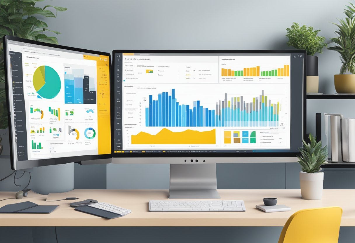
For data visualization, Matplotlib and Seaborn are important. They make it possible to create revealing charts and plots that uncover insights from the data.

Developing these skills is crucial as they allow an analyst to present data findings clearly and effectively, ultimately supporting decision-making processes in real-world applications.

Core Python Programming Concepts

Python programming involves foundational techniques like control structures, loops, object-oriented programming (OOP), and error handling. These building blocks help create efficient and organized code.

Control Structures and Loops

Control structures allow for decision-making and repetition in code. If-else statements are used to execute code based on conditions. With loops, Python can repeat code segments efficiently.

For loops iterate over sequences, providing an easy way to traverse lists or strings. While loops continue until a condition is satisfied, which can be useful for indefinite iterations.

These tools are crucial for automating repetitive tasks and handling data in bulk.

Object-Oriented Programming

Object-oriented programming (OOP) enables developers to create classes and objects for structuring code. OOP helps organize complex code by grouping related properties and methods. It promotes code reuse through inheritance, where new classes derive attributes from existing ones.

Encapsulation ensures data hiding, while polymorphism allows methods to operate differently based on object type. This approach leads to more maintainable and scalable applications.

Error Handling and Debugging

Error handling in Python uses try-except blocks to catch and manage exceptions without crashing programs. This tool allows for a graceful response to errors, such as logging an error message or retrying an operation.

Debugging involves finding and fixing bugs through print statements or using tools like the Python debugger (PDB).

Effective error handling and debugging are vital for creating reliable software.

Function Definitions and Generators

Functions in Python encapsulate logic for reuse and clarity. Functions take inputs, perform actions, and return results, making programming modular.

Generators are a special type of function that use yield instead of return. They produce a sequence of results lazily, saving memory by generating items on-the-fly.

This technique is beneficial for working with large datasets, as it avoids storing entire sequences in memory.

Effective Data Handling in Python

Efficient data handling is crucial when working with Python for data analysis. Key components include powerful libraries that simplify data manipulation and cleaning tasks. Managing dates and times effectively also plays a significant role in organizing data for analysis.

Python Libraries for Data Analysis

Python is equipped with numerous libraries that enhance data analysis processes.

Libraries like NumPy provide support for large, multi-dimensional arrays and matrices, along with mathematical functions.

Pandas is another essential library that offers data structures and operations for manipulating numerical tables and time series. For data visualization, Matplotlib and Seaborn are highly popular.

They enable the creation of static, animated, and interactive visualizations, helping make sense of raw data more visually.

Data Manipulation with Pandas

Pandas offers versatile data structures known as DataFrames that allow users to easily manipulate and analyze data.

With Pandas, one can efficiently handle missing data and perform tasks like data cleaning. It also allows easy filtering, grouping, and sorting of data.

Handling categorical variables becomes straightforward with Pandas, as it converts them into discrete values, making them easier to analyze and interpret.

Working with Dates and Times

Handling dates and times accurately is crucial in data analysis.

Python’s standard library includes the datetime module which simplifies date and time manipulation. Pandas builds on this with its own methods to handle date and time data efficiently.

This includes converting date strings into datetime objects and working with different time zones.

Date handling is vital when organizing time series data or analyzing data trends over time.

Data Analysis Techniques

Data analysis requires a strong understanding of various techniques that are essential for extracting insights from data. These techniques include exploratory data analysis, descriptive statistics, and interpreting data distributions.

Exploratory Data Analysis (EDA)

Exploratory Data Analysis is a crucial first step in data analysis. It involves looking at datasets to summarize their main characteristics, often using visual methods.

EDA allows analysts to identify patterns, detect outliers, and find relationships between variables.

Charts like histograms, scatter plots, and box plots are commonly used. These tools help in revealing underlying structures in the data.

EDA is about making sense of data by employing a hands-on approach. It emphasizes visualization, encouraging analysts to view data from different perspectives.

While performing EDA, one often starts by cleaning the data. This involves handling missing values and checking for data entry errors.

Only after this can the true power of EDA unfold in revealing meaningful insights.

Descriptive Statistics in Python

Descriptive statistics provide a summary of the main features of a dataset. In Python, libraries like NumPy and Pandas are widely used for this purpose.

These statistics include measures of central tendency like mean, median, and mode. Each measure gives a different view of the data’s center.

Mean is calculated as the average of values. It is helpful in understanding the overall level of a dataset but can be skewed by extreme values.

The median gives the middle value of ordered data, making it more robust to outliers. Mode is the most frequently occurring value and is useful for categorical data.

Python makes it easy to compute these statistics with functions such as mean() and median(), providing a clear picture of the data with minimal code.

Understanding Distributions of Data

Grasping the distribution of data is key to advanced analysis. Distributions describe how values are spread across a dataset.

Common distributions include normal, skewed, and uniform. Recognizing them helps in choosing the right statistical tests and models.

Visual tools like histograms and kde plots in Python can reveal the shape of a dataset’s distribution.

A normal distribution is symmetric and bell-shaped, while a skewed distribution is asymmetrical. Understanding these properties helps predict kurtosis and variability.

By analyzing the distribution, data scientists can detect anomalies and potential biases in datasets. This knowledge enhances predictive modeling and improves the reliability of conclusions drawn from the data.

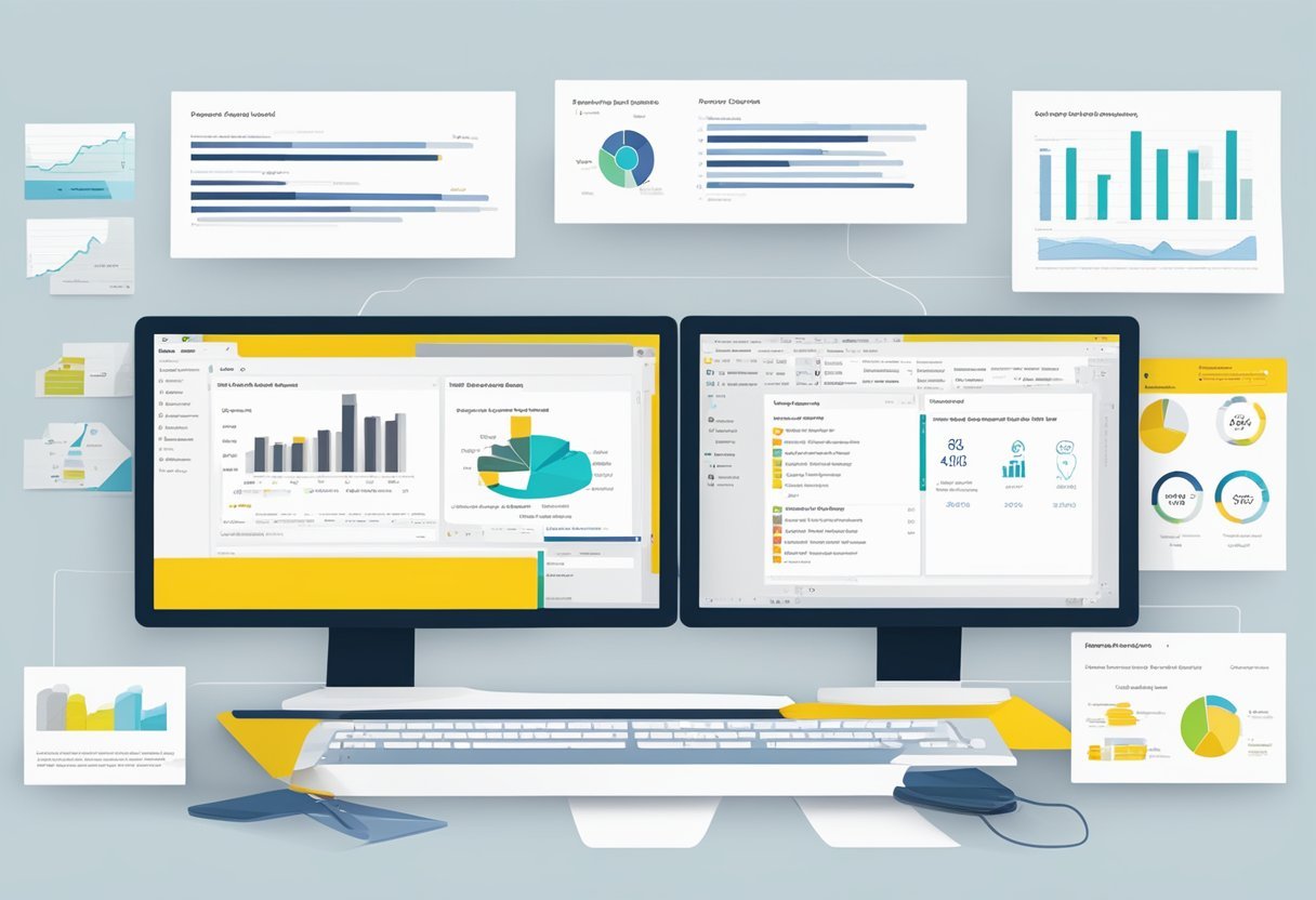
Data Visualization Fundamentals

Data visualization is a crucial tool for interpreting complex datasets. Understanding library functions, like Matplotlib, helps in creating clear and effective visual representations. Additionally, learning to create interactive visualizations can enhance user engagement and data analysis depth.

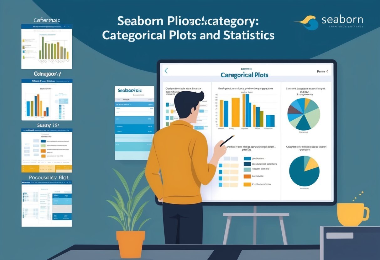
Charting with Matplotlib

Matplotlib is a versatile library used to create static, animated, and interactive visualizations in Python. It supports a range of plot types like line charts, bar graphs, histograms, and scatter plots. These charts help in identifying trends, patterns, and outliers in data.

One of the standout features of Matplotlib is its customization capability.

Users can adjust color schemes, line styles, and fonts to make charts more informative and visually appealing. It also integrates well with Jupyter notebooks, making it ideal for sharing insights interactively.

The library supports various output formats, enabling the saving of visualizations for reports or presentations.

By mastering Matplotlib, users can enhance their ability to communicate data insights effectively.

Creating Interactive Visualizations

Interactive visualizations engage users by allowing them to explore data dynamically.

Libraries like Plotly and Bokeh, in conjunction with Matplotlib, can produce these types of visualizations.

Interactive features might include zooming, panning, and tooltips that display data values on hover.

Interactive elements help users investigate data without needing extensive coding knowledge. This is valuable in fields like business intelligence and data science, where interpreting large datasets quickly is crucial.

Creating interactive visualizations requires understanding both the data and the audience’s needs.

By offering an engaging way to explore data, interactive visualizations can lead to more insightful conclusions and better decision-making.

Leveraging Advanced Python Features

A person sitting at a desk with a computer, surrounded by books on Python programming and data analysis. Code snippets and data visualizations are displayed on the computer screen

Advanced Python features can significantly enhance data analysis capabilities. By utilizing advanced data structures, and mastering decorators and context managers, data handling and code efficiency are greatly improved.

Advanced Data Structures

Using advanced data structures in Python can transform the way data is stored and accessed.

Dictionaries and sets are pivotal for efficient data manipulation. Dictionaries allow storing data in key-value pairs, enabling quick lookups and modifications. This feature is crucial for tasks requiring rapid access to data, such as indexing large datasets.

Lists and tuples offer flexible ways to handle ordered data. Lists are mutable, allowing changes to data. Tuples, being immutable, provide a secure way to store data that must not change.

Using these data structures effectively requires understanding their strengths and weaknesses. This understanding improves code performance and resource management in larger projects.

Mastering Decorators and Context Managers

Decorators and context managers add functionality to Python code without modifying its structure.

Decorators allow the enhancement of functions or methods, offering a powerful way to modify behavior or add logging features seamlessly.

Context managers manage resources like file or network connections. By using a with statement, they ensure resources are adequately handled, avoiding potential issues like memory leaks.

They are invaluable in scaling projects where resource handling becomes complex.

Mastering these tools enhances Python’s readability and maintainability. Implementing them effectively requires a solid understanding of Python syntax and practice in real-world scenarios.

These skills not only streamline code but also contribute to more robust and efficient applications.

Machine Learning with Python

A person using a computer to study Python for data analysis

Machine learning with Python offers a powerful combination of flexibility and simplicity for developing data-driven solutions. Python skills are crucial for data scientists to implement machine learning algorithms efficiently and solve complex problems.

Fundamentals of Machine Learning

Understanding the basics of machine learning is essential for any aspiring data scientist.

Machine learning involves teaching computers to recognize patterns and make decisions based on data. It primarily consists of supervised and unsupervised learning.

In supervised learning, the system is trained on a labeled dataset, such as classifying emails as spam or not spam.

Unsupervised learning, by contrast, involves finding hidden patterns without predefined labels, like grouping customers based on purchasing behavior.

Python is widely used for these tasks due to its vast library support, including tools like scikit-learn for model training and Pandas for data manipulation. Model evaluation metrics like accuracy and F1 score are also crucial here.

Implementing Machine Learning Algorithms

Implementing machine learning algorithms involves using Python’s rich ecosystem of libraries.

Libraries like SciPy and scikit-learn provide interfaces for running classic algorithms.

For instance, decision trees and support vector machines (SVM) are common in supervised learning tasks.

Python makes it easy to test and apply different algorithms to find the best fit for specific problems.

Project work often includes data preprocessing, feature selection, and model tuning.

Efficient use of these libraries requires solid Python skills, focusing on writing clear, maintainable code.

Machine learning projects often conclude with model evaluation and deployment, where Python’s versatility shines, enabling seamless integration into larger data analytics pipelines.

Project and Workflow Management

A desk with a laptop, notebook, and pen. A whiteboard with project flowchart. Python code on a computer screen

Effective management of projects and workflows is crucial for successful data analysis.

By leveraging tools like Jupyter Notebooks and embracing version control, data scientists and software engineers can enhance productivity and promote seamless collaboration.

Using Jupyter Notebooks Effectively

Jupyter Notebooks are powerful tools that help in organizing code, visualizations, and notes in an integrated environment.

They provide an interactive platform for experimenting with data, making it easier to document and share insights.

Notebooks support various programming languages but are most commonly used for Python, making them ideal for data analysis projects.

Key features include:

  • Interactive data visualizations
  • Easy modification and testing of code snippets
  • Inline documentation capabilities

Best practices involve structuring notebooks with clear headings, meaningful comments, and segregating code into understandable blocks.

This ensures that analyses and results are presented clearly, assisting others in replicating or reviewing the work.

Version Control and Collaboration

Version control systems like Git play a crucial role in managing code changes and collaboration among team members.

This ensures that all project stakeholders can access the latest updates without erasing past work.

Key features of version control include:

  • Tracking changes over time
  • Facilitating collaborative editing
  • Reverting to previous code states if needed

For effective collaboration, using platforms like GitHub allows for distributed development, where software engineers and data scientists can work simultaneously on different aspects of the project.

Tools such as pull requests and issue tracking further streamline workflow management, fostering a collaborative environment where everyone can contribute efficiently and confidently to the project’s goals.

Building a Professional Portfolio

A person working on a laptop surrounded by books and papers, with graphs and charts on the screen

A professional portfolio in data analysis demonstrates proficiency in Python and technical skills and shows creativity and problem-solving abilities. This resource is essential for standing out to employers and advancing in a data analyst career.

Hands-On Projects and Case Studies

Hands-on projects and case studies are vital for an appealing portfolio. They show potential employers the ability to apply theoretical knowledge to real-world problems.

Projects should include tasks like data cleaning, analysis, and visualization.

Case studies can demonstrate skills in Python coding, machine learning, and data analytics.

When creating a project portfolio, variety is key. Include projects that showcase different skills, such as statistical analysis or creating visualizations from datasets.

Collaborating with others on group projects can also add depth. Participating in data hackathons or online competitions is a great way to gather diverse experiences and enhance project work.

Showcasing Your Work to Employers

Effectively showcasing a portfolio is crucial for catching the eye of potential employers.

Use platforms like GitHub to host and share projects. Each project should have clear, concise documentation. Include details about the problem solved, the methods used, and the results achieved.

Additionally, consider writing blogs or articles that explain projects in more detail. This not only demonstrates communication skills but also highlights expertise.

Another approach is to present portfolio work on a personal website. This offers a central place for all projects and can include a resume and contact information. Using links to guide potential employers to specific projects can make it easier for them to navigate and understand the work.

Advancing Your Career in Data Analysis

To grow in data analysis, it’s essential to focus on certifications and targeted learning paths. Online courses and interactive lessons are key resources for building skills efficiently and effectively.

Certifications and Learning Paths

Certifications can greatly boost a data analyst’s career. They validate one’s skills to employers and can distinguish an individual from other candidates.

Key certifications like the Microsoft Certified: Data Analyst Associate or the Data Science Professional Certificate offer technical and analytical learning paths.

These certifications often cover data visualization, database management, and statistical analysis.

Pursuing a certification shows a commitment to continuous education, which is highly valued in the industry.

Choose a certification that aligns well with career goals and areas of interest. These structured paths provide a clear framework for skill development.

Online Courses and Interactive Lessons

Online courses provide accessible ways to learn new skills at your own pace.

Platforms like Coursera and Dataquest offer courses focused on data analysis with Python, which is highly recommended due to Python’s widespread use in the industry.

Interactive lessons engage learners with real-world scenarios, enhancing understanding.

These platforms often offer practice problems and projects that mimic actual data challenges.

Many courses also include community forums where learners can discuss topics and resolve doubts, making learning more collaborative.

Look for ones that offer a Dataquest guarantee, which ensures satisfaction through quality education and practical experience.

Working with Real-world Data

A person sitting at a desk with a computer, surrounded by books and papers, working on coding and data analysis

When dealing with real-world data, understanding how to manipulate text, analyze large datasets, and visualize results is essential. These skills are crucial for transforming raw information into valuable insights.

String Manipulation and Text Data

String manipulation is key in cleaning and organizing data. Text data can be messy, containing irregular spacing, punctuation, and mixed cases.

Using Python’s string methods, one can modify text by removing unwanted characters, splitting strings into lists, or changing letter cases to achieve uniformity.

Regular expressions (regex) are powerful in identifying patterns in text. They can extract emails, dates, or any specific format within strings, making data cleaner and more usable.

Python libraries like re simplify regex tasks, helping to automate complex text processing efficiently.

Processing text data often involves using data structures like lists and dictionaries to store and iterate over text collections. These tools make it easier to organize, search, and retrieve data quickly.

Analyzing and Visualizing Large Datasets

Handling large datasets requires efficient analysis techniques to uncover trends and patterns.

Python libraries like pandas and NumPy enable users to perform complex calculations and transformations on extensive data collections swiftly.

To make datasets more understandable, data visualization tools such as matplotlib and seaborn are invaluable.

These libraries can create a wide range of graphs and charts, like histograms or scatter plots, which present data visually, highlighting key insights.

When dealing with large datasets, efficient data structures like DataFrames provide a way to manage and manipulate data without excessive memory use.

This enhances performance, allowing for quick access and processing, crucial when working with real-world data complexities.

Staying Current with Python Developments

A person studying Python code while surrounded by data analysis tools and resources

Continuous learning is crucial for professionals in Python-related fields. Staying informed about new updates and connecting with the community are keys to maintaining expertise. This ensures data scientists and software engineers are always up-to-date.

Continuing Education for Python Professionals

Python professionals should focus on ongoing education to keep their skills sharp.

Courses from platforms like DataCamp and Codecademy offer valuable resources.

These platforms provide structured learning paths covering advanced modules, libraries, and data analysis techniques.

For data scientists, enrolling in specialized training like machine learning or data visualization can expand expertise.

Participating in webinars and workshops presents an opportunity to learn from industry leaders.

Keeping abreast with the latest Python versions and updates is essential, ensuring they know recent language enhancements and best practices.

Community Engagement and Networking

Joining Python communities offers great benefits for learners and professionals.

Forums like Reddit’s Python community and Stack Overflow provide opportunities for problem-solving and exchanging knowledge.

Engaging with these platforms allows professionals to ask questions, share experiences, and obtain solutions quickly.

Networking at industry conferences, such as PyCon, lets data scientists and software engineers meet peers and industry leaders.

These events offer sessions on trends and innovations. Community involvement ensures professionals build a support system, gaining insights and potential career opportunities.

Participants in online study groups can also collaborate on projects, fostering skill development and idea exchange.

Frequently Asked Questions

A person working on a laptop with Python code on the screen, surrounded by books and notes on data analysis

Intermediate Python skills are crucial for anyone looking to excel in data analysis. Key areas include proficiency in essential libraries, data manipulation, data visualization, statistical analysis, and the implementation of machine learning techniques.

What are the essential Python libraries one should be proficient in for data analysis?

Python libraries play a vital role in data analysis. Libraries such as Pandas and NumPy are essential for data manipulation and numerical computations.

For data visualization, Matplotlib and Seaborn are widely used, while SciPy offers advanced statistical functions to enhance data analysis capabilities.

Which Python data structures are most commonly used in data analysis tasks?

Data analysis often involves working with data structures like lists, dictionaries, and data frames.

Lists and dictionaries are fundamental, but data frames, primarily through Pandas, provide a flexible way to store and manipulate large datasets, making them crucial for data analysis tasks.

How can one efficiently handle data manipulation in Python?

Efficient data manipulation can be achieved using Pandas for organizing and cleaning data.

Techniques like filtering, aggregation, and handling missing values are straightforward with this library. Understanding these operations enhances one’s ability to prepare data for further analysis.

What are the best practices for visualizing data in Python?

Data visualization is key to understanding data insights.

Best practices include using Matplotlib for creating basic charts and plots, while Seaborn is suited for more advanced visualizations. Both libraries help in presenting data in a clear and understandable way.

In what ways can Python be used to perform statistical data analysis?

Python offers a range of tools for statistical analysis.

Libraries like SciPy make it possible to perform complex statistical operations. This includes hypothesis testing, regression analysis, and descriptive statistics, all of which are essential for thorough data analysis.

How does one implement machine learning techniques in Python for data analysis?

Machine learning in Python involves using libraries like scikit-learn. This library provides tools for implementing algorithms such as classification, regression, and clustering.

These techniques can enhance data analysis by allowing predictions and insights from complex datasets.

Categories
Uncategorized

Learning Pandas for Data Science: Mastering Tabular Data with Pandas

Understanding Pandas and Its Ecosystem

Pandas is an essential tool for data analysis in Python. It provides powerful features for handling tabular data. It works alongside other key Python libraries like NumPy to create a comprehensive ecosystem for data science.

Overview of Pandas Library

The pandas library simplifies data manipulation with its robust tools for working with datasets in Python. It offers easy-to-use data structures like Series and DataFrame that handle and process data efficiently.

DataFrames are tabular structures that allow for operations such as filtering, aggregating, and merging.

Pandas is open source and part of a vibrant community, which means it’s continually updated and improved. Its intuitive syntax makes it accessible for beginners while offering advanced functionality for seasoned data scientists.

Python for Data Science

Python has become a leading language in data science, primarily due to its extensive library support and simplicity. The pandas library is integral to this, providing tools for complex data operations without extensive code.

Python packages like pandas and scikit-learn are designed to make data processing smooth.

With Python, users have a broad ecosystem supporting data analysis, visualization, and machine learning. This environment allows data scientists to leverage Python syntax and develop models and insights with efficiency.

The Role of Numpy

NumPy is the backbone of numerical computation in Python, forming a foundation on which pandas builds its capabilities. It provides support for arrays, allowing for fast mathematical operations and array processing.

Using NumPy in combination with pandas enhances performance, especially with large datasets.

Pandas relies on NumPy’s high-performance tools for data manipulation. This offers users the ability to execute vectorized operations efficiently. This synergy between NumPy and pandas is crucial for data analysts who need to handle and transform data swiftly.

Fundamentals of Data Structures in Pandas

Pandas provides two main data structures essential for data analysis: Series and DataFrames. These structures allow users to organize and handle data efficiently.

Exploring DataFrames with commands like info() and head() helps in understanding data’s shape and contents. Series proves useful for handling one-dimensional data with versatility.

Series and DataFrames

The Pandas Series is a one-dimensional array-like object that can hold various data types. Its unique feature is the associated index, which can be customized.

DataFrames, on the other hand, are two-dimensional and consist of rows and columns, much like an Excel spreadsheet. They can handle multiple types of data easily and come with labels for rows and columns. DataFrames allow for complex data manipulations and are a core component in data analysis tools. This versatility makes Pandas a powerful tool for handling large datasets.

Exploring DataFrames with Info and Head

Two useful methods to examine the contents of a DataFrame are info() and head().

The info() method provides detailed metadata, such as the number of non-null entries, data types, and memory usage. This is crucial for understanding the overall structure and integrity of the data.

The head() method is used to preview the first few rows, typically five, of the DataFrame. This snapshot gives a quick look into the data values and layout, helping to assess if any cleaning or transformation is needed. Together, these methods provide vital insights into the dataset’s initial state, aiding in effective data management and preparation.

Utilizing Series for One-Dimensional Data

Series in Pandas are ideal for handling one-dimensional data. Each element is linked to an index, making it easy to access and manipulate individual data points.

Operations such as filtering, arithmetic computations, and aggregations can be performed efficiently on a Series. Users can capitalize on this to simplify tasks like time series analysis, where a Series can represent data points indexed by timestamp. By leveraging the flexibility of Series, analysts and programmers enhance their ability to work with one-dimensional datasets effectively.

Data Importing Techniques

Data importing is a crucial step in any data analysis workflow. Using Pandas, data scientists can efficiently import data from various sources like CSV, Excel, JSON, and SQL, which simplifies the preparation and exploration process.

Reading Data from CSV Files

CSV files are one of the most common formats for storing and sharing data. They are plain text files with values separated by commas.

Pandas provides the read_csv function to easily load data from CSV files into a DataFrame. This method allows users to specify parameters such as the delimiter, encoding, and column names, which ensures the data is read correctly.

By tailoring these parameters, users can address potential issues like missing values or incorrect data types, making CSV files easy to incorporate into their analysis workflow.

Working with Excel Files

Excel files are widely used in business and data management. They often contain multiple sheets with varying data formats and structures.

Pandas offers the read_excel function, allowing data import from Excel files into a DataFrame. This function can handle Excel-specific features like sheets, headers, and data types, making it versatile for complex datasets.

Users can specify the sheet name or number to target exact data tables saving time and effort. Given that Excel files can get quite large, specifying just the columns or rows needed can improve performance and focus on the required data.

Loading Data from JSON and SQL

JSON files are used for data exchange in web applications because they are lightweight and human-readable.

The read_json function in Pandas helps convert JSON data into a DataFrame, handling nested structures with ease and flexibility.

SQL databases are another common data source, and Pandas provides functions to load data via SQL queries. This is done using pd.read_sql, where a connection is established with the database to execute SQL statements and retrieve data into a DataFrame.

By seamlessly integrating Pandas with JSON and SQL, data scientists can quickly analyze structured and semi-structured data without unnecessary data transformation steps, allowing broader data access.

Data Manipulation with Pandas

Pandas provides powerful tools for data manipulation, allowing users to efficiently filter, sort, and aggregate data. These operations are essential for preparing and analyzing structured datasets.

Filtering and Sorting Data

Filtering and sorting are key tasks in data manipulation. Filtering involves selecting rows that meet specific criteria. Users can accomplish this by applying conditions directly to the DataFrame. For instance, filtering rows where a column value equals a specific number can be done using simple expressions.

Sorting helps organize data in ascending or descending order based on one or more columns. By using the sort_values() method, you can sort data effectively. Consider sorting sales data by date or sales amount to identify trends or outliers. This functionality is crucial when dealing with large datasets.

Advanced Indexing with Loc and iLoc

Pandas offers advanced indexing techniques through loc and iloc. These methods provide more control over data selection.

loc is label-based indexing, allowing selection of rows and columns by their labels. It’s useful for accessing a specific section of a DataFrame.

For example, using loc, one can select all rows for a particular city while selecting specific columns like ‘Date’ and ‘Sales’.

On the other hand, iloc is integer-based, making it possible to access rows and columns by their numerical index positions. This is beneficial when you need to manipulate data without knowing the exact labels.

Aggregation with GroupBy

The groupby function in Pandas is a powerful tool for data aggregation. It allows users to split the data into groups based on unique values in one or more columns, perform calculations, and then combine the results.

Use groupby to calculate metrics like average sales per region or total revenue for each category.

For example, in a sales dataset, one might group by ‘Region’ to aggregate total sales.

The ability to perform operations such as sum, mean, or count simplifies complex data analysis tasks and provides insights into segmented data. GroupBy also supports combining multiple aggregation functions for comprehensive summaries. This feature is essential for turning raw data into meaningful statistics.

Data Cleaning Techniques

Data cleaning is essential to prepare data for analysis. In this section, the focus is on handling missing data, techniques for dropping or filling voids, and converting data types appropriately for accurate results using Pandas.

Handling Missing Data in Pandas

Missing data is common in real-world datasets. It can occur due to incomplete data collection or errors. In Pandas, missing values are typically represented as NaN. Detecting these gaps accurately is crucial.

Pandas offers functions like isnull() and notnull() to identify missing data. These functions help in generating boolean masks that can be used for further operations.

Cleaning these discrepancies is vital, as they can skew analysis results if left unmanaged.

Dropping or Filling Missing Values

Once missing data is identified, deciding whether to drop or fill it is critical.

The dropna() function in Pandas allows for removing rows or columns with missing values, useful when the data missing is not substantial.

Alternatively, the fillna() function helps replace missing values with specified values, such as zero, mean, or median.

Choosing the appropriate method depends on the dataset context and the importance of missing fields. Each method has its consequences on data integrity and analysis outcomes. Thus, careful consideration and evaluation are necessary when dealing with these situations.

Type Conversions and Normalization

Data type conversion ensures that data is in the correct format for analysis. Pandas provides astype() to convert data types of Series or DataFrame elements.

Consistent and accurate data types are crucial to ensuring efficient computations and avoiding errors during analysis.

Normalization is vital for datasets with varying scale and units. Techniques like Min-Max scaling or Z-score normalization standardize data ranges, bringing consistency across features.

This process is essential, especially for algorithms sensitive to feature scaling, such as gradient descent in machine learning. By maintaining uniform data types and scale, the data becomes ready for various analytical and statistical methods.

Exploratory Data Analysis Tools

Exploratory Data Analysis (EDA) tools in Pandas are essential for understanding data distributions and relationships. These tools help handle data efficiently and uncover patterns and correlations.

Descriptive Statistics and Correlation

Descriptive statistics provide a simple summary of a dataset, giving a clear picture of its key features.

In Pandas, the describe() function is commonly used to show summary statistics, such as mean, median, and standard deviation. These statistics help identify data quirks or outliers quickly.

Correlation looks at how variables relate to each other. It is important in data analysis to find how one variable might influence another.

Pandas has the corr() function to compute correlation matrices. This function helps to visualize relationships among continuous variables, providing insight into potential connections and trends.

Data Exploration with Pandas

Data exploration involves inspecting and understanding the structure of a dataset. Pandas offers several functions to assist with this, like head(), tail(), and shape().

Using head() and tail(), one can view the first and last few rows of data, providing a glimpse of data structure. The shape attribute gives the dataset’s dimensions, showing how many rows and columns exist.

These tools facilitate detailed data exploration, enhancing comprehension of data characteristics. They are essential for effective and efficient data analysis, allowing one to prepare the data for further modeling or hypothesis testing.

Visualization of Data in Pandas

Visualizing data in Pandas involves leveraging powerful libraries to create charts and graphs, making it easier to analyze tabular data.

Matplotlib and Seaborn are key tools that enhance Pandas’ capabilities for plotting.

Additionally, pivot tables offer visual summaries to uncover data patterns and trends efficiently.

Plotting with Matplotlib and Seaborn

Matplotlib is an essential library for creating static, interactive, and animated visualizations in Python. It provides a comprehensive framework for plotting various types of graphs, such as line charts, histograms, and scatter plots.

This library integrates well with Pandas, allowing users to plot data directly from DataFrames.

Users often choose Matplotlib for its extensive customization options, enabling precise control over each aspect of the plot.

Seaborn, built on top of Matplotlib, offers a simpler way to create attractive and informative statistical graphics. It works seamlessly with Pandas data structures, providing beautiful color palettes and built-in themes.

With its high-level interface, Seaborn allows the creation of complex visualizations such as heatmaps, violin plots, and box plots with minimal code. This makes it easier to uncover relationships and patterns in data, enhancing data visualization tasks.

Creating Pivot Tables for Visual Summaries

Pivot tables in Pandas are a powerful tool for data analysis. They offer a way to summarize, sort, reorganize, and group data efficiently.

By dragging fields into the row, column, or value area, users can quickly transform vast tables into meaningful summaries, showcasing trends, patterns, and comparisons.

Visualizing data with pivot tables can also be combined with the plotting libraries to present data visually.

For example, after creating a pivot table, users can easily plot the results using Matplotlib or Seaborn to glean insights at a glance. This combination provides a more interactive and informative view of the dataset, aiding in quick decision-making and deeper analysis.

Exporting Data from Pandas

When working with Pandas, exporting data is an essential step. Users often need to convert DataFrames into various formats for reporting or sharing. Below, you’ll find guidance on exporting Pandas data to CSV, Excel, and HTML formats.

Writing Data to CSV and Excel Files

Pandas makes it straightforward to write DataFrame content to CSV files using the to_csv method. This function allows users to save data efficiently for further analysis or distribution.

Users can specify options like delimiters, headers, and index inclusion.

For Excel files, the to_excel function is used. This method handles writing Pandas data to an Excel spreadsheet, providing compatibility with Excel applications.

Options like sheet names, columns, and index status are customizable. Both CSV and Excel formats support large datasets, making them ideal choices for exporting data.

Exporting DataFrame to HTML

HTML exports are useful when sharing data on web pages. The to_html function in Pandas converts a DataFrame to an HTML table format.

This creates a representation of the DataFrame that can be embedded in websites, preserving data layout and style.

Users can customize the appearance of HTML tables using options such as border styles and column ordering. This is beneficial for creating visually appealing displays of data on the web. Exporting to HTML ensures that the data remains interactive and accessible through web browsers.

Performance Optimization in Pandas

A laptop displaying a Pandas code editor with a dataset, surrounded by books on data science and a notebook with handwritten notes

Optimizing performance in Pandas is crucial for handling large datasets efficiently. Key approaches include improving memory usage and employing vectorization techniques for faster data operations.

Memory Usage and Efficiency

Efficient memory management is vital when working with large datasets. One way to reduce memory usage in Pandas is by optimizing data types.

For example, using int8 instead of int64 can save space. The category dtype is also useful for columns with a limited number of unique values. It can significantly lower memory needs by storing data more compactly.

Monitoring memory usage can be done using the memory_usage() method. This function offers a detailed breakdown of each DataFrame column’s memory consumption.

Another method is using chunking, where large datasets are processed in smaller segments. This approach minimizes the risk of memory overflow and allows for more manageable data computation.

Vectorization in Data Operations

Vectorization refers to processing operations over entire arrays instead of using loops, making computations faster.

In Pandas, functions like apply() can be replaced with vectorized operations to improve performance. For instance, using numpy functions on Pandas objects can lead to significant speed improvements.

The numexpr library can also be used for efficient array operations. It evaluates expressions element-wise, enabling fast computation.

Utilizing built-in Pandas functions, such as merge() and concat(), can also enhance speed. They are optimized for performance, unlike custom Python loops or functions. These methods ensure data operations are handled swiftly and efficiently, reducing overall processing time.

Integrating Pandas with Other Tools

A laptop displaying a Pandas dataframe alongside other data science tools like Jupyter Notebook and Python code

Pandas is a powerful library widely used in data science. It can be combined with various tools to enhance data analysis, machine learning, and collaboration. This integration improves workflows and allows for more effective data manipulation and analysis.

Analysis with Scikit-Learn and SciPy

For machine learning tasks, combining Pandas with Scikit-Learn is highly effective. Data stored in Pandas can be easily transformed into formats that Scikit-Learn can use.

This allows seamless integration for tasks like model training and data preprocessing. Scikit-Learn’s extensive API complements Pandas by providing the tools needed for predictive modeling and machine learning workflows.

SciPy also integrates well with Pandas. It offers advanced mathematical functions and algorithms.

By using Pandas dataframes, these functions can perform complex computations efficiently. This collaboration makes it easier for data scientists to run statistical analyses and visualization.

Utilizing Pandas in Jupyter Notebooks

Jupyter Notebooks are popular in the data science community for their interactive environment. They allow users to run code in real-time and visualize data instantly.

Pandas enhances this experience by enabling the easy manipulation of dataframes within notebooks.

By using Pandas in Jupyter Notebooks, data scientists can explore datasets intuitively. They can import, clean, and visualize data all in one place. This integration streamlines workflows and improves the overall efficiency of data exploration and analysis.

Collaboration with Google Sheets and Kaggle

Pandas can be effectively used alongside Google Sheets for collaborative work. Importing data from Google Sheets into Pandas enables team members to analyze and manipulate shared datasets.

This is particularly useful in teams where data is stored and updated in the cloud. The seamless connection allows for continuous collaboration with live data.

On Kaggle, a popular platform for data science competitions, Pandas is frequently used to explore and preprocess datasets. Kaggle provides an environment where users can write and execute code.

By utilizing Pandas, data scientists can prepare datasets for analysis or machine learning tasks efficiently. This aids in model building and evaluation during competitions.

Frequently Asked Questions

A laptop open to a webpage titled "Frequently Asked Questions Learning Pandas for Data Science – Tabular Data and Pandas."

This section addresses common inquiries about using Pandas for data science. It covers importing the library, handling missing data, differences between key data structures, merging datasets, data manipulation techniques, and optimizing performance.

What are the initial steps to import and use the Pandas library in a data science project?

To start using Pandas, a data scientist needs to have Python installed on their system. Next, they should install Pandas using a package manager like pip, with the command pip install pandas.

Once installed, it can be imported into a script using import pandas as pd. This shorthand label, pd, is commonly used for convenience.

How does one handle missing data within a DataFrame in Pandas?

Pandas provides several ways to address missing data in a DataFrame. The isnull() and notnull() functions help identify missing values.

To manage these, functions like fillna() allow for filling in missing data with specific values. Alternatively, dropna() can be used to remove any rows or columns with missing data.

What are the main differences between the Pandas Series and DataFrame objects?

A Pandas Series is a one-dimensional labeled array capable of holding any data type, similar to a single column of data. In contrast, a DataFrame is a two-dimensional labeled data structure with columns of potentially different types. Think of a DataFrame as a table or spreadsheet with rows and columns.

Could you explain how to perform a merge of two DataFrames and under what circumstances it’s utilized?

Merging DataFrames in Pandas is done using the merge() function. This is useful when combining datasets with related information, such as joining a table of customers with a table of orders.

Merges can be conducted on shared columns and allow for inner, outer, left, or right join operations to control the outcome.

What methodologies are available in Pandas for data manipulation and cleaning?

Pandas offers robust tools for data manipulation and cleaning. Functions like rename() help in modifying column labels, while replace() can change values within a DataFrame.

For rearranging data, pivot() and melt() are useful. Data filtering or selection can be done efficiently using loc[] and iloc[].

What are some best practices for optimizing Pandas code performance when processing large datasets?

When working with large datasets, it is crucial to improve performance for efficient processing. Using vectorized operations instead of iterating through rows can speed up execution.

Memory optimization can be achieved by using appropriate data types. Additionally, leveraging built-in functions and avoiding unnecessary copies of data can enhance performance.

Categories
Uncategorized

Learning about Merge Sort and How to Implement in Python: A Comprehensive Guide

Understanding Merge Sort

Merge Sort is a popular sorting algorithm known for its efficiency and reliability. It follows the divide-and-conquer strategy, which means it works by dividing a problem into smaller sub-problems, solving them independently, and then combining their solutions.

The algorithm splits an array into two halves, repeatedly doing this until each sub-array contains a single element. At this point, these elements are considered sorted.

Next, the algorithm merges the sorted sub-arrays to produce new sorted arrays. This process is repeated until the entire array is sorted.

One of the key benefits of Merge Sort is its stability. Being a stable sort, it maintains the relative order of equal elements, which can be important in cases where the original order carries meaning.

Merge Sort Key Features

  • Time Complexity: O(n log n) for all cases (best, average, worst).
  • Space Complexity: Requires additional storage proportional to the array size.
  • Stability: Keeps the order of equal elements consistent.

Merge Sort is often compared with other sorting algorithms such as Quick Sort and Bubble Sort. Its predictable performance makes it an excellent choice for larger datasets or when memory usage can be accommodated.

By employing the divide and conquer algorithm structure, Merge Sort remains an essential tool in the collection of sorting algorithms, providing consistent results and predictable performance. For more details on implementation, visit Merge Sort: A Quick Tutorial and Implementation Guide.

Basics of Divide and Conquer in Sorting

Divide-and-conquer is a common strategy used in sorting algorithms like merge sort. This approach involves breaking down a problem into smaller, more manageable parts, then solving those parts and combining them. In sorting, this typically means dividing a list into sub-arrays, sorting those, and merging them back together to form a sorted array.

Splitting the List

The first step in divide-and-conquer sorting is splitting the list. In merge sort, the unsorted list is divided into two halves until each sub-array contains a single element. This process continues recursively. By breaking the list down, it’s easier to manage and sort smaller pieces rather than dealing with a large unsorted list at once.

For example, consider a list of eight numbers. It gets split into two lists of four numbers each and then those are split further into lists of two and finally into single elements.

This step is crucial because it simplifies the merging process later. A completely divided list allows for more efficient subsequent operations and accurate sorted results.

Sub-Array Management

Once the list is split into sub-arrays, each sub-array is managed separately. This involves sorting each sub-array before merging them back together into a sorted array.

The merge function plays a pivotal role, operating on the assumption that each sub-array is already sorted. It compares elements from each sub-array, selecting the smallest currently available item to build a new sorted array.

Managing these sub-arrays effectively is key, for ensuring accuracy and efficiency in sorted outputs. It reduces complexity when dealing with larger data sets. This process not only optimizes sorting but also makes the merge sort algorithm highly effective, especially for larger data sets, due to its time complexity of O(n log n).

The Merge Procedure Explained

The merge procedure in merge sort is essential for combining sorted subarrays to form a single, sorted list. This step involves a clear process that ensures efficiency and stability in sorting the entire dataset.

Merging Subarrays

During the merging of subarrays, the merge function plays a critical role. First, it takes two sorted subarrays. For example, consider an array divided into arr[l..m] and arr[m+1..r]. The merge function compares the smallest elements from both subarrays.

The smaller element is added to a new temporary array. This comparison continues until all elements from one subarray are exhausted. Subsequently, any remaining elements from the other subarray are directly copied to the temporary array. This systematic merging results in a single sorted sequence.

Creating a Sorted List

Once the subarrays are merged, the next step is forming a sorted list. The merge function ensures that all elements are in order by continually checking and inserting the smallest available element into the temporary list.

Once merged, this list replaces the original unsorted section of the array. This temporary sorted list maintains the stability of the sort, meaning it preserves the original order of identical items. This final sorted sequence represents the successful sorting of elements, ready for further processing or evaluation by the program.

Analysis of Time Complexity

In analyzing the time complexity of Merge Sort, it’s essential to explore different scenarios it may encounter and how it compares to other sorting algorithms. Knowing these details helps in understanding its efficiency.

Best, Average, and Worst Cases

Merge Sort consistently performs with a time complexity of O(n log n) across best, average, and worst cases. This is because it always divides the array into halves and requires linear time to merge them back. Unlike other algorithms, Merge Sort doesn’t have a worst-case scenario more complex than its average, making it a reliable choice for sorting large datasets.

This makes Merge Sort more predictable. For arrays that aren’t already sorted or those with complex ordering, it maintains its efficiency. Even in cases where many sorting algorithms slow down, Merge Sort demonstrates its stability and performance advantage by maintaining a lower upper limit on operations needed.

Comparing with Other Sorting Algorithms

When compared to other algorithms like QuickSort, Merge Sort offers more consistent performance. QuickSort has a best-case time complexity of O(n log n) but can degrade to O(n²) if not properly optimized or if the data is poorly distributed. This indicates that for certain datasets, QuickSort may require more operations and time than Merge Sort.

A key advantage of Merge Sort is its stability and predictability. It performs steadily regardless of the initial data configuration. In contrast, Selection Sort or Bubble Sort often appear slower due to their O(n²) complexity. These attributes give Merge Sort an edge in environments where consistent operation speed is crucial.

Space Complexity Considerations

Space complexity is an important aspect when analyzing algorithms. It refers to the amount of memory space an algorithm requires during its execution. Understanding space complexity helps in evaluating the efficiency of sorting algorithms.

The space complexity of merge sort is O(n). This means the algorithm needs additional memory equal to the size of the input array. This extra space is used to store temporary arrays during the merging process.

Merge sort is particularly useful for external sorting, which is sorting large datasets that are too big to fit in main memory. In such scenarios, merge sort can be adapted to work efficiently by writing parts of the sorted data to disk during the process.

Memory space considerations are crucial when deciding on the appropriate algorithm for a task. Although merge sort is efficient for large datasets, its linear space requirement may not be optimal for smaller in-memory datasets where other algorithms, like quicksort, might be more suitable.

Merge Sort Implementation in Python

Merge sort is a popular algorithm due to its efficiency and predictability. It works by dividing an array into halves, sorting them, and merging them back together in order.

Python Program Essentials

To implement merge sort in Python, several key components must be in place. Begin by importing necessary libraries, though Python’s built-in functions often suffice. Understanding the basic data structure, such as lists, is crucial since merge sort primarily works by altering list elements.

Defining variables and ensuring proper input handling are fundamental. Start with an unsorted list and plan how it will be divided. The merge sort algorithm involves splitting lists continuously until each sub-list contains a single element. This division forms the backbone of the algorithm. By focusing on smaller parts, it handles the elements efficiently.

Include inline comments in your code to ensure clarity, and leverage Python’s syntax to write clean, efficient code. A proper setup lays the groundwork for a smooth implementation.

Writing the Recursive Function

The key to merge sort is its recursive nature. The recursive function repeatedly splits the array until single elements remain. This base case is crucial—it stops the recursion once there’s only one element. Use the function’s parameters to track the sub-array boundaries.

The recursive function calls itself for each half of the array. Once the splitting is complete, the merge function comes into play. It merges sorted sub-arrays back into a single sorted array. This crucial operation assembles the original list in order.

Efficiency comes from managing these splits and merges effectively. It’s essential to ensure stability by preserving the order of equal elements. This characteristic makes merge sort a reliable choice, aligning with theoretical predictions on its performance.

Developing a Stable Sorting Solution

Merge sort is a prime example of a stable sorting algorithm. “Stable sort” means that it maintains the relative order of equal elements. This is especially helpful when sorting arrays containing duplicate values or custom objects with identical keys.

For example, consider sorting a list of students by grade, where several students have the same grade. A stable sorting method like merge sort ensures these students remain in the same order they appeared in the original list. This property is crucial for applications where the original data order provides additional context.

Merge sort works by dividing the array into smaller sub-arrays, sorting them, and combining them back together. This approach, known as “divide and conquer,” makes it efficient as well.

Merge sort uses extra space in order to handle this splitting and merging, which is a trade-off for achieving stability. Despite this, its ability to sort data consistently makes it valuable for various situations, especially when working with custom objects that carry context-sensitive details. More about merge sort can be found in this Python program for merge sort guide.

For situations that require both stability and efficiency, merge sort serves as a solid choice. It processes data methodically, maintaining stable order while being capable of handling large datasets. This makes it ideal for real-world applications where data integrity and order consistency are priorities.

Efficiency and Performance

Merge sort is known for its efficiency, especially on large datasets. It uses a divide-and-conquer approach, which splits the data into smaller subarrays, sorts them, and then merges them back together.

The time complexity of merge sort is O(n log n). This is consistent across best, average, and worst-case scenarios. This makes it an attractive choice for situations where performance is crucial.

While the time complexity is efficient, merge sort has a drawback in terms of space complexity. It requires additional memory for temporary arrays used in the merging process, leading to a space complexity of O(n).

Merge sort is also a stable sorting algorithm. This means that if two elements are equal, their original order is preserved in the sorted output. This property is essential in scenarios where the order of equal elements matters.

In terms of practical implementation, merge sort can be executed in Python either recursively or iteratively. Both methods strive to achieve the same sorting performance but require different coding structures.

For tasks requiring parallel processing, merge sort is advantageous. Its ability to independently handle subarrays makes it a suitable candidate for parallel execution, enhancing its efficiency further. This characteristic is beneficial in environments that leverage multi-core processing.

Recursion in Merge Sort

Merge sort is a divide-and-conquer algorithm. It works by breaking down a list into smaller parts and then sorting those parts recursively.

The recursive function in merge sort splits an array into two halves. This is the “divide” part of the algorithm. Each half is then processed separately.

Once each half is divided, the algorithm continues to break them down until it reaches individual elements. These single elements are naturally sorted.

After reaching the smallest list size, the merging begins. This is the “conquer” part of the algorithm. The merge step combines these small, sorted lists into larger sorted lists.

In Python, a recursive function calls itself to handle each division. It contains a base case to stop the recursion. Usually, this base case is when the list has zero or one element.

The advantage of merge sort’s recursion process is that it efficiently handles large data sets. Each recursive call reduces the problem size, keeping the process structured and manageable.

For more details on how merge sort divides and processes each step, one can refer to this guide.

Advanced Concepts

Merge sort can be better understood by exploring its more intricate variations. The bottom-up merge sort is a key concept that brings a fresh perspective to the traditional divide-and-conquer approach.

Bottom-Up Merge Sort

In the bottom-up approach, the merge sort algorithm begins by sorting smaller subarrays and gradually builds up to larger arrays. Instead of recursive division, it systematically merges pairs of elements into sorted sequences, which are then merged into larger ones. This method is less reliant on the stack, unlike the top-down approach.

This technique is especially effective in scenarios involving external sorting, where large datasets that do not fit into memory are sorted. By breaking the dataset into smaller chunks that are sorted and merged, it optimizes resource usage. This method is valuable when dealing with large files in data-heavy applications. The iterative nature reduces the complexity of recursive calls, making it more suitable for certain system architectures.

Applying Merge Sort to Real-World Problems

Merge sort is a popular sorting algorithm used in many computer science applications. Its ability to efficiently sort data makes it ideal for various real-world scenarios. In database systems, merge sort helps organize and retrieve data quickly, enhancing system performance.

For software engineers, merge sort offers a way to handle large data sets with precision. It’s especially useful in applications like data analysis, where sorting can significantly speed up data processing. Its stability ensures that identical elements maintain their relative order, an advantage over other algorithms.

Another common use is in file systems for external sorting. It manages large files by breaking them into smaller, sortable chunks. Once sorted, these chunks are merged back together, forming an organized whole.

Merge sort’s application extends to search algorithms, where having sorted data allows for faster searches. It divides data into smaller sections, sorting and combining them efficiently, which aids in quick data access and management.

Though merge sort requires additional memory for merging processes, its predictable performance, characterized by a time complexity of O(n log n), makes it a reliable choice. This complexity remains consistent, regardless of data order, providing an advantage in predictable environments.

Frequently Asked Questions

Merge sort is a powerful sorting algorithm with distinct steps for implementation, examples of both iterative and recursive methods, and specific time complexity considerations.

What are the steps involved in implementing a merge sort algorithm in Python?

In the merge sort algorithm, the main steps include dividing the list into two halves, sorting each half, and then merging these sorted halves back together. This approach is commonly referred to as “divide and conquer.”

Can you provide an example of a merge sort implementation in Python?

An example of a merge sort in Python involves using a function to split the list, recursively sorting the sublists, and then merging them in sorted order. To see a detailed guide, check out the merge sort implementation guide.

How does recursive merge sort work in Python, and how do you write it?

Recursive merge sort involves calling a function on smaller sections of the list until you reach lists of one element. It sorts each section and then combines them in order. This method ensures an organized way to handle sorting efficiently.

What are the differences between iterative and recursive merge sort implementations in Python?

Recursive merge sort uses a divide and conquer strategy, calling itself with smaller arrays. Iterative merge sort, on the other hand, uses loops to manage the split and merge tasks without recursive calls. Understanding how each method approaches the problem helps in selecting the right one for your needs.

How can one analyze the time complexity of the merge sort algorithm in Python?

Merge sort has a time complexity of O(n log n), making it efficient for large datasets. This complexity arises because the array is divided multiple times, and each division involves merging sorted lists. For more on efficiency, refer to the merge sort advantages.

What are some common pitfalls or mistakes to avoid when implementing merge sort in Python?

Common mistakes include improperly merging lists or failing to correctly handle base cases in recursion.

It’s important to ensure the merge function maintains the order and handles sorting accurately.

Avoiding these issues ensures the algorithm functions correctly and efficiently.

Categories
Uncategorized

Create SQL Server Notebooks in Azure Data Studio: A Step-by-Step Guide

Setting Up Azure Data Studio for SQL Server Notebooks

Setting up Azure Data Studio to work with SQL Server notebooks involves specific steps to ensure smooth operation.

Key aspects include installing the software and configuring connections to SQL Server instances for efficient database management.

Installation and Configuration

To start, download and install Azure Data Studio. The application is available for various operating systems, including Windows, macOS, and Linux.

Installation is straightforward; just follow the prompts to complete the setup.

Once installed, open Azure Data Studio. Navigate to File > Preferences to configure the environment.

Customizing settings like themes or key bindings can enhance usability.

Make sure to install any necessary extensions. Some popular ones include SQL Server Management Studio (SSMS) and database dashboard widgets.

These enhance functionality and offer tools for monitoring and managing SQL Server instances.

Connecting to SQL Server Instances

Connecting to SQL Server instances is the next crucial step.

In Azure Data Studio, select New Connection from the Connections pane.

Enter the server name and authentication type. Windows Authentication is often used in secure environments.

For easier management, organize connections into a server group. This can be done during setup by choosing a group name in the connection dialog box.

After configuring these settings, test the connection to ensure it’s working.

This involves verifying the ability to run basic queries and view database structures, ensuring everything is set up correctly.

Use Azure Data Studio’s quickstart guide to troubleshoot any connection issues.

Creating and Managing Notebooks in Azure Data Studio

Azure Data Studio (ADS) provides a flexible environment for working with notebooks. Users can create SQL notebooks to visualize data and use Git for efficient version control. These tools streamline the development and sharing of insights.

Create a Notebook

To create a notebook in Azure Data Studio, users can start by connecting to a SQL Server or other supported data sources.

They should navigate to the File menu and select New Notebook. This will open a new file with a .ipynb extension, which supports both text and code cells.

When a notebook is opened, it requires a kernel to execute the code.

In most cases, users choose the SQL kernel for database interactions, allowing real-time query execution and results display.

They can embed their SQL queries, and alongside, they can add markdown text to document their processes.

For more detailed steps, see the guide on creating SQL Server notebooks.

Managing Notebook Files with Git

Managing notebook files using Git in Azure Data Studio allows seamless collaboration.

Git integration facilitates version control right from the ADS interface.

Users can make changes, commit, and push these updates to remote repositories like GitHub, thereby maintaining a history of modifications.

With Git, users can track different versions of their notebooks and collaborate with team members.

They can perform operations like cloning a repository, checking status, and merging changes directly within ADS.

This integration ensures that all edits are automatically tracked, preventing overwrites or loss of data.

The streamlined workflow makes it easy for teams to maintain consistency in projects.

For complete management capabilities, refer to the Git integration guide.

Working with Code and Queries in Notebooks

Creating and managing code within notebooks in Azure Data Studio offers extensive possibilities. Users can seamlessly integrate T-SQL and Python scripts while leveraging tools like code snippets and Markdown to enhance readability and functionality.

Writing and Executing T-SQL Code

In Azure Data Studio, users can easily execute T-SQL code directly within a notebook. This is achieved by selecting the SQL kernel option, which allows users to run SQL queries and T-SQL scripts efficiently.

By doing so, database administrators and developers can interact with SQL Server databases without leaving the IDE.

Users can enter SQL code into a cell and execute it to view results immediately.

This interactive approach facilitates real-time data exploration and testing. Moreover, it supports the creation of comprehensive database documentation, combining query results with descriptive text.

Integrating Python Scripts

Notebooks can also run Python scripts, which is useful for data analysis tasks.

By choosing the Python kernel, users can write Python code alongside their SQL code.

This integration is beneficial for data scientists who may need to perform advanced data processing or visualization.

The Python kernel allows running scripts that interact with the database, enabling users to fetch data, process it, and even generate plots or charts.

This seamless integration makes Azure Data Studio a versatile tool for professionals combining data engineering and analytics tasks.

Leveraging Code Snippets and Markdown

Azure Data Studio supports the use of code snippets, which allow users to quickly insert reusable pieces of code.

This feature helps streamline the development process by reducing the need to rewrite common queries or scripts. Users can access these snippets from a library or create their own for repetitive tasks.

Markdown language is another powerful feature, enabling users to add formatted text, lists, and images to their notebooks.

This functionality is ideal for documenting processes, explanations, or insights derived from the executed code.

With Markdown, the notebook becomes a comprehensive document that communicates not just results but insights, supported by both code and text.

Visualizing and Presenting Data

A laptop open to an SQL server notebook in Azure Data Studio, with charts and graphs displayed on the screen

Visualizing and presenting data in SQL Server notebooks with Azure Data Studio involves incorporating various elements such as query results, images, and markdown text. This enhances clarity and engagement for readers, making complex data more understandable.

Incorporating Query Results and Images

In Azure Data Studio, users can run SQL queries and directly display the results within the notebook. This feature is crucial for presenting data findings in a seamless, integrated manner.

After executing a query, the results are shown in tabular format, which users can copy or save.

Images can also be embedded to complement the data. Users might include charts generated from query outputs.

For those using Visual Studio Code, image functionality extends to saving or copying results into other applications such as Word or Excel.

This dual capability of integrating data tables and visual elements increases the notebook’s utility for sharing insights.

Using Markdown for Document Structuring

Markdown is a powerful tool for structuring SQL Server notebooks. It allows the inclusion of formatted text, links, and even inline images to document and explain data analysis findings comprehensively.

This format supports headers, lists, and tables, which organize content logically and make it reader-friendly.

For example, users can insert links directly into the text to direct readers to more detailed resources or related content.

The flexibility of markdown emphasizes clarity and aids in the smooth navigation of complex topics. By combining markdown with query results and images, users create interactive documents that not only inform but engage.

Advanced Notebook Features for Database Administration

A person using a laptop to create SQL server notebooks in Azure Data Studio

Azure Data Studio not only allows creating SQL Server notebooks, but it also provides advanced features that enhance database administration tasks. These features include database scripting, version control, and task automation.

Database Scripting and Stored Procedures

Notebooks can streamline scripting by allowing DBAs to write and execute a query directly within the SQL editor.

This setup is ideal for complex script executions such as creating a table or accessing stored procedures. Using notebooks, they can manage operations like defining a primary key or checking active processes with tools like sp_who.

Scripts and results can be documented in a single file, making it easy to share insights with team members.

This integration of code and results helps in maintaining transparency in database operations.

Version Control Integration and Collaboration

Collaborating and maintaining version control is much easier with notebooks in Azure Data Studio.

Integration with tools like Git enables DBAs to track changes in their scripts. They can commit code, share updates, and collaborate on database administration tasks more effectively.

This integration ensures that changes are documented, and earlier versions of scripts can be retrieved if needed.

Sharing notebooks through Git allows teams to work together remotely, aligning database changes with project goals.

Automating Repetitive Tasks with PowerShell

Automating repetitive tasks is crucial for efficiency.

Notebooks support PowerShell scripts, enabling DBAs to automate processes like scheduled backups or monitoring database health.

By embedding these scripts in a notebook, they can automate tasks that would otherwise take time if done manually.

This feature reduces human error and ensures that necessary administration tasks are consistently performed.

Automations help in maintaining the database’s performance without constant manual intervention.

Using PowerShell within notebooks, DBAs can effectively manage their workload, focusing more on strategic planning rather than routine maintenance.

Frequently Asked Questions

A person using a computer to create SQL server notebooks in Azure Data Studio

This section addresses common inquiries about using SQL Server notebooks in Azure Data Studio. It covers setting up notebooks, integrating Python, managing multiple connections, finding examples, and utilizing various capabilities for managing SQL databases.

How can I set up a new SQL Server notebook in Azure Data Studio?

Setting up a new SQL Server notebook in Azure Data Studio involves opening the application and selecting “New Notebook” from the File menu.

Users must ensure the correct SQL kernel is selected before connecting to the desired SQL Server instance.

What steps are involved in connecting a Python notebook to SQL Server within Azure Data Studio?

To connect a Python notebook to SQL Server in Azure Data Studio, users should first create a new notebook and set the kernel to Python. Then, they can use Python libraries, such as pyodbc or sqlalchemy, to establish a connection.

Can multiple connections be managed within a single notebook in Azure Data Studio?

Yes, Azure Data Studio allows users to manage multiple connections in a single notebook. This feature is useful for accessing different databases or servers within the same document, enhancing the flexibility of data analysis and management tasks.

Where can I find examples of SQL Server notebooks for Azure Data Studio?

Examples of SQL Server notebooks for Azure Data Studio can be found in the Azure documentation.

This resource provides sample notebooks that demonstrate various scenarios and functionalities available in the application.

What are the capabilities of Azure Data Studio when it comes to managing SQL notebooks?

Azure Data Studio offers features like live code execution, the inclusion of rich text, and visualization capabilities within SQL notebooks.

Users can perform data cleaning, transformation, statistical analysis, and more, making it a versatile tool for data management tasks.

How do you create and manage a SQL database using Azure Data Studio notebooks?

Creating and managing a SQL database using Azure Data Studio notebooks involves writing and executing SQL scripts within a notebook.

Users can create tables, insert data, perform queries, and visualize results, all within the interactive and user-friendly environment of the notebook interface.

Categories
Uncategorized

Learning about Matplotlib Figures and Axes: A Comprehensive Guide

Overview of Matplotlib

Matplotlib is a popular library in the Python programming ecosystem, used extensively for creating static, interactive, and animated visualizations.

It plays a critical role in data visualization, enabling data scientists and analysts to transform complex datasets into understandable charts and graphs.

The library is built on top of NumPy, providing a foundation of mathematical functions that aid graphical representation.

As a versatile tool, Matplotlib supports various types of plots, including line, bar, scatter, and histogram plots. This flexibility is vital for customizing visual outputs according to specific needs.

One of the core components of Matplotlib is the Figure object. It acts as a container for all plot elements.

Inside the Figure, users can create Axes, which represent the plotting area where visual data is displayed. Each Axes holds features like titles, labels, and gridlines.

Matplotlib is part of the wider Python data science suite, often used alongside libraries like Pandas and Seaborn. This integration makes it a preferred choice for data scientists, particularly for handling and visualizing large datasets.

Users can manipulate plot features with ease, thanks to functions that offer fine-tuned control over graph appearances.

The user-friendly approach allows even individuals new to data science to produce professional graphs, supporting tasks ranging from simple data inspections to comprehensive analytical reports.

For those looking to learn more about Matplotlib, resources like tutorials and documentation provide extensive guidance.

This powerful tool continues to evolve, adapting to the needs of modern analytics and enhancing the efficiency of data visualization in Python.

Fundamentals of Figures and Axes

In Matplotlib, two core components are essential for creating plots: the Figure and the Axes. Understanding their roles is crucial for effective data visualization.

Figures serve as the main canvas, while Axes are where the data is actually drawn.

Figure Object Essentials

The Figure is the primary container in a Matplotlib plot. It acts like a blank page ready for drawing. This “big-picture” component can hold multiple Axes, also known as subplots, along with elements like titles and legends.

A Figure is created using plt.figure() in the matplotlib.pyplot module. The Figure object has several properties such as size, resolution, and background color, which can be customized to suit the needs of the visualization.

Each component within a Figure, like Axes, can be tailored further. Functions like add_axes and add_subplot allow users to insert Axes at specific locations inside a Figure.

Users benefit from the flexibility of arranging multiple plots or charts within a single Figure, making it an essential tool for efficient data representation.

Axes Object Explained

Axes in Matplotlib are the true workhorses of any plot. They define the space where data is plotted, like x- and y-coordinates, using methods like ax.plot or ax.imshow. Each Axes object contains a pair of Axis Artists responsible for setting up the data coordinate system.

Axes can feature additional elements such as labels, titles, and ticks. Through ax.set_xlabel and ax.set_ylabel, users can specify axis labels, enhancing plot clarity. Axes can also display legends, which differentiate elements within the same plot.

Adding Axes to a Figure can be done using methods like fig.add_axes() or plt.subplots(), which helps in organizing data presentation within the Figure.

Creating Custom Figures

To create custom figures in Matplotlib, it’s important to understand how to initiate a figure instance, add various types of axes, and use tools like subplot_mosaic for more complex layouts. Each method provides unique capabilities to fine-tune and organize your visualizations.

Initiating a Figure Instance

Creating a figure is the first step in Matplotlib. The figure() function from the pyplot module is typically used. This function allows setting parameters such as figsize, which controls the width and height of the figure in inches. Larger figures can display more or clearer details.

A custom figure class can also be created to extend the capabilities of a basic figure. For instance, a Custom Figure subclass can add unique features like watermarks or specific styling options.

These features enable tailored presentations and add utility beyond the standard figure functions.

Adding Axes with add_axes

Once a figure is initiated, axes are needed to plot the data. The add_axes() method is a versatile function that allows specific placement of axes. It uses a list of four numbers, indicating the left, bottom, width, and height of the axes relative to the figure’s dimensions.

This method is beneficial when precise control over the placement and size of plot elements is essential. Unlike grid-based methods, add_axes allows for non-standard configurations, making it useful for overlaying plots or when working with limited space on a figure.

Using subplot_mosaic for Complex Layouts

For organizing complex visualizations, the subplot_mosaic() function is a powerful tool. It arranges axes into a specified grid layout defined by a nested list or dictionary, where each element represents a subplot position.

This approach provides flexibility where different axes can span multiple rows or columns. Arranging multiple Axes using this method simplifies creating dashboards or multi-plot interfaces that require coordinated layouts and shared features like legends or color bars.

Using subplot_mosaic enriches the capability to explore multi-faceted data through enhanced visual arrangements.

Configuring Plot Elements

A person configuring plot elements on a computer screen using Matplotlib

Matplotlib allows users to fine-tune various elements of a plot to better convey information visually. By adjusting line properties, setting colors and markers, and applying text and annotations, users can enhance the plot’s clarity and aesthetic appeal.

Adjusting Line Properties

In Matplotlib, the properties of lines such as linewidth and linestyle can be customized to distinguish different data series or to highlight specific parts of a plot.

The linewidth parameter controls the thickness of a line. A thicker line can draw more attention to important data, while thinner lines might be used for less critical information.

The linestyle parameter changes the pattern of the line, offering options like solid ('-'), dashed ('--'), or dotted (':'). These styles help differentiate multiple lines within a single plot.

Additionally, adjusting the alpha parameter allows users to set the transparency of plot lines, which is particularly useful for overlapping lines, enabling better visibility of each data series.

Setting Colors and Markers

Colors and markers are vital for making plots stand out and ensuring data points are clear.

In Matplotlib, users can select from a wide range of predefined color names or RGB codes to change the plot elements’ colors. This ability aids in emphasizing specific datasets or trends.

Markers refer to symbols used to represent individual data points. Options include circles ('o'), squares ('s'), and others, making it easy to differentiate datasets at a glance.

Combinations of color and marker types enhance visual distinction without overcrowding the graphic. Adjusting alpha for markers can further refine the appearance, ensuring clarity when points overlap.

Applying Text and Annotations

Text and annotations are essential for providing context and insights within a plot.

In Matplotlib, the text function lets users add titles, labels, and other descriptors directly onto a plot. This feature clarifies axes and data points, enhancing the information conveyed.

Annotations go a step further, making use of arrows and other pointers to highlight important areas or values. By controlling position and appearance, annotations guide the viewer’s attention directly to critical regions or specific data points, making the plotted information easier to interpret.

Customizing Axes and Scales

Customizing axes and scales in Matplotlib involves setting labels, modifying tick locations, and adjusting aspect ratios for better data visualization. These modifications enhance the readability and presentation of plots.

Setting Axis Labels and Titles

Labels and titles help identify axes and provide context for the data presented. Using set_xlabel and set_ylabel, users can label the x and y axes with descriptive text. These functions take in string arguments to specify the labels.

Titles can be added with set_title, allowing for a succinct description at the top of a plot.

For instance, one might label axes “Time (seconds)” and “Distance (meters)” while the title describes “Motion Over Time.” These text elements are crucial for understanding a plot’s data at a glance.

Using clear and concise labels (https://matplotlib.org/stable/users/explain/axes/axes_intro.html) ensures effective communication.

Modifying Axes Limits and Ticks

Adjusting the limits of axes refines the data display. set_xlim and set_ylim specify the range of data shown along the x and y axes, respectively. Users can tailor these values to focus on areas of interest in the dataset.

Ticks, which are marks indicating axis values, can be customized to enhance readability. The tick_params function allows users to change the size, direction, and location of ticks.

While setting the scale, a LogLocator and LogFormatter might be used for log scales to format ticks and labels accurately over different orders of magnitude.

Adjusting the Aspect Ratio and Scales

The aspect ratio relates to the proportional dimensions of a plot. It can be controlled using set_aspect, which determines how axes scale relative to each other.

A setting of ‘equal’ makes units on both axes the same length, which is useful in plots where true distance needs depiction.

Scales determine the distribution and appearance of data. A linear scale shows data uniformly while a logarithmic scale changes axis spacing to accommodate a wide range of values.

Understanding how to configure these settings allows for more meaningful and clearer data presentations.

Implementing Plots and Subplots

Creating plots and subplots in Matplotlib allows for a versatile display of data. With tools like plt.subplots() and figure layouts, users can design complex visualizations.

Leveraging plt.subplots() for Efficient Plotting

The plt.subplots() function in Matplotlib provides an easy way to create a set of subplots. This method simplifies how figures and axes are generated in a grid layout.

Users specify the number of rows (nrows) and columns (ncols), which creates a grid of subplots. This can be particularly useful for displaying multiple datasets side by side.

By using pyplot.subplots(), both the figure and an array of axes are returned, making it simple to update each subplot individually.

In addition, plt.subplots() allows for detailed control over layout spacing. Options like tight_layout ensure there is minimal overlap between subplots, which enhances the visual appeal of the plots.

This makes it ideal for creating datasets that require well-organized and clean presentation.

Managing Multi-figure Layouts

Handling multiple figures in Matplotlib involves organizing different plotting areas within a single display. Each figure can have its own set of axes, enabling separate configurations.

This is essential when dealing with complex visualizations that require distinct settings or styles for each figure.

Users can use subplots to maintain consistency across multiple figures by keeping a standardized layout for all charts.

Additionally, options such as Figure.add_axes() allow for positioning axes manually within figures, providing flexibility for custom visualization needs.

Managing these elements effectively helps showcase intricate data comparisons across several plots without losing coherence in presentation.

Enhancing Plot Aesthetics

Enhancing the aesthetics of a plot involves strategic use of legends, colorbars, titles, and suptitles. These elements can help clarify the data, making the visualization more engaging and informative.

Incorporating Legends and Colorbars

Using legends in a plot provides crucial context by explaining the data represented by various colors or symbols. Legends detail the significance of different lines or markers in a chart.

Adding them is essential when multiple data sets or conditions are represented on the same axes.

Colorbars complement legends by providing a scale that indicates the value ranges of colors in visualizations like heatmaps or scatter plots. This addition is especially useful in plots involving gradients or a spectrum of values.

Both legends and colorbars should be placed where they easily relate to the graph elements without obstructing data clarity.

For readers interested in integrating these elements, Matplotlib offers numerous customization options available in its documentation.

Utilizing Figure Titles and Suptitles

Titles and suptitles play a pivotal role in conveying the main message of a plot. A well-crafted title gives insight into the visualization’s purpose and content.

When creating multi-plot figures, suptitles provide overarching descriptions, allowing for a cohesive presentation of related data.

These text elements should be concise yet descriptive, offering enough context for viewers to understand the data at a glance.

Matplotlib’s title and suptitle functions allow adjustments in font size, style, and positioning, enabling a mix of functionality and aesthetic appeal.

Effectively applying these features contributes to a polished and professional presentation.

Working with Data Structures

Handling data structures like NumPy arrays and Pandas DataFrames is crucial for plotting in Matplotlib. Understanding how to work with these structures allows for efficient and effective data visualization. It is also important to deal with categorical variables properly.

Plotting from Numpy Arrays and Pandas DataFrames

NumPy arrays provide a fast, flexible option for handling numerical data. With NumPy, performing mathematical operations on data is efficient due to its array manipulation capabilities.

Plotting data stored in these arrays involves simple syntax using Matplotlib.

Pandas DataFrames offer a robust structure for tabular data. They make it easy to manage datasets with multiple columns, accommodating both numerical and categorical data.

Plotting directly from DataFrames is practical by leveraging built-in methods that integrate seamlessly with Matplotlib. This allows users to create plots like line graphs and bar charts effortlessly.

By using column names as labels, the clarity of plots is enhanced, making analysis more interpretable.

Handling Categorical Variables Within Plots

Many datasets contain categorical variables, which are non-numeric data types that represent categories. Handling these variables requires conversion into a format suitable for plotting.

Pandas simplify this by offering functions like pd.get_dummies() to convert categorical data into a numerical format.

Once converted, Matplotlib can visualize these variables using plots such as bar graphs or pie charts. Legends become key in these plots to ensure readers understand category representation.

Another useful approach is to assign specific colors to categories, making them visually distinct. This enhances the interpretability of plots, helping users convey the insights hidden within the categorical variables clearly.

Interactive Visualizations in Jupyter

Interactive visualizations in Jupyter make data analysis more engaging. With the help of Matplotlib and specific backends, users can create plots that allow for interaction like zooming and panning.

Integrating with Jupyter Notebooks

Jupyter Notebooks provide a flexible environment for interactive data exploration. Users can leverage the %matplotlib magic command to enhance their visualizations.

This command enables tools like matplotlib.pyplot to connect with different backends, offering flexibility in how data is displayed.

Typically, %matplotlib inline is used to embed static images. For more interactivity, %matplotlib notebook can be applied, allowing users to interact directly with plots—zoom in, pan around, or update them dynamically within the notebook environment.

The integration extends further with interactive widgets such as sliders and buttons.

Tools like ipywidgets can be paired with matplotlib.pyplot, providing users with control over plot parameters.

This feature is valuable in scenarios where real-time updates are necessary for thorough data exploration.

Embedding Interactive Backends

Embedding interactive backends within Jupyter involves more than just simple plots. By using backends like %matplotlib widget, users tap into richer interactive functionality.

Matplotlib when integrated with ipympl, makes it possible to include complex features in JupyterLabs.

The IPython display system, when set up correctly, allows smooth embedding of interactive plots.

ipympl offers a robust framework within Jupyter environments, making it seamless to switch between different types of interactivity.

For ease of use, installation of both the matplotlib and ipympl packages should be ensured first. This setting supports real-time plot rendering, facilitating dynamic data interaction, and teaching or presentations where user input is critical.

Saving and Exporting Figures

When using Matplotlib, it is crucial to know how to save and export figures effectively. This ensures that visualizations are preserved for future use and can be shared or included in reports and presentations.

Using savefig to Preserve Visualizations

The savefig function in Matplotlib is used to save high-quality visualizations. It allows users to specify the file name and format, ensuring the figure retains its original look.

Users should ensure all plot details are included before saving, as changes made after calling plt.show() may not appear in the saved file.

Adjusting the dpi (dots per inch) setting can improve image quality by controlling the resolution. A higher DPI results in a clearer picture, especially when figures are used in print materials or large displays.

Figures can be saved in different modes depending on user preference. For color accuracy, using the rgb setting guarantees the saved figure matches on-screen colors.

Incorporating these options helps in creating professional and visually appealing graphics.

Exporting in Various Formats like PNG, SVG, and PDF

Matplotlib supports exporting figures in several formats such as PNG, SVG, and PDF, each having its benefits.

PNG files are popular for web use due to their transparency support and lossless compression. They are easy to share and widely supported across platforms.

SVG files are vector-based, making them ideal for scalable graphics that need resizing without losing quality. This is especially useful for charts and diagrams that may appear at different sizes in publications.

PDF format combines the benefits of both by maintaining vector elements and ensuring consistent layout across devices.

Choosing the right format depends on the intended use case. Whether sharing online, printing, or embedding in digital documents, proper format selection helps achieve the best results.

Advanced Plotting Techniques

Advanced plotting techniques can enhance data visualization by making plots interactive and adaptable. These techniques involve creating animations, implementing custom functions, and exploring other plotting libraries to increase efficiency and visual appeal.

Creating Animations and Dynamic Updates

Creating animations and dynamic updates in Matplotlib allows users to bring data to life. By using functions like FuncAnimation from matplotlib.animation, one can animate data over time, which is particularly helpful for illustrating trends or changes.

For instance, animated plots can effectively showcase fluctuating stock prices or weather changes.

Dynamic updates can also be achieved with the blit parameter, which improves performance by only redrawing parts of the plot that have changed.

This feature is useful when working with large datasets, as it helps in maintaining high performance without compromising on quality.

Implementing Custom Plotting Functions

Custom plotting functions in Matplotlib enable users to tailor plots to specific needs. By defining their own functions, users can create unique visual elements or modify existing ones.

This flexibility supports a wide range of customized features, from personalized axis scales to specialized markers.

To create a custom plot, users can start by using matplotlib.pyplot to layer different plot elements. This approach allows the integration of multiple plot types within one figure.

For those who need more customization, Matplotlib supports plugins or extensions that further enhance functionality.

Exploring Alternative Plotting Libraries

Beyond Matplotlib, alternative plotting libraries like Bokeh and Plotly offer additional features tailored for interactive and web-based visualization.

Bokeh excels in creating interactive plots with minimal code, making it ideal for dashboards that require real-time data updates.

Plotly, on the other hand, is well-known for its ease of use in building complex, interactive plots. Its seamless compatibility with Python makes it a popular choice for projects that demand visually appealing and responsive plots.

These libraries provide diverse tools and features that can complement Matplotlib, expanding the user’s visualization toolkit.

Frequently Asked Questions

An open book with a page showing a graph, surrounded by a pencil, ruler, and computer with a coding window open

Matplotlib is a powerful library for creating plots and visualizations. Understanding how figures and axes work is key to using it effectively. The following sections answer common questions about creating and using figures and axes in Matplotlib.

How do I create a figure with multiple axes in Matplotlib?

To create multiple axes within a figure, use the pyplot.subplots() function. This function allows the user to specify the number of rows and columns of the layout grid. Each cell in the grid can contain an individual axes object.

What are the main components of a Matplotlib figure, and how do they relate to each other?

A Matplotlib figure is the entire window in which plotting occurs. Inside the figure, there can be one or more axes. Each axes is a plot within the figure and includes elements like labels, titles, and legends. These components work together to display data visually.

What are the steps involved in plotting data using figures and axes in Matplotlib?

Start by creating a figure using pyplot.figure(). Then, add axes to the figure with fig.add_axes() or pyplot.subplots().

With the axes ready, plot data using various plotting functions, like .plot() or .scatter().

Customize the plot with labels and titles as needed.

Can you explain the differences between subplots, figures, and axes in Matplotlib?

In Matplotlib, figures are the containers for one or more plots. Axes are individual plots within a figure, where data is drawn. Subplots refer to the arrangement of multiple axes in a grid layout within a figure, created using commands like pyplot.subplots().

How can beginners effectively learn and utilize Matplotlib figures and axes for data visualization?

Beginners should start by exploring simple plots and gradually advance to complex visualizations. Try used tutorials and documentation from the Matplotlib website.

Practical experience and experimentation are key to mastering figure and axes manipulation.

What are some common properties of axes objects in Matplotlib and how do you modify them?

Axes objects include properties like x-labels, y-labels, title, limits, and tick settings.

These can be modified using methods like .set_xlabel(), .set_ylabel(), and .set_title().

Adjust axis limits with .set_xlim() and .set_ylim(). This customization allows for precise control over the appearance of plots.

Categories
Uncategorized

Learning Power BI – Optimization Tools for Enhanced Data Analysis

Understanding Power BI Components

Power BI is a powerful tool used for data visualization and business intelligence. It contains key components that help users analyze and present data effectively.

These components include Power BI Desktop, data models, and visuals, each playing a crucial role in creating a comprehensive user experience.

Overview of Power BI Desktop

Power BI Desktop is a comprehensive tool for creating interactive reports and dashboards. Users can import data from various sources, including Excel, databases, and cloud services.

It facilitates data transformation and enables users to clean, model, and visualize data in a user-friendly interface. The software supports the creation of calculated columns and measures, enhancing data analysis capabilities.

By using the drag-and-drop feature, users can efficiently design their reports. Additionally, Power BI Desktop allows for seamless integration with Power BI services, enabling sharing and collaboration on reports and dashboards.

Roles of Data Models in Power BI

Data models serve as the backbone of Power BI, organizing data systematically for analysis. They involve creating relationships between tables and applying complex calculations, known as DAX (Data Analysis Expressions).

A strong data model enhances the performance and accuracy of reports. In Power BI, the semantic model plays a significant role in simplifying data interactions, representing complex business logic in an understandable format.

This model allows users to perform advanced calculations and generate insights from diverse datasets efficiently. By structuring a robust data model, organizations can ensure comprehensive data integrity and accuracy in their analytics.

Visuals and User Experience

Visuals in Power BI are critical for converting data into meaningful insights. They allow users to create interactive charts, graphs, and maps that enhance understanding of trends and patterns.

Power BI provides a variety of visuals, including bar charts, pie charts, and line graphs, that can be customized to fit specific needs.

The visualizations enable a more intuitive user experience, allowing stakeholders to grasp complex data insights quickly. Through reports that include slicers and filters, users can interact with data and explore different dimensions effectively.

An emphasis on user experience ensures that reports not only look appealing but also are accessible and straightforward to navigate for all users.

Optimizing Data Models for Performance

Optimizing data models in Power BI involves using techniques that enhance performance by improving relationships and managing cardinality.

Improving Model Relationships

Model relationships define how tables are connected in Power BI. Establishing clear and efficient relationships can significantly impact the performance of semantic models.

Reducing unnecessary many-to-many connections helps streamline data processing. Users should aim to minimize complex relationships for quicker queries.

Utilizing proper relationship types like one-to-many and ensuring correct data model alignment can prevent performance bottlenecks. Leveraging star schemas, where possible, can simplify relationships and enhance overall efficiency.

Setting up filters and cross-filter directions correctly ensures the right semantics in data flow.

Managing Cardinality and Hierarchies

Cardinality deals with the uniqueness of data values in columns. High cardinality can slow down data processing.

It is crucial to identify and manage columns with large numbers of unique values effectively. Reducing detail in such columns when possible can also help improve performance.

Hierarchies organize data into levels, making analysis easier. Properly designed hierarchies allow users to drill down into data efficiently.

Aligning hierarchies with business logic and regularly reviewing them is vital for maintaining an optimized model. Using visuals that handle hierarchies adeptly enhances the user’s interaction with data reports.

Introduction to DAX for Power BI

A laptop displaying a Power BI dashboard with DAX formulas, surrounded by optimization tools and charts

DAX, or Data Analysis Expressions, is crucial for leveraging the full potential of Microsoft Power BI. It allows the creation of powerful calculations and analyses for robust data models.

Understanding DAX Queries

DAX queries allow users to explore and analyze data in Power BI. These queries help in filtering, sorting, and calculating data values.

A good understanding of how DAX queries work can significantly improve data analysis efforts.

DAX queries are written in DAX Studio, which is an excellent tool for optimizing and testing these queries.

An important feature is its ability to quickly preview data and results, making it easier to identify trends and patterns.

Knowing how to effectively write and execute DAX queries lets users extract meaningful insights from large datasets.

Creating Efficient Measures

Measures in DAX are used for calculations and aggregations within a data model in Power BI. They are dynamic and change based on the context of the data they interact with.

Creating efficient measures is vital for performance optimization.

Proper use of DAX calculations can significantly enhance the efficiency of these measures.

Understanding the context within which a measure operates is key to ensuring its accuracy and performance.

Effective measures help in drawing clear, precise insights from data and lead to more informed decision-making.

Effective Data Loading and Transformation

Efficient data loading and transformation in Power BI involves mastering techniques that ensure smooth and optimal performance. Understanding how to extract and load data impacts the overall functionality and speed of the business intelligence system.

Data Extraction Techniques

Data extraction is crucial in preparing data for analysis. Techniques involve importing data from various sources such as databases, spreadsheets, and cloud services.

Power BI users often use Power Query for this task due to its advanced functionalities.

Power Query allows users to filter, clean, and shape data before it reaches the Power BI environment. Implementing these processes at the extraction stage reduces unnecessary data load, thus enhancing performance.

Incremental data loads ensure only updated data is processed, saving time and resources.

Automated extraction setups through connectors and APIs can streamline data import, ensuring accuracy and timeliness. Choosing the right extraction approach depends on data volume, source type, and frequency of updates required by the user.

Load Processes and Impact on Performance

Data loading involves bringing the transformed data into Power BI for analysis and visualization. This process can significantly affect performance, depending on how efficiently it is managed.

Using DirectQuery or Import Mode impacts loading speed. DirectQuery loads data on-demand, reducing initial load time but requiring constant connection to the data source.

In contrast, Import Mode brings the entire dataset into Power BI, which can improve speed but increases memory usage.

Understanding and managing column store indexing in Power BI helps in maintaining performance levels.

Efficient load processes often involve simplifying data models by removing unnecessary columns and tables, optimizing the speed at which the reports can be generated.

Proper load strategy can greatly enhance user experience and report generation times.

Leveraging Advanced Aggregation Strategies

Advanced aggregation strategies in Power BI enable users to enhance performance and efficiency in data analysis. By focusing on optimizing the data model and leveraging aggregations, businesses can achieve faster and more insightful analytics.

Utilizing Aggregations in Power BI

Aggregations in Power BI allow users to improve query performance by summarizing data at different levels. This is particularly useful when dealing with large datasets.

In Power BI, aggregations can be set up to pre-calculate results, reducing the need to repeatedly compute totals or averages. This speeds up the queries and enhances the overall user experience.

The use of aggregations involves creating a new table structure where summarized data is stored, enabling quicker access.

Optimizing DAX queries by aligning them with these aggregations can further boost performance. This approach integrates seamlessly with the data model, ensuring efficient data processing and retrieval.

Query Performance Tuning Techniques

A computer screen displaying a Power BI dashboard with various optimization tools and performance tuning techniques

Efficient query performance is crucial for optimizing Power BI models. Two key methods include optimizing query execution and using variables in DAX to enhance performance tuning.

Optimizing Query Execution

Efficient query execution impacts overall performance. To optimize, users should focus on minimizing data transformations and reducing the number of columns and rows processed.

Using the best data source query capabilities helps achieve this.

Always choose direct queries over importing the entire dataset. This reduces memory usage and speeds up processing. Implementing incremental data refreshes can also limit the amount of data processed.

Review query folding, ensuring it occurs whenever possible. Query folding allows transformations to be passed back to the data source, reducing load on Power BI.

Using Variables in DAX Optimization

Introducing variables in DAX formulas can streamline performance by preventing redundant calculations.

Use variables to store values or results of a complex expression that are used multiple times in a measure.

Variables are created using the VAR keyword. By capturing intermediate calculations, they can make DAX expressions easier to read and maintain.

Variables improve formula efficiency significantly by ensuring the reuse of computed values and avoiding repeated calculations.

Use them in complex measures to enhance readability and optimize performance. This ensures calculations are executed only once, preventing unnecessary repeats and improving query performance.

Exploring External Tools for Power BI

Power BI users can greatly enhance their analytical capabilities by integrating external tools. These tools, like DAX Studio and Tabular Editor, provide features outside of Power BI’s native offerings. Additionally, Performance Analyzer helps users gain insights into their reports’ efficiency.

Integrating DAX Studio and Tabular Editor

DAX Studio is an essential tool for Power BI users, allowing them to write, debug, and optimize DAX queries with ease. It provides detailed query performance statistics and enhances model performance evaluation.

Tabular Editor complements this by offering advanced model development capabilities. Users can manage measures, tables, and relationships effortlessly. It supports batch editing, making repetitive tasks faster and more efficient.

Both tools improve workflow efficiency and provide deeper insights into Power BI models. Direct integration through the external tools menu in Power BI makes accessing these utilities straightforward.

Leveraging Performance Analyzer for Insights

Performance Analyzer in Power BI is crucial for identifying bottlenecks in reports. It breaks down report processing times into detailed segments, highlighting where optimizations are necessary.

Users can pinpoint slow-running visuals and complex calculations. The tool generates a performance log, which can be exported for further analysis in tools like DAX Studio.

By leveraging the insights gained, users can streamline report performance, reducing load times and enhancing the user experience. Combining Performance Analyzer with external tools ensures comprehensive optimization capabilities for Power BI reports.

Understanding Storage and Calculation Engines

Power BI uses different engines to handle data storage and calculations efficiently.

Understanding the roles and functions of these engines can improve the optimization of Power BI models.

The two main components are the formula engine and the storage engine, specifically Power BI’s VertiPaq engine.

Distinguishing Between Formula and Storage Engines

The formula engine and the storage engine in Power BI perform distinct tasks.

The formula engine is responsible for interpreting DAX (Data Analysis Expressions) queries. It executes the logical steps needed to calculate results but does not interact directly with the data storage.

In contrast, the storage engine handles the actual data retrieval. This engine is essential for accessing data from memory or disk, depending on how data is stored in Power BI. It communicates with the formula engine to supply the necessary data for calculations.

Efficiency in Power BI comes from the interplay between these two engines.

While the formula engine focuses on computation, the storage engine optimizes data access. Understanding the distinction allows users to better configure their Power BI reports for performance.

Optimizing Power BI’s VertiPaq Engine

Power BI’s VertiPaq engine is a crucial component of the storage engine system.

It compresses and caches data for faster processing. The VertiPaq engine uses in-memory technology to store a large amount of data efficiently, making it accessible quickly for calculations.

To optimize VertiPaq, minimizing column cardinality and removing unnecessary columns are effective strategies. Lower cardinality equals lower storage usage, speeding up data retrieval.

Further, maintaining only the most necessary relationships between tables reduces complexity. By focusing on simplifying data models, users can significantly enhance performance.

Power BI Accessibility: Consumers and Developers

A group of people learning and using optimization tools in Power BI

For those involved in business intelligence, Power BI offers powerful accessibility options for both consumers and developers. These tools are designed to integrate best practices and empower teams to make data-driven decisions efficiently.

Incorporating Business Intelligence Best Practices

Power BI supports incorporating best practices in business intelligence by providing interactive dashboards and reports.

With tools like Power BI, users can transform raw data into actionable insights using maps and graphs. The platform is web-based, allowing real-time data sharing across teams.

Interactive features are vital for making analysis results accessible to various users, enhancing decision-making processes. The use of visual tools like charts and tables makes complex data easier to understand. A well-structured dashboard helps streamline workflow and enhance productivity.

Empowering Teams with Power BI Solutions

Power BI solutions empower teams by enabling self-service analytics, where users can create their own reports without deep technical knowledge. This democratization of data access helps teams with diverse skill sets collaborate effectively. Users can customize their dashboards and reports based on specific needs, making it easier to track key performance indicators.

Teams benefit from sharing insights quickly through features that allow publishing Power BI content to different platforms. This shared accessibility ensures everyone stays informed and aligned with organizational goals.

Moreover, Power BI’s integration with various data sources allows seamless connection to other tools, ensuring flexibility and adaptability for businesses. This holistic approach ensures that teams can focus on strategic initiatives rather than data management tasks.

DirectQuery vs. Import Mode

DirectQuery and Import Mode in Power BI provide different ways to manage data. DirectQuery is useful for handling large datasets without needing to import them into memory completely, which can be beneficial when dealing with databases that have high cardinality. Import Mode, on the other hand, brings in data fully into Power BI, allowing for faster performance on pre-loaded data with efficient data queries.

Handling High Cardinality with DirectQuery

DirectQuery enables Power BI to connect directly to large databases without transferring the entire dataset. This is advantageous in scenarios with high cardinality, where there are numerous unique values. It keeps the report size manageable by querying the database in real time whenever someone interacts with the report.

Since it does not store data locally, users can always access the most current data. However, performance may rely on the speed of the underlying database and network connection. Query optimizations in the source database can help improve response times.

For those looking to explore more, DirectQuery Power BI reports can be designed with real-time data access in focus, integrating seamlessly with powerful backend databases.

Optimizing Import Mode Data Loads

Import Mode fully loads datasets into Power BI’s memory, allowing for swift and complex data operations. This is ideal when the dataset is not excessively large, ensuring users can extensively refine and visualize data without querying the database repeatedly.

Data loads in Import Mode should be efficiently optimized to reduce load times and memory consumption. Users can apply data compression and remove unnecessary columns before importing to minimize resource usage. Additionally, using more focused queries during the import process can improve input processing speeds.

For more information on using Import Mode in Power BI, see this Power BI cookbook.

Frequently Asked Questions

A computer screen displaying Power BI optimization tools with a list of frequently asked questions

Power BI optimization involves various strategies ranging from using built-in tools to improving skills through learning. Key approaches include enhancing report performance, optimizing data queries, and increasing the efficiency of the service itself.

How can you use the Performance Analyzer to optimize Power BI reports?

The Performance Analyzer tool in Power BI helps users identify bottlenecks in report performance. By recording and viewing the time taken for data query, DAX evaluation, and visual rendering, users can pinpoint areas that need improvement. Utilizing this feature is crucial for efficient report optimization.

What tips are there for DAX query optimization in Power BI?

To optimize DAX queries, it’s recommended to use variables to simplify calculations and reduce redundancy. Additionally, avoiding complex or unnecessary calculations can improve query speed. Being mindful of using filtered data sets can also make computations more efficient.

Which best practices should be followed for Power BI performance tuning?

Best practices for performance tuning include reducing the data model size and simplifying complex relationships. Keeping visuals to a minimum on reports can help increase performance. It’s also recommended to incrementally refresh data to optimize processing resources.

What steps can be taken to enhance data retrieval efficiency in Power BI?

Enhancing data retrieval involves using efficient data sources and query folding wherever possible. Filtering data at the source rather than in Power BI itself can reduce the load and improve speed. Using table indexing is another strategy to retrieve data efficiently.

How can one monitor and improve Power BI service performance?

Monitoring Power BI service performance can be achieved by utilizing the built-in usage metrics. These metrics provide insight into report usage patterns and can highlight performance issues. Regular checking and updating of gateway and server resources can contribute to improved performance.

What are key strategies to learn and improve skills in Power BI?

Improving Power BI skills involves joining learning communities and participating in structured courses.

Practical experience through hands-on projects significantly aids learning.

Reading books on data analysis with Power BI can further enhance user expertise.

Categories
Uncategorized

Learning About Version Control Within the Data Engineers Workflow: Essential Practices and Tools

Understanding Version Control Fundamentals

Version control is essential in managing changes in software and data projects. It organizes code, tracks changes over time, and allows collaboration.

Core concepts like branching and merge conflicts help teams work more efficiently. Git is a popular tool used to implement these practices effectively.

Key Concepts and Terminology

Version control uses various terms and practices to manage data and code. Repositories act as storage areas for project files, keeping track of every change.

A commit records changes to the repository, often marked with messages describing what was done. This forms a commit history, allowing developers to identify and review modifications over time.

Branching enables developers to create separate lines of development, allowing multiple versions of a project to exist simultaneously. This is useful when adding new features or experimenting without affecting the main project version.

When these branches are combined, merge conflicts may arise. This occurs when changes from different branches interfere, requiring careful resolution to ensure a smooth integration.

Importance of Version Control in Software Development

In software development, version control is crucial for collaboration and maintaining a clear project history.

Tools like Git provide mechanisms to track changes systematically. This helps teams keep an organized record of development progress and retrieve previous versions when needed.

Version control systems (VCS) facilitate team collaboration by allowing multiple developers to work on the same project simultaneously. Changes are tracked separately, preventing data loss and minimizing errors.

The ability to revert to earlier versions ensures stability and reduces risk when integrating new features. This organized approach helps teams manage complex tasks efficiently, making VCS a cornerstone of successful development workflows.

Introduction to Data Version Control (DVC)

Data Version Control (DVC) is a crucial tool for managing datasets in data engineering workflows. It helps in tracking data versions and maintaining reproducibility in data-driven projects, utilizing tools like Git alongside cloud storage services.

DVC Fundamentals

DVC is designed to manage large datasets efficiently. It integrates with existing software tools like Git, enabling data versioning in a similar manner to code versioning. The format it uses allows users to store metadata about data files instead of the files themselves, reducing the complexity of managing large datasets.

Key commands like dvc add and dvc run help in tracking data files and creating reproducible data pipelines. dvc repro re-runs these pipelines when data or code changes.

DVC supports numerous remote storage options for data storage. Users can securely store and manage data on platforms like Google Cloud Storage, AWS S3, and Azure Blob Storage to ensure scalability and accessibility.

Setting Up a DVC Environment

Setting up DVC involves a few straightforward steps.

First, install DVC using a package manager like pip, which is especially useful in Python environments.

Once installed, initialize DVC in the project’s root directory with the dvc init command.

Linking DVC with a remote storage service such as AWS S3 or Google Cloud Storage is crucial for managing data efficiently. Configuring this requires setting the remote URL in the DVC configuration file with dvc remote add.

Following these initial setup steps enables seamless tracking and management of data across different environments and facilitates collaboration in data-driven projects.

Integrating Git with Data Engineering

Integrating Git into data engineering provides an efficient way to manage data changes and maintain data integrity. This approach enhances collaboration by using repositories for proper versioning and tracking of data files.

Git for Data Tracking

Git plays a crucial role in tracking data changes effectively. By utilizing Git, data engineers can maintain a complete history of modifications made to data files. Each change is recorded with a unique commit, allowing for easy rollback if needed. This ensures that data management is consistent and reliable, reducing errors.

Versioning data with Git can prevent many issues by providing a clear line of development changes. Teams can collaborate seamlessly as multiple contributors can work on separate branches without interfering with one another.

Using Git Repositories for Data Projects

A Git repository serves as a central hub for data engineering projects. By using GitHub or similar platforms, teams benefit from robust collaboration tools and version control systems. These repositories store code, scripts, and data files in a structured manner.

GitHub enables easy sharing and modification of project components, making it suitable for complex data projects. Engineers can leverage branching to experiment with new features while keeping the main branch stable. This functionality supports continuous integration and deployment practices in data workflows, streamlining development and deployment processes.

Workflow Management for Data Science

Effective workflow management in data science involves handling complex data and ensuring seamless coordination between different tools and processes. Key areas include maintaining versions of data for machine learning and ensuring data pipelines are reproducible.

Versioning for Machine Learning Projects

Versioning is vital in machine learning as it ensures that datasets, model parameters, and scripts are consistently managed.

Tools like DVC offer a solution for versioning large datasets, complementing Git, which typically manages code versions. This allows data scientists to track changes in training data and model versions effectively.

Tracking revisions can aid in debugging and improve model performance over time. It’s essential for maintaining the integrity of experiments by returning to earlier versions if needed. Moreover, such practices enhance team collaboration by providing a clearer view of changes and developments.

Data Science Pipelines and Reproducibility

Data science pipelines are crucial for automating the workflow from data ingestion to model deployment.

Ensuring reproducibility of data science workflows relies on consistent version control and automated pipelines. Tools like Airflow or Luigi are used to orchestrate these workflows, enabling repeated experiments under the same conditions.

Reproducibility requires consistent training data and models, making it easier to verify results and compare different models.

By employing structured pipelines and effective versioning, data engineers can ensure that each step of the workflow is accurately documented and repeatable, thus enhancing trust in the results.

Data Storage and Handling Large Datasets

A data engineer carefully organizing and managing large datasets using version control within a high-tech data storage facility

Handling large datasets is crucial for data engineers. It involves choosing the right storage solutions and creating environments that support collaboration and data sharing. Selecting remote storage and ensuring scalability are key considerations, especially with tools like S3.

Effective Strategies for Large Data

Using efficient storage solutions greatly impacts the management of large datasets. Amazon S3 is a popular choice due to its scalability and ability to handle vast amounts of data. It allows users to store and retrieve any amount of data at any time, ensuring data accessibility and integrity.

Remote storage options like S3 also offer cost-efficient solutions. They help manage storage costs by allowing users to pay only for the storage they use.

These options integrate well with version control systems tailored for data, such as DVC. DVC supports large file handling, bridging the gap between traditional versioning systems and modern data needs.

Collaborative Environments and Data Sharing

Creating environments that facilitate collaboration is important in data engineering. Tools that support data sharing among teams improve efficiency and project consistency.

Cloud-based platforms often come equipped with features that enable multiple users to access data files simultaneously, enhancing teamwork.

With platforms like Git, engineers can manage source code and collaborate on projects even when handling large datasets. This makes it easier for teams to work together, share insights, and make informed decisions on data projects. Additionally, they offer built-in version tracking to keep data history intact, aiding in both reproducibility and accountability.

Best Practices in Data Engineering

Data engineering involves several crucial elements to ensure data workflows are efficient and scalable. Important aspects include maintaining modular and clean code as well as proper data management practices to support data versioning and quality control.

Code and Data Modularity

Building modular code and data structures is vital in data engineering. Modular designs allow for the reuse of code components, which simplifies updates and increases the efficiency of data workflows.

By breaking down complex systems into smaller, manageable parts, engineers can more easily isolate issues and improve system growth.

Using containers like Docker can help maintain modularity. They encapsulate software in a complete package with all its dependencies, enabling easy deployment across different environments.

Integrating version control systems with tools like Airflow and DBT further ensures that changes are tracked, helping teams stay synchronized without disrupting workflows.

Maintaining a Clean Codebase

Maintaining a clean codebase is essential for effective data management and ease of collaboration. A clean codebase is organized, readable, and well-documented, facilitating quick understanding and modification by team members.

Implementing clear naming conventions and consistent styling contributes to a clean codebase.

Regular code reviews can help catch errors early and enforce coding standards. These reviews also promote knowledge sharing and adherence to best practices.

Tools like DVC and Git can support this process by providing robust versioning capabilities that allow teams to track changes over time, revert to previous states, and ensure data integrity in data science projects.

Versioning Considerations for Continuous Learning

In the world of continuous learning, managing data versions and tracking metrics are essential. Proper versioning ensures that as models and data evolve, their histories are preserved, enabling better model evaluation and iteration.

Managing Data through Model Iterations

Handling data is vital when models are updated. Each change in the dataset or model necessitates maintaining a clear record, or data lineage. This includes tracking data versions and the transformations applied.

Data versioning allows data scientists to revisit earlier datasets if needed, ensuring reproducibility and consistency.

Tools like DVC assist in keeping these records organized. By systematically recording each model and data update, teams can evaluate models more efficiently. This practice supports not only current projects but also long-term learning as team members can understand past decisions and results.

Experimentation and Tracking Metrics

Experimentation is crucial for improving models. Tracking metrics helps evaluate each iteration of a model, comparing them effectively.

This involves logging key performance metrics such as accuracy, precision, recall, and more.

Platforms like Neptune or MLflow facilitate this by integrating with existing workflows. They provide interfaces to log metrics, store data versions, and compare model performance.

This systematic approach enables teams to align their data experiments with business goals and ensures that continuous learning is data-driven and effective.

Enhancing Collaboration Amongst Team Members

Team members discussing version control, surrounded by data engineering tools and diagrams, collaborating and sharing ideas

Effective collaboration is crucial for data engineers working in teams. By managing merge conflicts and ensuring smooth transfer of knowledge, teams can maintain a consistent workflow.

Resolving Conflicts and PR Strategies

Merge conflicts occur when multiple team members make changes to the same section of code. These conflicts can disrupt the workflow if not managed properly.

To handle conflicts, it is essential to use strategic pull request (PR) processes.

Data scientists can benefit from structured PR guidelines that include clear instructions for code review, setting priorities, and managing version histories.

  • Code reviews ensure quality and coherence.
  • Automated testing helps catch errors early.
  • Maintaining a comprehensive change log assists in tracking contributions.

Applying these strategies can minimize disruptions and promote seamless collaboration.

Furthermore, integrating tools that facilitate conflict resolution can streamline these processes.

For instance, having access to visual diff tools helps in quickly identifying differences in code.

Facilitating Knowledge Transfer

Efficient knowledge transfer is vital in collaborative environments. Sharing information with team members ensures consistent data understanding and application.

Documentation plays a key role here, providing a reference for current and future team members.

Creating clear and detailed documentation of processes, decisions, and methods helps everyone stay on the same page.

Regular meetings and workshops encourage sharing insights and lessons learned.

These can be organized as part of regular sprint reviews or stand-up meetings.

Using collaboration platforms can also enhance this process by allowing real-time communication and file sharing.

Incorporating these practices into the daily workflow of data engineers helps reduce misunderstandings and supports a consistent approach across the team.

Automating and Optimizing Data Workflows

A data engineer's workflow: a computer screen displaying automated data workflows and version control tools

Enhancing data workflows with automation can significantly improve efficiency and accuracy in data engineering.

By deploying data pipelines and utilizing tools like Airflow and DBT, organizations can streamline their processes and ensure data consistency.

Deployment of Data Pipelines

Deploying data pipelines involves setting up automated systems to transport data from one location to another. This process minimizes the need for manual intervention and reduces errors.

Automation in data pipelines also facilitates real-time processing, allowing for immediate insights.

Key components of data pipeline deployment include defining workflow tasks and sequencing them for execution.

Data lineage is crucial here for tracking data flow across the pipeline.

Integration with MLOps and thorough testing of pipelines ensures reliability and scalability, which are vital for robust performance.

Using Tools like Airflow and DBT

Airflow is a popular tool for orchestrating complex data workflows. It allows users to define, schedule, and monitor workflows through directed acyclic graphs (DAGs).

This tool simplifies the management of dependencies and execution order in data processing.

DBT (Data Build Tool) focuses on data transformation. By building data models within your warehouse, DBT enables efficient data transformation.

Linking DBT with version control systems ensures consistency and collaboration among teams.

Both Airflow and DBT support automation in data processes, enhancing workflow efficiency.

Proper testing of workflows is necessary to ensure they meet desired outcomes, making tools like Airflow and DBT indispensable for effective data engineering.

Advanced Features of DVC and Integration

A data engineer working on DVC integration, surrounded by code, data pipelines, and version control diagrams

DVC offers powerful features for data management and version control. Key aspects include managing remote storage and leveraging cloud services for seamless integration into workflows.

Remote Storage Management

DVC allows users to manage data efficiently by connecting to various remote storage solutions. This feature is crucial for handling large datasets without cluttering local resources.

Supported systems include Google Cloud Storage, AWS S3, and Azure Blob Storage.

By configuring a remote storage in the DVC configuration file, users ensure their data is stored safely off-site.

The use of remote storage involves commands like dvc add to track files and dvc push to upload data.

These commands help keep project datasets synchronized between local and remote locations, reducing storage overhead locally.

Users find remote storage beneficial for collaboration as team members can access datasets stored externally.

Using DVC with Cloud Services

Integrating DVC with cloud services expedites the data management process, especially for distributed teams.

When linked with services like Google Cloud Storage, AWS S3, or Azure Blob Storage, DVC automates data versioning and storage workflows.

Each cloud service offers unique advantages, such as scalability and redundancy, complementing DVC’s features.

Setting up DVC to work with these services requires specific steps.

First, update the DVC configuration file with credentials and endpoint details of the cloud service.

Then, with commands such as dvc run, automate tasks while ensuring data flows seamlessly to and from the cloud.

This integration is valuable for maintaining robust, consistent datasets in machine learning and data science projects.

Optimizing Data Engineering for Scalability

A data engineer working on multiple screens, organizing and managing data flow for scalability, while learning about version control in their workflow

Scaling data engineering workflows is crucial for handling large datasets efficiently.

By employing robust data versioning systems and improving efficiency in data handling, organizations can boost their capability to process and analyze data at scale.

Scalable Data Versioning Systems

Implementing scalable data versioning systems is vital for managing large datasets. These systems keep track of changes to data files, ensuring that they can be accessed and modified without loss of integrity.

Technologies like version control systems have become essential.

They offer the ability to revert to previous data states, essential for audits and troubleshooting issues as datasets grow larger and more complex.

This helps data engineers maintain a reliable history of data changes while improving data governance and collaboration.

Tackling Data Growth and Efficiency

Handling the rapid growth of data is challenging but necessary for modern data-driven applications.

By optimizing workflows, organizations can enhance data processing and storage efficiency.

Utilizing cloud-based storage solutions like S3 provides flexible, scalable storage.

Techniques like data partitioning and indexing offer faster retrieval times for large datasets.

As data grows, it’s important to re-evaluate storage and processing techniques to avoid bottlenecks which can slow data pipelines.

Automation of repetitive tasks also plays a significant role in maintaining data processing efficiency by reducing manual intervention and potential errors in large data management tasks.

By focusing on these areas, organizations can ensure their data engineering systems are scalable and efficient.

Enhancing Traceability and Auditing in Data Projects

A data engineer at a computer, working on version control and traceability in a data project. Multiple screens show different stages of the workflow

Managing data effectively is crucial in any data engineering workflow. Traceability ensures that every transformation and change in data is accounted for.

This helps in understanding the data lineage, making it easier to identify the origin of each data element and track its journey through various stages.

In machine learning projects, maintaining clear traceability is important. By recording each data input and transformation, it becomes simpler to replicate results or diagnose errors.

Using tools like Git and GitHub can standardize the process of tracking changes and improve collaboration among team members.

Data versioning allows for efficient management of different data states. By controlling data versions, engineers can maintain a clear commit history, enabling seamless reversions to prior states if needed.

This enhances auditing capabilities, ensuring data integrity and trust across its lifecycle.

An effective auditing system records all data changes. This not only helps in maintaining data quality but also makes compliance with policies easier.

Version control systems like DVC provide tools to systematically track data, making the auditing process more transparent.

Frequently Asked Questions

A data engineer studying version control, surrounded by computer screens and technical documents, with a flowchart and diagrams on the desk

Version control is crucial for managing data and models in engineering workflows. It ensures consistency, tracks changes, and simplifies collaboration.

This section addresses common questions about version control’s role in data engineering.

How does version control benefit a data engineer’s workflow?

Version control systems allow data engineers to track changes in datasets and scripts efficiently. This not only enhances collaboration but also ensures data consistency across different stages of the project.

What are best practices for implementing version control in data engineering projects?

Best practices include setting up clear naming conventions, regularly committing changes, and using branching strategies. It’s also important to document decisions and changes accurately for future reference.

How is data version control different from software version control?

While both track changes, data version control focuses on datasets and machine learning models. In contrast, software version control primarily deals with code.

Tools like DVC, integrated with systems such as Git, cater to the unique needs of data projects.

What are common challenges when introducing version control to data engineering teams?

Common challenges include resistance to change, lack of understanding, and integration with existing tools.

Training and proper tooling are essential to overcoming these obstacles.

How does version control support machine learning model management?

Version control systems help manage different versions of machine learning models. They record experiments, track changes, and enable reproducibility, allowing teams to understand which model versions perform best.

What role does version control play in DevOps for data-intensive applications?

In DevOps, version control is key to continuous integration and deployment.

It ensures that data pipelines and models are updated seamlessly, reducing errors and enhancing workflow efficiency for data-intensive applications.

Categories
Uncategorized

Most Used Windows Functions in SQL for Data Analysis

SQL window functions are an essential tool for anyone working with data analysis. These functions let you perform calculations across a specific set of rows known as a window, while still displaying individual row data.

This means users can analyze data without losing the unique details of each row, making it possible to generate insights that are both broad and deep.

A laptop screen displaying SQL queries and data tables

Among the most used SQL window functions is the ability to create running totals and cumulative sums, providing necessary insight into data trends over time.

Additionally, ranking data becomes straightforward with functions that can assign ranks to rows within specified partitions. This ranking capability allows analysts to compare data like sales or performance metrics across different groups easily.

Functions like LEAD and LAG also allow analysts to compare data from different rows without writing complex queries. These functions help in scenarios where understanding previous or next values in a dataset is crucial for understanding trends and patterns.

SQL window functions thus enable more robust and flexible data analysis.

Key Takeaways

  • SQL window functions allow detailed data analysis with individual row views.
  • Ranking and cumulative operations are easily handled with these functions.
  • LEAD and LAG facilitate comparison of different rows in data analysis.

Understanding SQL Window Functions

SQL window functions are powerful tools for data analysis, allowing users to perform calculations across a set of table rows related to the current row. They are useful for tasks like ranking, calculating running totals, and finding moving averages, without collapsing the results into a single output.

Fundamentals of Window Functions

Window functions in SQL are essential for analyzing subsets of data without altering the base dataset. These functions operate over a window, which is defined by the OVER clause.

Unlike standard functions, they do not group and return fewer rows; instead, they return a result for each row in the window.

Common window functions include RANK(), ROW_NUMBER(), and SUM(). These functions help identify trends, patterns, and anomalies in data by operating over specific partitions.

Window Function Syntax Overview

The syntax of window functions involves using an aggregate or ranking function followed by the OVER clause.

An example is SUM(column_name) OVER (PARTITION BY category ORDER BY date). This calculates a running total for each category, ordered by date.

The syntax allows for great flexibility, enabling complex calculations within defined partitions or the entire dataset. Understanding this structure is crucial for utilizing the full potential of window functions, ensuring accurate and efficient data analysis.

The Over Clause and Its Components

The OVER clause is a critical part of window functions, as it determines the window frame for the calculations. It comprises optional components like PARTITION BY and ORDER BY.

  • PARTITION BY divides the result set into partitions to which the function is applied. For instance, calculating a rank within each department.
  • ORDER BY specifies the order of rows in each partition, crucial for functions like RANK() or ROW_NUMBER().

These components enable precise control over how data is processed, making window functions versatile and effective for various analytical tasks.

The Role of Data Partitioning

Data partitioning is an essential element in SQL window functions, particularly for data analysts. It allows operations on specific subsets of data without altering the overall dataset structure, improving the efficiency and clarity of analyses.

Partition By Clause Explained

The PARTITION BY clause is an integral part of many SQL window functions. It allows users to define distinct subsets of data known as partitions. Each partition operates independently of others during calculations.

This means you can perform computations on specific groups of data, such as sales by region or scores by student.

Within each partition, individual rows are retained, unlike traditional aggregate functions that summarize data into a single value. This functionality is vital for tasks requiring detailed insights across different data dimensions.

By using the PARTITION BY clause, data analysts can work more efficiently, segmenting and analyzing complex datasets with ease.

Examples of Data Partitioning

A common use of data partitioning in SQL is ranking functions, such as ROW_NUMBER, RANK, and DENSE_RANK. These functions use partitions to rank items within a group based on specific criteria.

For instance, sales associates might be ranked according to sales within each region, which aids in regional performance analysis.

The SQL window functions can also calculate running totals and averages within each partition. This helps in tracking metrics like cumulative sales over time within distinct market segments.

Partitioning ensures the accuracy and relevance of these calculations for decision-making processes. Data partitioning supports a deeper understanding of data by isolating meaningful patterns and trends within datasets.

Sorting Data with Order By

Sorting data is essential in SQL to organize the result set meaningfully. The ORDER BY clause in window functions helps achieve this by specifying how rows should be sorted within the result set.

Order By Clause in Window Functions

The ORDER BY clause is a powerful tool when used in SQL window functions. It organizes rows based on specified columns, dictating the sequence in which data is presented.

When combined with PARTITION BY, the ORDER BY clause sorts data within each partition separately, offering more granular control over data presentation.

This is especially important in window functions like ROW_NUMBER() and RANK(), which rely on sorted order to assign rankings correctly.

For instance, using ORDER BY with the SUM() window function produces a cumulative sum, benefiting from a structured sequence for accurate calculations.

Implementing Sorting in Analysis

Effective data analysis often starts with ordering data logically. The ORDER BY clause ensures that rows are processed in a specific sequence, aiding various analysis needs such as trend analysis or ranking.

In complex queries, the order determined by the ORDER BY clause can influence how aggregate calculations are performed, impacting the final output.

While SQL Server sometimes returns results as per the ORDER BY in the OVER clause, this is not always guaranteed. Different query plans may alter this order based on optimization choices, as discussed in this SQL analysis. This flexibility requires careful consideration in complex analyses where row order is crucial.

Creating Running Totals and Cumulative Sums

When analyzing data in SQL, creating running totals and cumulative sums is essential. These calculations help track totals over time, such as cumulative sales or expenses. This section explores how to use SQL functions to achieve these calculations, emphasizing clarity and practical application.

Cumulative Sum with SUM Function

The SUM() function plays a crucial role in calculating cumulative sums. By using it with the OVER() clause, it is possible to add values sequentially over rows.

This approach works well for financial data like expenses or revenues because it provides a step-by-step addition of each row’s value to an accumulating total.

For example, calculating cumulative total sales requires ordering data by date and then applying the SUM() function. The syntax looks like this:

SELECT Date, 
       SalesAmount, 
       SUM(SalesAmount) OVER(ORDER BY Date) AS CumulativeSales 
FROM SalesData;

This queries the SalesData table to compute a running tally of sales amounts by date. The result is a clear representation of how sales accumulate over time, valuable for financial trends analysis.

Calculating Running Totals in SQL

Running totals compute the progressive sum of values in a result set. Like cumulative sums, they require the use of window functions.

In SQL Server, this involves applying SUM() with an OVER() clause containing PARTITION BY or ORDER BY clauses. This calculation adds structure to data analysis, as it organizes results within groups or sequences.

For instance, calculating a running total of sales by date can be done using:

SELECT Date, 
       SalesAmount, 
       SUM(SalesAmount) OVER(ORDER BY Date ROWS BETWEEN UNBOUNDED PRECEDING AND CURRENT ROW) AS RunningTotal 
FROM SalesData;

This SQL command adds each SalesAmount to the sum from all previous rows. Running totals give businesses insight into trends and changes over time, helping in strategic decision-making and performance analysis.

Ranking Data with SQL Functions

A computer screen displaying SQL code with various functions, surrounded by data charts and graphs for analysis

SQL provides powerful tools for ranking data, essential for analysis and comparison. These tools, like RANK(), DENSE_RANK(), and ROW_NUMBER(), help users assign ranks to rows based on specific criteria. Understanding these functions is crucial for tasks such as competitive analysis and performance evaluation.

Understanding RANK, DENSE_RANK, and ROW_NUMBER

The RANK() function assigns a unique rank to each row within a partition of a result set. If there is a tie, the next rank is skipped. For example, if two rows are both ranked 1, the next row gets rank 3.

DENSE_RANK() operates similarly but does not leave gaps in ranking. This means if two rows share rank 1, the subsequent row will have rank 2. This method ensures a continuous sequence without skips, which can be useful when a precise order without gaps is important.

The ROW_NUMBER() function gives a unique number to each row, without considering ties, making it ideal for cases where every row needs a distinct sequence number.

These functions are essential tools in SQL for sorting, prioritizing, and organizing data.

Using Ranking Functions for Competitive Analysis

In competitive analysis, ranking functions are invaluable for comparing data, such as sales teams, product performances, or website traffic. By using SQL’s ranking functions, analysts can quickly determine top performers and identify underperforming areas.

For example, using RANK() can highlight top sales representatives within each region by assigning sales ranks. This kind of analysis benefits companies in understanding which employees or products consistently outperform others.

Using DENSE_RANK() is useful when the focus is on identifying all entities that rank at certain levels, like top 10% performers.

ROW_NUMBER() can help in assigning enumerations for precise record management or reporting, aiding in detailed data analysis and consistent data organization. These functions enhance the ability to derive actionable insights from data.

Leveraging LEAD and LAG for Data Analysis

A person using a computer to analyze data with SQL functions like LEAD and LAG

Using LEAD and LAG functions in SQL can enhance data analysis by efficiently accessing and comparing different rows in a dataset. These functions are particularly useful in monitoring patterns, such as changes in sales data or employee performance over time.

Comparing Values with LEAD and LAG

The LEAD and LAG functions help retrieve data from subsequent or preceding rows. This ability allows for easy comparison between current values and those in surrounding rows.

The LEAD() function fetches data from future rows, letting analysts look ahead in a dataset. In contrast, the LAG() function accesses prior data from earlier rows, providing a historical perspective.

These functions streamline data analysis by eliminating complicated self-joins.

For instance, sales analysts can compare current sales figures with previous and future data without complex queries. Both LEAD and LAG functions enable insights into trends and patterns by examining changes within a sequence of data.

Applications in Sales and Employee Data

In sales analysis, LEAD and LAG functions provide a way to track changes over time. By examining sales data, businesses can spot trends such as rising or falling sales.

For example, LEAD() allows analysts to view the next period’s sales, while LAG() provides information about past sales. This insight is crucial for adjusting marketing or production strategies.

Similarly, in employee data analysis, these functions can show performance changes. For instance, tracking productivity or attendance records becomes straightforward with LEAD and LAG.

Managers can see how current performance compares to past trends. Using the LEAD and LAG functions ensures efficient data analysis without unnecessary complexity. This approach enhances decision-making related to employee management and development.

Computing Averages and Moving Averages

A computer screen displaying a SQL query for computing averages and moving averages, with various data points and charts

Averages are fundamental in analyzing data as they offer a simple way to summarize data sets. Moving averages help identify trends over time by smoothing out fluctuations in data.

Calculating Average Values with AVG

The SQL function AVG() is used to find the average value of a numerical column. It’s one of the most common functions in SQL, making it easy to calculate the mean of a set of numbers.

For instance, to find the average sales in a sales table, SELECT AVG(sales_amount) FROM sales would suffice.

It’s important for analysts to ensure that the data set is clean and doesn’t contain outlier values that could skew results. AVG is versatile and can be combined with other clauses like GROUP BY to compute averages for groups of data.

This is helpful when calculating average sales per region or average test scores per class.

Understanding Moving Averages in Trend Analysis

A moving average is essential for spotting trends in time series data. Unlike simple averages, moving averages account for data changes over particular intervals.

This helps smooth out short-term fluctuations and highlight longer-term trends.

In SQL, moving averages can be calculated using window functions, which allow computation across specific data windows. For example, calculating a 7-day moving average of sales can reveal weekly sales trends without day-to-day noise.

The OVER() clause in SQL helps define these windows effectively.

Moving averages are crucial in fields like finance and inventory management, where understanding past trends is key to decision-making. They help provide clarity by revealing underlying patterns and are a staple in trend analysis.

Advanced Grouping with NTILE and Other Functions

A computer screen displaying SQL code with NTILE and other functions, surrounded by charts and graphs for data analysis

In SQL, advanced grouping methods enhance data analysis by dividing datasets into specific categories. Functions like NTILE(), percent_rank, and value window functions play a crucial role in this process.

Dividing Data into Percentiles with NTILE

The NTILE() function helps in dividing a dataset into a specified number of groups, or “tiles.” This is often useful for ranking data into percentiles.

For instance, when running NTILE(100) on a dataset, each row is assigned a percentile rank. This function is crucial in scenarios where understanding the distribution of data is important.

By using NTILE(), users can quickly identify how data points compare against the entire dataset, making it a valuable tool in statistical analysis.

Working with Aggregate and Value Window Functions

Aggregate and value window functions extend the capabilities of traditional SQL grouping operations. Functions like SUM(), AVG(), and COUNT() become more powerful when combined with OVER() clauses, allowing calculations over specific windows of data rather than entire datasets.

In terms of value window functions, they return single or multiple values from within the window. For example, PERCENT_RANK helps in calculating the relative rank of a row within a partition.

These functions are helpful for complex data assessments, such as calculating rolling averages or rank comparisons, providing deeper insights without disrupting the natural order of data rows.

Practical Use Cases for Window Functions

A computer screen displaying SQL code with various window functions being used to analyze data

Using SQL window functions can significantly enhance data analysis by allowing more detailed insights into datasets. These functions help in breaking down complex information, such as sales trends or financial data, by ranking, averaging, or summing values within specified partitions.

Analyzing Trends in Sales and Marketing Data

Window functions are highly useful for analyzing sales data and understanding market trends. They allow the ranking of sales figures across different departments or regions.

For instance, a RANK() function can organize sales data to identify top-performing products within a region, offering insights into what drives revenue.

Cumulative totals, using SUM() over a partition, enable businesses to see total sales growth over time.

This shows the effectiveness of marketing campaigns or seasonal sales strategies without combining separate queries. Analytical insights gained are more integrated and straightforward, allowing swift interpretation of trends.

Employing Window Functions in Financial Analysis

In financial analysis, window functions can be used to calculate running totals, averages, and rank financial performance.

For example, calculating the cumulative sum of a company’s total salary expenses can be done using SUM() within a moving partition, revealing cost trends.

Functions like AVG() help determine average revenue over specified time periods, which can be key in forecasting and budgeting processes.

NTILE() can group revenue data to find quartiles, providing a deeper dive into financial performance across different business units. This aids in clear, data-driven decision-making.

Optimizing and Troubleshooting Window Functions

A computer screen displaying various SQL window functions being analyzed and optimized

When using SQL window functions, focusing on optimization and avoiding common errors is key to efficient data analysis. By following best practices and understanding potential pitfalls, users can leverage these functions effectively.

Best Practices for Efficient Window Function Queries

To ensure efficient execution of window function queries, users should pay attention to syntax and performance. It’s useful to start by selecting only necessary columns. This reduces the data volume and speeds up processing.

Using partitioning effectively can also improve performance, as it segments the data into meaningful subsets.

Indexing can significantly boost efficiency when dealing with large datasets. It aids in faster data retrieval, especially when combined with a well-structured partition by clause.

Additionally, arranging datasets with an appropriate order by clause helps maintain efficient processing flow.

Practicing query optimization ensures that unnecessary computations are minimized. This involves revising query logic to avoid redundant calculations and checking if the same results can be achieved with simpler queries.

Monitoring query execution plans can pinpoint areas where performance might be lagging.

Common Pitfalls and How to Avoid Them

Common issues with SQL window functions often involve incorrect syntax and inefficient query structures. A prevalent mistake is using window functions without appropriate partitioning, leading to slower performance.

Partitions should be set up thoughtfully to process only relevant data segments.

Another issue is excessively complex queries. Overly nested or layered window functions can lead to unreadability and slow execution.

Keeping queries straightforward and breaking down complex queries into smaller, manageable parts often resolves this problem.

Data analysts should also be cautious of errors stemming from order by clauses. These can cause unexpected output if not correctly specified.

Regularly checking and testing window functions ensures they return the expected results and catch potential errors early in the process.

Frequently Asked Questions

A computer screen with multiple open windows displaying SQL functions for data analysis

SQL window functions are incredibly useful for performing complex calculations and analyses on data. They allow for operations like ranking, calculating running totals, and managing data windows with the use of specific clauses.

What are the different types of window functions available in SQL for data analysis?

Window functions in SQL include aggregate functions, ranking functions, and value functions. Each type serves a specific purpose in data analysis, such as calculating sums or averages over a set window of data, assigning ranks to rows, or retrieving values based on row sorting.

How do you use window functions in SQL to calculate running totals?

To calculate running totals, a window function such as SUM() can be used along with the OVER() clause. The function will accumulate values from the start of a dataset to the current row, helping analysts track cumulative sums within a data set.

Can you provide examples of how SQL window functions can be used to perform rankings?

SQL window functions like RANK() or DENSE_RANK() are commonly employed for ranking. They assign rankings to each row within a partition of a result set.

This is especially useful in scenarios where ordering results and resolving rank ties are important factors.

What is the purpose of the PARTITION BY clause in SQL window functions?

The PARTITION BY clause is used to divide result sets into partitions. Within each partition, window functions perform calculations independently.

This allows for more granular analysis, such as computing running totals or averages for specific groups within a larger dataset.

How do OVER() and RANGE/ROWS clauses work within SQL window functions?

The OVER() clause defines windowing for functions, specifying the bounds within which the function operates. The RANGE and ROWS specifications within OVER() further refine this by setting limits on the number of rows or range of values considered in calculations.

In what scenarios would you use frame specification in SQL window functions?

Frame specification comes into play when precise control over the window frame is required. It allows specifying exactly which rows are included in a calculation, making it ideal for running totals, moving averages, or any analysis where boundaries need adjusting around the current row.

Categories
Uncategorized

My Experience Working with Notebooks in Azure Data Studio: Insights and Best Practices

Understanding Azure Data Studio for Jupyter Notebooks

Azure Data Studio is a versatile tool that integrates seamlessly with Jupyter Notebooks, enhancing its use for data professionals. It combines robust SQL query capabilities with the interactive experience of Jupyter, enabling users to efficiently handle data tasks.

Introduction to Azure Data Studio

Azure Data Studio is a cross-platform database tool designed for data professionals who work with on-premises and cloud data platforms. It provides a range of features that make data management more efficient and user-friendly.

The interface is similar to Visual Studio Code, offering extensions and a customizable environment. This tool supports SQL Server, PostgreSQL, and Azure SQL Database, among others, providing a flexible workspace for various data tasks.

Users can execute SQL queries, generate insights, and perform data transformations directly within the environment. The intuitive interface and extensibility options cater to both beginners and experienced users, making it a popular choice for those who need a powerful yet easy-to-use data tool.

The Integration of Jupyter Notebooks

The integration of Jupyter Notebooks into Azure Data Studio allows users to create documents that contain live code, visualizations, and text narratives. This feature is particularly useful for data analysis, as it enables a seamless workflow from data collection to presentation.

Users can connect their notebooks to different kernels, such as Python or R, to run data analysis scripts or machine learning models within Azure Data Studio. The ability to compile multiple notebooks into a Jupyter Book further augments the experience, providing an organized way to manage and share related notebooks.

The collaborative nature of Jupyter Notebooks combined with SQL Server features enhances productivity and facilitates better decision-making for data-driven projects.

Working with SQL and Python in Notebooks

Azure Data Studio allows users to integrate both SQL and Python within notebooks, offering versatility in data management and analysis. By employing SQL for database queries and Python for more complex computations, users can fully utilize the capabilities of notebooks.

Executing SQL Queries

Users can execute SQL queries directly within notebooks to interact with databases like Azure SQL Database and PostgreSQL. The process typically involves connecting to a SQL Server and using the SQL kernel. This enables users to run T-SQL scripts, perform queries, and visualize data results.

Selecting the correct kernel is crucial. SQL Server notebooks often employ the SQL kernel to handle operations efficiently.

Users can also add query results to their reports directly, making SQL notebooks useful for quick data retrieval and presentation tasks.

Python in Azure Data Studio

Python can be used within Azure Data Studio notebooks to extend functionality beyond typical SQL operations. Utilizing the Python kernel allows users to perform data analysis, visualization, and automation tasks that might be complex with SQL alone.

Python is excellent for advanced data manipulation and can connect to SQL Server or Azure SQL Database to fetch and process data.

Modules like pandas and matplotlib are often used to manipulate data and create visualizations. Users can easily switch between SQL and Python kernels to get the best of both worlds.

Leveraging T-SQL and Python Kernels

The integration of both T-SQL and Python within a notebook enables powerful data workflows. Users can start by running SQL queries to extract data, which can then be handed off to Python for further analysis or visualization.

This hybrid approach is beneficial for scenarios involving data pipelines or extensive data transformation.

Switching between T-SQL and Python kernels enhances flexibility. For example, users might use T-SQL to pull data from a SQL Server, apply complex calculations in Python, and then update results back to an Azure SQL Database.

By combining these tools, users can maximize the functionality of their SQL Server notebooks, expanding capabilities with additional options like PySpark or KQLmagic where necessary.

Creating and Managing Notebooks

Working with notebooks in Azure Data Studio involves two main aspects: the process of creating them and the skills needed to manage them efficiently. Users can explore multiple methods to create notebooks and learn how to organize them within the interface to enhance workflow.

Notebook Creation Process

Creating a notebook in Azure Data Studio offers flexibility. Users can start by selecting New Notebook from the File Menu, right-clicking on a SQL Server connection, or using the command palette with the “new notebook” command.

Each method opens a new file named Notebook-1.ipynb. This approach allows the integration of text, code, images, and query results, making it a comprehensive tool for data presentation and analysis.

Adding a Jupyter book is an option for those wanting a collection of notebooks organized under a common theme. Users can also enhance their notebooks using Markdown files for text formatting or a readme for providing additional information. This flexibility supports various projects and helps share insights effectively.

Managing Notebooks within Azure Data Studio

Once created, managing notebooks becomes crucial. Azure Data Studio provides a Notebooks tab in the SQL Agent section, where users can organize their work efficiently. This tab helps in viewing and managing existing notebook jobs, making it easier to track and update documents.

Managing notebooks also involves organizing files into logical sections and keeping them up to date. Regular updates help in maintaining the relevance of data insights and code snippets.

Using the available tools within Azure Data Studio, users can ensure their notebooks are not just well-organized but also useful for repeated reviews and presentations.

Enhancing Notebooks with Multimedia and Links

An open notebook with multimedia elements and linked tabs, surrounded by a computer and various tech devices

Using multimedia and links in Azure Data Studio notebooks can make data more engaging and easier to understand. By adding images, charts, and links, users can create rich documents that provide context and enhance readability.

Adding Images and Visual Content

Incorporating images and charts can significantly improve the presentation of data within a notebook. Users can add visual content using Markdown by embedding images directly from a file or an online source. This can be done using the syntax ![Alt Text](image-url).

Images can explain complex data patterns effectively. Using appropriate visuals, such as charts or graphs, helps in conveying information quickly, especially when dealing with large datasets.

A chart, for instance, can summarize results that might require extensive narrative otherwise.

Charts can be particularly useful for displaying numerical data. Popular libraries like Matplotlib in Python can be used for this purpose. Visuals should be clear and relevant to the topic being discussed to maximize their impact.

Incorporating Links and References

Links are essential for connecting different components within notebooks or pointing users to additional resources. Users can include links using Markdown format [link text](URL).

These links can navigate to external websites, other sections within the notebook, or related documents.

Providing references to relevant articles or documentation can enhance the reader’s comprehension and offer additional perspectives on the subject. For instance, linking to a tutorial on Azure Data Studio can help users who want a deeper understanding of its features.

Links should be descriptive, allowing readers to anticipate what information will be accessed by clicking. This practice ensures better accessibility and improves the user’s navigation experience within the notebook.

Keeping links current and accurate is also crucial to maintain the usefulness of a notebook over time.

Productivity Features for Data Professionals

A data professional working on a laptop in a modern office, surrounded by charts and graphs on the screen

For data professionals, Azure Data Studio offers a variety of productivity-enhancing features. By utilizing functionalities like code cells and advanced text cell options, professionals can streamline their workflows. Additionally, reusable code snippets further facilitate efficient coding practices.

Utilization of Code Cells

Code cells allow data scientists to execute parts of the code independently. This can be especially useful for testing or debugging specific sections of a script.

Users can simply write a block of code in a code cell and press the Run Cell button to execute it without affecting the rest of the script.

Using code cells promotes iterative development, where changes can be tested on the fly. This capability mimics certain features of Visual Studio Code, making the transition smoother for users familiar with that environment.

Enhanced code cell functionality reduces the time spent moving between coding and checking results, thus enhancing technical skills efficiency.

Advanced Text Cell Functionality

Text cells in Azure Data Studio are more than just spaces for notes. They support Markdown, which allows the inclusion of formatted text, bullet points, and tables.

This advanced functionality enables users to document their processes clearly and concisely.

By using text cells effectively, data professionals can keep track of important insights and methodologies. This organized approach benefits not only the individual but also team collaboration.

Proper documentation with text cells ensures that any team member can follow the analysis steps taken, fostering better communication and improved collaboration.

Reusable Code Snippets

Reusable code snippets save valuable time for data professionals by allowing them to store and access frequently used code blocks easily. These snippets can be dragged into different parts of a notebook or other projects, minimizing repetitive tasks.

By leveraging code snippets, data teams can ensure code consistency and reduce errors. This speeds up the development process, as there’s no need to rewrite functions or methods for common tasks repeatedly.

The ability to reuse code is a critical feature in enhancing productivity, providing more time for data analysis and other core activities. This feature makes Azure Data Studio a compelling choice for database professionals seeking to optimize their workflow.

Applying Notebooks in Data Science and ML

A person using a laptop to work on data science and machine learning projects in a modern office setting

Notebooks provide an interactive environment for tackling complex data science tasks. They are essential for data visualization and streamlining machine learning workflows. These tools allow users to blend code and narrative seamlessly, enhancing productivity and collaboration.

Data Exploration and Visualization

Data exploration is a crucial step in data analysis. Notebooks like Jupyter are widely used for exploring data sets interactively. Python notebooks are popular because of libraries like Matplotlib and Seaborn. These tools help create comprehensive plots and graphs that make data patterns and trends clear.

Incorporating SQL queries allows users to pull data directly from sources like SQL Server 2019, making analysis more efficient.

By combining SQL for querying and Python for visualization, users can generate detailed insights quickly. Interactivity in notebooks also lets users adjust parameters on the fly, revealing new dimensions of the data without re-running entire processes.

Machine Learning Workflows

In the realm of machine learning, notebooks simplify the process of building and training models. They offer a step-by-step interface for developing algorithms, from data preparation to model evaluation.

This workflow typically involves importing datasets, preprocessing data, training models, and evaluating performance.

Notebooks integrate well with popular machine learning frameworks like TensorFlow and Scikit-learn. These platforms accelerate model development with pre-built functions and modules.

Sharing models and results with team members is straightforward, fostering easier collaboration. Notebooks also allow documentation of the entire process, which is vital for reproducibility and understanding model performance.

By using them, data scientists can efficiently manage and iterate on their machine learning projects.

Frequently Asked Questions

A person using Azure Data Studio to work on notebooks, with various tabs open and actively typing and interacting with the interface

Azure Data Studio offers a dynamic environment for creating and managing Jupyter Notebooks. It includes various features for data analysis, integration with version control, and productivity tools to enhance the user experience.

What are the steps to create and run a Jupyter Notebook in Azure Data Studio?

To create a Jupyter Notebook in Azure Data Studio, users can go to the File Menu, right-click a SQL Server connection, or use the command palette. After the notebook opens, users can connect to a kernel and start running their code.

Can I open and work with multiple notebook connections simultaneously in Azure Data Studio?

Azure Data Studio allows users to manage multiple notebook connections. This flexibility helps in organizing various tasks without switching across different instances.

Users can handle different queries and analyses in separate notebooks that are open concurrently.

What are the key benefits and features of using Azure Data Studio for data exploration and analysis?

Azure Data Studio provides a rich notebook experience with features supporting languages like Python, PySpark, and SQL. It streamlines data exploration with integrated tools and visualization options, making data analysis more efficient for users.

How can notebooks in Azure Data Studio be integrated with version control systems like Git?

Notebooks in Azure Data Studio can be integrated with Git by connecting them to Git repositories. This allows for easy version tracking, collaboration, and management of the notebook files within the version control system, enhancing project workflow.

What kind of examples are available for learning how to use notebooks in Azure Data Studio effectively?

Different tutorials and examples are available for beginners, which cover various features of notebooks in Azure Data Studio. These examples help users understand data organization, visualization, and coding within the environment.

What shortcuts and productivity tips should users be aware of when working with notebooks in Azure Data Studio?

Users can leverage numerous keyboard shortcuts for efficiency, like opening the command palette with Ctrl + Shift + P.

Customizing the workspace and using command line tools can also speed up daily tasks, helping users maintain productivity.

Categories
Uncategorized

Learning Seaborn Categorical Plots and Statistics: A Guide to Mastering Visualization Techniques

Getting Started with Seaborn for Categorical Data

Using Seaborn for visualizing categorical data in Python simplifies identifying patterns in datasets. It supports several plot types suitable for comparing and contrasting data effectively.

Introduction to Seaborn

Seaborn is a powerful library for data visualization in Python. It builds on Matplotlib to offer a variety of plots that are easy to create and customize. For those working with Python, it is especially useful for creating statistical graphics quickly.

To work with Seaborn, users often begin by importing it along with other essential libraries like Pandas.

With data stored in a pandas DataFrame, Seaborn can elegantly visualize it through categorical plots such as bar plots, box plots, and violin plots. These plots help in displaying and comparing data across different categorical groups. Seaborn’s integration with Pandas enhances its ability to handle complex datasets, making it a preferred choice for data visualization tasks.

Understanding Categorical Variables

Categorical variables are types of data divided into distinct groups or categories, such as color names or types of animals. These aren’t numbers, so usual numerical operations don’t apply.

When working with these variables in Seaborn, choosing the right plot type is key.

Different categorical plots like strip plots and swarm plots can show individual observations with respect to their categories. This helps in understanding the distribution and frequency of data.

Bar plots can display means or counts of data points per category, providing a clear comparison across groups. By distinguishing categories, Seaborn enables detailed analysis and visual representation of variables that standard plots might not handle as effectively. Understanding how to manage these variables is essential for clear and insightful visualization in Seaborn.

Exploring Dataset Characteristics

A colorful chart displaying various categorical plots and statistics, showcasing the characteristics of a dataset using Seaborn

Analyzing datasets helps in understanding the patterns and relationships within data. This section covers the importance of exploring data distribution and provides insights into the analysis of the Tips dataset using Seaborn.

Importance of Data Distribution

Data distribution is crucial for understanding how data points spread across different categories. Knowing the distribution allows for better insights into variations, outliers, and central tendencies.

When using a Python data visualization library like Seaborn, understanding distribution helps in choosing the right plot type, such as histograms or box plots.

Seaborn offers several tools to effectively display data distribution. These tools assist in performing exploratory data analysis (EDA), revealing patterns and trends that are not immediately obvious. Effective data analysis depends on recognizing the distribution, which influences decision-making and prediction accuracy.

Analyzing the Tips Dataset

The Tips dataset is commonly used in data analysis to demonstrate categorical plots. It comprises information about tips given in a restaurant and includes variables like total bill, tip, sex, smoker, day, and time. Analyzing this dataset with Seaborn helps highlight differences in tipping behavior.

Using Seaborn’s powerful visualization features, various plots, such as bar plots and box plots, can depict comparisons across different days and times. This helps visualize statistics within categories, allowing researchers to analyze tipping trends. By visualizing these data points, one can derive meaningful insights and understand customer behavior patterns more clearly.

Basic Categorical Plot Types in Seaborn

Seaborn offers several tools for visualizing categorical data, each suitable for different analysis types. Among these, bar plots, count plots, box plots, and violin plots are key. They help display distributions, counts, and statistical summaries within categories.

Bar Plots

Bar plots in Seaborn represent categorical data with rectangular bars. The length of each bar is proportional to the value it represents, making this plot type useful for visualizing comparisons between groups.

Bar plots can display central tendency like mean or median across categories. Using features like hue can add layers to the bars, showing two categorical variables at once.

To create a bar plot, the barplot() function is typically used. This function can calculate and plot the mean of the data by default, though other statistical functions can be specified. The flexibility to adjust bar orientation and combine these with different styling makes Seaborn’s bar plots an excellent choice for categorical estimate plots.

Count Plots

Count plots visualize the count of observations within each category, making them perfect for displaying categorical data distributions. Unlike bar plots, count plots use the countplot() function, which does not require a statistical aggregation—each bar corresponds to a count.

These plots shine in situations where users need to understand how many observations fall under each category. Count plots can reveal patterns, such as imbalances or insights in categorical datasets. They also support additional groupings through hue, allowing visualization of multiple categories in stacked or side-by-side fashion.

Box Plots

Box plots, or box-and-whisker plots, summarize the distribution of data across categories. They provide graphical representations of statistical measures like quartiles, median, and potential outliers.

Seaborn’s boxplot() function is useful here, showing data distribution, skewness, and highlighting outliers efficiently.

Box plots are particularly valuable for comparing distributions across multiple categories and identifying how data is spread within each category. The box displays the interquartile range while whiskers indicate variability outside the upper and lower quartiles. This makes box plots a powerful tool for quickly assessing data characteristics in categorical estimates.

Violin Plots

Violin plots are similar to box plots but add a kernel density estimation of the data. This results in a plot combining the features of the box plot and a density plot, offering deeper insight into data distribution.

Using Seaborn’s violinplot() function, one can visualize both the probability distribution and the central tendency of the data.

Violin plots are beneficial when it’s important to understand the distribution shape of categorical data, especially when the dataset has multiple peaks or is not normally distributed. These plots allow users to see nuances and variations within categories, offering a more detailed visualization than box plots alone.

Advanced Categorical Plots

Advanced categorical plots in Seaborn provide deeper insights into data distributions and category comparisons. They allow for detailed visualization of variance and relationships within categories, offering a clear view of differences between datasets.

Strip Plots and Swarm Plots

Strip plots and swarm plots are forms of categorical scatter plots, useful for displaying individual points in a category. A strip plot is simple, placing each point along the axis without adjustment for overlapping data. This makes it easy to see all data points, albeit with some possible overlap.

On the other hand, a swarm plot improves visibility by avoiding overlap through a systematic adjustment of points along the categorical axis. This means all data points are visible without overlap, which is especially helpful in datasets with many data points in each category.

Both plots are effective when analyzing how many individual data points lie within each category or when assessing the spread of data points across a category. Swarm plots can highlight denser areas within categories.

Boxen Plots and Point Plots

Boxen plots and point plots offer different views on statistical data within categorical variables. A boxen plot extends the concept of a box plot, better reflecting data with wide ranges by displaying additional quantiles. This plot type is particularly useful for large datasets with many outliers or a long tail.

Meanwhile, a point plot is ideal for highlighting mean or other summary statistics of categories with a glimpse of variation through confidence intervals. This plot displays a single value per group, making it great for comparing different group means across categories.

Both plots are insightful for understanding deeper statistical elements of data, particularly when analyzing group trends or subsets within complex datasets. They allow users to focus on central tendencies and variabilities.

Customizing Plots with Aesthetic Parameters

When customizing plots, choosing a color palette and adjusting parameters like jitter and dodge can enhance clarity and aesthetics. These adjustments help in creating insightful visualizations that align with the message you want to convey.

Choosing a Color Palette

Selecting the right color palette is crucial for clarity and appeal. Seaborn offers built-in options like deep, muted, and pastel, among others. These palettes can emphasize different categories by using the hue parameter. The choice of palette influences how viewers perceive the data, especially when comparing categories across a categorical axis.

Deep palettes work well for high-contrast needs, while pastel shades suit softer distinctions. It’s important to consider colorblind-safe options to ensure accessibility.

Using the palette argument in plotting functions, users can dictate specific color schemes, enhancing the readability of the plot.

Adjusting Jitter and Dodge

Jitter and dodge settings are important for accurately representing overlapping data points.

Jitter introduces a small, random variation along the categorical axis. It helps prevent points from overlapping and improves visibility, especially in scatter plots.

On the other hand, dodge is used in bar plots to separate bars within the same category. By using the dodge parameter, users can create grouped bar plots that clearly display comparisons among subcategories.

Adjusting these parameters carefully can lead to more precise and informative visualizations. Setting both jitter and dodge ensures that the data presentation remains clear without unnecessary clutter.

Statistical Estimation within Categorical Plots

Statistical estimation in categorical plots helps visualize key insights such as central tendency and confidence intervals. These estimations can be applied to different types of categorical data to provide a clearer picture of distribution and trends.

Implementing Estimators

Estimation in categorical plots often involves applying functions to summarize the data. Using estimators like the mean or median, users can focus on the central tendency of a dataset. In Seaborn, functions like barplot() and pointplot() facilitate this by providing visual representation.

By incorporating confidence intervals, these plots offer a statistical summary alongside data visualization. This approach is useful when comparing groupwise distributions. For example, categorical estimate plots display trends and shifts in data using estimations that improve interpretation over raw data alone.

Aggregating with Estimators

Aggregation involves combining data points to represent a category through estimated values. Seaborn provides the tools to perform this through categorical plots that aggregate data points using given estimators.

This includes using a kernel density estimate, which can help in smoothing distribution data points into a probability density function.

Such plots are particularly effective in observing patterns and relationships among categories. They allow for comparing distributions across different groups effectively. By using the plotting capabilities powered by matplotlib, Seaborn enables users to transform raw data into insightful visual summaries.

Working with Outliers in Categorical Data

Outliers can significantly impact the appearance and interpretation of categorical plots. Recognizing these outliers is crucial, particularly when using visual tools like box plots and violin plots. Different methods are utilized to identify and manage outliers effectively, ensuring accurate representation of the data.

Identifying Outliers

Outliers are typically identified by examining data points that fall outside the expected range. In box plots, these are points outside the whiskers, usually determined by 1.5 times the interquartile range (IQR) above the third quartile or below the first quartile.

Using a violin plot, shapes can indicate density, with outliers sometimes appearing as distant points.

One must consider the data distribution while identifying outliers to avoid mistakenly treating extreme values as outliers. Statistical calculations, like the z-score, may also be used to quantify how far a data point is from the mean. Charts and tables summarizing these statistics can further enhance understanding and identification.

Handling Outliers in Plots

Once identified, handling outliers involves deciding whether to include, exclude, or modify them in the dataset.

Removal should be approached cautiously, as it may affect the data’s integrity.

Often, treating data points with methods like data transformation can mitigate the outlier’s effect without entirely excluding it.

Plots such as the box-and-whisker enhance visualization by clearly marking outliers, aiding in the decision-making process.

In some cases, specialized formatting or color coding can help in distinguishing these outliers without removing them.

This approach can also highlight the outliers while maintaining their contribution to the data analysis.

Faceting and Multi-Plot Grids

Faceting with Seaborn allows users to create complex visualizations that break down data into multiple subplots.

By using FacetGrid, relplot, and catplot, users can showcase relationships within datasets, making it easier to understand complex data patterns.

Leveraging the FacetGrid

The FacetGrid in Seaborn is a powerful tool for visualizing data by creating grids of plots.

It organizes data in structured multi-plot grids, which allow each subplot to represent a subset of the data.

This approach is helpful for comparing different categories or groups side by side.

You can use FacetGrid to plot various types of graphs, like scatter plots or histograms, for each level of a categorical variable.

This technique is particularly useful for exploring relationships between multiple variables.

It’s important to synchronize the appearance of plots across facets to maintain consistency.

For example, a seaborn documentation suggests using a consistent color scheme throughout the grid.

Creating Subplots with Catplot

The catplot function simplifies creating multi-plot grids by providing a figure-level interface.

It is particularly suited for creating categorical plots.

Users can choose from different plot styles, like bar plots or box plots, to visualize the distribution of categories effectively.

With catplot, users can add subplots easily.

This function integrates well with other seaborn functions, making it an excellent choice for examining data within categories.

For instance, when plotting, it adjusts the layout automatically to ensure each subplot fits well.

To explore the potential of catplot, check this tutorial.

This feature proves particularly useful when dealing with large datasets that require a detailed examination.

Incorporating Categorical Data in Relational Plots

Integrating categorical data into relational plots enhances the depth of any analysis by showcasing relationships between variables within specified categories.

Techniques like overlaying plots and combining multiple plot types can reveal insights that might be missed using simpler methods.

Overlaying Categorical with Relational Plots

When working with relational plots, such as scatter plots, adding categorical information can highlight differences between groups.

This is often done by using markers or colors to distinguish categories.

For example, one could use different colors to represent different species of plants, showing how each interacts with variables like height and sunlight exposure.

Using tools like Seaborn’s scatterplot(), one can easily map categorical variables to features such as hue, size, or style.

This enhances the plot’s ability to communicate complex data in an understandable format.

If data related to time, run a line plot for each category to track changes over time, highlighting trends specific to each group.

Combining Multiple Plot Types

Mixing different types of plots can also be powerful.

By combining bar charts with scatter plots, for instance, one can show distribution and correlation at the same time.

This approach provides a fuller picture by leveraging the strengths of each plot type.

Bar charts can effectively display categorical distributions, while scatter plots overlayed can show the precise relationships within these distributions.

This combination sheds light on both the scope and details of the data, making complex datasets easier to understand.

Choose plot types based on the data features one wants to highlight, ensuring that each plot type adds valuable context to the overall analysis.

Advanced Data Visualization Techniques

Advanced data visualization techniques in Seaborn, like pair plots and heatmaps, offer powerful ways to explore relationships and patterns in large datasets.

By mastering these tools, users can enhance their ability to interpret complex information effectively.

Pair Plots and Pair Grids

A pair plot is a useful technique for visualizing relationships between multiple variables in a dataset.

It creates a matrix of scatter plots, showing the pairwise relationships among variables. This is particularly effective for identifying trends or clustering patterns.

Pair plots allow analysts to quickly spot how variables interact with one another, which is valuable when examining correlations and insights.

A pair grid extends the pair plot functionality by offering customization options.

Users can map different kinds of plots to the grid, enabling deeper analysis.

For instance, adding histograms or kernel density estimates can provide additional context.

Pair grids are versatile, allowing the mapping of unique visual representations to different sections of the matrix plot.

They make the exploration of multivariate datasets more interactive and customizable.

Heatmaps and Cluster Maps

Heatmaps represent data in a matrix format, where colors signify data values.

This technique is ideal for visualizing patterns, distributions, and variations across a dataset.

Heatmaps can easily highlight areas of interest or concern, especially in large datasets.

By incorporating color scales, users can discern differences in data density or frequency, enhancing the interpretability of complex datasets.

Cluster maps build upon heatmaps by adding hierarchical clustering to the data visualization.

This feature helps group similar data points, making it easier to identify patterns and relationships.

Cluster maps are particularly useful for uncovering hidden structures within data.

By using this advanced visualization, analysts can uncover trends and segments, facilitating informed decision-making and exploration of learning curves.

These techniques, including cluster maps, enrich data understanding, offering detailed insights through structured and intuitive visualizations.

Best Practices for Data Visualization

Effective data visualization in Seaborn involves thoughtful use of color and choosing the appropriate plot type. These practices help in accurately representing data and conveying insights clearly.

Effective Use of Hue Semantics

Hue semantics are used to add an extra dimension to a plot, allowing data to be split into different groups.

When using hue, it’s important to select colors that are easily distinguishable.

Bright and contrasting colors help in differentiating categories clearly.

For example, in a categorical plot like a bar plot, the hue parameter can represent different levels of a categorical variable.

This can be especially useful when comparing between categories or when visualizing multiply categorical variables.

When displaying more than a few categories, consider using a color palette that provides both distinction and aesthetics.

Ensuring that each hue is unique helps avoid visual confusion, particularly for categorical plots where color differentiation is crucial.

Choosing the Right Plot

Selecting the right plot type is crucial for effective data visualization.

A count plot is ideal for visualizing the frequency of categories in a dataset.

When working with multiple categories or sub-variables, a displot can efficiently show distribution and density.

For continuous data divided into categories, a bar plot is effective for displaying aggregated values like averages or sums.

This plot type shows clear differences and comparisons among groups.

Choosing the right plot ensures that the visual representation matches the statistical nature of the data, offering clear and meaningful insights.

Being aware of each plot’s strengths helps in creating more accurate and informative visualizations.

Frequently Asked Questions

A person studying a chart with different categories and plot types for Seaborn Categorical Plots and Statistics

Seaborn offers various tools for visualizing categorical data. Users can create specific plots for multiple variables, visualize statistical relationships, and interpret data distributions.

How do you create a catplot in Seaborn to visualize multiple categorical variables?

A catplot in Seaborn is versatile for displaying categorical variables across different subsets.

It can be created using the sns.catplot() function, which allows for easy faceting by row or column.

This function can effortlessly handle multiple categorical variables.

What types of categorical plots can you generate using Seaborn, and how do they differ from each other?

Seaborn offers various categorical plots, including bar plots, count plots, and box plots. Each type serves a different purpose.

For instance, a bar plot shows the average value of a variable, while a count plot displays the frequency distribution of different categories.

Which Seaborn function is specifically designed for visualizing statistical relationships within categorical data?

For visualizing statistical relationships, the sns.violinplot() function is particularly effective.

This plot is ideal for showing the distribution of data across different categories, and it incorporates both the range and distribution density.

Can you give examples of the best graph types for representing categorical data distributions in Seaborn?

To represent categorical data distributions, box plots and violin plots are excellent choices.

A box plot is useful for displaying quartiles, while a violin plot captures the distribution shape and variation.

What is the most effective way to represent two categorical variables in a single plot using Seaborn?

The sns.heatmap() function is highly effective for visualizing interactions between two categorical variables.

It uses color gradations to highlight patterns and relationships between different categories.

How do you interpret a scatter plot with categorical data in Seaborn?

In Seaborn, a scatter plot with categorical data can be interpreted using the sns.stripplot() function. It shows individual data points for categories, allowing viewers to see variations and overlaps.

This can be useful for identifying outliers or clusters.